-

Qualtrics Platform -

Customer Journey Optimizer -

XM Discover -

Qualtrics Social Connect
Global Results-Reports Settings

Report Settings
When you click the report options dropdown and select Report Settings, you have the ability to change options that will apply to your whole report.
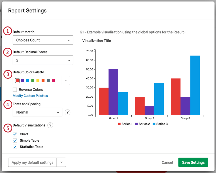
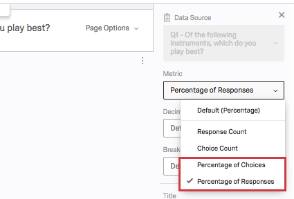
- Default Metric: Select the default metric set in your visualization. This can be:
- Choices Count: The number of times each choice was selected. Note that for multi-answer questions, where respondents can choose more than one answer, the choices counts will often add up to a higher number than your total survey respondents!
- Percentage: The percentage of respondents who chose each choice.
Qtip: If you have multi-answer questions and are more interested in the percentage of choices than the percentage of respondents, adjust the metric on the visualization editing pane.
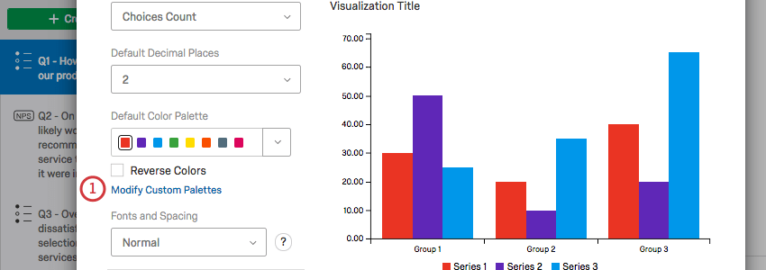
- Default Decimal Places: Select how many decimal places are included in your report data.
- Default Color Palette: Choose the colors used in your visualizations. Select Reverse Colors to reverse the order the colors in the palette appear. Click a color on your palette to choose the first color that appears in your visualizations. In the image above, if you click the purple, then purple is the color of the first variable in a chart, blue the second, and so on.
Qtip: To create your own color palette, see the Adding Custom Palettes section below.
- Fonts and Spacing: Change the font size and spacing on your visualizations. This applies to table padding, font size, and bar size in charts. These changes are compatible with PDF, Word, and PowerPoint report exports.
- Default Visualizations: Determine which visualizations are included in your report by default. This affects how the report is initially generated, and does not restrict your ability to manually build and edit whatever you want. See more in the Default Visualizations section below.
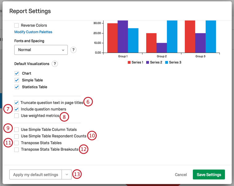
- Show full question text in page titles: When selected, the full question text appears. When deselected, longer questions are cut off by ellipses. See the above screenshot for an example of the deselected version.
- Include question numbers: When selected, this includes question numbers in the page titles.
- Use weighted metrics: When selected, any response weighting you’ve set up will be included in the calculation of your report. When deselected, this weighting will not be applied. See the Response Weighting page on how to set weights up or turn weights on and off for individual visualizations.
- Use Simple Table Column Totals: When selected, totals are displayed at the bottom of your column. This setting will only impact questions with two dimensions. For example, Matrix Tables (which have statements and scales), Pick Group and Rank (which have items and groups), and visualizations with a breakout applied.
- Use Simple Table Respondent Counts: When selected, totals will be based on the number of respondents, rather than the number of times a response was selected. This setting will only impact questions with a Multi-Answer setting.
- Transpose Stats Tables: When selected, you will switch your rows (statements or breakouts) and columns (which statistics you have included).
- Transpose Stats Table Breakouts: When selected, questions you’ve applied a breakout to will switch your rows and columns. By default, the visualization is broken into columns (the question set in the data source) and rows (question you break out by).
- Default settings dropdown: This dropdown allows you to save your global settings for use later in other reports, or to revert back to the Qualtrics default settings. See the Default Settings section for more information.
When you adjust any of these settings, the visualization on the right will adjust so you can preview your changes.
To keep your changes, click Save Settings.
Default Visualizations
When you generate a report, each question gets a page, and there are visualizations already created on these pages for you. You have three options you can include as default visualizations:
- Chart: This is usually a Bar Chart. A chart is included with almost all questions, except for Text Entry, Hot Spot, Heat Map, and other incompatible fields.
- Simple Table: The Simple Table is included for almost all questions, except for Text Entry and other incompatible fields.
- Statistics Table: The Statistics Table is only included by default for numeric, open-ended questions.
All three of these visualization types can be edited after the fact.
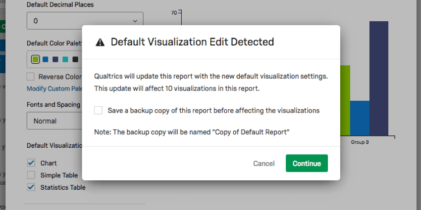
When you elect to remove one of these visualizations from your settings, you will be warned about the number of questions this will affect and be asked if you want to keep a copy of the original report. Select Save a backup copy of this report before affecting the visualizations to do so.
Default Settings
It can be a hassle to edit your colors, fonts, and visualizations over and over again. Global Settings help you create a standard style for your whole report, but what about when you create a new report? Do you have to start editing your global settings all over again?
Thanks to Default Settings, you can choose your favorite global settings for reuse over and over again. Any new reports you create will take on your personalized default settings, and you can easily switch old reports over.
Applying Default Settings
When you click the default settings dropdown arrow, you have three options:
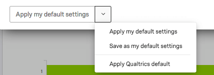
- Save as my default settings: Allows you to save changes you’ve made on this window as personalized default settings. This option does not apply changes to the report you’re working on, but saves them for reuse. These default settings will be applied to new reports you create.
- Apply my default settings: Apply the default settings you saved earlier.
- Apply Qualtrics default: Go back to the default Qualtrics settings.
Adding Custom Palettes
In addition to choosing from preset color palettes, you can create your own custom palette to use in your reports.
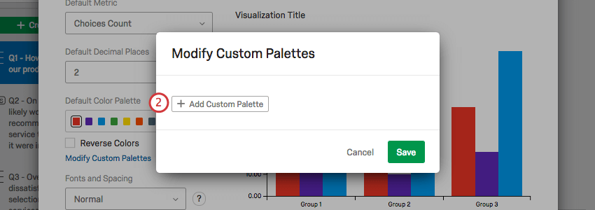
- Click Modify Custom Palettes.
- Click Add Custom Palette.
- Drag your cursor around the middle of the color picker to choose the shade. Drag your cursor on the bar on the right of the color picker to select a color.
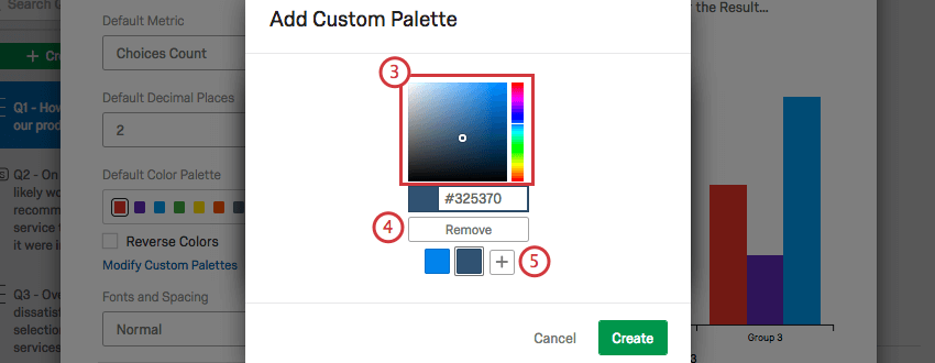
- Click Remove to get rid of a color.
- Click the plus sign (+) to add another color to your palette. You can add up to eight.
- Click a color to change it.
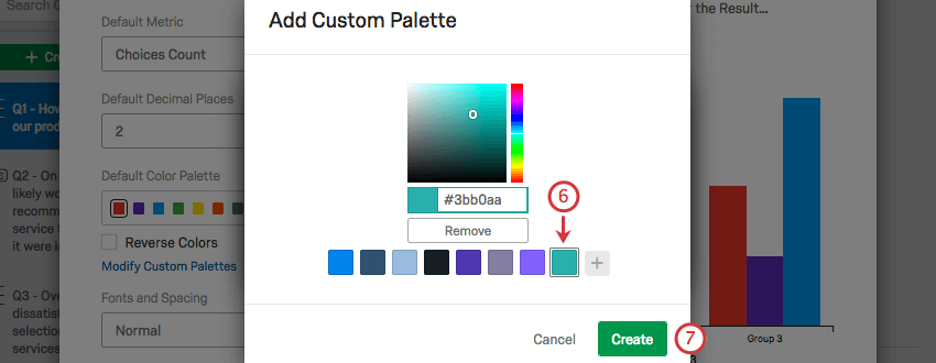
- Click Create to save your palette.
- Click the edit icon to edit your palette.
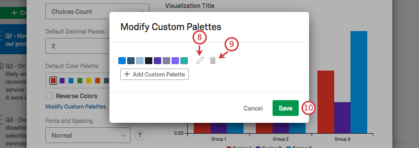
- Click the trash icon to delete your palette.
- Click Save to save your palette.