-

Qualtrics Platform -

Customer Journey Optimizer -

XM Discover -

Qualtrics Social Connect
MaxDiff Analysis Reports
About MaxDiff Analysis Reports
You don’t have to conduct analyses or customize your own reports when you’re conducting a MaxDiff. The reports you need to understand your MaxDiff analyses will be generated for you.
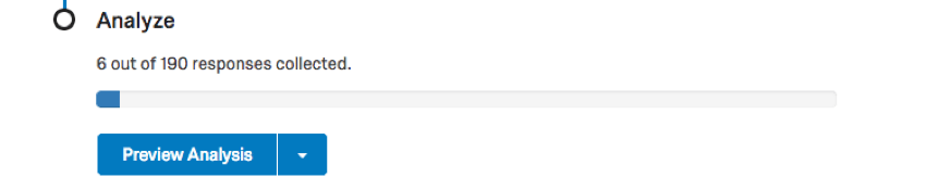
You can access your MaxDiff analysis reports by going to the Reports tab and making sure you remain in the MaxDiff Analysis section. No data or graphs will appear until you have collected the minimum number of responses required to do so.
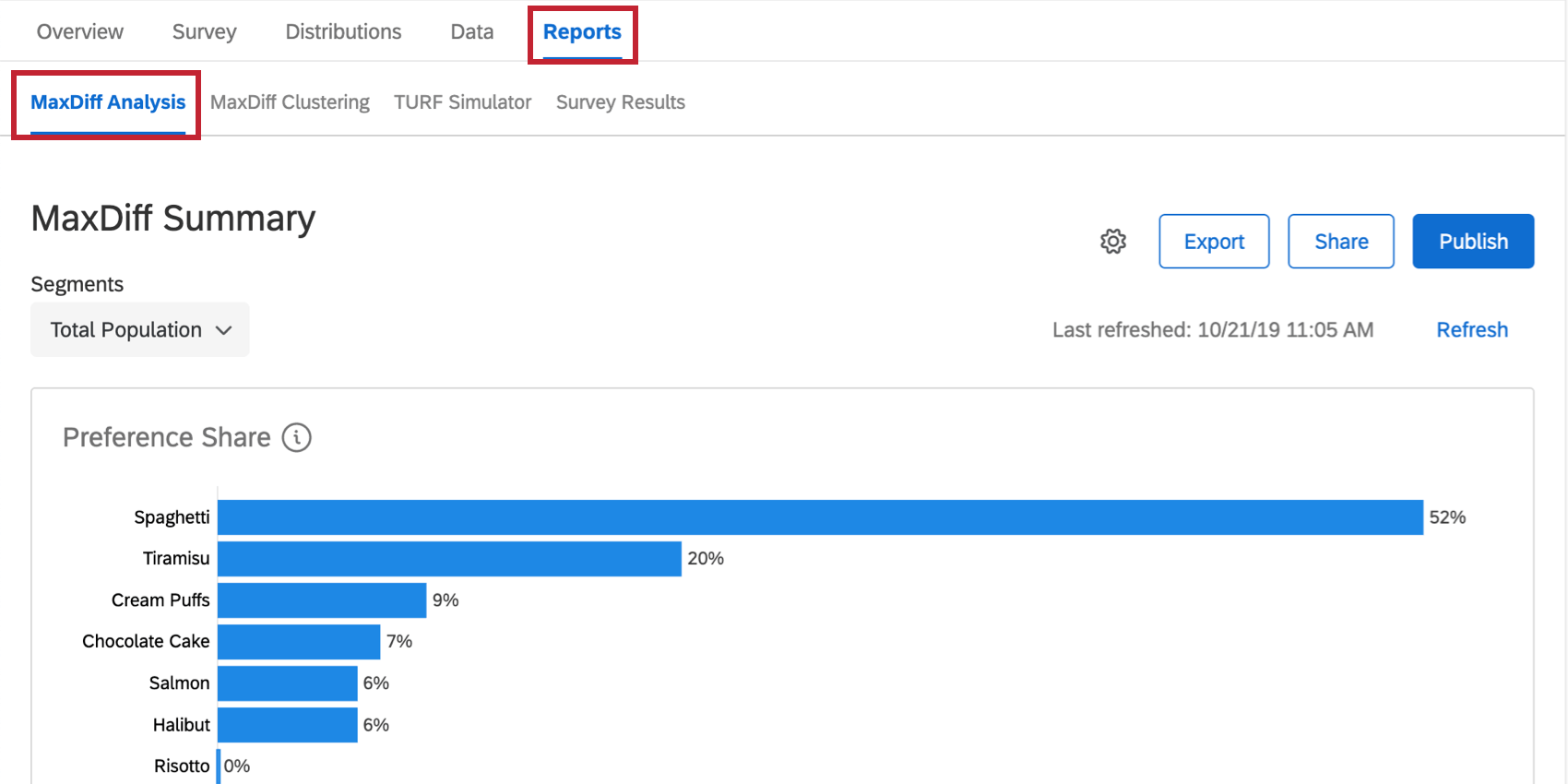
Qtip: You can also get to reports by clicking Preview Analysis on the Overview tab.
Feature Counts
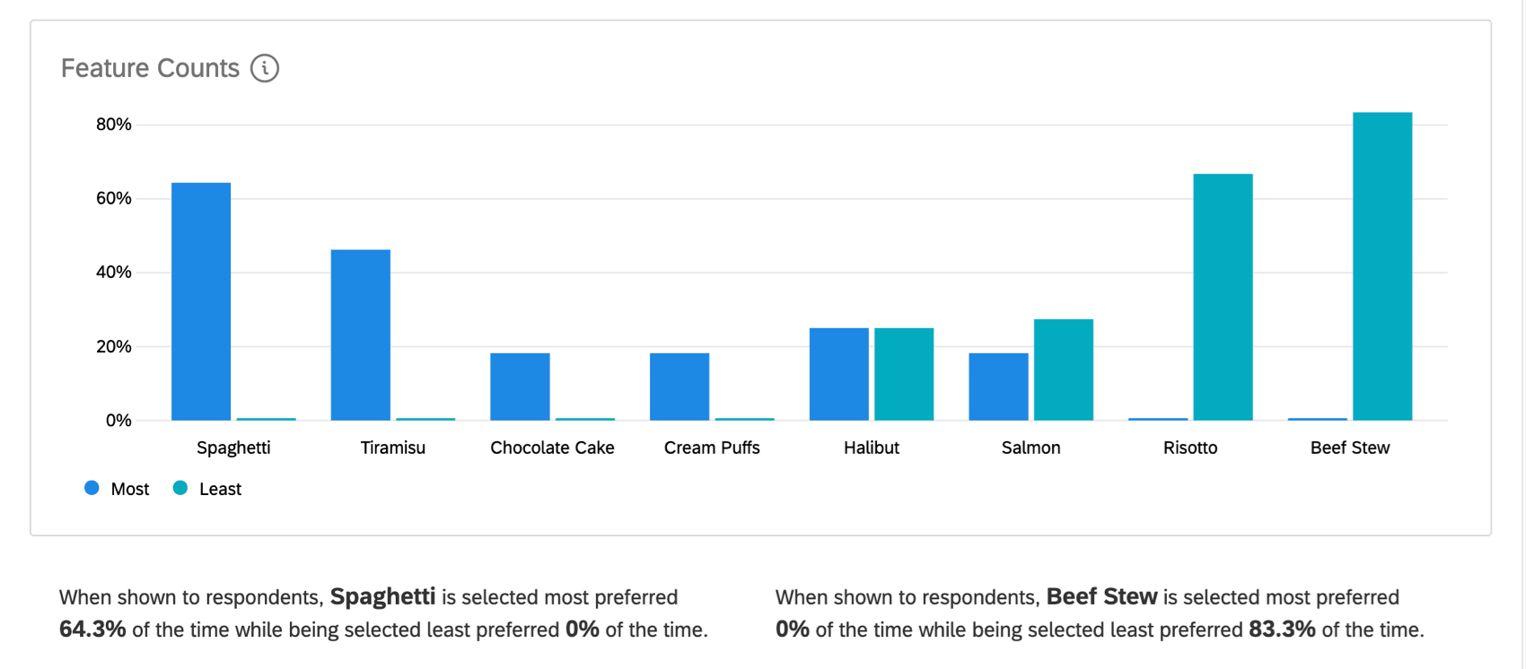
This graph gives you the percentage of responses where the attribute was marked as the most favorite or the least favorite compared to the other items it was presented with. Most preferred is represented as a blue line, whereas least preferred is represented as a teal / turquoise line.
For example, looking at the screenshot above, we see that “Reasonable Prices” was indicated as a least preferred option in 0% of the samples where it was presented, whereas in 47.2% of samples where it was presented respondents marked it as their most favorite.
Highlighting over a data point gives the percentage again. The number above the percentage is the data point’s order of appearance on the X-axis and has nothing to do with the actual count of respondents who selected that answer.
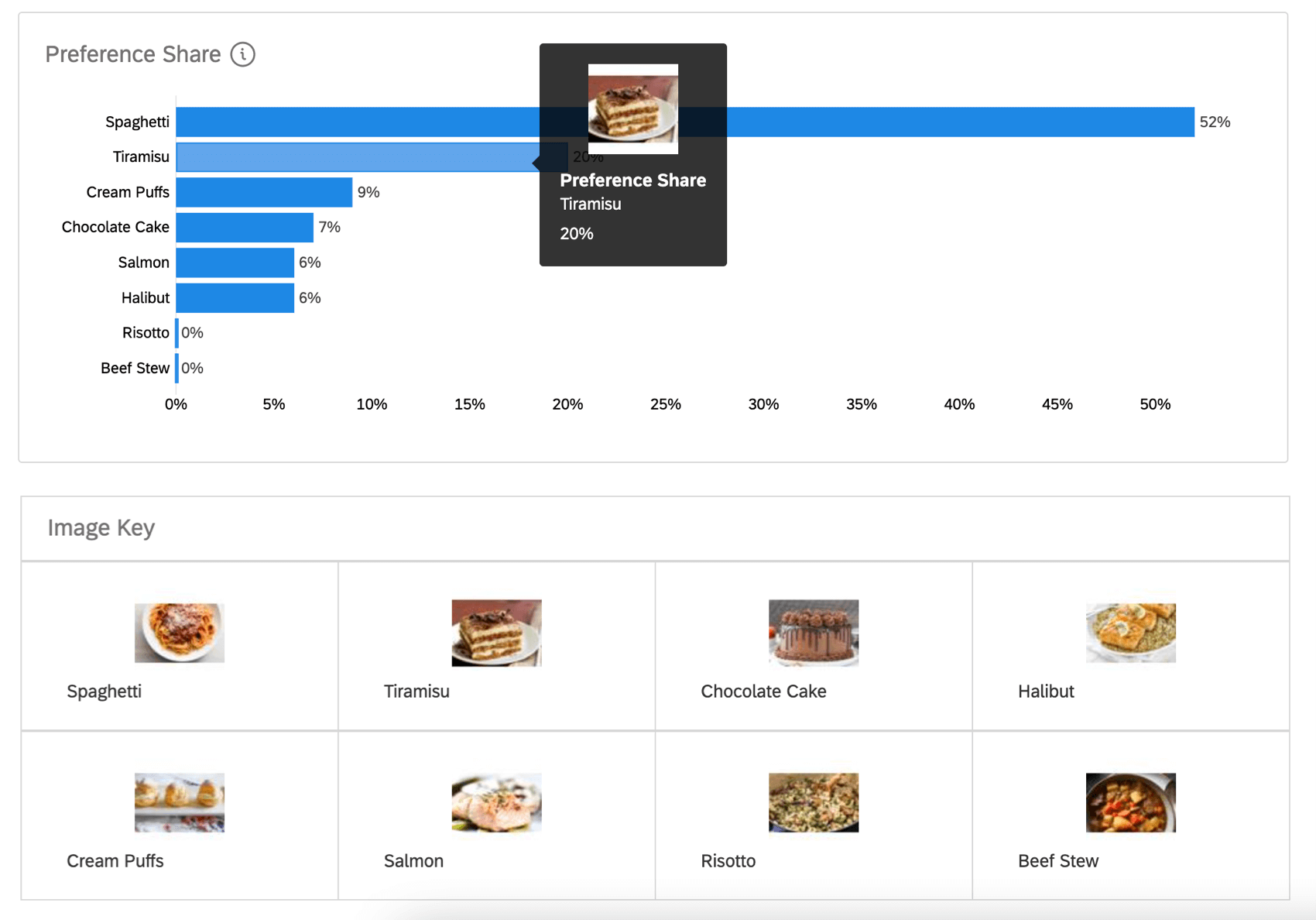
Image Key
If your levels have images attached, there will be an image key explaining the level corresponding to each image. In addition, if you hover over your graph, you will see images in place of feature text.
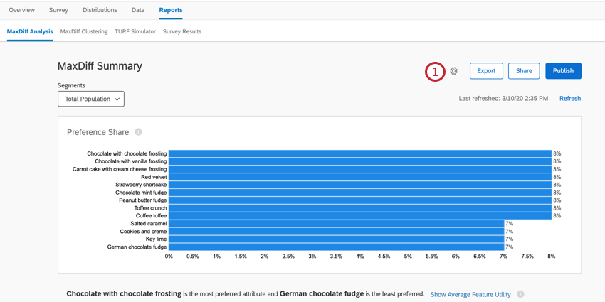
Average Feature Utility
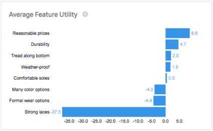
The Average Feature Utility is the average calculation across respondents’ individual utility scores for each feature. The higher a feature’s average utility is, the more it was preferred by customers. The more negative the average utility, the more likely it was that the feature was indicated as least preferred.
Using the example above, people tended to find “Reasonable prices” important when judging shoe products from this company. On the other hand, “Strong laces” has a very high negative score because it was frequently the least important feature when respondents were asked to choose between it and every other available item.
In order to see this chart, you may need to click Show Average Feature Utility below the preference share chart.
TURF Analysis
The TURF Analysis graph helps you determine what combination of items would appeal to the largest portion of your sampled market. To learn more about how this is calculated and how best to use this data, see the TURF Analysis support page.
Using the Analysis type dropdown, you can change your TURF analysis to the following:
- First Choice: This method is calculated by looping through each product combination and deriving the percentage of the sample that is reached. The researcher can define if being “reached” means that the item has to be a respondent’s top overall choice or preference.
- Top 2 Choices: This method is calculated by looping through each product combination and deriving the percentage of the sample that is reached. The researcher can define if being “reached” means that the item has to be in the respondent’s top 2 overall choices or preferences.
- Weighted Probabilities: This method incorporates the principles of the multinomial logit modeling used to derive the MaxDiff utility preferences. It calculates the probability that a combination of items would be selected as most preferred, weighted by the item’s preference share.
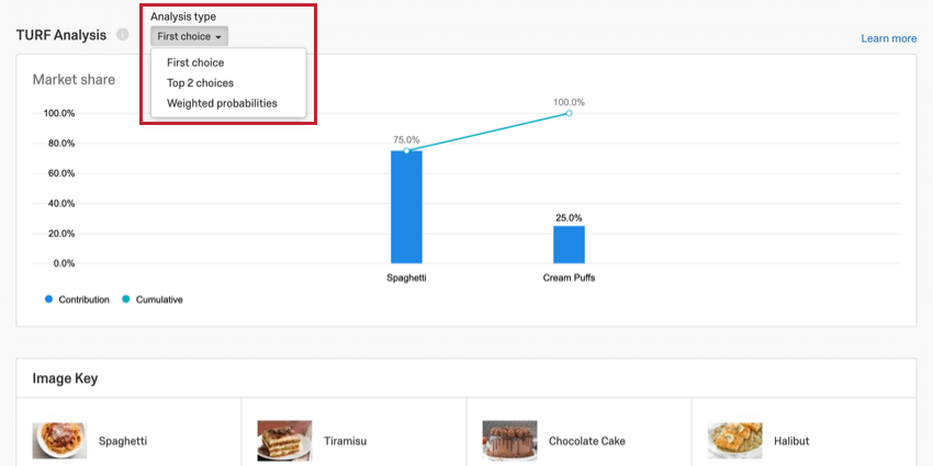
Every TURF analysis displays the most preferred combination of choices. Within this preferred combination, the graph displays each attribute’s contribution to this being the most preferred combination, and the cumulative effect of those choices on the market share as they are combined.
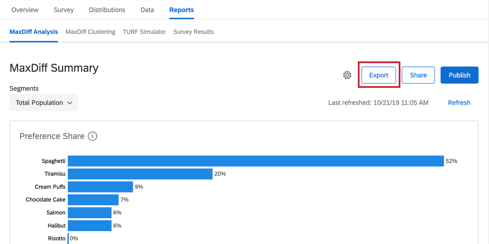
Export
Using the Export button, you can export MaxDiff data into a CSV format. Learn more about the process, what calculations are exported, and what the different column headers mean on the Exporting Raw MaxDiff Data support page.
Refreshing the Data
When you visit the reports after new data has been collected, a yellow banner will alert you that New responses have been collected since you last refreshed your report. This means the data you see may be from a previous batch of responses. This banner can be temporarily closed, but if you leave the page and come back without any data refreshes having taken place, it’ll pop up again.
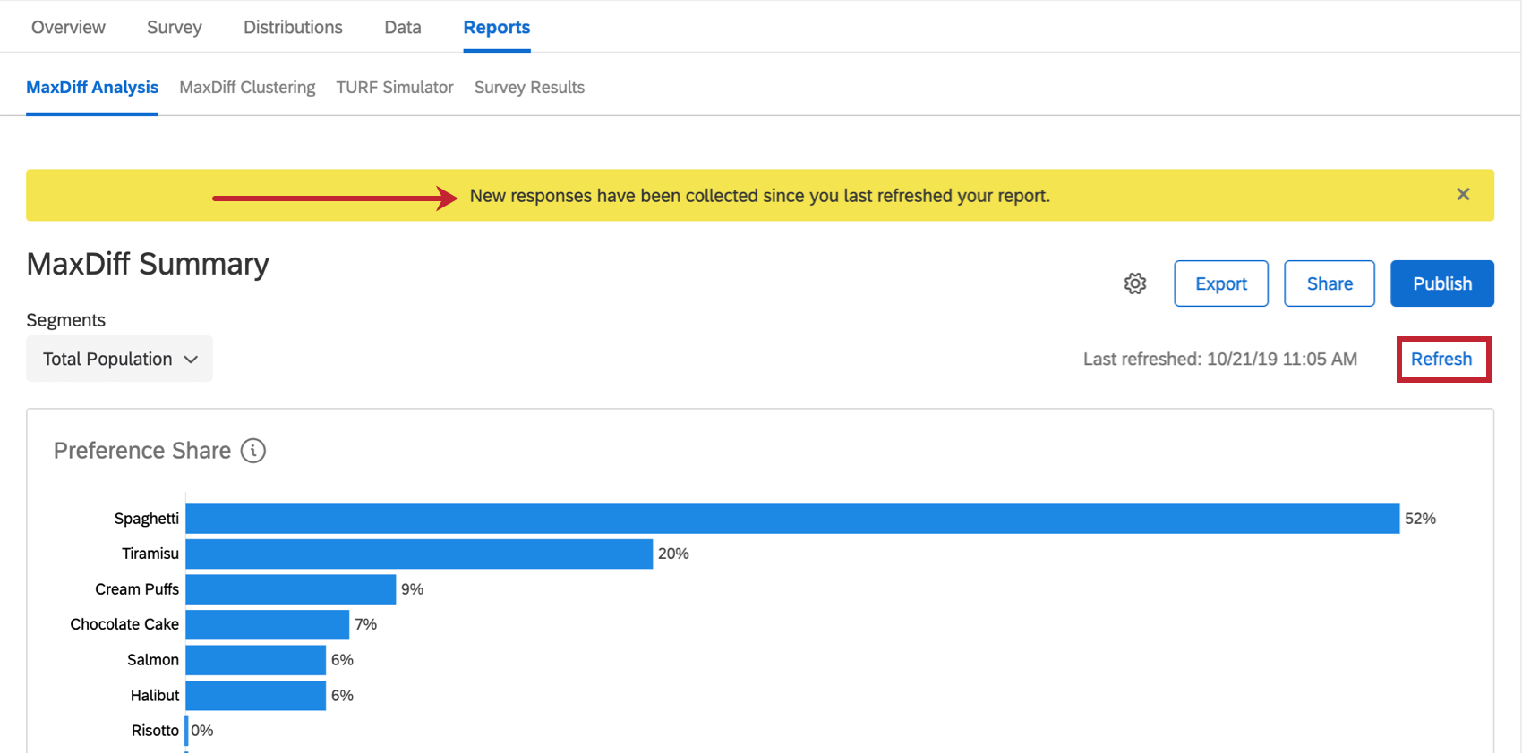
If you would like to manually refresh and force the report to update, click Refresh in blue on the upper-right.
Changing MaxDiff Report Display Names
You can change the display names of the features and levels of your MaxDiff project so that your data is easier to visualize. This will not affect the feature and level names as they appear in your MaxDiff survey.
- Click the gear icon on your report.
- Enable Display Names.
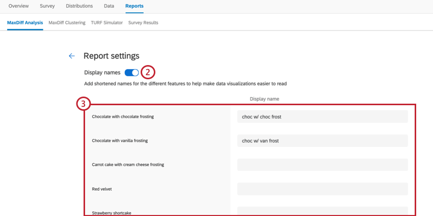
- Enter the text you want used in your report.
Qtip: You can leave a field blank if you don’t want to change its display text.
- Click Save at the bottom of the editor.