
Overview of Report Template Visualizations (EX)
What's on this page
Qtip: This page describes functionality available to Engagement, Lifecycle, and Ad Hoc Employee Research projects. For more details on each, see Types of Employee Experience Projects.
About Visualizations Overview
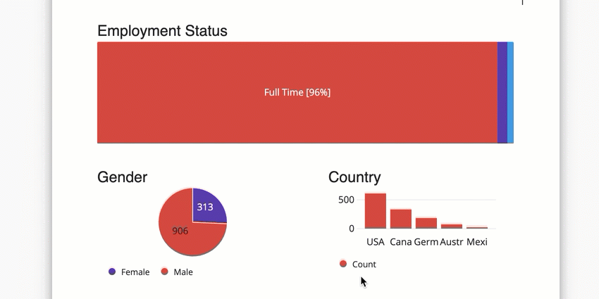
Visualizations make up the bulk of your report template; they display your data in simple and powerful graphics to help you analyze your Engagement results. While each visualization has its own special features and customization options, there are certain edits you can make to just about any visualization.
Adding and Removing Visualizations
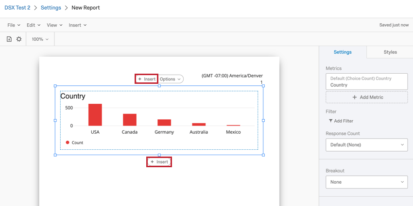
Adding a Visualization
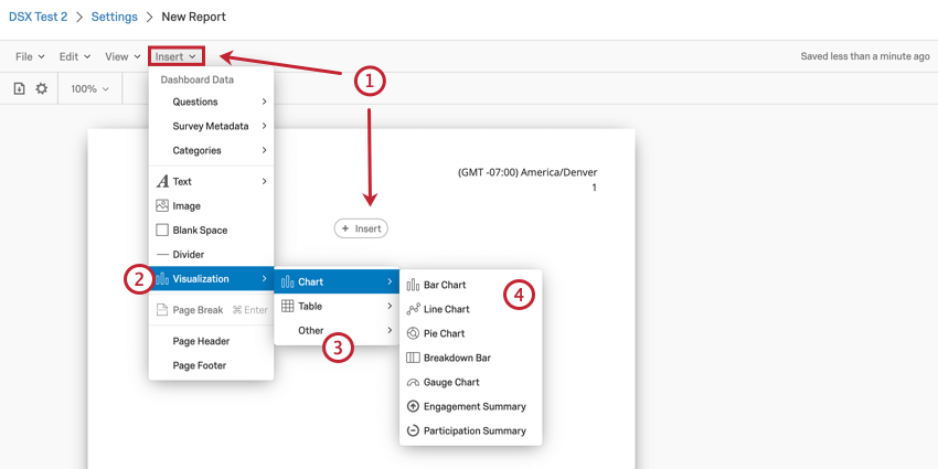
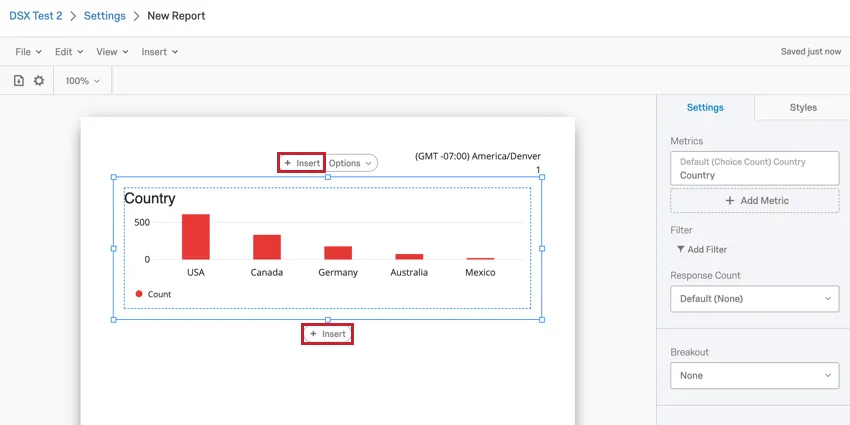
After inserting one visualization, repeat the above process to insert additional visualizations. Furthermore, you can click on an existing visualization to make an Insert button appear above and below the visualization. You can click one of these buttons to insert a new visualization either above or below the selected visualization.
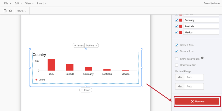
Removing a Visualization
Qtip: You can also remove a visualization using the remove button at the bottom of the visualization settings panel.

Resizing and Rearranging Visualizations
Resizing Visualizations
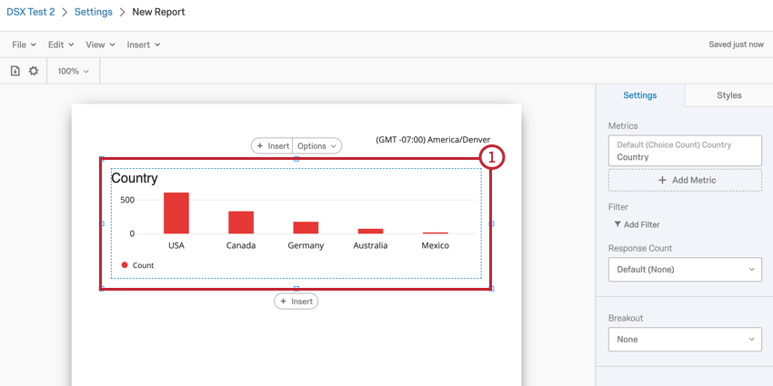
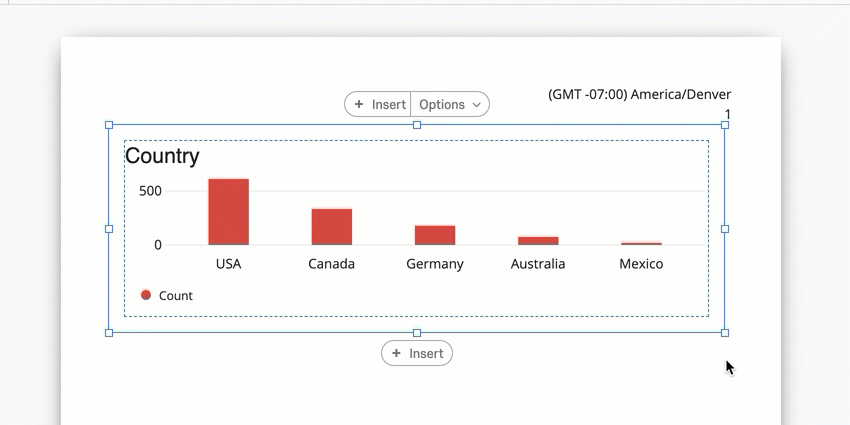
You can resize visualizations to create flexible and interesting report formats. To resize a visualization, click one of the boxes around the visualization’s outline and drag your mouse.

Rearranging Visualizations
You can also rearrange your visualizations in your report. To move your visualization, simply click the visualization and drag it to where you’d like it to be.

General Visualization Settings
Most visualizations share common settings to customize the look of data displayed in your visualizations.
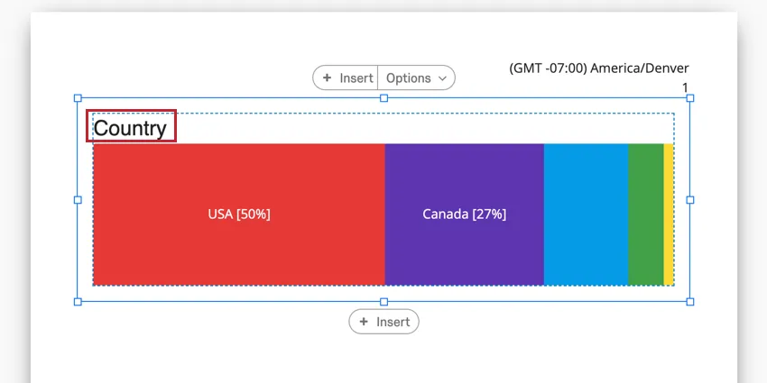
Visualization Title
When you add a visualization into your report, it will have an associated title. By default, the title will be the field name you are displaying in the visualization. However, these names don’t usually make sense as titles, so you can retitle your visualizations.
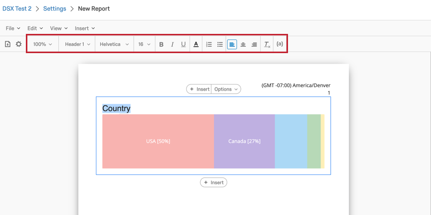
To edit the title of a visualization, double click the existing title.
You can then use the Rich Content Editor that appears to edit your text and apply any special formatting you’d like. This Rich Content Editor works the exact same as the one that appears for Text Areas. Read the linked page for an explanation of each option available to you.

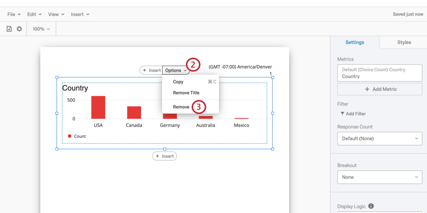
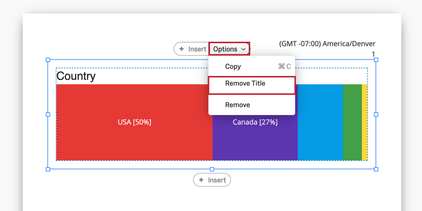
To remove a title entirely, click the Options menu for your visualization and select Remove Title.

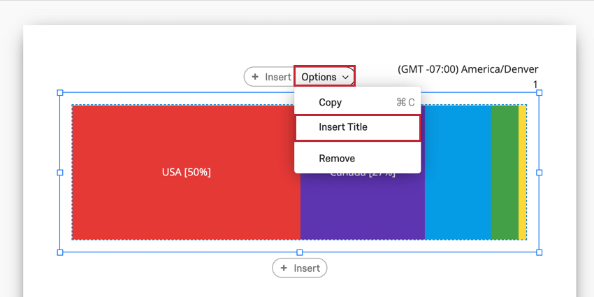
If your visualization does not have a title, you can add it by clicking the Options menu for your visualization and selecting Insert Title.

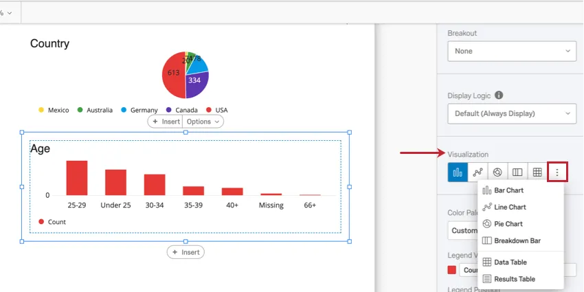
Visualization Type
Many visualizations are flexible enough to be easily switched to a different visualization type. To change your visualization type, choose the visualization from the list of available options within your visualization editing panel. Click the icon with three dots to see the entire list of available options. Your currently selected visualization type will be the first icon highlighted in blue.
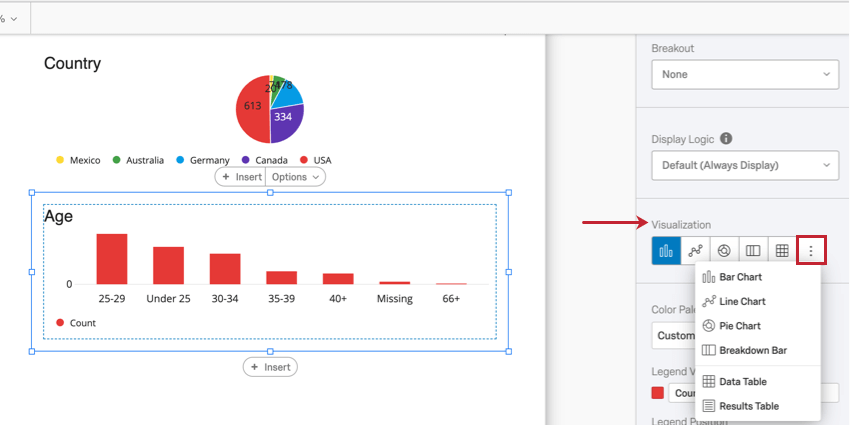
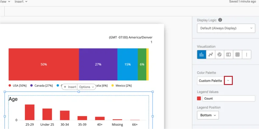
Color Palette
Most visualizations have a Color Palette which determines the colors used in the visualization. You can choose from a variety of premade palettes, or create your own! Clicking the down arrow next to the Color Palette will pull up the menu of color palettes.
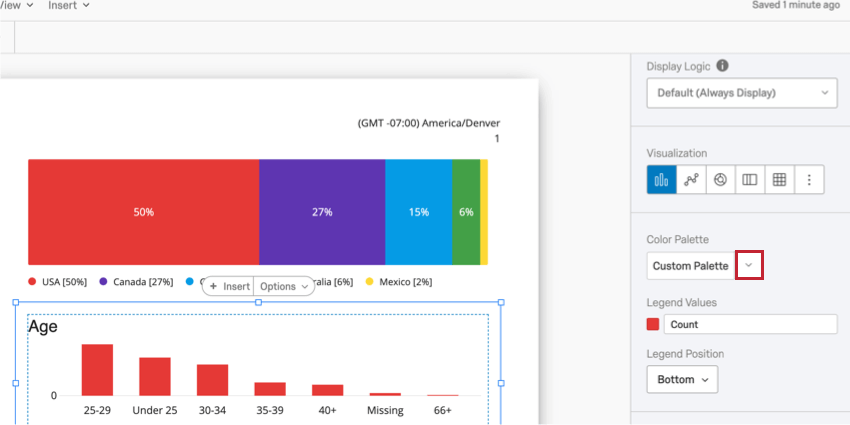
Qtip: You can change the color palette for all the unedited visualizations in the report by going to the global visualization settings.
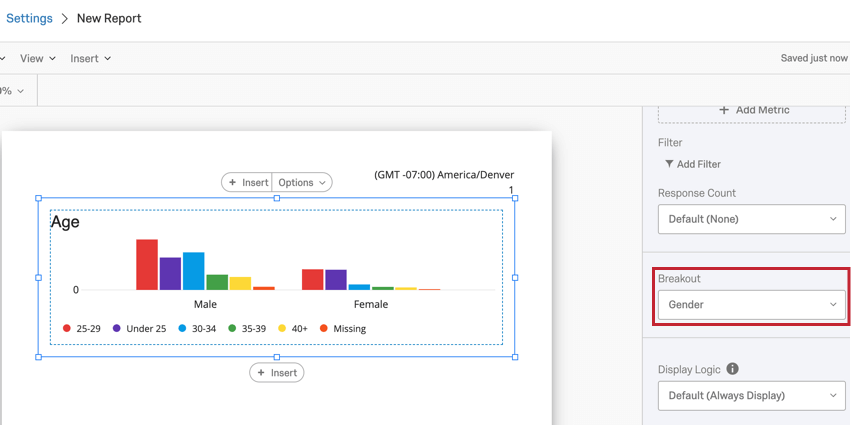
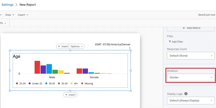
Breakout
Breakouts are a great way to segment your data for further analysis. For example, let’s say you’re analyzing engagement data by department. You can then break out these departments by tenure to identify gaps between junior and senior employees.
To add a breakout, select a field in the Breakout menu.
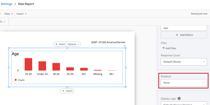
If you decide to remove your breakout, click the Breakout dropdown and select None.
Qtip: Each visualization can only have one breakout applied to it. You can, however, continue to filter your visualization for more detailed results.
Breakouts are compatible with the following visualization types:
- Bar Chart
- Line Chart
- Data Table
- Statistics Table
Qtip: For visualizations that can’t be broken out, try adding visualization filters instead.
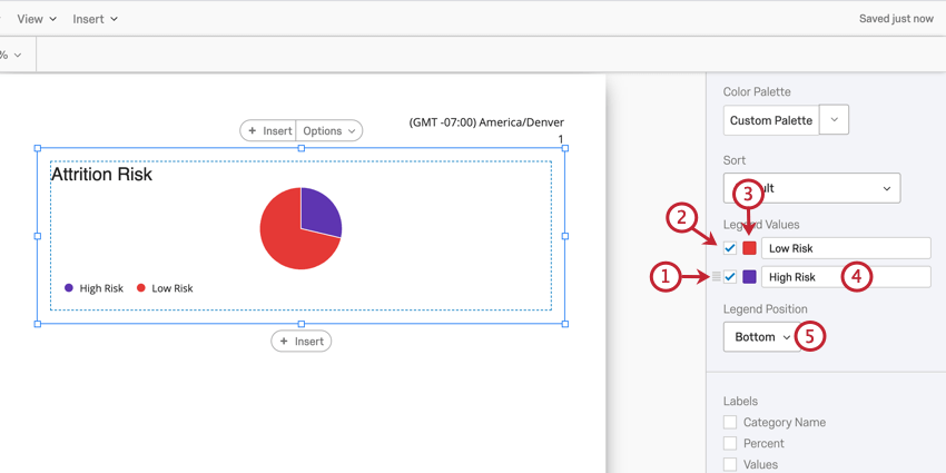
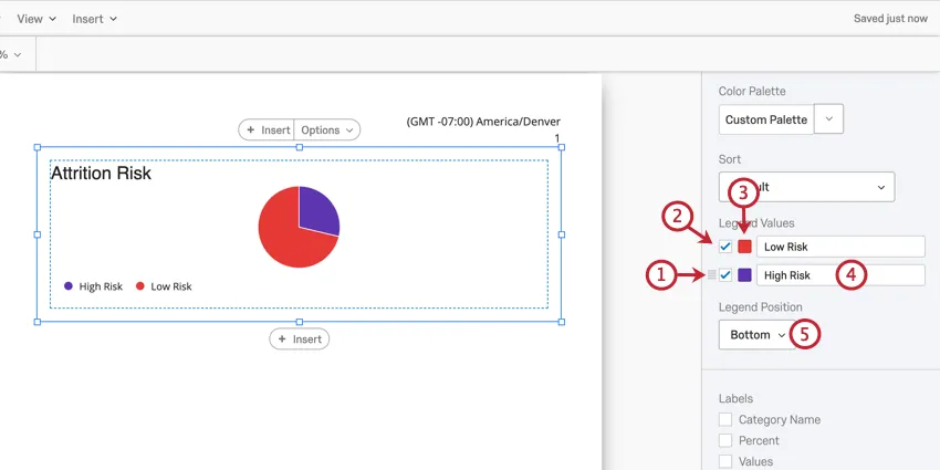
Legend Values & Position
Some visualizations have an accompanying legend to help identify different parts of the visualization. You can customize the following aspects of your legend:
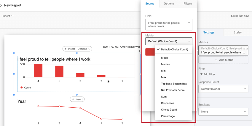
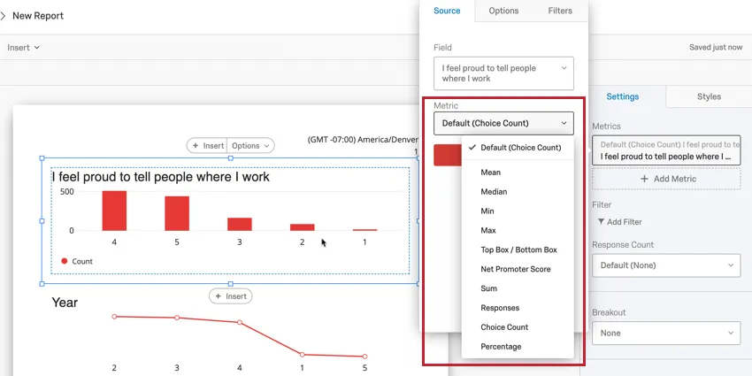
Metric
The Metric dropdown determines what format of data you want to include in your visualization. These options can vary based on the type of visualization you’ve chosen and the field type of the field you are displaying.
Qtip: You can add multiple metrics to Bar Charts, Line Charts, and Data Tables.
Numeric and Number Set Metrics
When you select a field that’s been mapped as either a Numeric or Number Set field type for your metric, you can choose to display one of the following:
-
- Mean: Display the average, or mean, of the collected responses.
- Median: The median of your dataset is the exact midpoint. When all of your collected values are organized from smallest to largest, this value is right in the middle. Qtip: Qualtrics calculates the median using a non-deterministic percentiles aggregation to approximate the desired percentage counts at scale. The median, or 50th percentile, is accurate at about 99.9% on average.

- Min: Display the minimum value response. This will always be the lowest point on your scale if you have a Multiple Choice question, whereas a question where respondents can enter values in will be less predictable.
- Max: Display the maximum value response. This will always be the highest point on your scale if you have a Multiple Choice question, whereas a question where respondents can enter values in will be less predictable.
- Top Box / Bottom Box: Used to analyze questions on a scale (i.e. from 1 to 5). You can choose which scale points are included in your top box / bottom box metric.
- Net Promoter Score: This is a calculation of the Net Promoter® Score. Although you can technically select this metric for other question types, this metric is best for when your survey actually contains an NPS® question.
- Sum: The total sum of all the respondents’ answers to the questions added together.
- Responses: The number of people who responded to a question. Qtip: If your questions don’t have validation on them forcing respondents to answer, then this number can be lower than your number of total survey respondents.
- Choice Count: The number of times each choice was selected by respondents.
- Percentage: The percentage of respondents who chose each choice.
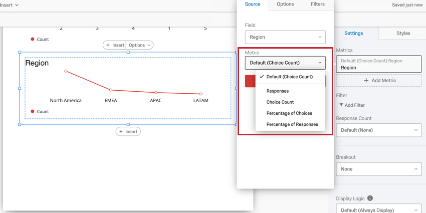
Text Set and Multi-Answer Text Set Metrics
When you select a field that’s been mapped as either a Text Set or Multi-Answer Text Set field type for your metric, you can choose to display one of the following:
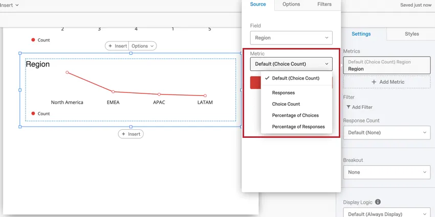
- Responses: The number of people who responded to the question.
- Choice Count: The number of times each choice was selected by respondents.
- Percentage of Choices: The number of times each choice was selected as a percentage of all choice selections.
- Percentage of Responses: The percentage of responses that selected each choice.
Visualization Compatibility
The following visualizations are compatible with all metric types:
Gauge Charts are only compatible with Numeric and Number Set metrics.
For Breakdown Bars and Pie Charts, the displayed metric is always Choice Count.
Metric Filters
You can filter metrics the same way you filter visualizations. To add a metric filter:
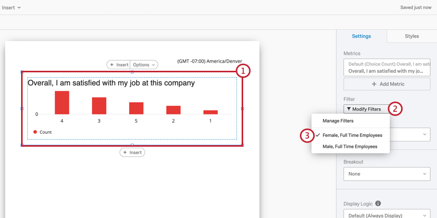
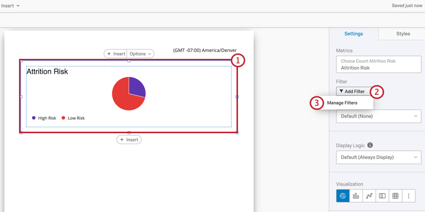
Visualization-Level Filters
Visualization-level filters allow you to apply filters to a single visualization instead of to your entire report.
Visualization-level and report filters are always additive in nature. For example, if your report filter isolates male data, and the visualization is filtered to only display data from respondents who indicated high dissatisfaction, the visualization will display only data from men who rated high levels of dissatisfaction.
See Visualization-Level Filters for a guide on adding filters to visualizations.
Qtip: The Engagement Summary, Participation Summary, Question List, and Scorecard visualizations cannot use visualization-level filters. However, they do obey report filters.
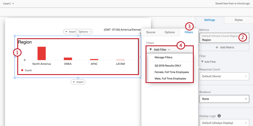
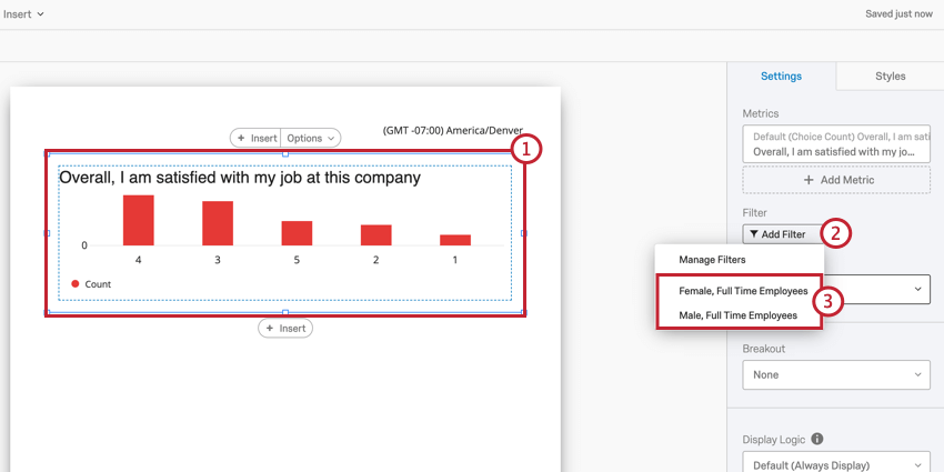
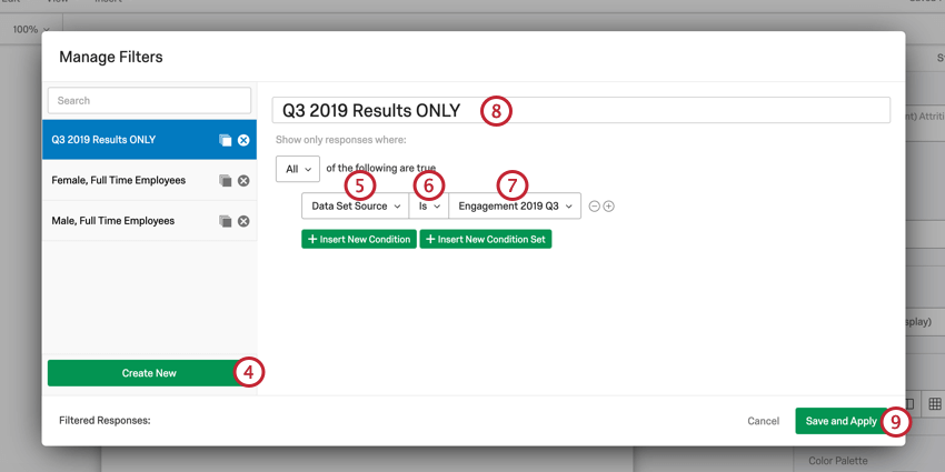
Reusing Visualization Filters
Once you create a filter, you can quickly apply it to other visualizations in your report. To load a previously saved filter to a new visualization:
Removing Visualization Filters
Visualization Display Logic
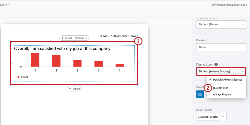
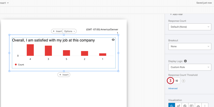
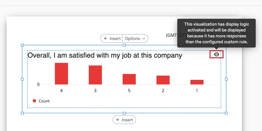
Visualization Display Logic allows you to set anonymity thresholds on your report visualizations. The feature determines how many responses need to be in the visualization before it appears in report exports. By default, all visualizations are displayed.
This feature is important for maintaining employee confidentiality with your engagement results. For example, if you have a visualization displaying data for a certain department, you’ll want to make sure that there’s enough responses in the visualization so that no individual employee’s response can be singled out. Visualization display logic helps you accomplish that.
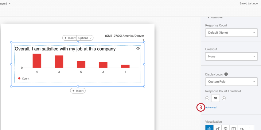
Adding Visualization Display Logic
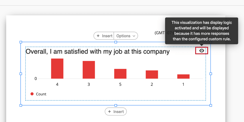
After adding display logic to your visualization, an eyeball icon will appear in the top right-hand corner. Hovering over this icon will show whether the visualization will appear in report exports.
Qtip: You cannot add display logic to the Engagement Summary, Participation Summary, Question List, and Scorecard visualizations.
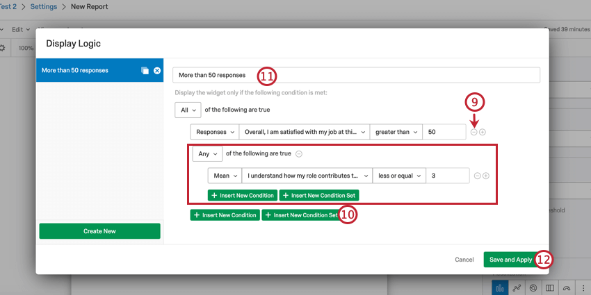
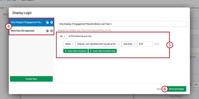
Advanced Display Logic
Advanced display logic allows you to add conditions and limit when the visualization is displayed based off of data for other questions.
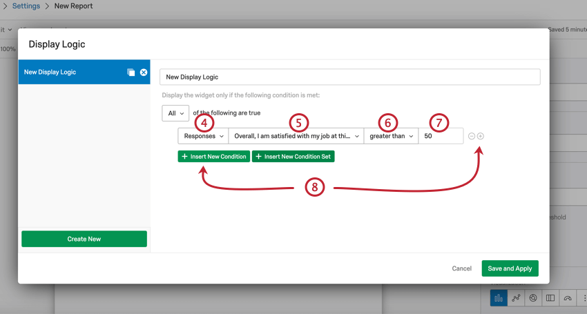
You can always return to edit your visualization display logic at any time.
Reusing Advanced Display Logic
Once you create an advanced display logic set, you can easily apply that set to multiple visualizations in your report.
Multiple Data Sources
If your dashboard has multiple data sources, your data will be aggregated together for most visualizations. To view data based on a singular data source, you will need to filter your visualizations by data source. This applies to the following visualizations:
- Bar Chart
- Line Chart
- Pie Chart
- Breakdown Bar
- Gauge Chart
- Data Table
- Statistics Table
- Results Table
- Word Cloud
Qtip: To quickly filter all data in your report by a specific data source, add a dashboard page filter for Data Set Source and filter for the specific source.
Filtering Visualizations by Data Source
Qtip: You can select multiple data sources.
Data Source Dropdown
A few visualizations give you the option to select a data source from directly within the visualization editing pane.
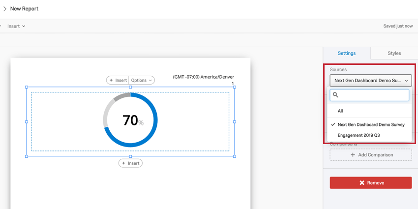

This dropdown is available in the following visualizations:
That's great! Thank you for your feedback!
Thank you for your feedback!