
Scorecard Widget (EX)
What's on this page
About Scorecard Widgets
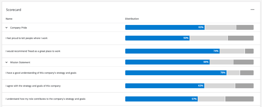
A Scorecard widget displays data for categories that you set up in the Categories section of your dashboard Settings. It will show a bar for each statement in your category that displays the percentage of respondents that had favorable, neutral, or unfavorable responses (the responses that fall into these categories are determined by the Scales section of your dashboard Settings).
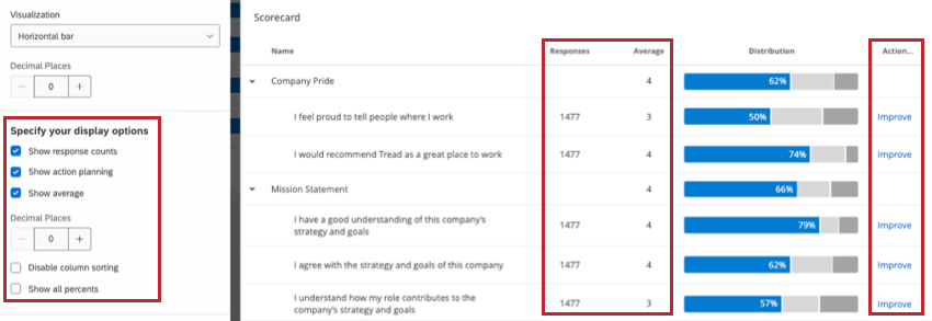
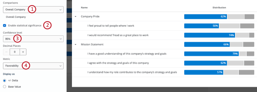
For example, for the statement “I would recommend this as a great place to work” in the example below, 74% of the respondents responded favorably. For the category “Company Pride,” on average, 62% of the respondents responded favorably for all of the statements within that category.

Qtip: Unsure which Employee Experience projects have this widget? See our Widget Types and Project Compatibility table.
Field Type Compatibility
The Scorecard widget uses scoring categories as the data source. These are set up in the Categories section of your dashboard settings. These categories need to be comprised of fields that are mapped as a Number Set field type.
Note that the data displayed in the widget is dependent on the scales that you set in the Scales section. Be sure to adjust these scales differently if you would like your Favorable, Neutral, or Unfavorable scores to be calculated differently.
Widget Customization
For basic widget instructions and customization, visit the Widgets Overview support page. Continue reading for widget-specific customization.
Basic Setup
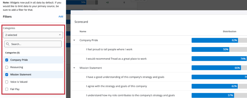
To set up your Scorecard widget, you first need to select 1 or more categories you would like displayed in your widget. These categories are set up in the Categories section within dashboard Settings.
Your widget will pull in data from all the sources you’ve added in Dashboard Data by default. If you want to limit data to a single source, add a filter.

The order of the items listed in the categories is determined by the order the fields are mapped in your dashboard data.
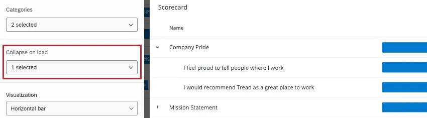
Collapse on Load
If you have a category that has several statements included in it, you can choose to collapse the category by default upon a dashboard loading. You can apply this option to multiple categories and will always be able to expand the category with this option.
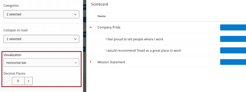
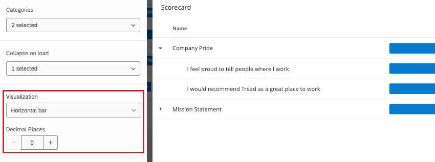
Visualization
You can choose a Histogram or Horizontal Bar view. If you choose Horizontal Bar, you will then be able to specify your desired number of decimal places and add multiple Sources.
Qtip: Qualtrics recommends using a Horizontal Bar view in order to display your data in the most concise format.
Display Options
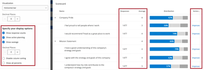
- Show Response Counts: Displays the total number of responses accounted for in each statement.
- Show Action Planning: Displays an Action Planning column, where a dashboard viewer can click Improve to create a new action plan or add to an idea board.
- Show Average: Displays the average of all responses for a statement or category. This number is based off of a question’s recode values. With this option turned on, you can specify your desired number of decimal places for the mean.
- Disable Column Sorting: Will not allow a dashboard user to sort the columns on the widget.
- Show All Percents: Rather than only show the percentage for the favorable engagement, selecting this option will display percentages for neutral and negative engagement, too.
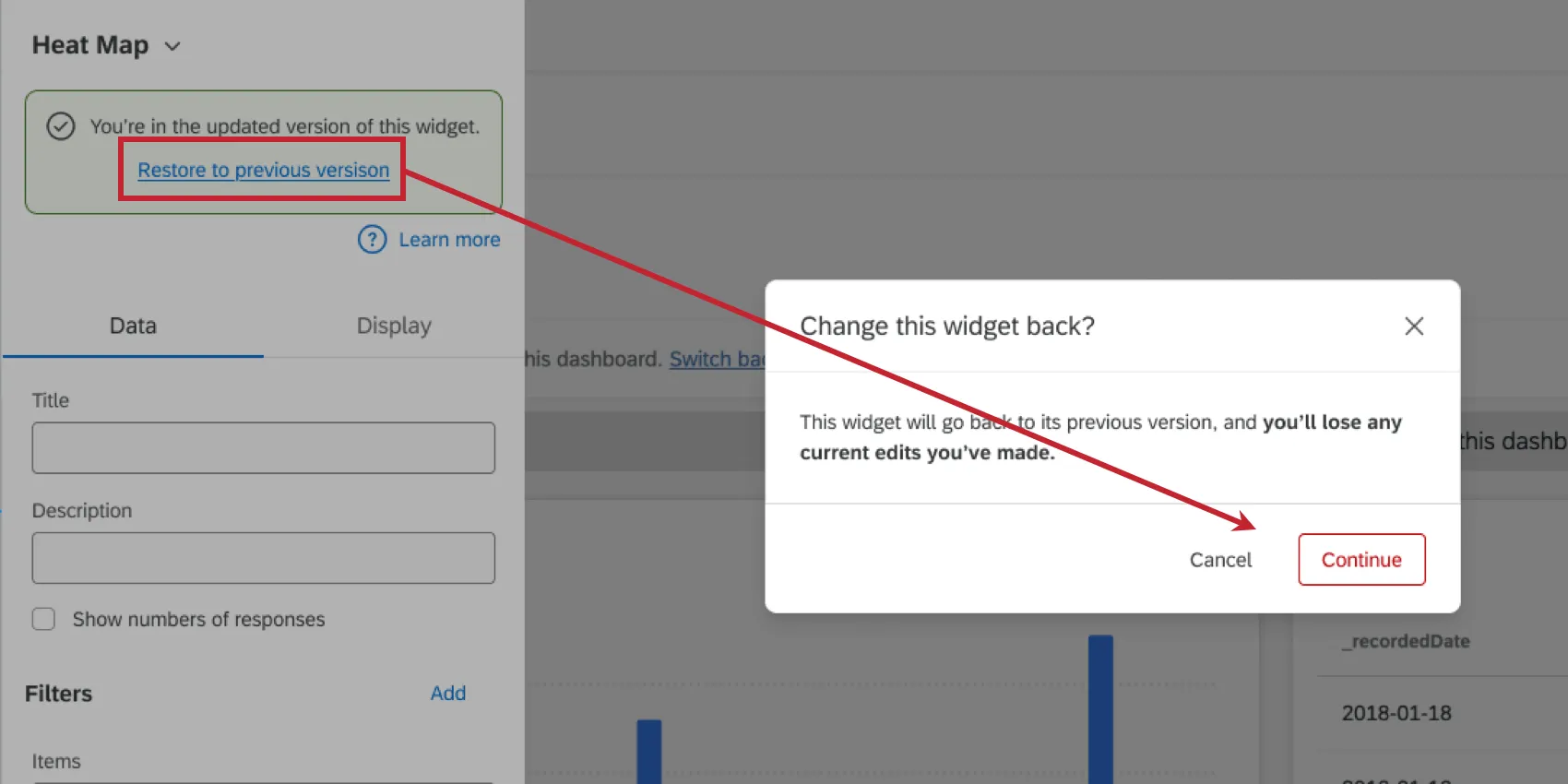
Qtip: If your widget setup looks slightly different than what’s on this page, then it’s likely you are using an old version of the widget. This older version will be automatically migrated to the new version at a later date. You can migrate your widget early by editing it and clicking Update now.If desired, you can revert to the old version by clicking Restore to the previous version. Please note that any new edits you may have made will be lost when reverting the widget.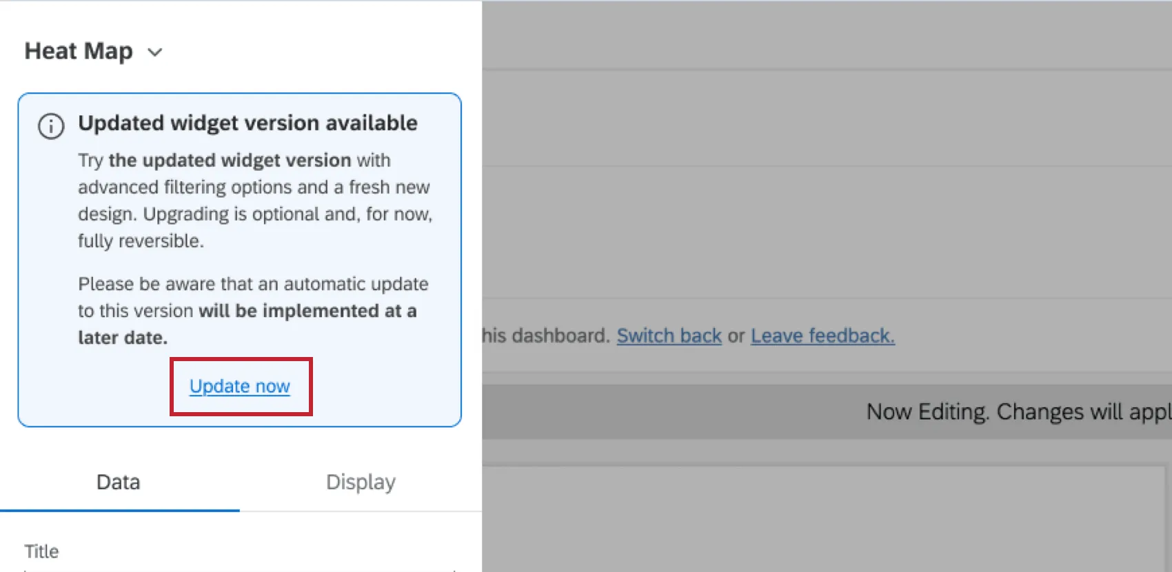

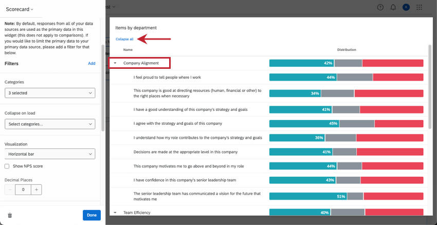
Expanding and Collapsing Rows

When the scorecard displays categories, the overall category performance is shown, with individual category questions nested underneath. Click the arrow or name of a category to expand and collapse the items underneath it. There will also be an Expand all / Collapse all button at the top of the widget.
Qtip: By default, all category rows are expanded. Use Collapse on load to choose categories you want to be collapsed by default.
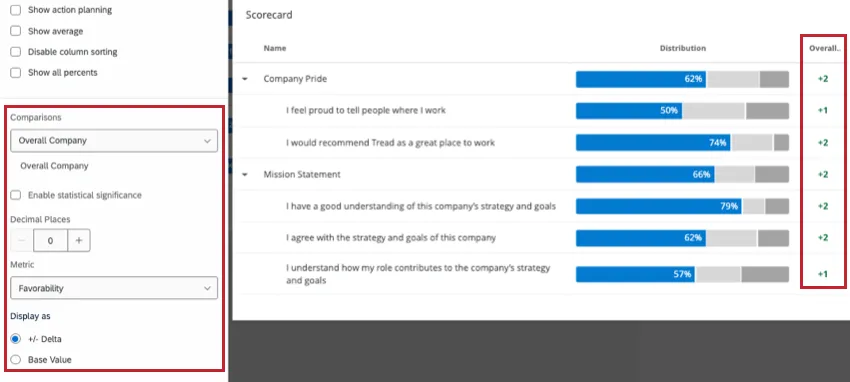
Comparisons
You can add both benchmarks and comparisons as comparison data in your Scorecard widget.
In order to add a comparison to the widget, you will have to ensure that you have at least 1 benchmark added in your Benchmark Editor or at least 1 comparison added in your Comparisons section of your dashboard Settings.
Note that you can add multiple comparisons, if you would like. A maximum of 10 comparisons can be added to each widget.
Metric
The metric is another field that determines how the numbers along the x-axis are calculated. You can either present results based on engagement or average.
- Favorability: Base your data on favorability. This is calculated as an engagement score, the percentage of participants who rated favorably on the set scale. For more on setting favorability scales, see Scales.
- Average: Base your data on the average value. In a Heat Map, that means you see the average of everyone’s score in a group. You can only switch the metric to average once Show Average is enabled in the widget’s display options. Qtip: Depending on the number of scale points, it may be difficult to get a large range for average. Consider adjusting your value ranges to include decimals.

Display As
Once your comparison is added and you’ve decided on the metric, you can display the comparison data as +/- Delta (displays the difference between your survey data and your comparison data) or as the Base Value (displays the actual value of your comparison data).
Qtip: Comparisons are displayed in green for positive values and red for negative values. These colors cannot be modified.
Significance Testing
When displaying comparisons or benchmarks on your widgets, you’ll see a lot of changes from one group to another. But are these changes to be expected, or are they representative of something deeper? How can you decide what changes demand your attention? Thankfully, you can flag whether a difference is statistically significant.
Enabling Significance Testing

Qtip: To use significance testing, you must set your widget to display number values as +/- Delta.
Qtip: Don’t see the option to select a metric? Make sure Show Average is first enabled in your widget’s Display Options. If the Metric dropdown is not visible, then the display metric is Favorability.
Types of Significance Tests
The type of significance testing that is being performed varies based on your chosen metric and whether you have added a benchmark or a comparison.
| Favorability | Average | |
|---|---|---|
| Comparisons | A 2 proportion z-test in 2 tails. Here, we are comparing proportions of favorability for 2 populations.
| An independent samples t-test. Here, we are comparing 2 different distributions of scores: the current project’s survey results against the comparisons’ survey results.
|
| Benchmark | One sample test of binomial proportions. Here, we are comparing expected proportion (a benchmark) to the experimental proportion of the binomial question: is this favorable or unfavorable. | One sample t-test. Here, we are comparing the benchmark mean (which is a single value) to the current survey’s results, which is a distribution of values. The sample size for categories is the average number of responses across the items in the category. |
Qtip: Only benchmarks that are comparisons with Top Box / Bottom Box can be added to this widget.
Understanding Significance in a Widget
The Confidence Interval indicates how confident you would like to be that the results generated through the analysis match the general population. Higher confidence levels raise the threshold for a difference to be considered statistically significant, meaning only the clearest differences will be marked as such.
Once you have enabled significance testing, only the changes that are significant will appear in color, with arrows to indicate the direction of the change. Insignificant changes will be in gray.
FAQs
Why are some of the fields in my Breakout Table or Scorecard widget in my EX dashboard displaying dashes and no data?
Why are some of the fields in my Breakout Table or Scorecard widget in my EX dashboard displaying dashes and no data?
Why do I not have any data options in the Scorecard widget in my EX dashboard even though I’ve mapped over everything for my project?
Why do I not have any data options in the Scorecard widget in my EX dashboard even though I’ve mapped over everything for my project?
That's great! Thank you for your feedback!
Thank you for your feedback!