-

Qualtrics Platform -

Customer Journey Optimizer -

XM Discover -

Qualtrics Social Connect
New Survey Taking Experience
About the New Survey Taking Experience
The new survey taking experience, formerly called the Simple Layout, is designed to simplify your survey building tools while also making the resulting survey more mobile-friendly, easy to use, and accessible for your respondents.
Benefits of this experience include:
- Overall usability: Modernized user interface of surveys to meet evolving web design standards, as well as the latest AI enhancements, powered by an updated web framework.
- Mobile-friendly: Surveys are optimized for taking on mobile, meeting respondents where they are and setting the foundation for the interaction models of the future.
- Accessibility: Surveys meet WCAG 2.1 AA accessibility standards for key features, the full list of which can be found in Overview of Improvements.
- Additional question types: Access additional question types, such as the Solicit Reviews Question.
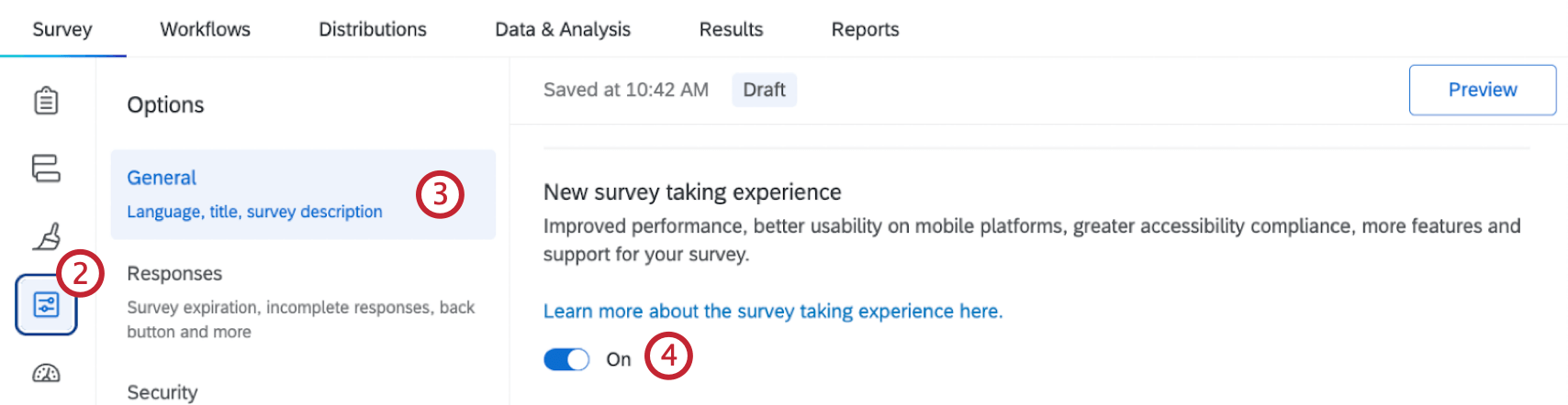
Activating the New Experience
Activating the new survey taking experience for a survey is quick and easy. Please note this must be done individually for each survey, and you can only do this for 1 survey at a time.
- Open the survey where you want to enable this experience.
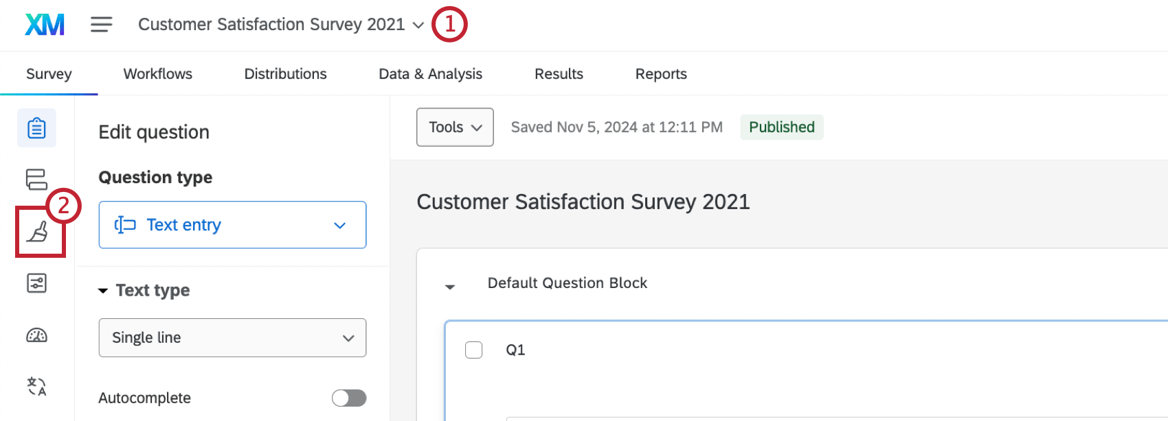
- Go to Look and feel.
- A pop-up will appear asking if you want to activate the new survey taking experience. Click Upgrade to activate it for this survey.
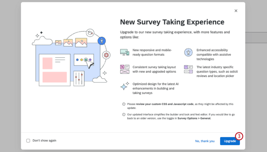 Attention: If you click Don’t show again, the pop-up won’t appear for you in any survey when using your current browser. If you access Qualtrics in a different browser, you will see the pop-up.
Some elements in your survey, such as custom CSS and Javascript code, may be affected when switching to the new experience. See the Currently Unsupported Survey Features section for more information.
Overview of Improvements
The new survey taking experience includes a number of qualitative updates to provide a cleaner and more visually-appealing experience. This section is by no means comprehensive, but calls out some of the larger updates to the survey-taking experience.
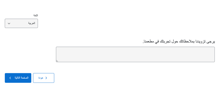
Navigation
The navigation user interface has always been mirrored for right-to-left languages, such as Arabic and Hebrew. Now, however, both buttons appear on the same side to improve visibility.
Example: In Arabic, both the “Next” and “Back” buttons will be left-aligned, with the “Next” button appearing to the furthest left.
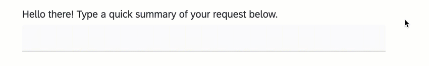
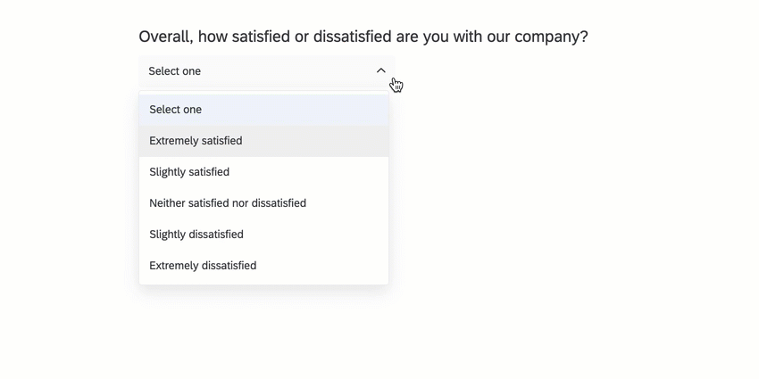
Clear response expectations
The new survey-taking experience includes increased visual signals for different state changes to help the survey-taker better understand what kinds of responses they are expected to give.
Example: Here is a text entry question. Note how the field changes appearance based on whether it is empty, selected, being typed in, or already has a value entered.
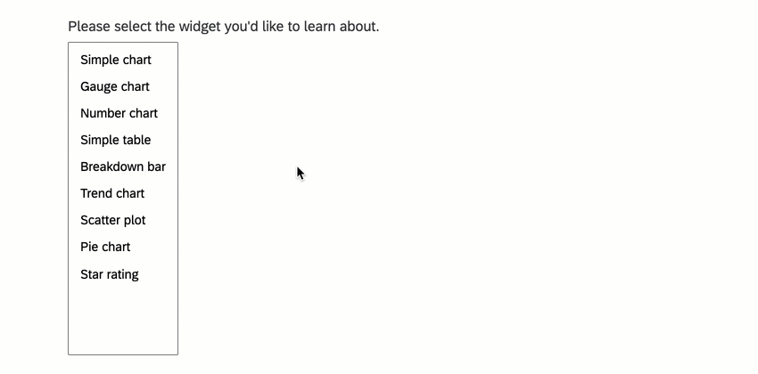
Example: This is a multiple choice question in the select box format. Note the differences when you haven’t clicked it, when items are selected, when the box is being hovered over, and so on.
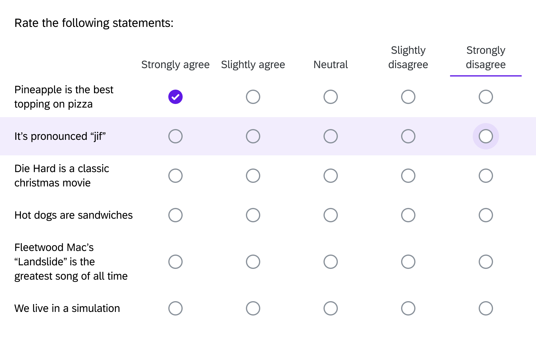
Example: In this Likert matrix, when a survey-taker hovers over a row, it is highlighted to communicate the survey-taker’s current focus state.
Response requirements and validation
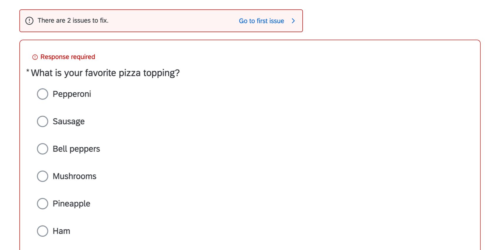
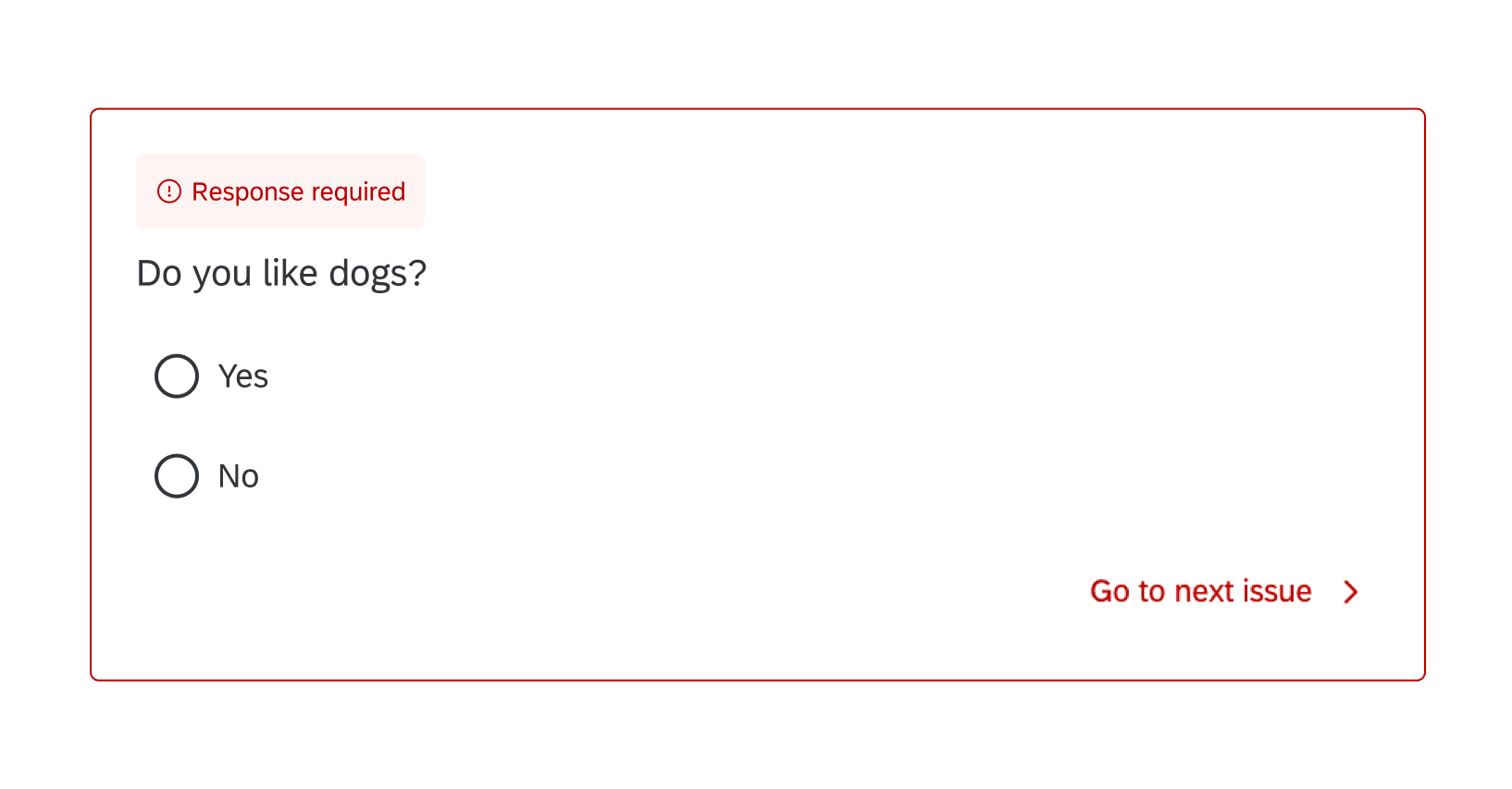
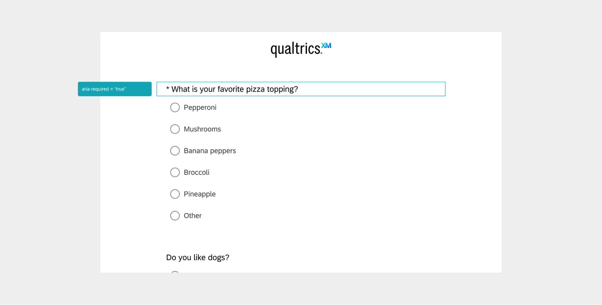
Any questions that have Force Response enabled will have an asterisk ( * ) at the beginning of the question to indicate the required response. Validation errors are displayed after a survey-taker presses the “Next” button, summarizing any answers they may need to fix on that page of the survey.
The top banner communicates the number of errors on the page. The buttons (“Go to first issue,” “Go to next issue,” and “Go to end”) help the user resolve errors more quickly by guiding them through each error. When an error is resolved, the user is automatically advanced to the next error. The last error allows you to scroll past it to progress to the next page of the survey.
Accessible color contrast
Color contrast is an important component of accessibility. For example, font and background colors can’t be the exact same or too similar, or you cannot read the text. As you adjust primary, secondary, and background colors for your survey, the new survey taking experience will automatically change other colors to meet accessible contrast standards. For example, if you have black font, and change the background color to black, the editor automatically switches to a light gray font.
Example: When the background color of a survey is customized, response validation messages and errors colors maintain acceptable color contrast ratios.
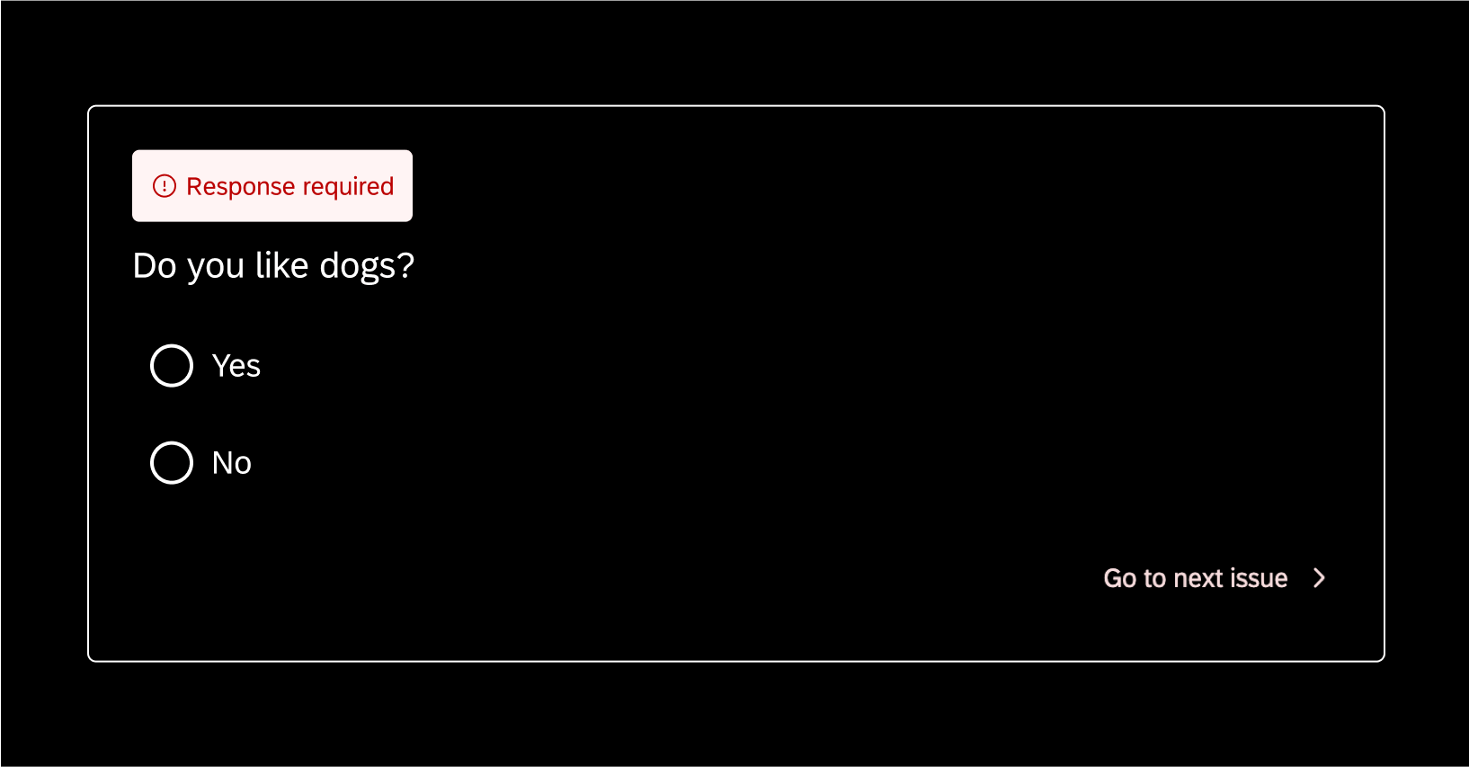
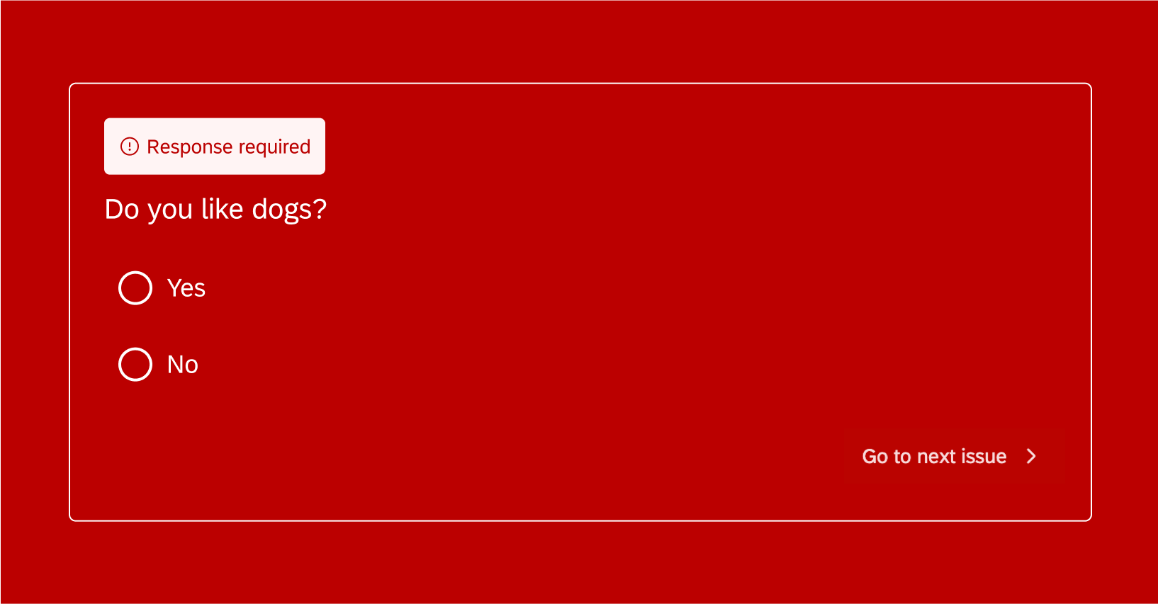
Since color contrasting can affect the way your brand your survey, it can help to either set a neutral background color before you choose primary and secondary colors, or to make sure you use a question container with dark backgrounds.
Mobile-Friendly
Example: For accessibility, the Likert matrix adapts to small screen sizes (such as mobile devices) by switching to an accordion view instead of a table view. Each question statement is expanded by default to display the choices.
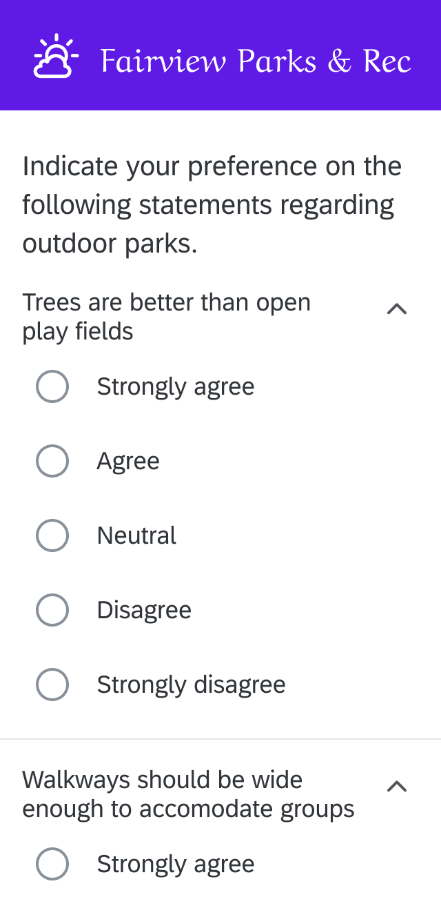
Qtip: By default, Likert matrix tables adapt to the accordion view on small screen sizes for accessibility. You will not be able to turn this setting off while using the new survey taking experience.
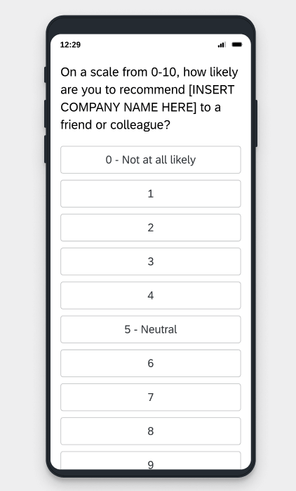
Example: NPS® questions are highly responsive to touch on mobile, and display clearer visual cues for light touch (equivalent to desktop “hover”), click, and so on.
Keyboarding, screen readers, and assistive technologies
Qualtrics is subject to browser and operating system defaults for different keyboarding and screen reader behavior. Although we can guarantee that the New Survey Taking Experience meets accessibility standards, we cannot confirm exact behavior for keyboarding and screen readers.
For example, when the survey taker is navigating through answers in a question, 1 browser may announce the total number of answers available. (E.g., “Selecting radio button 1 of 5.) However, another browser may not, instead just reading off the text of an answer without saying how many there are in total. In cases like these, we recommend incorporating the total number of options into the text of the question so all survey takers get the same information ahead of time. (E.g., “Choose 1 answer from the following 5 options.”)
This section goes over a few common examples of keyboarding, screen reader, and assistive technology improvements introduced by the New Survey Taking Experience. Your chosen operating system or screen reader may not exactly match what’s described.
Example: This is a single-answer multiple choice question. Pressing Tab selects the first answer in the list, and arrow keys can be used to navigate through the rest. Answer choices are automatically selected as the user moves through them. Once the user finishes and moves onto the next question, the answer choice will display a selected state.
In addition, pressing Space will deselect the answer choice on a multiple-answer question.
Example: For questions with force response validation, an asterisk will appear before the question text, setting the expectation that this question is required. The asterisk is configured to work with assistive technologies like screen readers to communicate “required” when focusing on the field.
Other Question Improvements
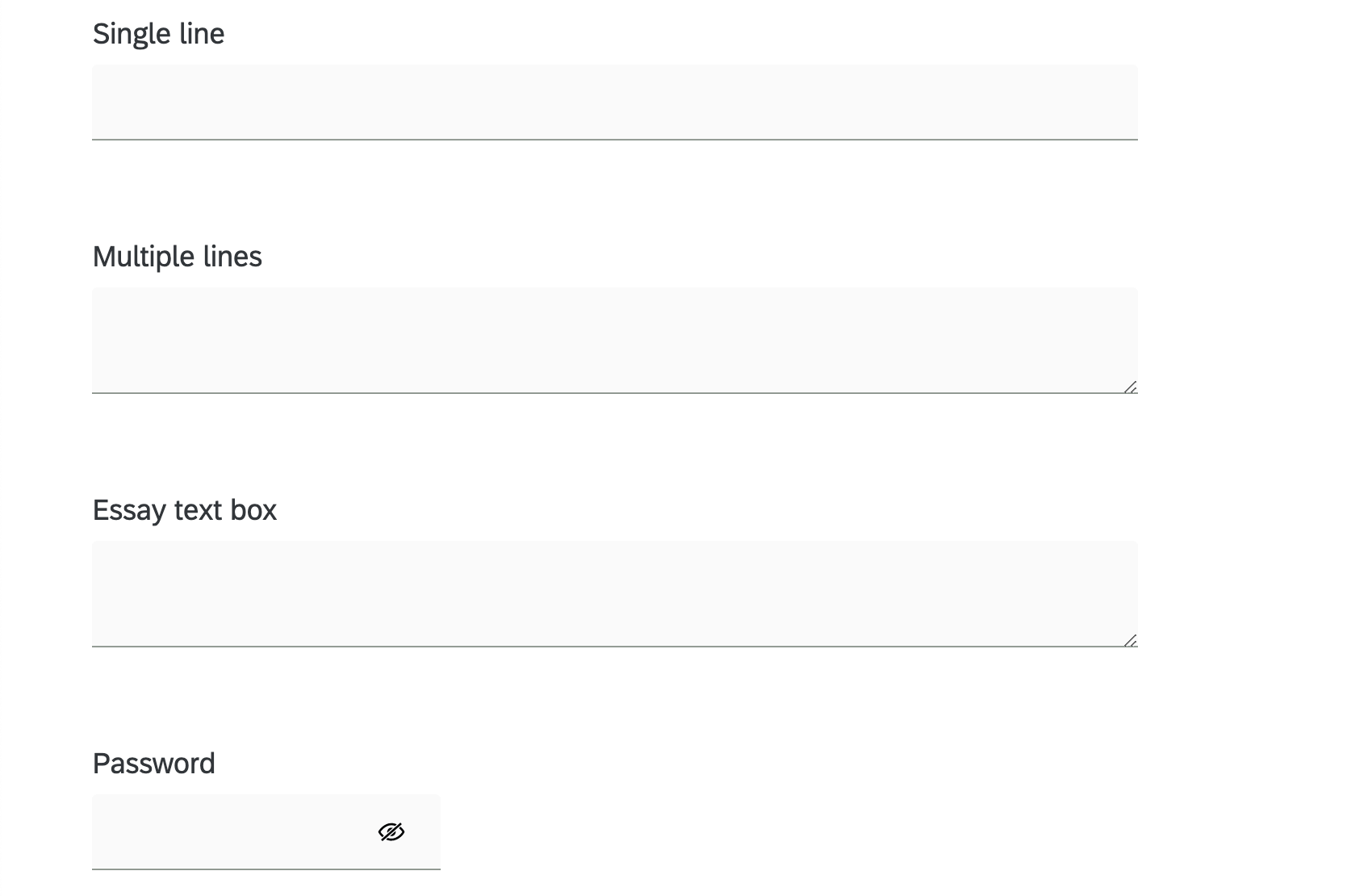
Text entry questions are now consistent in size based on type. This is to help survey takers more easily identify the type of answers required for the field.
Survey builders can resize the width for single line text boxes and resize both width and height for multiple line text boxes. In addition, survey takers can adjust the height of multiple line and essay fields by dragging and dropping the corner.
The password text box type comes with an icon to indicate that it is a password field.
Question and Feature Updates
The new survey taking experience strives to introduce improvements that make the survey-taking experience more accessible, usable, and mobile-friendly. This includes updates to the following questions and survey features:
Questions
- Text / graphic
- Text entry (including autocomplete)
- Form field
- Slider
- Multiple choice
- The following Matrix table variations:
- Standard Likert variation
- Text Entry
- Dropdown
- Constant Sum
- MaxDiff
- Transpose table option
- Net Promoter Score® (NPS)
- Drill Down
- Rank order
Qtip: Only the drag and drop format is available in the new survey taking experience.
- File Upload
- Signature
- Timing
- Meta info
- Side by Side
- Video Response
- Org Hierarchy (EE)
- Captcha Verification
- Tree testing
- Constant Sum
Survey Features
- Force response / request response
- Password protection
- Validation messaging
- Question preview
- In-page display logic
- End of survey messaging (whether set by default or in the survey flow)
- Including showing a response summary.
- Back / Next buttons (whether set in the Look and feel menu or by block)
- Survey descriptions
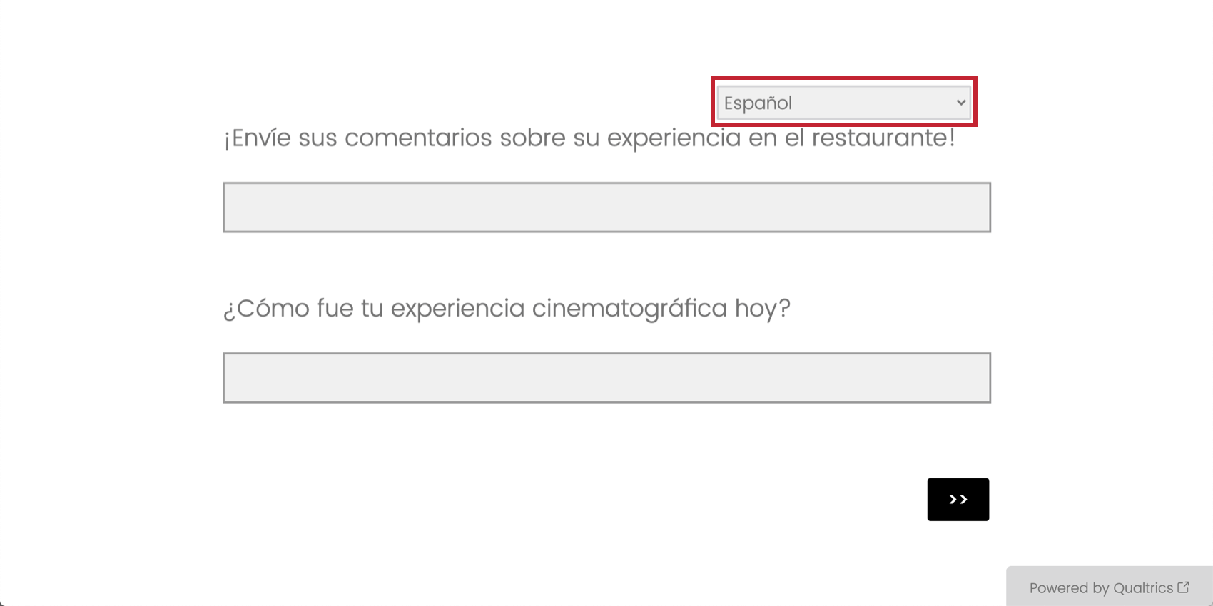
- Translations
- Survey language picker
- Header / footer
- Look and feel
- Logo support
- Logo alt text translations
- Progress bar
- Authenticators
- Custom JavaScript
- Custom CSS (including external CSS)
- Autoadvance
Qtip: When autoadvance is enabled on the new survey taking experience, survey takers will see a final page at the end of the survey that contains the text “End of survey. Select Submit to finish.”
- Question style options like vertical format for NPS questions on mobile devices.
- Table of contents
Currently Unsupported Survey Features
When your project has the new survey taking experience enabled, you may notice small changes to the survey builder. For one, only certain question types are available, based on what’s supported. Some features are also not yet compatible with the new survey taking experience. These restrictions are meant to coincide with improvements to accessibility, usability, and survey methodological accuracy, making it easier for you to build a better survey by narrowing down your choices.
If you try to activate the new experience in a survey with incompatible features, you may receive a warning message. To resolve this issue, first make sure that you are only using question types and features that are currently compatible with this experience.
For additional troubleshooting, these are the features not yet supported by the new survey taking experience:
- Question Types:
- The following Matrix question variations:
- Carousel view
- Hot Spot question
- Heat Map question
- Highlight question
- Screen Capture question
- The following Matrix question variations:
- Survey options:
- Static themes
Qtip: In place of static themes, Brand Administrators can create branded themes for the whole company to use, which are compatible with the New Survey Taking Experience. See the Themes Tab for more details.
- Options removed from Matrix table: Likert questions
- Adjust column width
- Repeat headers
- Add whitespace
- Options removed from text entry fields on questions
- Size settings
- Autofocus
- Autoadvance on questions. Autoadvance between pages is compatible through the look & feel editor.
Incompatible Features
Some features and question types will not be migrated to the new survey taking experience. It is recommended to use the below question types or features as a replacement when using the new experience.
These are the features that are not available in the new survey taking experience, as well as their recommended replacements:
- Graphic Slider Question: Use the Slider Question instead.
- Constant Sum Question – Bars Variation: Use the Choices variation or Slider Question instead.
- Constant Sum Question – Slider Variation: Use the Choices variation or Slider Question instead.
- Pick, Group, & Rank Question – Stack Items option: Use the non-stacked Pick, Group, & Rank question instead.
- Pick, Group, & Rank Question – Stack Items In Groups option: Use the non-stacked Pick, Group, & Rank question instead.
- Rank Order Question – Radio Buttons Variation: Use the drag and drop variation instead.
- Rank Order Question – Text Box Variation: Use the drag and drop variation instead.
- Rank Order Question – Select Box Variation: Use the drag and drop variation instead.
- Matrix Table Question – Rank Order Variation: Use the Rank Order Question drag and drop variation instead.
Reverting to the Legacy Experience
You can turn off the new survey taking experience and return to the legacy experience within Survey Options.
- Open the project where you want to disable the new experience.
- Click Survey Options.
- Go to the General tab.
- Click the toggle to turn off the new survey taking experience.
After reverting to the legacy experience, you can enable the new experience again at any time. The process is different from the first time it was enabled.
- Go to Look and feel.
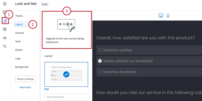
- Select the Layout tab.
- Click the tile Upgrade to the new survey taking experience.
Setting an Organization-Wide Survey Taking Experience
Brand Administrators can set whether they want new surveys in their organization to use the new survey taking experience by default. This setting can be found in the Themes section of the Admin page, where admins also adjust branded themes.
See Setting a Default Survey Taking Experience for steps.