-

Qualtrics Platform -

Customer Journey Optimizer -

XM Discover -

Qualtrics Social Connect
Step 5: Additional Dashboard Customization
Customizing the Dashboard’s Appearance and Branding
If you’re building a dashboard for your CX program, you probably want it to have on-brand theming. You can adjust your dashboard’s theme from the Theme section of your dashboard settings.
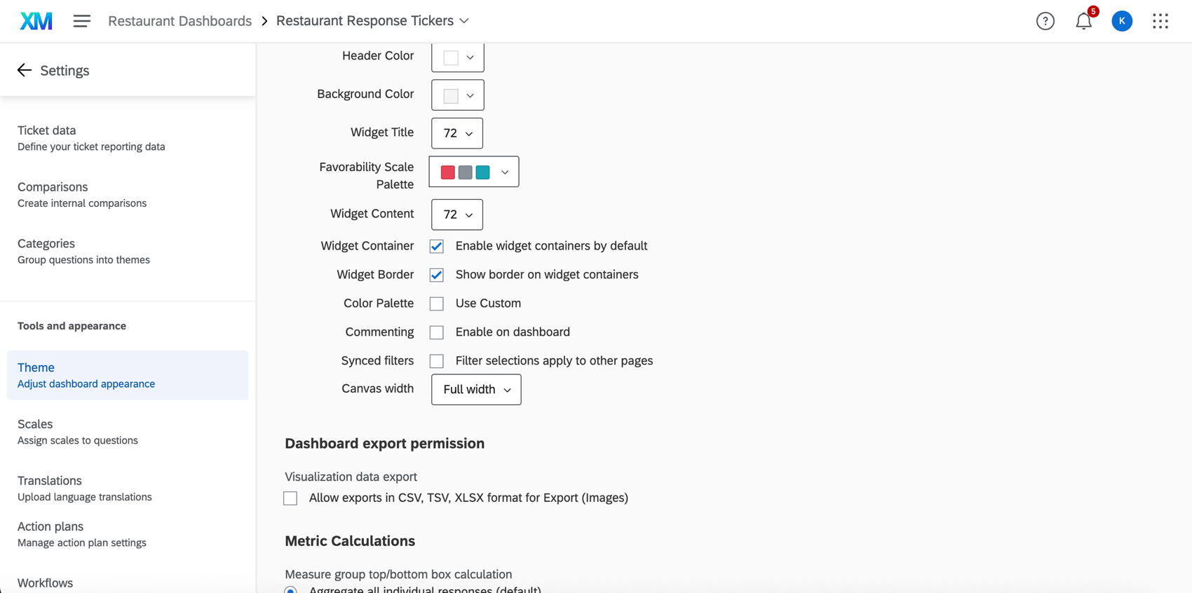
Here, you can change default widget palettes, the background and header color, fonts, and more. You can also customize the dashboard export and the top box / bottom box metric calculation. Learn more on the Dashboard Theme support page.
Custom Metrics
Every company has different metrics, or KPIs (key performance indicators), that it tracks in order to quantify its success. Sometimes these metrics are as simple as a CSAT or NPS, a measure we can ask customers to rate in a quick survey. Sometimes, though, these can get more complex, such as the creation of a percentage, custom scoring calculations, or composite metrics.
Example: In our Digital CX program, we’re always striving to improve the quality of the website we’ve created. On each page, we provide a survey asking how helpful visitors found the material. We want to report the percentage (represented as a ratio) of visitors who accomplished their goal on our website. We can easily create this ratio as a custom metric, which lets us add it to widgets the same way we would an average NPS or a CSAT.
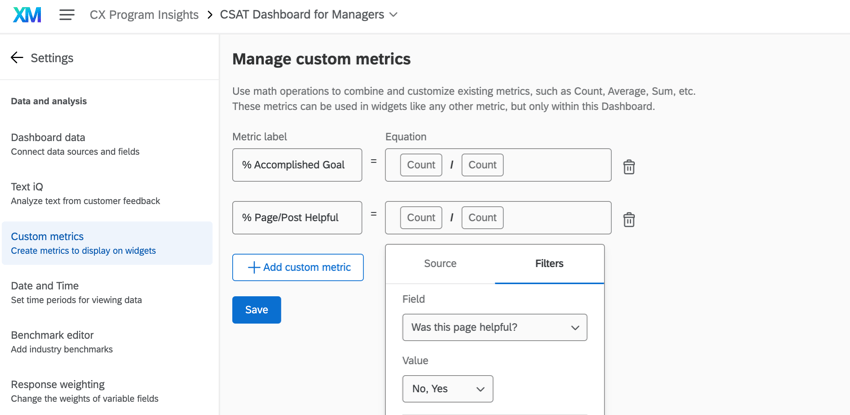
Now that this custom metric is created, we can pull it into the metric field on any widget. We could map this ratio’s change over time, or even just pull it into a gauge chart to judge how it’s doing against the internal benchmarks we’ve set.
For step-by-steps on how to create a custom metric and then add it to a widget, see the Custom Metrics support page.
Ticket Data
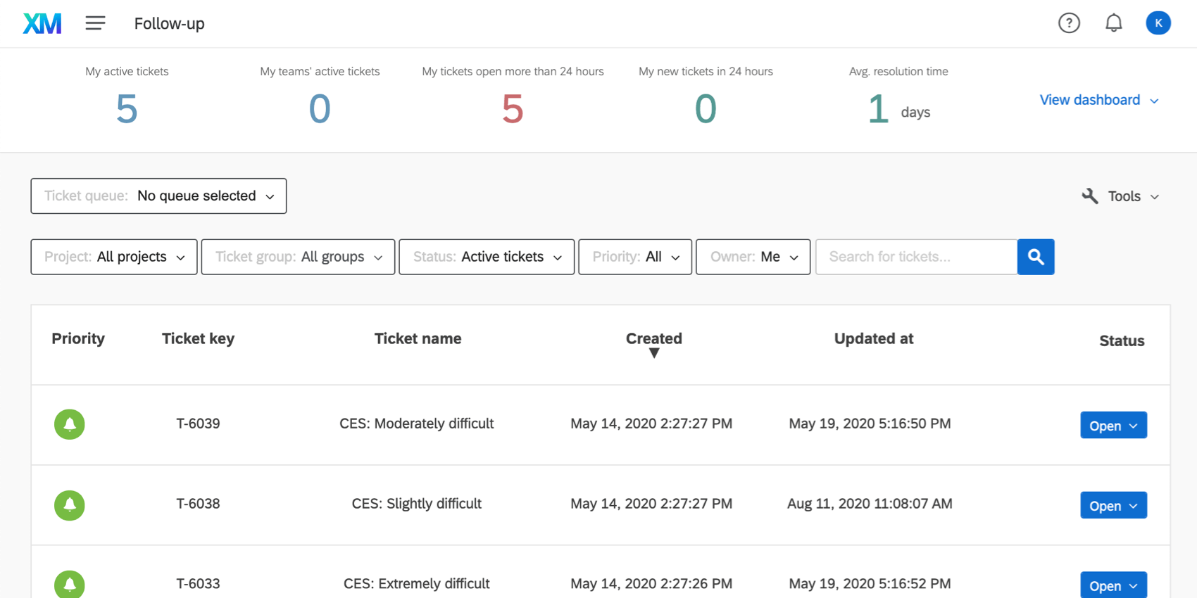
Many CX programs incorporate a “close the loop” program. Whether you’re running a call center support team or escalating customer feedback, “closing the loop” is essential to running a successful CX program. If your closed loop team uses tickets in Qualtrics, you’ll probably want to build a dashboard devoted to this data. Here are some important things to keep in mind about ticket reporting.
Mapping Ticket Fields
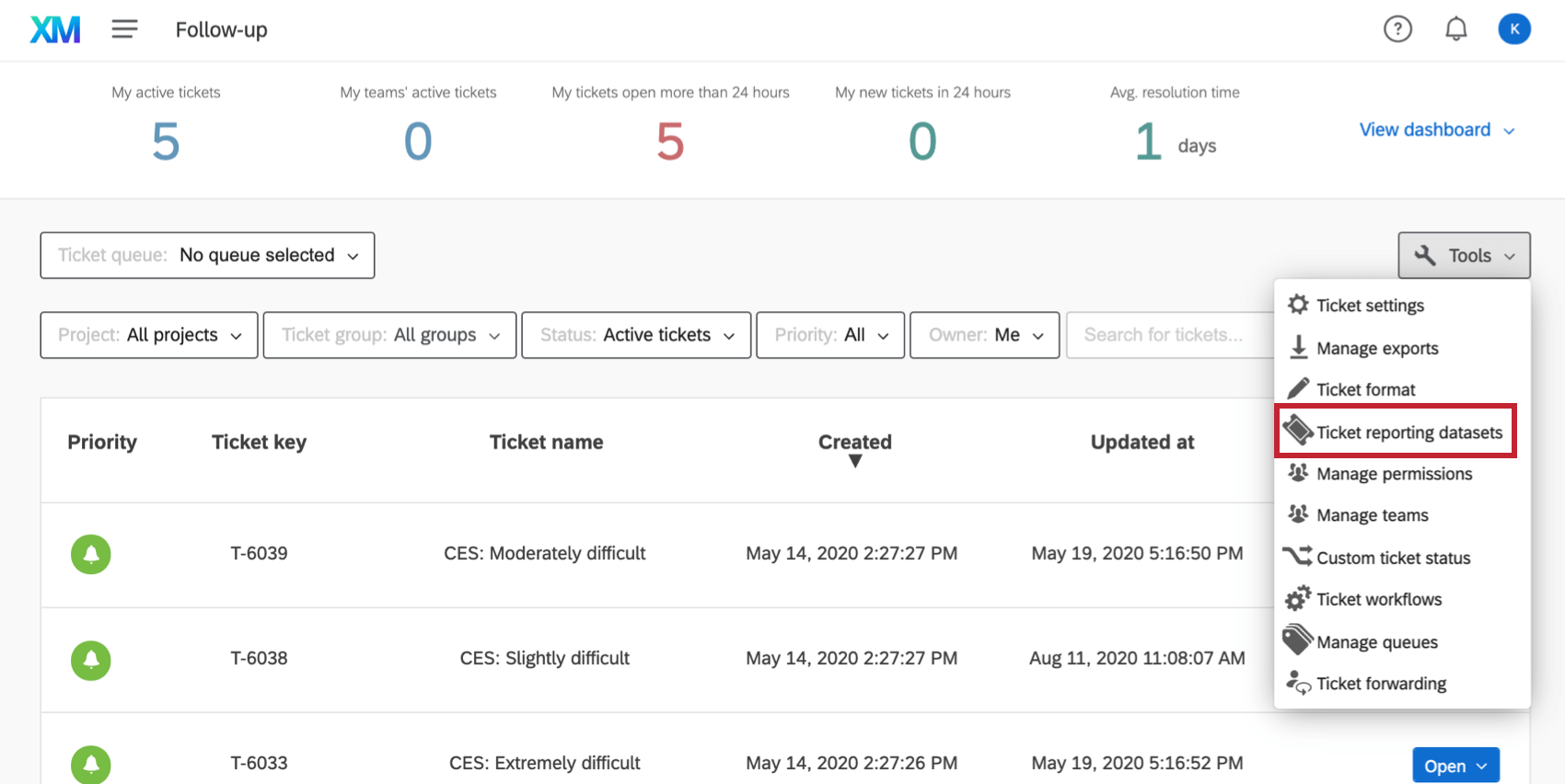
Mapping tickets fields is similar in principal to mapping regular dashboard data – you have fields that you map to a certain type, which is then compatible with different widgets. But fields for ticket reporting are mapped from the ticket tools on a page called Ticket Reporting Data Sets.
Restrictions and Data Access
Only someone who is a Brand Administrator and has editing access to a dashboard can map ticket data.
Once the data’s mapped, it’s accessible to all dashboards in your brand. Hence, it’s important to apply restrictions to it so only the right people can edit or access the right fields.
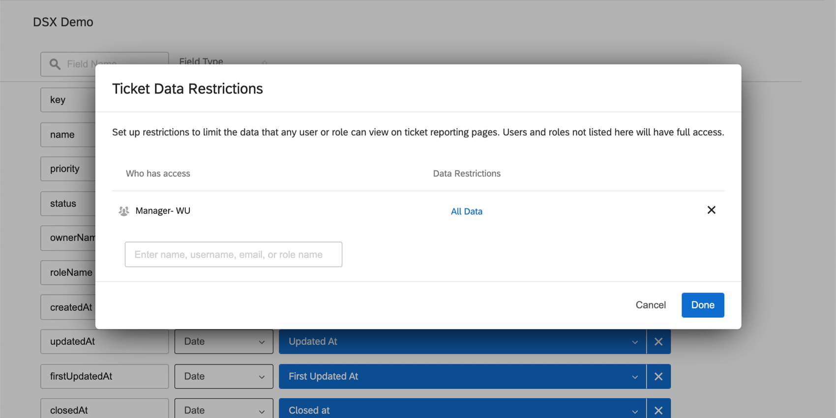
Be careful how you name, format, and remove fields from this page for the same reason.
Reporting on Tickets
Ticket Reporting is done on a special kind of dashboard page.
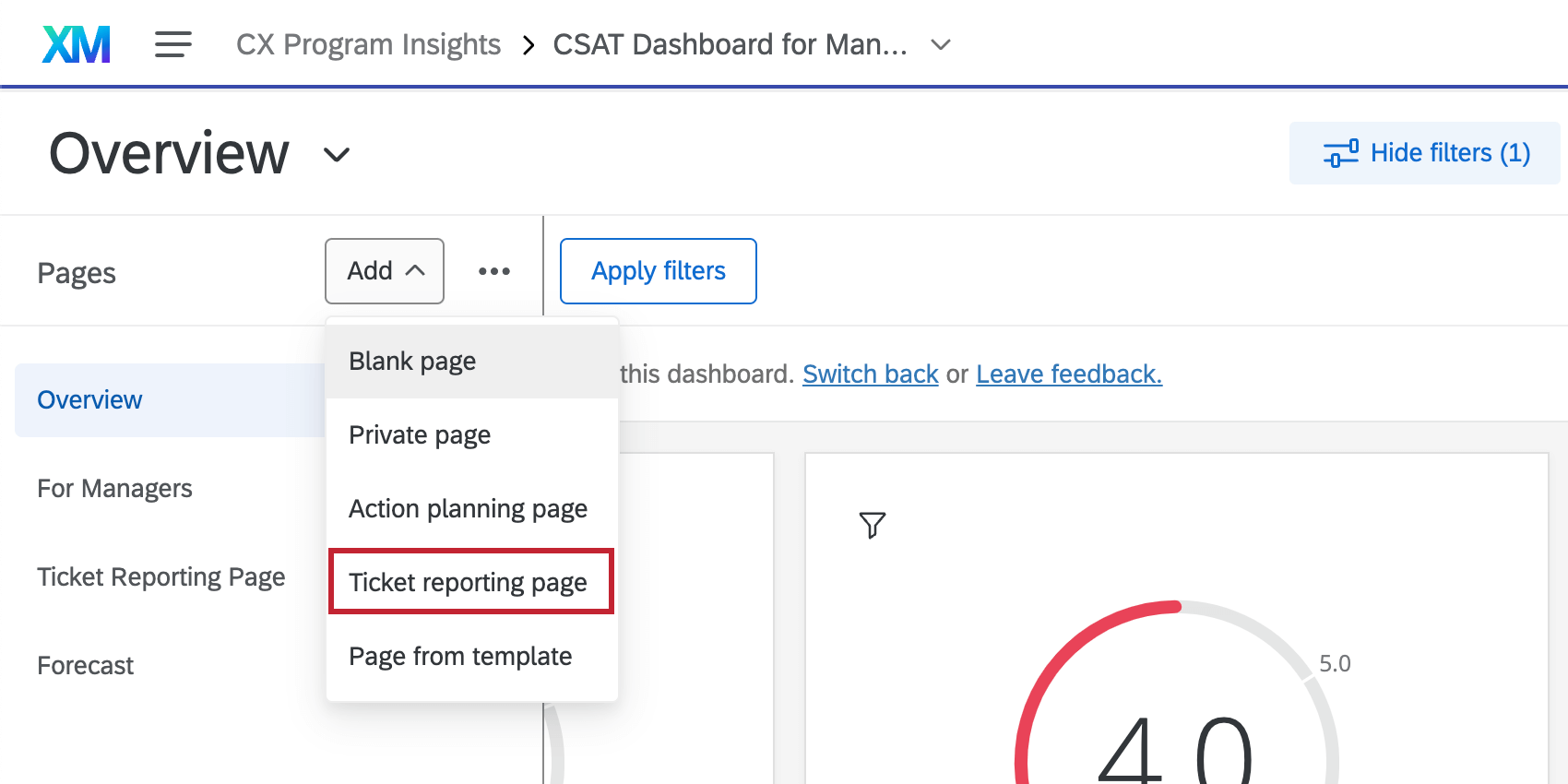
On ticket reporting pages, you have access to all the widgets the rest of the dashboard has access to, so you can build whatever you want. (Although if you’re stuck on where to start, we have some example widgets you can use as a reference.)
For more information, see the Ticket Reporting support page, where we cover the process step by step.
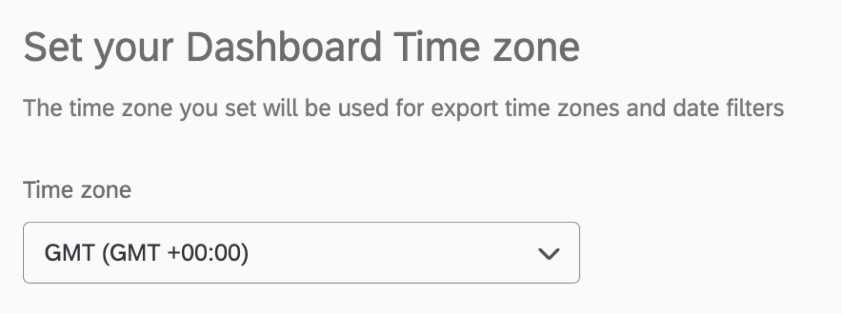
Dashboard Time Zones
The time zone of every CX Dashboard is separate from your account time zone. Most CX Dashboards are set to GMT by default, but you can adjust this by going to the Date and Time page of your dashboard settings.