-

Qualtrics Platform -

Customer Journey Optimizer -

XM Discover -

Qualtrics Social Connect
Key Drivers Widget
About Key Drivers Widgets
The key drivers widget allows you to see the correlation between an outcome metric and 1 or more potential drivers.
Types of Dashboards
This widget can be used in a few different types of dashboard. This includes:
Field Type Compatibility
Only Number Sets, Numeric Values, and individual items from field groups (CX) and categories (EX) are compatible with the key drivers widget. For more information on field types and widget compatibility, check out our Field Type & Widget Compatibility Tables.
Widget Customization
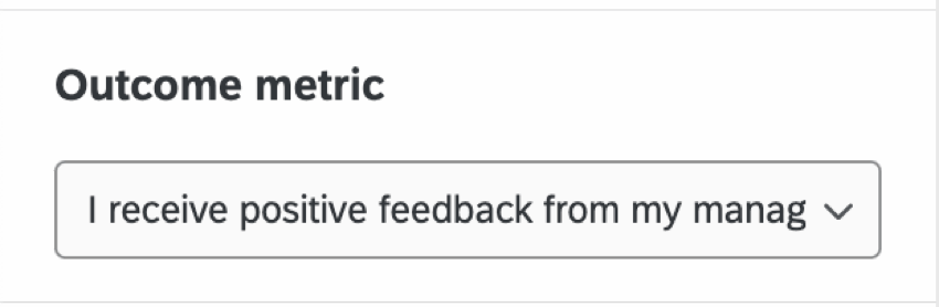
Outcome Metric
The outcome metric is a measure of progress that is influenced by key drivers. For example, a company might be concerned about their clients’ overall satisfaction with a particular product or service. The outcome metric in this case would be an overall satisfaction score.
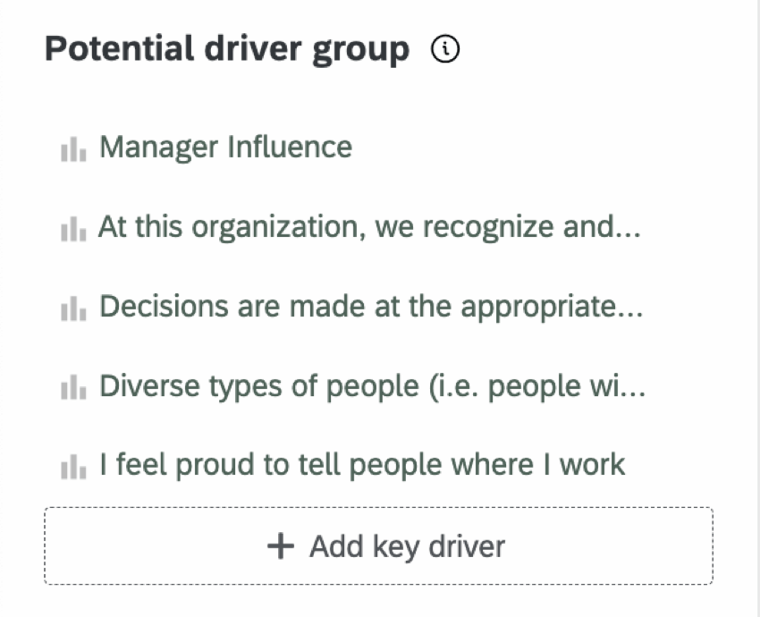
Potential Drivers
Potential drivers are performance-based metrics that influence the outcome metric. For example, if a company’s outcome metric is overall satisfaction for a product or service, potential drivers might include quality, value, or usefulness.
Specifying Field Bounds of Drivers
You can specify field bounds for your drivers when your widget metric is set to either average or top / bottom box. Depending on the selected metric, the setup is different.
If you would like to specify the upper and lower absolute limits of a field value (so the widget knows how to make its calculations), you can specify the field bounds for any potential driver that you add to your widget if the metric is average. You will click on the name of the potential driver, check the box for Specify Field Bounds, and then set your field minimum and field maximum for the selected driver. The purpose is to allow the bounds to be greater in both directions than what is observed in your response data.
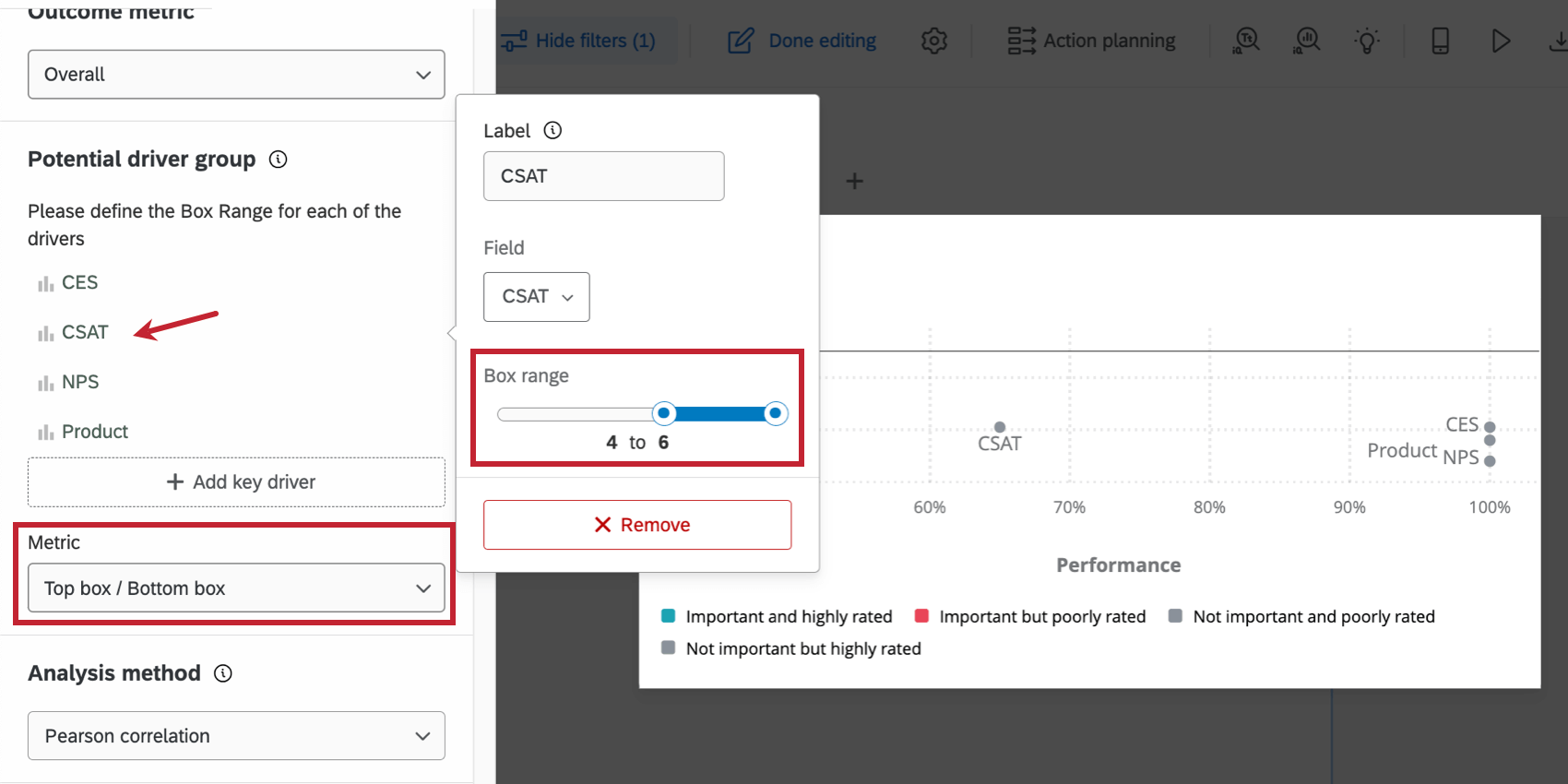
If you would like to specify the upper and lower absolute limits of a field value and the metric is top / bottom box, you can do so by specifying the box range. You will click on the name of the potential driver and then move the sliders for the Box Range to set your field minimum and field maximum for the selected driver.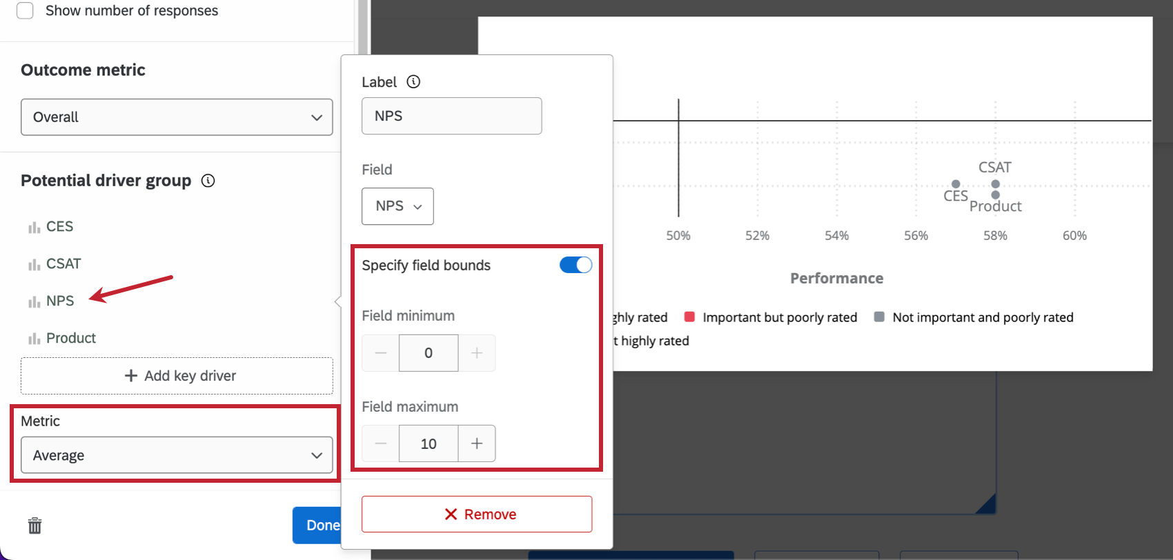
Performance Axis
The performance axis refers to the x-axis of the key drivers widget.
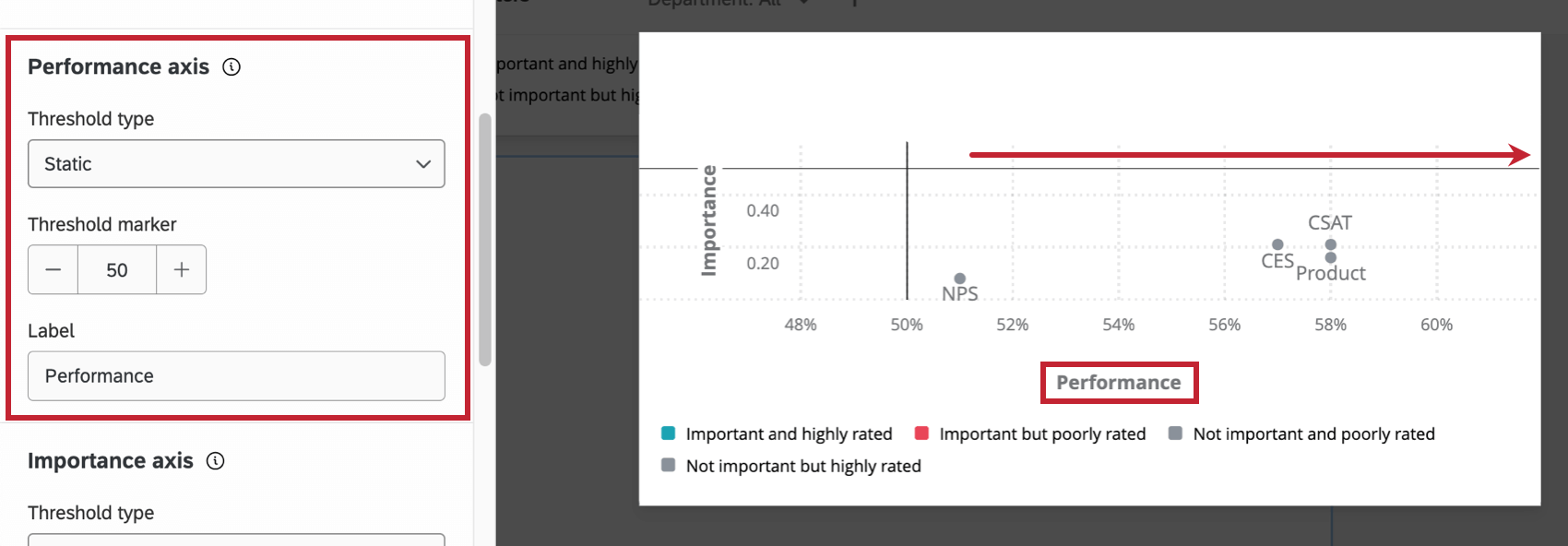
Changing the Threshold Type will adjust the vertical line along the x-axis:
- Static: Determine where the vertical threshold line will lie on the x-axis. Moving the Threshold Marker allows you to decide the point at which a score changes from performing well to performing poorly.
- Dynamic: The threshold line will automatically be set to the median values of the drivers being pulled into the widget.
Qtip: Customer satisfaction data is often driven by the data collected, not hardcoded standards. In cases where there are no industry standards, this option can be favorable.
This axis can be renamed by typing your desired name in the Label text box.
Importance Axis
The importance axis refers to the y-axis of the key drivers widget.
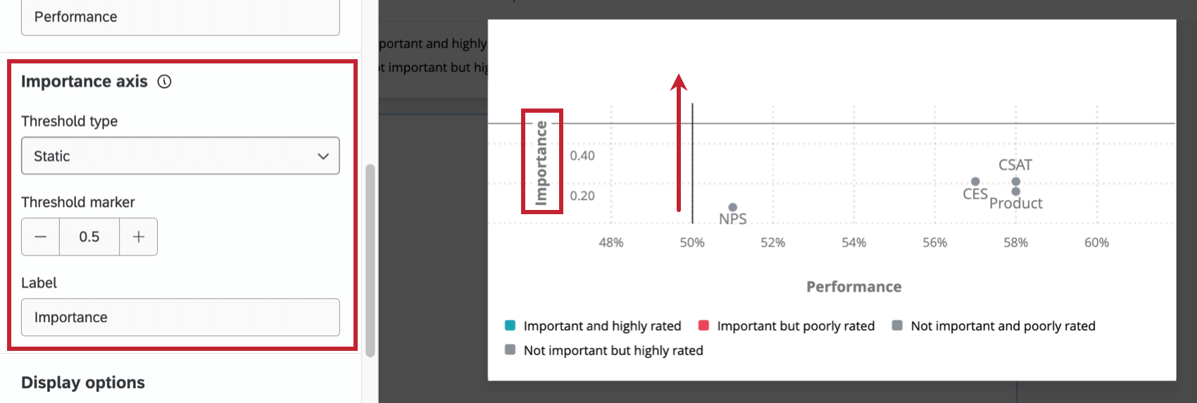
Changing the Threshold Type will adjust the horizontal line along the y-axis:
- Static: Determine where the vertical threshold line will lie on the y-axis. Moving the Threshold Marker (not pictured) allows you to decide the point at which a score changes from performing well to performing poorly.
- Dynamic: The threshold line will automatically be set to the median values of the drivers being pulled into the widget.
Qtip: Customer satisfaction data is often driven by the data collected, not hardcoded standards. In cases where there are no industry standards, this option can be favorable.
This axis can be renamed by typing your desired name in the Label text box.
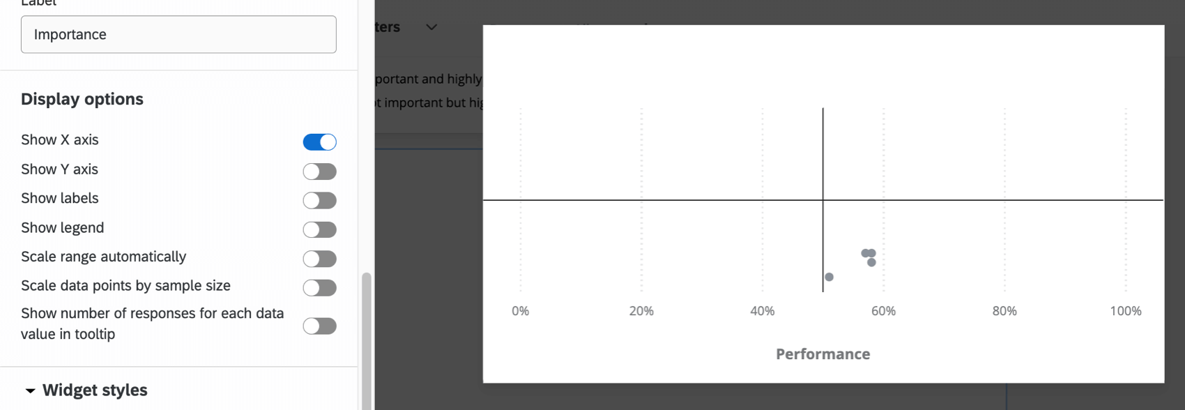
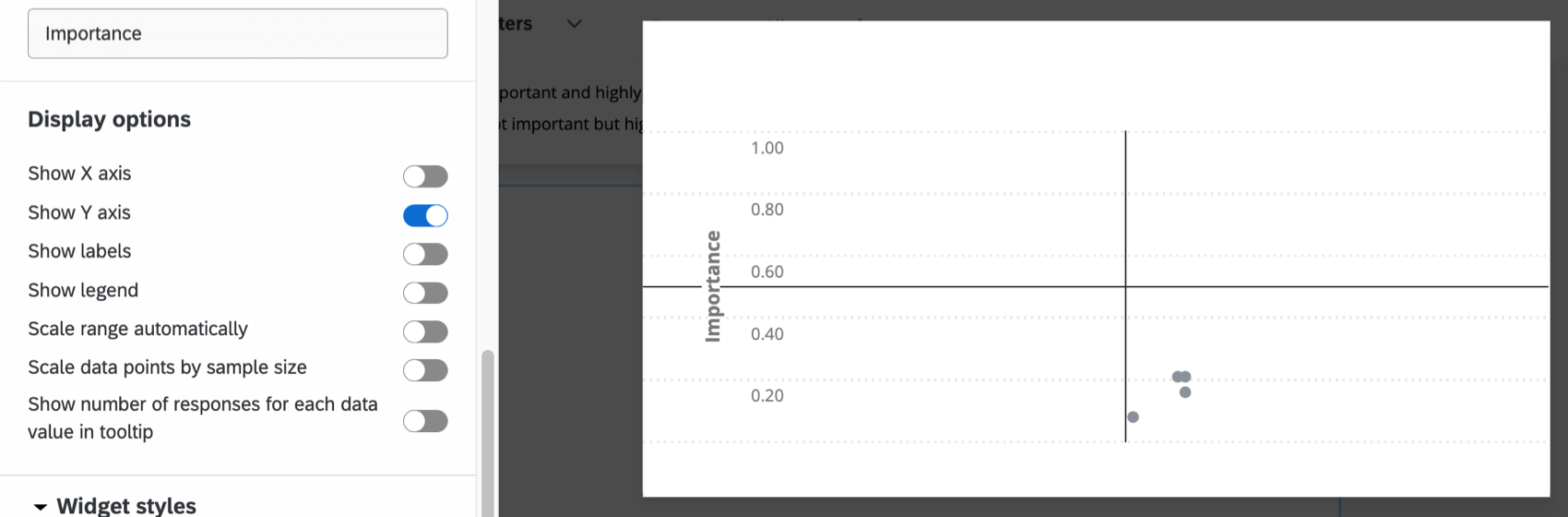
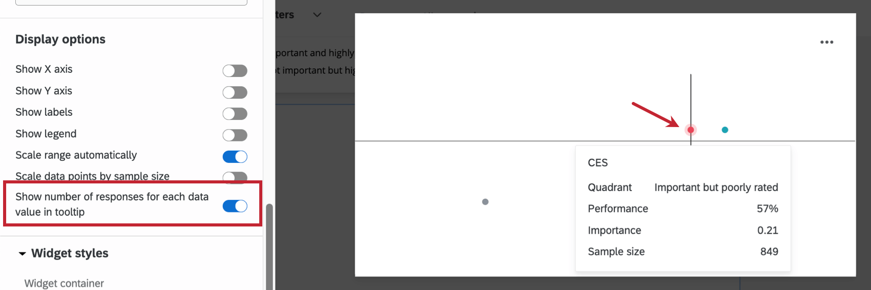
Display options
Select from the different Display Options to further customize the widget.
Select Show X Axis to display the Performance percentages along the bottom of the widget.
Select Show Y Axis to display the importance values along the left side of the widget.
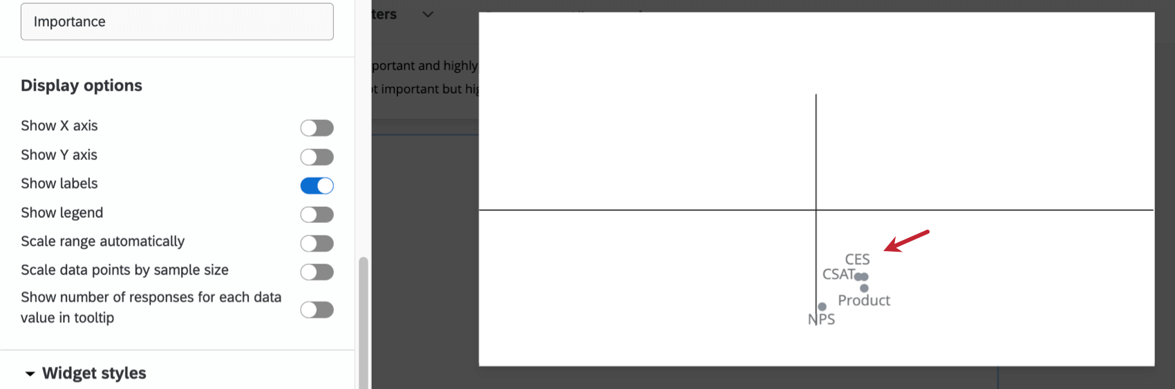
Select Show Labels to show the labels next to the drivers within the widget.
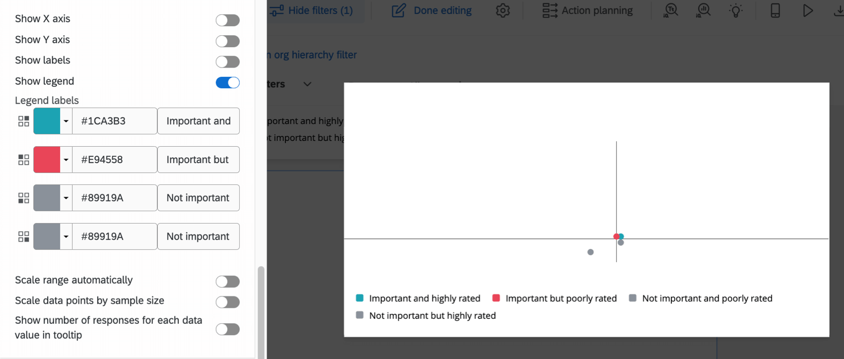
Select Show Legend to display the legend in the widget. Click on the color swatch to change the color of the driver circles for each quadrant. You can also select the default text and type in your own legend values.
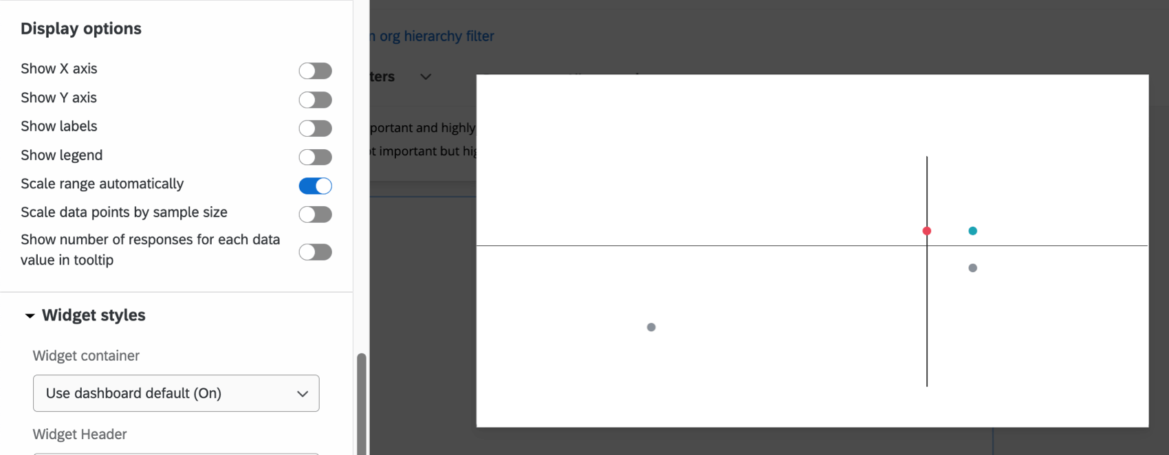
Select Scale Range Automatically to adjust minimum and maximum axis values automatically. This does not adjust your threshold markers. Rather, it serves to “zoom in” or “zoom out” to give you the best possible view of your key drivers.
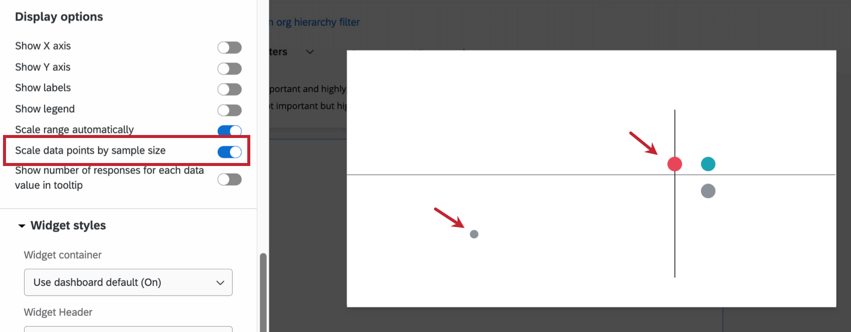
Select Scale Data Points by Sample Size to adjust the size of each driver circle relative to the other driver circles’ sample sizes. The larger the circle, the larger the sample size.
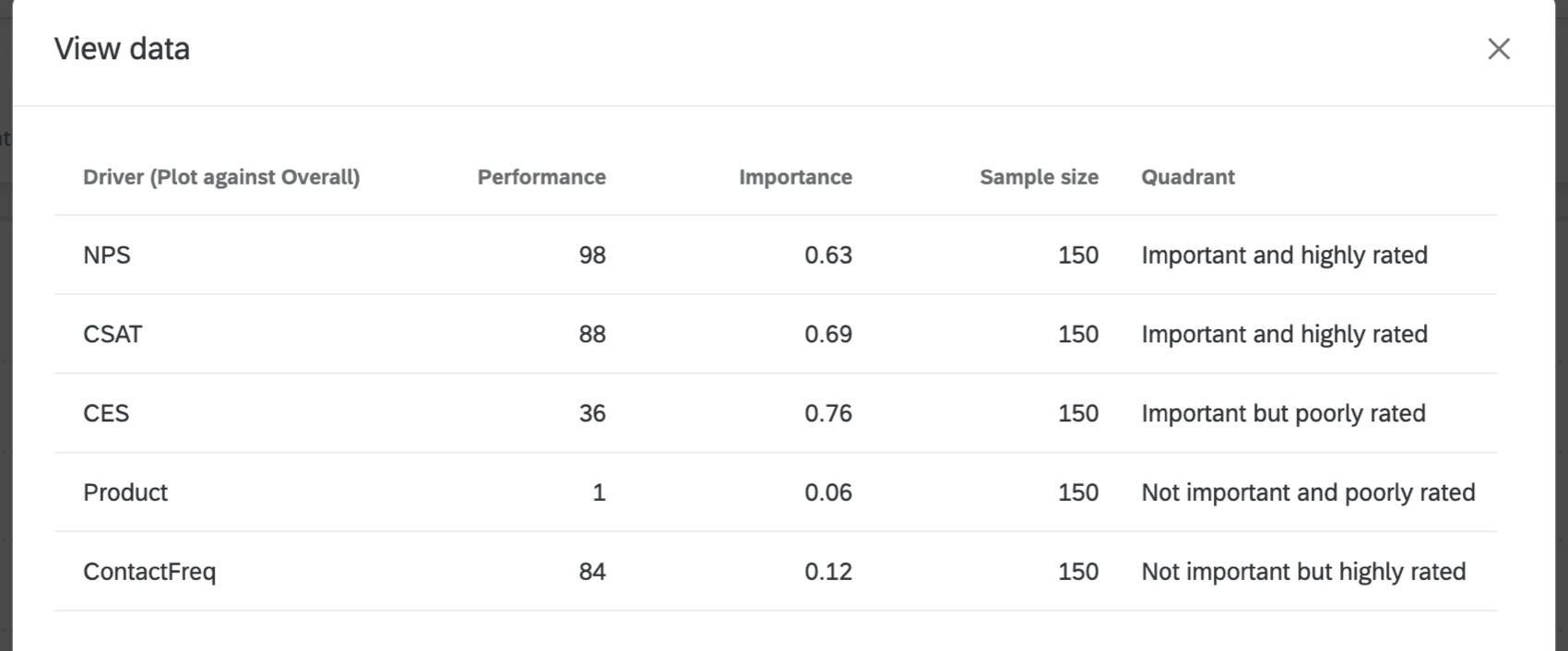
Show number of responses for each data value in tooltip ensures that when someone hovers over a data point, a tooltip will show them the performance, importance, and sample size for that data point.
Interpretation
The Y-axis, also called the importance axis, is a value between 0 and 1 that represents how strongly a given driver is correlated with the outcome metric. It is calculated by taking the absolute value of Pearson’s r, such that:
Importance = | r |
As the importance value gets closer to 1, the relationship between the driver and outcome is understood to be stronger.
The X-axis, also called the performance axis, is a normalized scale. This means the value ranges from 0% to 100%. This axis is normalized, and depending on whether you selected average or top / bottom box for your metric, is either dependent on the average score or the top / bottom boxes of scores. Normalizing makes it possible to compare potential drivers with different scales. The percentage for average is calculated by taking the value for the outcome metric’s potential driver and dividing it by the maximum possible value of the potential driver.
The percentage for top / bottom box is calculated by taking the value for the outcome metric’s potential driver and dividing it by 100.
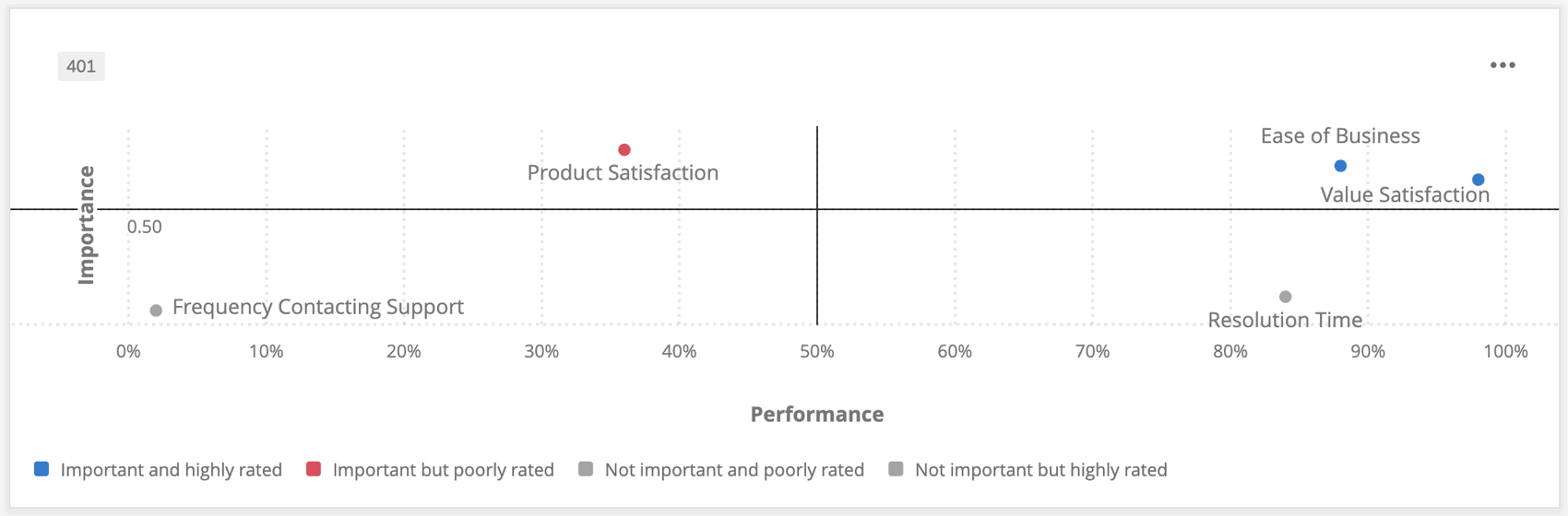
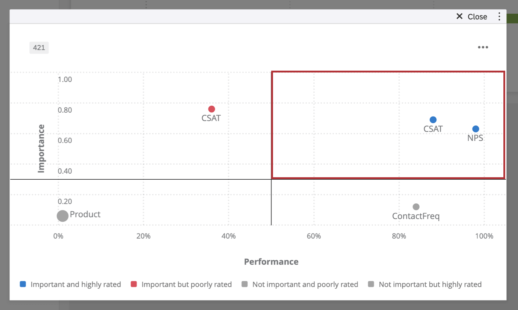
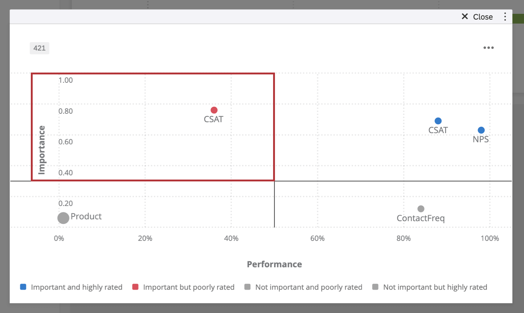
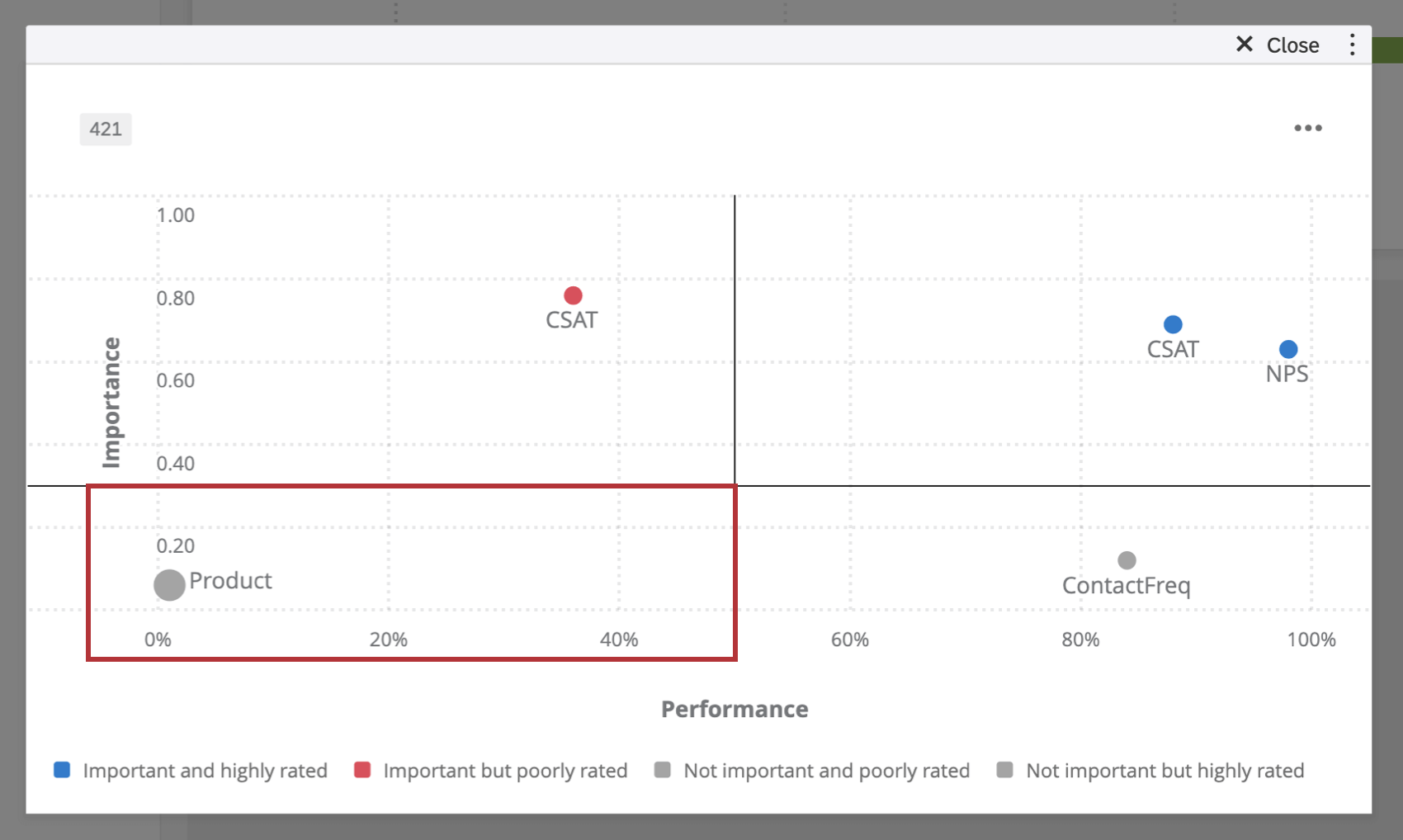
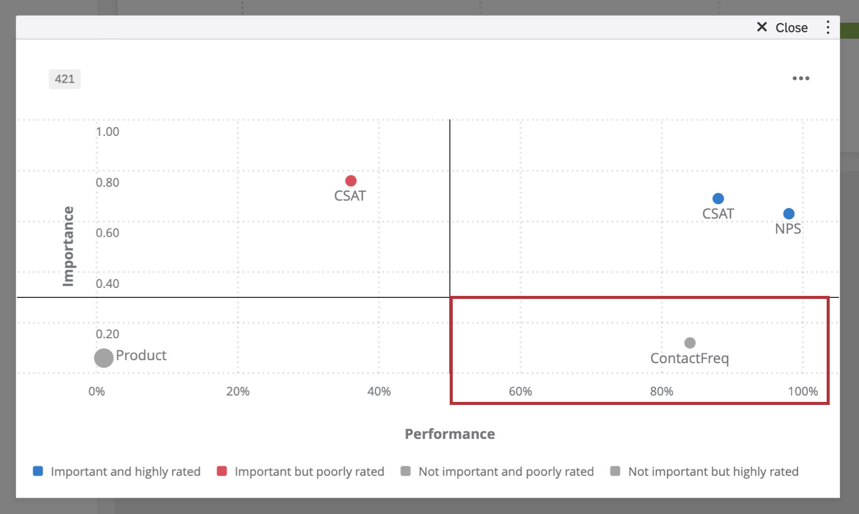
The key drivers widget is divided into 4 quadrants:
- Important and highly rated: These values fall in the top right quadrant and indicate drivers that play a large role in determining the outcome measure. These drivers also have higher scores. For example, “Service Satisfaction” drives overall satisfaction in such a way that higher perceived safety is related to higher overall satisfaction scores. In this case, respondents have also indicated that this company is performing well with regards to “Service Satisfaction.”
- Important but poorly rated: These values fall in the top left quadrant and indicate drivers that play a large role in determining the outcome measure. However, these drivers have lower scores. For example, “Product Satisfaction” plays a big role in determining overall satisfaction in such a way that poor products are related to lower overall satisfaction scores. In this case, respondents indicated that this company is not doing well in regards to controlling “Product Satisfaction.” This is an area of improvement for this company.
- Not important and poorly rated: These values fall in the bottom left quadrant and indicate drivers that are not important in determining the outcome measure. These drivers also have low scores. For example, “Frequency of Contacting Support” doesn’t drive overall satisfaction scores and respondents also indicated this company was not having to contact support often. However, this company might not need to improve on this driver because it isn’t affecting their overall satisfaction.
- Not important but highly rated: These values fall in the bottom right quadrant and indicate drivers that are not important in determining the outcome measure. These drivers also have a high score. For example, “Resolution Time” does not drive satisfaction, but it was given high scores by respondents. While one might argue that having a good resolution time for escalated issues is always a good thing, it does not influence this company’s overall customer satisfaction.
Analysis Method
The key drivers widget has 2 different analysis methods that can be applied to it. This affects how the values are displayed in the 4 quadrants and the importance score. You can change the calculation used in your widget at any time – just keep in mind that the importance score and the values in the 4 quadrants may change.
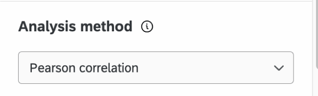
- Pearson correlation: This calculation measures the linear correlation between the drivers and the outcome metric.
Qtip: For all key driver widgets created before February 18, 2022, the default and only calculation was Pearson Correlation. All widgets created before this date have been left as Pearson, but you can now switch the calculation if desired. Alternatively, creating a new key drivers widget will enable access to the newest version of this functionality.Qtip: Measure groups can only be used as an outcome metric when Pearson correlation is selected.
- Relative importance analysis: This is the default calculation method. Relative Importance analysis runs models with every combination of the independent variables to determine the independent impact on the r-squared (variance explained), because all the drivers are likely to be highly correlated. Please note that when you first set up your widget with Relative Importance analysis, it may take some time before it loads and displays data. To learn more about this method of analysis, also called Johnson’s Relative Weights, see our Stats iQ page.
Attention: Relative Importance analysis is not currently available in EX dashboards.Qtip: Relative Importance analysis does not currently support using measure groups as the outcome metric. Additionally, you cannot use org hierarchy dashboard filters with Relative Importance analysis.Attention: Relative Importance analysis requires a complete response count greater than the number of drivers. A complete response is one that contains data for every single driver. Relative Importance analysis supports up to a maximum of 50 drivers at a time.
Deciding Between Calculations
Pearson Correlation does not account for multicollinearity, which is when the independent variables (in this case, drivers) being compared to the dependent variable (an outcome metric) are already highly correlated themselves. Relative Importance, in contrast to Pearson, does consider multicollinearity. That’s why it is the industry standard for survey data.
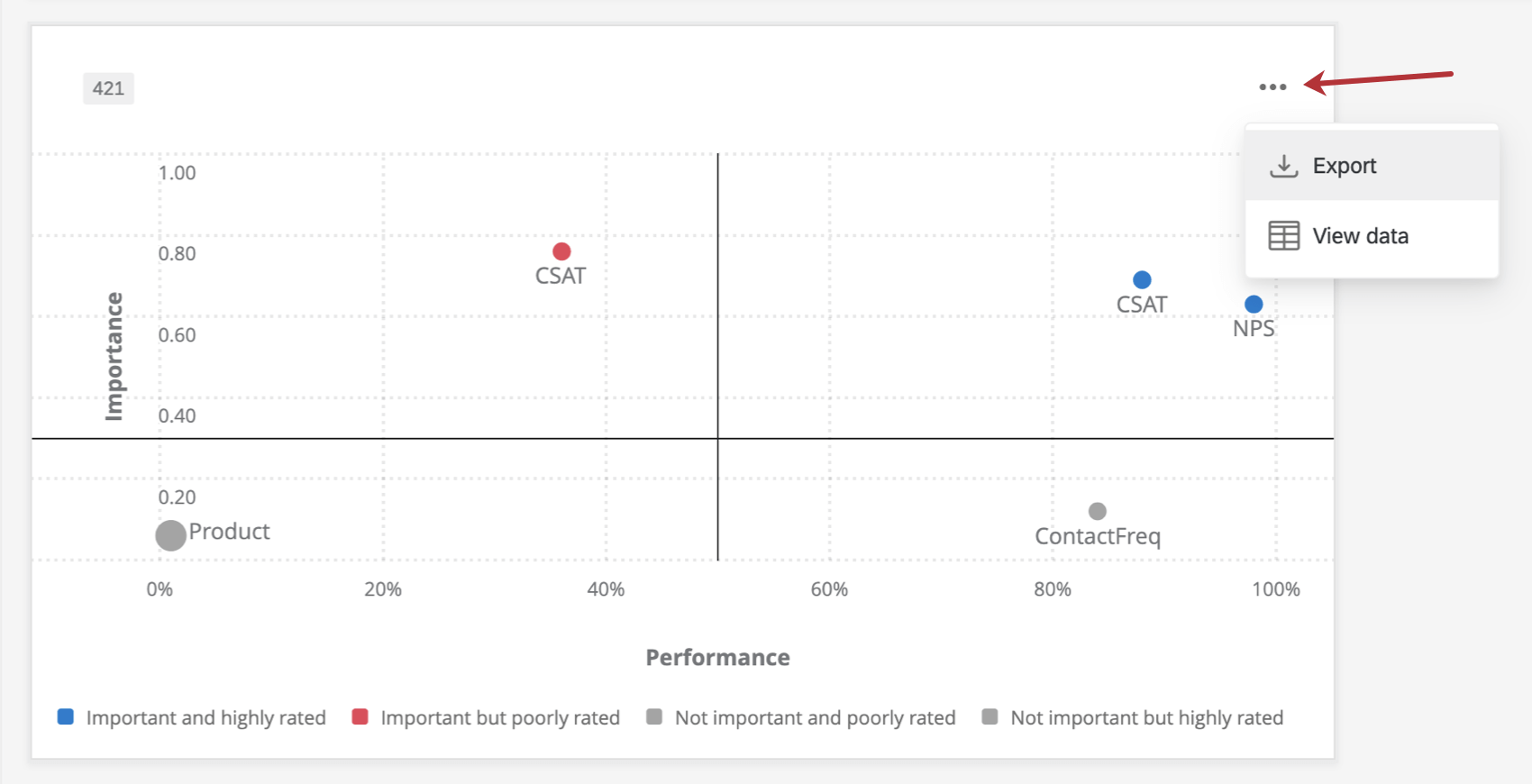
Additional Options
Click on the 3 horizontal dots in the top-right corner of your widget to view additional options.