
Advanced-Reports Basic Overview
What's on this page
About Advanced-Reports
The end goal of Advanced-Reports is to create informative online and printed reports to share with your stakeholders.
Advanced-Reports provide the layout tools you’ll need to design:
- Visualizations: Individual charts, images, graphs, text areas, or tables pulled from your dataset.
- Filters: Logic to include or exclude data from your visualizations and reports.
- Page Layouts: Collections of visualizations with accompanying headers, themes, color schemes, margins, and fonts.
Creating an Advanced-Report
To start an initial advanced-report:
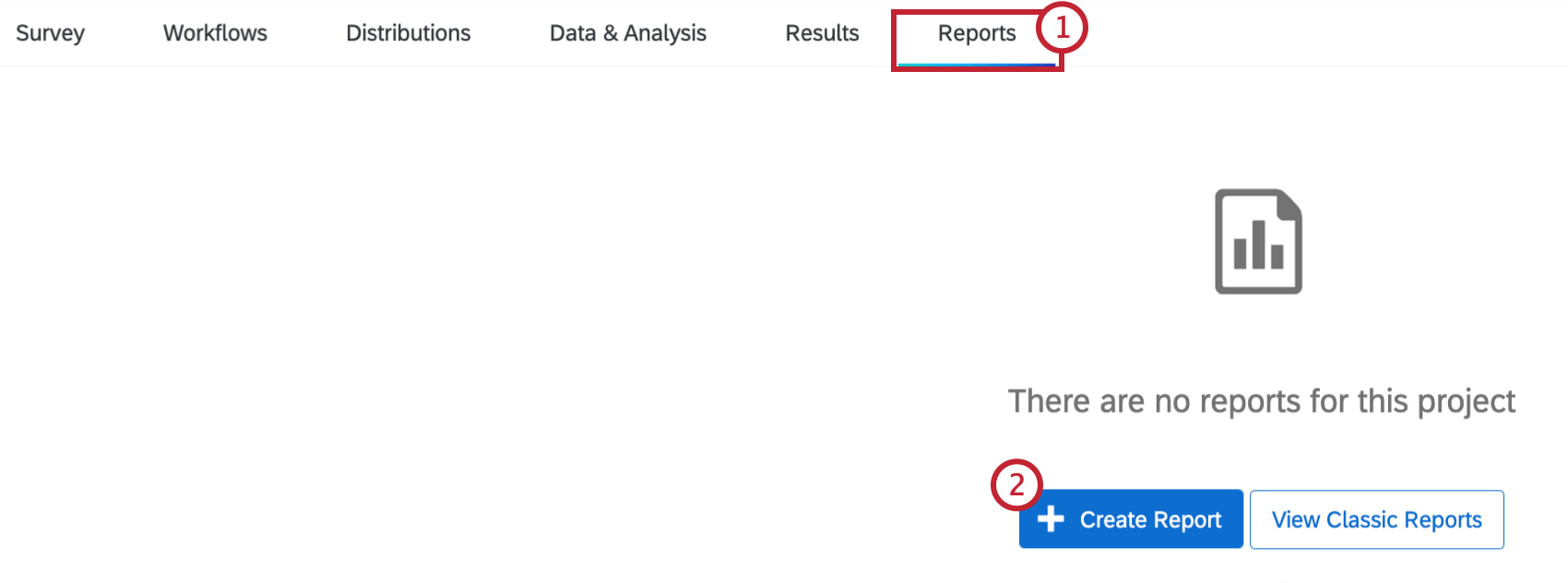
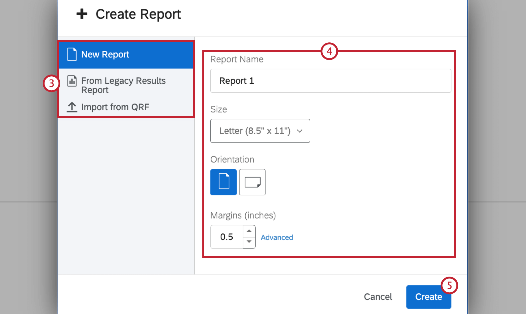
- New Report: Start a blank, new report from scratch.
- From Legacy Results Report: Begin with a previously saved Results-Report. Qtip: This is an option for users with the old version of Reports. Read the Results-Reports Basic Overview for details. This option is not compatible with the new version of Results. Read the Results Dashboard for more information.

- From QRF: Import a Qualtrics Report File (QRF) from a previously made report to carry over all settings and visualizations. See Creating an Advanced-Report from QRF for more information.
Qtip: You can change your initial settings in the Page section of your Global Settings.
The Page Layout Toolbar
After the initial set up, your layout tools will be accessible from the Advanced-Reports toolbar. From this toolbar you can:
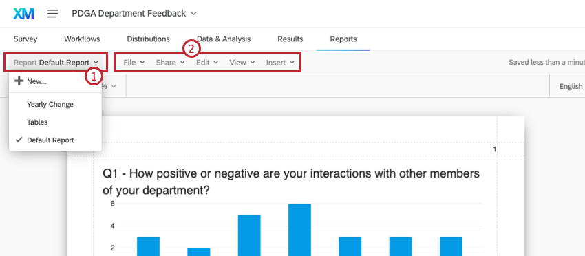
Qtip: Review all the features in each menu option in the Advanced-Reports Toolbar page.
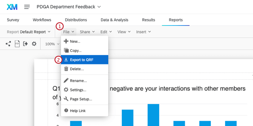
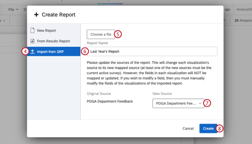
Creating an Advanced-Report from QRF
About Visualizations
“Visualizations” refer to the charts, tables, and other elements that visualize your survey data.
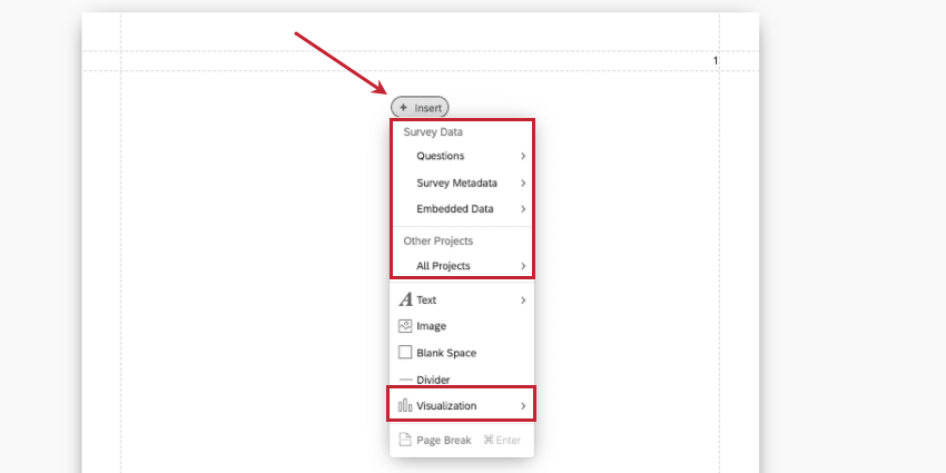
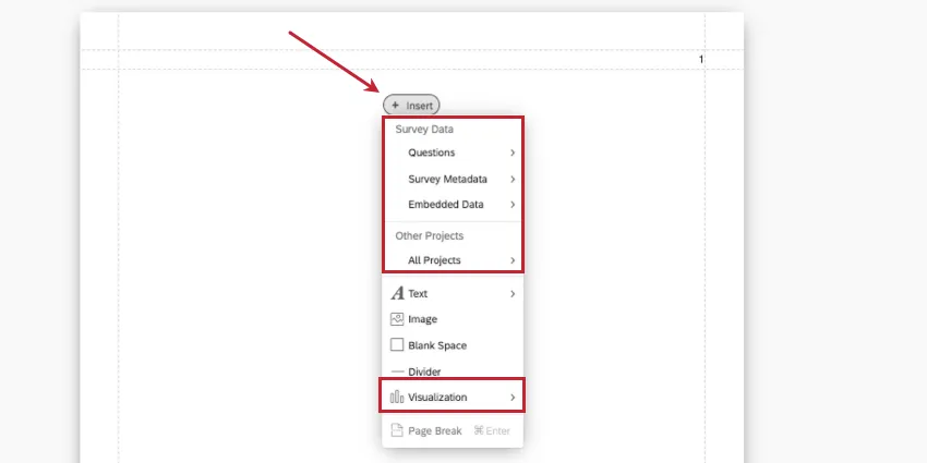
Creating Visualizations
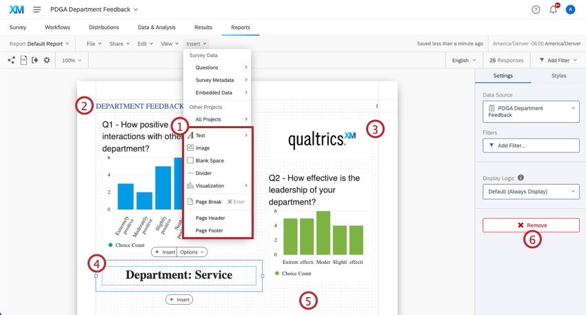
To create a visualization, select Insert. You can choose to start by choosing the data you want to show, or the kind of visualization you want to use.
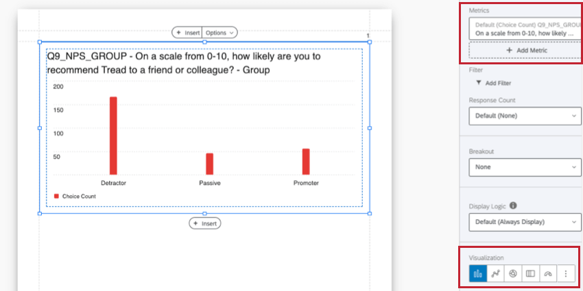
Once you make this decision, you can complete your visualization using the editing pane on the right. Metrics are where you can change or add the data you want to show. Visualization is where you can select a type of visualization.
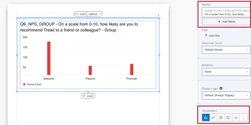
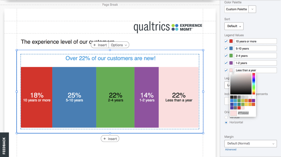
Different visualizations are available based on the type of data you want to report. For example, pie charts and breakdown bars are ideal for showing portions of a whole, like demographic percentages, whereas word clouds are better for open-ended feedback.
You can see a list of all visualizations here.
Qtip: You cannot insert your entire survey into a report (e.g., the full live survey showing the survey taker’s experience). Instead, you can print your survey to PDF. If you are sharing the report digitally, you could include the survey preview link in the report.
Customizing visualizations
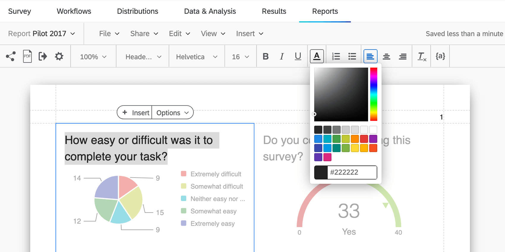
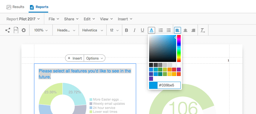
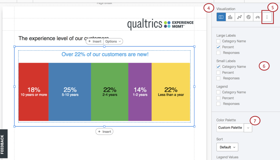
You can customize many aspects to a visualization. For more, see our Visualization Overview and guide to Creating Visualizations.
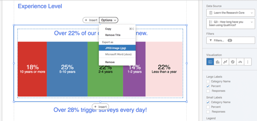
Sharing a Single Visualization
Create and share individual visualizations by re-styling visualizations and exporting them as a JPEG image (.jpg) or Microsoft Word (.docx) from the visualization Options.

About Filtering
Filtering excludes information from visualizations and reports. Several data sources can be used to define the condition necessary to create a filter, specifically:
Apply your filters at two different levels:

Applying Global Filters
If you choose to apply global filters, all of the individual visualizations in a report will assume these filters as their presets. For example, if you exclude all participants under the age of 21, you will not be able to include this demographic in any of your visualizations.
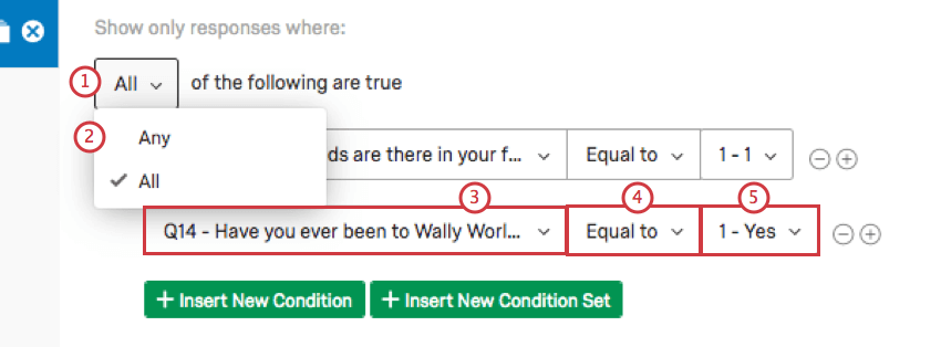
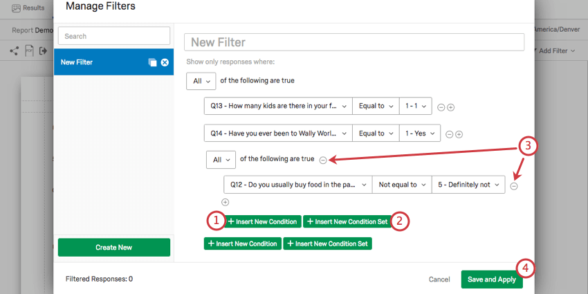
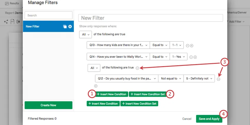
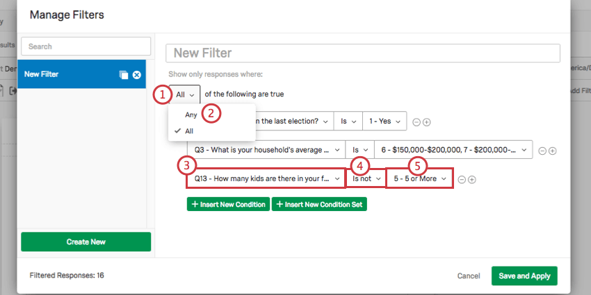
Filters are set by creating conditional statements which use ALL or ANY to drive your filtering criteria, operators, and operands (i.e., values).

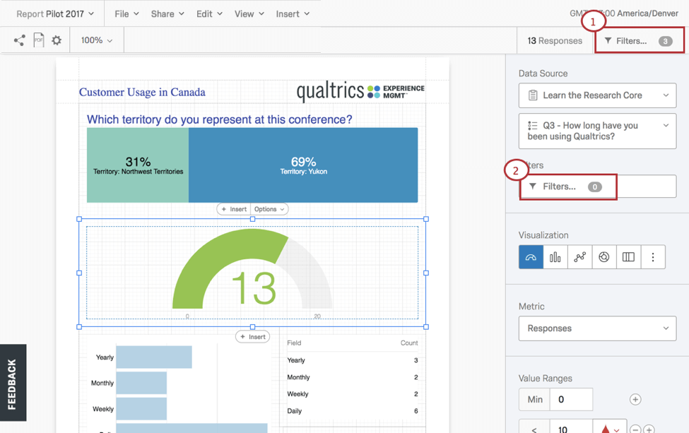
Conditions are managed in the Filters popup window opened by selecting Filters from the Advanced-Reports toolbar. In this window click:
Qtip: Filtering is explained in detail in the Global Advanced-Reports Filters page.
Applying a Filter to a Visualization
Visualization-level filters can dramatically change a single visualization without impacting the rest of the Advanced-Report. To apply a visualization filter:
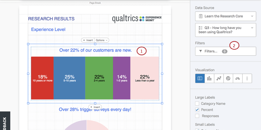
Then, set the filter:

Qtip: Learn more by reviewing the Global Advanced-Reports Filters page.
About Page Layouts
In your page layouts you can:

Qtip: Jump to the Inserting Advanced-Reports Content page to learn how to add and adjust report content.
About Sharing Reports (in Print or Online)
After you finish your page layouts, there are two ways to share your Advanced-Reports. See Sharing Your Advanced-Reports to learn more.
Where You Can Find Advanced-Reports
Advanced-reports can be found in a few different project types across the XM platform:
The following projects also contain features similar to advanced-reports. However, the way you navigate to them and the exact functionality included varies. See more details linked below:
Advanced-reports are not available in any form in Conjoints, MaxDiff, Pulse projects, or any other project types not listed above.
FAQs
Can I change the default settings on a report instead of editing each visualization one at a time?
Can I change the default settings on a report instead of editing each visualization one at a time?
You can learn how to change your default settings on Results-Reports on the Global Results-Reports Settings support page, and you can learn how to change the default settings for Advanced-Reports on the Global Advanced-Reports Settings support page.
Can I add other columns of information to my visualizations?
Can I add other columns of information to my visualizations?
In the visualization editing pane for either visualization, you will be able to select Add Additional Columns.
No other visualization can add additional columns like this.
Can I break down the information in a visualization into groups based on other data?
Can I break down the information in a visualization into groups based on other data?
See Breakouts for Advanced-Reports or Breakouts for Results-Reports, depending on the reporting you are using.
How do I rename my report?
How do I rename my report?
- Results-Reports: Click the gear in the upper-right and select Edit Report. A new window will open with a field for the name.
- Advanced-Reports: Go to File and choose Rename.
I don't have the tab described on this page! What do I do?
I don't have the tab described on this page! What do I do?
That's great! Thank you for your feedback!
Thank you for your feedback!