
Line Chart Visualization
What's on this page
About Line Charts
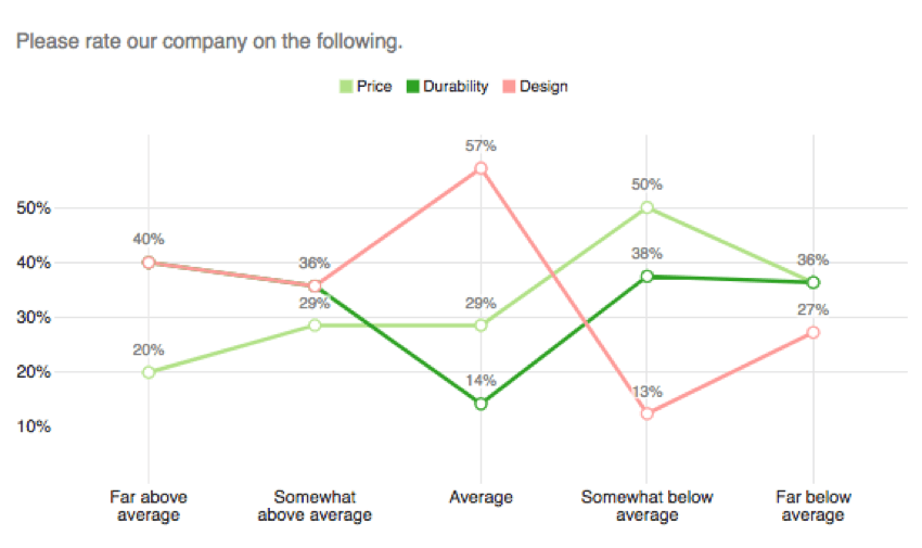
The Line Chart is a visualization that you can customize in the Reports section. Every data point is represented by a dot, and each dot in a series is connected by a line.
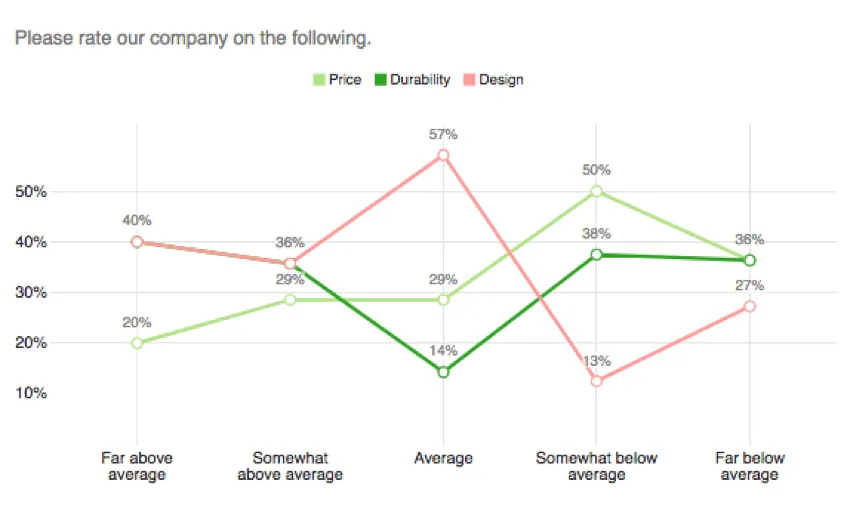
One axis of the visualization shows the specific answer options being measured, and the other axis represents a discrete value (e.g., counts or percentages of respondents with that option).
Customization
For basic visualization instructions and customization, visit the Visualizations Overview support page. Continue reading for visualization-specific customization.
Qtip: When breaking data out by date, you can also add a rolling average to your line chart. See Rolling Averages.
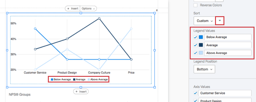
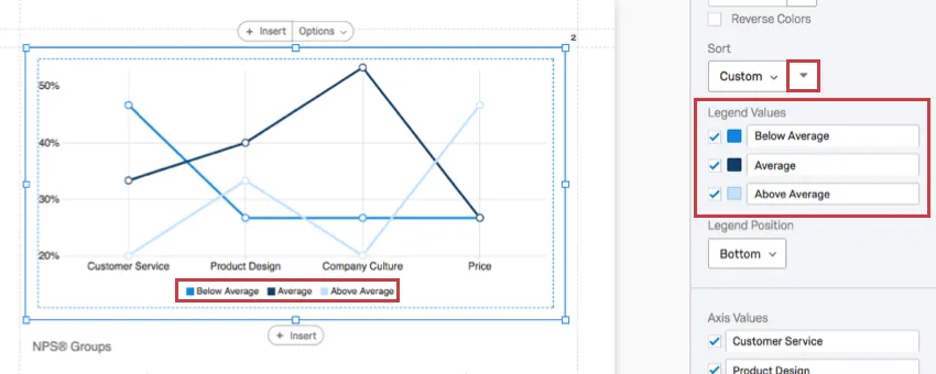
Sort
Qtip: This option only appears for questions with two dimensions. For example, Matrix Tables (which have statements and scales), Pick Group and Rank (which have items and groups), and visualizations with a breakout.
By default, your answer choices (or Legend Values) are displayed in order from top to bottom. By selecting Custom, you can drag and drop your legend values into a different order.
Reverse your sort order by clicking the arrow button.
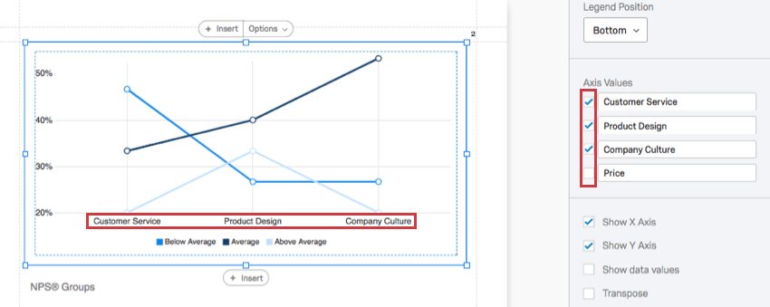
Axis Values
Sometimes, you may have a question with many choices, but you only want to display a few in your graph. The Axis Values feature allows you to hide answers you don’t want to include in your chart by deselecting the checkmark to the left of the choice.

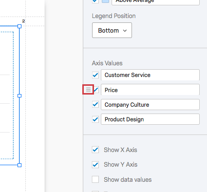
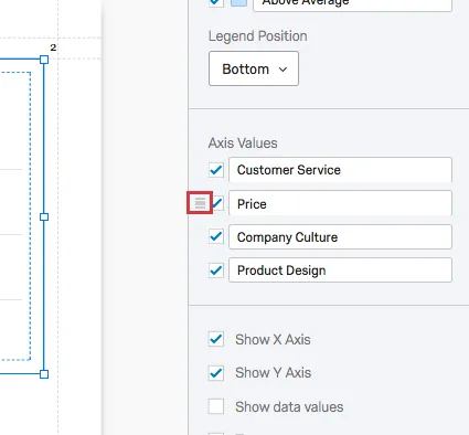
You can also click and drag values to change the order they appear in the chart. First hover over the value, then click and drag the icon to the left.
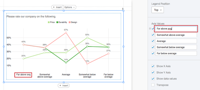
Click into a field and start typing to rename a value in the visualization. This does not affect the name of the choice in the survey or in other data.
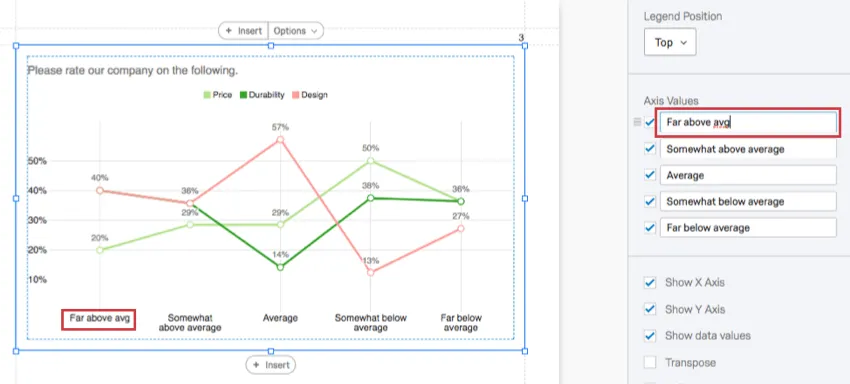
Qtip: Want the Axis Value to revert back to its default name? Just erase what you’ve written, and it’ll automatically go back to what is was before.
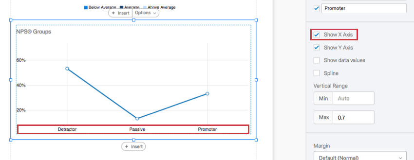
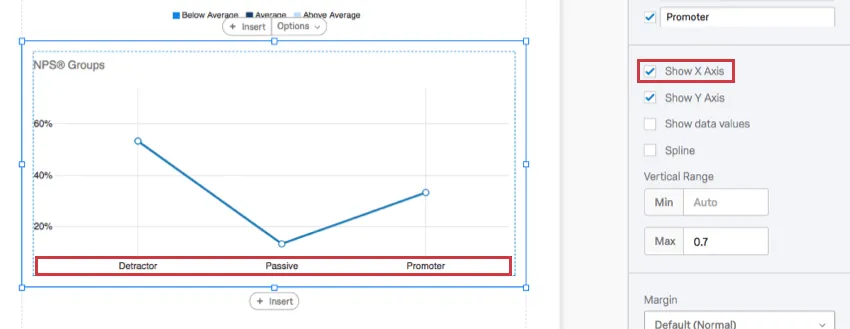
Show X Axis
When deselected, the X axis will be removed.
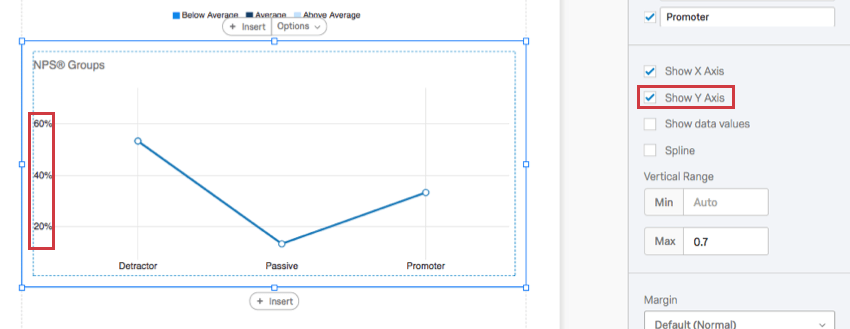
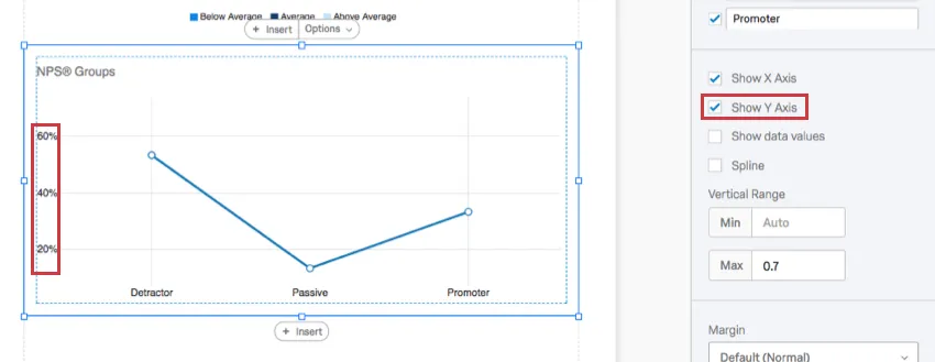
Show Y Axis
When deselected, the Y axis will be removed.
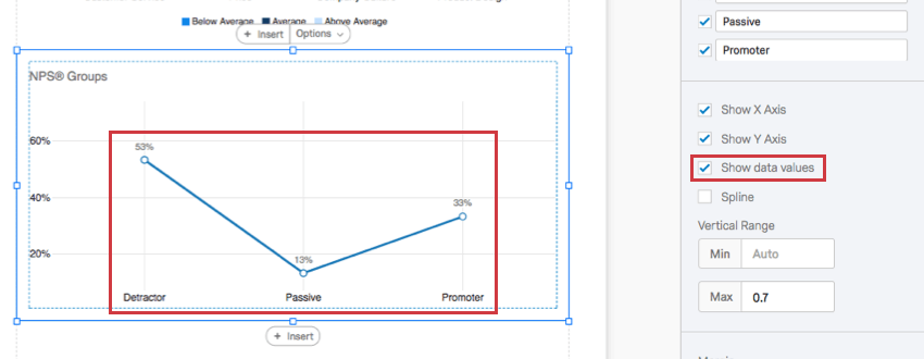
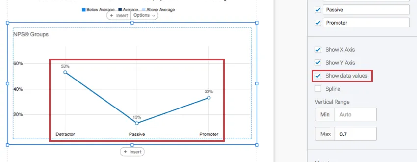
Show data values
When selected, the numbers will display above each point on the line. This can be helpful for charts with longer X axes, so that the value is displayed with each point and the person viewing the report does not have to estimate the values based on the scale lines.
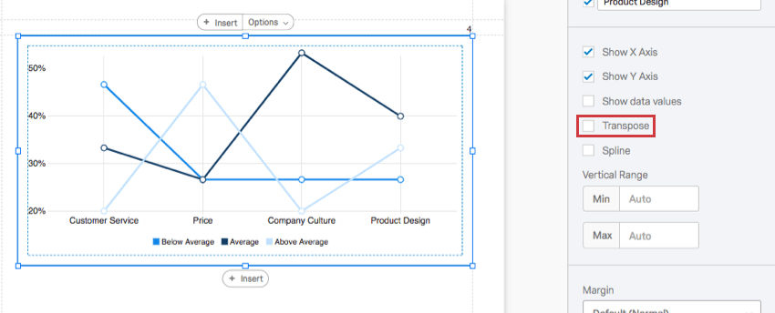
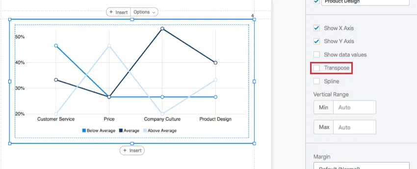
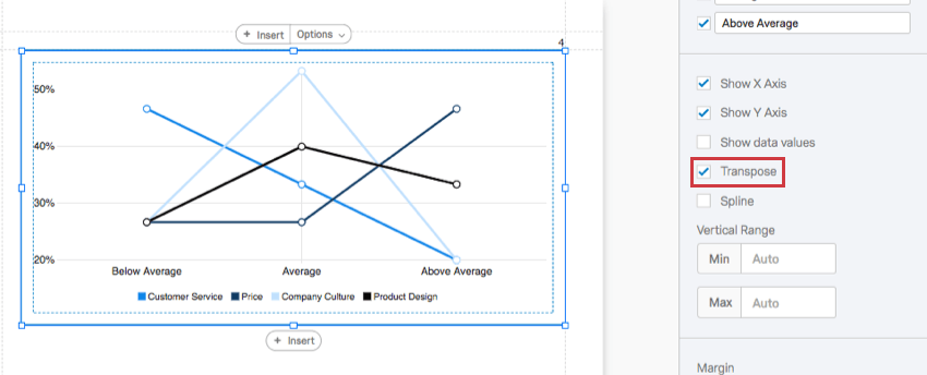
Transpose
Qtip: This option only appears for questions with two dimensions. For example, Matrix Tables (which have statements and scales), Pick Group and Rank (which have items and groups), and visualizations with a breakout.
When selected, the items listed on the X axis and the items listed on the Y axis will switch places.
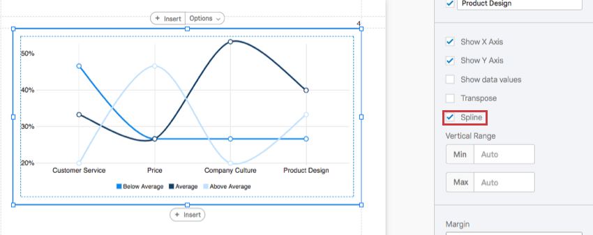
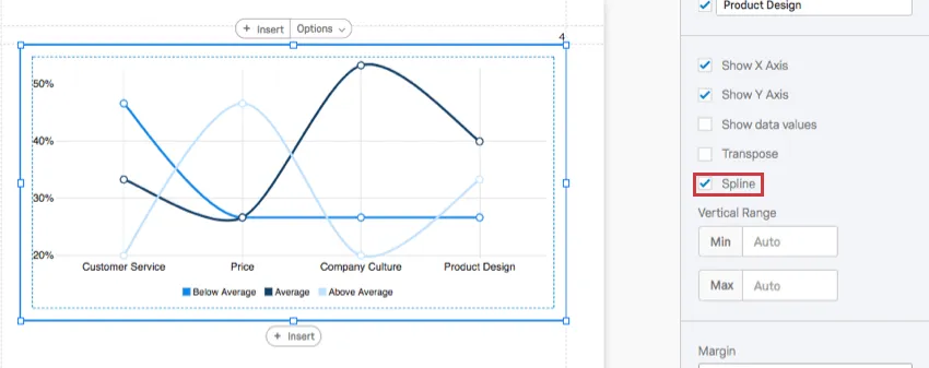
Spline
When you select this option, the lines will curve instead of meeting at angles.
Vertical Range
The Vertical Range refers to the scale points displayed on the visualization’s Y axis. The visualization tries to account for maximum and minimum values automatically, but if your visualization looks funny, or you want to adjust the appearance of your data, you can manually type new minimum and maximum values in the field.
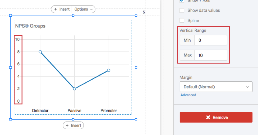
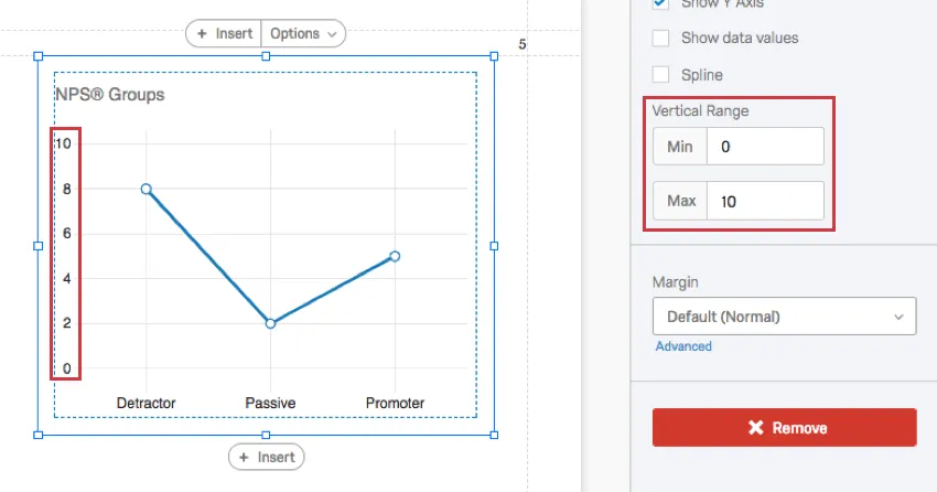
Qtip: This feature does not change the actual question’s scale points. It merely changes the range of the data that fits onto the visualization.
Qtip: If you are using Percentage as your metric, then remove 2 decimal places when typing your maximum and minimum values. For example, if you want your maximum to be 100%, just type 1.
Incompatible Fields
Line Charts are compatible with almost every kind of variable in Qualtrics because they can display both discrete data (for example, a finite, five point scale) and continuous data (for example, a question where respondents type in their age). This includes most question types, survey metadata, embedded data, and custom variables, such as Formulas or Bucketed variables.
Below are the few variables Line Charts are not compatible with:
- Text Entry questions lacking numeric validation
- Form field questions lacking numeric validation
- Open text fields on other questions, such as Text Entry Matrix Tables, text entry columns on Side by Sides, and “Other” text boxes lacking numeric validation
- Heat Maps with no regions defined
- Signature question
- Filter Only Embedded Data
- Text Embedded Data
- Text manual variables
In general, Line Charts are incompatible with open text content that is not numeric.
Qtip: Be careful with numeric data collected from open-ended questions and with finite scales that have hundreds of choices. A Line Chart cannot comfortably display hundreds of choices!
Types of Reports
This visualization can be used in a few different types of report:
That's great! Thank you for your feedback!
Thank you for your feedback!