
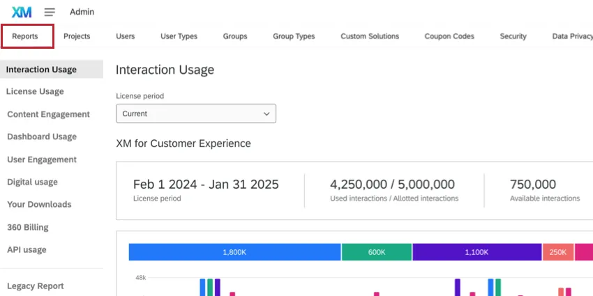
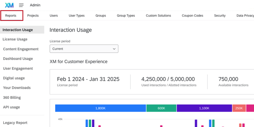
Admin Reports
What's on this page
About the Admin Reports
The Reports tab helps you as an admin understand how Qualtrics user across your license are using the platform. Here, you can find reports on everything from the amount of interactions consumed across the license, dashboard usage, API usage, the rate of successful workflow executions, and more.
Qtip: Only Brand Administrators and Division Administrators have access to this tab. Brand Administrators will see statistics across the entire brand, whereas Division Administrators will only see statistics for their division. Division Administrators do not have access to the Interaction Usage Report, License Usage Report, Activity Report, or Content Engagement.
Qtip: For information about how your organization is billed for license and interactions usage, please contact your Brand Administrator. Brand Administrators with billing questions can reach out to Account Services.
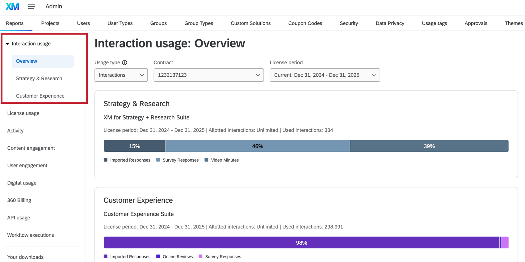
Interaction Usage Report
Qtip: This report is only available for CX and Strategy & Research licenses on the new simplified pricing and packaging plans. If you do not see this report, then use the License Usage Report instead. At this time, this report can only be accessed by Brand Administrators.
The Interaction Usage report shows you the interaction consumption for your current Qualtrics license. This is a detailed view of your data consumption allowing for greater transparency into your license usage. Interactions can be survey responses, online reviews, video screen captures, and more.

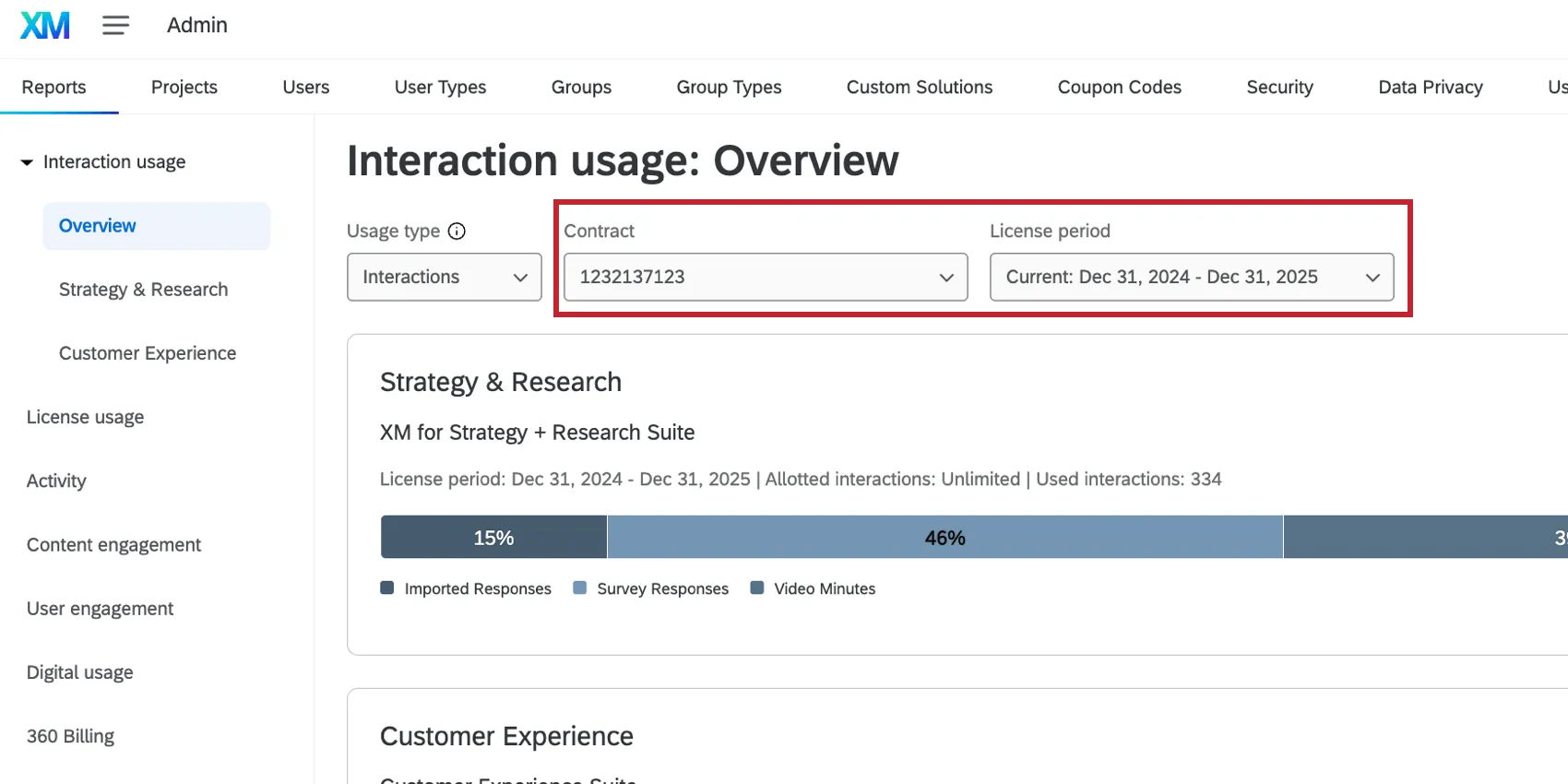
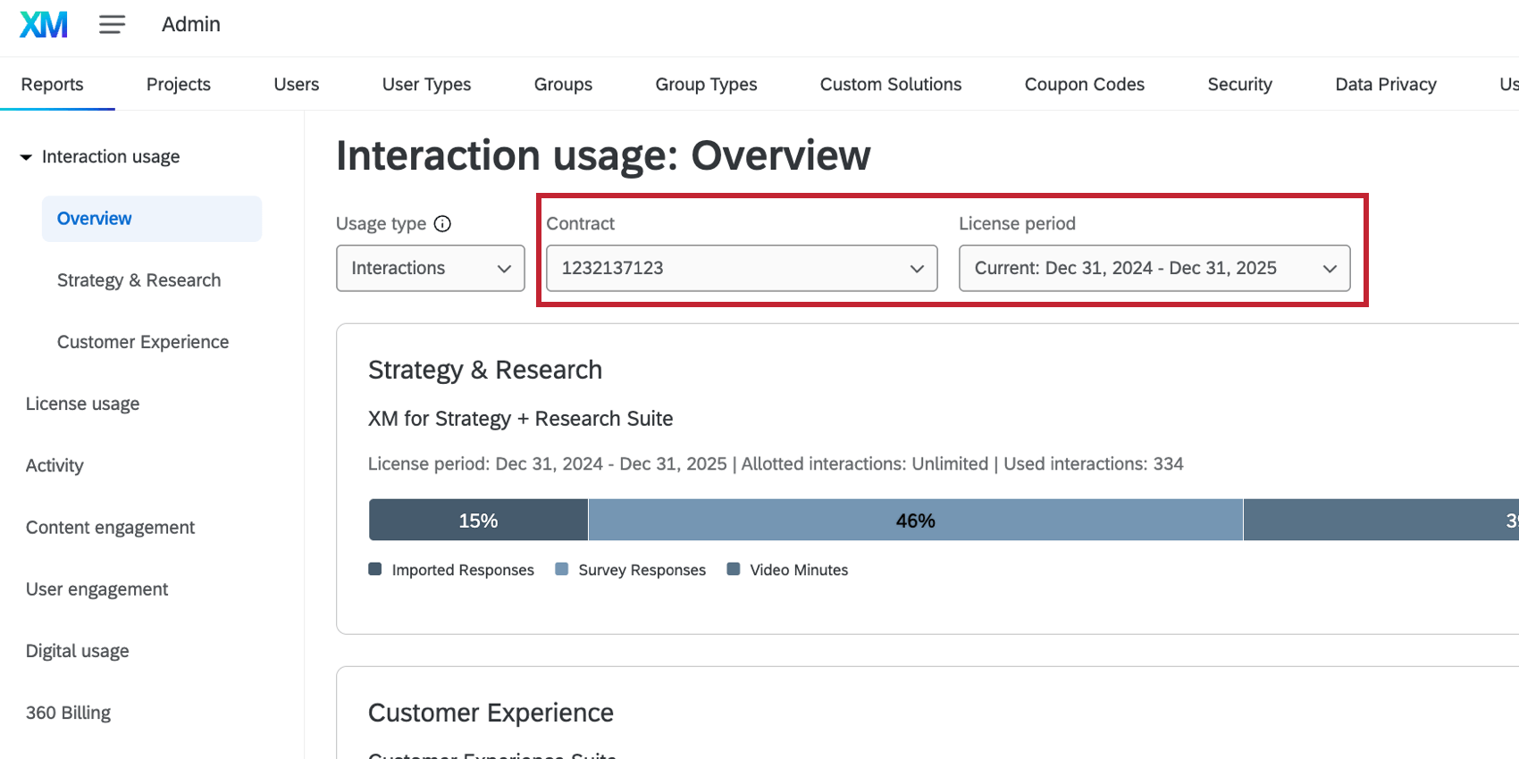
Use the Contract and License period dropdown menus to select the interactions you’re interested in viewing data for.
Additionally, use the Usage type dropdown to choose the type of usage data to view:
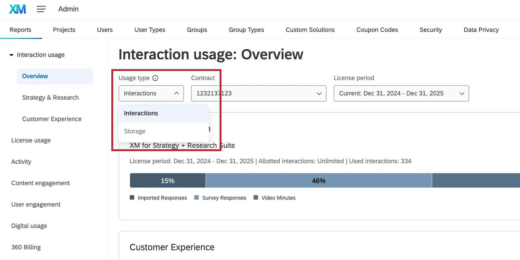
- Interactions: View data about individual interaction consumption (responses, etc).
- Storage: Storage is defined as the total number of interactions stored within Qualtrics, at a given point in time. Storage is currently only applicable to the interaction types voice, chat, and emails.
After making your selections, you can view the following information about your license, broken out by product line (if you have access to multiple):
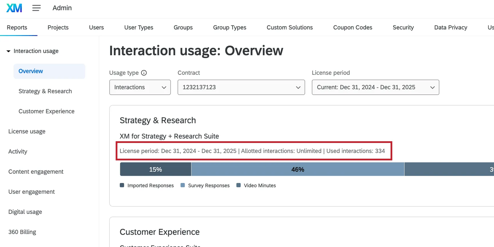
- The current license period
- The number of allotted interactions
- The number of interactions used
- The number of remaining interactions
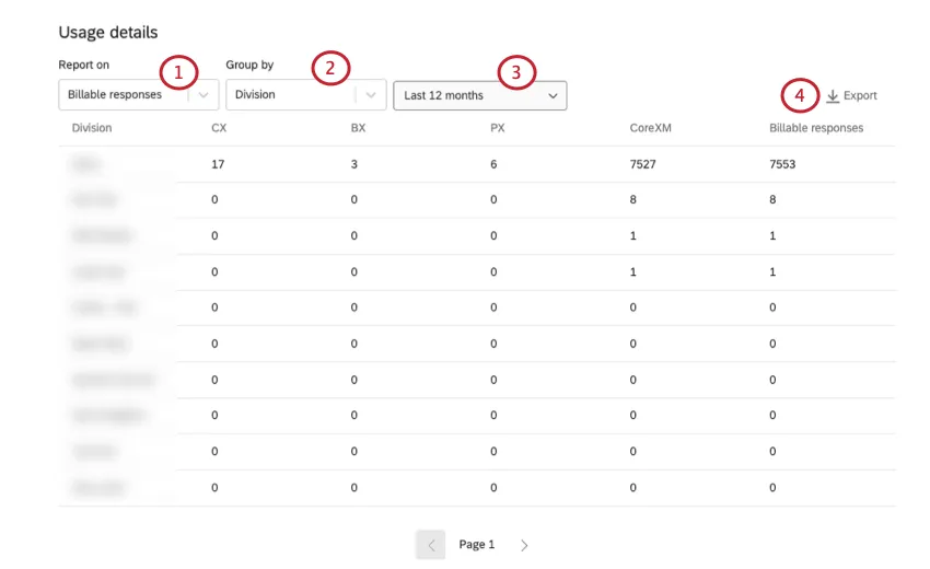
Usage Details
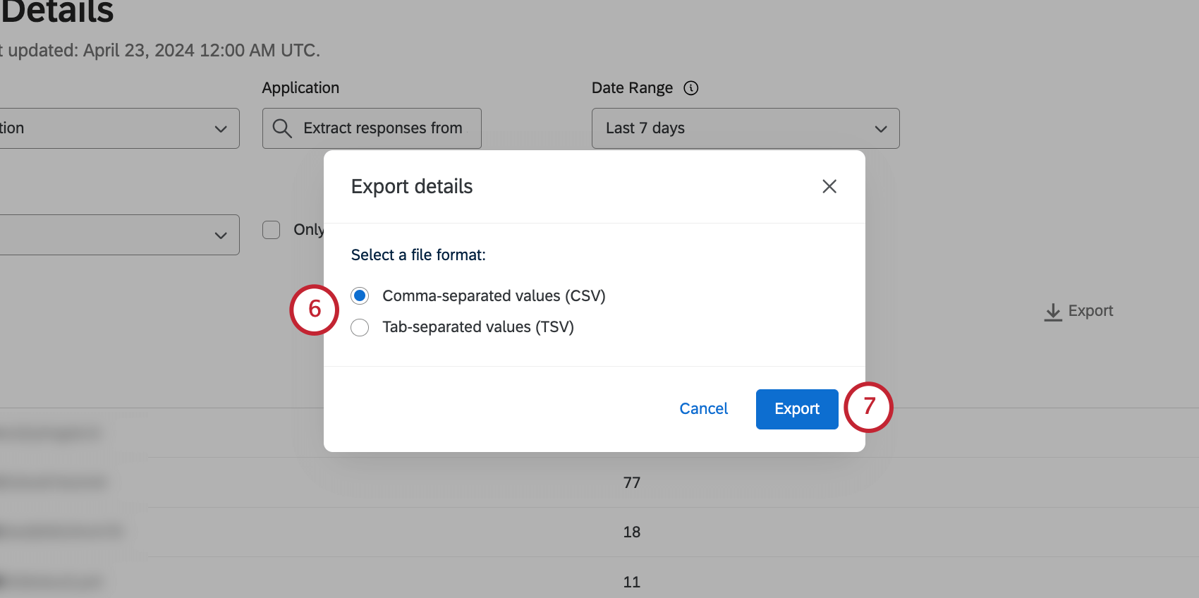
The Usage details table shows each interaction type available for your license and how much of each type has been used over the chosen time period. If desired, you can click Export to download the displayed data to CSV or TSV.
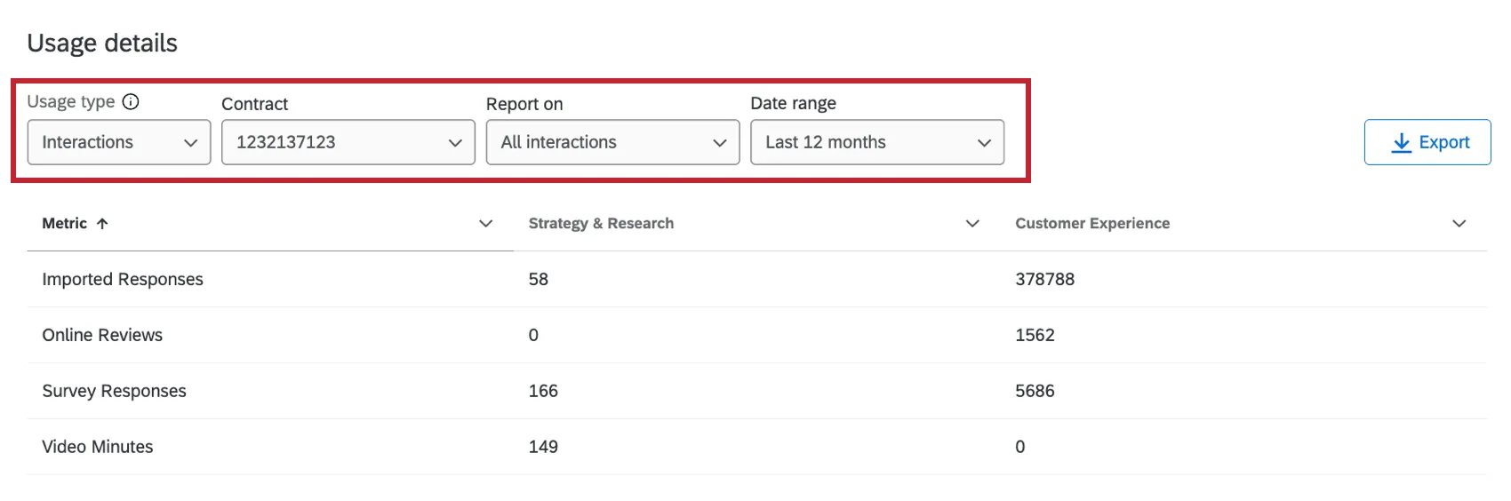
You can use the dropdown menus at the top of the page to filter the data:
- Usage type: Switch between reporting on interactions or storage data.
- Contract: Filter by a specific contract, all contracts, or a legacy contract. Qtip: Legacy usage refers to billable responses from your previous license type that overlapped with your new license type, starting in January 2024.

- Report on: Filter by all interaction types, imported responses, collected responses, or Engage vs. Discover interactions (voice, chat, and email data collected in Discover vs. Qualtrics).
- Date range: Filter by a set date range, a specific license period, or choose a custom date range. Qtip: The default time period is Last 12 months, which may not align with your currently selected license period. Make sure to adjust the date range to the timeframe you’re interested in.
- Group by: If reporting on responses or imported responses, then you can group these responses by survey, division, user, or usage tag.
The following interactions will appear in this table:
- Chats: Chat interactions uploaded in XM Discover (as of January 1, 2025) and in Qualtrics.
- Emails: Email threads in XM Discover (as of January 1, 2025) and in Qualtrics.
- Imported Responses: Imported survey responses (as of January 1, 2024). Attention: Imported responses are billed in the new simplified pricing and packaging plans.
 Qtip: Non-survey data imported into Imported Data Projects are non-billable and do not appear in this table.
 - Moderated Response: Responses to moderated user testing.
- Online Reviews: Reviews from online sites. This includes:
- Reviews in an Online Reputation Management project (as of October 14, 2024).
- Online reviews in XM Discover (as of January 1, 2025).
- Responses: Responses to surveys (as of January 1, 2024). Qtip: Responses to EX surveys are not included.
- Social Mentions: Social mentions in XM Discover (as of January 1, 2025).
- Unmoderated Responses: Responses to unmoderated user testing questions.
- Video Minutes: Responses imported into an imported audio & video project and screen captures for video response questions (as of July 18, 2024).
- Voice: Conversational audio data uploaded in XM Discover (as of January 1, 2025), and voice data uploaded within Voice projects.
- Synthetic: Synthetic panel responses count towards interaction usage.
- Other: Emails, Online Reviews, and Social Mentions from XM Discover between January 1 and July 2025 only.
Qtip: Discover interaction types depend on the connector settings. Some connectors support multiple interactions and the type is set when the connector job is configured. Contact your Discover representative if you questions about the interactions consumed by a particular job. If you do not have your representative’s contact information, reach out to the Discover Support Team.
Product Line Reports
In addition to the overview report, you can also view interaction usage for individual product lines by selecting the product line underneath “Interaction usage.”
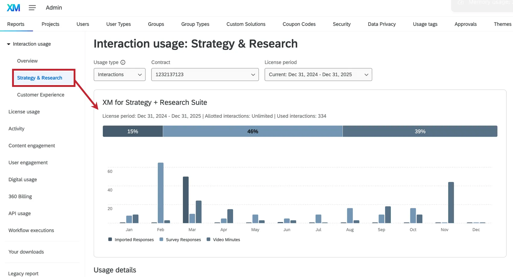
This report contains much of the same information as the overview report, but filtered for the specific product line. The individual product line reports contain an additional bar graph to visualize interaction usage by month.
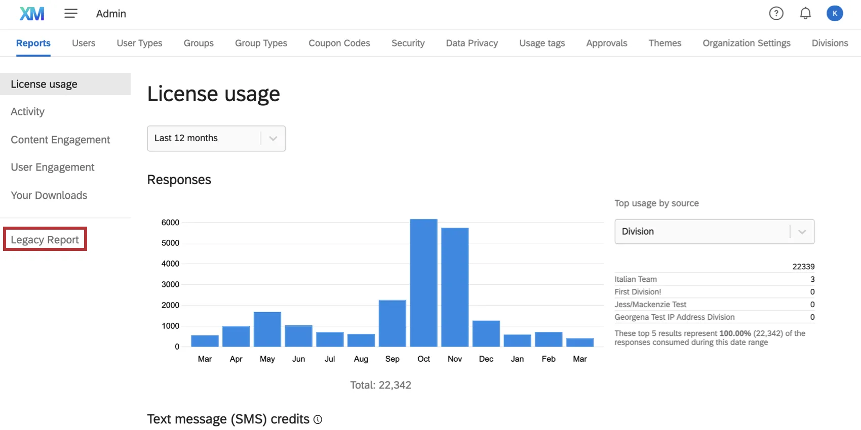
License Usage Report
Attention: If the billable responses report doesn’t have data for recent months, then your license has likely moved to the new simplified pricing and packaging plans. See the Interaction Usage Report for information on monitoring your license’s response usage.
This section tracks the number of auditable responses collected in your license. This includes any responses collected on the Recorded Responses page, except preview data, test data, and imported responses.
Qtip: Contact your Account Executive for pricing on importing. Imported responses are considered separate from and will not impact the account’s response limit.
If you’ve set up Usage Tags as a cost management system, you can break out your data by the tags as well. At the top of all of these reports, you can filter by the time period you’d like to see license usage for.
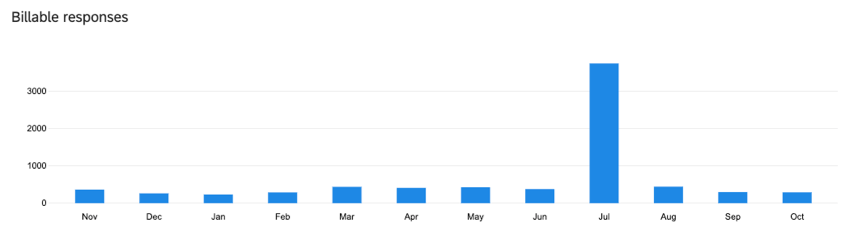
Billable Responses Chart
The Billable responses chart displays how many responses have been collected by the surveys in your license.

Qtip: Once a response is recorded, it is billable. Deleting a response does not remove it from the number of billable responses.
Attention: Responses from EX projects do not appear in the responses chart or usage details table. See Administration (EX) for more information.
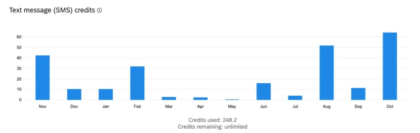
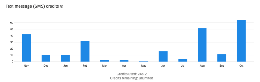
SMS Credits Chart
The SMS Credits chart displays how many SMS credits have been consumed in your brand, as well as the remaining SMS credits for the brand.
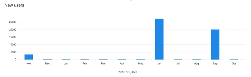
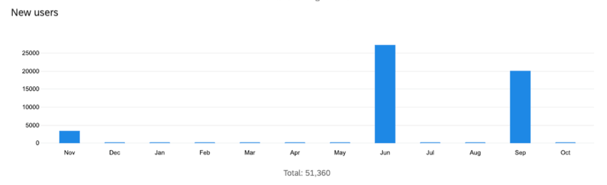
New Users Chart
The New Users chart displays how many new user accounts have been created in your license. Use the dropdown menu to the right of the chart to change what the chart displays. You can break out your data by division or any tags you’ve created.
Usage Details Table
Qtip: If your license uses the new simplified pricing and packaging plans, then you cannot report on responses here. See the Interaction Usage Report for information on monitoring your license’s response usage.
The Usage Details table displays the same information as the charts in your License Usage Report, but in a different format. You can also export the data from this section. The Usage Details table is located at the bottom of the License Usage Report page.
Attention: When viewing “SMS credits” grouped by “user,” this table will only display credit consumption by the survey owner. Any SMS credits consumed by collaborators will not be displayed here.
Qtip: When choosing a date range for your CSV export please note that the export will include responses beginning with the From Date selected, but will only include responses that were recorded before the selected End Date.
The Billable responses column shows you total billable responses for your chosen group. The data will also further be broken out by license type (i.e., CX, BX), so that if you have access to multiple products, you can see where the responses were used. “CoreXM” refers to use of survey projects and other core platform features not included in CX, BX, or PX. If you ever have questions about billable responses, talk to Account Services.
Qtip: You can export details about all users in your brand by setting filters to:
Report on: Users
Group by: None
Date range: All
Activity Report
The Activity report shows the survey activity within your brand. Here, you can see details of all surveys in your brand including their quality as measured by Expert Review.
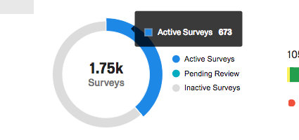
Active, Pending, and Inactive Surveys
The first graph in the Activity Report provides the total number of surveys in the brand (center of circle). The colors on this pie chart represent how many of these surveys are active, pending review, or inactive. Highlight over a colorful section of the chart to get the exact number of surveys in the brand that have that status.

- Active Surveys: Surveys that can collect survey responses. These surveys are not new, paused, or closed.
- Pending Review: If you have designated that users must have surveys approved before they go live, this status will show how many surveys have been submitted for approval but are not approved and activated yet. Learn more about the permissions needed to set up this process on the Survey Approval Process support page.
- Inactive Surveys: These surveys have been paused or closed.
You can click statuses in the legend to exclude them from the graph, or to reinclude them.
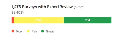
ExpertReview
The ExpertReview breakdown bar helps you check the quality of your brand’s surveys by displaying the scores of surveys that have ExpertReview enabled. You can highlight over the bars of this graph to get the survey count.
To learn more about ExpertReview and how it scores surveys, see the linked support page.
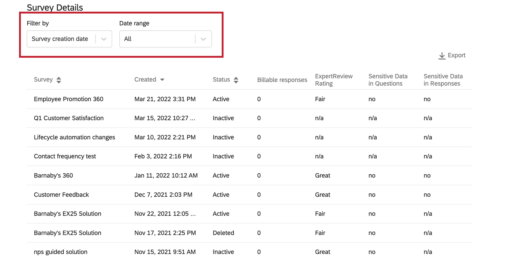
Survey Details
The Survey Details table provides insight into when surveys were created, how many responses they’ve collected, their status, their ExpertReview rating, and whether they contain sensitive data in the questions or responses.
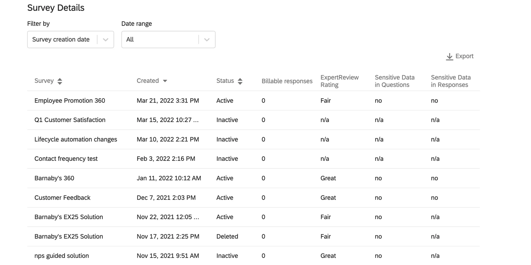
You can filter activity reports by survey creation date range and response date range by using the drop-downs above the table.

Attention: Brand Administrators can’t bulk export survey results for their users.
The Survey Details report the presence of sensitive data as a Yes or No. To learn more about the specific topics being violated, reach out to the survey owner.
| Yes | No | N/A | |
|---|---|---|---|
| Sensitive Data in Questions | Survey contains questions that ask for sensitive data. | Survey does not contain questions that ask for sensitive data. | Sensitive Data evaluation not available for this survey. Surveys created before you turned on Sensitive Data Policy for your brand will have N/A for both columns. |
| Sensitive Data in Responses | Survey responses contain sensitive data. | None of the responses contain sensitive data. | Sensitive Data evaluation not available for this survey. Surveys created before you turned on Sensitive Data Policy for your brand will have N/A for both columns. |
You can click Export to export a CSV or TSV of your Survey Details table. The columns include survey ID, survey name, when it was created, the owner ID, division ID, division name, survey status, responses, owner username, owner user type ID, owner user type name, ExpertReview score, Sensitive Data in Questions, and Sensitive Data in Responses. This export includes every survey in the brand, including deleted ones.
Qtip: Sensitive Data Policies are a great way to prevent identifying or private information about respondents from being collected. You must have topics set up before the sensitive data columns of your Survey Details will provide information on policy violation.
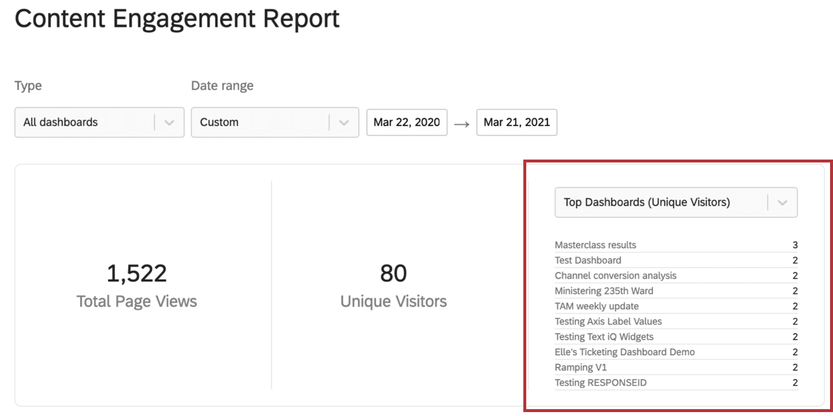
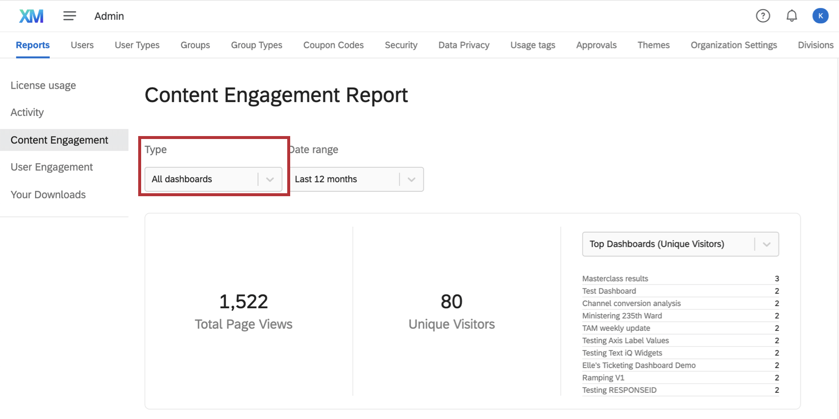
Content Engagement
The Content Engagement report is a great way to determine the dashboards your users engage with the most. Here, you can determine top dashboards by timeframe and export data on pageviews and unique visitors.
Qtip: This report is only available for brands with CX, EX, or BX licenses that have dashboards.
Type of Dashboards
You can choose to view all dashboards in your brand, or specify based on whether they are CX, EX, or BX. Depending on your license and what kinds of projects you have access to, not all of these options may be available.
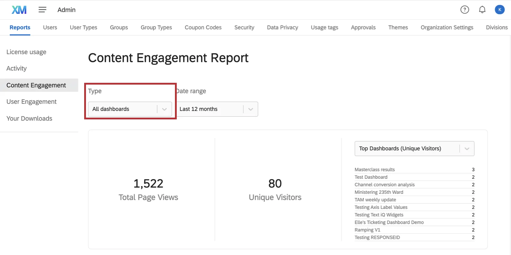
Qtip: All CX Dashboards show up under CX. Dashboards created in any EX project, such as Ad Hoc Employee Research, Engagement, or Lifecycle, will show up under EX. BX dashboards are Brand Tracker Dashboards.
Date Filter
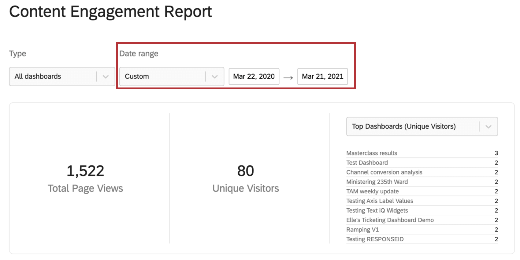
Use the date dropdown to adjust the data displayed on the Content Engagement report. You can choose a preset date, or filter by a custom timeframe. This date filter will adjust all the data in this admin report.
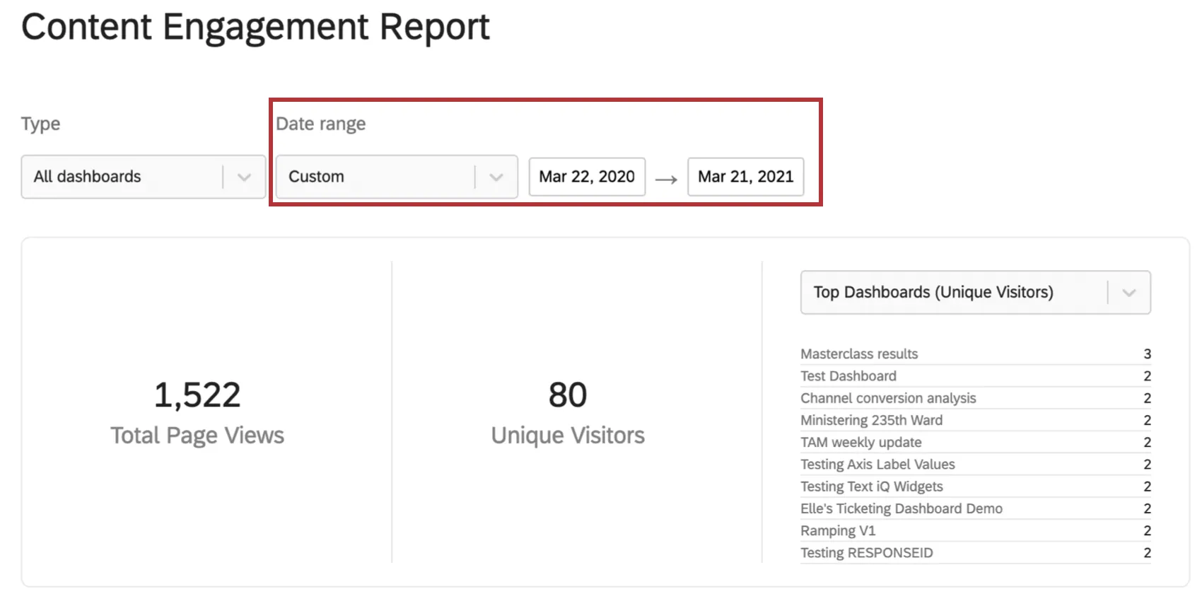
Qtip: Engagement data was not recorded prior to April 1, 2019. The Content Engagement report will always warn you if you try to filter for earlier dates.
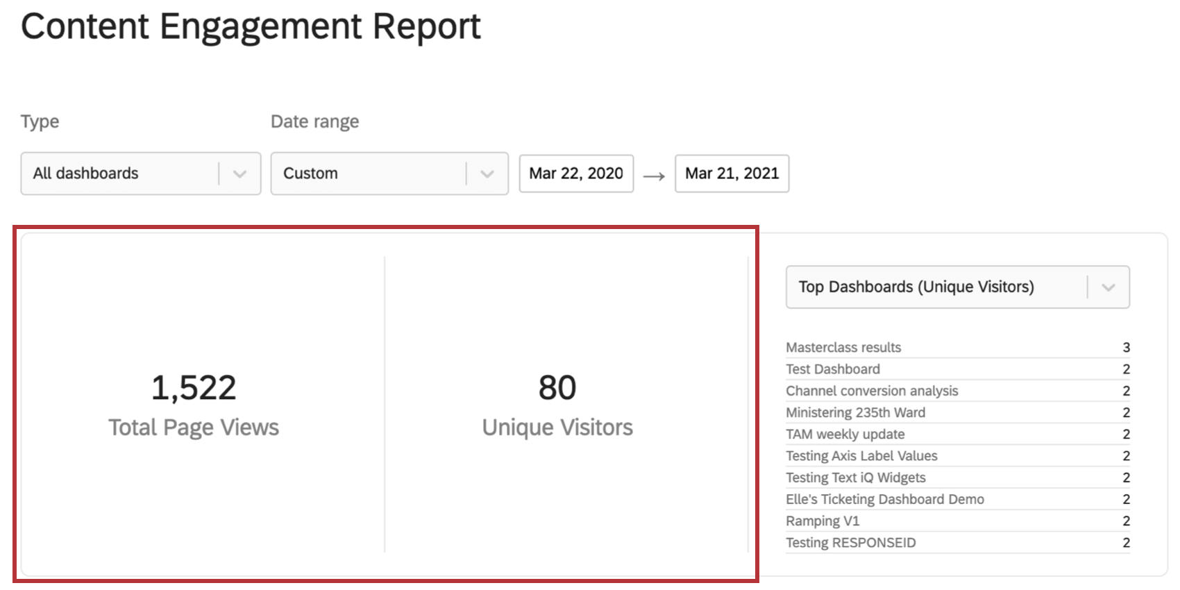
Total Views and Unique Visitors Across Dashboards
To the left of the report are Total Pageviews and Unique Visitors across all dashboards existing in your brand (for the selected timeframe).

- Total Pageviews: Number of individual pageviews. Navigating between pages of a dashboard will increase the pageviews. This metric is generally a higher number than unique visitors, because individuals can visit multiple pages or the same page multiple times.
- Unique Visitors: Individual users in your Qualtrics brand who have viewed the dashboard in the selected timeframe. Qtip: The number of unique visitors may be higher than the number of unique users due to how visitors are measured. Some actions, such as emailing the dashboard as a PDF, increase the visitor count but do not increase the user count.
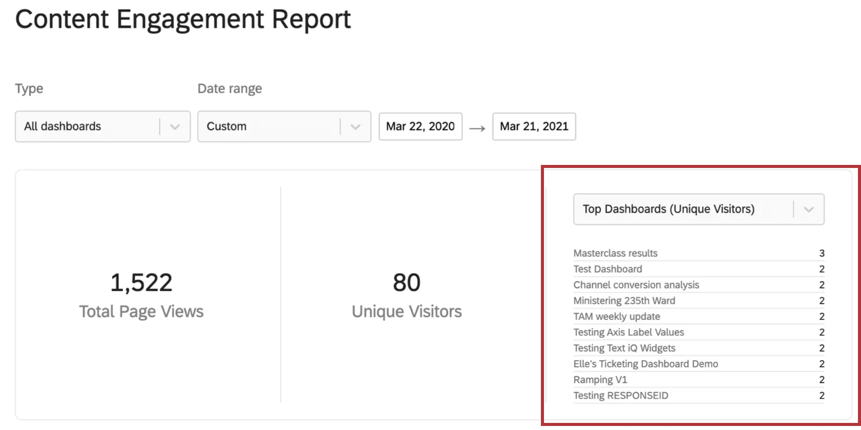
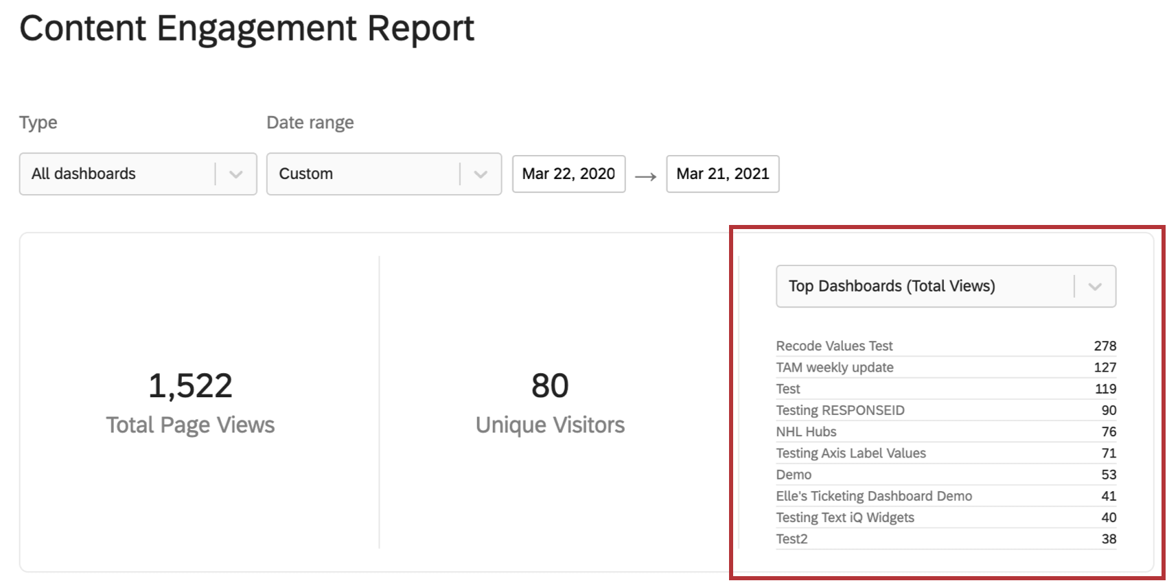
Top Dashboards by Total Views or Unique Visitors
Using the dropdown above the list, you can see the top 10 dashboards in your brand.
- Total Views: See the dashboards that have gained the most pageviews within the chosen timeframe. The exact number of views across all pages of a dashboard will be given for each dashboard.
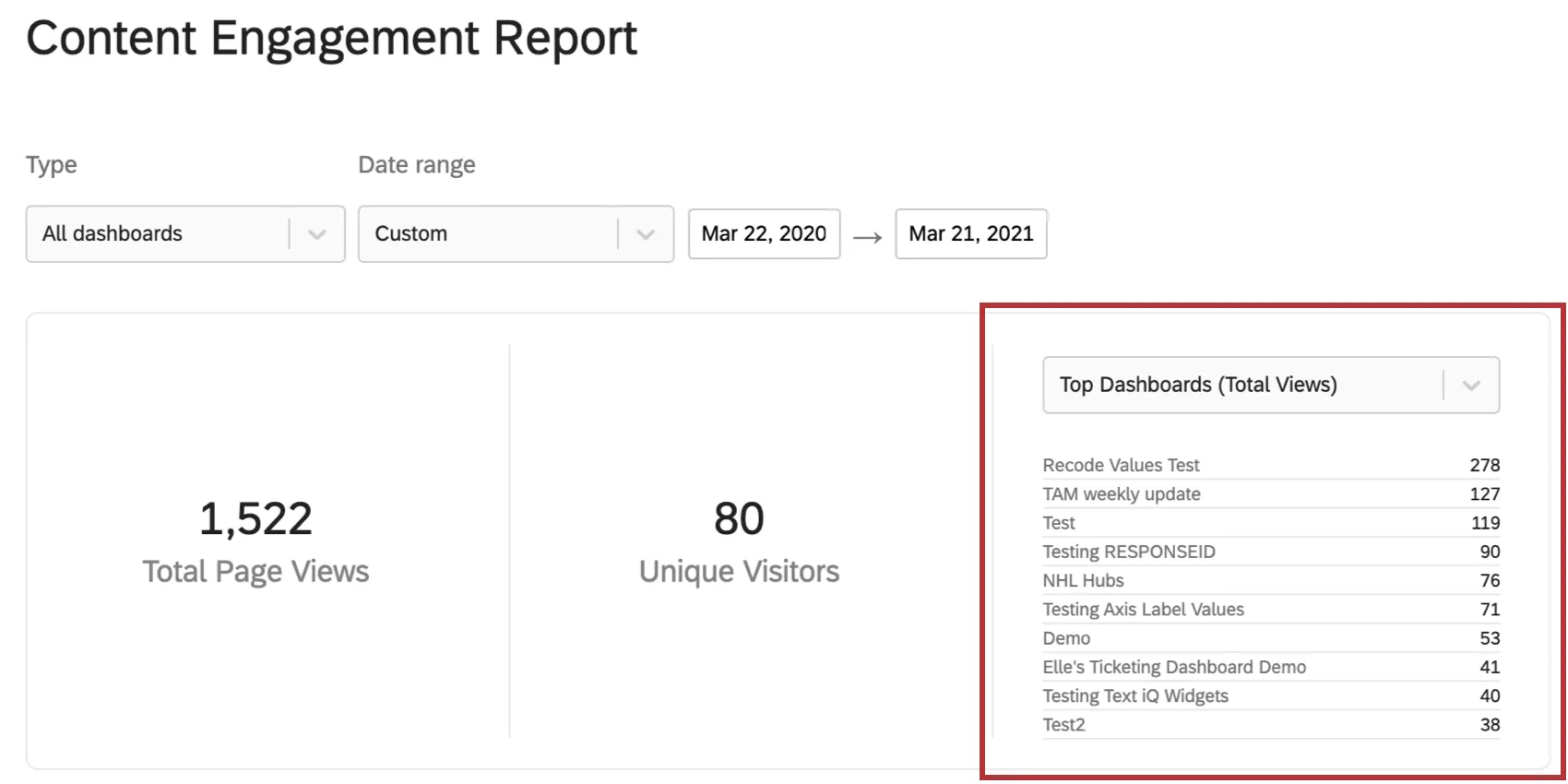
- Unique Visitors: See the dashboards that have been viewed by the most Qualtrics users within the chosen timeframe. The exact number of unique visitors will be given for each dashboard.
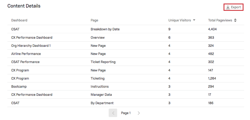
Content Details
The Content Details show unique visitors and pageviews to specific pages of dashboards in your brand (instead of providing this information for the entire dashboard). You can sort the table by pageviews or visitors.
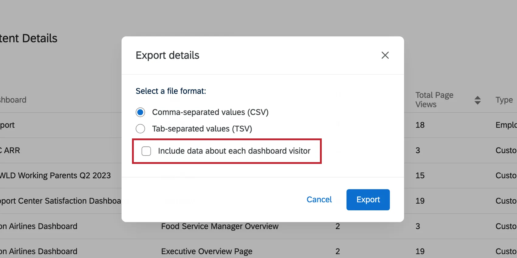
You can download this data to a CSV or TSV by clicking Export. The export includes the Dashboard ID (an internal ID assigned by Qualtrics), the Dashboard’s name, the Page ID (an internal ID assigned by Qualtrics), the page name, total unique visitors, and total pageviews. Each row represents the data for a different dashboard page.
To export a list of users that accessed the dashboard, enable Include data about each dashboard visitor in the export details.
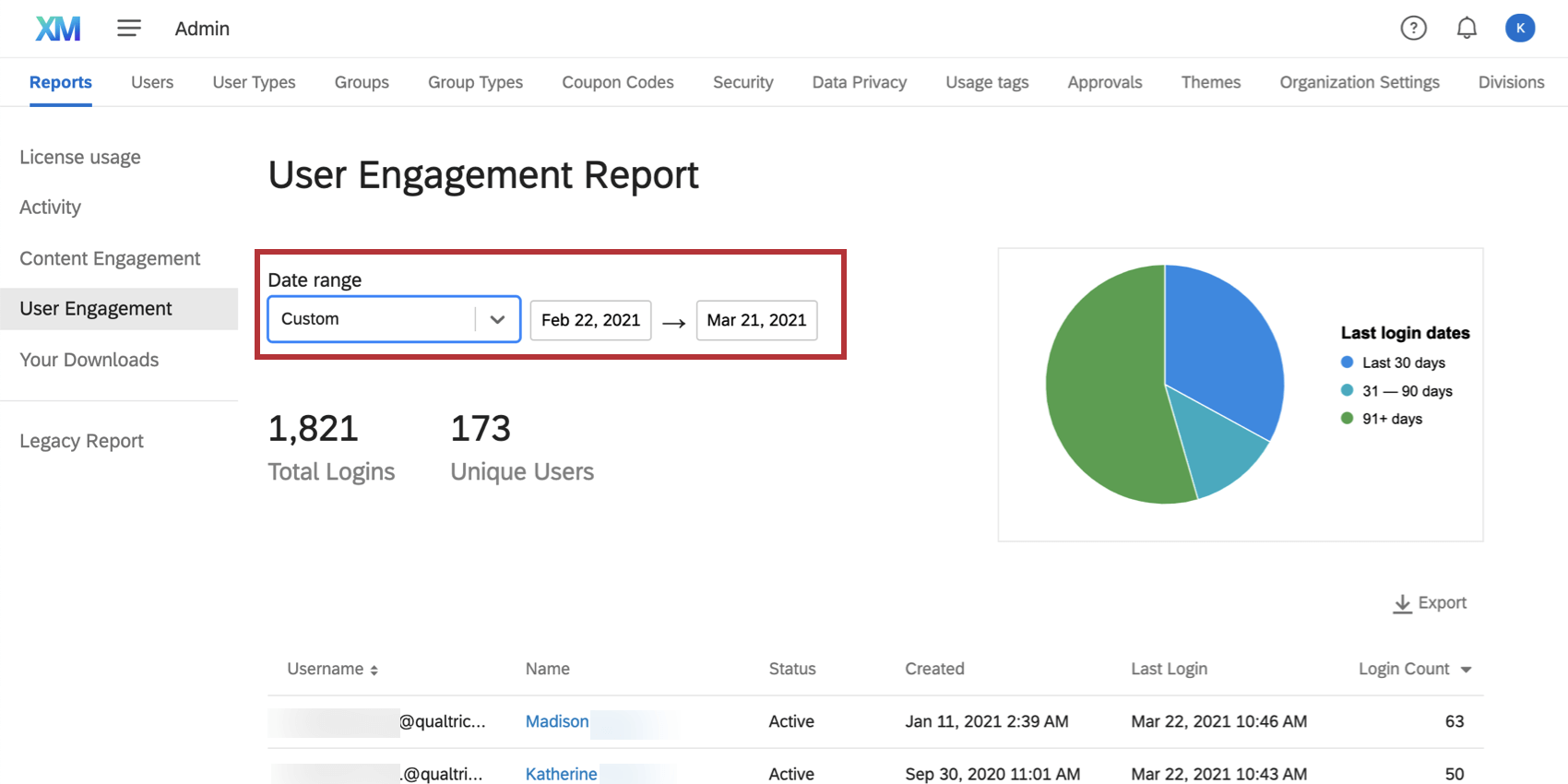
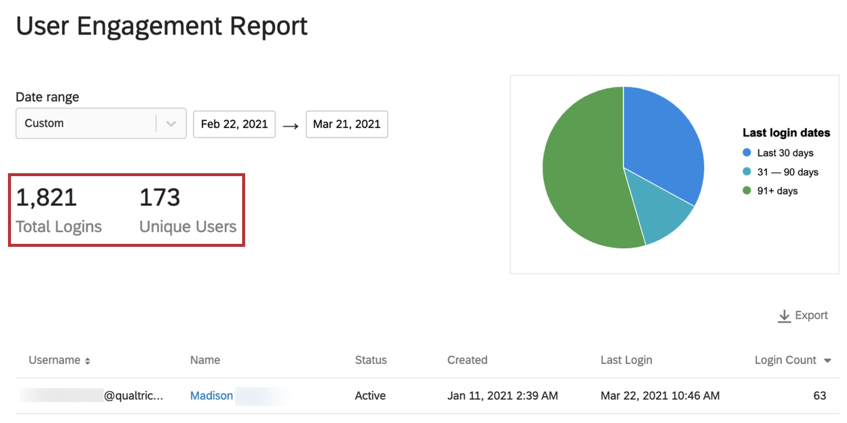
User Engagement
The User Engagement report is a great way to determine which users are most engaged with your Qualtrics license. Here, you will see information on top users and login behavior.
Date Filter
Use the date dropdown to adjust the data displayed on the User Engagement report. You can choose a preset date, or filter by a custom timeframe. This date filter will adjust login and user summary, as well as the data table in this admin report.

Logins

- Total Logins: The number of times users logged into accounts. This includes the same user logging in multiple times, logins to dashboards (both CX and EX), or Brand Administrators proxy-logging into accounts from the Admin page.
- Unique Users: The number of unique users that logged in.
Qtip: These statistics do not include logins to the XM app.
User Details

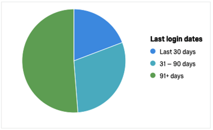
This pie charts shows a breakdown of users who logged in:
- Within the last 30 days (blue)
- 31-90 days ago (teal)
- More than 90 days ago (green)
Hover over a color to get an exact count of users who fit into that category.
Exporting User Details
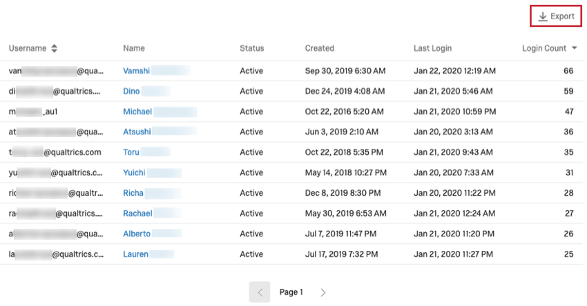
This table shows the usernames, names (which link to the user’s email address), account status, date of account creation, date of last login, and the login count for the filtered users. This table can be sorted by username or login count.
If you export this data, the file will include the user ID (an internal ID assigned by Qualtrics), username, first name, last name, email, account status, when the account was created, when the user last logged in, and how many times they logged in. Like all the data on this report, the export will also match the date filter.
This data can be exported in CSV or TSV format.
Digital Usage
The Digital Usage report tracks your usage of Digital Experience Analytics (DXA). Using this report, you can see session replay usage, then break out that data by month or project.
You’ll have access to this report if your organization has Digital Experience. However, this report only displays Digital Experience Analytics data.
Digital Usage reports update hourly.
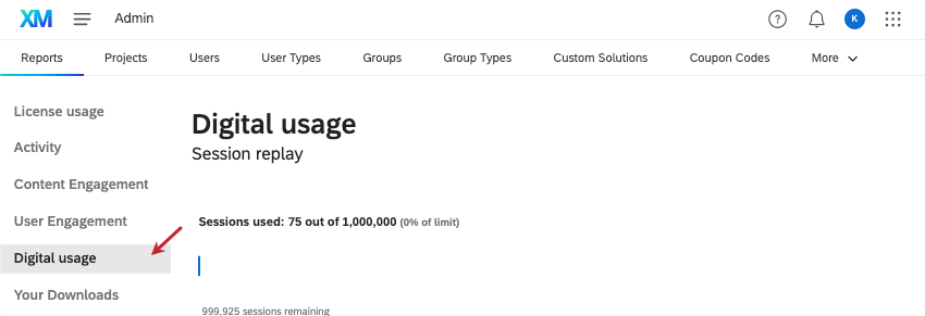
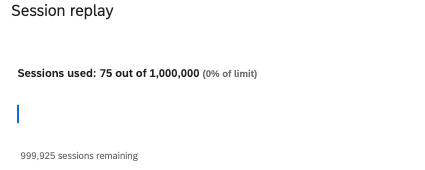
Session Replay
Session replay (or session capture) is a feature that tracks your visitors’ website sessions and gives you insight on any frustration behaviors they may display. The Session Replay report shows how many session replay recordings are available to your license, as well as how many have been used, and how many are left over. The number of sessions used is presented as an exact number, a percentage of your total allowance, and as a bar chart.

Qtip: If you ever have questions about how many sessions your license has, talk to your Technical Success Manager.
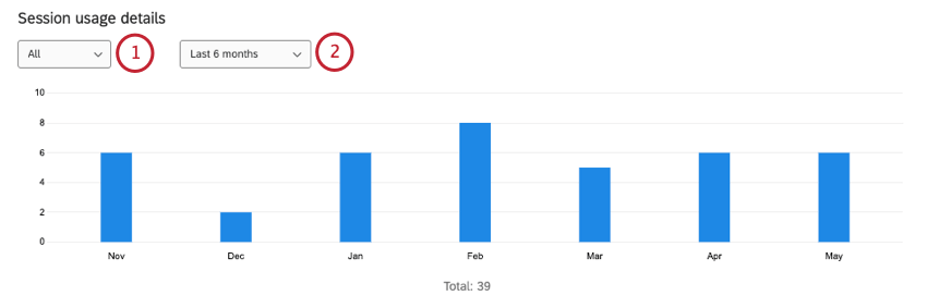
Session Usage Details
The Session Usage Details shows how many sessions have been recorded in your license each month.

This report also comes with filters you can adjust:
Exporting Session Usage Details
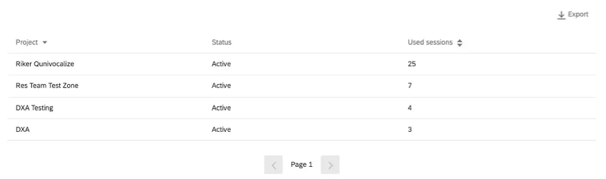
The filters you apply to the Session Usage Details graph also apply to the table below. This table includes information on each project recording sessions, including:
- The name of the project.
- The status of the project.
- How many sessions this project used in the timeframe you chose.
Click Export to download this data as a CSV or TSV file.
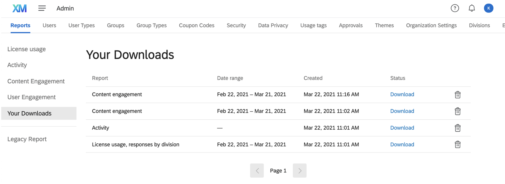
Your Downloads
In the Your Downloads section, you can view any files you’ve downloaded from the admin reports. Files will appear here for 30 days.
Qtip: API details will not appear here.
A list of reports is shown on this page with the report it was downloaded from (e.g., license usage or activity), the dates it was filtered for, the date you requested to download the file, the status, and the ability to delete the file from your download history. Time zones match the one set in your account.
To re-download a file, click Download.
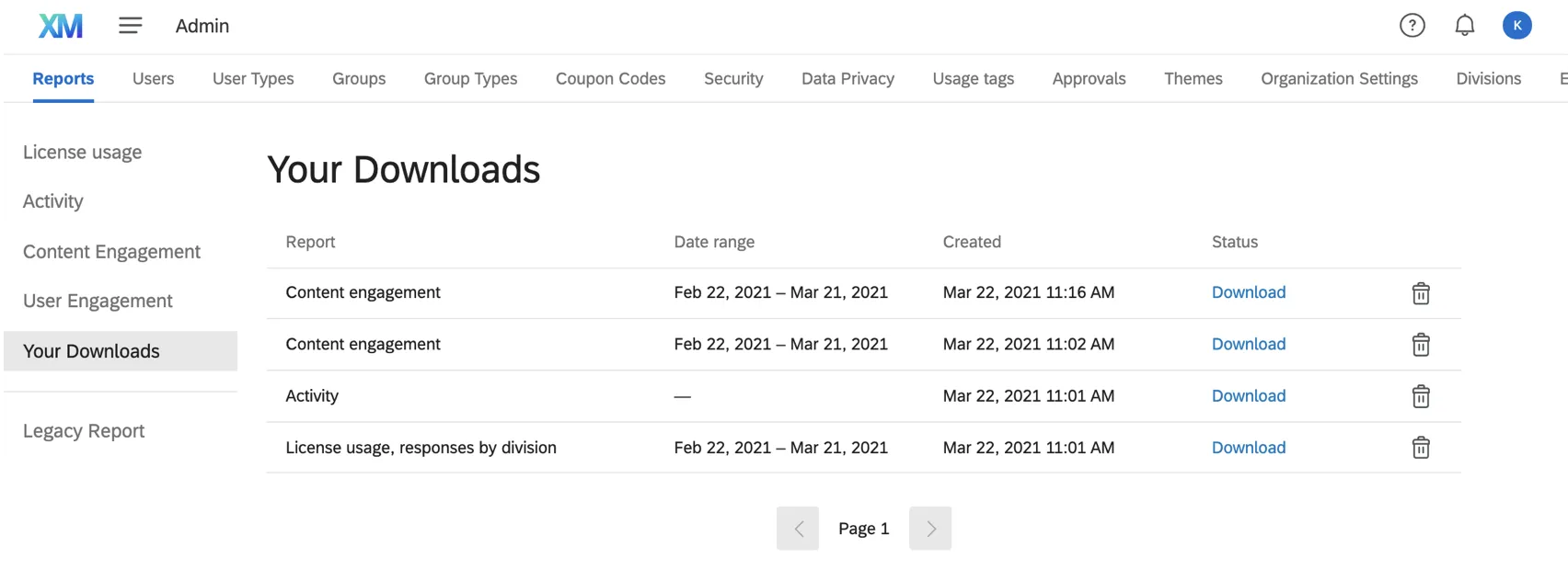
Qtip: This section only shows files download in your own user account from license usage, activity, content engagement, or user engagement. Legacy report exports will be excluded from this list.
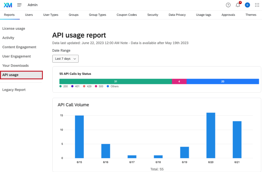
API Usage
Qtip: Check out the API usage threshold event if you’d like to trigger a workflow notification based on your API usage.
In the API Usage section, you can see a count of all API calls made by your brand. You can also see the status of API calls, as well as API call volume over time. Only data for the last 60 days will be displayed.
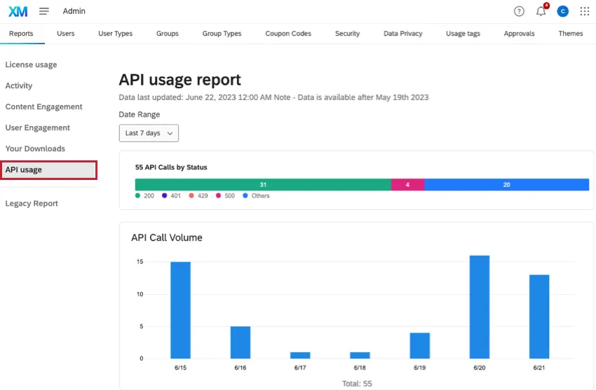
Qtip: If you select a Date Range under 24 hours, API usage data will be accurate to within a few minutes. If the Date Range is under 7 days, it will be accurate to within a few hours, and if the Date Range is over 7 days, the data will be accurate to within a day.
Qtip: It is normal to see failure rates below 1-2% of all calls. If you are seeing failure rates greater than 3% for a given day, we recommend reaching out to our support team by logging into the Customer Success Hub. If you are seeing a high volume of 429 errors, you may be hitting an endpoint limit. See API Request Limits for more information on API limits.
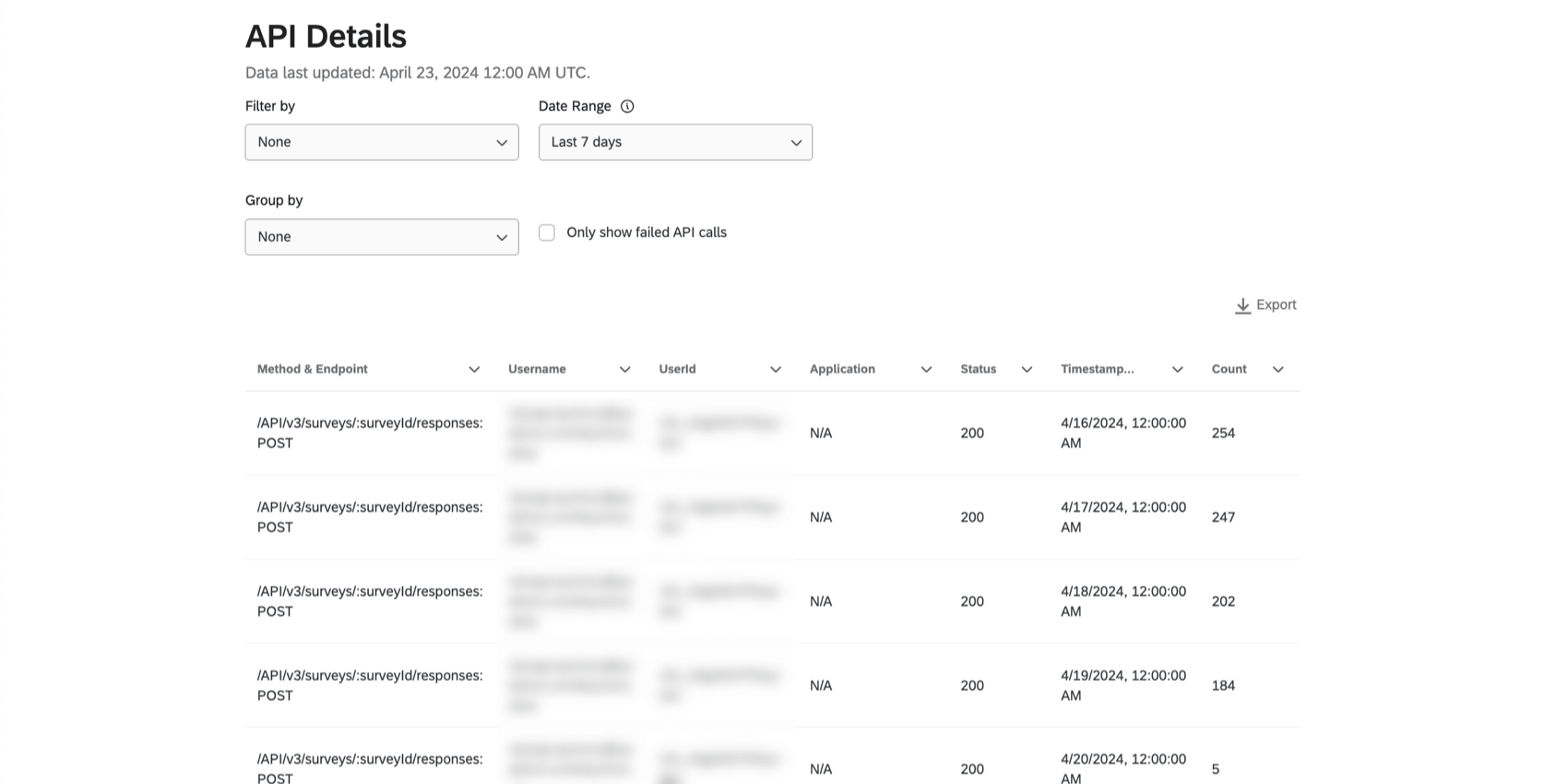
You can also view the API Details table for more info on API calls. This includes the Method & Endpoint, UserID, and Status. For more information on the Qualtrics API, see the API Reference.
Qtip: The API Details table shows details about the calls made by your organization or an App/Partner on behalf of your organization. The table rolls up call counts based on the time range selected. If your range is less than or equal to 24 hours, calls will be aggregated per minute. If the time range selected is 1 to 7 days, the calls will be aggregated per hour. If the time range selected is greater than 7 days, the calls will be aggregated per day.
The Application column will tell you if there’s a workflow in Qualtrics where this specific API was run. If you see “N/A,” this likely means the API was run outside of workflows.
Example: If your brand has exceeded your API rate limits, you can group the API details table by UserId to see who is making the most API calls. You can then search for this User ID within the Users tab.
Exporting API Usage Details
You can export the data from the API Details table to CSV or TSV. You can also filter results and choose how they’re grouped in the exported file.
Qtip: Filters that are set on the API Usage Details table will be applied to the Download. If you don’t see the expected data displayed on the table, please revise the filters on the table before downloading the file.
Qtip: Downloads of API Details will not appear in the Your Downloads tab.
Qtip: The max file size that can be generated is 1MB. If your file won’t generate, try adjusting your filters and date range.
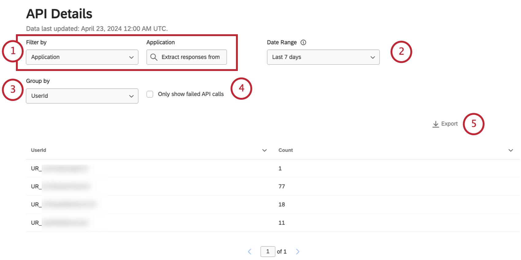
- Method & Endpoint Qtip: Filter API Details by Method & Endpoint if there’s a specific API call you’re interested in.
- Username
- UserId
- Application
- Status Qtip: You can only filter by 1 category set to 1 value at a time. For example, if you’re filtering by someone’s UserId, you cannot filter for an additional user or add a Status filter on top.
Qtip: API Usage Details only displays 90 days worth of API call history.
Example: Group by username to see how many API calls each user made. Only users who have made API calls in your selected date range are included in the list.
- CSV (comma-separated values)
- TSV (tab-separated values)
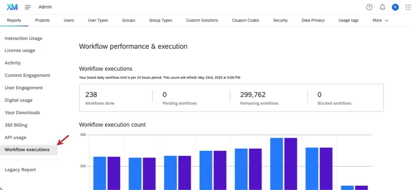
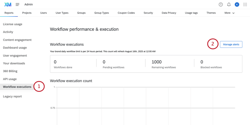
Workflow Executions
Qtip: We intend to start enforcing the 300,000 daily workflow execution limits starting on September 10, 2025. Qualtrics may, in its sole discretion and without liability, change the timing of any product feature rollout, change the functionality for any in preview or in development product feature, or choose not to release a product feature or functionality for any reason or for no reason.
With the Workflow executions report, you as an administrator can see the most frequently triggered workflows in your organization. See how many workflows have been used towards the brand-wide limit, in addition to a list of the specific workflows that execute the most often. You can also set alerts so you or other key stakeholders are notified as your organization approaches the limit.
Workflow executions are the attempt to run a workflow, or the act of triggering a workflow. An executed workflow may eventually fail or succeed, but the goal of this admin report is to track how many workflows are executed regardless of success.
Qtip: Once you know more about your workflow usage, you can use this information to adjust user permissions, or flag to owners that certain workflows aren’t working properly. To troubleshoot an individual workflow’s performance, the owner will need to check out the workflow’s run history.
Qtip: If your organization goes over the workflow execution limit often, try our troubleshooting tips.
Table of workflow executions
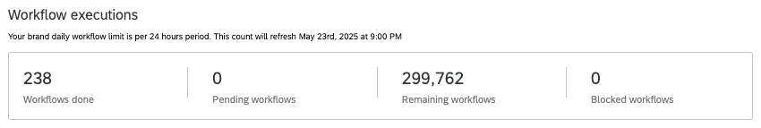
The first workflow execution table shows a breakdown of workflows executed across all users in your organization today. The workflows in your Qualtrics organization (brand) will refresh every 24 hours. The time this limit will refresh is displayed in your personal account’s time zone.
- Workflows done: How many workflows successfully executed today. Executions refer to how many times workflows were started or triggered, not to success or failure.
- Pending workflows: How many workflows are still in progress for the day. This includes the statuses queued, in progress, and auto-retrying.
- Remaining workflows: How many workflows you have left in your daily limit. All executed workflows, whether successful or failed, count towards your limit. Once the limit is reached, workflows will be blocked. Qtip: The daily workflow limit for an entire brand is 300,000 executions a day. If you would like to increase your allotment, reach out to Account Services.
- Blocked workflows: How many workflows have been blocked today. Workflows are blocked once you hit the daily workflow limit. These blocked workflows are put in a backlog that starts once the daily limit refreshes. Qtip: A blocked workflow and a failed workflow are not the same. A failed workflow has started, but cannot finish for various reasons, such as a task being set up incorrectly. A blocked workflow may be set up correctly, but because your license has hit the daily workflow limit, it can’t be run yet.
This table is not affected by the date filters or search.
Workflow executed over the last week
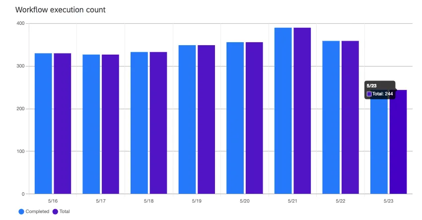
This chart allows you to compare your current workflow execution rates with the week-to-date, displaying workflow executions for the last seven days, as well as the workflows executed so far today. The bars represent successfully completed (blue, left) versus total workflows executed (purple, right). You can hover over the bars to see the values.
This chart is not affected by the date filters or search.
Filterable table of workflows
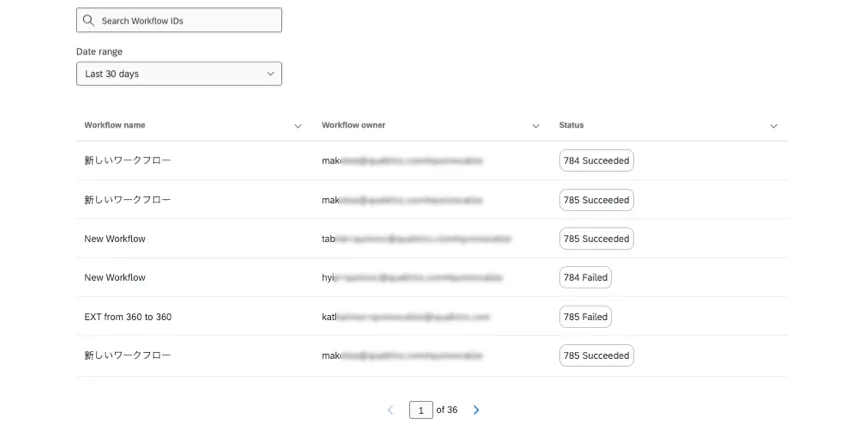
This table shows the most frequently executed workflows in your brand for the chosen date range.
Qtip: You can use this table to determine what workflows to get rid of. For example, it looks like some of the workflows above have failed hundreds of times. This would be a good reason to contact the owner or proxy log into their account to turn the workflow off.
- Search workflows by title, workflow ID, or owner’s username.
- Select a date range of data. You can filter by the last 30 days, the last 7 days, today, or yesterday.
- Rows of results are listed from highest to lowest number of executions. You cannot re-sort rows.
- Click the arrow next to a column name to pin the column to the start or move it right or left.
Alerts for daily Workflow limits
As a Brand Admin, you can also use this report page to set up alerts for workflow consumption. As your organization approaches its daily workflow execution limit, send notifications to key team members. You can customize the exact limit you want to track, meaning you can send alerts well before the limit is reached. These notifications can be sent to multiple recipients over multiple channels, such as email and in-app.
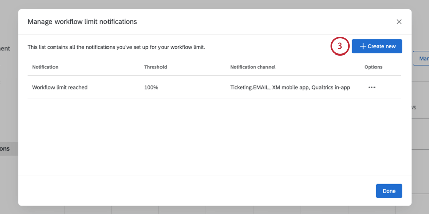
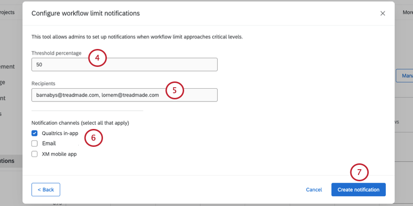
Example: 100 means the alert will send when the limit is reached, with 300,000 workflow executions met.
Example: 50 means the alert will send halfway towards the limit, with 150,000 workflow executions met.
- Qualtrics in-app: Get alerted in the notifications feed of your Qualtrics account.
- Email: Get alerts by email. Although you enter usernames, messages will go to the email address linked to the user account.
- XM mobile app: Get alerted in the XM App.
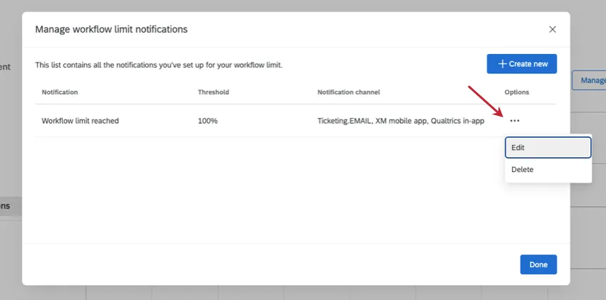
Qtip: You can change these alert details later, by clicking Manage alerts, selecting Options, and clicking Edit. You can also use this menu to permanently remove an alert.
Subscription Credits
Subscription credits are a way you can pay for all types of online panels. Once subscription credits are added to a license, they are shared by users across the organization (brand). Brand Administrators can track their organization’s usage and consumption by using the Subscription Credits admin report.
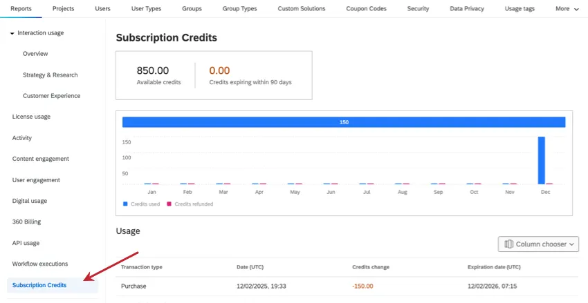
Credits Summary

At the top, there’s a table showing the number of credits currently available for use across the organization. You can also see how many credits are expiring within the next 90 days, so you can plan ahead with your panel setup.
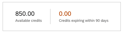
Credits Usage Chart
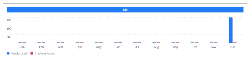
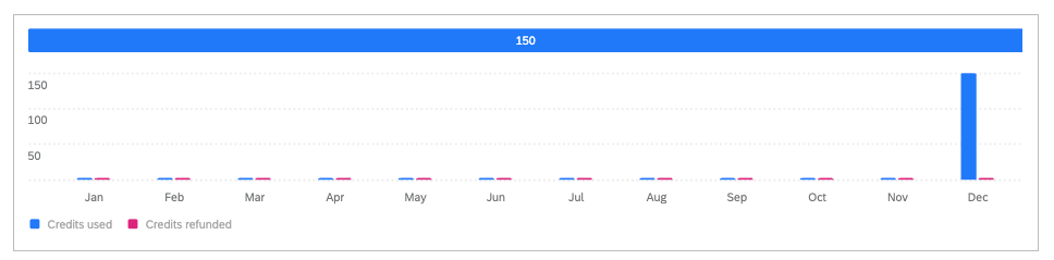
The top of this bar chart shows a horizontal bar. This bar breaks out the total number of credits used or refunded over the year to date.
Below that, the vertical bar chart shows these credit totals broken out by months in this year to date.
Example: In the image above, 150 credits have been used for the year so far, and none were refunded. All of these credits were used in December.
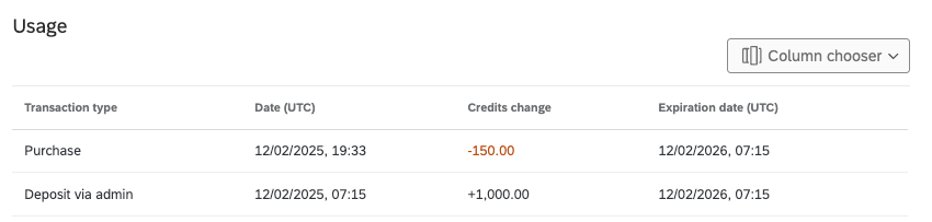
Usage Table
The Usage table shows a list of all panel transactions that have happened in the organization. You can even view more details on each transaction that took place.

Use the Column chooser to customize which columns of information are included for each transaction. Available columns are:
- Transaction type: What type of transaction took place. These include:
- Deposit via admin: The amount of credits added for use by the entire organization (brand).
- Purchase: An individual transaction. In other words, any time a user consumes credits by using them to buy an online panel.
- Refund: Credits returned to an organization’s credit pool after a panel project ends; these are leftover responses that were not completed.
- Expire: Credits that reach 12 months while used. Once expired, those credits cannot be used anymore
- Date (UTC): The date the transaction took place. These dates are in a UTC time zone and MM/DD/YYYY format.
- Credits change: How many credits were added or spent during this transaction. A negative, red number is a purchase, and a black, positive number is a deposit.
- Panel ID: The internal ID for the panel.
Qtip: This is an ID for the online panel created. This ID is not related to contact list ID. - Survey ID: The ID of the survey the panel was created in.
Qtip: You can search for surveys using their IDs on the Projects page and in the Admin page. - Transaction ID: The internal ID for the transaction.
- Expiration date (UTC): The date that the credits mentioned in the transaction expire. These dates are in a UTC time zone and MM/DD/YYYY format.
Qtip: Expiration dates are more useful when checking deposits, refunds, and past expirations. Expiration dates do not impact purchases, since those credits are already consumed. - Deposit ID: The ID of the deposit initially made by the admin. Individual purchases, refunds, and expirations may share the same deposit.
Example: Your admin deposits 1000.00 credits. You then purchase a panel for 300 credits. Both the deposit and the purchase have the same deposit ID, since they’re related to the same pool of credits.
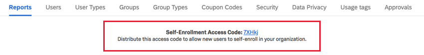
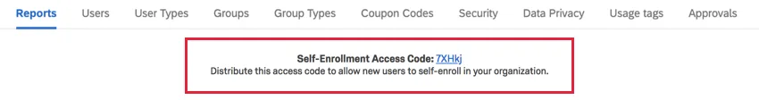
Self-Enrollment Code
Qtip: To view this feature, select Legacy Report.

The Self-Enrollment Code serves as an extra security measure. For example, if you don’t want to restrict the email domains people can use to sign up with your Qualtrics license, you can choose a Self-Enrollment Code instead. This functions as a code new users have to enter when signing up to complete the account.
Qtip: This option is only available for brands with Self-Enrollment enabled. This means users don’t have to ask a Brand Administrator to make an account for them, but can do it themselves. Not all brands have Self-Enrollment codes enabled. Reach out to Account Services if you’re interested in having this permission turned on for your organization.
The Self-Enrollment Code is randomly generated and displayed at the top of your Admin Report as soon as the permission is turned on for your organization.
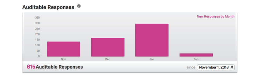
Auditable Responses
Qtip: The License Usage Report is a new feature that performs the same function as the Auditable Responses graph, but with major improvements. We recommend using the License Usage Report instead.
Qtip: To view this feature, select Legacy Report.
This section tracks the number of responses collected in your license. This includes any responses collected on the Recorded Responses page, except Preview Data, Test Data, and Imported Responses.
Qtip: Contact your Account Executive for pricing on importing. Imported responses are considered separate from and will not impact the account’s response limit.
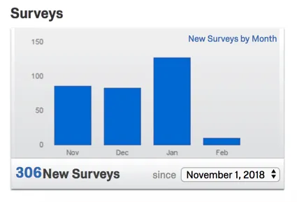
Surveys
Qtip: The Activity Report is a new feature that performs the same function as the Surveys graph, but with major improvements. We recommend using the Activity Report instead.
Qtip: To view this feature, select Legacy Report.

This sections counts all the surveys on the license that have a status of new.
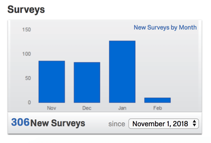
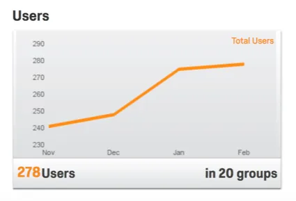
Users
This section counts all users in all groups.
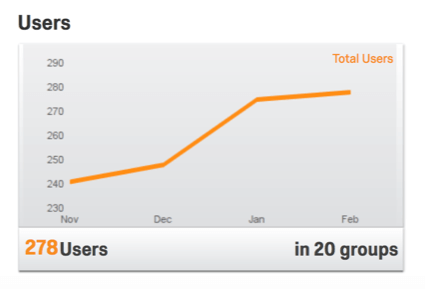
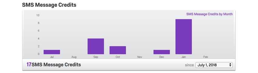
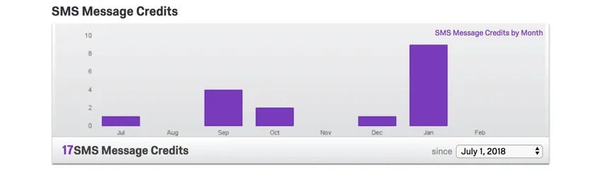
SMS Message Credits
Qtip: The License Usage Report is a new feature that performs the same function as the SMS Credits graph, but with major improvements. We recommend using the License Usage Report instead.
Qtip: To view this feature, select Legacy Report.

If your license has purchased access to SMS distribution, this section will show you how much of your available credit you’ve used.
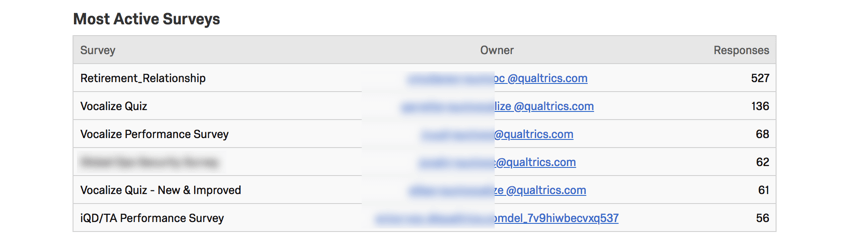
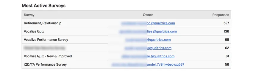
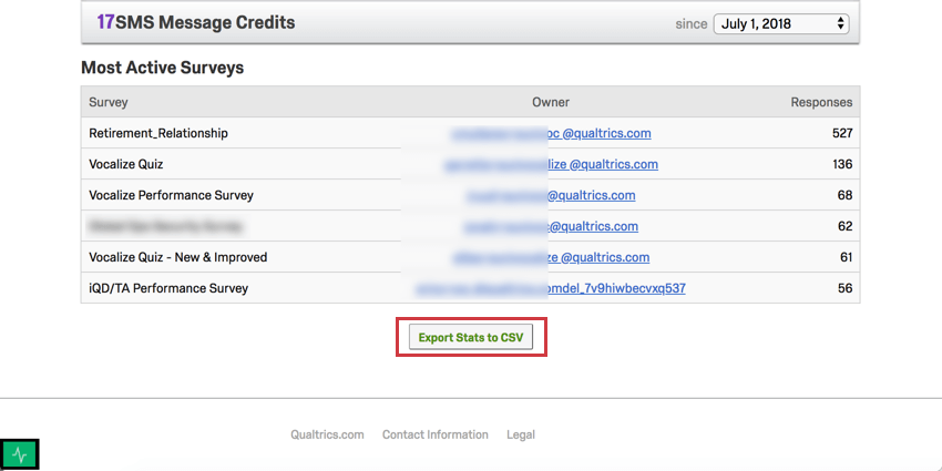
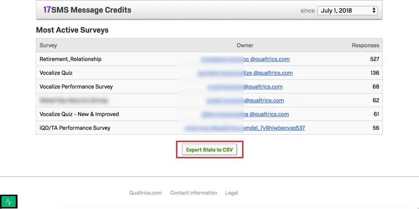
Most Active Surveys
This section is a list of surveys sorted from most to least responses received. The survey name and owner will be displayed.
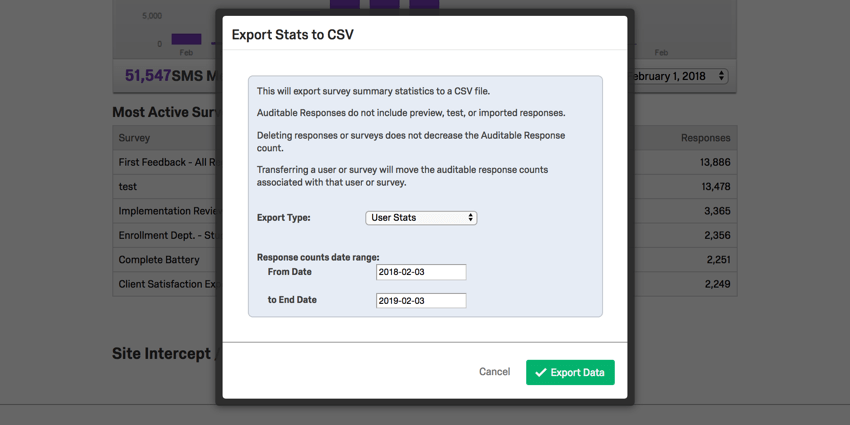
Export Stats to CSV
Qtip: To view this feature, select Legacy Report.

In addition to these metrics, you have the option to export a detailed spreadsheet of the usage statistics for your organization. This export option is found at the bottom of the page.
When you export these stats, you will have the option to specify a date range and the type of data you’d like to export.
Qtip: When choosing a date range for your CSV export, please note that the export will include responses beginning with the From Date selected, but will only include responses that were recorded before the selected End Date.

- User Stats: Statistics for every user in the brand. Includes a column for User ID, username, email, first and last name, the date the user was created, the date their account expires (if such a date was applied), the last time they logged in, user type, user status (enabled, disabled, or not verified), division, number of surveys, auditable responses collected, and “other responses” (previews, tests, etc., which are not auditable).
- Survey Stats: Statistics for every survey in the brand. Includes a column for Survey ID, survey name, survey description (meta description), auditable responses collected in that survey, “other responses” collected in that survey (previews, tests, etc.), survey status, creation date, Owner ID, username of the survey’s owner, first and last name of the survey’s owner, their user type, and their division. Before you export the data, you can choose from a list of columns to sort the data by.
- Survey Stats, Grouped: Export data on auditable vs. “other” (non-auditable) responses. This data can be presented by user (first name, last name, username, or Owner ID), by survey (survey name or Survey ID), or by division.
FAQs
What responses actually count toward my license?
What responses actually count toward my license?
Licensed responses are any completed responses that are not Survey Previews or Survey Tests. Completed responses can include imported responses, finished surveys, and partial surveys that were moved out of responses in progress and recorded. If you ever want to know the exact number of interactions you’ve used, reach out to your Brand Admin. You can also view your response usage by going to Account Settings to view the legacy Account Usage report.
Contact Account Services or your Account Executive prior to importing historical responses, as this may require an update to your license.
How does account usage differ from recorded responses?
How does account usage differ from recorded responses?
Think of recorded responses as the total number of complete responses collected for a survey. This can include individual responses, anonymous responses, imported responses, and more.
Imported responses are billable under the new simplified pricing and packaging plans. If your license is on the new pricing plan, you can check your license’s usage with the Interaction Usage Report. If you are on multiple suites, imports are not currently included in the usage report. If you are not on a new plan, imports are not included in your usage report. Contact Account Services if you have questions about your license.
Account Usage shows you how many responses you’ve collected, labeled as “Allowed Responses.” This excludes imported responses because they are considered separate. If you have questions about pricing for imported responses, reach out to your Account Executive.
That's great! Thank you for your feedback!
Thank you for your feedback!