
Response Ticker Widget
What's on this page
About Response Ticker Widgets
The response ticker widget displays individual response information in a scrolling list. In addition, a numerical value from different fields can be displayed alongside textual information, such as an NPS or satisfaction score, for example.
Qtip: The response ticker scrolls as more feedback appears in the table. It can show a maximum of 10,000 responses, and this limit applies to any widget exports containing visualized data. If your widget contains more than 10,000 responses, then you can export the raw data to CSV or TSV, and this will export the entire set of responses.
Qtip: When exporting the response ticker to PDF, only responses that are currently visible in the widget will export. Check Include all widget content to export all data within the widget.
Types of Dashboards
This widget can be used in a few different types of dashboard. This includes:
- CX Dashboards
- Results Dashboards
- Employee Engagement
- Lifecycle
- 360
- Pulse
- Ad Hoc Employee Research
- Employee Journey Analytics
- Brand Experience
Attention: For EX dashboards with anonymity enabled, the anonymity threshold for comments uses the number of responses (not the number of comments) to determine whether or not to show data. If you have multiple open-ended questions added to the same widget, each response with a comment on any question in the widget will count towards the threshold.
Field Type Compatibility
The response ticker widget accepts multiple fields. Fields can be added under Content, Primary label, Secondary label, Date, and Ticker Value. For an overview of the different field types, read our page on Field Types & Widget Compatibility.
For the Content field, the only compatible field type is Open Text.
For the Primary label, the compatible field types are:
- Text Set
- Text Value
- Multi-Answer Text Set
For the Secondary label, the compatible field types are:
- Text Set
- Text Value
- Multi-Answer Text Set
For the Date, the only compatible field type is Date.
For the Ticker Value, the compatible field types are:
- Numeric Value
- Number Set
Only fields with the above types will be available when selecting data fields for each component of the response ticker widget.
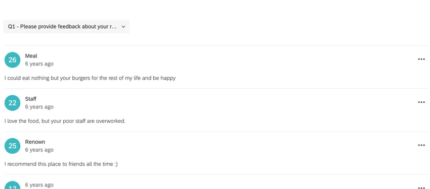
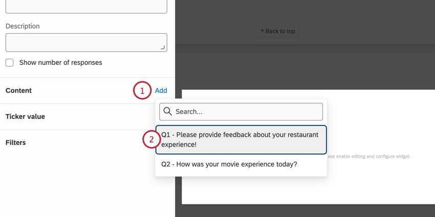
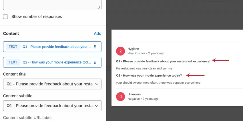
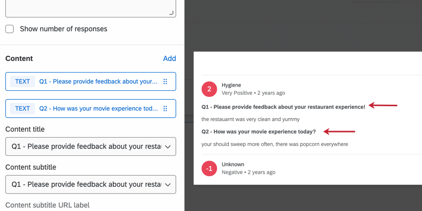
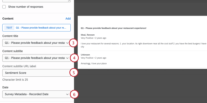
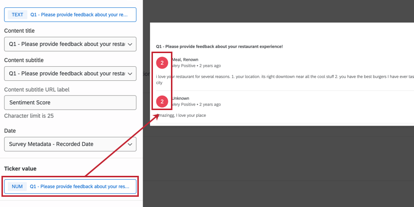
Content
The content configuration is where you determine which open-text field, such as customer verbatims or feedback, to include in the response ticker.
Qtip: When multiple content fields are selected, each response will show all content fields with the field name displayed above.
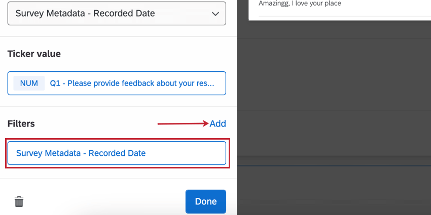
TICKER VALUE
The ticker value is displayed to the left of every response in the widget. This value is compatible with number and number set field types.

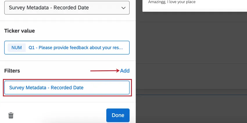
FILTERS
Add filters to your widget for a more granular look at the data in your chart. Click Add and then decide which metrics to include or exclude. To configure the filter, click the filter and edit the properties in the menu. For more information, see Filtering CX Dashboards (Employee Experience version of page).
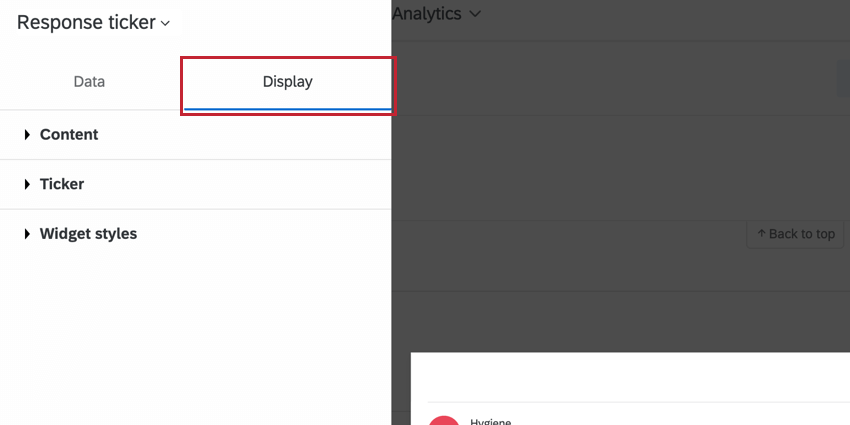
Display Options
Configure display options to customize the data in the response ticker widget.

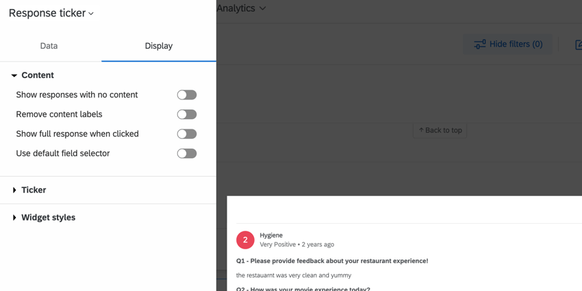
CONTENT
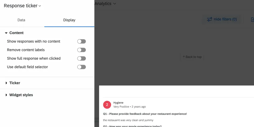
- Show responses with no content: Enabling this option will display all responses, including those that do not contain data for your chosen content. Deselect this option to hide empty responses.
- Remove content labels: Enable this to remove content field names from the widget. If you selected more than one content field, content will be separated by only a line break. If one of the fields was left blank, it will say “N/A.” If you do not like how this looks, you can always try using the default field selector.
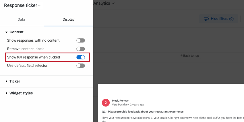
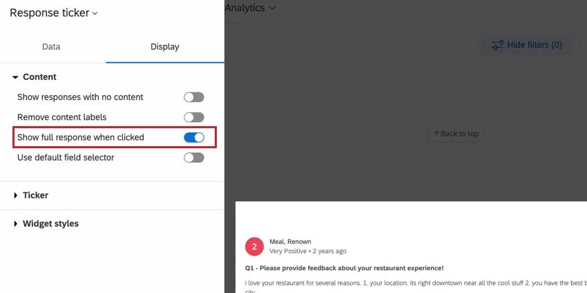
- Show full response when clicked: When enabled, clicking on the response displays a detailed record allowing you to view related tickets, action those tickets, and email the client from the ticket. For more information, see Enabling the Full Response Records. This feature is only available in CX Dashboards and is not available in Engagement, Lifecycle, Ad Hoc Employee Research, 360, or Pulse dashboards.
- Show Email tab in full response: When enabled, clicking on the response displays an Email tab where you can email the client without a ticket. This option only shows up when Show full response when clicked is enabled. This feature is only available in CX Dashboards and is not available in Engagement, Lifecycle, Ad Hoc Employee Research, 360, or Pulse dashboards. Qtip: For this option to work, a Brand Administrator must also make sure Disable “Send Email” button in tickets is not selected in Ticket Settings.

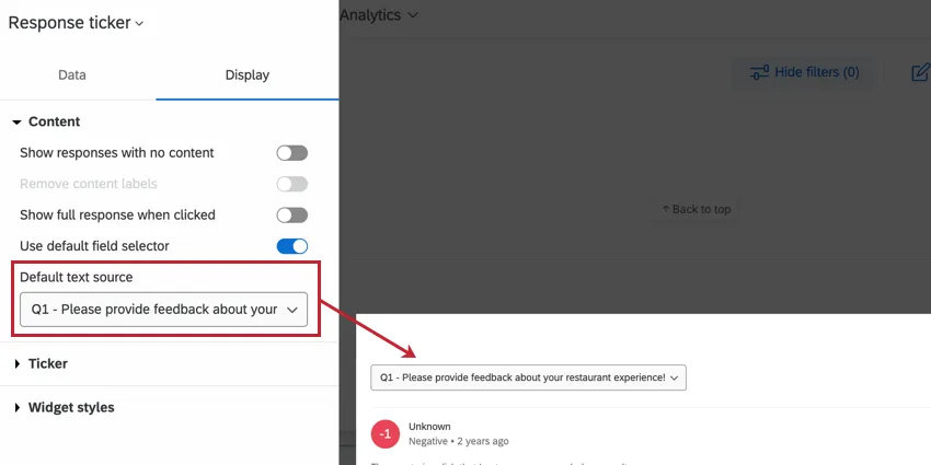
- Use default field selector: If you’ve added multiple content fields to your response ticker widget, you may want to choose a field to display as default, and just make the rest available for selection from a dropdown. Select Use default field selector to create a dropdown on your widget that users can adjust when you have multiple content fields.

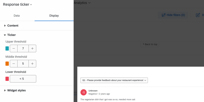
TICKER
Adjust how the color changes for each ticker value by configuring the range. Use the plus ( + ) and minus ( – ) signs to manually adjust the values in the range, or you can type directly in the fields.

Attention: Thresholds will be applied when the response value is greater than or equal to the threshold value.
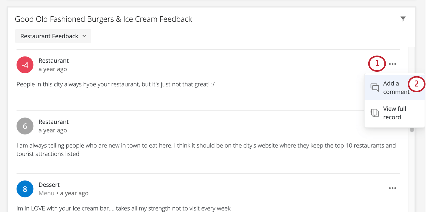
Commenting on Responses
Qtip: “Commenting” must be turned on within the dashboard’s settings to allow commenting to appear in the widget. This setting can be found in the Theme section of your dashboard settings.
The response ticker widget allows you to leave comments on the responses it displays. This section describes how to use this functionality on desktop, but it is also available on mobile; see the Qualtrics XM App page for details.
Users with either view or edit access to the dashboard (CX|EX) can add comments. Users cannot comment on any pages, data, or dashboards they do not have permission to view. Once created, a comment can be viewed by all the users with access to the corresponding pages or data in the dashboard.
Qtip: It is not possible to disable commenting in an individual widget.
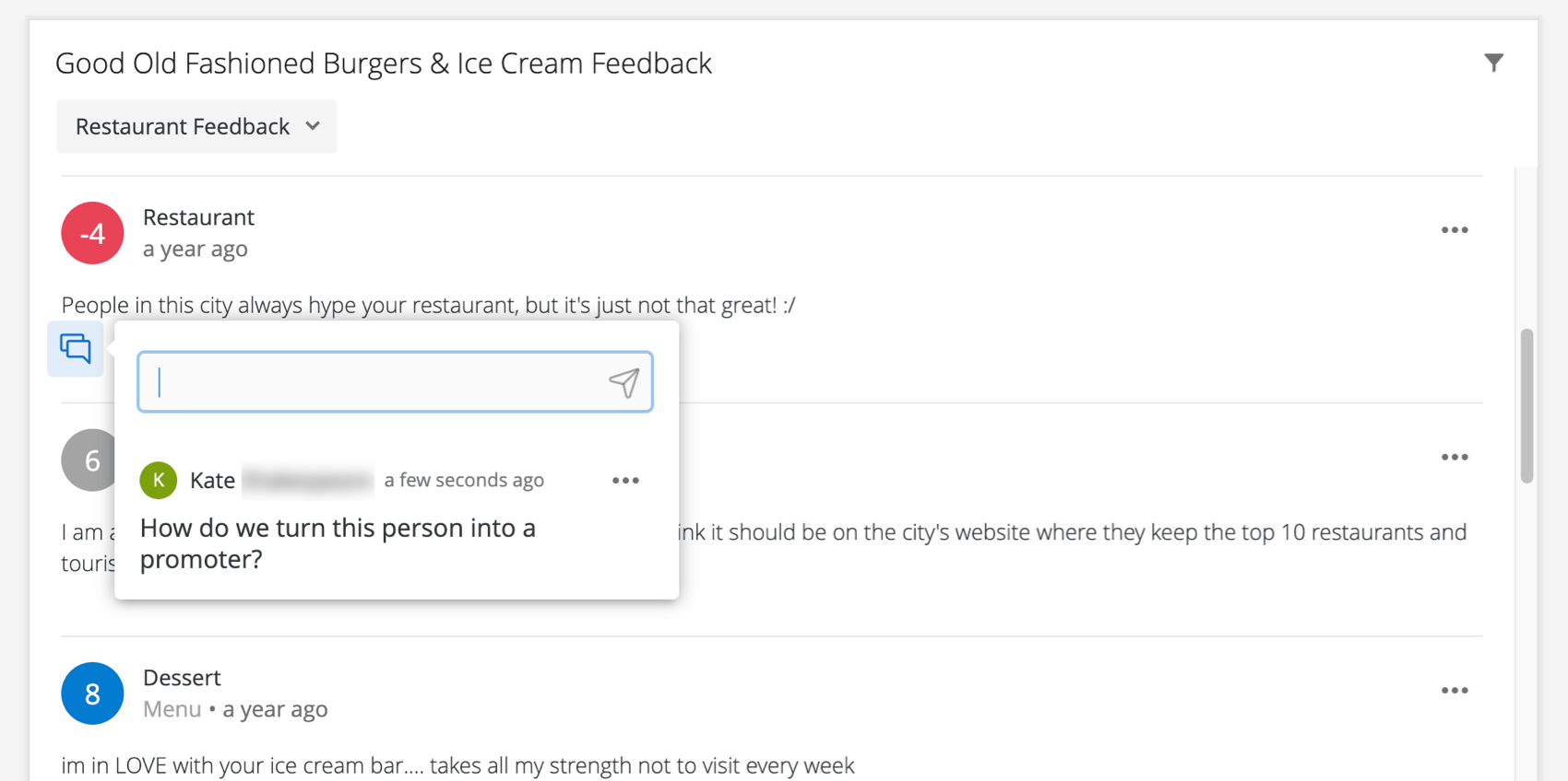
Leaving Comments on Responses
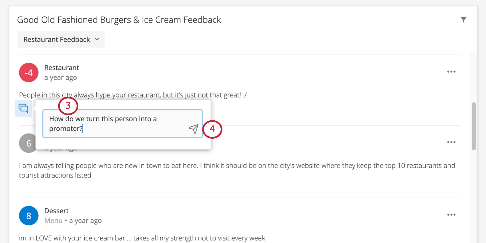
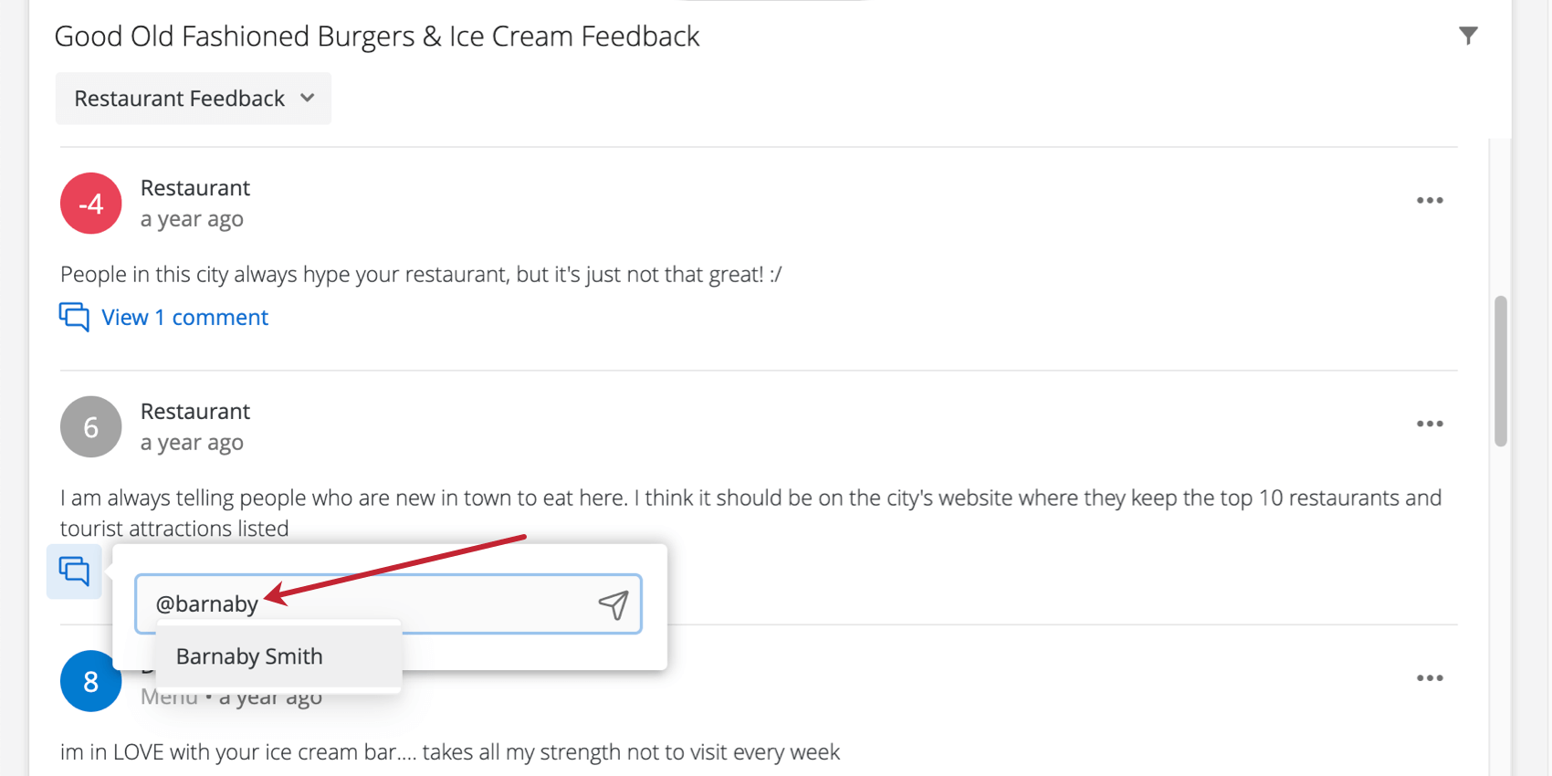
Mentioning Users in Comments
You must have the “Access Organization Address Book” user permission enabled if you want to mention other users in comments. To mention someone in a comment, type @ followed by their name (e.g., @Barnaby). Click the user when their name appears in the list.

Qtip: You can only mention users that already exist in your Qualtrics brand.
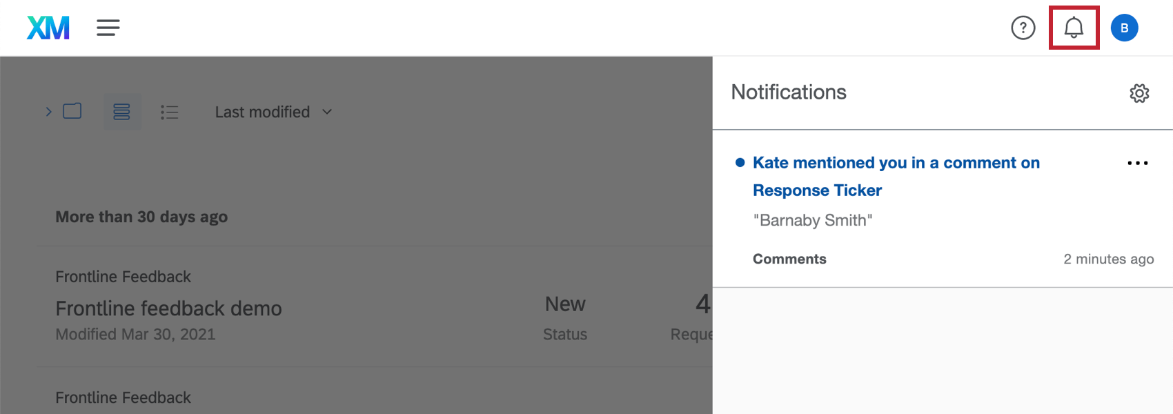
Once you post the comment, the user will receive a notification. The notification will include the comment and, once clicked, link the user to the response ticker in the dashboard.
Qtip: You will also get a notification if someone responds to a comment you left, regardless of whether they mentioned you.
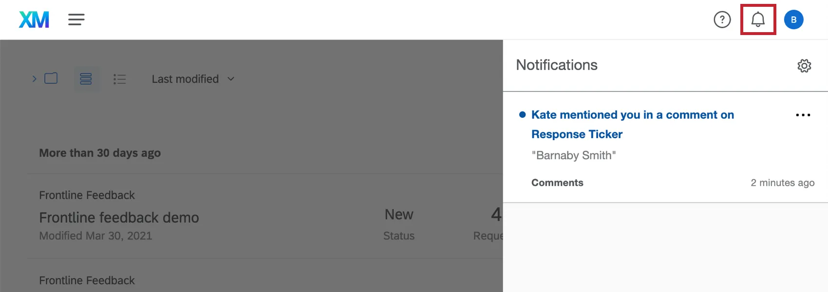
In the menu that opens from the notification, the user can leave another comment.

Attention: Mentioning someone in a comment will not automatically share the dashboard with them; that means if they do not have permission to view the dashboard, they will not see any of its data, even if they click the notification to try to go to the dashboard.
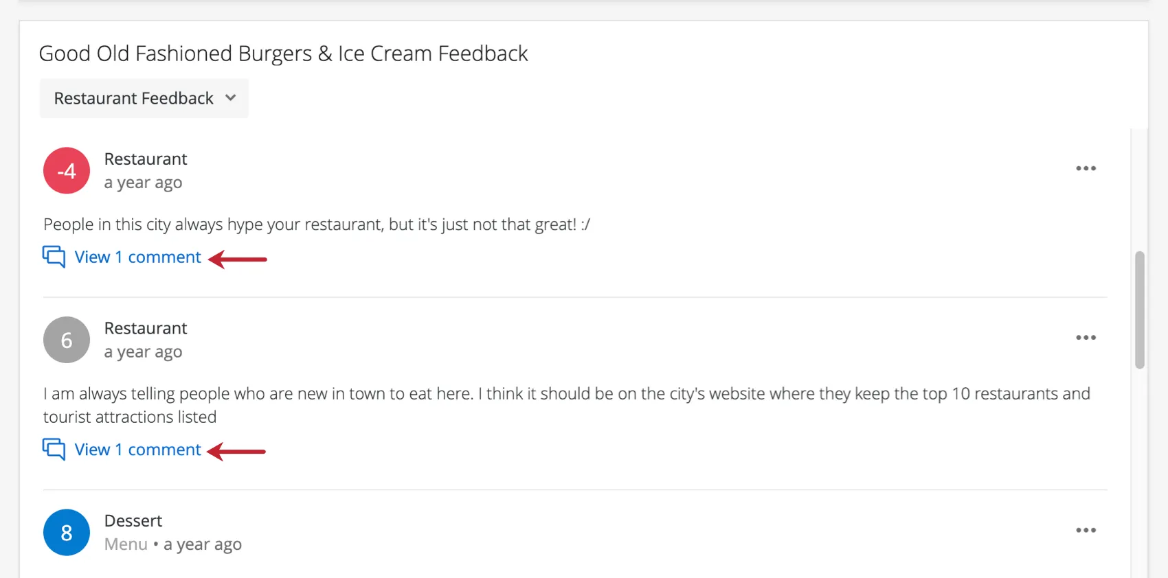
Viewing Comments
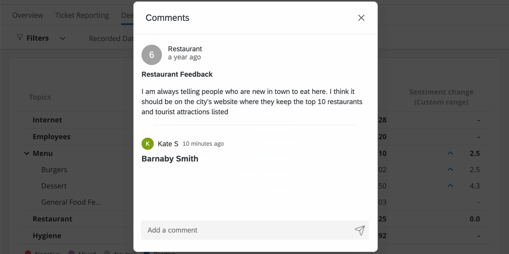
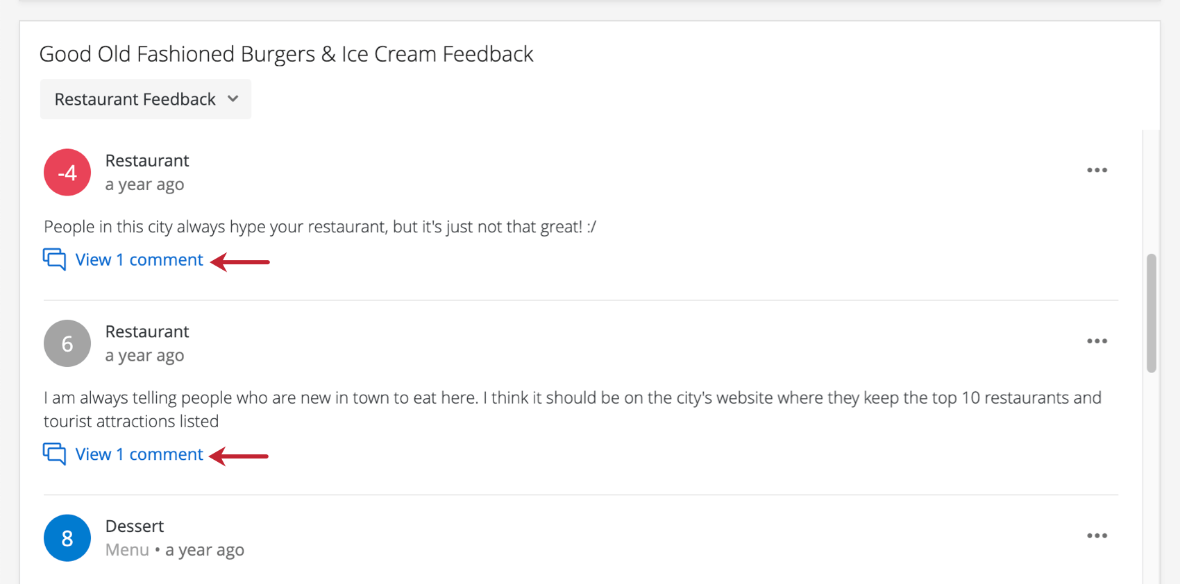
Once comments are left on a response, they can be viewed by clicking the View # comment(s) text. Comments will be listed from newest to oldest, with the most recent on top.
From the menu that expands, you can also leave additional comments.
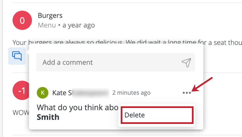
Removing Comments
To delete a comment, click the dropdown next to it and select Delete.
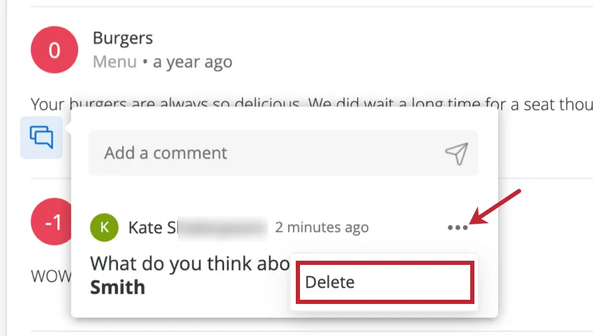
You can only remove comments you made. Admins cannot delete other users’ comments.
Searching by Keyword
The response ticker widget allows dashboard viewers to search responses by keywords. This is accomplished by adding a filter by following the steps below:
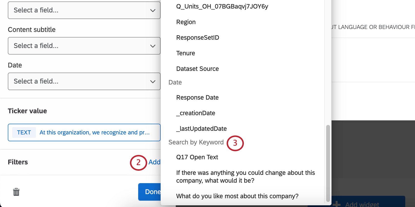
By default, users will be able to specify whatever keyword they’d like to filter by. If you want to limit the keywords users can filter by, you can do so by following the procedure below:
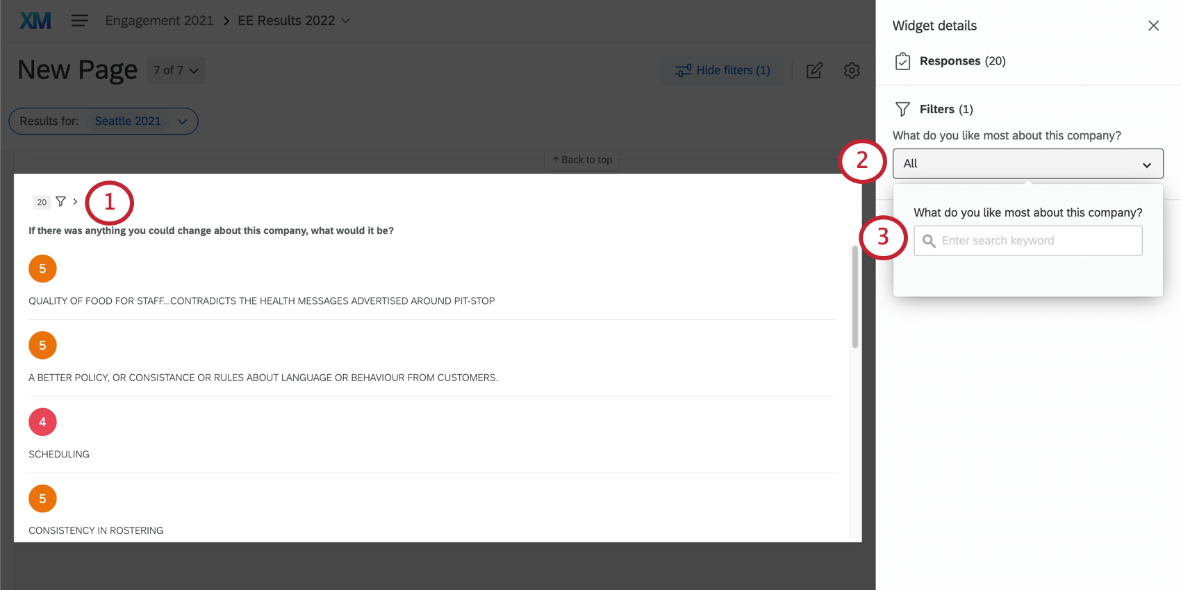
Qtip: Symbols can be used to specify choices when searching keywords. The search functionality can search exact phrases by using quotes (“Chocolate Chip“), use an OR operator to match either phrase (cinnamon OR sugar), and remove negative matches using a minus sign (–peanut butter -“peanut butter cookies“).
Enabling the Full Response Records (CX)
Attention: This feature is only available in CX Dashboards.
You can make it so that when someone in your dashboard clicks a widget, they can view a detailed record of the response, view related tickets, action those tickets, and then email the client from the ticket. This seamless integration prevents your dashboard users from having to navigate between their tickets and the dashboard.
To enable this feature, select Show full response when clicked in the display options menu.
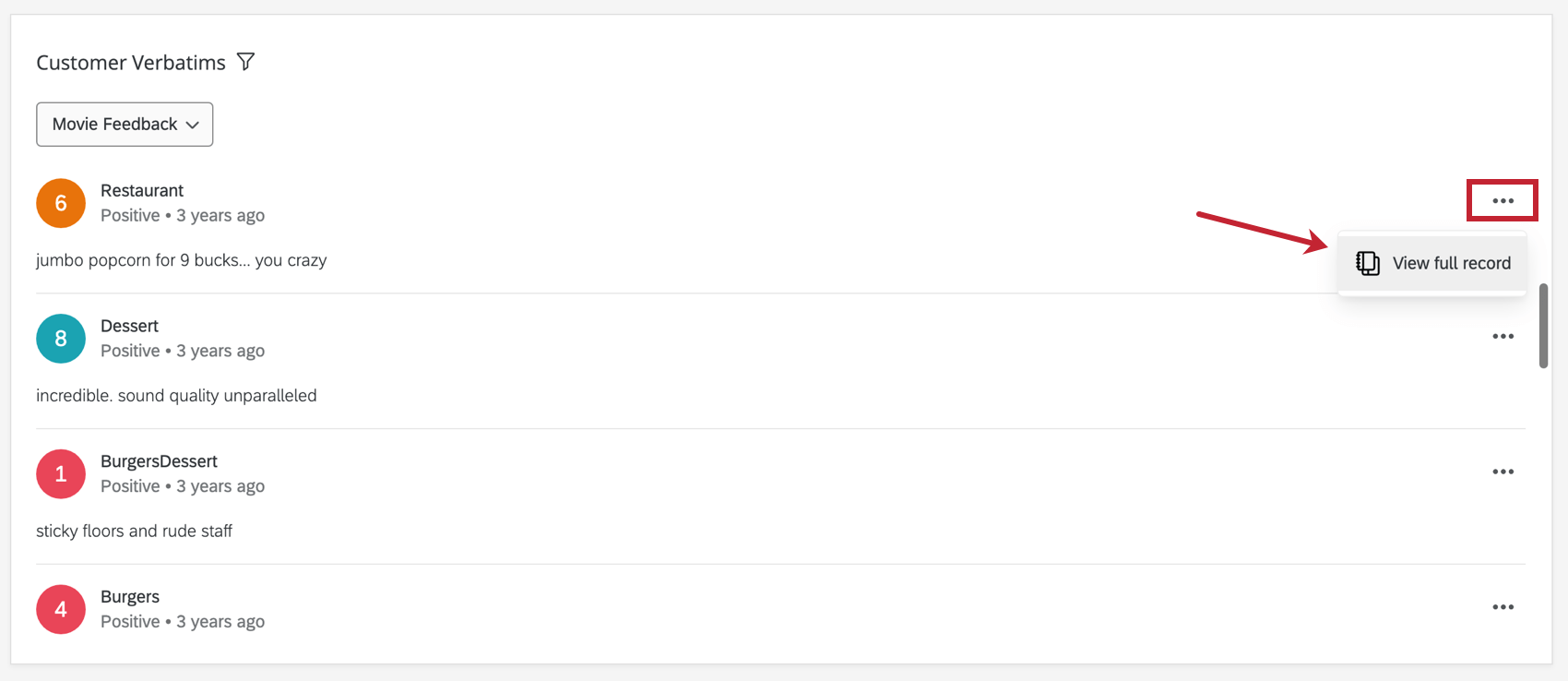
After this setting is enabled, all your dashboard users have to do is click the dots in the upper-right of a response and then select View full record.
Qtip: When using ticket reporting, this option will not be available.
Making Edits to the Record
Qtip: Only dashboard administrators can edit the record.

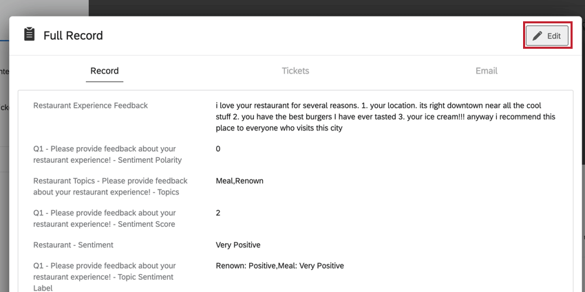
Customize how the response record appears when your users view it. Edit your dashboard, select any response record, then click Edit in the upper-right.
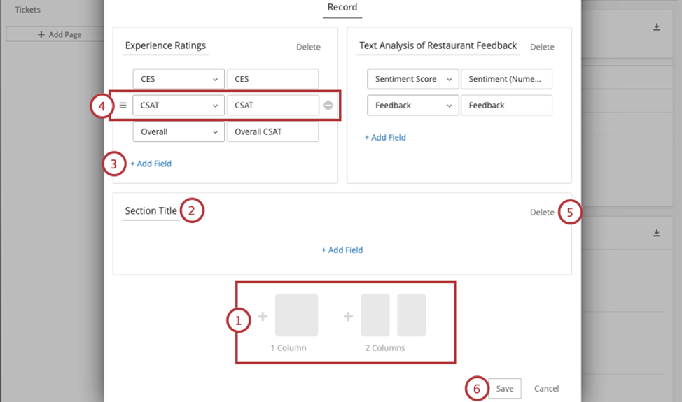
Qtip: The fields available in records are pulled from the dashboard data. When selecting fields, you will see every field mapped in your dashboard, not just a list of specific survey fields. If you want to report on a particular field, make sure it is mapped to the dashboard.
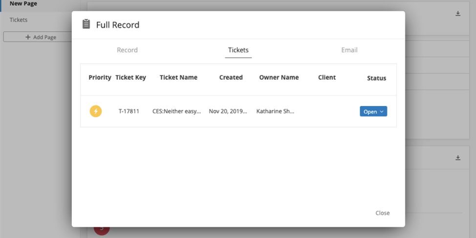
Tickets Tab
In the Tickets tab, dashboard users can perform all the same functions they do on the tickets page. The only difference is that this tab is filtered to only show tickets assigned to the user that were generated by this survey response.
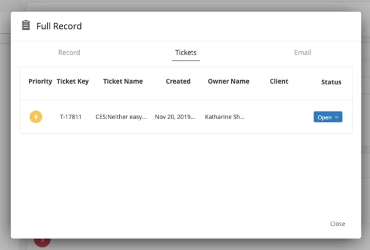
Functions include:
- Expanding and collapsing tickets
- Changing the ticket status
- Assigning tickets to users or teams
- Assigning priority
- Root cause
- Ticket summaries
- Ticket data
- Activity
- Deleting tickets (Brand Admins only)
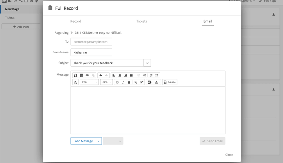
Email Tab
Qtip: To view this tab, you must enable the Show Email tab in full response setting in Display options. A Brand Administrator must also make sure Disable “Send Email” button in tickets is not selected in Ticket Settings.
In the Emails tab, you can perform the same email functions you normally would on the ticket. You can also send emails before a ticket is created.
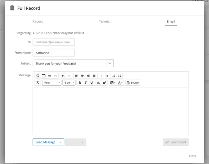
See Follow Up Emails on the ticket support page for more information.
Qtip: If your brand has a custom from address, then this email will be sent from that address. If your brand does not have a custom from address, then this email will be sent from noreply@qemailserver.com.
FAQs
I have multiple datasets on my dashboard. Can I use this feature with all of my widgets?
I have multiple datasets on my dashboard. Can I use this feature with all of my widgets?
- Changing which dataset your widget shows: Not all widgets can have their referenced dataset switched. Some can only use the default dataset. For a compatible list, see this section.
- Showing multiple datasets in the same widget: Not all widgets can show multiple datasets’ results at the same time. For a compatible list, see this section.
That's great! Thank you for your feedback!
Thank you for your feedback!