-

Qualtrics Platform -

Customer Journey Optimizer -

XM Discover -

Qualtrics Social Connect
Pivot Table
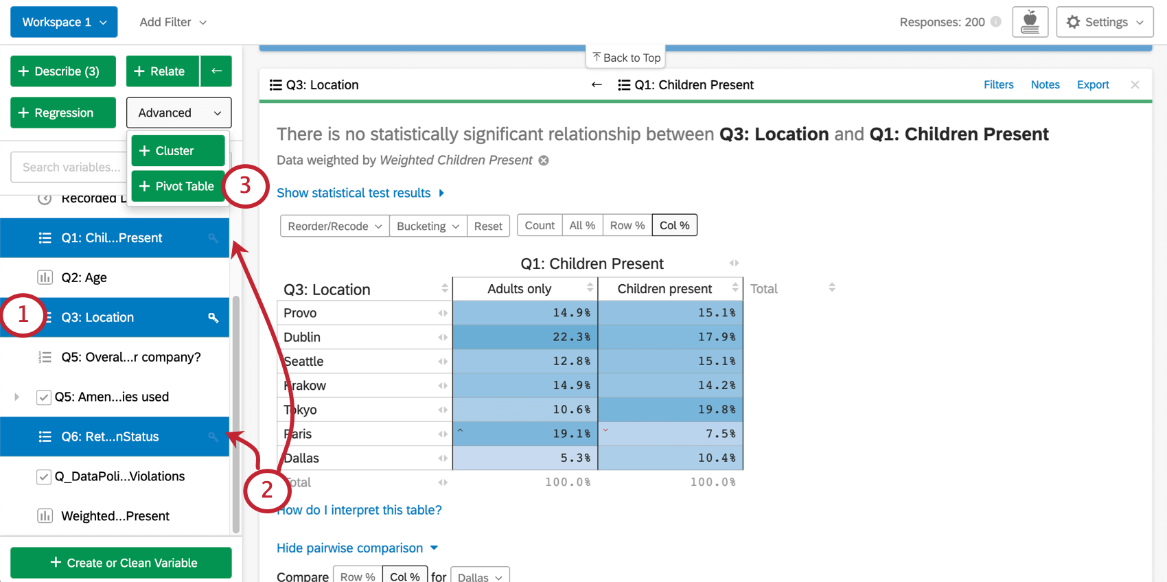
About Pivot Tables
Creating a pivot table allows you to compare variables to each other in a heavily customizable, cross tab-like table. The cell values for the table can be changed to display the data in many different ways.
Selecting Variables for Pivot Table Cards
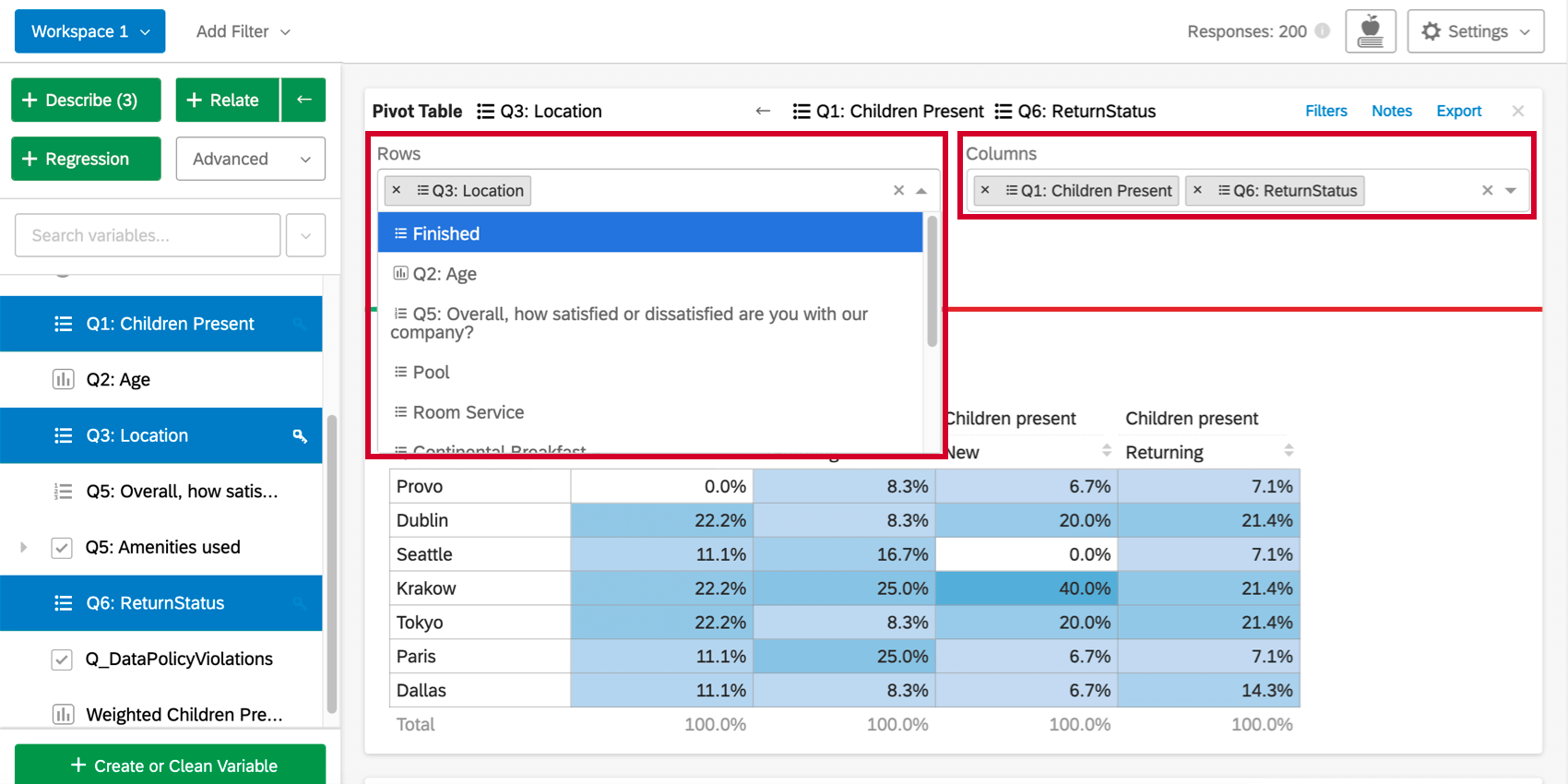
- The first variable that is selected when choosing variables for a pivot table will be the key variable. If the key variable is a categories variable, its values will form the rows in the pivot table.
- All categories variables selected after the key variable will be columns in the pivot table. If more than one column variable is selected, a separate column will be created for each possible combination of the variable values (e.g if your columns are “Age” and “Country,” you might get columns like “Young” and “USA,” “Young” and “UK,” “Old” and “USA,” “Old” and “UK,” etc.). Any number variables selected will populate the cells in the table.
- Once the desired variables are selected, click Advanced and then Pivot Table to create the card.
Adding Rows and Columns
Once you’ve created the pivot table, clicking the Rows or Columns dropdown above the table will allow you to add more variables to the rows or columns of the table. Each additional variable added will break out the table so that there is a row or column for each combination of variable values.
Changing the Cell Values
By default, the cells of the pivot table card will display the column percentages (the percentage of each column that falls into each row value). This value can be changed by clicking the the dropdown under Values, or by initially including a numbers variable. The first set of options for cell values use the data for the selected rows and columns.
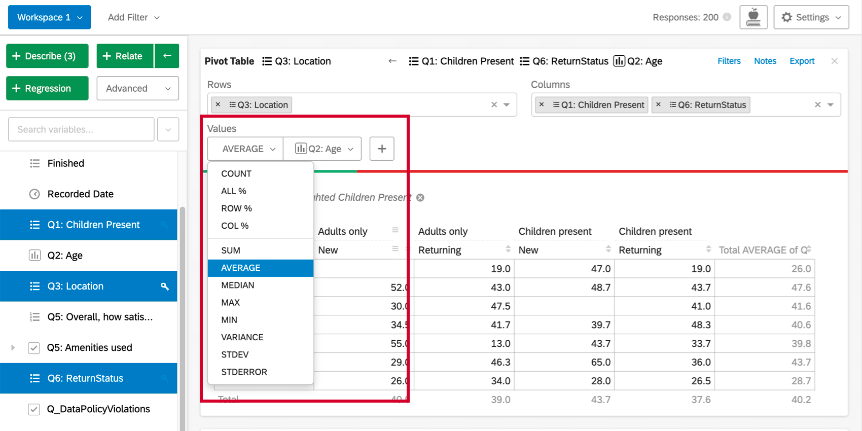
The second set of options (sum, average, median, max, min, variance, and standard deviation) allows you to use statistical values from other variables in the dataset in the table cells. For example, you may want to find the average income of any respondent who falls into a given cell.
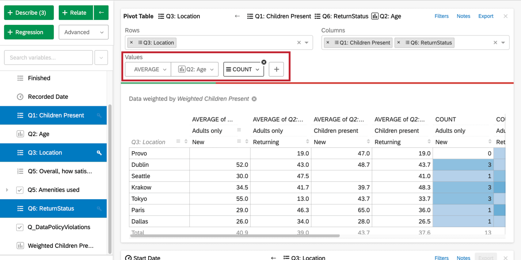
You can also click the plus sign ( + ) to add additional data to your table. Hover over a value to re-order it or remove it.
Stats iQ Pivot Table vs. Regular Crosstabs
Pivot tables in Stats iQ differ from traditional crosstabs, such as the ones created in the Crosstabs section of Data & Analysis.
- Unlike a traditional “banner and stub” cross tab, when multiple variables are added to the columns on a Stats iQ pivot table, there will be a column created for each combination of the values for all of the column variables. In a traditional cross tab, a column is created for each variable value individually, such that one variable’s values are to the side of the other’s and not nested underneath them.
- In Stats iQ, you have the ability to use values from other (non-row or column) variables in the cells of the table. This creates the potential for a wider range of information to be displayed.
Statistical Tests Within Pivot Tables
The significance arrows for each cell in the pivot table are determined in the same way as they are in the table created when relating two categorical variables. Specifically, the arrows are determined by the adjusted residual of each cell. Stats iQ shows up to three arrows, depending on the p-value calculated from the adjusted residual. A different number of arrows will be shown depending on the degree of significance of the result. Specifically, one arrow is shown if the p-value is less than alpha (?) where ? = (1 – Confidence Level) (the confidence level is set under analysis settings), two arrows if the p-value is less than ?/5, and three arrows if the p-value is less than ?/50.
For example, if your confidence level was set to 95%:
- p-value <= .05: one arrow
- p-value <= .01: two arrows
- p-value <= .001: three arrows