Loading...
Skip to article
  • Qualtrics Platform
    Qualtrics Platform
  • Customer Journey Optimizer
    Customer Journey Optimizer
  • XM Discover
    XM Discover
  • Qualtrics Social Connect
    Qualtrics Social Connect

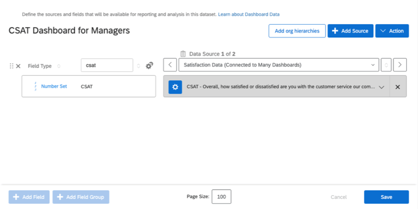
Step 4: Building Your Dashboard (CX)


Was this helpful?


This site is protected by reCAPTCHA and the Google Privacy Policy and Terms of Service apply.

The feedback you submit here is used only to help improve this page.

That’s great! Thank you for your feedback!

Thank you for your feedback!


So far, we’ve made a dashboard, configured its source, and thought about who the dashboard is being made for. Now it’s finally time to build it! In this lesson, we’ll talk about widgets (especially the favorites) and filters.

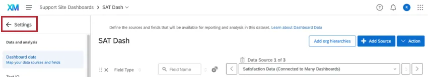
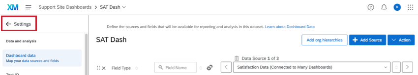
Qtip: If you are not sent to your dashboard after you save your first data source, click the Settings arrow in the upper-left.

In dashboard settings, there's an arrow in the upper-left that says Settings, and its pointing left

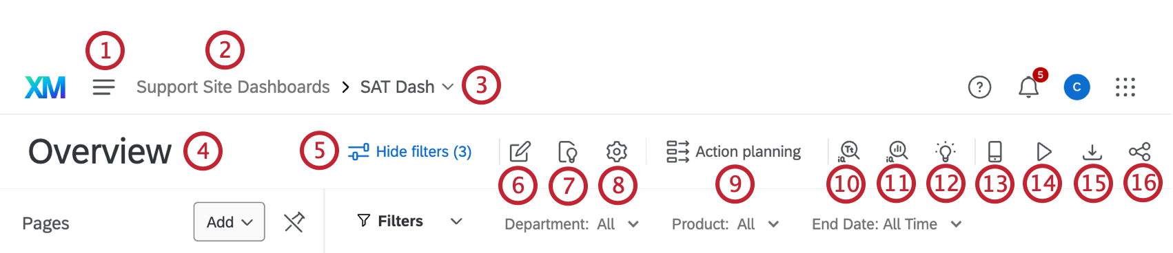
The Basics of Navigating and Editing a Dashboard

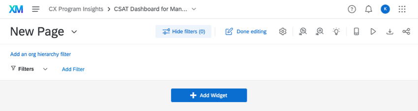
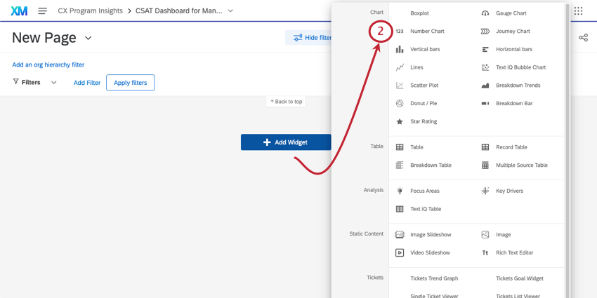
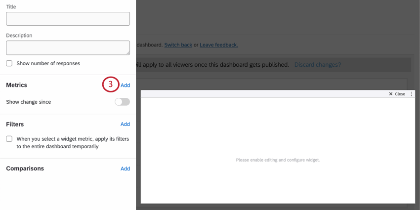
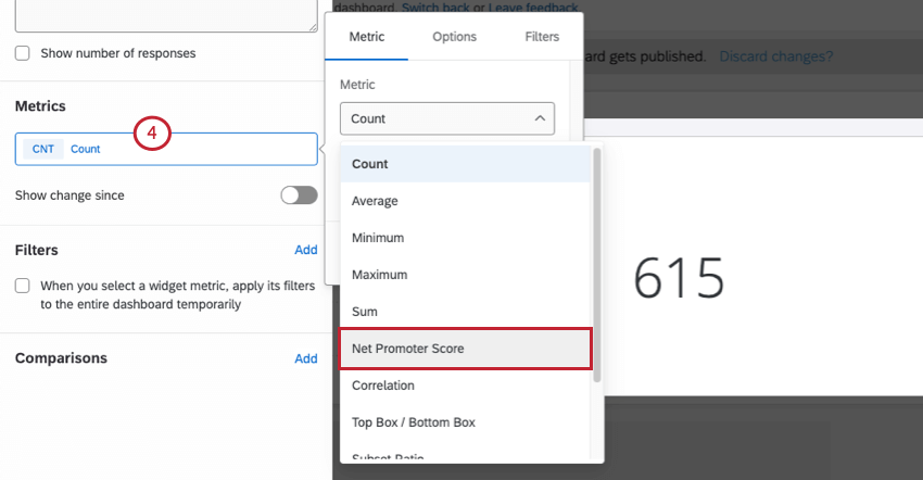
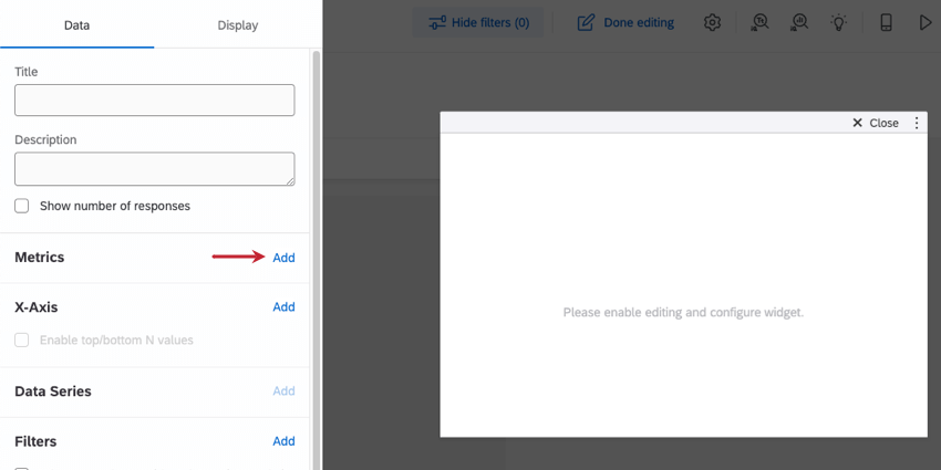
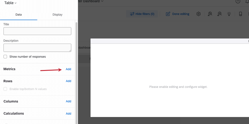
Now that you’re inside the dashboard, let’s go over the basics of where you are and how to get around. The numbers on the screenshots correspond to the numbers in the list.

Qtip: Note that you can also navigate through the entire dashboard using your keyboard (use the Tab key to move forward, ShiftTab to move backwards, and the Spacebar or Return/Enter key to select an option) and navigate and change filters with the keyboard as well.

Numbered guide to the many icons and features in the headers above your dashboard

  1. This is the global navigation. You can use it to navigate out of your dashboard to other parts of the Qualtrics platform. What’s available in this list will vary based on what you’re allowed to do in your account, but most users have access to a Projects page, where all your projects will be listed, and the catalog, where you create projects. This menu is also how you access your tickets.
  2. This is the name of the overall dashboards project you are inside. Click this to return to the list of dashboards in the project. This screenshot shows where you’ll go after clicking the dashboard project name:
    Inside a dashboards project instead of the dashboard
  3. This is the dashboard you’re currently editing. You can click its name to open a dropdown list of other dashboards in your account, and navigate to them. This screenshot shows what this dropdown looks like:
    Dropdown list of dashboards inside the project
  4. This dropdown shows the page you’re currently on. If you click it, you can navigate between different pages. If you’re in edit mode, you’ll also see additional page options, such as copying, deleting, or renaming an existing page, or adding a new page.
    Menu opens to the left, showing dashboard pages

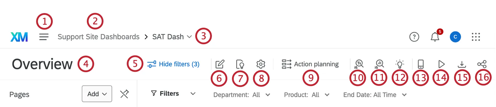
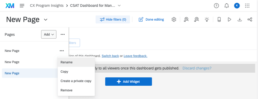
    Qtip: If you’d like to display your page list all the time, click the options next to the Add button, and select Always show pages. This setting applies to all of the dashboards you have switched to the new experience. You can deselect this option any time.
  5. Click the Hide filters button to hide your filters, and click Show filters to show them. This button does not remove the effects of the filter on the data.
  6. Click this button to edit your dashboard. The following screenshot shows how the Add Filter and Add Widget buttons appear after it is clicked:
    Editing mode. Done editing button blue upper-right, add widget button bottom center
  7. The settings gear will take you to the dashboard settings. Here you will be able to return to the data source we described in a previous lesson, or adjust other settings, such as ticket data, notifications, response weighting, the dashboard’s theme, and more. This screenshot shows what page opens after the gear is clicked:
    Dashboard data with lists of fields
  8. The Action planning button takes you to the action planning page of your dashboard. Here, you can assign tasks and plan resolutions to some of your company’s biggest issues with customer experience. See Action Planning (CX).
  9. This button takes you to your dashboard’s Text iQ. On this page, you can perform text analysis on any open ended feedback you’ve captured in your data.
  10. This button takes you to your dashboard’s Stats iQ.
  11. The lightbulb icon takes you to the Insights page, where you can identify areas of improvement and strength.
  12. The mobile preview option lets you see how your dashboard will look on a mobile device. It is helpful if you’ve enabled a dashboard for viewing on the XM app.
  13. In Kiosk mode, CX Dashboards will automatically rotate through your pages after 30 seconds or so. This is useful if you’d like to display your dashboard on a screen or projector.
  14. If the dashboard is available to download (which depends on how it was shared with you), you can use this button to download the dashboard or email it to someone.
  15. Share your dashboard. We’ll talk about this more later in this Getting Started guide.

Common Widget Configurations

Sometimes it’s easier to learn by example. We have a support page for every CX Dashboard widget, but rather than ask you to read each of those, let’s learn the basics of widget-building by making some of the most commonly used widgets.

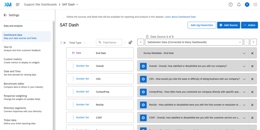
Attention: Below, we show how fields appear when mapped in the data mapper. However, these are the same field types you would use in the data modeler.
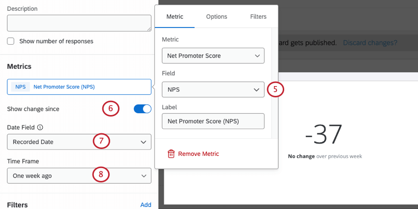
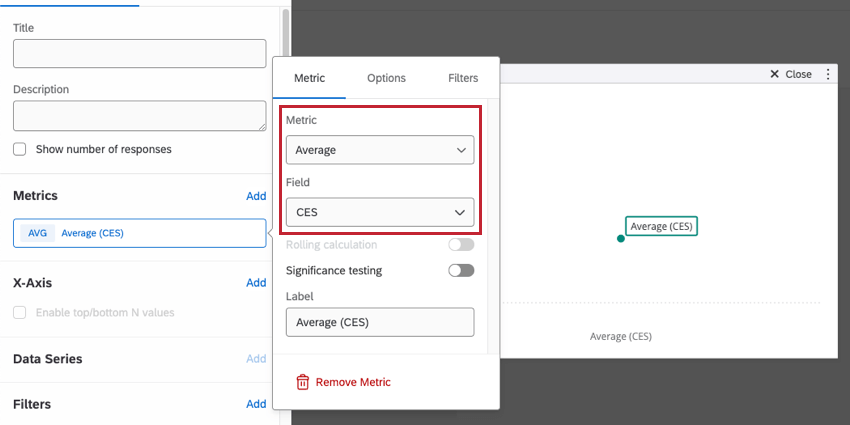
NPS and its Change since…

Number charts are a useful widget if you want to display a metric (in this case, NPS) and how it has changed over time.

  1. Make sure your NPS is mapped in your data source as a Number Set field.
    Fields in a data mapper

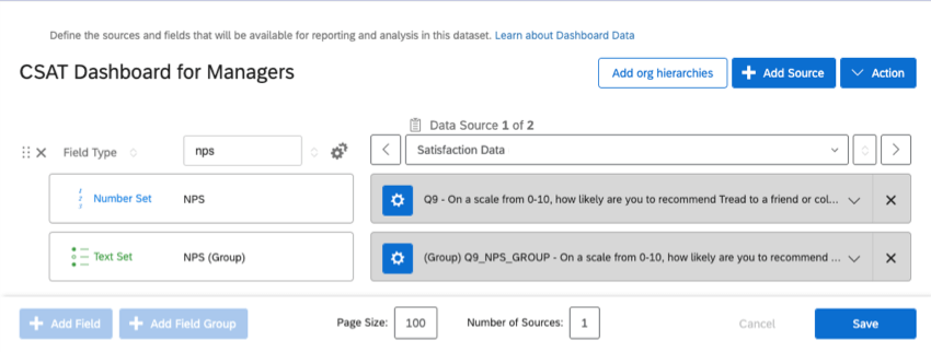
    Qtip: The numeric value of NPS should be mapped as a Number Set, which is what we’re using in this example. The NPS group should be mapped as a Text Set.
  2. Add a number chart widget to your dashboard.
    Menu expanded from add widget button
  3. Add a metric.
    Once clicked into widget, editing pane opens to left, and theres a field when you scroll down that says add metric

    Qtip: For more on understanding “metrics” in a widget, see Metrics.
  4. Click Count and change the metric to a Net Promoter Score.
    Green count button in the same metrics section of the widget editing pane
  5. Set your Field to your NPS field.
    Back in the widget editing pane
  6. Enable Show change since.
  7. Make sure you’re using the correct date field.
  8. Choose the timeframe of the change you want to highlight.
  9. On the Display tab, you can customize the colors for increases and decreases.
    Choosing colors for increase and decrease
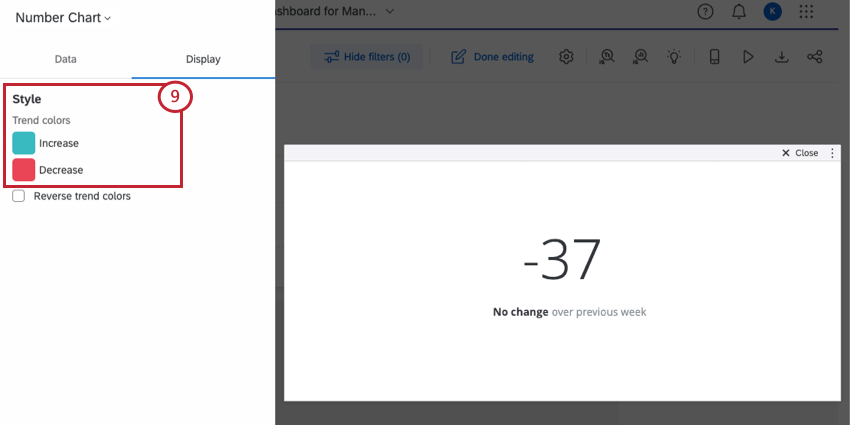
Qtip: See the Number Chart support page for more customization options.
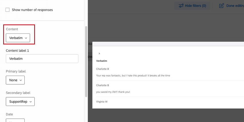
Verbatims

When collecting verbatims (or “open feedback”), you always want to map these fields as Open Text. From there, you have a few widget options you can use to display this data. Word clouds are a quick, popular choice. However, if you want to communicate more detailed information about verbatims and the customers who provided them, we’d recommend using a response ticker instead.

Response tickers display a scrolling list of the responses your customers provided in addition to a numeric score, such as a CSAT, NPS, CES, or anything else you desire to highlight with their response. That way you can see both the rating a customer provided and the specific feedback they had about the experience.

  1. Make sure the question or field where you collected verbatims is mapped as an Open Text field. Also make sure you have whatever additional scores you want to add mapped as Number Set or Numeric.
    Dashboard data mapper with fields described
  2. Add a response ticker widget to your dashboard.
    Menu expanded from add widget button
  3. Under Content, enter the field where your verbatims are mapped.
    Once clicked into widget, editing pane opens to left, and theres a field dropdown called "Content"
  4. Determine if you want to add primary, secondary, and date labels. Here, we also added the Support Rep who helped the customer and the date the CSAT was submitted.
  5. Under Ticker Value, select the CSAT field.
    Ticker Value and thresholds highlighted in widget editing pane
  6. Determine the thresholds that should change the CSAT’s associated color. Make sure the scale makes sense for a CSAT – here, we had to change the upper threshold to 5, since that’s the maximum CSAT.
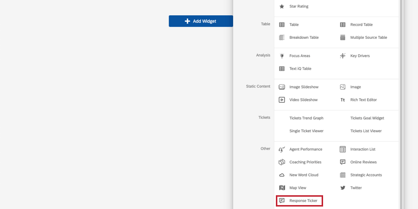
Qtip: See the Response Ticker support page for more customization options.

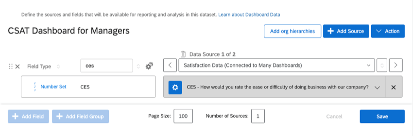
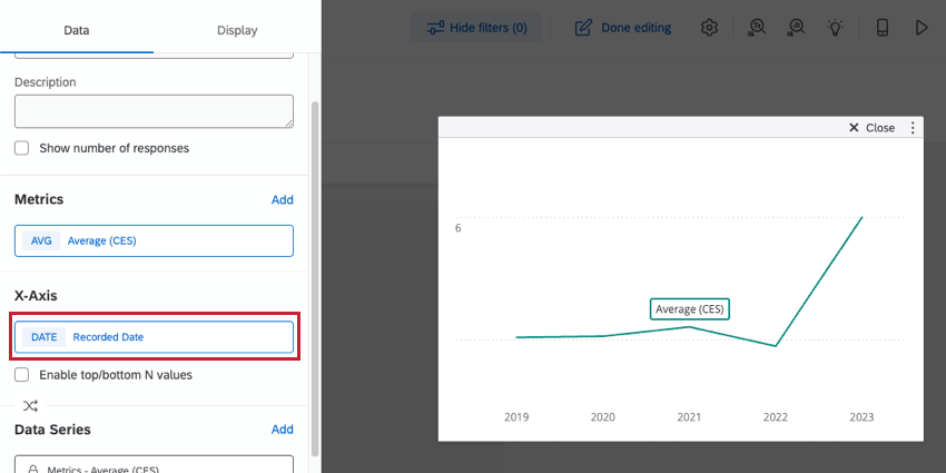
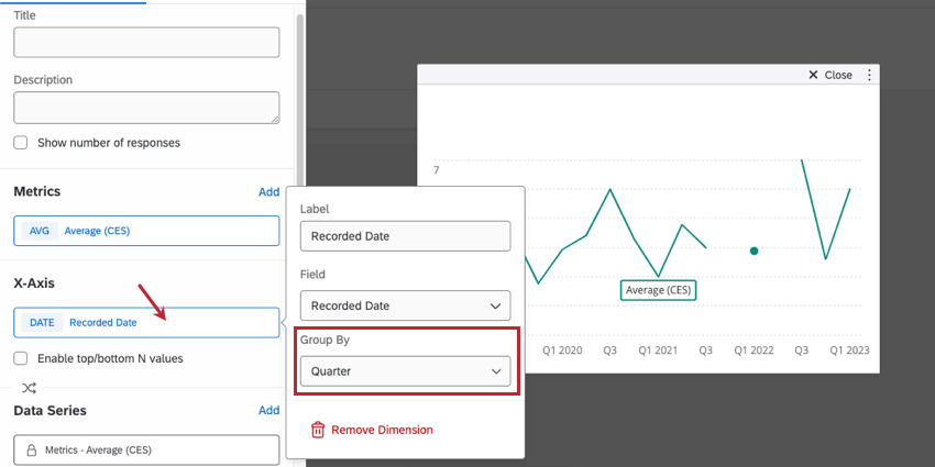
Average CES (Customer Effort Score) Over Time

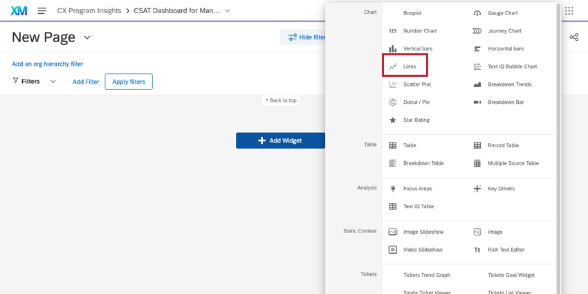
Qtip: Do you need a line graph? Do you want to chart trends over time? You should almost always use the line chart widget rather than the trend or simple chart.

The line widget is perfect for reporting how a metric such as CES (or CSAT, or NPS, or any other metric) has changed over time. In this example, we’ll show how the average CES changed, but you can use any metric you want.

  1. Make sure your CES metric and at least one date metric are mapped in your data source as a Number Set field.
    Field in data mapper as described
  2. Add a Lines widget to your dashboard.
    Menu expanded from add widget button
  3. Add a metric.
    Metrics section of widget editing pane has an Add button
  4. Change this metric from Count to Average.
    Clicking green count opens menu to the left where you can configure the average
  5. Change the Field to CES.
  6. Under X-Axis, add a date field.
    Back in the widget editing pane
  7. Click on your date field to adjust how dates are grouped along the X-Axis. Unless the page is filtered to only show data for the last week or so, it’s better not to use day. In our example, we used Quarter.
    Menu for grouping dates after you click your field
Qtip: See the Line and Bar Charts support page for more customization options.
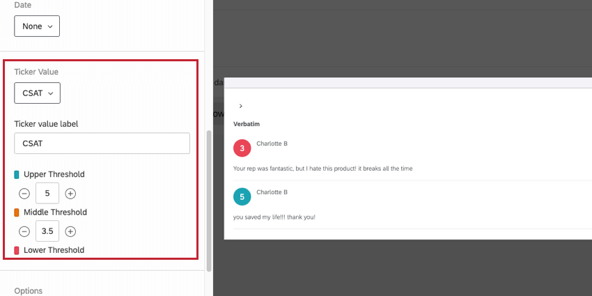
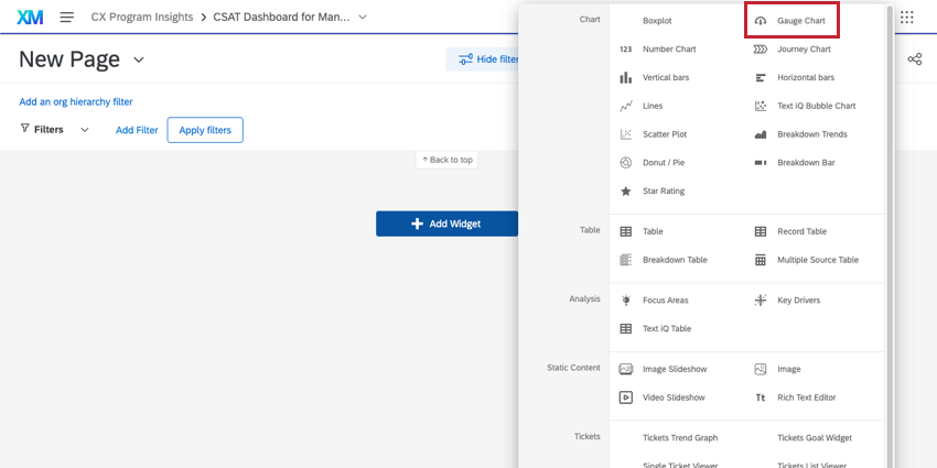
Showing CSAT in Relation to a Benchmark

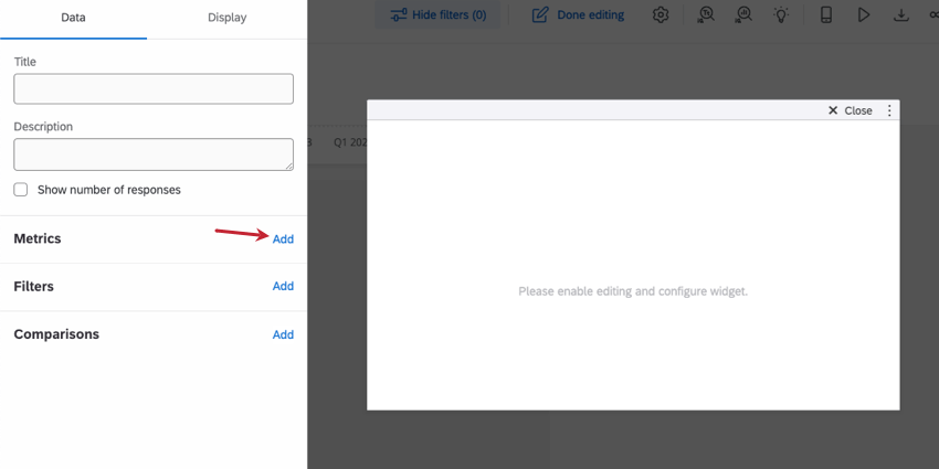
Sometimes you don’t necessarily want to show a change over time – you just want to know what the department’s CSAT is right now, and how it compares to the CSAT your department should have. Gauge Charts are the perfect widget to accomplish this!

  1. Make sure your CSAT is mapped in your data source as a Number Set field.
    Fields mapped as described
  2. Add a Gauge Chart widget to your dashboard.
    Menu expanded from add widget button
  3. Add a metric.
    Once clicked into widget, editing pane opens to left, and theres a field when you scroll down that says add metric
  4. Click the Count. Change this to an Average.
    Clicking count opens menus to the left where the average can be configured
  5. Select the CSAT field.
    setting the metric
  6. Now we can adjust our benchmarks. Head to the Display tab.
  7. The maximum a CSAT can be is 5, so be sure to change the Max value.
    Back in the widget editing pane

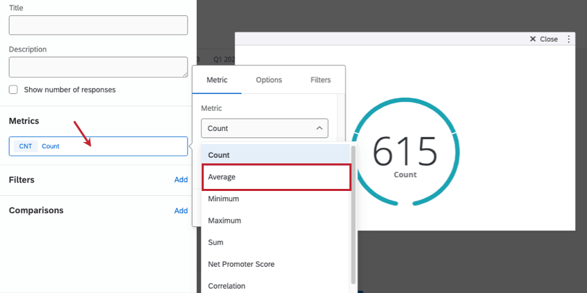
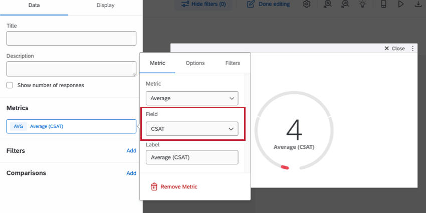
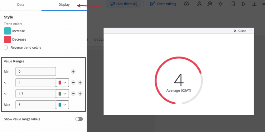
The rest of the values are up to the standards you have set. In our example, we consider CSATs 1 to 4 to be below expectations, 4 to 4.70 to be fair, and greater than 4.70 to be excellent.

If you only want to judge when a CSAT has moved from “Good” to “Bad,” you can click the minus sign ( ) next to any value to remove it. You can also add more value ranges by clicking the plus sign ( + ).

Qtip: Are your stakeholders interested in seeing how your department’s all-time CSAT holds up, or are they only interested in this quarter’s CSAT? If your data source has multiple months, weeks, or even years’ worth of data, you should probably add a date filter to the page or to the gauge chart widget.
Qtip: See the Gauge Chart support page for more customization options.

Breaking Out Metrics by Teams, Departments, and More

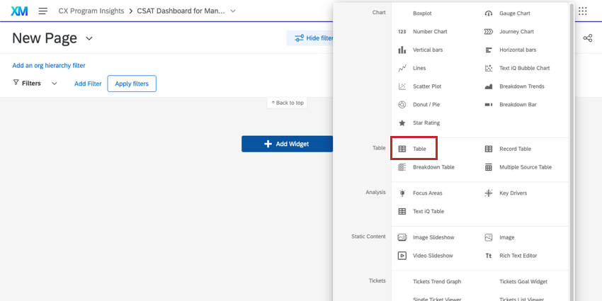
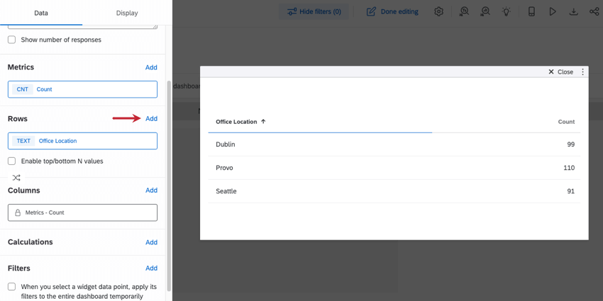
Sometimes you’ll need to break out information by multiple levels. For example, let’s say we’re communicating call center data, such as number of calls. We can break this information out so we see these metrics by employees, managers, and locations. The widget best equipped to report this way is the table widget.

In this example, we work at a call center with 3 locations and 2 managers at each location. We want to see the number of support phonecalls, emails, and chat per manager and office location.

  1. Table widgets can report on Dates, Number Sets, Text Sets, and Multi-Answer Text Sets. Make sure your fields are mapped accordingly. In this example, we’d map the following fields as Text Sets:
    Fields mapped as described

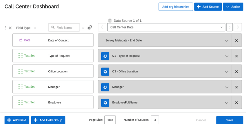
    • Type of Request (chat, email, or phone support request)
    • Office Location
    • Manager
  2. Add a table widget to your dashboard.
    Menu expanded from add widget button
  3. Add a metric.
    Clicking Add button in Metrics section of widget editing pane
  4. For each field you want to break out by, add a row. In this case, this is where we’d add the Office Location and Manager fields.
    Once clicked into widget, editing pane opens to left, and theres the fields described in the steps
  5. Breakouts should be listed with the highest level of authority first, and the lowest last. If your breakouts aren’t in order, hover over the field and use the icon to drag and drop the order the rows should break out by.
    Dots on the side of each row, indicating they can be dragged and dropped
  6. Now, we want to break out by the type of request – phonecall, chat, or email. We can add this as a row, but that’ll look confusing and produce too many rows. Instead, let’s add it as a column.
    clicking set column dimension and choosing a field
  7. Each manager only works in 1 office, so we won’t have data for every manager at every office location. In the Display tab, make sure Show empty responses is not enabled.
    Show empty responses option, hidden under Data values dropdown in the display tab

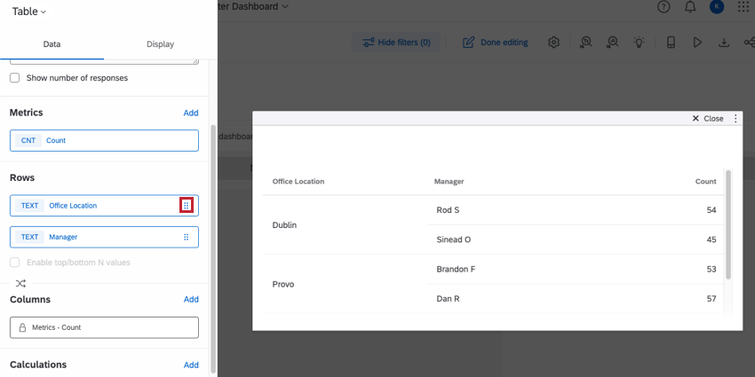
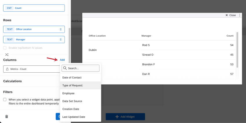
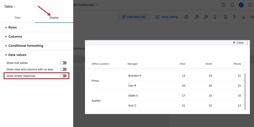
This is what the finished product looks like:

Table. Rows showing managers per location. Columns showing phones vs. chats vs. emails

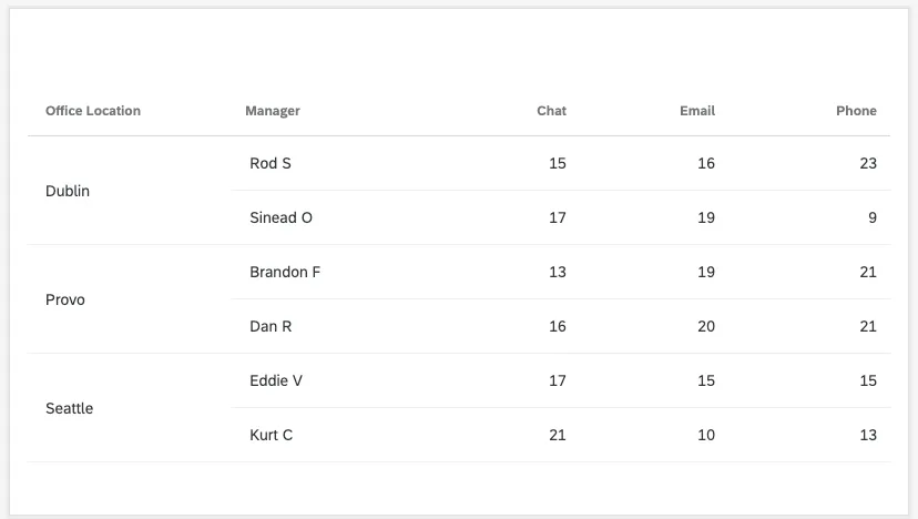
Qtip: See the Table Widget support page for more customization options.
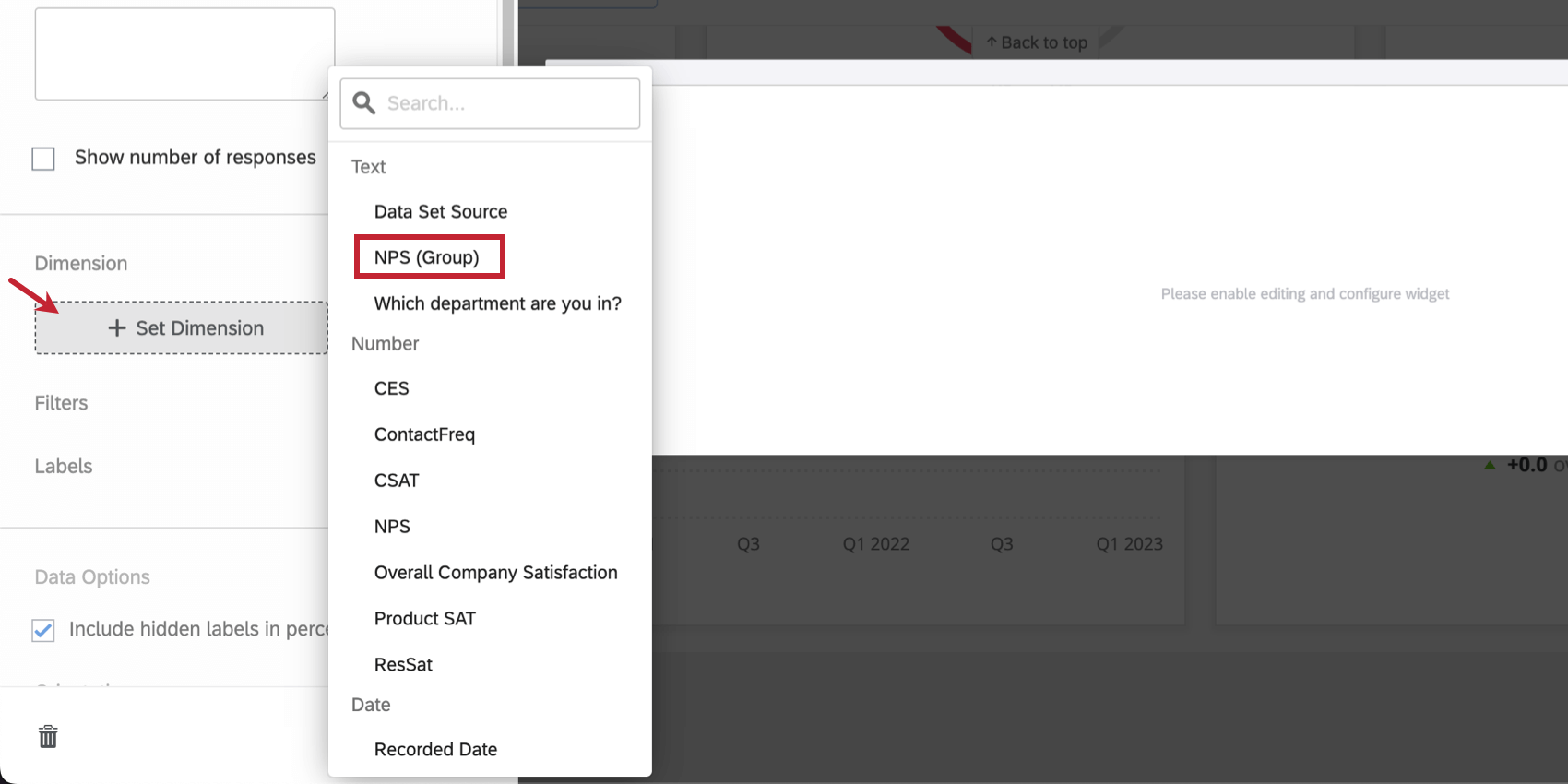
NPS Breakdowns

Users often like to see a breakdown of how many customers fit into each NPS group. While pie charts can be handy, people generally prefer to use breakdown bar widgets for this.

  1. Make sure your NPS fields are mapped in your dashboard. Your NPS Groups field should be mapped as a Text Set. Your numeric NPS should be mapped as Number Set.
    Fields in a data mapper
  2. Add a breakdown bar widget to your dashboard.
    Menu expanded from add widget button
  3. Click Set Dimension and select the NPS field you want to display. It’s generally more useful to choose the NPS Group instead of the numeric scale.
    Once clicked into widget, editing pane opens to left, and theres the fields described in the steps
  4. Choose whether you want to display the legend at the bottom, or turn it off.
    setting the legend display options
  5. Determine the labels on the segments of the bar. Here, we chose to add the Detractor, Promoter, Passive labels to the segments, so we can turn off the legend if we want.
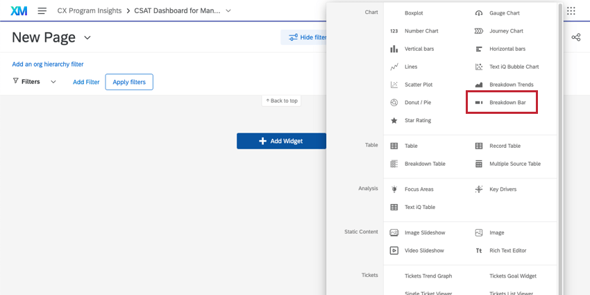
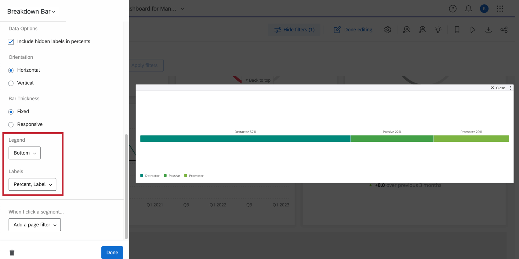
Qtip: See the Breakdown Bar support page for more customization options.

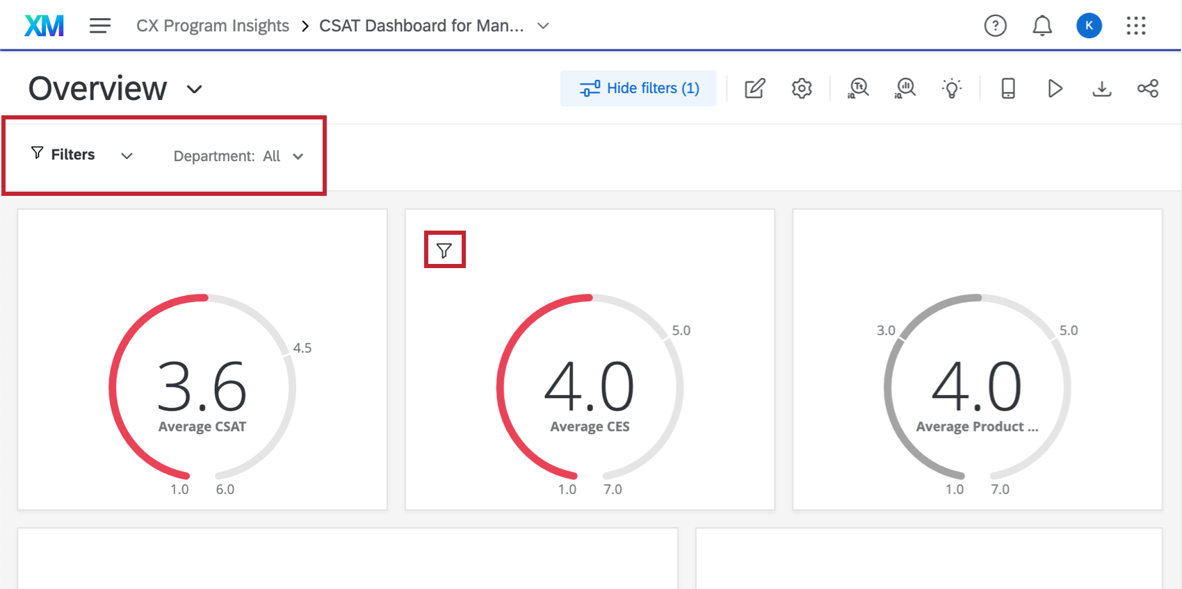
Filtering For Your Audience

In a few of the example widgets we made, we talked about filters. Filters can be incredibly useful for narrowing down data according to what your dashboard users are most interested in seeing. You can add filters to the whole page of a dashboard, or just to one widget at a time.

Page filters are listed in top navigation bars. Widget level filters are listed as a little funnel icon in the upper-left of a widget

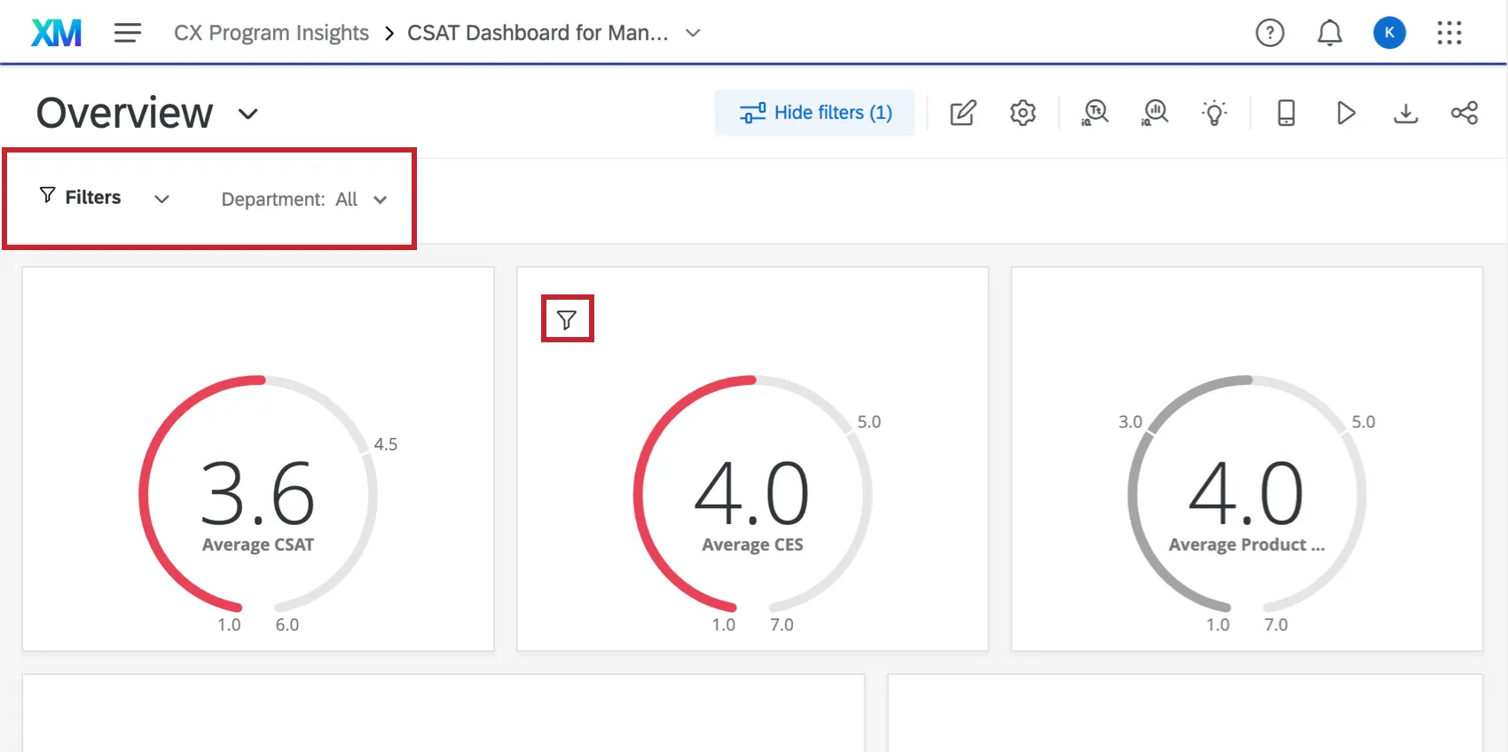
Filtering doesn’t just mean permanently restricting data – it also means providing your users with the filters they might want to apply to their data.

Qtip: Be thoughtful about the information you include within your dashboard. You can use data restrictions and filters to control the data users see, but if there are sensitive fields within your dashboard, consider excluding them completely from the dashboard data or adding them to a separate dashboard with limited access.

Filters for General Use

Filters you may add to a page or a widget for users to adjust as needed:

  • Date filters, so managers can adjust and compare time periods as needed.
  • Employee, so managers can see a particular direct report’s stats.
  • Office location, so department heads can compare performance across locations.
  • And more…

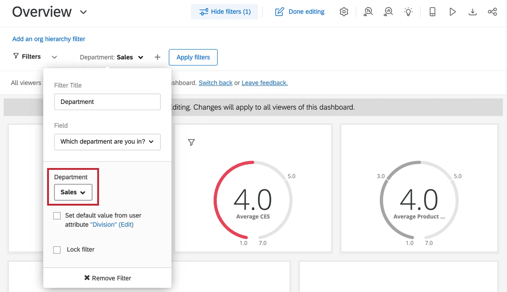
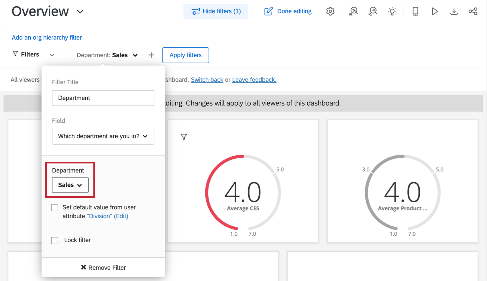
Qtip: If you select specific values while editing your filter and then exit out of editing mode, the filter will be applied automatically for your dashboard viewers. In the below example, the value Sales was selected for the filter, “Department” When dashboard viewers go to this dashboard, the filter “Department” will automatically be set to filter for Sales.
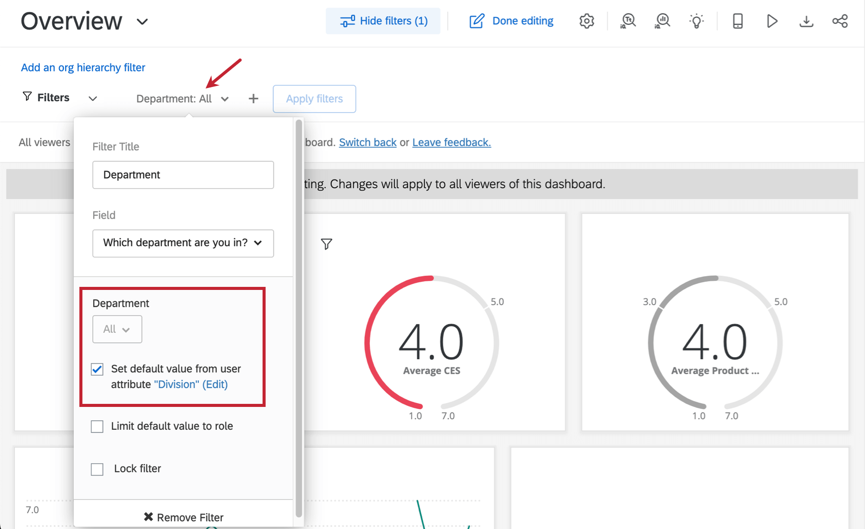
Filter expanded to show settings described

Restrictive Filters

Filters you may add to a page or widget and lock, so no further adjustments can be made:

  • A date filter on the dashboard that only shows the relevant fiscal quarter or year’s data.
  • Adjusting a field like Department so it always matches a user attribute. That way only members of the department see their own data.
    Filter expanded. User attribute and lock settings are selected
Attention: Although filters can be used to restrict data, you should focus on restricting data using roles. Roles allow you to determine what data fields or dashboard pages a group of users is allowed to view. We will go over these in the last lesson.


FAQs