-

Qualtrics Platform -

Customer Journey Optimizer -

XM Discover -

Qualtrics Social Connect
Multiple Data Sources in 360 Reports
About Multiple Data Sources in 360 Reports
You may add multiple data sources to your 360 visualizations. All visualizations except the statistics table, results table, agreement chart can have multiple data sources. How you add your data sources depends on the type of visualization. Having multiple data sources in one visualization allows you to build reports with the following characteristics:
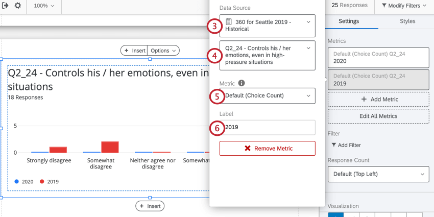
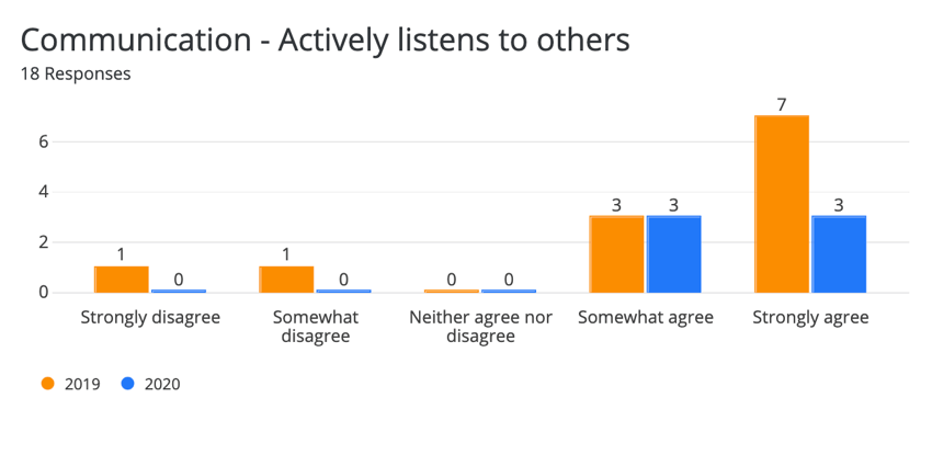
- Display data from different surveys in one visualization for easy comparison. For example, you can show 2019 and 2020 data side by side to see how an employee has improved throughout their career.
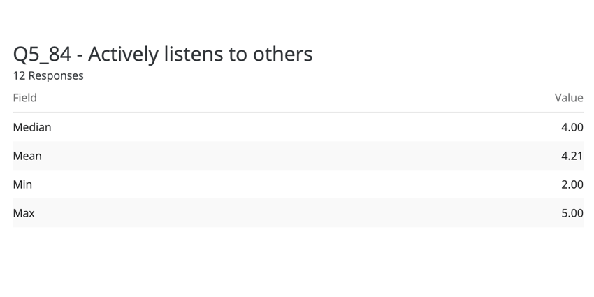
- Report on multiple metrics in one visualization. For example, you want to see Mean, Minimum, and Maximum next to each other.
- Compare how evaluators from different demographics scored the subject. For example, you may want to see how a manager rated a subject vs. how their peers rated them.
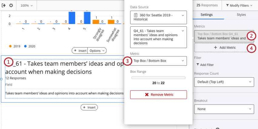
Adding Multiple Data Sources via Add Metric
The following widgets add data sources through the Add metric button:
Multiple data sources are a great way to compare data collected across surveys. The method described in this section is best for data where the choices are not numeric, but instead categorical, or subjective groups. For example, most Multiple Choice-style questions collect data in this format. These data sources can be displayed in two different formats (metrics): Choice Count or Percentage. It is best to choose one of these metrics and apply it to every data source you have in a visualization.
- Click on one of the compatible widgets.
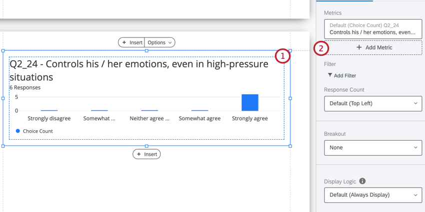
- Click Add Metric.
- Select a survey for the data source.
- Choose the field from the survey to display.
- Select the displayed metric. Usually, you’ll want your displayed metric to be consistent across all data sources in a visualization.
- If desired, change the label for your displayed field.
Adding Multiple Data Sources via Add Data Source
The following widgets add data sources through the Add data source button:
- Gap chart
- High and low scores table
- Hidden strengths / improvement areas table
- Scoring overview
- Report summary
To add data sources:
- Click your widget.
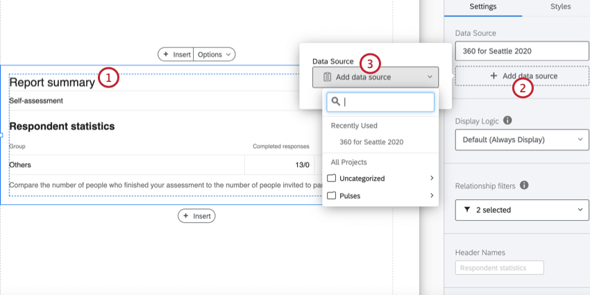
- Click Add data source.
- Select the data source to add to the widget.
- Click your newly added data source.
- Enter a Label for the data source. This is what it will appear as in the visualization.
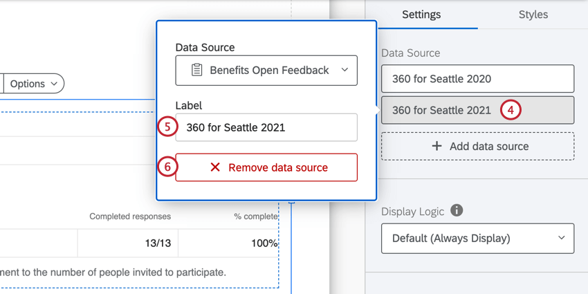
- If needed, click Remove data source to delete it from the visualization.
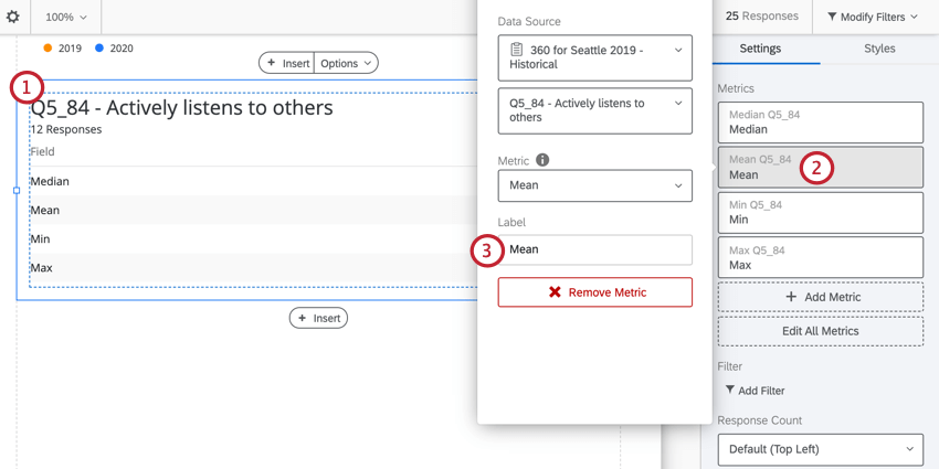
Adding Multiple Metrics
A visualization can display different numeric metrics side by side, so that different statistics for the same data can be displayed together. If the widget adds data sources through the Add Metric button, then you can add multiple metrics to that widget. When using a numeric metric format, you can choose to display data in Mean, Min (Minimum), Max (Maximum), NPS (Net Promoter Score), Responses, and Sum format. This option is best for data collected from recoded Multiple Choice questions, and any question type that lets you collect numeric data.
- Click on a compatible widget.
- Select the field under Metrics.
- Use the Metric dropdown menu to select your desired metric.
- Click Add Metric to add additional metrics.
- Select your newly added metric.
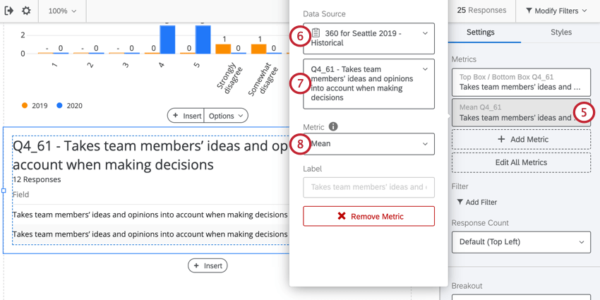
- Choose the survey the data comes from.
- Select the question the data comes from.
- Use the Metric dropdown to select a metric.
Labels
When you click on your metric or data source, you can change the Label displayed on the visualization. By default the label will display the question text and the chosen metric. However, the default label isn’t always useful for communicating relevant information about your data.
We highly advise you to change your labels to be short and easy to read. Generally, you should name labels after the name of the data source or the metric you’re using, depending on what you are trying to communicate. You can rely on titles and text boxes to give additional information about the variable being displayed.
Editing Labels
- Click on your visualization.
- Select the metric you want to edit the label for.
- Type the new label in the Label box.
Options
On each Metric, you can change the number of decimal points you display. Click on a Metric, go to the Options tab, and select from the dropdown.
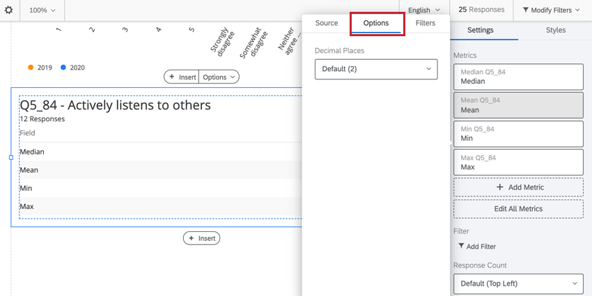
This option is only available for numeric Metrics, such as Mean, Min (Minimum), Max (Maximum), NPS (Net Promoter Score), Responses, and Sum.
Adding Filters to Sources
Just as you can filter a report or filter an entire visualization, you can filter individual data sources. This can be useful if you want to compare scores by relationship or by a metadata field, like Department. For example, you may wish to show how a manager scored a subject compared to how the subject’s colleague scored the subject
- Click on your visualization.
- Select the data source or metric you want to filter.
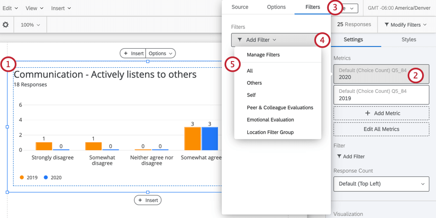
- Go to the Filters tab.
- Click Add Filter.
- Select the filter you’d like to apply from the list. If you want to create a new filter, click Manage Filters and then follow the directions on this support page about building filters.