
Key Drivers Widget
What's on this page
Attention: This widget is called the Upgraded Key Drivers Widget. The legacy version of the widget is called Key Drivers Widget. While you can still create legacy key drivers widgets, we recommend using the upgraded version of the widget. Widgets will not be automatically migrated to the new version, and will have to be recreated.
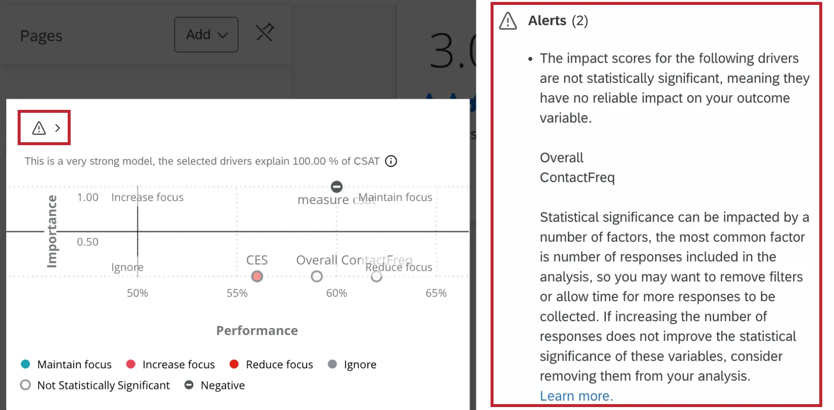
Qtip: The upgraded key drivers widget includes statistical significance testing and R-squared model quality indicators that do not exist in the legacy version. Drivers that are not statistically significant are now assigned a value of zero, which can shift where drivers appear in the scatter plot quadrants compared to what you may have seen in the legacy widget.
About Key Drivers Widgets
The key drivers widget shows dashboard users where to allocate resources for the biggest possible business impact, by informing them which potential drivers, such as NPS, Engagement, Satisfaction, and more, will have the biggest effect on a chosen outcome metric.
The widget displays the correlation between your chosen outcome metric and 1 or more potential drivers. This allows dashboard users to determine both how your business is performing on your chosen drivers, as well as where to focus your efforts and resources to positively impact your business.
Qtip: You can’t use custom period filters in key drivers widgets. To filter by a custom period, you can use a custom date range.
Types of Dashboards
This widget can be used in a few different types of dashboard. This includes:
- CX Dashboards
- Employee Engagement
- Lifecycle
- Pulse
- Ad Hoc Employee Research
- Employee Journey Analytics
- Brand Experience
Field Type Compatibility
The following data types can be used within the key drivers widget:
- Number Sets
- Numeric Values
- Individual items from field groups (CX) and categories (EX)
- Topics with sentiment
Qtip: When topics with sentiment are added to a key drivers widget, they are automatically mapped to 2 fields with the following values: Topic Mention/Not-mention (1,0) and Topic-Sentiment, Very Negative to Neutral to Very Positive (-2, -1, 0, 1, 2).
For more information on field types and widget compatibility, see the Field Type & Widget Compatibility Tables.
Qtip: This widget is not compatible with categorical variables, such as age groups, education, region, etc. If you believe categories like these will impact your selected outcome, you can use widget filters or page filters to isolate each category to understand the relative impact of your drivers within each category.
Requirements
The following are required to configure a key drivers widget:
- Dashboard Data: Data sources must be mapped to your dashboard.
- Sufficient response data: A minimum of 30 responses per driver are recommended. For example, if you have 10 drivers, you should have at least 300 responses in your dashboard data.
- Manageable dashboard size: Your dashboard should not have more than 15 million responses. If your dashboard has more than this, the key drivers widget will not work. You can add a dashboard filter such that your dashboard only displays responses below the limit so your key drivers widget works.
If you want to use Text iQ topics as drivers, you must configure Text iQ for the open text question(s) you want to analyze and make sure they are added as a field source in your dashboard data. For more information, see Text iQ in Dashboards and Text iQ Functionality.
Attention: When adding Text iQ topics as drivers, you can select a parent topic only if it has no child topics. If a parent topic has children, you must select the individual child topics instead.
If you've reorganized your topic hierarchy and a parent topic you previously selected as a driver has had child topics added to it, you'll need to update the widget configuration. Go back into the widget and replace the parent topic with the appropriate child topic(s) as your drivers.
Outcome
The outcome metric is a measure of progress that is influenced by key drivers. Outcomes are often survey questions or variables that relate to overall experience, sentiment or attitude, like NPS, Overall Satisfaction, or Intent to Return or Purchase. For example, a company might be concerned about their clients’ overall satisfaction with a particular product or service. The outcome metric in this case would be an overall satisfaction score.
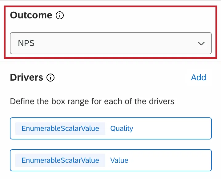
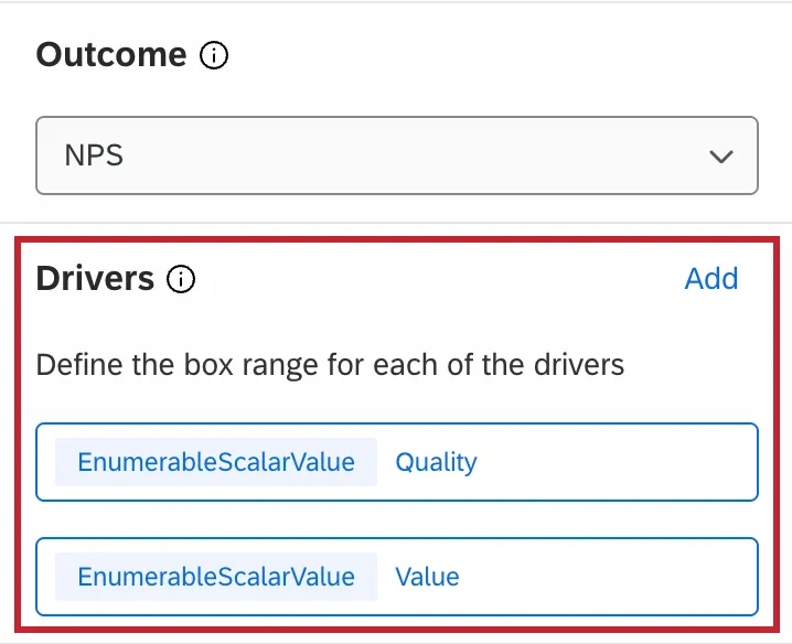
Drivers
Drivers are performance-based metrics that influence the outcome metric. These are typically specific survey questions, variables or topics that relate to a specific feature, characteristic or attribute of the business experience, like friendliness of customer service, availability of purchase options, competitive pricing, etc. For example, if a company’s outcome metric is overall satisfaction for a product or service, potential drivers might include quality, value, or usefulness.
Analysis Method
Within the Analysis Method section of the widget you can select the importance type and performance metric.
Importance
The key drivers widget has 2 different importance methods that can be applied to it. This affects how the values are displayed in the 4 quadrants and the importance score. You can change the calculation used in your widget at any time – just keep in mind that the importance score and the values in the 4 quadrants may change.
Qtip: Pearson Correlation is more performant than Relative Importance for large datasets. When the total dashboard response count across all data sources exceeds 5 million, Relative Importance analyses may time out or fail.
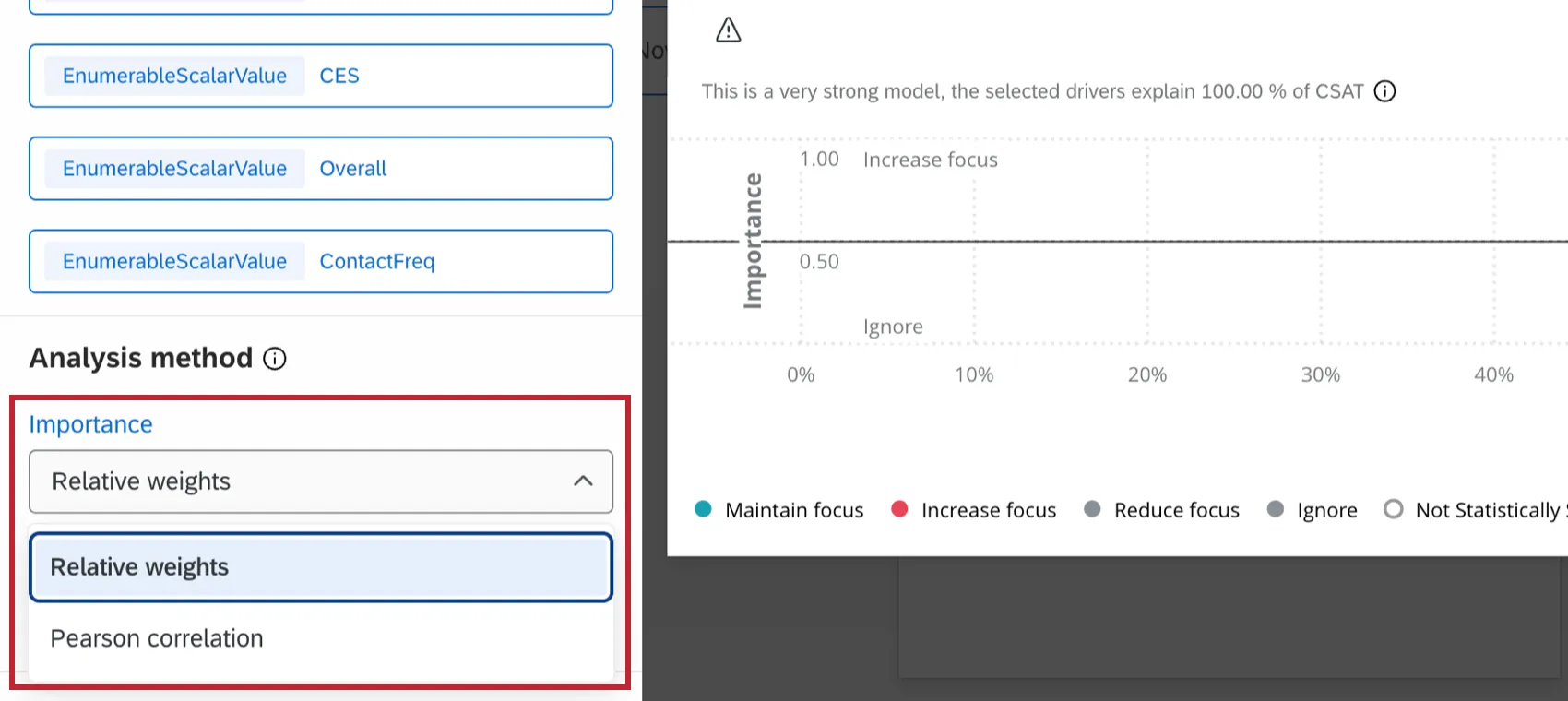
Pearson correlation: This calculation measures the linear correlation between the drivers and the outcome metric.

Qtip: For all key driver widgets created before February 18, 2022, the default and only calculation was Pearson Correlation. All widgets created before this date have been left as Pearson, but you can now switch the calculation if desired. Alternatively, creating a new key drivers widget will enable access to the newest version of this functionality.
Qtip: Measure groups can only be used as an outcome metric when Pearson correlation is selected.
Relative importance analysis: This is the default calculation method. Relative Importance analysis runs models with every combination of the independent variables to determine the independent impact on the r-squared (variance explained), because all the drivers are likely to be highly correlated. Please note that when you first set up your widget with Relative Importance analysis, it may take some time before it loads and displays data. To learn more about this method of analysis, also called Johnson’s Relative Weights, see our Stats iQ page.

Attention: Relative Importance analysis is only available in CX dashboards.
Qtip: Relative Importance analysis does not currently support using measure groups as the outcome metric. Additionally, you cannot use org hierarchy dashboard filters with Relative Importance analysis.
Attention: Relative Importance analysis requires a complete response count greater than the number of drivers. A complete response is one that contains data for every single driver. Relative Importance analysis supports up to a maximum of 50 drivers at a time.
Pearson Correlation does not account for multicollinearity, which is when the independent variables (in this case, drivers) being compared to the dependent variable (an outcome metric) are already highly correlated themselves. Relative Importance, in contrast to Pearson, does consider multicollinearity. That’s why it is the industry standard for survey data.
Example: Let’s say you’re trying to use whether a customer’s heard of a given brand and their preference for a given brand to predict their purchase intent. Are customers who haven’t heard of your brand very likely to indicate it as their top preference? It’s unlikely; naturally, the less aware of a brand a customer is, the less likely they are to show a preference for that brand. This is the problem multicollinearity presents. Because of this, it is important to tease out those relationships between drivers in order to determine which will have the greatest impact on the outcome metric.
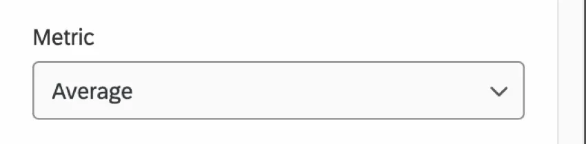
Performance
The key drivers widget has 2 different performance metrics that can be applied to it. This affects how you specify field bounds and box ranges for your drivers.
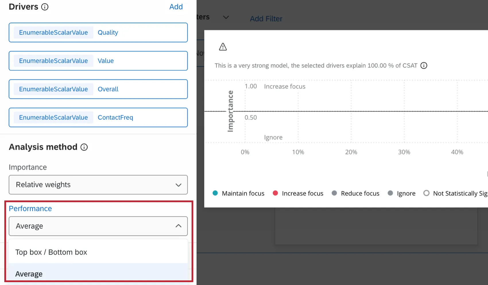
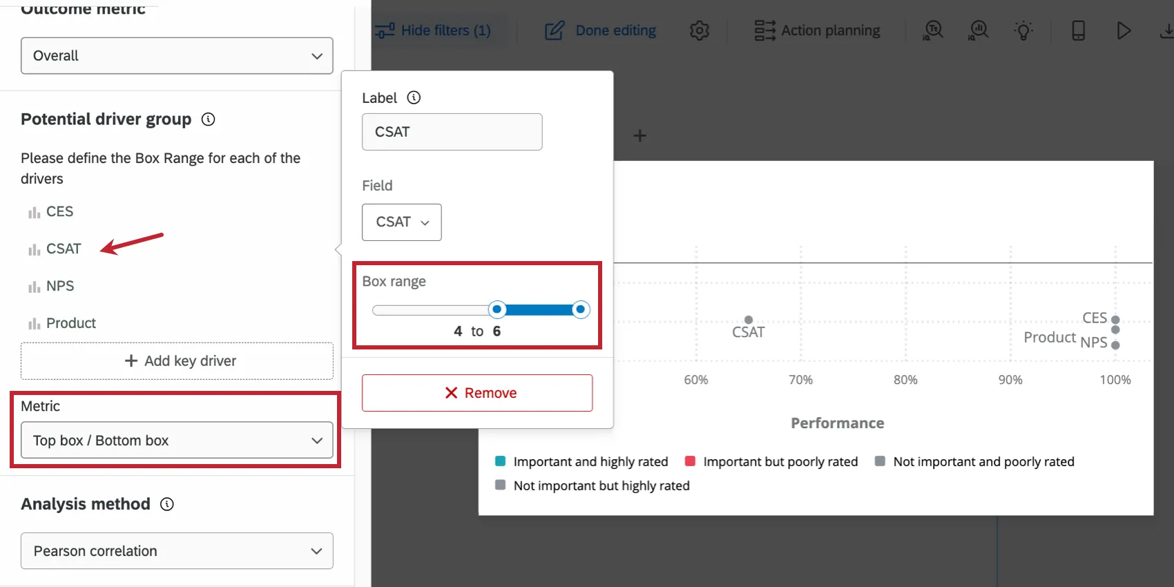
Top box / Bottom box: When Top box / Bottom box is selected, you can specify the upper and lower absolute limits of a field value by specifying the box range. Click on the name of the driver and then move the sliders for the Box range to set your field minimum and field maximum for the selected driver.
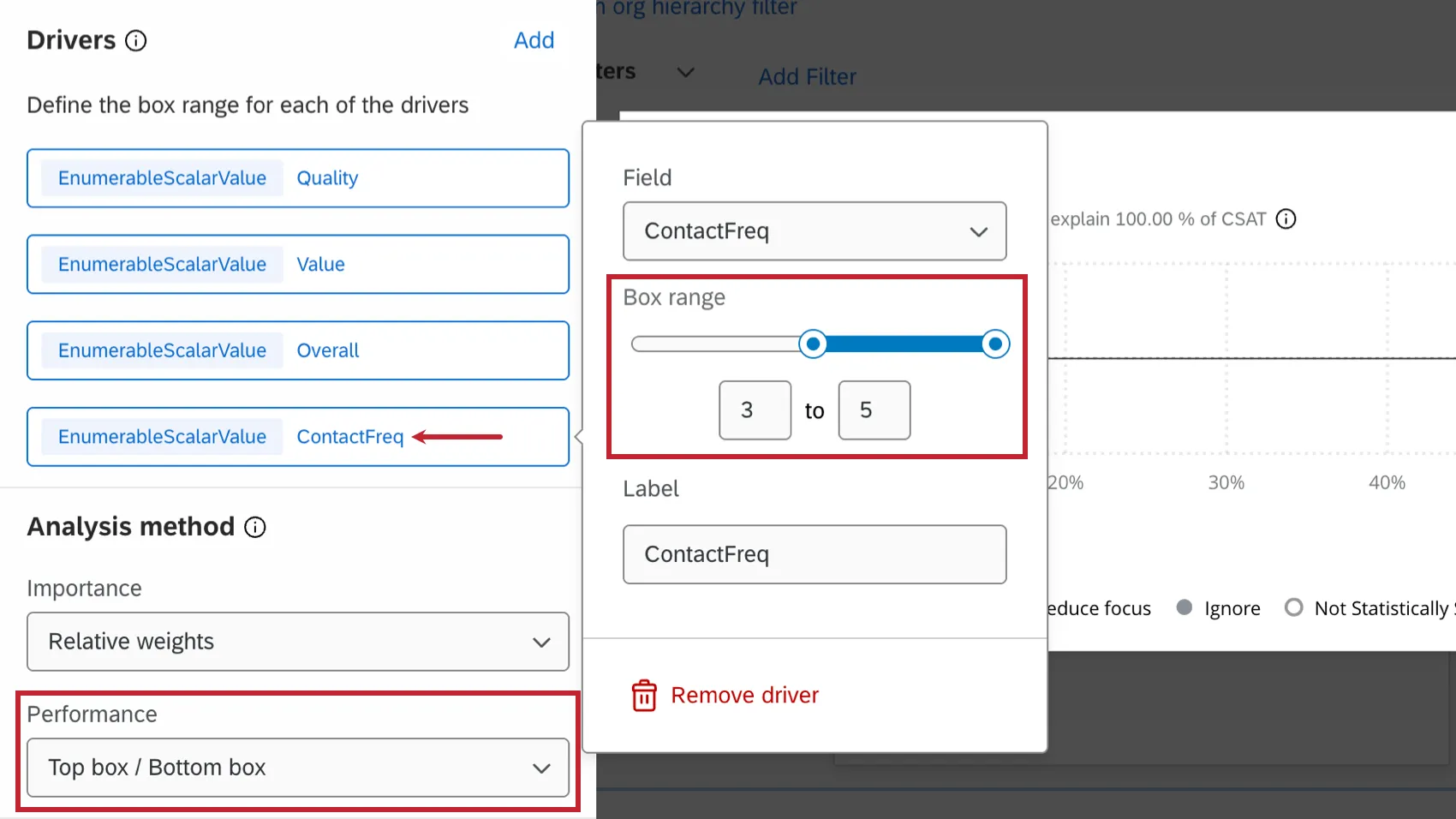
Attention: When using text topics as a driver, you can only select Top box / Bottom box as your performance metric.
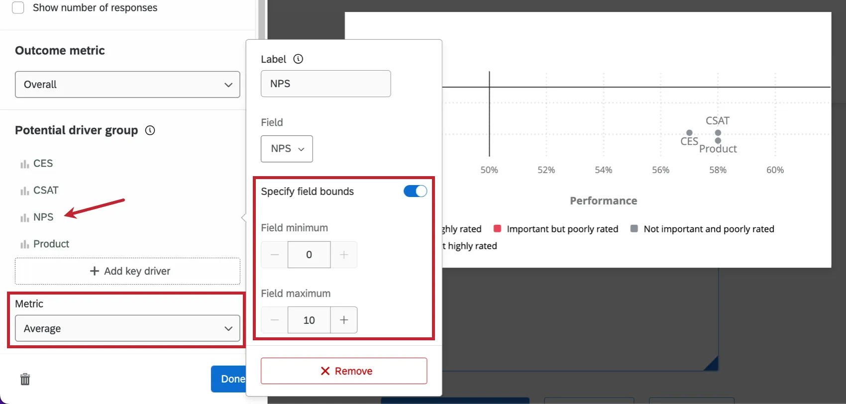
Average: When average is selected, you can specify the upper and lower absolute limits of a field value (so the widget knows how to make its calculations) for the drivers you add to your widget. Click on the name of the driver, check the box for Specify field bounds, and then set your field minimum and field maximum for the selected driver. The purpose is to allow the bounds to be greater in both directions than what is observed in your response data.
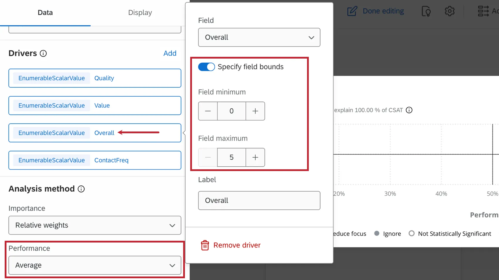

Example: For example, you may have a multiple choice question where respondents can select choices 1-10, but only choices 2-7 have been selected thus far. If you’d still like to make your calculation based on the highest possible choice, you can do so by specifying your minimum and maximum field bounds as 0 and 10, respectively.
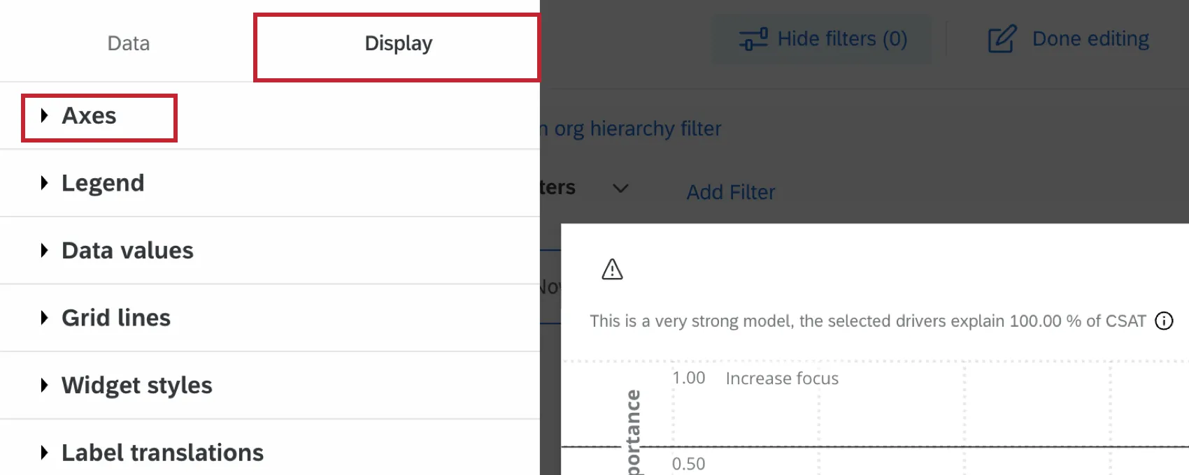
Widget Axes
The widget axes can be adjusted within the Display tab of widget customization.
X-Axis
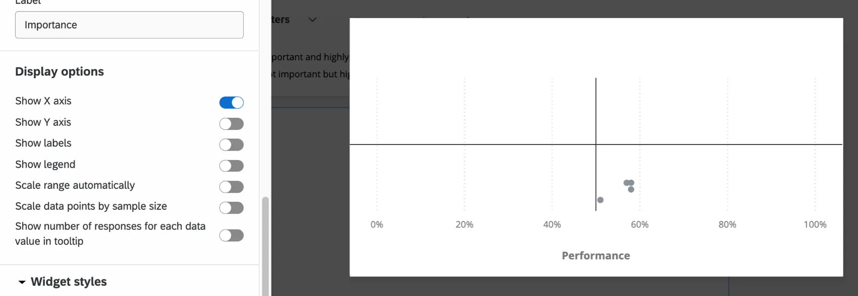
The x-axis of the widget is referred to as the performance axis. This axis can be renamed by typing your desired name in the Title text box. Select Show X-axis Title to display the axis title. Select Show X-axis Lines to display the vertical line along the x-axis.
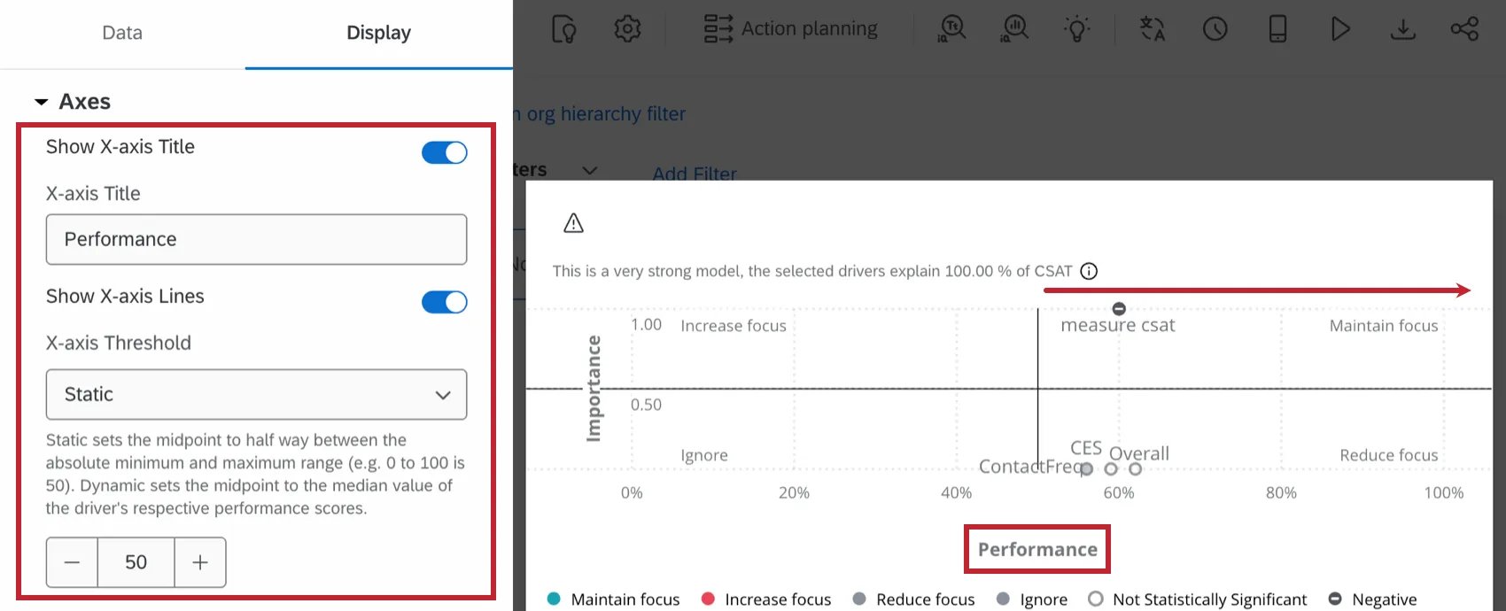
Changing the Threshold will adjust the vertical line along the x-axis:
- Static: Determine where the vertical threshold line will lie on the x-axis. Moving the threshold allows you to decide the point at which a score changes from performing well to performing poorly.
- Dynamic: The threshold line will automatically be set to the median values of the drivers being pulled into the widget.
Qtip: Customer satisfaction data is often driven by the data collected, not hardcoded standards. In cases where there are no industry standards, selecting the Dynamic option can be favorable.
Y-Axis
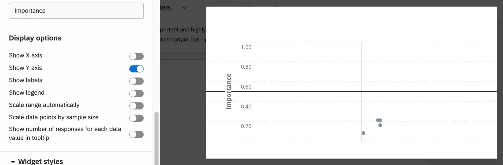
The y-axis of the widget is referred to as the importance axis. This axis can be renamed by typing your desired name in the Title text box. Select Show Y-axis Title to display the axis title. Select Show Y-axis Lines to display the horizontal line along the y-axis.
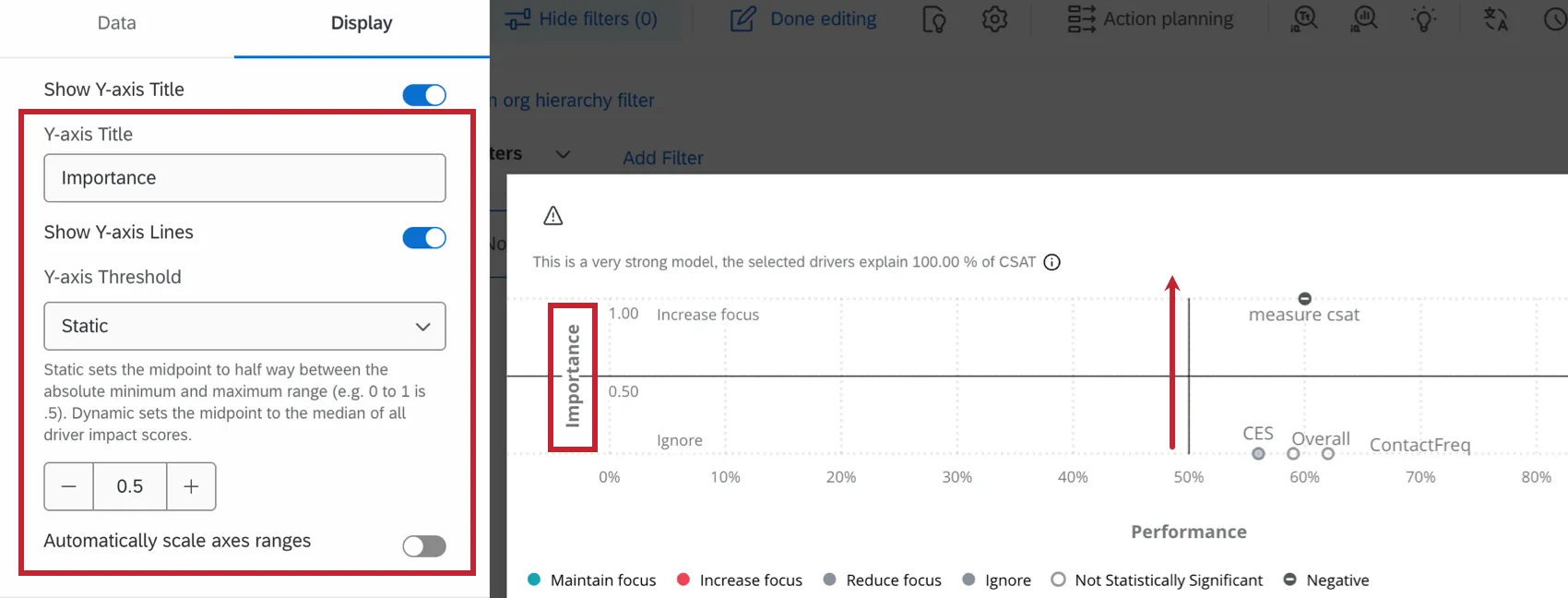
Changing the Threshold will adjust the horizontal line along the y-axis:
- Static: Determine where the vertical threshold line will lie on the y-axis. Moving the threshold allows you to decide the point at which a score changes from performing well to performing poorly.
- Dynamic: The threshold line will automatically be set to the median values of the drivers being pulled into the widget.
Qtip: Customer satisfaction data is often driven by the data collected, not hardcoded standards. In cases where there are no industry standards, the dynamic option can be favorable.
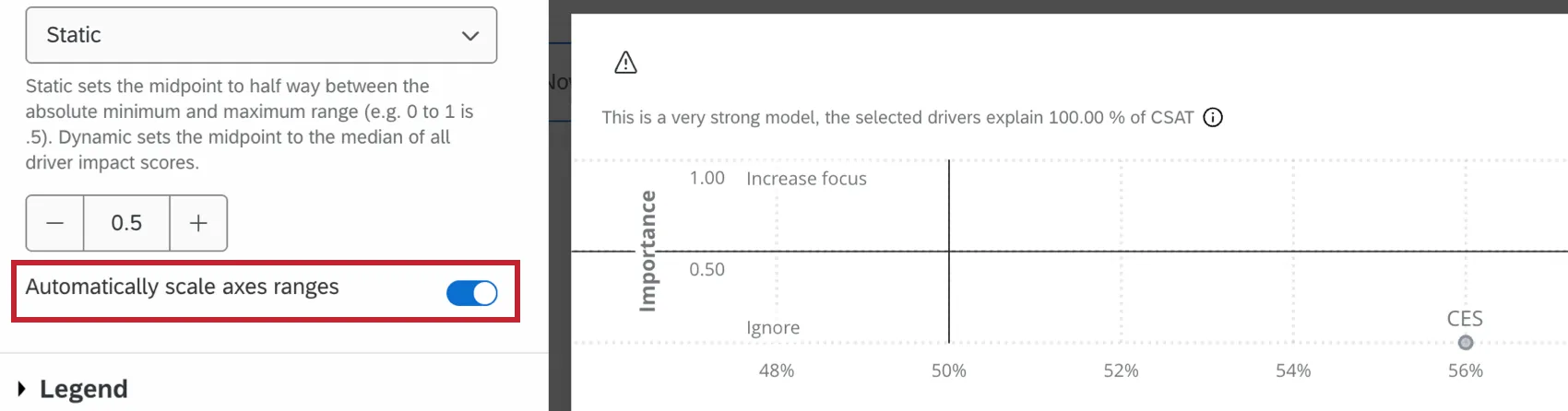
Automatic Scale
Select Automatically scale axes ranges to adjust the minimum and maximum axis values automatically. This does not adjust your threshold markers. Rather, it serves to “zoom in” or “zoom out” to give you the best possible view of your key drivers. When this is not selected, your widget will display the full range of both axes.
Widget Customization
In addition to editing the widget axes, you can customize other aspects of the widget within the Display tab.
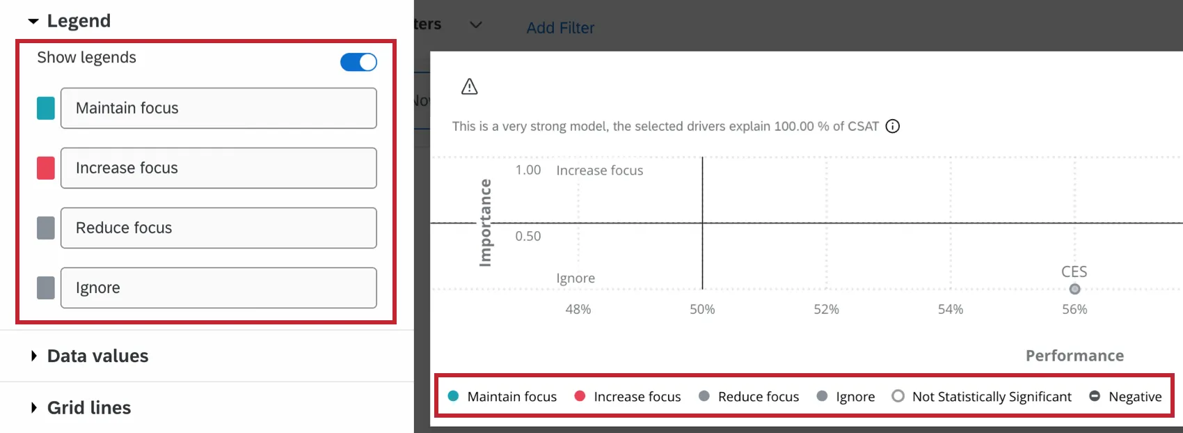
Legend
Select Show legend to display the legend in the widget. Each driver will be assigned a value based on the amount they influence your chosen outcome. Click the color swatch to change the color of the driver circles for each value. You can also rename each value by selecting the default text and typing in your own value.
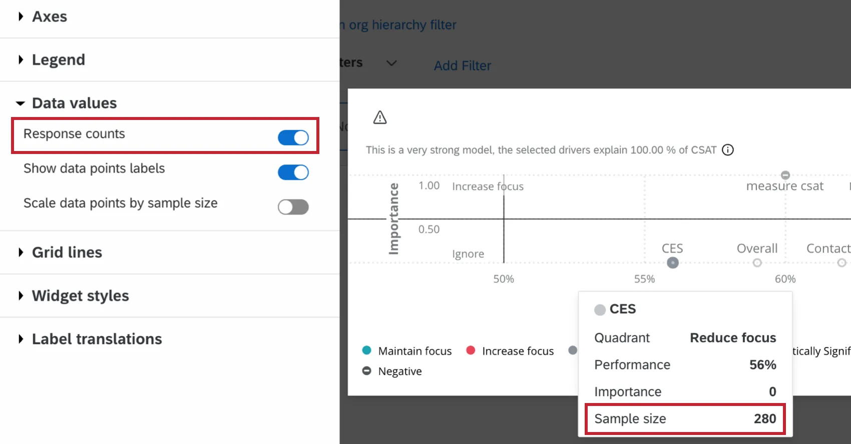
Data Values
Select Response counts to show the number of responses in the tooltip that appears when a driver is hovered over.
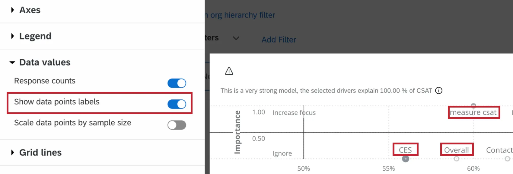
Select Show data points labels to show the labels next to the drivers within the widget.
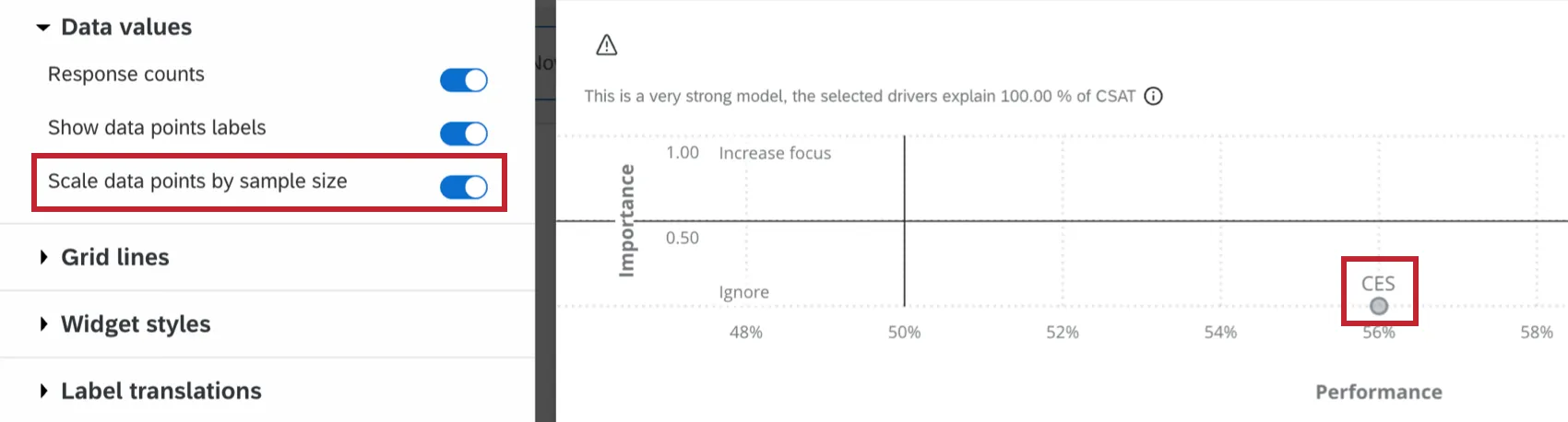
Select Scale data points by sample size to adjust the size of each driver circle relative to the other driver circles’ sample sizes. The larger the circle, the larger the sample size.
Interpretation
R-Squared Value
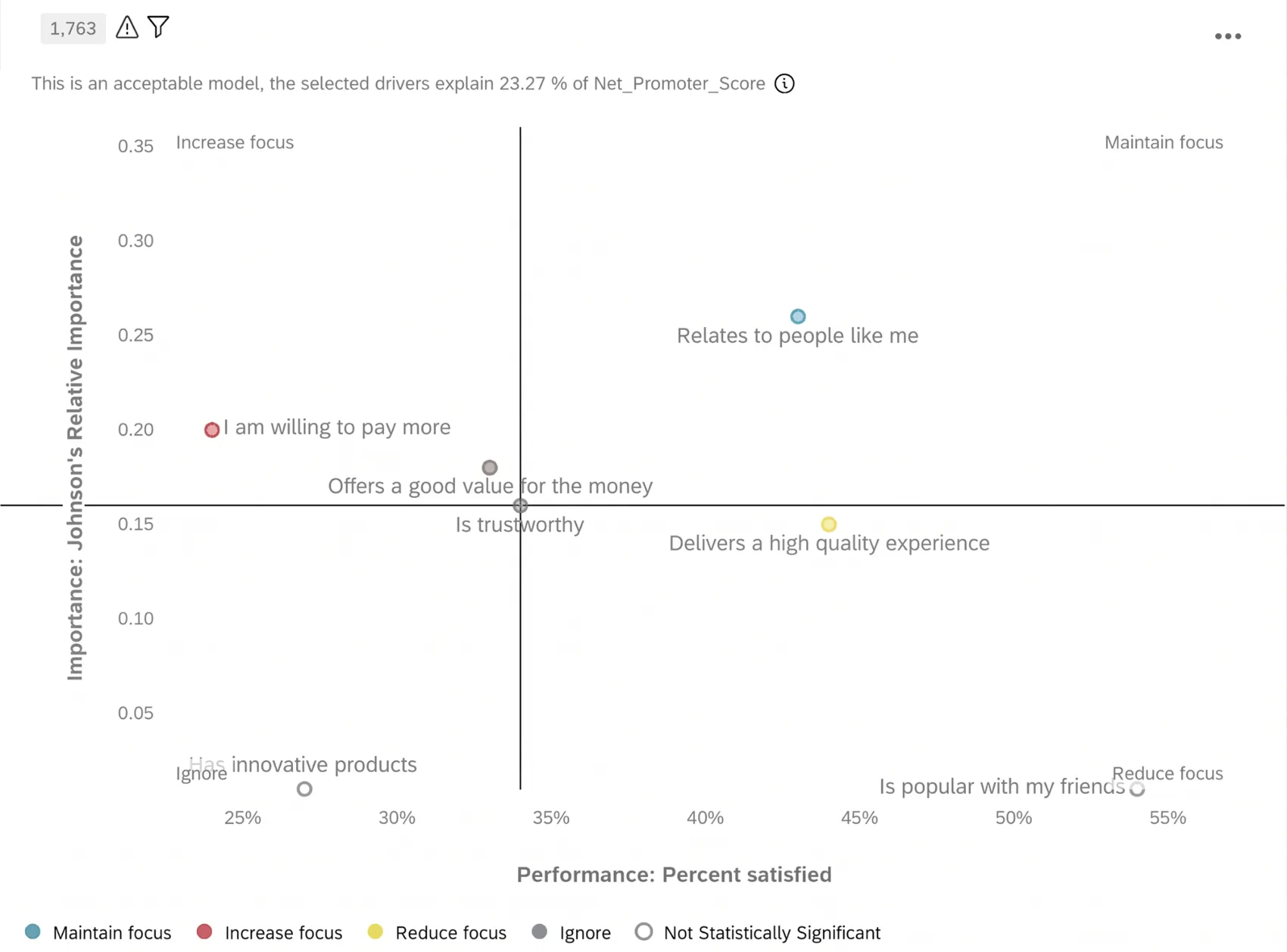
The strength of your model will be displayed in the top-left corner of the widget. This quality indicator is based on the overall R-squared value. The R-squared value offers insight into how well your drivers account for variations in your selected outcome. It will be a value between 0% and 100%.
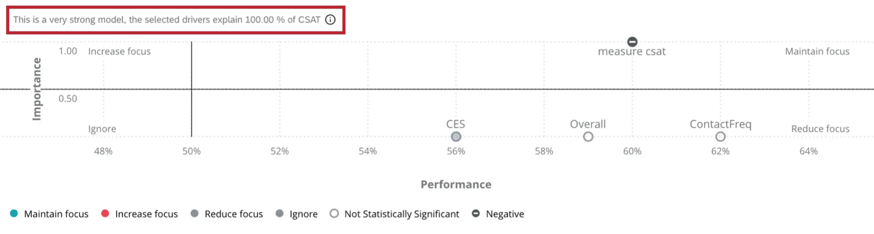
Each R-squared value tells you how much predictive power your selected drivers have on your selected outcome:
- 100%: Your drivers perfectly predict every observed value of your selected outcome.
- Greater than 60%: Your drivers are very strong predictors of your selected outcome. Taking action to improve your top drivers will have the desired impact on your selected outcome.
- Between 36% and 50%: Your drivers are strong predictors of your selected outcome. Taking action to improve your top drivers will likely impact your selected outcome.
- Between 20% and 35%: Your drivers are acceptable predictors of your selected outcome. Taking action to improve your top drivers will have some impact, but the impact may be small.
- Less than or equal to 19%: Your drivers are weak predictors of your selected outcome. Taking action to improve your top drivers will have some impact, but the impact will be small and hard to detect. Exploring additional or different drivers is recommended.
- 0%: Your selected drivers have no predictive power.
Y-Axis: Importance
The Y-axis, also called the importance axis, is a value between 0 and 1 that represents how strongly a given driver is correlated with your selected outcome metric. It is calculated using either Pearson’s correlation or Relative weights. For more information on these calculation methods, see Analysis Method.
When you select Pearson’s correlation, the importance axis is calculated by taking the absolute value of Pearson’s r, such that Importance = | r |. This analysis method does not adjust the score to account for the impact of other drivers, although it is a useful indicator for determining how strongly your driver is connected to your outcome.
When you select Relative weights, the importance axis is calculated using a regression-style driver analysis. This analysis method shows the impact of each driver on your selected outcome, adjusting for the impact of all other drivers. This method also corrects for multicollinearity among the drivers.
For both methods, as the importance value gets closer to 1, the relationship between the driver and outcome is understood to be stronger.
X-Axis: Performance
The X-axis, also called the performance axis, is a value between 0% and 100%. This axis is normalized, and depending on whether you selected average or top / bottom box for your metric, is either dependent on the average score or the top / bottom boxes of scores. Normalizing makes it possible to compare potential drivers with different scales.
Average: The percentage is calculated by taking the average value for the outcome metric’s potential driver and dividing it by the maximum possible value of the potential driver.
Example: Let’s say you ask respondents to answer a question on a scale from 1 to 5. If the average for that question is 2.5 and the highest score for this question is 4, then the percentage will be (2.5 / 4) X 100, or 62.5%.
Top box / bottom box: The percentage is calculated by taking the number of responses that have the selected top box / bottom box values and dividing it by the number of all responses.
Example: Let’s say you ask respondents to answer a question on a scale from 1 to 5. You define the top box as a 4 or 5 for that driver. Assuming you have 1000 total responses, where 560 responses selected 4 or 5, the top box score would be (560 / 1000) X 100, or 56%.
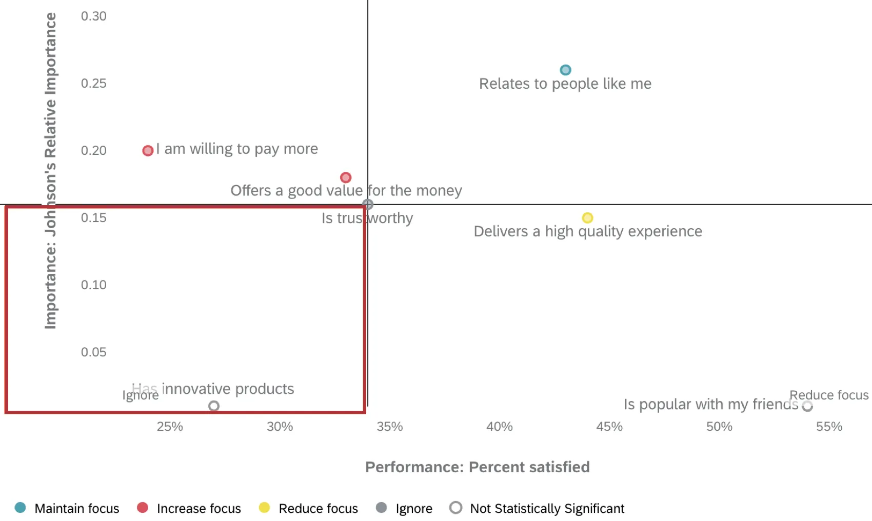
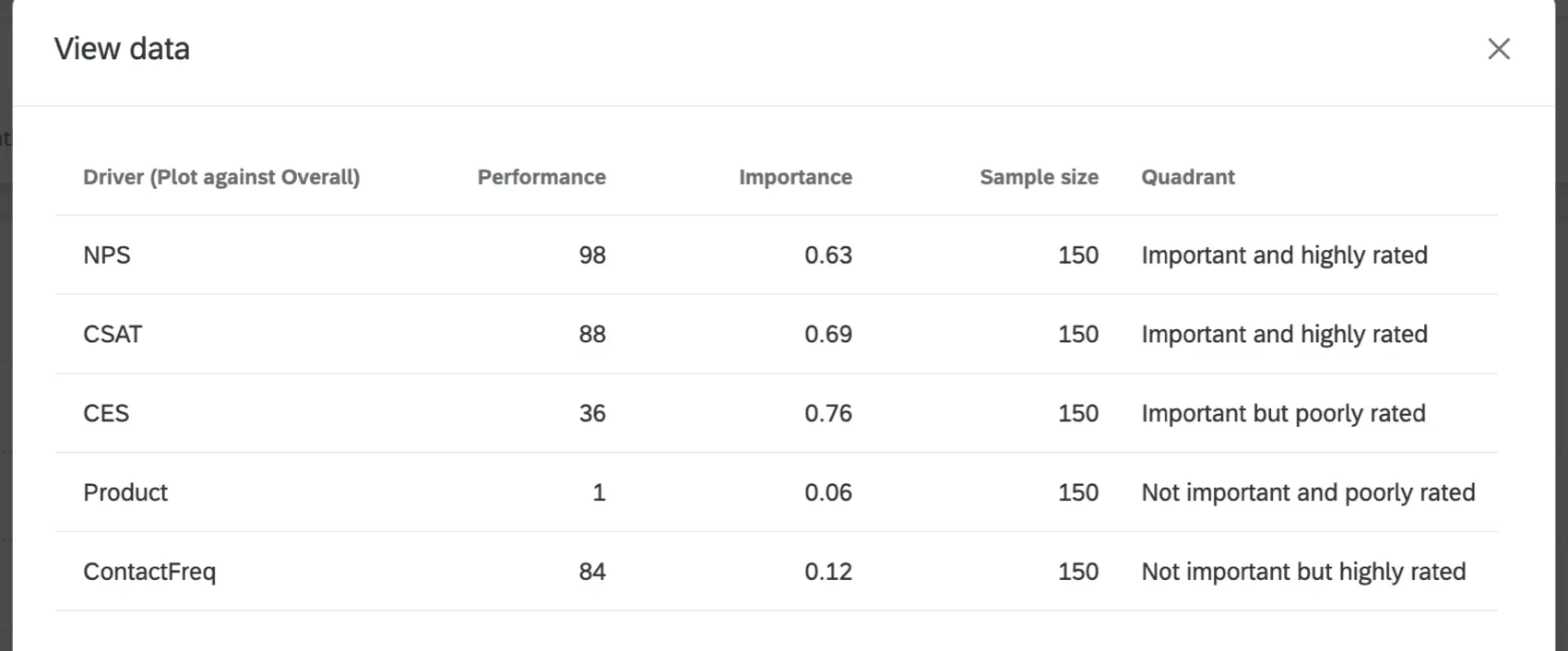
Quadrants
The key drivers widget is divided into 4 quadrants:
Increase focus: Drivers in this quadrant have a large impact on your selected outcome metric, but have lower scores. This may indicate that customers are not satisfied with this experience compared to other experiences they are having with your business. Drivers in this quadrant should be viewed as areas of improvement for your company.
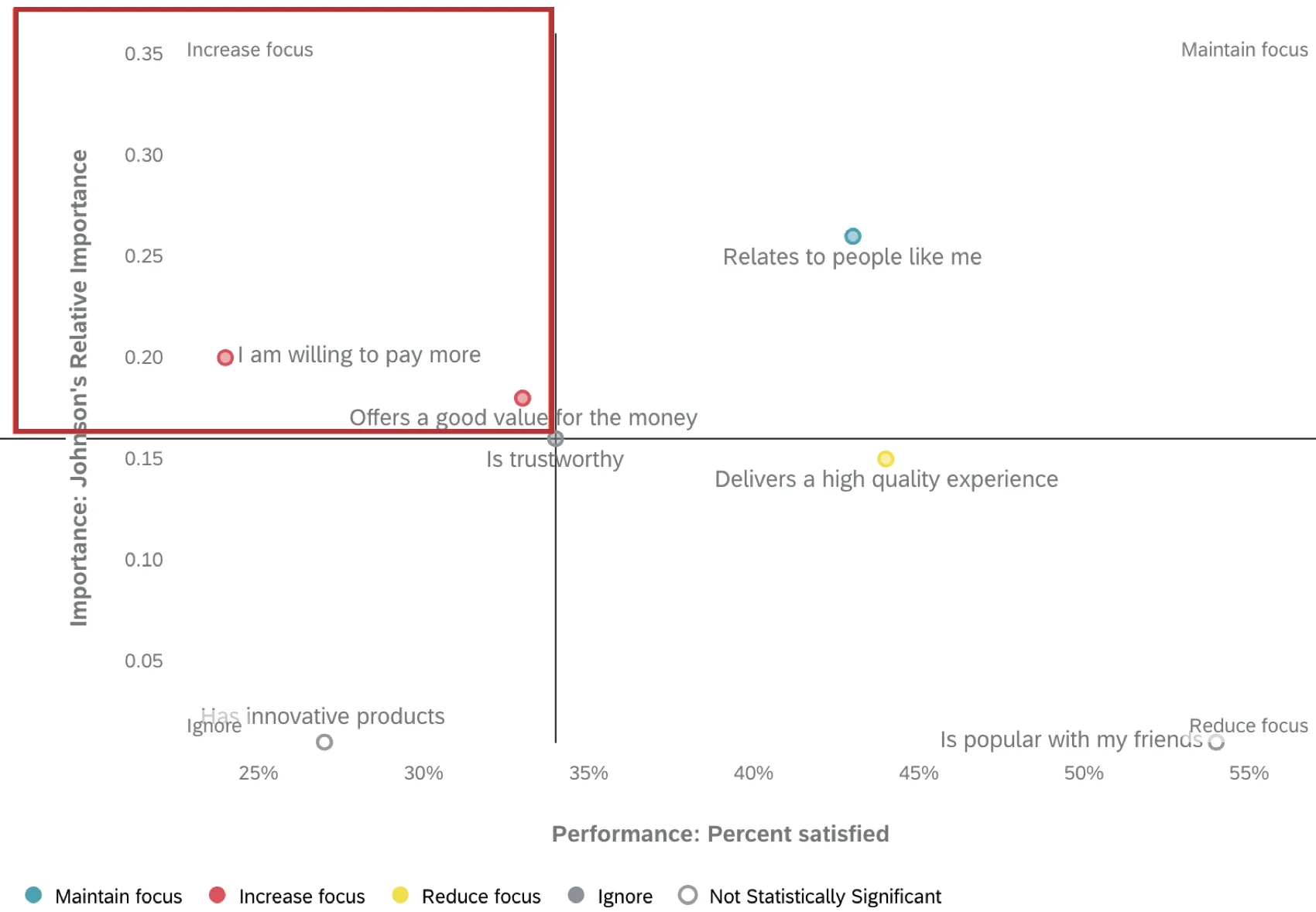
Maintain focus: Drivers in this quadrant have a large impact on your selected outcome metric, and have higher scores. You should continue to prioritize drivers in this quadrant and invest in improvements where possible.
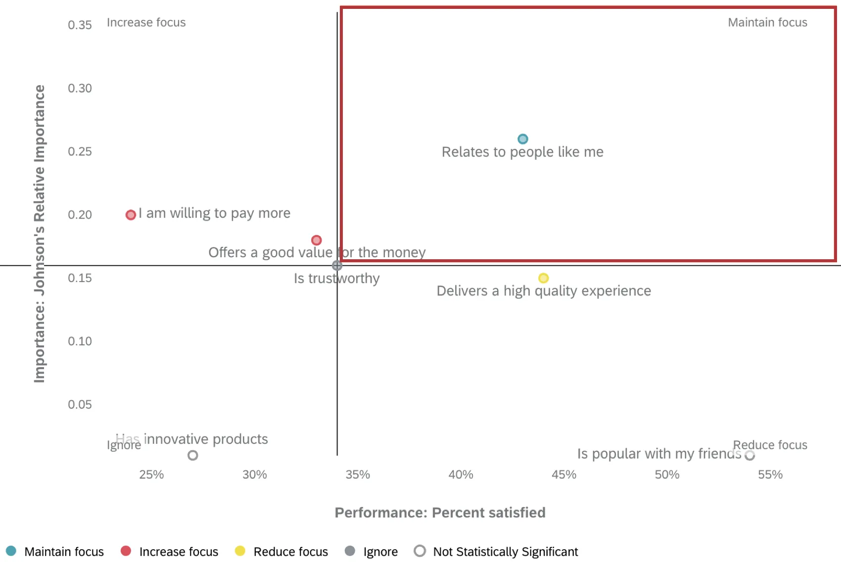
Reduce focus: Drivers in this quadrant have a smaller impact on your selected outcome metric compared to other drivers, but have higher scores. This may indicate that customers are comparatively more satisfied with this experience compared to other experiences they are having with your company. Drivers in this quadrant should not be focused on, and you should instead focus on areas with lower satisfaction or greater impact.
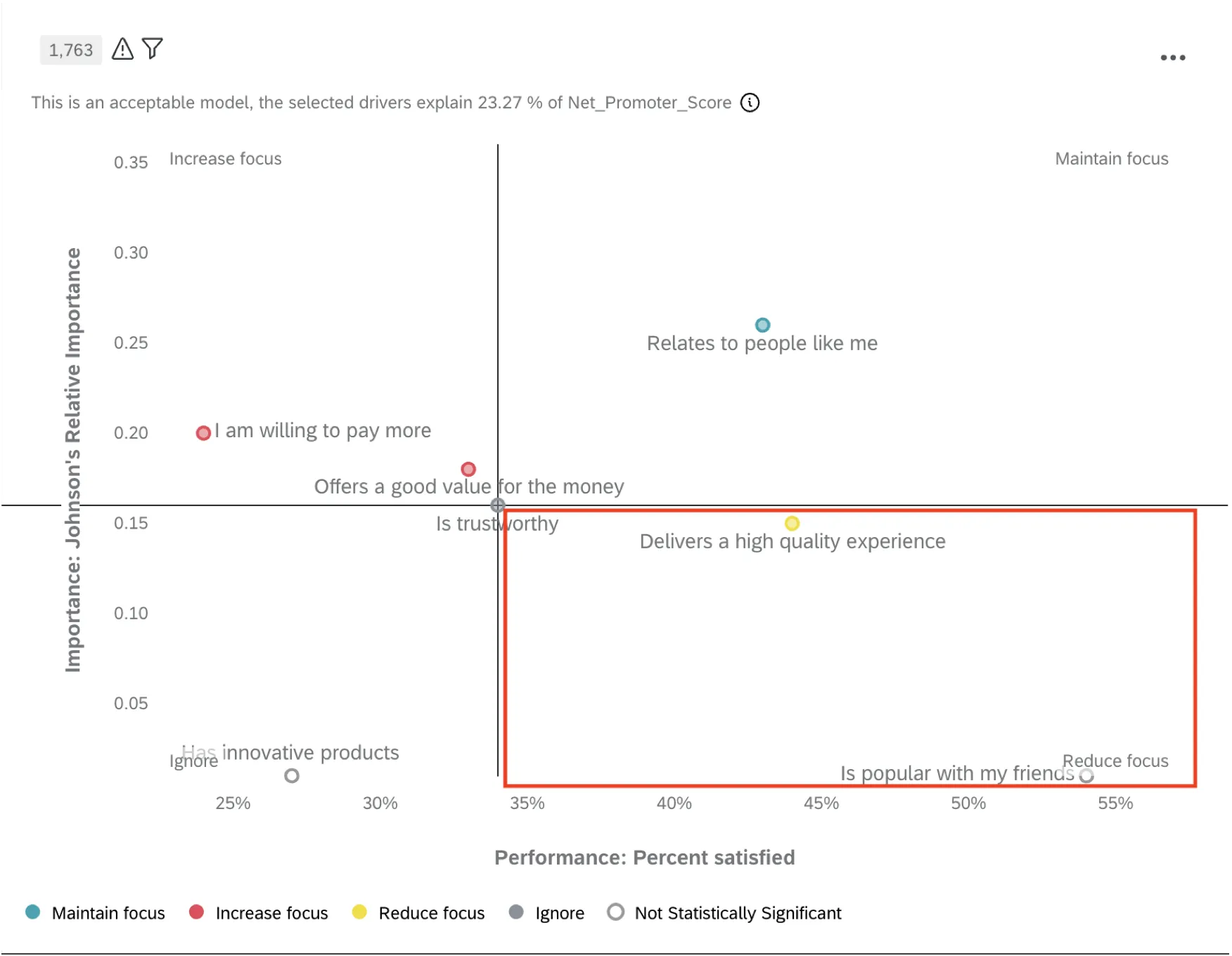
Ignore: Drivers in this quadrant have a smaller impact on your select outcome metric, and lower scores. These drivers should be deprioritized so your resources can be focused elsewhere.
Warnings
If any drivers are impacting your analysis, you’ll see a warning icon in the top-left of the widget. Click this icon when you are not editing the dashboard to view more information.
Additional Options
Click on the 3 horizontal dots in the top-right corner of your widget to view additional options.
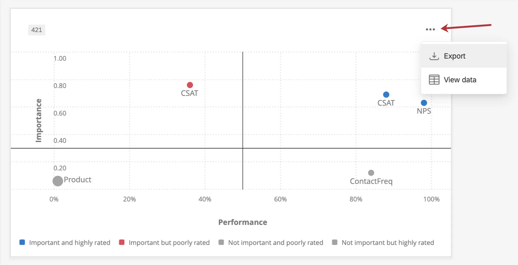
- Export: Export your widget as a JPG, PDF, or XLSX.
View data: View a table containing data on all the key drivers within your widget.
Legacy Key Drivers Widget
Legacy key drivers widgets are very similar to the new and improved key drivers widget, with a few less features. Here is a guide to help you edit any legacy widgets you may still have.
Warning: This widget is being deprecated and is no longer supported. For the same functionality with a more flexible setup, use the key drivers widget described earlier on this page.
Field Type Compatibility
Only Number Sets, Numeric Values, and individual items from field groups (CX) and categories (EX) are compatible with the key drivers widget. For more information on field types and widget compatibility, check out our Field Type & Widget Compatibility Tables.
Widget Customization
Specifying Field Bounds of Drivers
You can specify field bounds for your drivers when your widget metric is set to either average or top / bottom box. Depending on the selected metric, the setup is different.
If you would like to specify the upper and lower absolute limits of a field value (so the widget knows how to make its calculations), you can specify the field bounds for any potential driver that you add to your widget if the metric is average. You will click on the name of the potential driver, check the box for Specify Field Bounds, and then set your field minimum and field maximum for the selected driver. The purpose is to allow the bounds to be greater in both directions than what is observed in your response data.
Example: For example, you may have a multiple choice question where respondents can select choices 1-10, but only choices 2-7 have been selected thus far. If you’d still like to make your calculation based on the highest possible choice, you can do so by specifying your minimum and maximum field bounds as 0 and 10, respectively.
If you would like to specify the upper and lower absolute limits of a field value and the metric is top / bottom box, you can do so by specifying the box range. You will click on the name of the potential driver and then move the sliders for the Box Range to set your field minimum and field maximum for the selected driver.
Qtip: The values come from your selected field’s recode values.
Display Options
Select from the different Display Options to further customize the widget.
Select Show X Axis to display the Performance percentages along the bottom of the widget.
Select Show Y Axis to display the importance values along the left side of the widget.
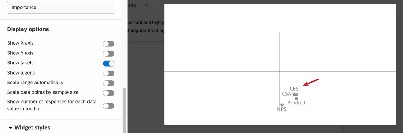
Select Show Labels to show the labels next to the drivers within the widget.
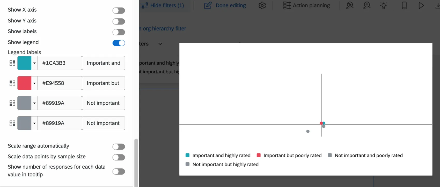
Select Show Legend to display the legend in the widget. Click on the color swatch to change the color of the driver circles for each quadrant. You can also select the default text and type in your own legend values.
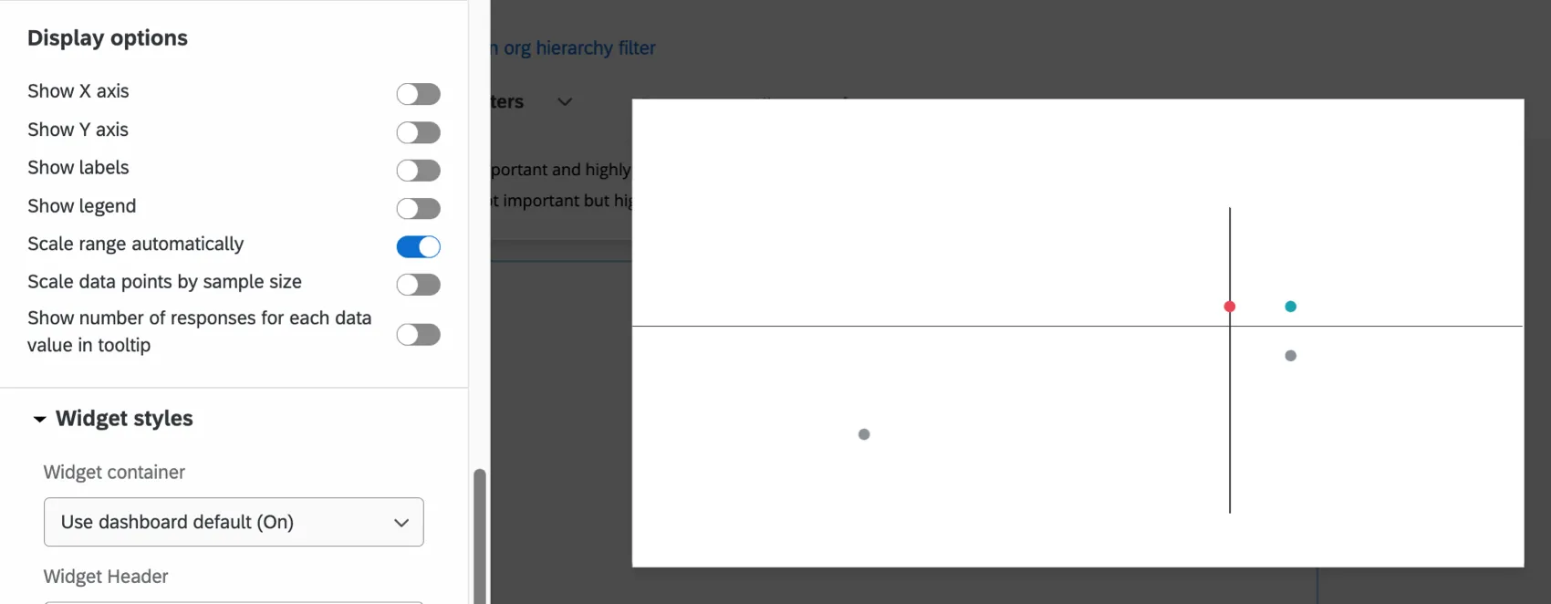
Select Scale Range Automatically to adjust minimum and maximum axis values automatically. This does not adjust your threshold markers. Rather, it serves to “zoom in” or “zoom out” to give you the best possible view of your key drivers.
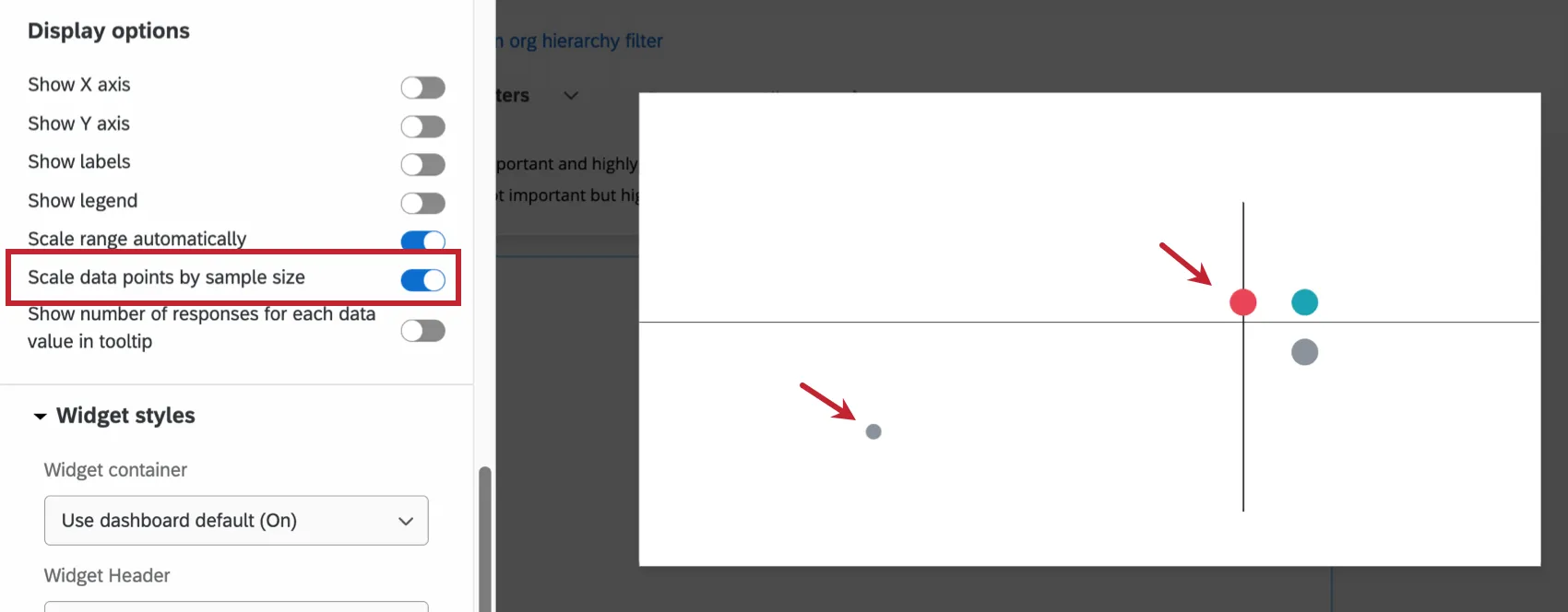
Select Scale Data Points by Sample Size to adjust the size of each driver circle relative to the other driver circles’ sample sizes. The larger the circle, the larger the sample size.
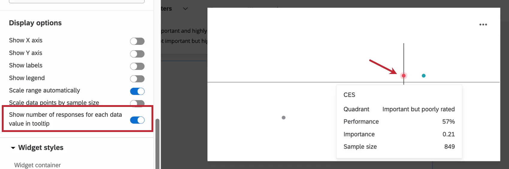
Show number of responses for each data value in tooltip ensures that when someone hovers over a data point, a tooltip will show them the performance, importance, and sample size for that data point.
Qtip: This setting can only show the total responses for up to 10 data values at once. After 10 data values, the tooltip will only show the number of responses for the value you are hovering over.
Interpretation
The Y-axis, also called the importance axis, is a value between 0 and 1 that represents how strongly a given driver is correlated with the outcome metric. It is calculated by taking the absolute value of Pearson’s r, such that:
Importance = | r |
As the importance value gets closer to 1, the relationship between the driver and outcome is understood to be stronger.
The X-axis, also called the performance axis, is a normalized scale. This means the value ranges from 0% to 100%. This axis is normalized, and depending on whether you selected average or top / bottom box for your metric, is either dependent on the average score or the top / bottom boxes of scores. Normalizing makes it possible to compare potential drivers with different scales. The percentage for average is calculated by taking the value for the outcome metric’s potential driver and dividing it by the maximum possible value of the potential driver.
Example: Let’s say you ask respondents to answer a question on a scale from 1 to 5. If the highest score a participant gives for this question is a 4, then the denominator when calculating the percentage on the performance axis will be the number of responses times 4.
The percentage for top / bottom box is calculated by taking the value for the outcome metric’s potential driver and dividing it by 100.
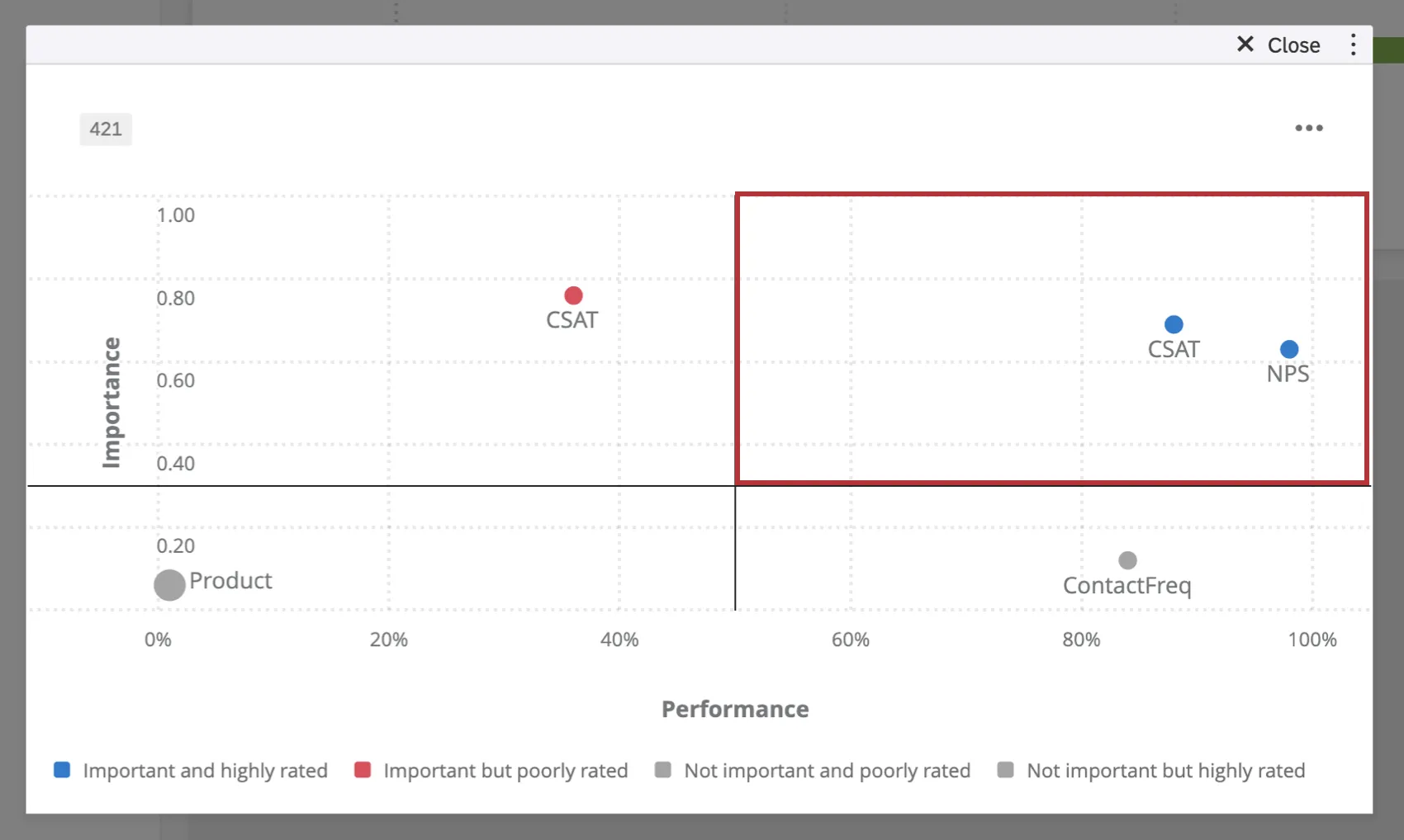
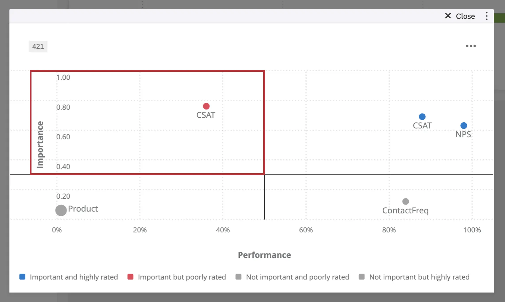
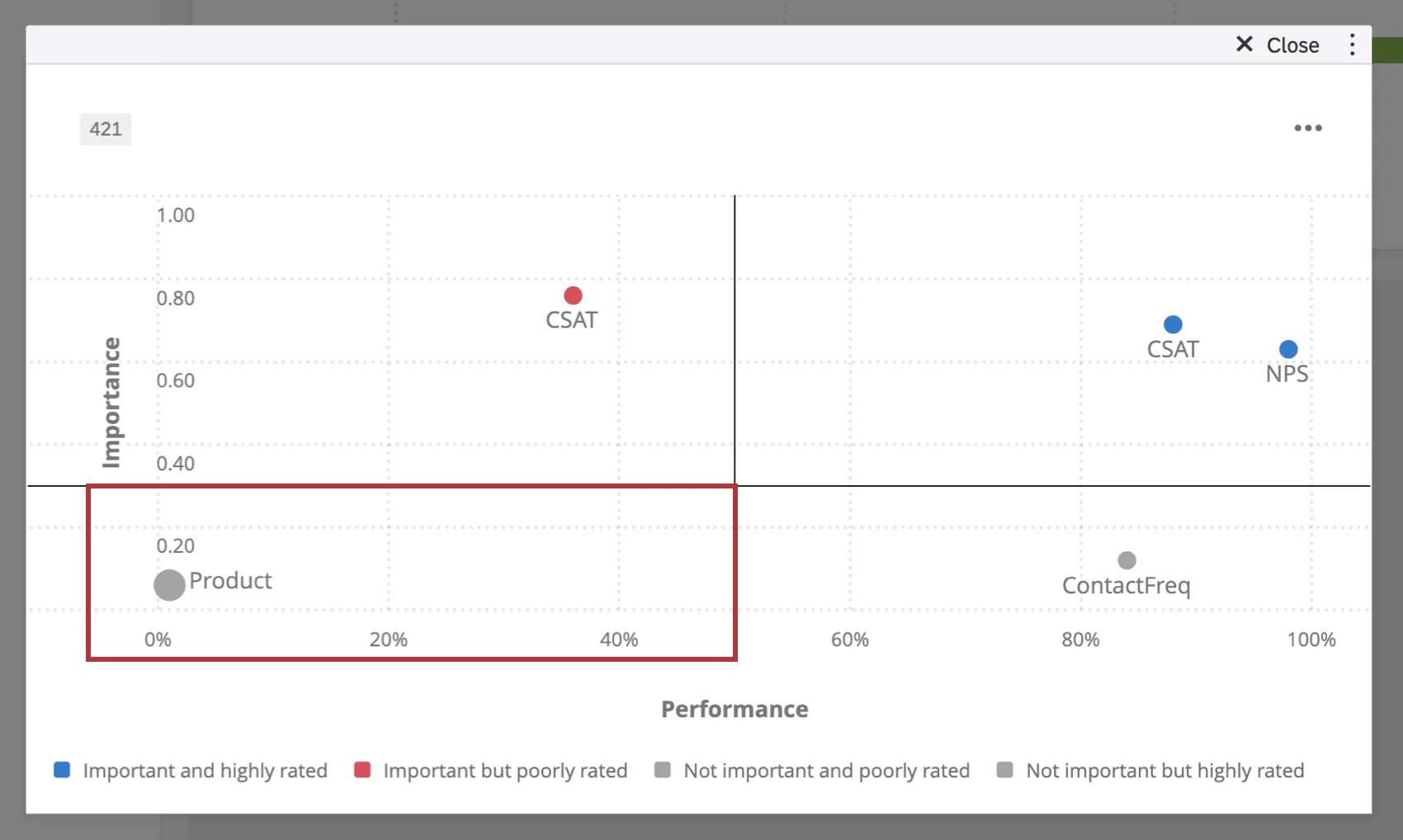
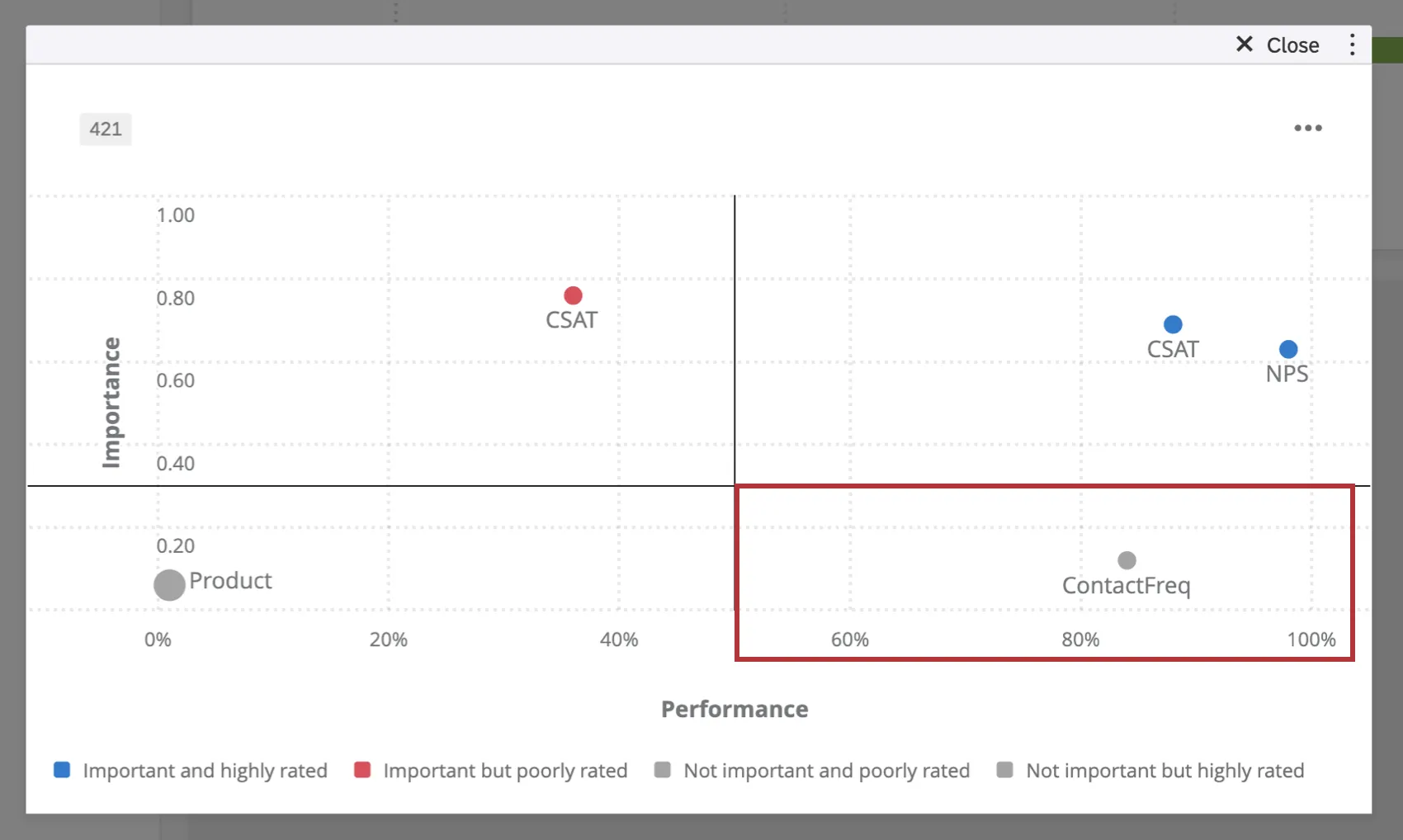
The key drivers widget is divided into 4 quadrants:
Important and highly rated: These values fall in the top right quadrant and indicate drivers that play a large role in determining the outcome measure. These drivers also have higher scores. For example, “Service Satisfaction” drives overall satisfaction in such a way that higher perceived safety is related to higher overall satisfaction scores. In this case, respondents have also indicated that this company is performing well with regards to “Service Satisfaction.”
Important but poorly rated: These values fall in the top left quadrant and indicate drivers that play a large role in determining the outcome measure. However, these drivers have lower scores. For example, “Product Satisfaction” plays a big role in determining overall satisfaction in such a way that poor products are related to lower overall satisfaction scores. In this case, respondents indicated that this company is not doing well in regards to controlling “Product Satisfaction.” This is an area of improvement for this company.
Not important and poorly rated: These values fall in the bottom left quadrant and indicate drivers that are not important in determining the outcome measure. These drivers also have low scores. For example, “Frequency of Contacting Support” doesn’t drive overall satisfaction scores and respondents also indicated this company was not having to contact support often. However, this company might not need to improve on this driver because it isn’t affecting their overall satisfaction.
Not important but highly rated: These values fall in the bottom right quadrant and indicate drivers that are not important in determining the outcome measure. These drivers also have a high score. For example, “Resolution Time” does not drive satisfaction, but it was given high scores by respondents. While one might argue that having a good resolution time for escalated issues is always a good thing, it does not influence this company’s overall customer satisfaction.
FAQs
Now that I have my key drivers, how should I act on the results in my EX dashboard?
Now that I have my key drivers, how should I act on the results in my EX dashboard?
If I have two sources mapped in my Dashboard Data, how can I make it so this widget only displays data from a single source in my EX dashboard?
If I have two sources mapped in my Dashboard Data, how can I make it so this widget only displays data from a single source in my EX dashboard?
Now that I have my key drivers, how should I act on the results for my Key Drivers widget in CX Dashboards?
Now that I have my key drivers, how should I act on the results for my Key Drivers widget in CX Dashboards?
I have multiple datasets on my dashboard. Can I use this feature with all of my widgets?
I have multiple datasets on my dashboard. Can I use this feature with all of my widgets?
- Changing which dataset your widget shows: Not all widgets can have their referenced dataset switched. Some can only use the default dataset. For a compatible list, see this section.
- Showing multiple datasets in the same widget: Not all widgets can show multiple datasets’ results at the same time. For a compatible list, see this section.
That's great! Thank you for your feedback!
Thank you for your feedback!