
Heat Map Plots (Results Dashboards)
What's on this page
About Heat Map Plots
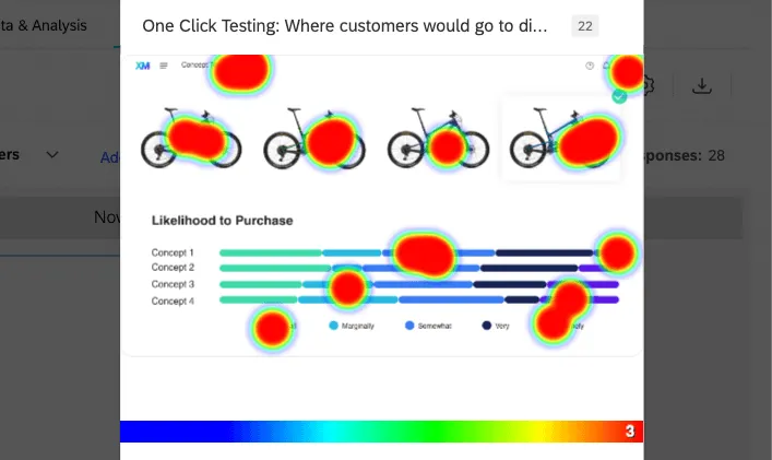
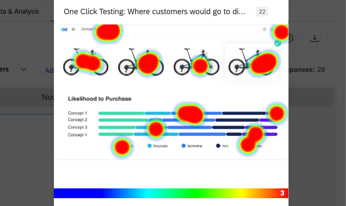
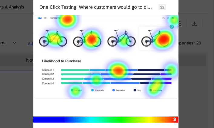
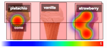
Heat map plots are widgets that show data collected from heat map questions. A spectrum of colors appears across the original image to show where respondents made their selections. The redder the area, the more respondents chose that coordinate.

Attention: Heat map plots are only supported by Results Dashboards. Heat map plots do not appear in CX Dashboards or EX Dashboards.
Up to 10,000 responses can be displayed in a heat map plot. Any responses above this limit will not be displayed.
Warning: Do not change the image in your heatmap question after you’ve already collected data, or your data will be invalidated, and you won’t be able to use it with the heat map plot.
Heat Map Plots in Results Dashboards
If you collected heat map data, a heat map plot will be included in your Results Dashboard by default.
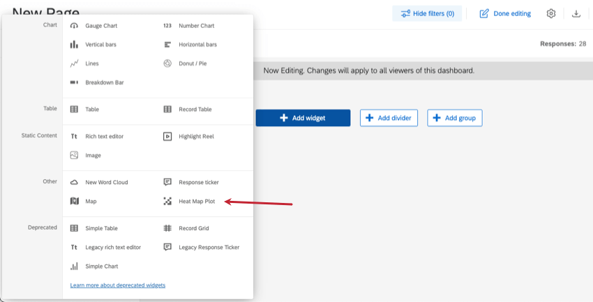
In the new widget menu, these widgets are under Other and called Heat Map Plot.

Basic Setup
The most important field that needs to be filled out before this widget can display data is the source. Here, you can select any individual heat map question in your survey.
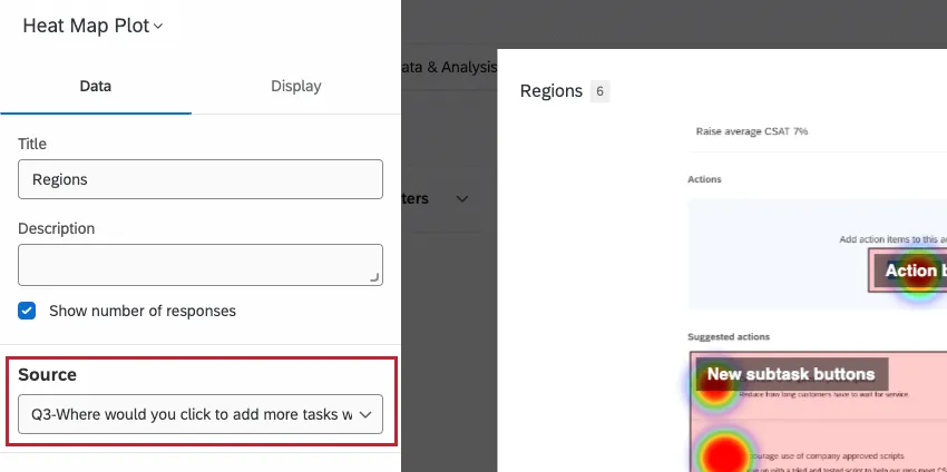
Qtip: You can only add heat map questions to the source of a heat map plot. You cannot use hot spots or any other kind of question.
Otherwise, it’s optional whether you add a title, description, or response count to your widget.
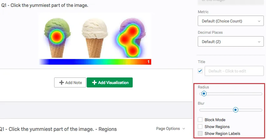
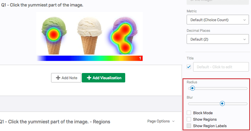
Display Options
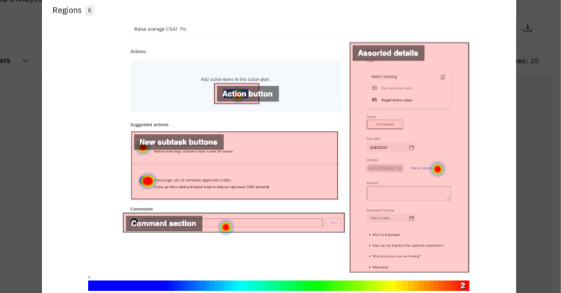
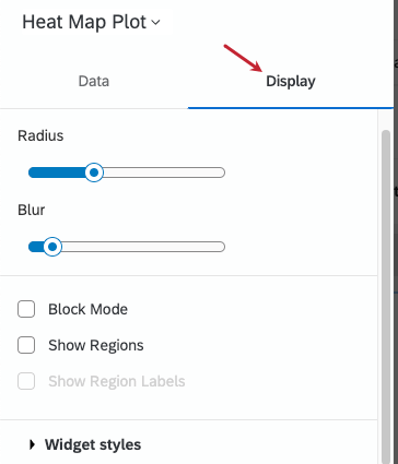
The heat map plot has a few additional options in the Display tab. These are especially useful if you want to adjust the color overlay or address heatmap regions.
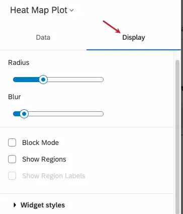
- Radius: Decide on the pixel radius of the colorful areas where respondents clicked. This increases or decreases the overall size of the color area.
- Blur: Decide how much to blur the transition from one color to another. This setting can increase contrast, thus showing more minute preference in large areas of the image that were clicked a lot.

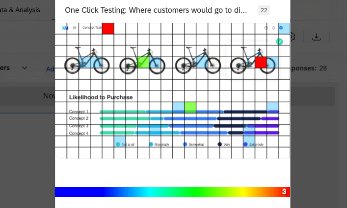
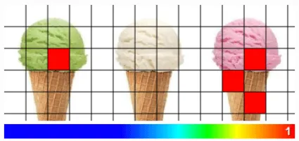
- Block Mode: Add a grid over the heat map plot, reducing clicks to individual colored squares with no gradient. While in this mode, the radius setting changes the size of the grid, and the blur setting has no effect.

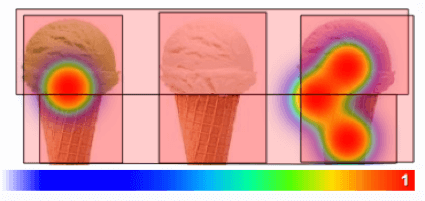
- Show Regions: If you have assigned regions to your Heat Map question, this option displays the regions over the heat map.
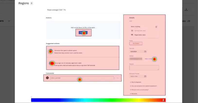
- Show Region Labels: You must turn on Show Regions This setting displays the name on each region.
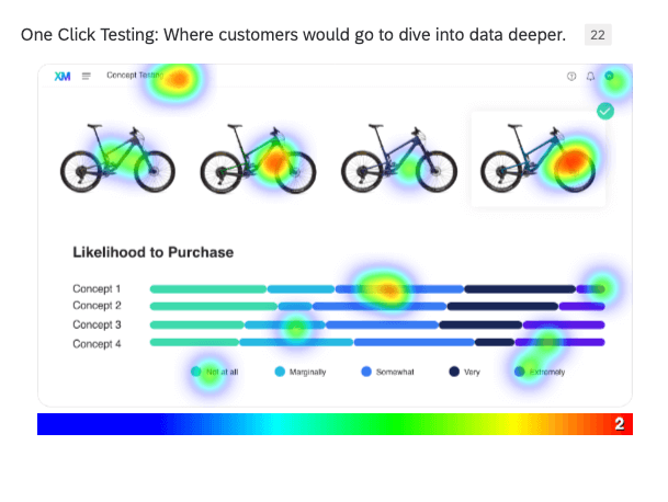
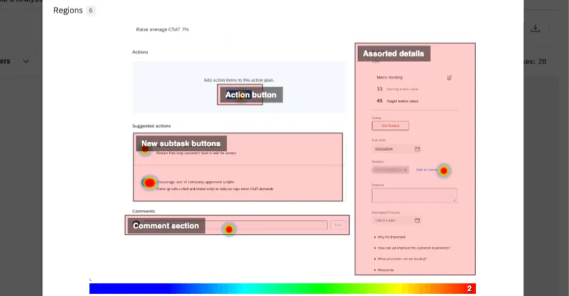 Qtip: You can also report on region-by-region data using standard widgets. However, the heat map plot is the best visual representation of where respondents clicked the image.

For more information on the Widget Styles settings, see Editing Widgets.
Heat Map Plots in Legacy Results
This section covers how heat map plots work in the legacy Results. We highly recommend using Results Dashboards instead; see Migrating to Results Dashboards for support.
Customization Options
There are five unique customization options for Heat Map visualizations:
- Radius: Determine the number of pixels a selected coordinate should color and affect.
- Blur: Determine the number of pixels used to transition from one color to another.
- Block Mode: Force data into a grid (note that while in this mode, Radius changes the size of the grid and Blur has no effect).
- Show Regions: If you have assigned regions to your Heat Map question, display the regions over the heat map.

- Show Region Labels: You must turn on Show Regions first. This gives you the option of showing the name of each region over it.


Region Visualizations
The following are the visualization types available if you have added regions to your Heat Map questions:
When it comes to visualizing the data, the unique regions of a heat map question act the same as any other multiple choice option.
FAQs
The heat map plot on the dashboard says, “Please enable editing and configure widget,” but I selected a heatmap question as the source. How can I get this widget to display data?
The heat map plot on the dashboard says, “Please enable editing and configure widget,” but I selected a heatmap question as the source. How can I get this widget to display data?
If you have added regions to your heat map question, you can also use a simple table, bar chart, line chart, pie chart, or breakdown bar to report on your data.
That's great! Thank you for your feedback!
Thank you for your feedback!