
Relate Data
What's on this page
About Relating Data
Relate explores the relationships between variables. When you select 2 variables and then select Relate, Stats iQ will choose the appropriate statistical test based on the structure of the data, run that test, then translate the results into a simple and clear explanation.
When you select 3 or more variables, Stats iQ will relate each variable to the 1 variable that has the key by it, then bring the strongest relationships to the top. You can select dozens of variables at a time, so you can sift through many relationships quickly.
Qtip: You may have up to 750 cards in your workspace. If you reach this limit, an error will appear when you try to create a new card, warning you that your oldest cards will be deleted.
Qtip: At the top of the card will be a green (and sometimes red) line. If you click on it, you will see the amount of responses marked as “Included,” “Missing,” or “Excluded by filter” for that specific card. If a response is marked as “Missing,” it means that the respondent did not answer both of the questions being related. Only respondents who provided data for both fields will be marked as “Included.”
The Key Variable
The first variable selected from the variable pane will be the key variable. The key variable serves 2 functions:
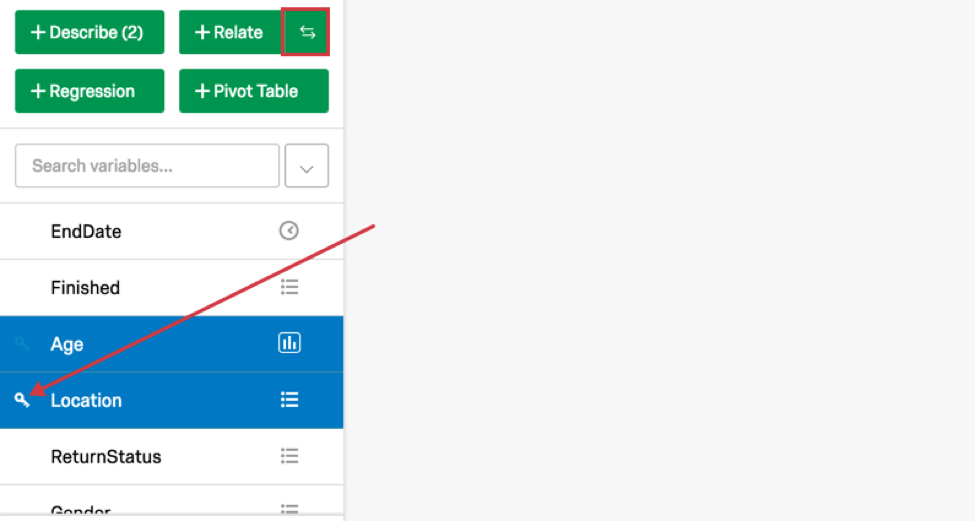
Qtip: Key variables can contain up to 10 categories.
Relating Numbers and Numbers Variables
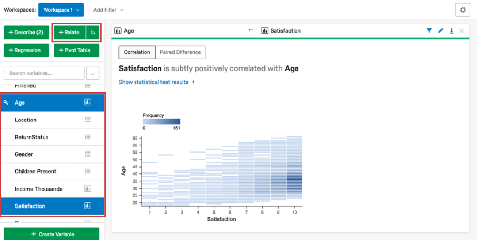
When you relate 2 numbers variables (including recoded categories), Stats iQ will usually run a correlation and create a scatter-plot to visually display the relationship between the 2 variables.
If the variables have many overlapping points on the scatterplot, Stats iQ will instead show a “binned” scatterplot where darker rectangles indicate a greater clustering of results. A line of best fit is shown by Stats iQ when the data indicates that the line will be useful (specifically, when the data doesn’t have outliers that might throw off the line).

To see the statistical details of any “relate” analysis results, click Show statistical test results. When relating 2 numbers variables, Stats iQ calculates a p-value and (for effect size) either a Pearson’s r or a Spearman’s rho. For more details on how Stats iQ chooses the statistical test, visit the Statistical Test Assumptions and Technical Details page.
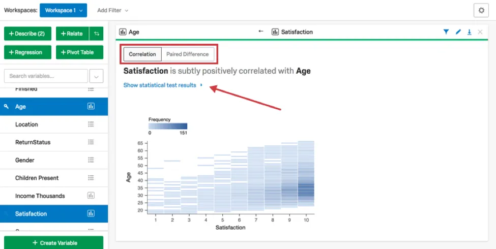
It’s possible that you’re less interested in whether the variables are correlated and more interested in which variable is higher on average. If the 2 variables are on similar scales, Stats iQ will provide an option at the top to switch from Correlation to Paired Difference, which allows you to compare averages.
Relating Numbers and Categories Variables
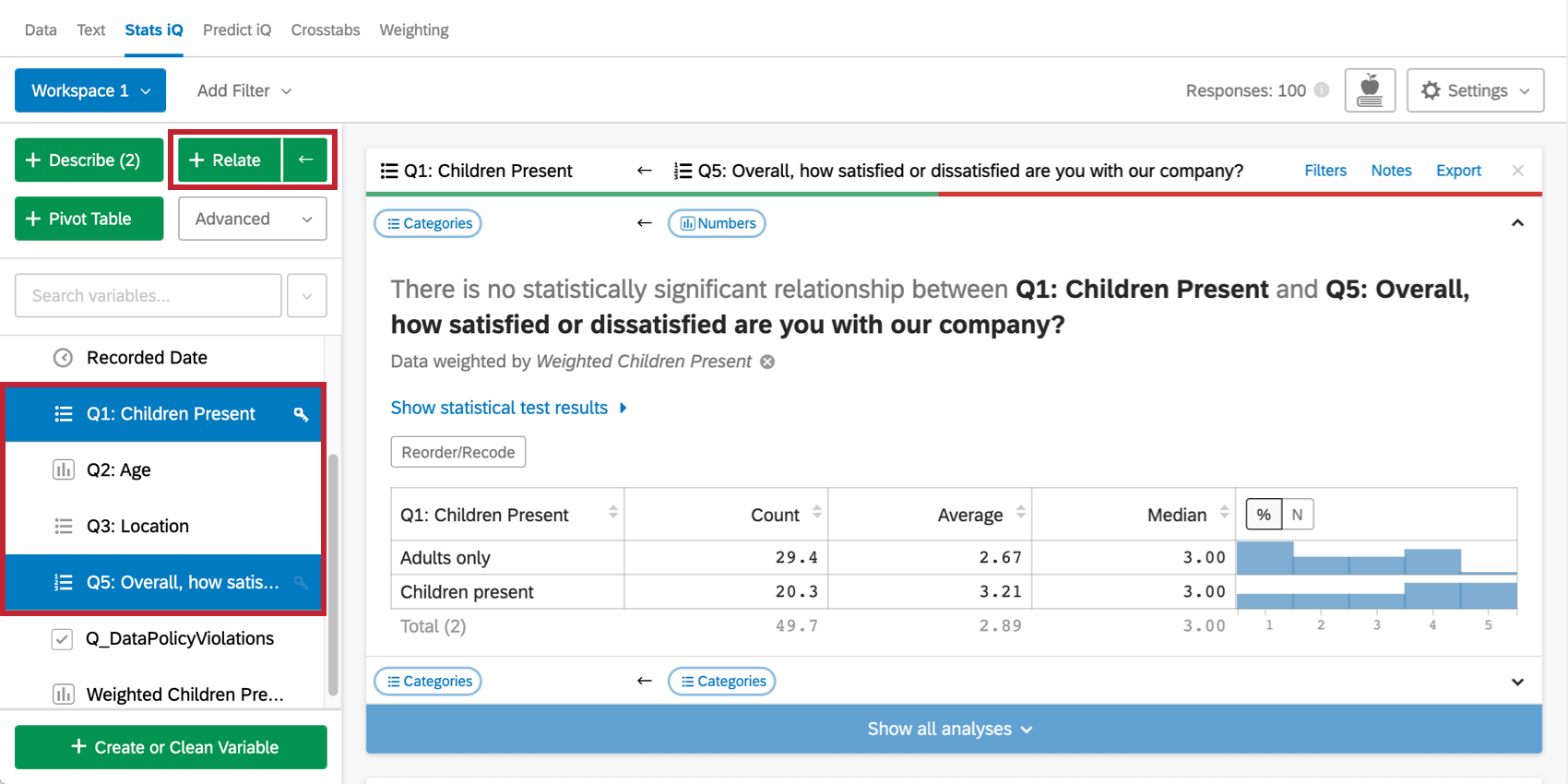
When you relate a numbers variable and a categories variable, Stats iQ runs a statistical test and creates a table displaying each category’s count, average, median, and distribution of the numbers variable.
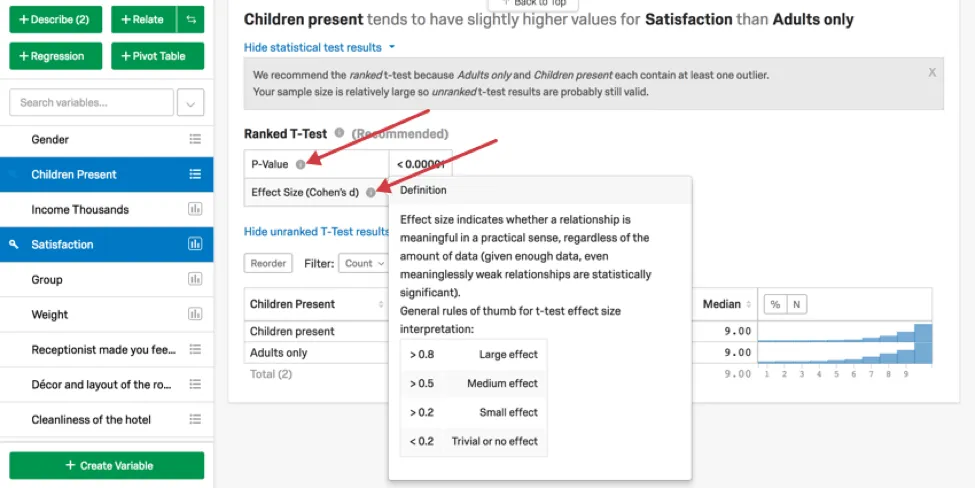
For example, you may wish to determine if guests at a hotel with children or guests without children are more satisfied on average. In this case, the “Children Present” variable is categorical, and “Satisfaction” is numeric.
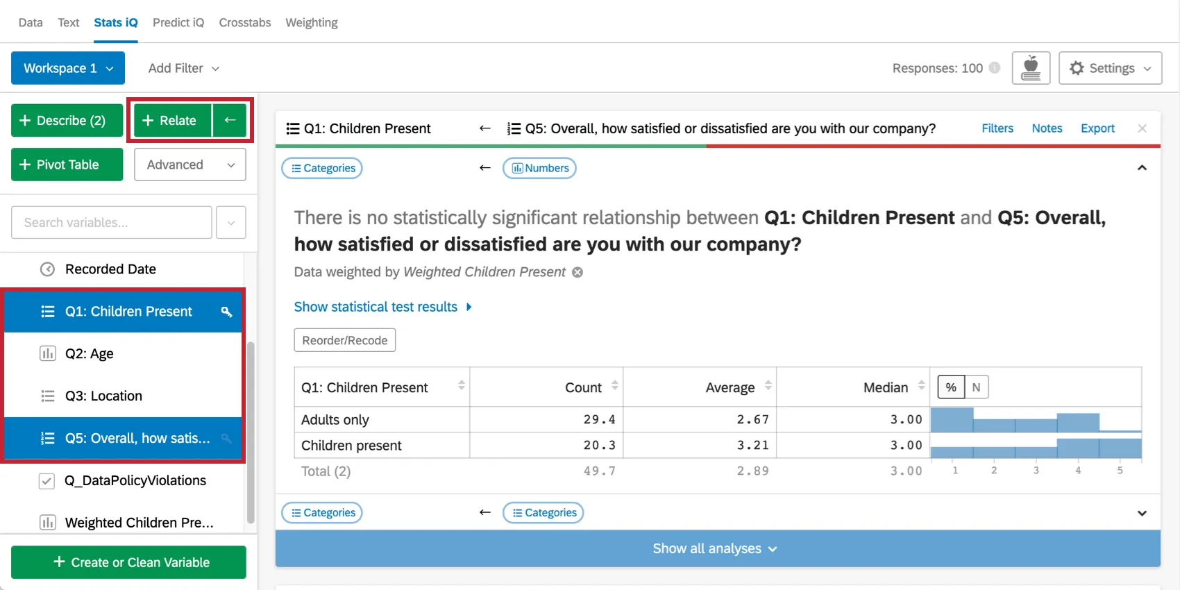
The output of this statistical test can be seen by clicking Show statistical test results on the card. When the categories variable has only 2
categories, Stats iQ performs a t-test or a ranked t-test. When it has more, Stats iQ runs an ANOVA or a ranked ANOVA, as well as a Games-Howell post hoc test. For more details on how Stats iQ chooses the statistical test, visit the Statistical Test Assumptions and Technical Details page.
Relating Categories and Categories Variables
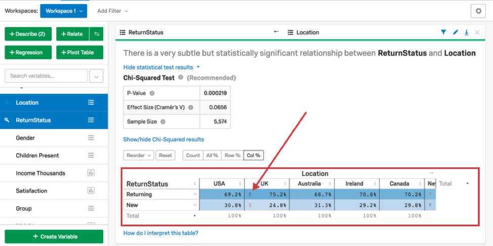
When you relate a categories variable and a categories variable, Stats iQ runs a statistical test and creates a cross tab.
Each column in the cross tab sums to 100%. In the example below, 69% of respondents in “USA” were “Returning” and 31% were “New.” You can select Row % to make the rows sum to 100%, Count to see the raw count in each cell, or All % to see the entire table sum to 100%. Alternatively, you can flip the rows with the columns entirely by selecting the ← at the top of the analysis result.
In the example below, since the columns sum to 100%, the question we are asking is, “What proportion of USA respondents were returning guests?” If we select Row % (or swap the columns and rows), we’re now asking “What proportion of returning guests were in the USA?” In this case, either of those questions could be useful to ask. Sometimes only 1 question will really be meaningful.
Green and red arrows within cells will indicate if the value of a cell is statistically higher or lower than you would expect if there was no relationship between the variables. If Col % is selected, the arrows compare that cell’s number to the other numbers in that row. More arrows correspond to a higher degree of statistical significance. Cells with high numbers in them appear darker than other cells.
In the example below, 75.2% is higher than the aggregate of the other numbers in that row, so the UK has a higher than typical proportion of returning visitors.
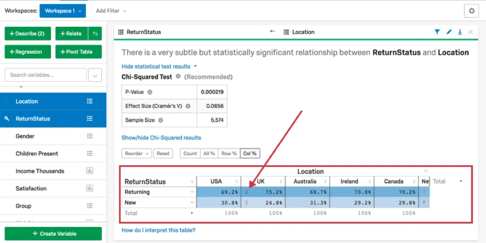
The output of the statistical test can be seen by clicking Show statistical test results on the card. Stats iQ performs either a Fisher’s Exact Test or a Chi-Squared test when 2 categorical variables are related. Up to 3 arrows will be shown in a cell, depending on the p-value calculated from the adjusted residual of the cell. For more details on how Stats iQ chooses the statistical test, visit the Statistical Test Assumptions and Technical Details page.
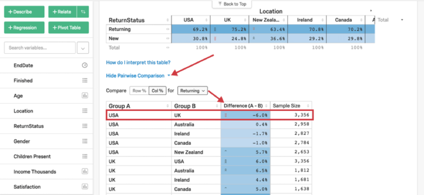
In addition to the general crosstab, Stats iQ will also generate a Pairwise Comparison table, which compares the values of pairs of categories in a given row. For example, the crosstab below shows the proportion of clients who are returning visitors from various locations. The Pairwise Comparison table shows, for example, that the UK has a 6 percentage-point higher proportion of returning visitors than the USA. The green and red arrows on cells indicate statistically significant differences.

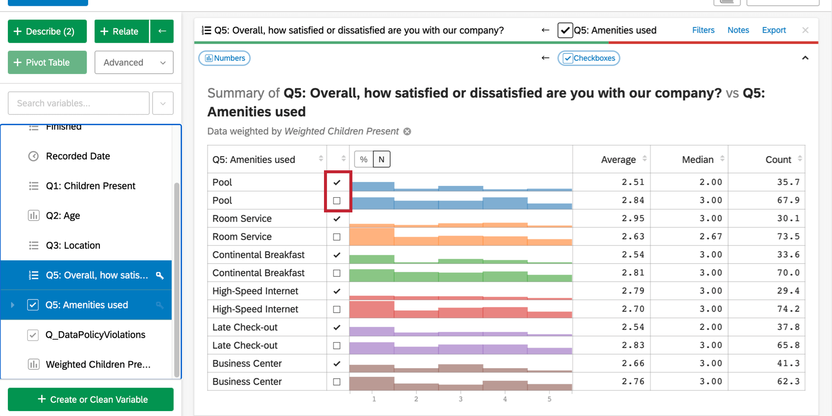
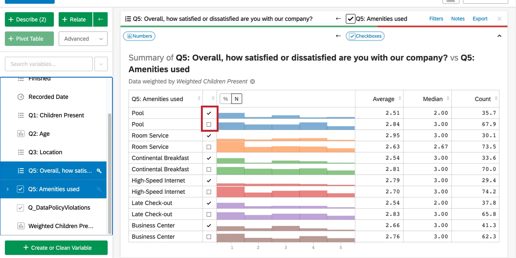
Relating Checkboxes and Numbers Variables
When you relate a checkboxes variable and a numbers variable, Stats iQ runs a statistical test and creates a summary table.
Stats iQ displays a table with 2 rows for each checkbox: one for if the box was checked and one for if it was not. For example, if 1 of the checkboxes represents whether or not a respondent used the pool, there will be a row for using (checked) and not using (unchecked) the pool, along with the average satisfaction scores of respondents who fall into either of those 2 groups.
This table, like most in Stats iQ, can be sorted. For example, you might want to sort by average or by whether the box was checked or not. Click the column header (e.g., Average) to sort the table by the values in that column.
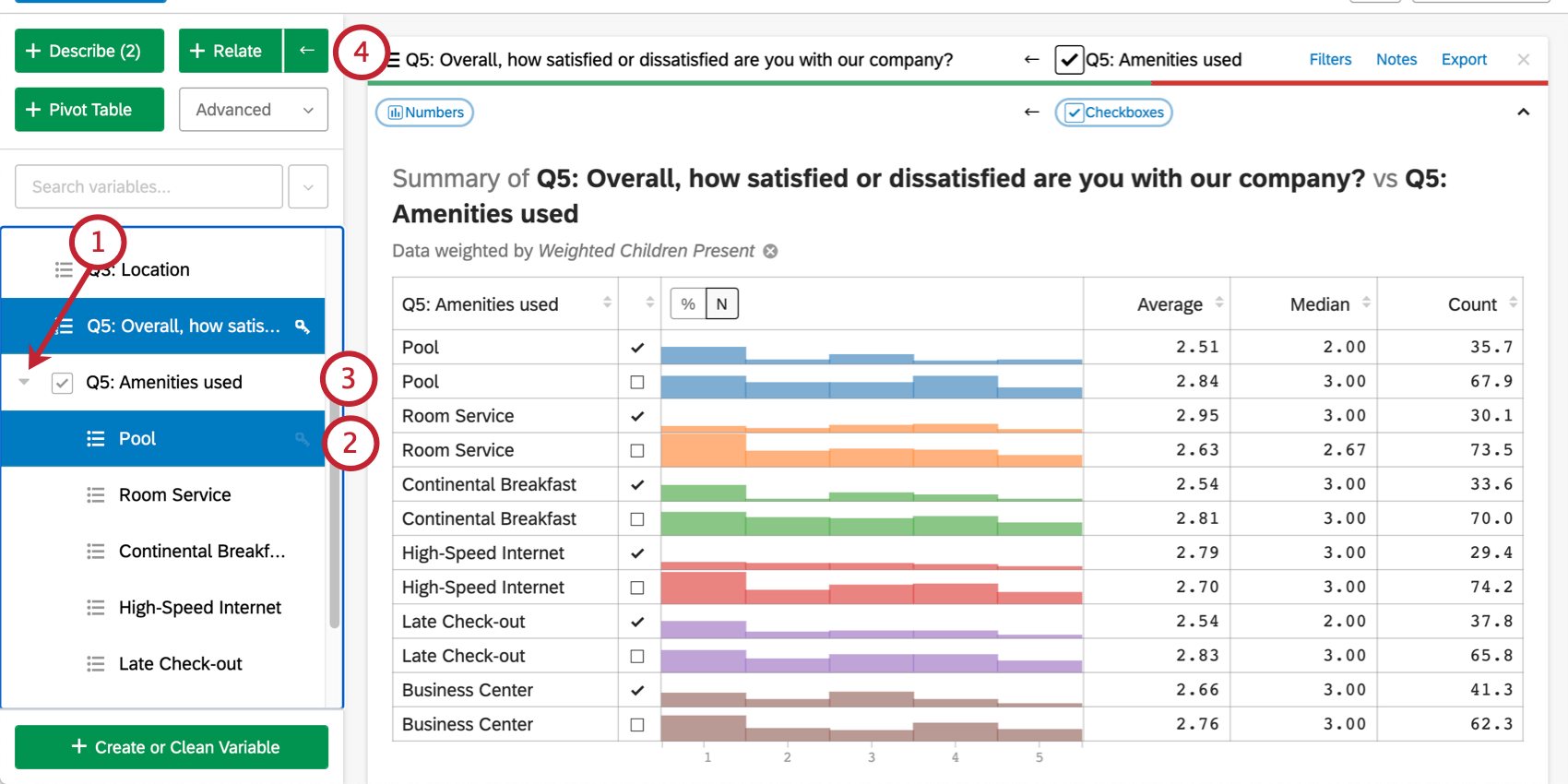
Although the table will display statistical information such as median and average, there are no statistical tests performed in this situation. To run a separate analysis comparing the averages of those who used the pool versus those who did not:
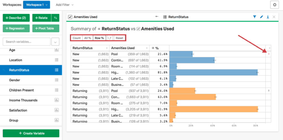
Relating Checkboxes and Categories Variables
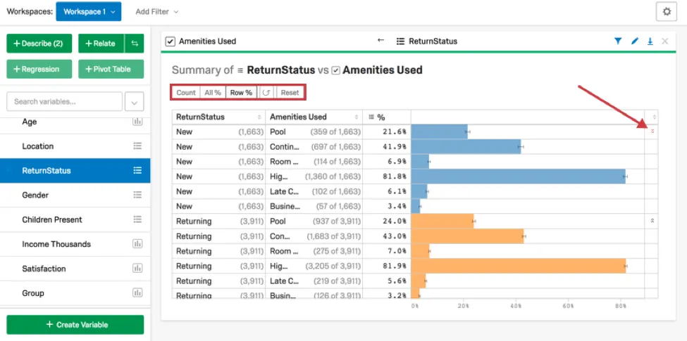
When you relate a checkboxes variable and a categories variable, Stats iQ runs statistical tests and creates a summary table.
Depending on which variable had the key by it, one of the first 2 columns will contain the categories variable options and the other will contain the checkbox options. The “%” column will indicate the proportion of the first column group that selected the second column group.
In the example below, the first row indicates the following:
- There were 1663 respondents who are new customers.
- Of those 1663 respondents, 359 used the pool.
- That means 21.6% of the 1663 respondents used the pool.
- The red arrows in the last column indicate that this is a lower than typical proportion.
The arrows in the last column are calculated in the same way as in the cross tab for categorical variables, discussed previously.
Qtip: When exporting a Relate scorecard from the Qualtrics platform to an Excel file, the data column labeled “%” will be labeled as “Category %” Excel.
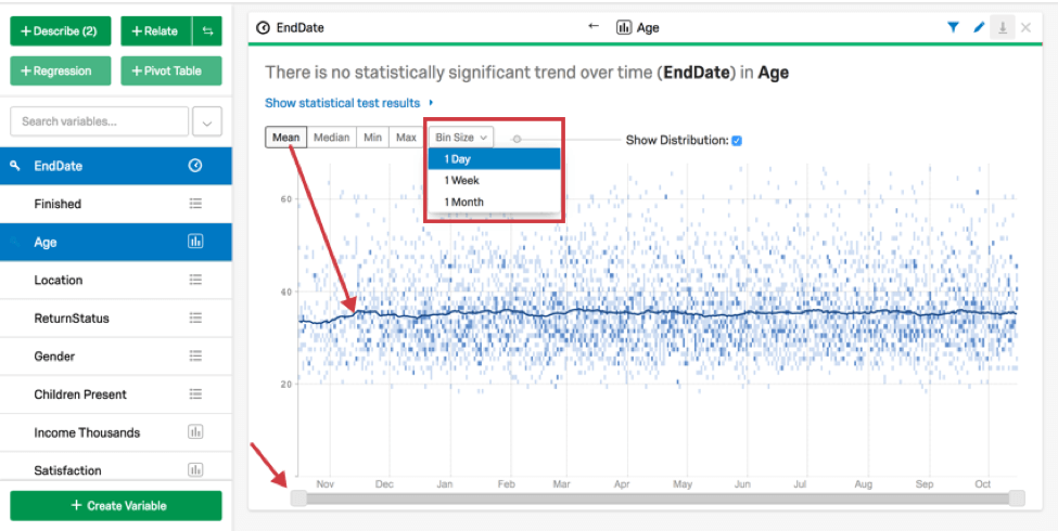
Relating Numbers and Times Variables
When you relate a numbers variable and a times variable, Stats iQ will create a chart that shows how the numbers variable has varied over time. To change the bin size (from days to weeks, for example), click Bin Size above the chart.
In addition to the date bins, Stats iQ will display a line for a specific statistical value over time. The default value is the mean. Selecting a different option at the top of the chart (Median, Min, or Max) will change which value is represented as a line on the chart. Adjusting the slider below the graph will narrow the date range displayed.
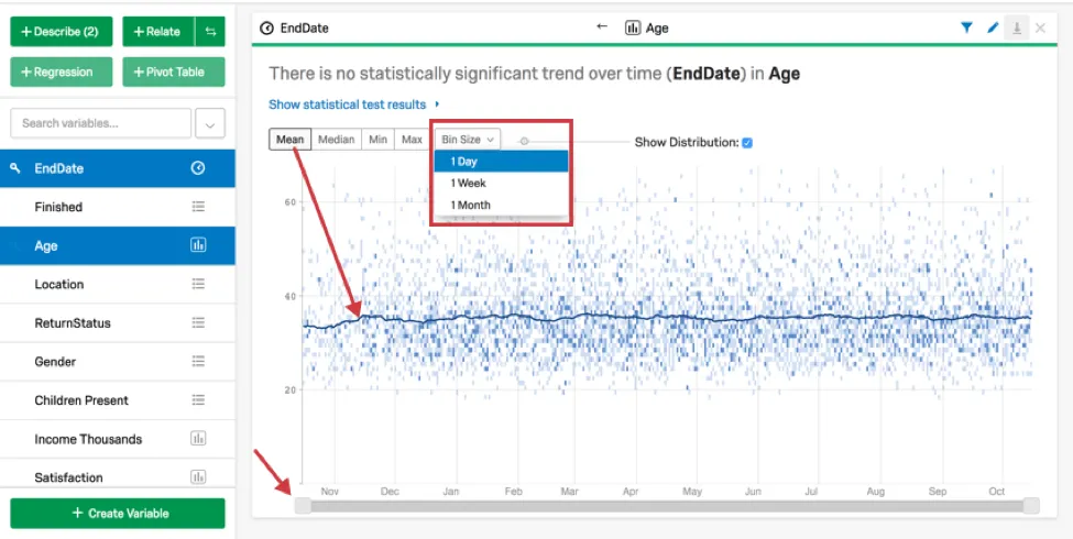
The output of this statistical test can be seen by clicking Show statistical test results on the card. The statistical tests Stats iQ runs are the same that would be run if the times variable were a numbers variable. In particular, this means that Stats iQ will run a correlation between the variables.
Relating Times and Categories Variables
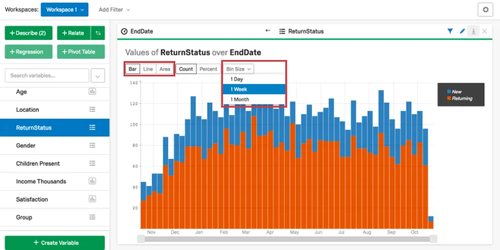
When you Relate a times variable and a categories variable, Stats iQ will create a chart that shows how the counts of those categories have changed over time. To change the bin size (from days to weeks, for example), click Bin Size above the chart.
For this type of card, you will have the option to select the type of chart that is displayed. The chart type is changed when a different option (Bar, Line, or Area) is selected above the chart. The chart will display data as a Percent or Count depending on which option is selected at the top of the chart. Percent is particularly useful for seeing how the distribution of groups has changed over time. No statistical tests are run for this type of card.
Statistical Tests in Stats iQ
Stats iQ chooses statistical tests based on the variable types and structure of the columns being analyzed. For reference, this is a full list of the non-regression statistical tests and effect size measures in Stats iQ:
- T-test (2 Categories vs. Numbers)
- ANOVA (3+ Categories vs. Numbers)
- Games-Howell post hoc tests (3+ Categories vs. Numbers)
- Cohen’s f
- Correlation (Numbers vs. Numbers)
- Pearson correlation
- Spearman correlation
- Point Biserial correlation
- Cohen’s d
- Paired t-test (Numbers vs. Numbers)
- Fisher’s Exact Test (2 Categories vs. 2 Categories)
- Chi-squared (3+ Categories vs. Categories)
- Cramer’s V
- Z-test (Categories vs. Categories)
- Time-series analysis
- Difference in differences (DID, DD)
Choosing Statistical Tests
Stats iQ will pick the correct statistical test for you, given its understanding of the data (e.g., whether a variable is a numbers variable or categories variable). You can change the variable type to trigger a different result, however.
For example, you could relate a 1/0 to a 1-7 scale. If the 1/0 is considered to be categorical, the result is a t-test. If it’s considered to be numeric, the result is a correlation (the results of those 2 analyses will be very similar).
Stats iQ will run a “ranked” relationship if numeric data isn’t normally distributed or has outliers. If you’d rather see the “unranked” relationship (or vice versa), that option is available in the statistical test results. For more details on ranked tests, visit the Statistical Test Assumptions and Technical Details page.
Multiple Comparisons Problem
The Multiple Comparisons problem can occur if you use the “relate” analysis with a large number of non-key variables selected. In this analysis, you’re likely to see about 5 of the results show up as statistically significant through pure luck, and not necessarily a meaningful relationship. This is a necessary consequence of the way statistical analysis works.
In Stats iQ, if you run many analyses at once and see results where the p-value is narrowly significant (e.g., 0.03 instead of 0.00004), this is a good indication that these correlations are not necessarily significant.
Translating Statistics into Sentences
Stats iQ explains the results of the Relate analysis in a way that’s easy to understand, even without expert knowledge of statistics.
If the p-value is not below the threshold of statistical significance (the default for this in Stats iQ is 0.05), the sentences will explain that there is not a statistically significant relationship.
If the p-value is below the threshold, Stats iQ will then look at the effect size. Depending on the effect size, Stats iQ will add words to the sentence like “weak” or “strong” to characterize the relationship. More information on how Effect Size and p-value are interpreted can be found by clicking the information (i) button under Show statistical test results.
The below table outlines how we would describe variable relationships for t-tests based on Effect Size.
| Effect Size | Effect Size Interpretation | Stats iQ Language |
|---|---|---|
| Below 0.2 | Trivial or no effect | There is no statistically significant relationship between the variables. |
| Between 0.2 and 0.5 | Small effect | Variables are statistically related. We wouldn’t use an extra adjective to characterize their relationship. |
| Between 0.5 and 0.8 | Medium effect | Variables are statistically related. We wouldn’t use an extra adjective to characterize their relationship. |
| Above 0.8 | Large effect | Variables are “strongly” related. |
Depending on the type of statistical test used, the Effect Size thresholds will be slightly different. However, the same general pattern applies.
FAQs
How do I create a new Stats iQ variable?
How do I create a new Stats iQ variable?
Which question types are compatible with Stats iQ?
Which question types are compatible with Stats iQ?
What are the options for analyzing my data in Stats iQ?
What are the options for analyzing my data in Stats iQ?
- Describe: Selecting a variable from the list and then clicking Describe will give you a visualization of the data contained in that variable. Use this when you would like to see how the data for a certain variable is distributed.
- Relate: Selecting two variables and then clicking Relate will run a statistical analysis of the relation between the two variables. Use this when you would like to know how strongly two variables are correlated.
- Pivot Table: Selecting two or more variables and clicking Pivot Table will create a table that displays the values of the variables as rows and columns. The cells can be set to display a variety of different information including column and row percentage, Sum, and Variance. Use this when you would like to compare the overlap between specific values of a set of variables.
- Regression: Selecting two variables and clicking Regression will give the mathematical relationship between the variables. Use this when you would like to predict values for one variable based off of the values of another.
- Cluster: Selecting two to ten demographic variables and clicking Cluster will display groupings of traits most likely to occur together, thus revealing the population segments captured in your data.
What do the different variable types mean in Stats iQ?
What do the different variable types mean in Stats iQ?
I don't know what this statistical term means. Can you tell me?
I don't know what this statistical term means. Can you tell me?
- Statistical tests: ANOVA, T-test, and Chi-squared are all statistical test that Stats iQ performs to test whether or not the relationship between two variables is significant. These tests are used to generate a P-Value.
- P-Value: This value represents the probability that the observed results would be seen if no correlation between the variables exists. A lower P-Value means more correlated data.
- Effect Size: The effect size is a measure of how large the correlation between two variables is. This is measured in different ways depending on the type of the statistical test performed. Examples are Cohen’s d, Pearson’s r, and Cramer’s v. The larger the effect size value, the more correlated the variables are.
How do I get my new responses to show up in Stats iQ?
How do I get my new responses to show up in Stats iQ?
What’s Stats iQ? / Where’s Statwing?
What’s Stats iQ? / Where’s Statwing?
What do I do if my data isn't loading properly?
What do I do if my data isn't loading properly?
That's great! Thank you for your feedback!
Thank you for your feedback!