-

Qualtrics Platform -

Customer Journey Optimizer -

XM Discover -

Qualtrics Social Connect
Widgets in Text iQ
About Text iQ Widgets
Widgets can illuminate your text data’s meaning in a visually pleasing way. Text iQ has several widgets available, which are detailed on this page.
Bubble Widgets
Bubble widgets provide a way to visualize the sentiment breakdown of each of your text topics. Bubble widgets are available in summary mode, but if you have Text iQ in your CX dashboard, the Text iQ bubble chart widget can be displayed directly in the dashboard.
When topics are nested together, topics at the highest level in the hierarchy appear as bubbles instead. Click this bubble to break out the topics underneath in the graph.
Once you select a topic that does not have nested topics below, you will see the terms used to build that topic. If your topic was built manually, without search queries, the graph will be blank
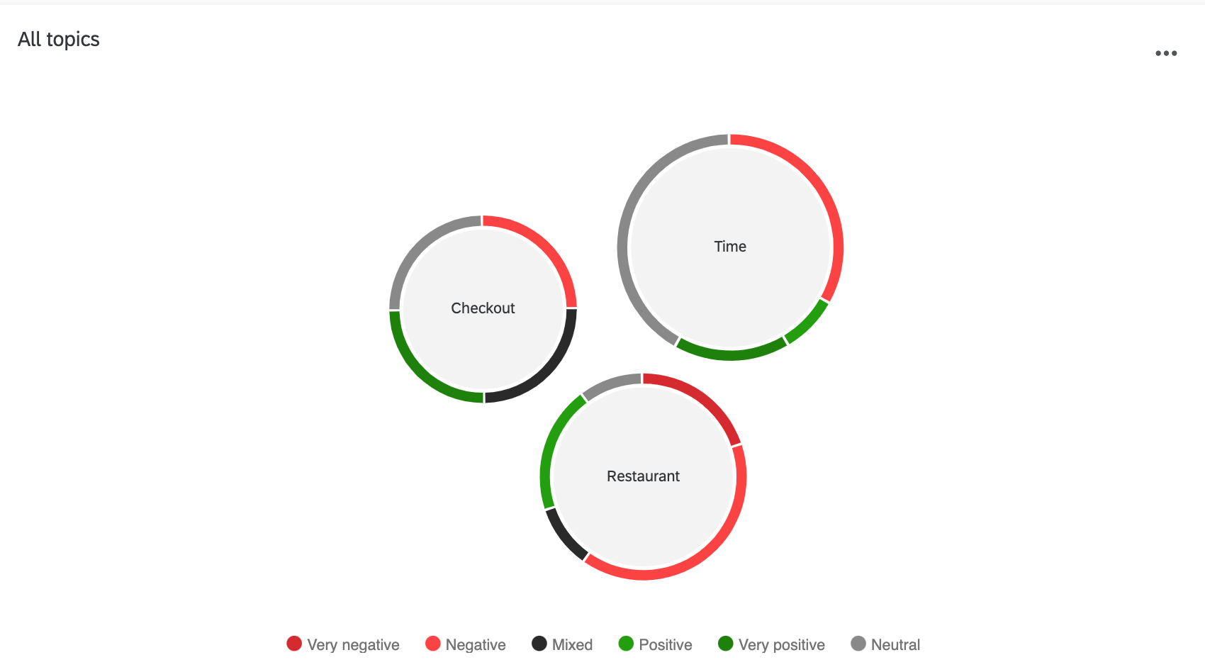
- Each bubble represents a topic, with the name in the center. The bubble size corresponds to the number of responses tagged with that topic.
Example: Staff only has 1 response, whereas food has 19, resulting in food being a much larger bubble than staff.
- The color around the rim of the bubble indicates the sentiments for those responses, with the length of color corresponding to how many responses match that sentiment.
- The legend along the bottom explains what color corresponds to what kind of sentiment.
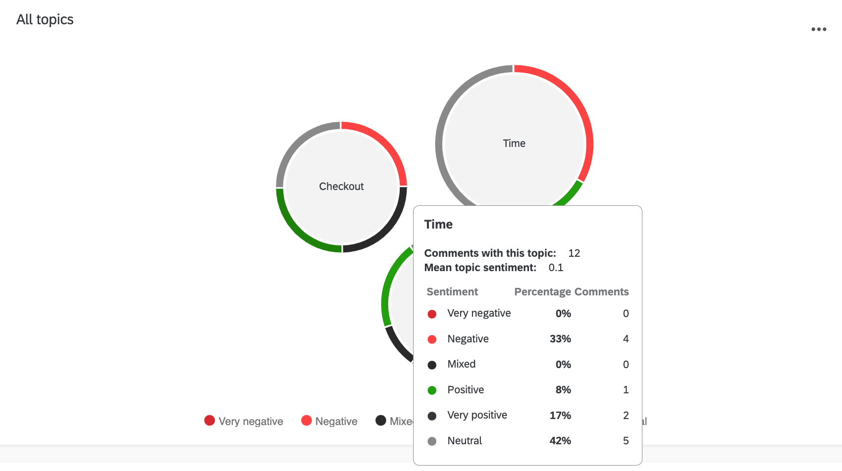
Hover over a bubble to learn more about that topic. You will be given breakdowns of total number of comments, sentiment types by percentage, and the count of each sentiment type.
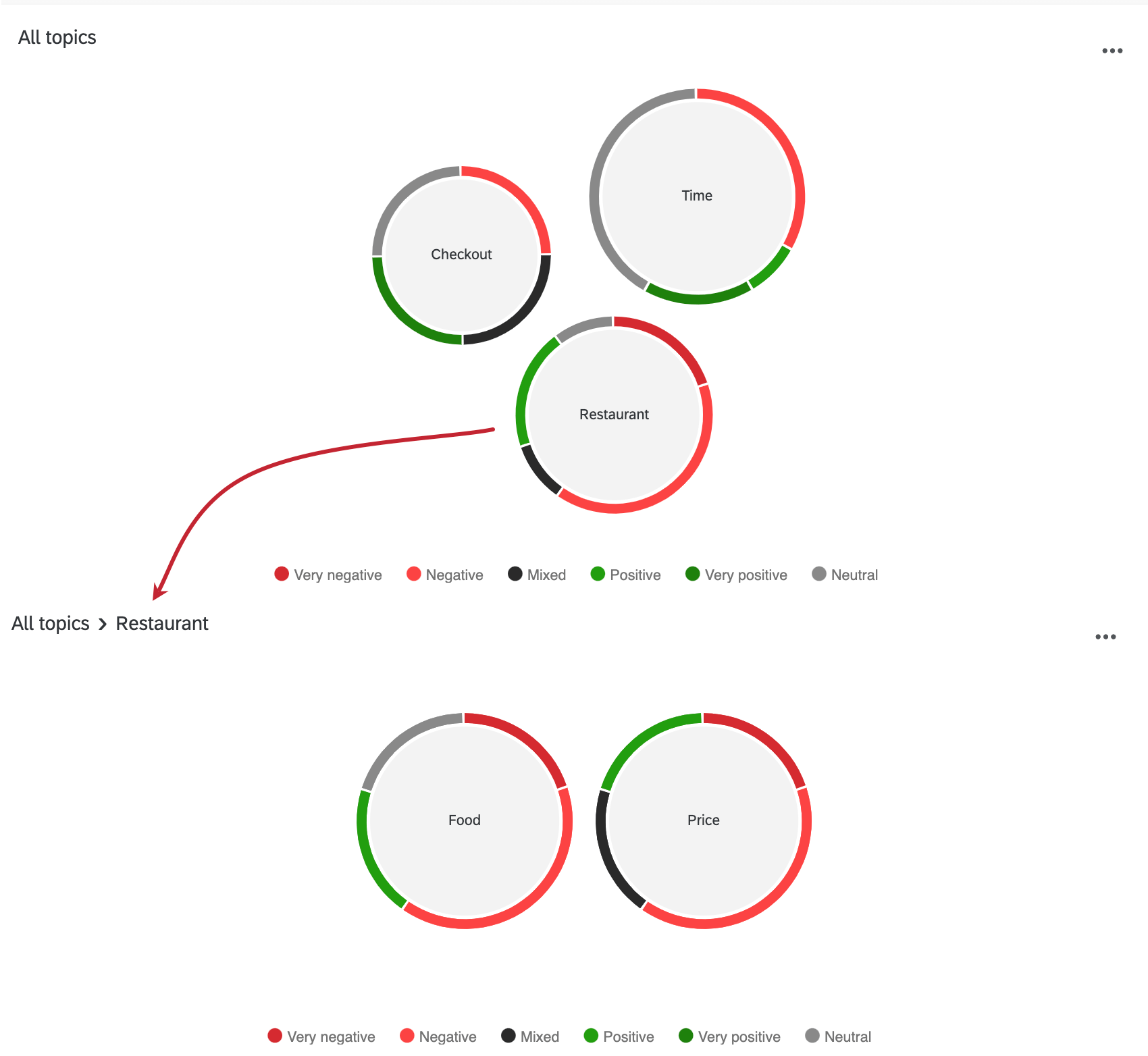
When topics are nested together under a parent topic, the parent topics will appear as bubbles instead. Click this bubble to break out the topics underneath in the graph.
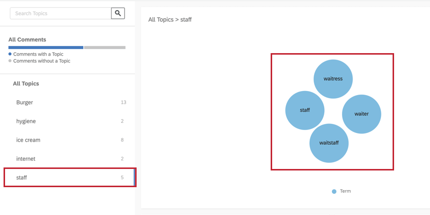
If you select a topic along the left or click a topic bubble, you will see the terms used to build that topic. If your topic was built manually, without search queries, the graph will be blank.
Topic and Sentiment Change Widgets
The topic and sentiment change widgets compare how your topics and sentiment have changed over time. If you have at least two days worth of data, the widgets will show a day comparison. If you have at least two weeks of data, a week comparison will show. Similarly, with at least two months of data, the widgets will compare months. If you do not have at least two days worth of data, the widgets will not display results.
To narrow down the topics included in the widget, click the View dropdown and select which level of the topic hierarchy you would like to view.
Topic Change
The topic coverage change widget will compute what percentage of your comments are covered by each topic (across 2 time periods) and then show you the topics with the greatest absolute count change between the 2 periods. Each change will be visualized by drawing a line between the previous value and the new value on the graph with a colored circle pointing in the direction of change.
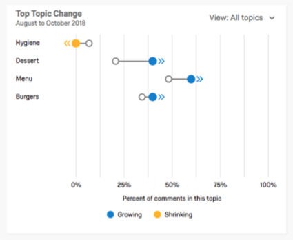
In the example above, Hygiene is yellow because it is shrinking. We see this not just because of the yellow dot, but because the starting point (clear) is further right on the x-axis than the yellow dot. The x-axis represents percent of comments tagged with this topic.
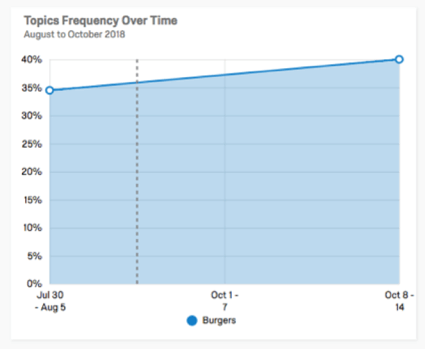
If a topic is selected, an area graph will show a more detailed view of the selected topic.
Sentiment Change
The Top Sentiment Change widget will show changes in the mean of topic level sentiment scores across 2 time periods. Similar to the topic change widget, sentiment change is visualized by drawing lines with circles pointing in the direction of change. If a topic is selected, a bar chart is shown with a more granular view of sentiment scores within the given time period (breaking down by sentiment label).
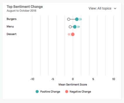
Since this widget calculates the difference between two means, only topics which have comments in both time periods will be shown.
Word Clouds
Word Clouds are widgets that appear in Summary mode. They list the 50 most frequently used words in the text responses, excluding common stop words like “the” or “a.” Words become more central, a darker font color, and bigger the more commonly they appear.
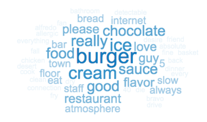
Frequency is determined by the number of responses with the word in it, not the number of times the word appears in each response
You cannot change the color of your Word Cloud.