
Pie Chart (Results)
What's on this page
Qtip: There is a new version of Results available. To opt in to the new Results Dashboards, navigate to the Results tab and click Try it now.

About Pie Charts
Pie Charts allow you to visualize how your answer choices or field values for a given data source compare to each other as components of a whole. The possible answer choices are each represented as a “slice” of a pie, taking up space proportional to how many respondents selected or were assigned the value.
Customization Options
For general settings, see the Visualizations Overview support page. Read on for settings specific to the Pie Chart.
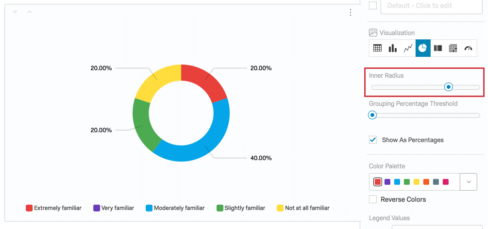
Inner Radius
The Inner Radius setting controls what percentage of the center of the Pie Chart should be empty. By default, this is set to 70%, but you can change this from anywhere between 0% to 99%.

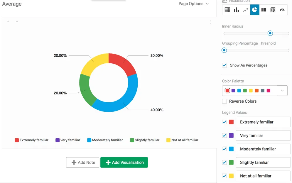
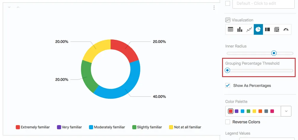
Grouping Percentage Threshold
Let’s say that some “slices” of your pie are very small. You might be fine with these options being grouped together so that people reading your report can focus on the big results. The Grouping Percentage Threshold allows you to establish the minimum percentage a portion of the pie chart should have before it gets lumped into an “All Others” category.
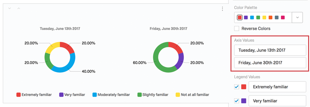
Example: In the picture below, “Not at all familiar” makes up 20% of the pie, as do “Extremely familiar” and “Slightly familiar.” If we set the Grouping Percentage Threshold to 25%, “Extremely familiar,” “Slightly familiar,” and “Not at all familiar” would be grouped into one category called “All Others” that took up the collective 60% of the pie.
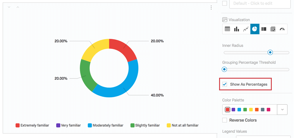
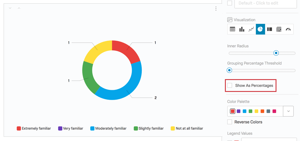
Show As Percentages
By default, percentages are used to show how much of the Pie Chart each answer option takes up.
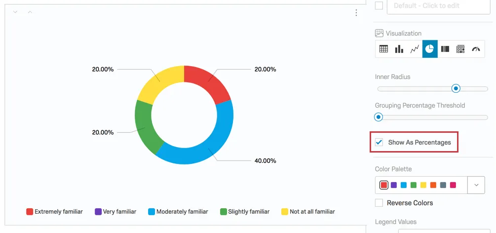
If desired though, you can disable the Show As Percentages option and display the values of the chosen metric instead. For example, response counts.

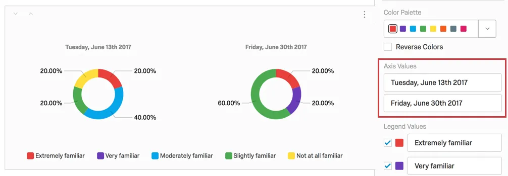
Axis Values
Whenever you apply a breakout to a Pie Chart, the visualization is broken into several different pies, one for each of the breakout options (or “axis values”). You can edit the text of these values by clicking directly into the text box for the name and entering the new name.
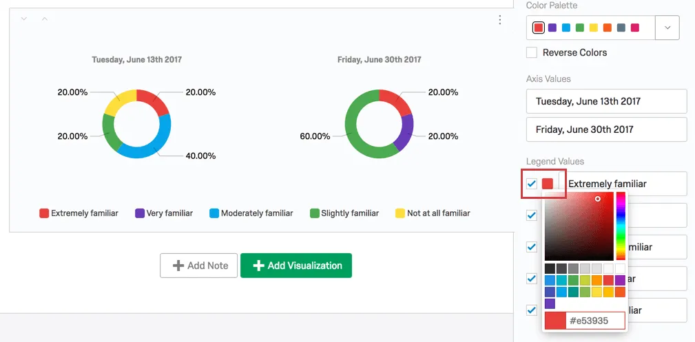
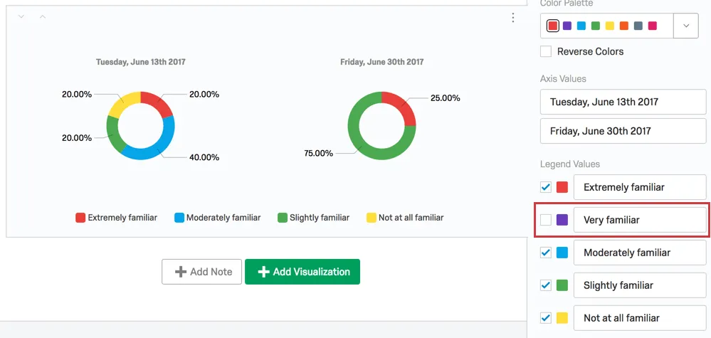
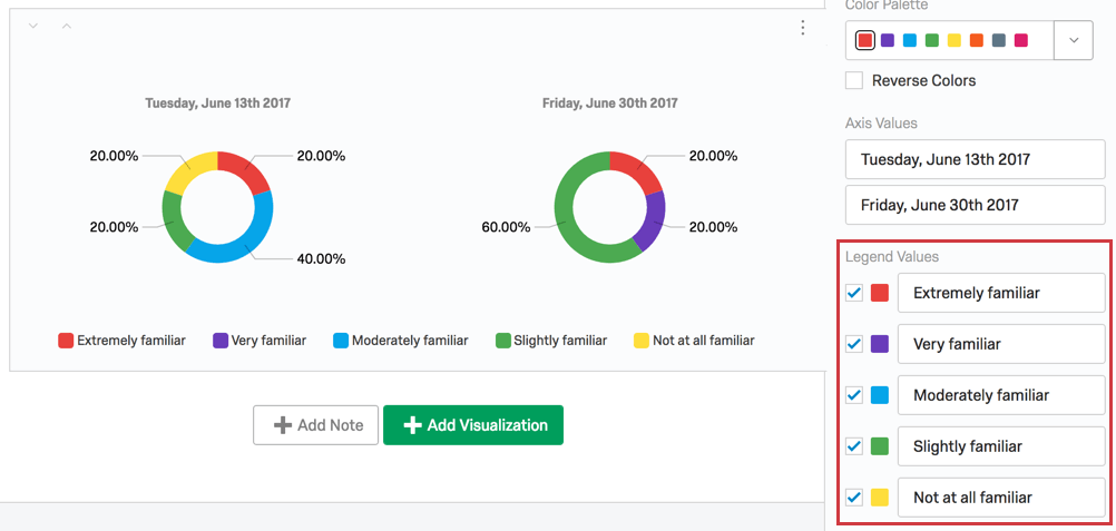
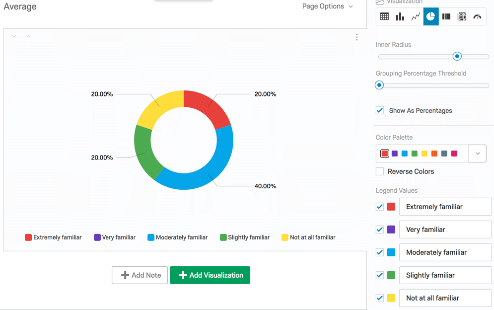
Legend Values
You have a variety of options concerning the answer names (or “legend values”), including the following:
- Change the legend value text by clicking directly into the text box for the name and entering the new name.
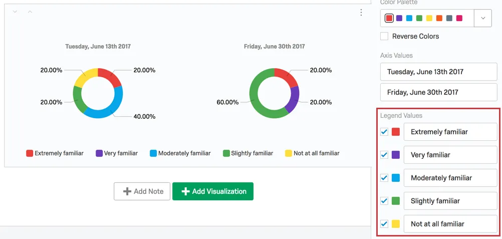
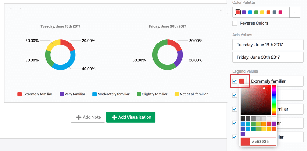
- Adjust the color of the option by clicking directly on the color box to the left of the value and selecting a new color.
- Change the order the values appear in the visualization by clicking to the left of a value and dragging it to its desired position.
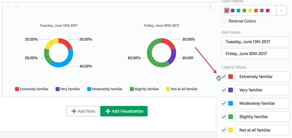
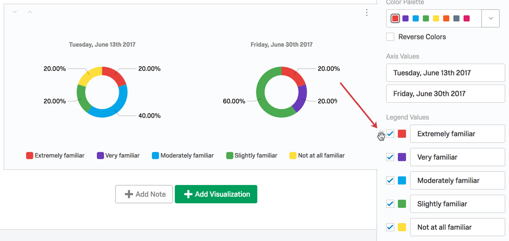
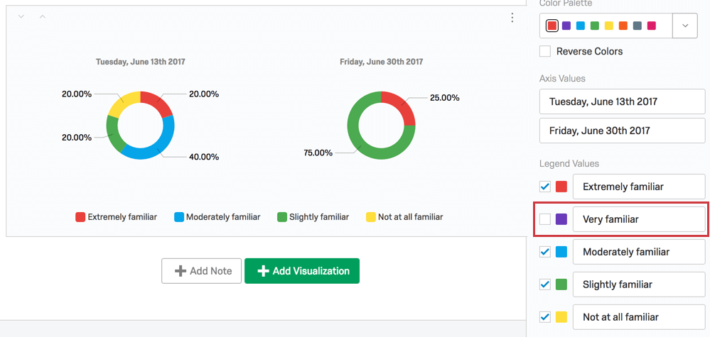
- Hide values from the visualization by deselecting the checkbox to the left of the value.
Incompatible Fields
Pie Charts are compatible with most scaled and discrete data, such as any question with a multiple choice option. They work best with variables that have a finite number of choices, such as questions that can have single-answer multiple choice formats.
The following are fields Pie Charts are not compatible with:
- Text Entry question
- Form field question
- Open text fields on other questions, such as Text Entry Matrix Tables, text entry columns on Side by Sides, and “Other” text boxes
- Heat Maps with no regions defined
- Signature question
- File Upload
- Timing
- Highlight question
- Constant Sum
- Constant Sum Matrix Table
- Slider
- Constant Sum
- Filter Only Embedded Data
- Text Embedded Data
- Number Set Embedded Data
- Text manual variables
- Numeric manual variables
- Formulas
- Survey metadata Duration
- Survey metadata Progress
In general, open text and continuous numeric data do not work well with Pie Charts. Pie Charts are better at showing percentages of a whole, and so are not as useful for statistical data like averages.
That's great! Thank you for your feedback!
Thank you for your feedback!