-

Qualtrics Platform -

Customer Journey Optimizer -

XM Discover -

Qualtrics Social Connect
Focus Areas Widget
About Focus Areas Widgets
The focus areas widget is used to inform dashboard users about which areas of the company to focus efforts based on key drivers compared to an outcome metric such as NPS or employee engagement. This widget is designed to compare data between specific units and the overall organization through the use of page filters (CX|EX).
Using the focus areas widget, it’s possible to measure the “impact,” or the correlation between a driver and the target metric, as well as whether the selected business unit is performing better or worse than the overall organization.
Types of Dashboards
This widget can be used in a few different types of dashboard. This includes:
Field Type Compatibility
Due to this widget using top box as the method of comparison, it requires data that has discrete values and that have been mapped as a Number Set field type in your dashboard data (CX|EX). Fields with infinite values do not work well with this widget, but those set on scales do.
Generally, outcome metrics are fields that have an overall score associated with them while key drivers are specific questions you asked in your survey. See the following section for examples of outcome metrics and key drivers.
Widget Customization
For general information on how to add and edit widgets, visit the Building Widgets page. Continue reading for information about how to customize this specific widget.
Source
To get your focus areas widget started, you will first need to select a source. This is the project from which the data will be pulled. If you have mapped additional sources into your dashboard data, you will have more than 1 option here. You can only select 1 source per focus areas widget.
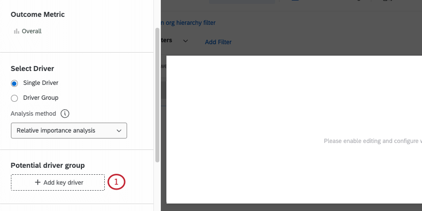
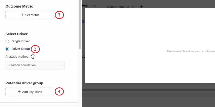
Outcome Metric
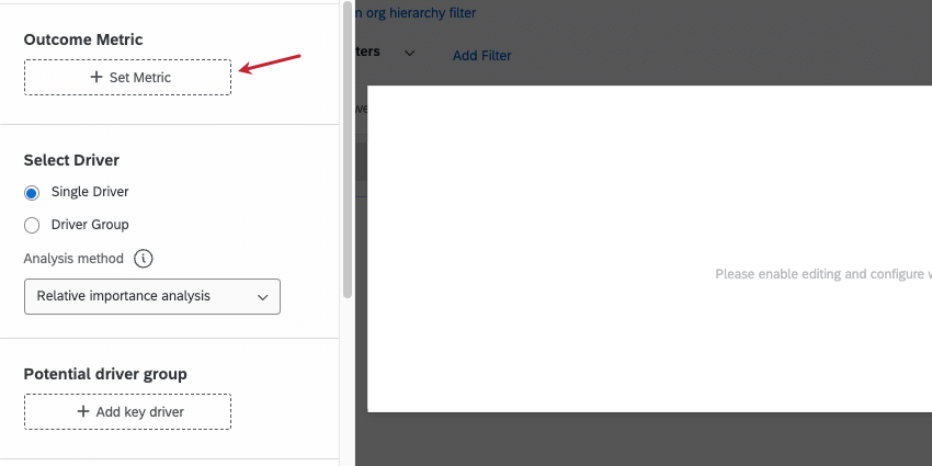
The first field to determine is the outcome metric. Generally, these are metrics such as NPS, customer satisfaction (CSAT), or employee engagement. The outcome metric is typically some type of overall score you’re evaluating in your survey. Only 1 outcome metric can be selected per widget.
For EX dashboards, your outcome metric is often a category that you created in your dashboard settings.
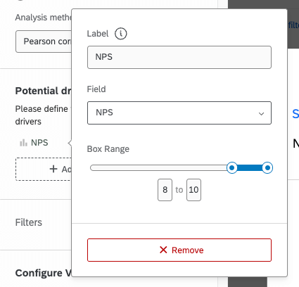
Key Drivers (Single Group)
The other important aspect of the focus areas widget are the key drivers. Key drivers are the factors that drive your overall outcome metric. Usually, key drivers are the individual questions you ask in your survey that contribute to the outcome metric. You may select multiple key drivers to display within 1 focus areas widget.
When selecting your key drivers, it’s important to specify the top box measurement. This can be an actual top box (only the highest value) or can be a range. Additionally, you should relabel your key drivers to make them actionable and easy to understand.
Good key drivers labels often have the following characteristics:
- Written in third person (i.e. you are telling your team what to improve)
- Have an action verb (e.g. deliver, keep, run, provide)
- Reflect the source question in a way that makes sense to your company
| Key Driver | Focus Areas Label |
| Product Importance – Reliability | Provide a reliable product for our customers. |
| Sales Importance – Sales Team | Ensure that your team is an important part of the sales process. |
| Q76 – Embedded Data – Support | Deliver superior and timely support to our clients. |
| My manager consistently acknowledges me for doing good work. | Acknowledge employees for doing good work. |
| I am able to shape how I do things in my role. | Allow employees to shape their role. |
To add your key drivers:
- Select Add key driver and choose the desired field.
- Click on the newly added field to edit it.
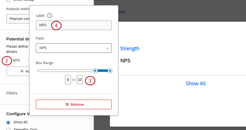
- Use the sliders or the numbers below the sliders to change which values are displayed on the widget.
Attention: In EX dashboards, you need to configure your dashboard’s scales. This will define the box range for your key drivers so that you don’t have to set it in the widget.
- If desired, relabel your key driver in a way that makes the most sense to you.
Configure View & Card Limit
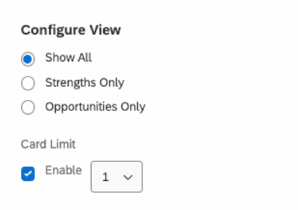
- Configure View: Determine whether you want the widget to show everything, just strengths, or just opportunities.
Qtip: Choosing Show All will show you both opportunities and strengths in order of importance, measured by the impact correlation score. This can mean working on something you could improve (i.e. an opportunity); however, sometimes keeping a Strength strong can be more impactful than working on an opportunity that won’t drive outcomes.
- Card Limit: Set a maximum number of cards to display on the widget.
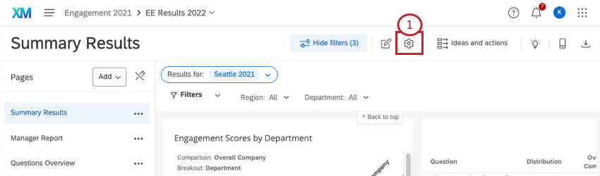
Filtering Focus Areas Widgets
You can filter a focus areas widget by both dashboard page filters and widget-specific filters.
Page Filters
To work properly, the focus areas widget must be used with page filters. Usually, these filters are fields such as location, response date, questions asked in your survey, or participant metadata. For more information about creating page filters, read the Filtering Dashboards page (CX|EX).
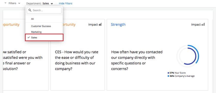
If no filters are actively applied to the page, then the inner and outer rings will match and show the same score. You must filter the dashboard for the widget to update and show a comparison.
Widget Filters
You can add filters directly to a Focus Areas widget as you would any other widget. See Adding Widget Filters for more details.
Hierarchy Comparisons
If no filters are actively applied to the dashboard except for the hierarchy filter, then the inner and outer rings of the Focus Areas widget may match and show the same score. However, if you want the org hierarchy filter to affect only the inner ring, and have the outer ring represent the entire company’s average (ignoring the hierarchy filter), add a comparison with no filters to the widget.
- Go to your dashboard settings.
- Go to the Comparisons page.
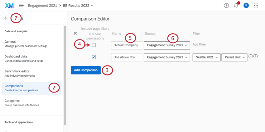
- Click Add Comparison.
- Keep Include page filters unchecked.
- Name the filter to indicate it’s an overall company performance comparison.
- If you have multiple sources mapped to your dashboard, select the source(s) of the hierarchy.
- Return to your dashboard.
- Edit your focus areas widget.

- Under Comparisons, select the overall comparison you just created.
Using Text Topics as a Key Driver
The focus areas widget allows you to use text topics from Text iQ as the widget’s driver. This allows for dynamic key drivers as your business evolves without needing to ask additional survey questions. As new topics develop in your open text questions, they’ll be incorporated into the widget.
To add text topics into your widget:
- Make sure you’ve mapped your text topics (CX|EX) into your dashboard.
- In the focus areas widget, enable Driver Group.
 Attention: “Select Driver” is not available for EX Dashboards.
 - Click Set Metric and choose your Outcome Metric.
- Click Add key driver and select the text topics for the field you’re interested in.
- Click your text topics field.
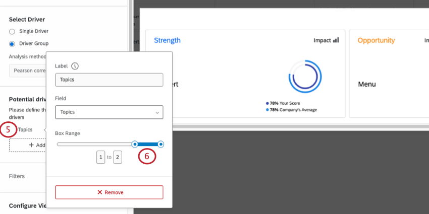
- Adjust the box range so that only the top range is selected.
Qtip: The box range is determined by your selected outcome metric.Example: In the above step, the box range ends at 2. Therefore, the adjusted box range should be 1 to 2. If the box range ends at 5, your adjusted box range should be 4 to 5.
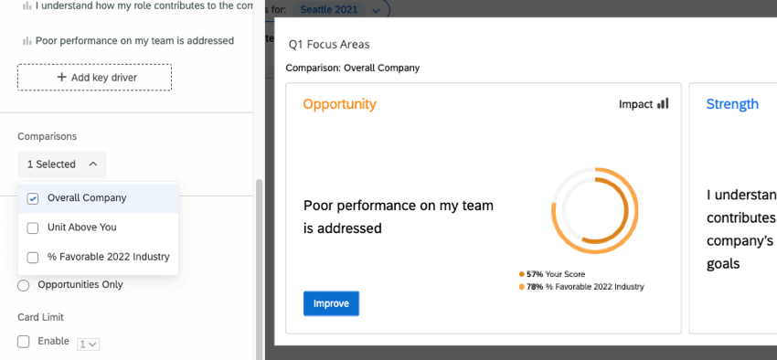
Widget Interpretation
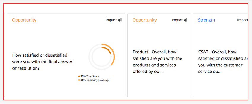
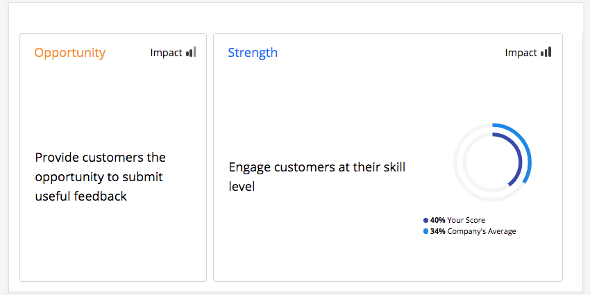
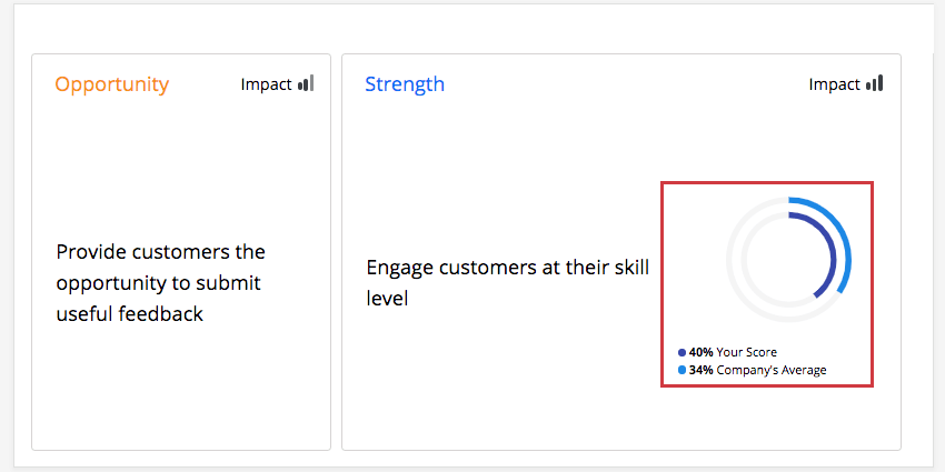
The focus areas widget shows at a glance the areas in which your department, team, or other specified group can improve, as well as the impact the selected key driver has on that group. Multiple key drivers can be added to a single widget to see how different drivers impact a single group in the company. Each key driver is represented in its own card, but only 1 card can be viewed in full at a time. In the widget below, 2 key drivers, “Provide customers the opportunity to submit useful feedback” and “Engage customers at their skill level,” are displayed in the widget. “Engage customers at their skill level” is the currently selected key driver.
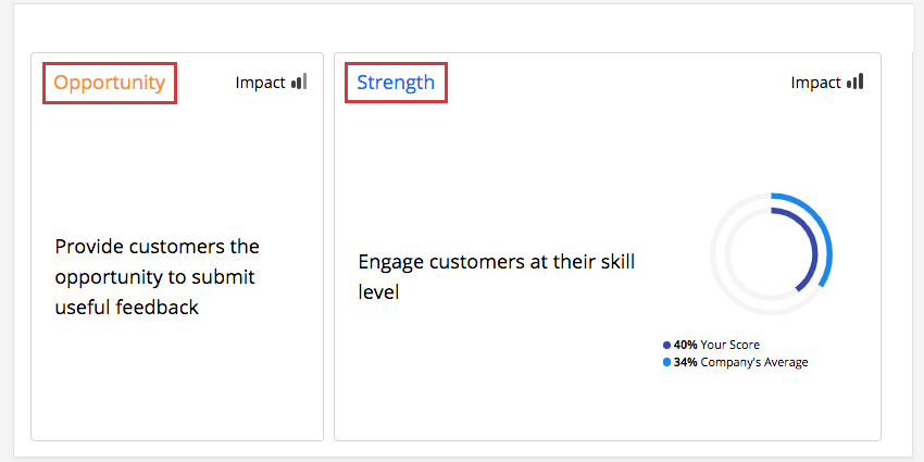
Strengths & Opportunities
Each card will be labeled as a strength (overperforming compared to the overall company average), highlighted in blue, or as an opportunity (underperforming compared to the company average), highlighted in gold / orange.
For example, in the widget below, the key driver “Engage customers at their skill level” is a strength for your department, meaning your department overperformed in this area compared to the company overall.
Impact
Impact measures the correlation between the selected key driver and the target metric. A given card will base its impact on the current filter if there are 100+ responses, or at an an organization level if there are fewer. This ensures that there is enough data to return a statistically valid result.
For example, in the widget below, “Engage customers at their skill level” has a low impact for all departments in your company, meaning there was not a clear pattern of responses for this specific key driver.
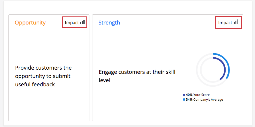
- High Impact: Respondents give a good overall score and are consistent in their rating of the key driver (either high or low).
- Low Impact: There is not a clear pattern of responses. Some respondents may give a good overall score and rate an area highly while other respondents may rate the same area poorly but still give a good overall score.
Impact is an r-value, which measures the correlation coefficient between each item in the table and a chosen outcome metric. Impact calculates the score for the category first, and then a correlation calculation is performed against that score using the chosen analysis method.
The size of the impact is based on the absolute value of the correlation. For example, a strong negative correlation is still a strong correlation and thus a strong driver of your engagement outcome.
If a respondent skips the question used as the impact measure, or any of the items in the table, their response won’t be included in the correlation calculation for the question(s) they skipped. Thus, impact follows a standard statistical approach called pairwise deletion, where missing data points are excluded from the calculation.
Comparison Ring
The comparison ring will show you how your selected unit compares to the company average. Only 1 comparison ring can be viewed at a time. Click a specific card to see its comparison ring.
The percentages on a comparison ring represent the favorability scores for the question. (For EX dashboards, favorability is defined by green / favorable areas of scales.)
Order of Cards
The focus areas widget allows you to compare your performance on your key drivers to your organization as a whole. Using that comparison, Qualtrics determines the “room for improvement,” or your score minus the comparison score. Qualtrics then multiplies the “room for improvement” by the impact to prioritize your key drivers. The most impactful drivers with the most room for improvement are shown first, making it easy to know where to focus.
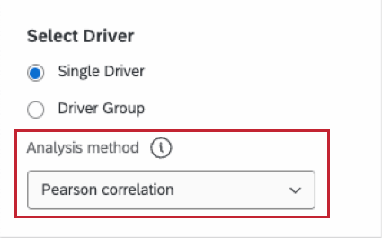
Analysis Method
The focus areas widget has 2 different analysis methods that can be applied to it. This affects the order of focus area cards and the impact score.
- Relative importance analysis: This is the default calculation selected when using the standard, Single Driver setup. Because all the drivers are likely to be highly correlated, Relative Importance Analysis runs models with every combination of the independent variables to determine the independent impact on the r-squared (variance explained).
Qtip: Learn more about this method of analysis, also called Johnson’s Relative Weights, see our Stats iQ page.
- Pearson correlation: Measures the linear correlation between the drivers and the outcome metric. The default (and only) option when using text topics as drivers, or a Driver Group.
Qtip: For all focus area widgets created before this feature was enabled, the default and only calculation was Pearson Correlation. All widgets created before this date have been left as Pearson, but you can now switch the calculation if desired.
You can change the calculation used in your widget at any time – just keep in mind that the impact score and the order of the cards may change.
Deciding between calculations
Pearson Correlation does not account for multicollinearity, which is when the independent variables (in this case, drivers) being compared to the dependent variable (an outcome metric) are already highly correlated themselves. Relative Importance, in contrast to Pearson, does consider multicollinearity. That’s why it is the industry standard for survey data.
Action Planning
Guided Action Planning (EX)
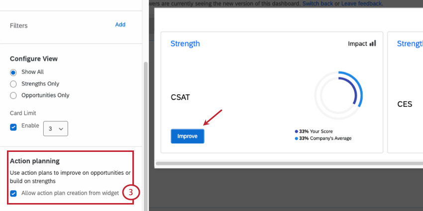
When you have guided action planning enabled, a new button will appear on your focus areas widget. Click Improve to create an action plan based off of that focus area.
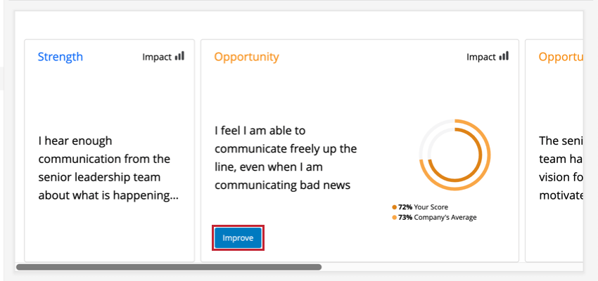
Both strengths and opportunities allow you to improve. A focus area card will be missing the Improve button if you have not made that item available for action planning.
Measurable Action Plans (CX)
Measurable action plans can be created by clicking Improve on any focus areas widget. However, this functionality must first be enabled for the widget.
- Enable action planning for the dashboard.
- Edit a focus area widget.
- Enable Action planning by clicking the checkbox. An Improve button will now appear in the driver group.