
Onboarding Journey
What's on this page
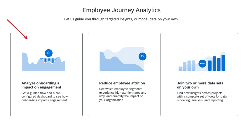
About Analyzing Onboarding’s Impact on Engagement
You can combine data from across your Employee Experience program to find how your onboarding program affects your overall employee engagement using Employee Journey Analytics. Analyze onboarding’s impact on engagement is an expert-designed journey that guides you through setup and results in a completed dashboard ready to share with colleagues, preventing you from having to build data models and dashboards from scratch.
Required Projects
To use the onboarding journey, you must have the following projects already built in your account:
Creating the Project
Create an Employee Journey Analytics project, and select Analyze onboarding’s impact on engagement.

Combining Data Sources
Follow these steps to combine your data sources after choosing Analyze onboarding’s impact on engagement when creating your project.
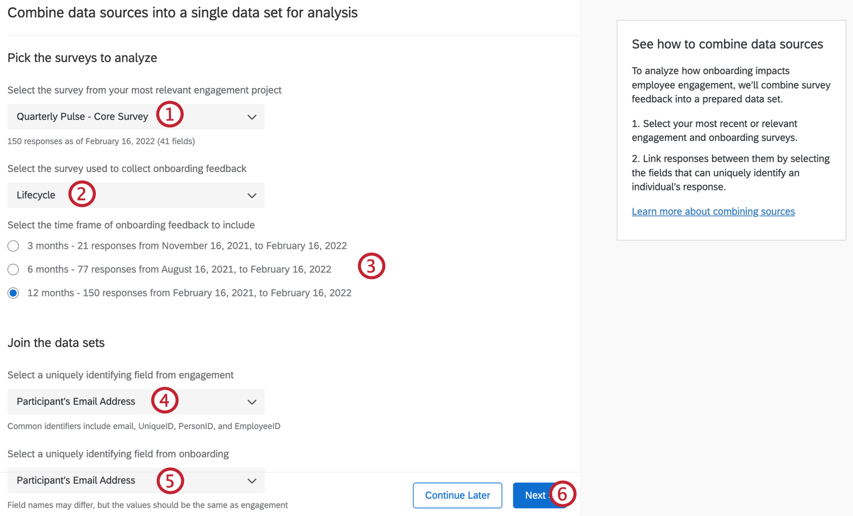
Qtip: Only Employee Engagement projects will show up in this dropdown.
Qtip: Only Employee Lifecycle projects will show up in this dropdown.
Qtip: The guided workflow joins projects with a left outer join.
Qtip: Click Continue later to return to the Projects page.
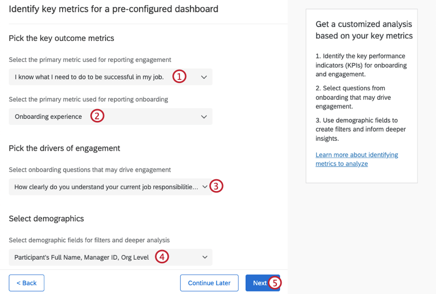
Identifying Key Metrics
After deciding how to combine your data sources, select key metrics you want to analyze in your dashboard.
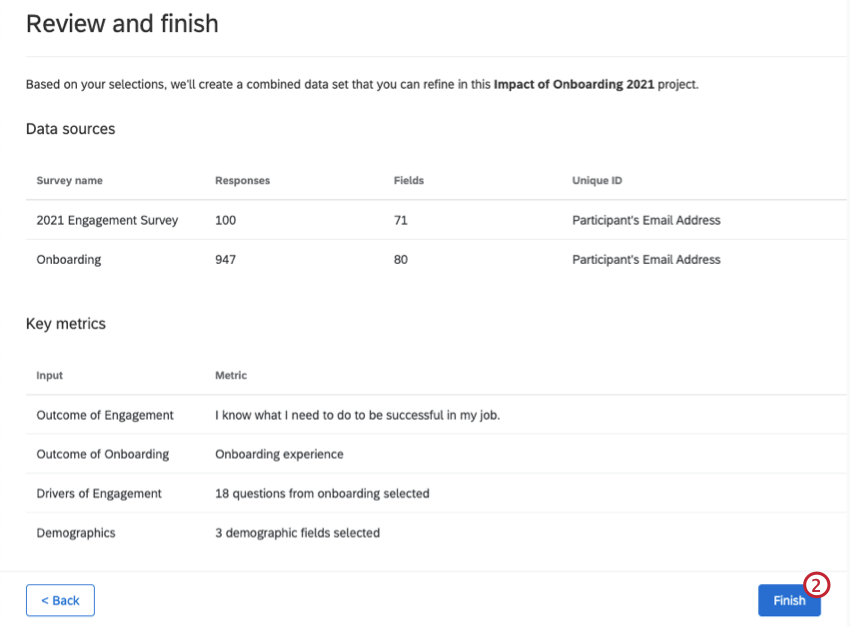
Generating Your Dataset
After combining data sources and selecting outcome metrics, follow these steps to generate your output dataset.
Onboarding Dashboard
This section covers widgets present in the prebuilt onboarding and engagement dashboard. When your dashboard is created it will contain 4 widgets. These widgets visualize the impact of onboarding on engagement, based on the outcome and key driver metrics you previously selected.
While you can customize your journey dashboard, we recommend keeping the prebuilt widgets described below.
Key Performance Indicators
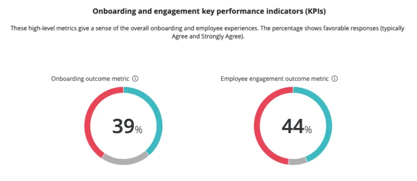
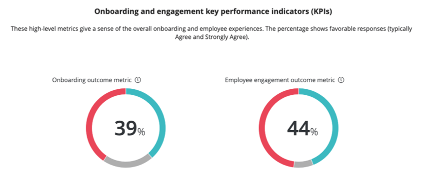
The first two widgets give a sense of the overall onboarding and employee experiences. They display the percentage of favorable responses to the items you selected as your onboarding and engagement Key Performance Indicators (KPIs).
Relationship Between Onboarding & Engagement
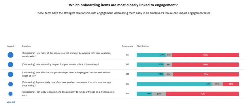
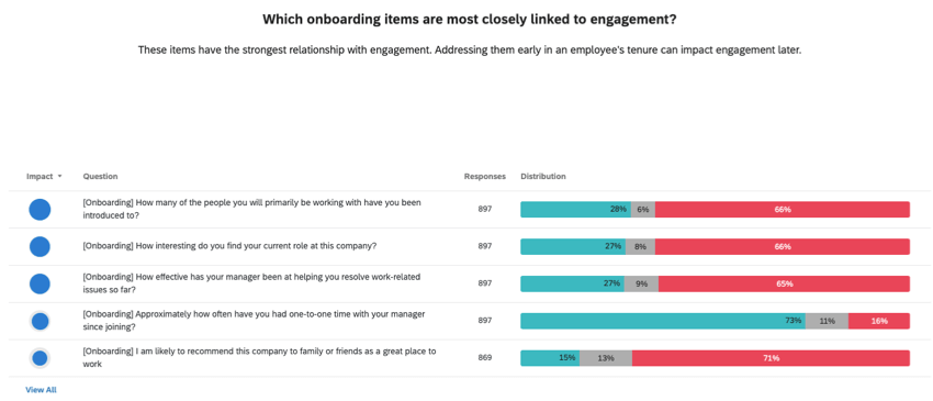
The third widget looks at which onboarding items are most closely linked to engagement. This widget displays the favorability of each onboarding item, as well as the correlation of each item with the engagement outcome metric. By default, the items are ranked by impact, and the top 5 most correlated items are shown.
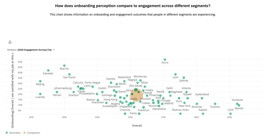
Onboarding & Engagement Outcomes
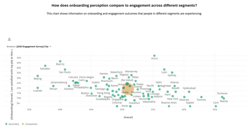
The fourth widget looks at how onboarding perception compares to engagement across different segments. The widget displays onboarding and engagement outcomes and can be broken out by the key performance indicators.
Sharing the Prebuilt Dashboard
Once your dashboard is finished, learn how to share the dashboard with other users in your organization.
Attention: You cannot edit your dashboard’s dataset from the dashboard itself. Make changes to your dataset in the Data Model tab instead.
That's great! Thank you for your feedback!
Thank you for your feedback!