
Embedded App Feedback
What's on this page
Qtip: If you don’t have access to any of the features described on this page, reach out to your Account Executive. For more information about the differences between Digital Feedback and CustomerXM for Digital, see Digital Feedback vs. CustomerXM for Digital.
About Embedded App Feedback
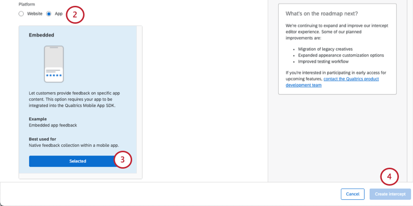
Embedded app feedback is a creative and intercept available for Website / App Insights projects. Embedded App feedback presents a way to build natural, conversational listening into your app experience. The guided setup for embedded app feedback lets you create an intercept right out of the box, allowing you to begin collecting feedback within your app with ease.
Qtip: This feature used to be named Mobile Embedded Feedback.
Creating Embedded App Feedback
Attention: Before getting your mobile app feedback project underway, make sure that you’ve implemented the Mobile App SDK integration.
Qtip: While using the Mobile App SDK (Software Developer’s Kit) integration, in order for your app to set the correct language in the embedded app feedback intercept, translations will first look to custom properties, then to the app language, and then will show the default.
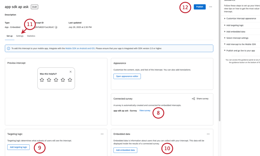
Qtip: For embedded feedback, we do not recommend using targeting logic to limit what users see the embedded feedback, since the intercept is embedded in the page, and this might cause confusion if it’s blank. See Setting Up Mobile Intercepts for additional help setting up your targeting logic.
Attention: This step is critical if you want to be able to filter or break out your data by the specific pages or sections of content being rated.
Qtip: See Setting Up Mobile Intercepts for additional help setting up your embedded data.
- Sampling
- Repeated display prevention
- XM Directory connection Qtip: Because the feedback is embedded right on the app and doesn’t impede the visitors’ ability to navigate or use a website, there is no reason to limit how often this intercept is seen, and in fact limiting it may be more confusing than not. We advise never hiding embedded feedback, sampling 100% of visitors, and not preventing repeated display.

Qtip: For importing details and more about the guidance sidebar, see Guided Intercepts.
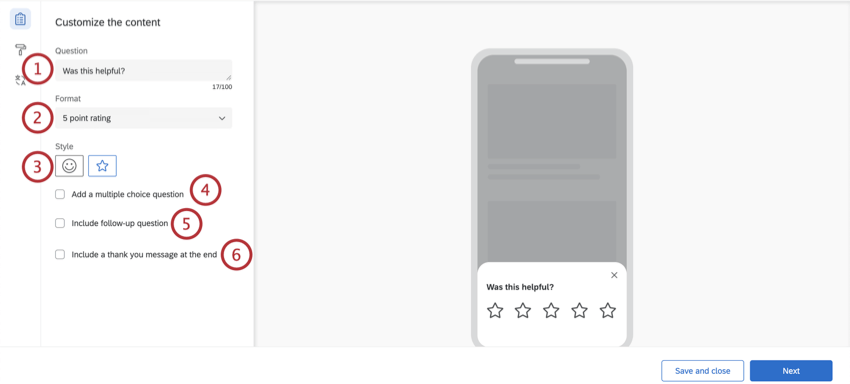
Customizing the Content
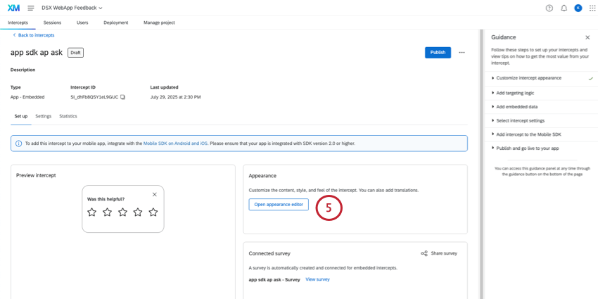
Attention: For embedded app feedback, there is no need to create a separate survey. The guided setup will automatically create a survey for you, without any additional work on your part.
The first section of your embedded app feedback intercept will allow you to customize the content of the intercept with questions, thank you messages, and optional changes to the buttons that appear.
Qtip: While editing your embedded app feedback intercept, the preview on the right side of the screen will update to match the settings you’ve added, and you can even click the buttons to see what the thank you message or follow-up question will look like. To reset the preview, feel free to select different options from the editing pane on the left side.
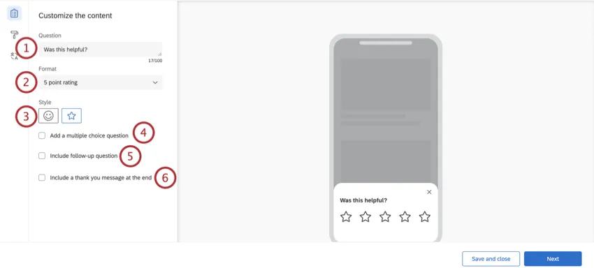
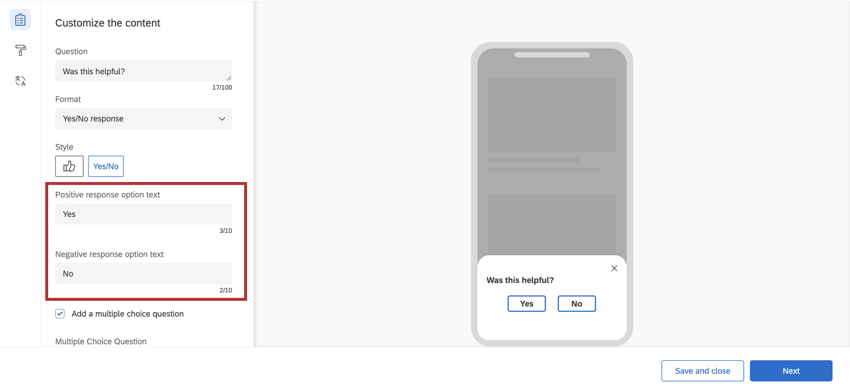
Example: You may include a question such as, “Was this helpful?” or “Please rate how helpful you found this content.”
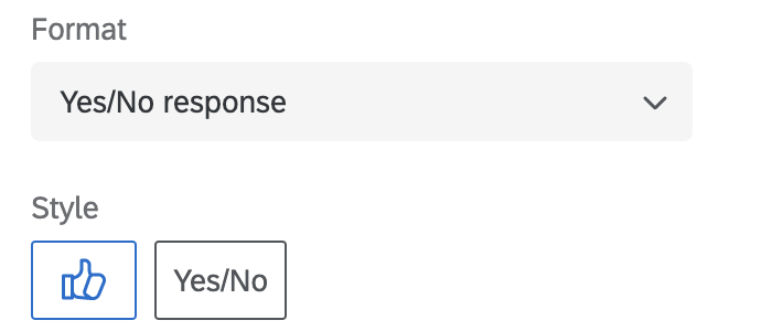
- Yes/No response: You will have the option to select thumbs up / thumbs down icons or Yes/No.

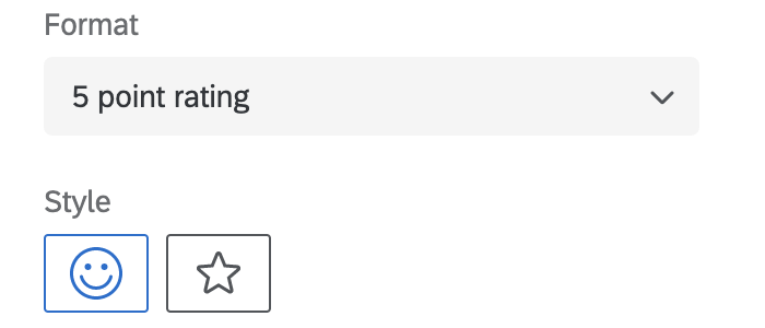
- 5 point rating: You will have the option to select emojis or stars.
 Qtip: If you chose “Yes/No,” you can modify the words used in your intercept’s question by entering your own text in the Positive response option text or Negative response option text. By default, this text will be “Yes” and “No.”
 Qtip: You cannot reverse the order that the emojis appear. For example, you cannot switch from increasingly positive to increasingly negative.
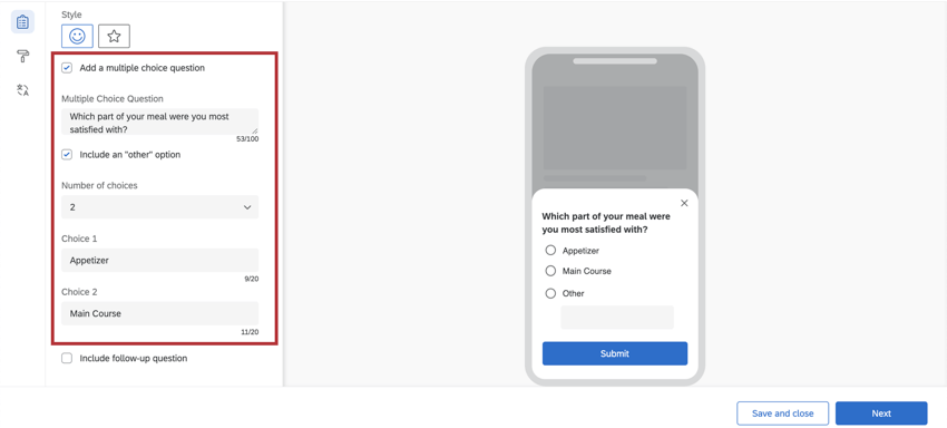
- Multiple Choice Question: Enter the question text.
- Include an “other” option: When checked, this will provide a choice that allows respondents to type in their own answer.
- Number of choices: Modify the number of available answer choices.
- Choice: Enter the answer choice text. Example: For example, the above intercept asks customers, “Which part of your meal were you most satisfied with?” and provides the option to select “Appetizer,” “Main Course,” or “Other.” If “Other” is chosen, the app visitor could enter an alternative option, such as “Dessert.”

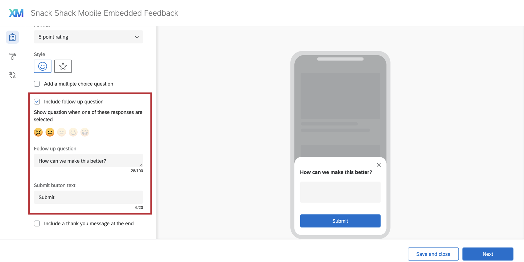
- Show question when one of these responses are selected: Determine when this question will display based on how respondents answer the first question. Qtip: You may select all or some of the answers, although we recommend targeting negative feedback.
- Follow up question: Enter the question text for your follow up question.
- Submit button text: Here, you will have the option to specify your own submit button text. The button text will say “Submit” by default. Example: You might want this button to say “Send” instead of “Submit.” You’ll have the option to change the text in the Submit button text box!
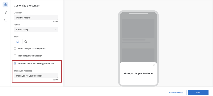
Qtip: By default, the thank you message will say, “Thank you for your feedback!”
Attention: Do not click Next at the bottom-right until you are happy with the Look and Feel and Translations!
Look and Feel
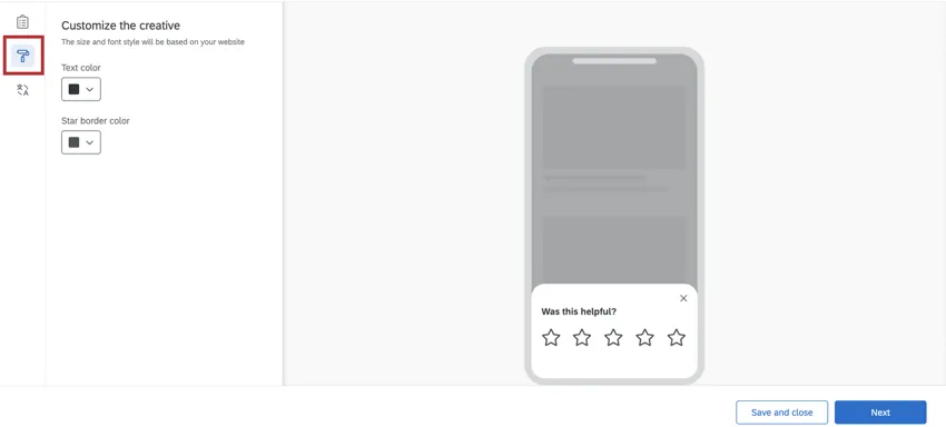
The Look & Feel section allows you to adjust the layout, text weight, and colors of the embedded app feedback intercept.
Qtip: The customization options will change depending on how you configured your questions in the previous steps.
- Overridden through SDK: This setting allows you to override certain elements of your creative with configuration details from the SDK. For more documentation on SDK, see our API documentation. When this setting is enabled, some other look and feel settings become read-only. Attention: This option is only available on SDK versions 2.13.0 (iOS) and 2.10.0 (Android) or higher.

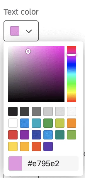
- Text color: The color of the question and answer text.
- Button customization: The colors you can change will depend on the format and style you chose earlier.
- Yes/No: Change the color of the button text, button border, and and the button fill.
- Thumbs up/thumbs down: Change the color of the button’s outline (border) and fill.
- Emojis: If Default is selected, the emojis will be yellow. If Custom is selected, you will have the option to change the color of the emoji border and the emoji fill.
- Stars: Change the color of the star’s outline (border). This is also the fill color of the stars when the respondent hovers over or selects them.
- Multiple choice question color: Change the fill color of the radio buttons on the multiple choice question.
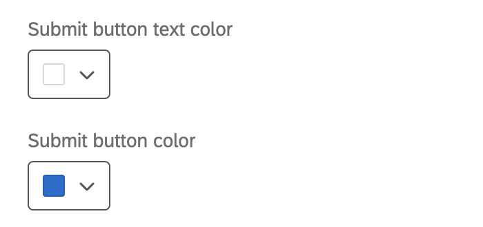
- Submit button text / button color: This setting allows you to change the submit button’s text and fill color. Submit button customization options will only appear if you’ve included a follow-up question in your embedded app feedback intercept.

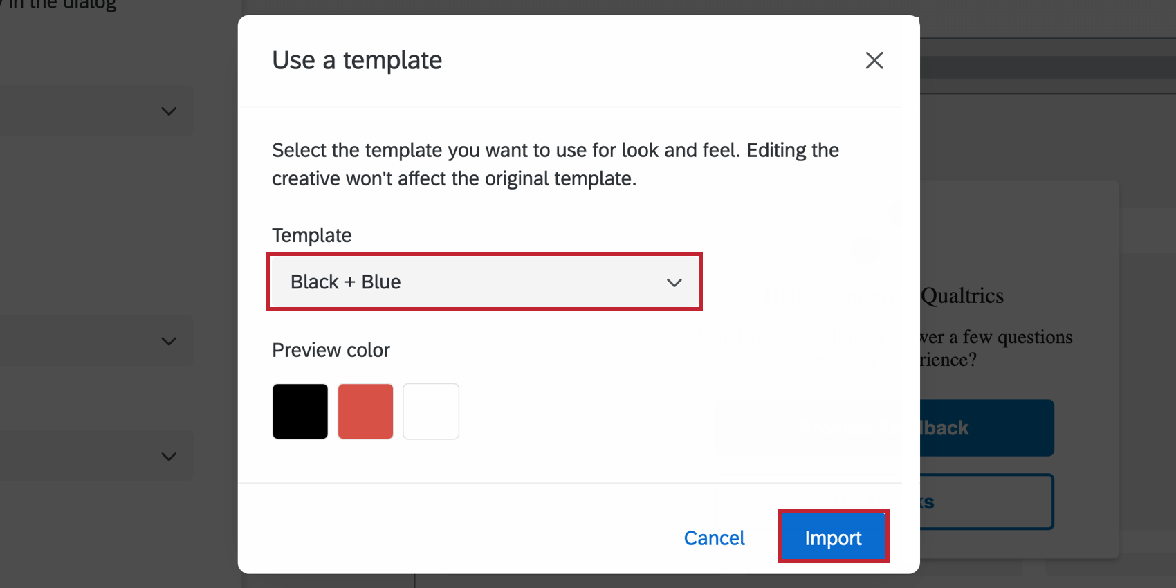
- Use a template: Use a survey theme as a template for the creative’s style settings. This will import the primary color and secondary color settings of that survey theme.
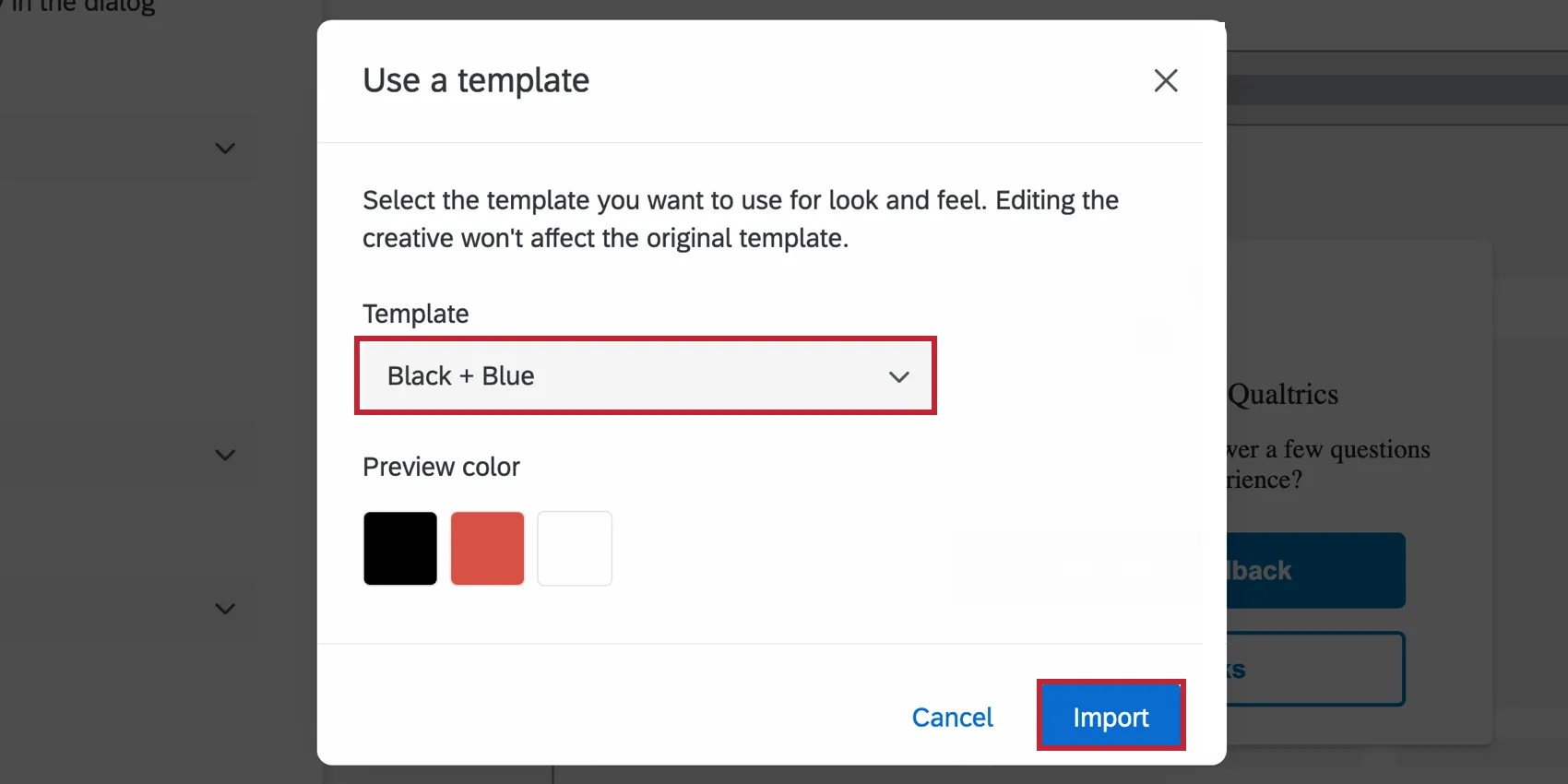 Qtip: The settings in the creative are disconnected from the theme used as a template. The creative’s settings do not update if the template theme changes, and changing the creative’s settings will not change the template theme.
Qtip: To further customize the colors in your embedded app feedback intercept, you can use the color dropdown menus underneath each option.

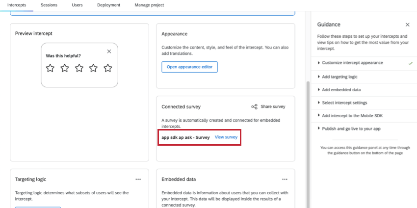
Embedded Surveys
When you create Embedded App Feedback, a survey is automatically generated for you. To view this survey and its data, go to the Set up, see Connected survey, and click the survey’s name.

For advice on handling this survey’s data, see Embedded Surveys. For tips on inviting others to work on this project, see Collaborating on Embedded Surveys. Although these links go to the support page for Templated Embedded Feedback, the equivalent guided intercept made for websites instead of apps, the way embedded surveys work is the same.
FAQs
When should I use logic on my action sets?
When should I use logic on my action sets?
For example, since creatives are not responsive to screen size, many users like to implement action set logic focused on whether a website viewer is/is not using a mobile device or whether the website is being displayed on a certain screen size. By using logic in this instance, you are able to target a properly formatted and sized creative to the appropriate person.
Action set logic based on location can even be used to make sure that website viewers are seeing a creative that is written in the language that most likely applies to them.
Can I capture information from my website visitors in my intercept's survey? How?
Can I capture information from my website visitors in my intercept's survey? How?
Aside from simply setting a static value that you want carried into the survey, the embedded data menu also comes pre-built with other options that can be carried into the survey. For example, you will be able to automatically capture the ID of both the intercept and creative shown, the URL of the page that displayed the intercept, the person‘s site history, or even how much time was spent on the site. You will even be able to capture information from a cookie that appears on that person‘s web browser or you can write a JavaScript expression that captures a particular variable that you are interested in.
If you are running a survey in Qualtrics, then you can also add the embedded data in the Survey Flow to save this information to the survey response.
What’s the difference between standalone intercepts, guided intercepts, and guided creatives?
What’s the difference between standalone intercepts, guided intercepts, and guided creatives?
Guided intercepts are when you create features like responsive dialogs, templated embedded feedback, feedback buttons, and embedded app feedback using these steps. Also known as guided setups, guided intercepts combine the visual element of a creative and the settings of a creative into one easy-to-follow flow that will guide you from start to finish.
Guided creatives are when you create features like responsive dialogs, templated embedded feedback, feedback buttons, and embedded app feedback using these steps instead. With a guided creative, you need to create a separate intercept to pair it with. You still get the improved creative editor, but not the rest of the guided setup.
That's great! Thank you for your feedback!
Thank you for your feedback!