
Drivers of Attrition
What's on this page
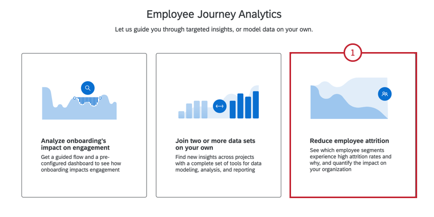
About Reducing Employee Attrition
You can combine data from across your Employee Experience program to find the drivers of employee attrition using Employee Journey Analytics. Reduce employee attrition is an expert-designed journey that helps you track which employee segments experience high attrition rates and why, in order to measure attrition’s impact on your organization. Instead of having to build data models and dashboards from scratch, the attrition journey guides you through setup and results in a completed dashboard ready to share with colleagues.
Creating the Project
To use this journey, you must already have both of the following projects built in your account:
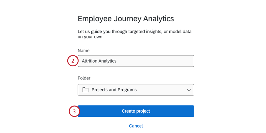
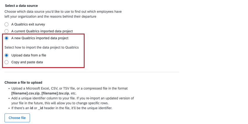
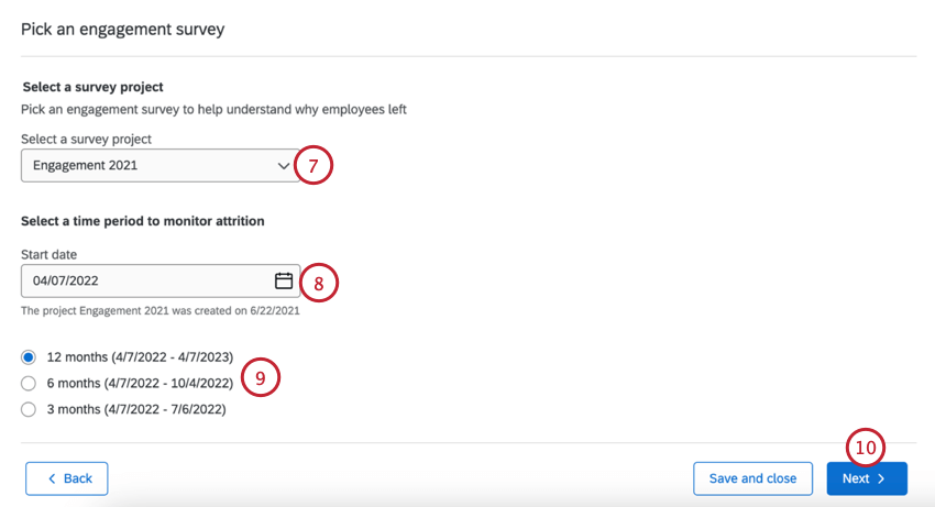
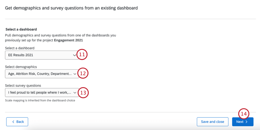
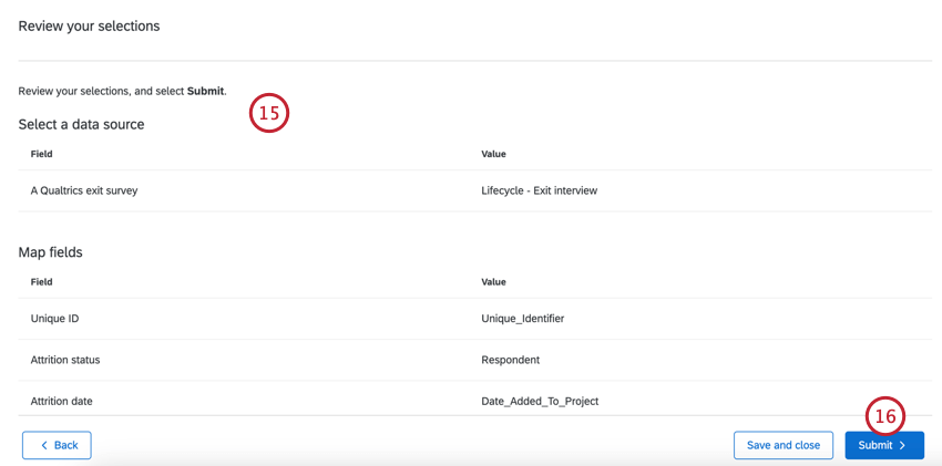
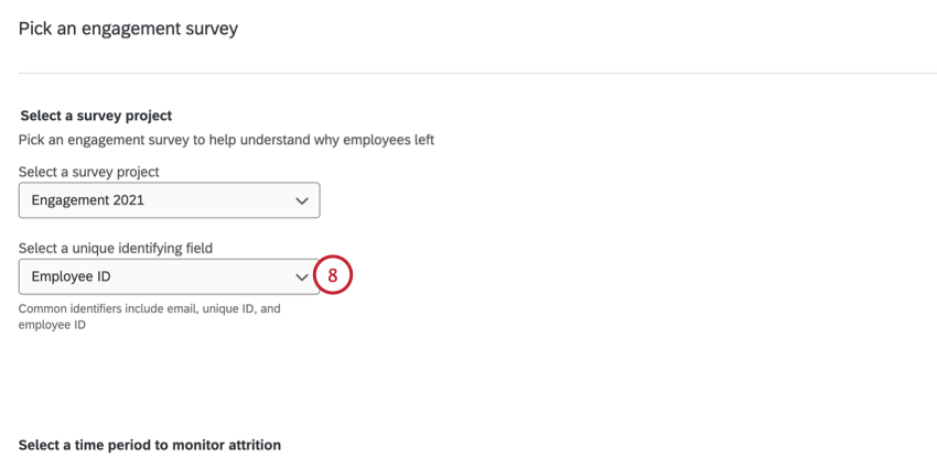
To use the Drivers of Attrition journey, create an Employee Journey Analytics project, then follow these steps:
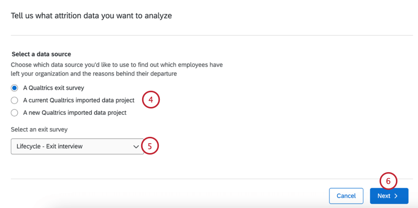
- A Qualtrics exit survey. Only Lifecycle projects will appear here. Qtip: We strongly recommend using this option since the data field mapping is automatic.

- A current Qualtrics imported data project.
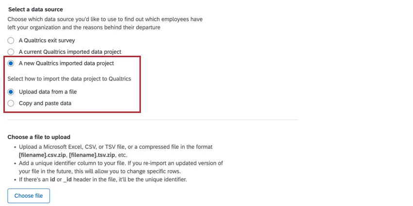
- A new Qualtrics imported data project.
Qtip: If creating a new imported data project, you can either paste in the data or upload a file with the data. See this support page for more information on uploading data. You’ll also need to manually map your attrition fields if using an imported data project. See Mapping Attrition Fields below for more information.
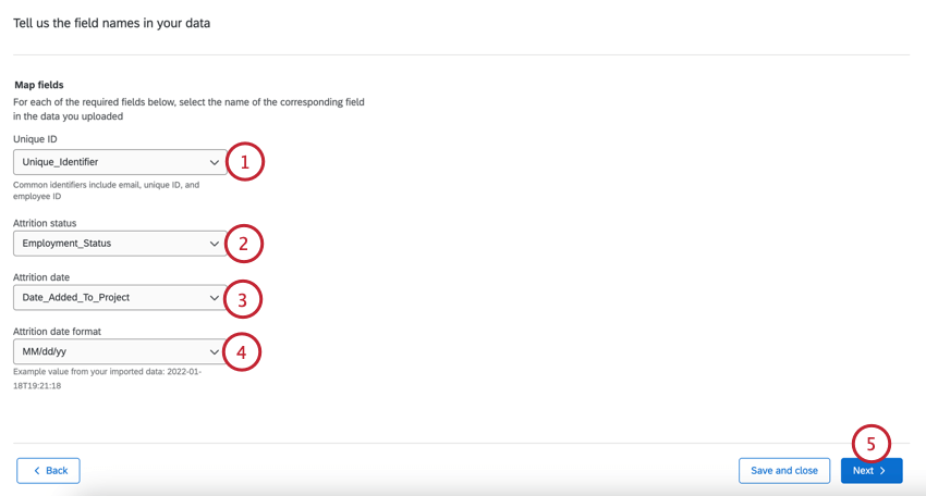
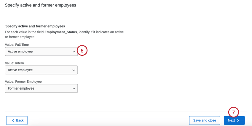
Mapping Attrition Fields from an Imported Data Project
If your attrition data is in an imported data project, you’ll need to manually map your fields after uploading your data:
Attrition Dashboard
Your prebuilt dashboard comes with a series of widgets uniquely set up to study the drivers of attrition. While you can customize your journey dashboard, we recommend keeping the prebuilt widgets described below.
Attention: Do not delete these widgets from your dashboard; they cannot be manually rebuilt. If you deleted a widget and would like to recover it, then you must regenerate the dashboard by creating a new dashboard in your project.
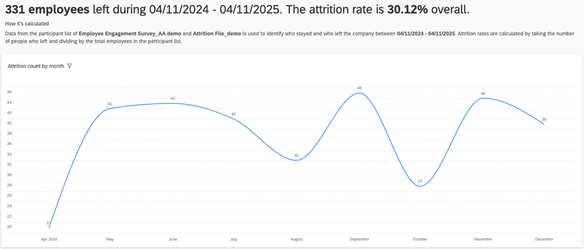
Attrition Insights
The attrition insights widget shows how many employees left your organization per month. You will also see an overall attrition rate for your organization based on the attrition window you selected during setup.
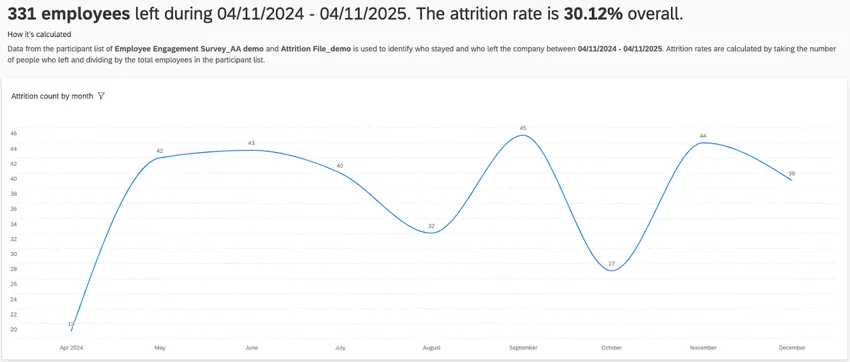
Attrition rate is calculated with the following formula:
Attrition Rate = [Number of terminated employees] / ([Number of terminated employees] + [Number of active employees])
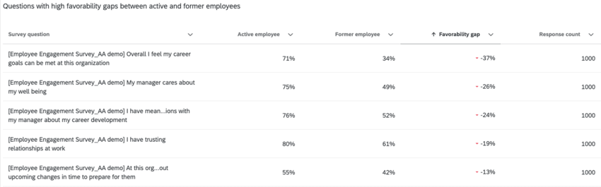
Stayers vs Leavers
The stayers versus leavers widget shows the survey questions with the largest gaps in favorability between employees who are active vs. terminated. These questions are directly taken from the questions you selected during the guided setup. By default, this widget is sorted by the favorability gap in ascending order, showing you survey items where the favorability for former employees is worse than active employees.
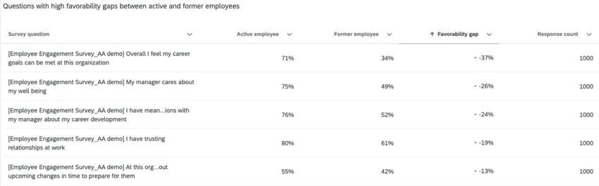
You can edit this widget to customize the following:
- Change the survey questions displayed in the widget.
- Add a widget-level filter to filter by participant metadata.
Drivers of Attrition
The drivers of attrition widget shows you different key drivers and how important those drivers are at affecting employee attrition.
This widget is powered by Stats iQ and uses logistic regression and relative importance calculations.
Logistic regression is used to identify a list of statistically significant drivers to generate odds that show how different categories within a driver can lead to an increase or decrease in attrition. Relative importance is used to explain the variation in why people are active or terminated.
By hovering over a purple bar, you can see the odds of attrition for that specific key driver.
Qtip: This widget uses all of the survey items and demographic fields selected during the guided setup as the starting data for the regression algorithm. This widget cannot be filtered by page-level filters.
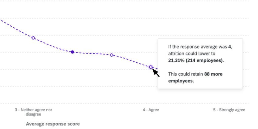
Attrition Simulation
The attrition simulation widget shows you how changes to responses for a key driver can impact your estimated attrition rate.
Qtip: This widget uses the fields generated by the drivers of attrition widget. You cannot add or remove fields from this widget. This widget cannot be filtered by page-level filters.
When you first visit this widget, you will see the survey item from the driver model with the highest relative importance preselected. You can click on this item at the top of the widget to change the item that is displayed.
The dotted line shows you the simulated attrition rate for different scores to this item. The solid dot is your actual score and rate of attrition. You can click the empty dots along the line to simulate how changes to the response score could impact attrition rates.
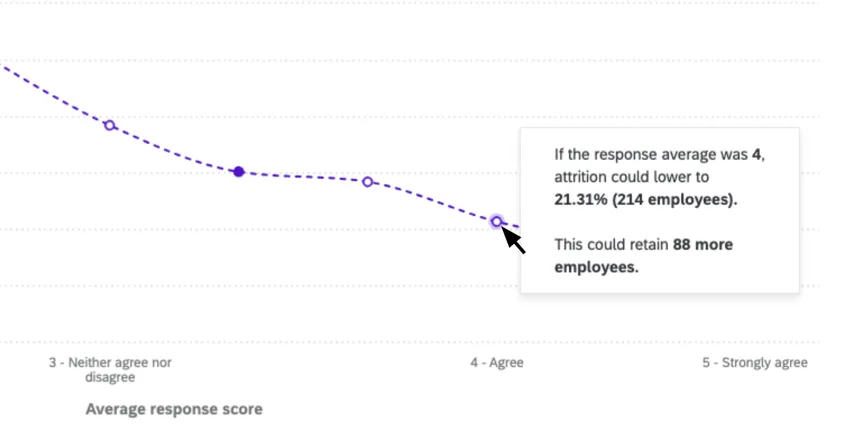
You can edit this widget to customize the following:
- Select demographic segments to use as filters on the widget.
- Input an estimated cost of attrition per employee. This allows the widget to show you how the cost of attrition can change based upon the estimated attrition rate associated with different survey item response averages.
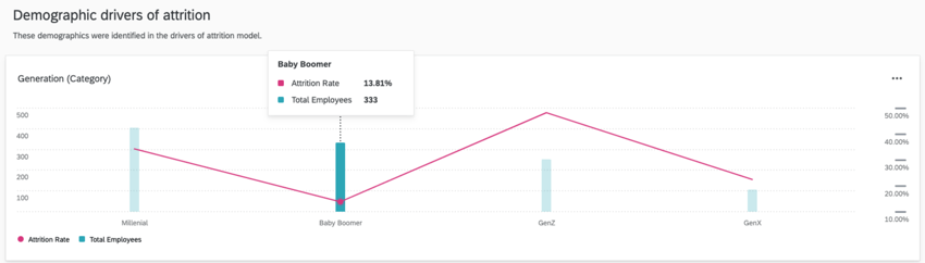
Attrition Demographic Breakouts
The attrition demographic breakouts show how groups of people in your organization experience attrition, which helps you understand potential hotspots within your organization. These widgets show both the size of the breakout groups (green bar) and the attrition rate (red line).
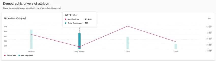
These widgets are broken out into 2 different sections:
- Demographic drivers of attrition: This section shows the breakout of fields that are in the driver model (i.e. statistically significant).
- All other demographics: This section shows all other demographics included in the analysis but not in the driver model.
Qtip: The demographics used in this section are selected during the guided setup.
Sharing the Prebuilt Dashboard
Once your dashboard is finished, learn how to share the dashboard with other users in your organization.
Attention: You cannot edit your dashboard’s dataset from the dashboard itself. Make changes to your dataset in the Data Model tab instead.
That's great! Thank you for your feedback!
Thank you for your feedback!