
Conjoint Analysis Reports
What's on this page
About Conjoint Analysis Reports
You don’t have to conduct analyses or customize your own reports when you’re conducting a conjoint. The reports you need to understand your conjoint analyses will be generated for you.
You can access your conjoint analysis reports by going to the Reports tab and making sure you remain in the Conjoint Analysis section. No data or graphs will appear until you have collected the minimum number of responses required to do so.

Attention: Conjoint projects must have less than 10k responses. Any responses over this limit will not be included in analysis.
Qtip: You can also get to reports by clicking Preview Analysis on the Overview tab.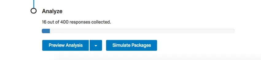
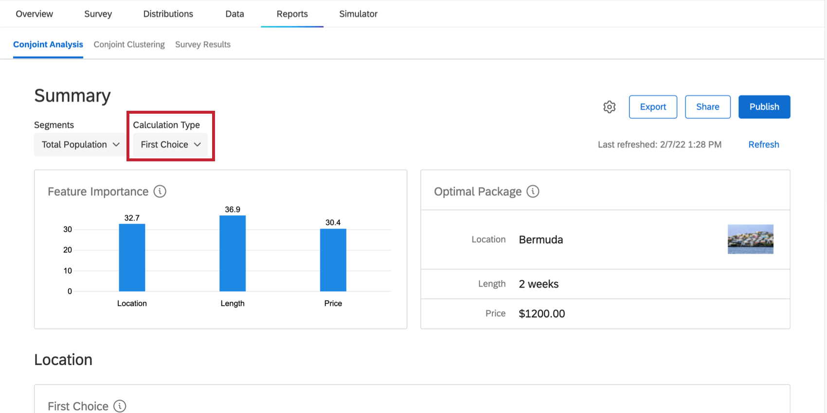
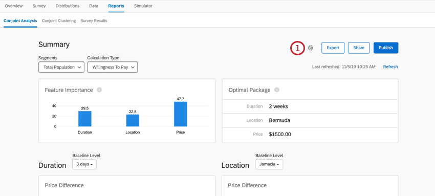
Summary
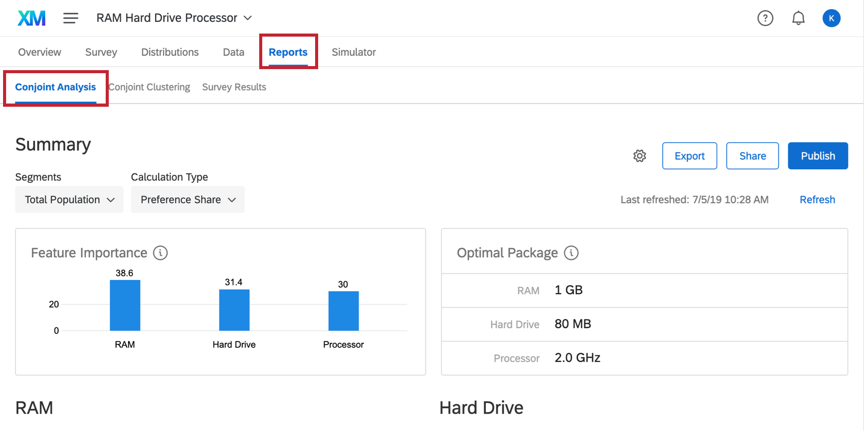
The graph and table under the Summary section shows you the ideal package to offer, based on the preferences displayed by your respondents so far.
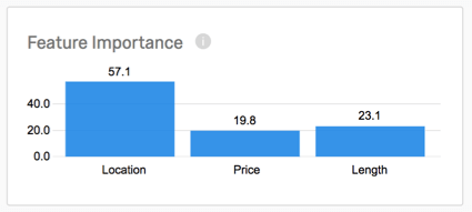
Feature Importance
The feature importance graph displays the influence a feature has when the respondent is choosing their preferred bundle. The higher the score, the more weight it carries in the decision-making process. This table compares each of your features’ importance.
In the example below, Location carries more weight than the other features, while Price seems to have the least importance to respondents.

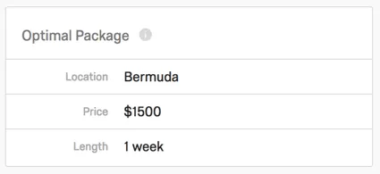
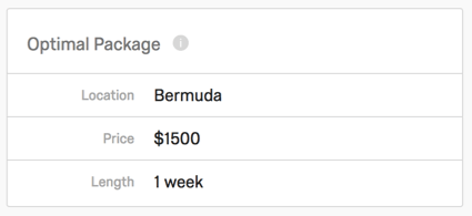
Optimal Package
The optimal package table displays the most preferred package across respondents. Both preference and utility are taken into account when determining this.
In the example below, the preferred Location was Bermuda, the preferred Price was $1500, and the preferred Length of the vacation was 1 week.
Qtip: For Conjoint Dynamic Images projects, the optimal package will display the associated image as well as the package feature levels.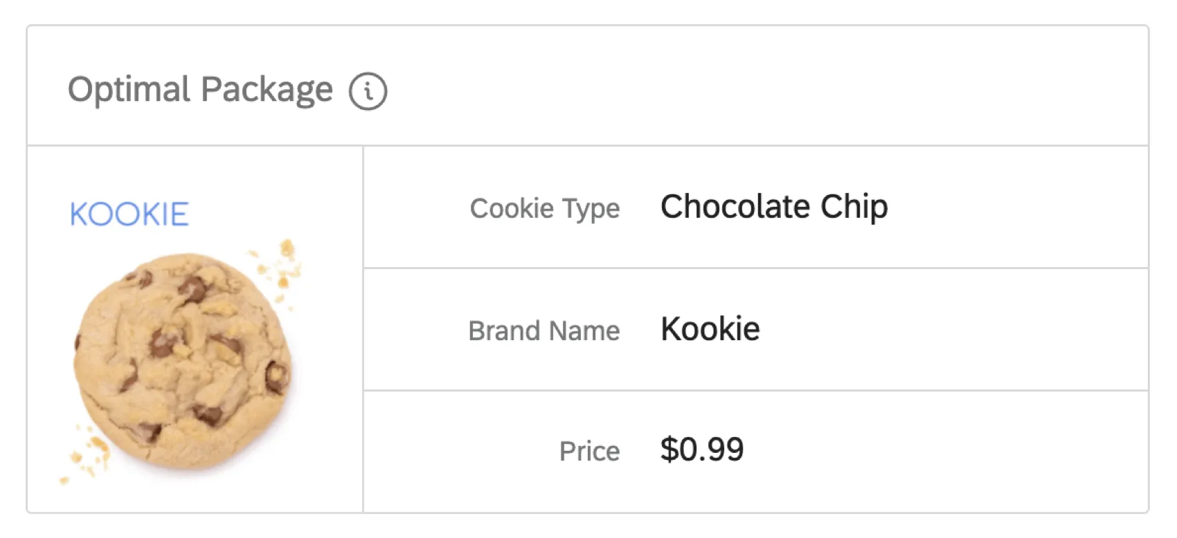

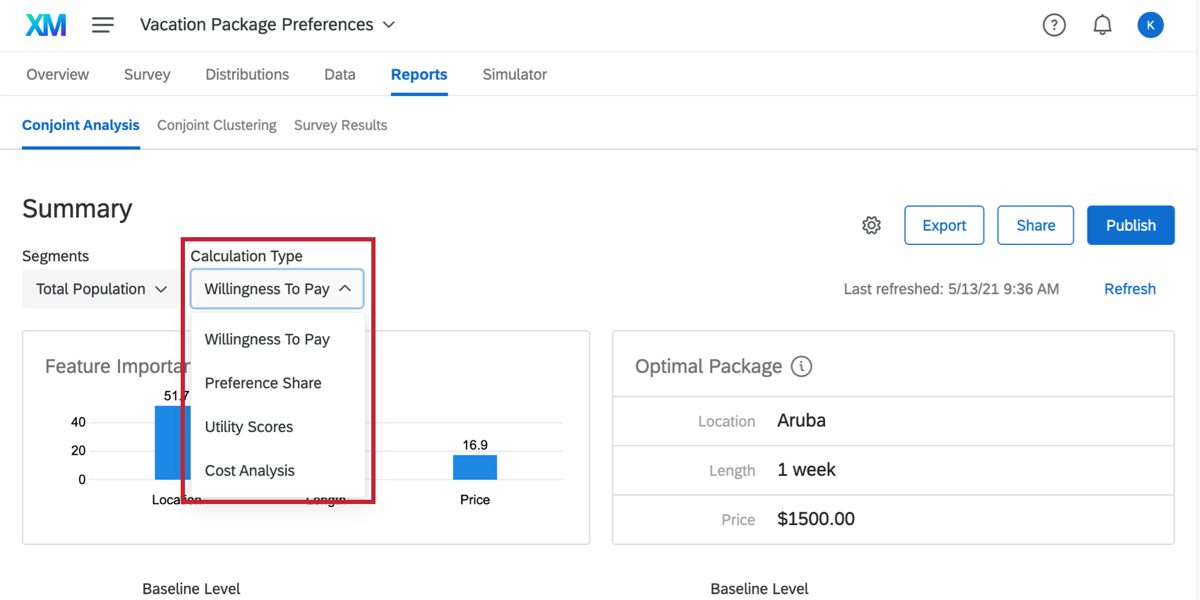
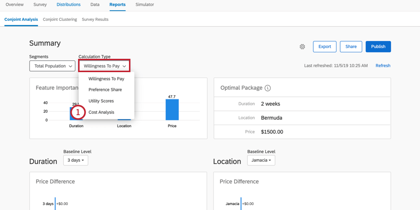
Calculation Type

In the upper-left, you can choose calculation types:
- Preference Share
- First Choice
- Utility Scores
- Cost Analysis
- Willingness to Pay Qtip: This option only appears if you’ve added pricing as a conjoint feature.

Which calculation you select affects the graphs and data that appear after the summary. These calculations are explained in the following sections.
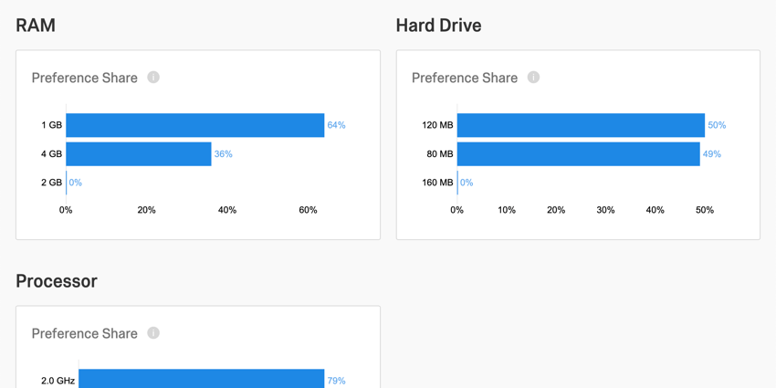
Preference Share
Preference share measures the preference that respondents had for each level of a feature. You will get a preference share graph for each of the features in your conjoint.
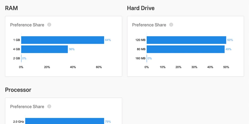
The preference share is the measurement of the probability that a level would be chosen over another (if all other feature components were held constant). The higher the percentage a level has, the higher a preference the respondents showed for that level over the others.
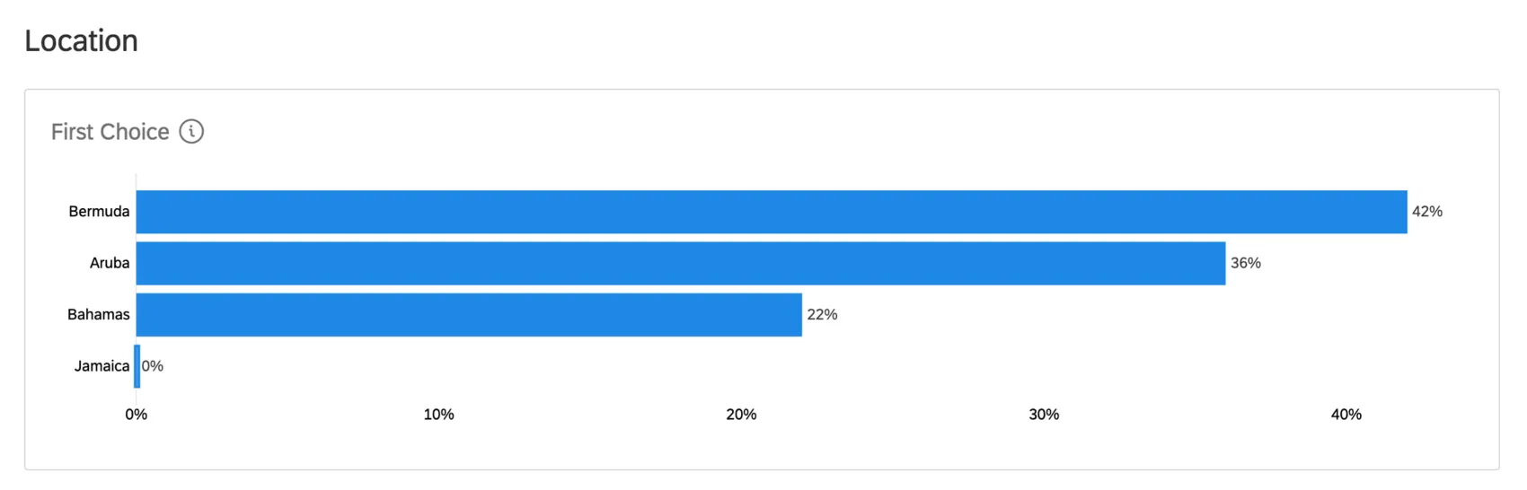
First Choice
If you switch Calculation Type to First Choice, you’ll be able to see what respondents are most likely to select as their first choice. This model assumes respondents will select the package with the highest utility.

There is a graph for each feature you added to your conjoint. Each graph shows what percentage of your respondents are likely to select each option as their first choice.
Example: In the graph below, we see a comparison of vacation locations. 42 percent of respondents likely would’ve picked Bermuda as their first choice, 36 percent would have chosen Aruba, 22 percent would’ve chosen the Bahamas, and none would have picked Jamaica.
You can also see the likelihood entire packages will be chosen as respondents’ first choice in the simulator.
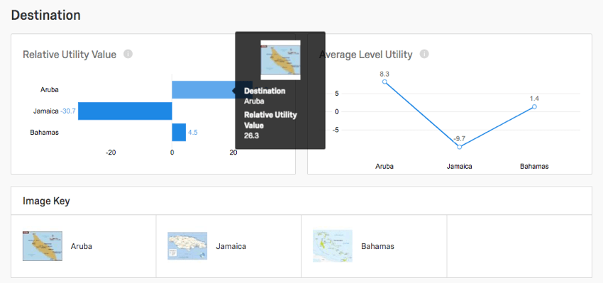
Utility Scores
Each feature gets its own relative utility value and average level utility graph. For example, since our conjoint is studying the preferred vacation package, our features are Location, Price, and Length.
In these reports, each level of a feature is compared to the others. Below, because Price is the feature, we see the different available prices being compared by utility scores.
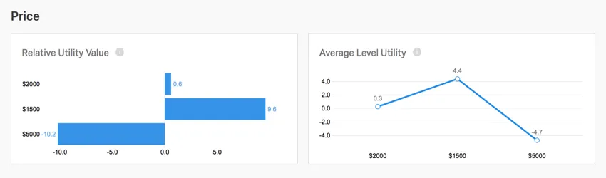
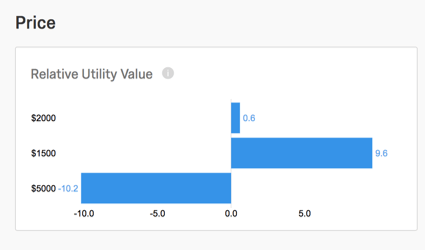
Relative Utility Value
The relative utility value bar graph displays the measurement of preference for each level of a feature. The greater a level’s relative utility value is, the more it enhances a package by being present.
Using the example below, the price of $1500 is highly favorable. Any package priced $1500 tends to be the respondent’s first choice. However, the price of $5000 has a highly negative relative utility value. It tends to be respondents’ last choices when they’re choosing a price. This makes sense, since people generally prefer saving money with cheaper prices.

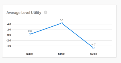
Average Level Utility
The average level utility is the direct average calculation across respondents’ individual level utility scores. This line graph is the normalized view of the relative utility values, and is useful in determining how significant a level is in contributing to a feature’s overall importance.
Willingness to Pay
Qtip: This option only appears if you’ve added pricing as a conjoint feature.

When you switch your calculation type to Willingness to Pay, you will see a table for Price Difference. This allows you to compare how much your respondents are willing to pay for a level, and how this compares to the other levels in that same feature.
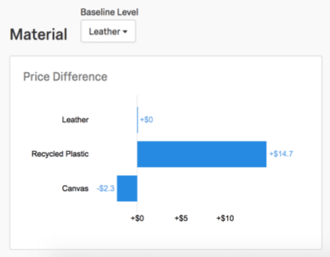
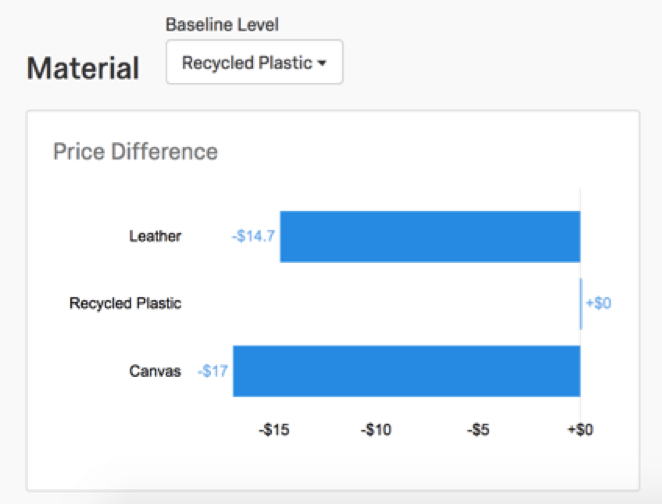
In the example below, we see the price difference chart for Material. Our Baseline is set to Leather, because we want to see how Recycled Plastic and Canvas compare specifically to Leather.

From the graph, we can tell that respondents are willing to pay $14.70 more for Recycled Plastic than Leather. This could imply the value of providing environmentally-friendly options to our customers. In contrast, respondents are willing to pay $2.30 less for Canvas than Leather.
Change the Baseline to change the level you’re comparing your other levels to. When we change the baseline to Recycled Plastic, we see again that customers are willing to spend $14.70 less on Leather than Recycled Plastic. We also see customers are willing to spend $17 less on Canvas than Recycled Plastic.
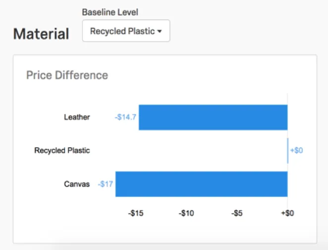
Qtip: You can also click the corresponding bar to switch the baseline. For example, if I clicked the Canvas bar at the bottom, Canvas would become the baseline of the graph.
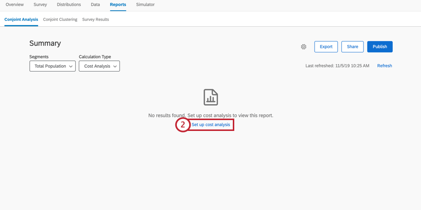
Cost Analysis
You can perform advanced cost analysis using the results from your conjoint study. With the cost analysis report, you can configure the cost associated with each conjoint level, and view a cost-benefit analysis chart. You can then view the optimal package based on your desired maximum cost along with the return on investment for your different conjoint levels.
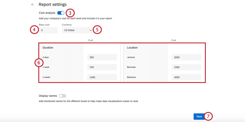
Setting Up Cost Analysis
Before you can view the cost analysis report, you need to define the costs for your conjoint levels.
Using the Cost Analysis Report
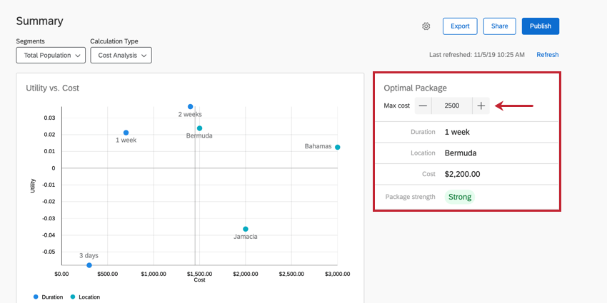
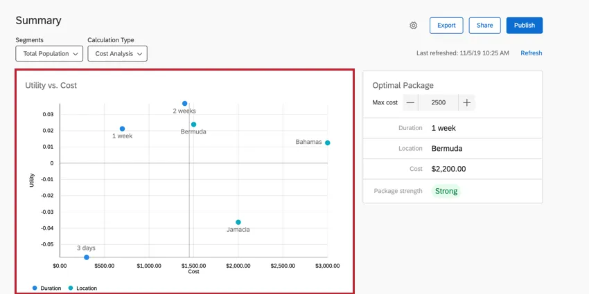
When viewing your cost analysis report, the first thing you should do is determine your optimal package’s maximum cost. To do this, enter the desired maximum cost in the Optimal Package section. After setting your maximum cost, this section will display the levels that make up the optimal package.
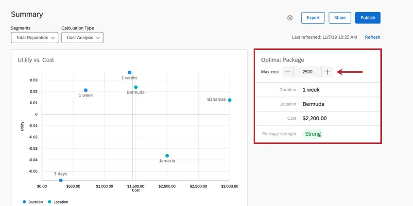
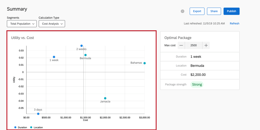
The Utility vs. Cost graph displays the different utility scores for your project’s levels against the cost of each level. A higher utility score means a higher amount of preference for the specific conjoint level. Generally, you will want to choose a package containing levels with a high utility while also trying to minimize the cost.
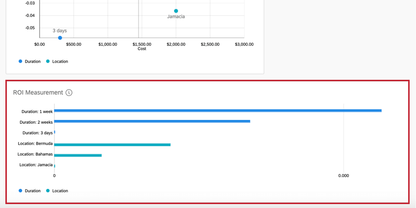
The ROI Measurement graph displays the Return on Investment (ROI) for the different conjoint levels. This graph measures the average utility score per unit cost for each level. Generally, you will want to choose a package that has a larger ROI for each level.
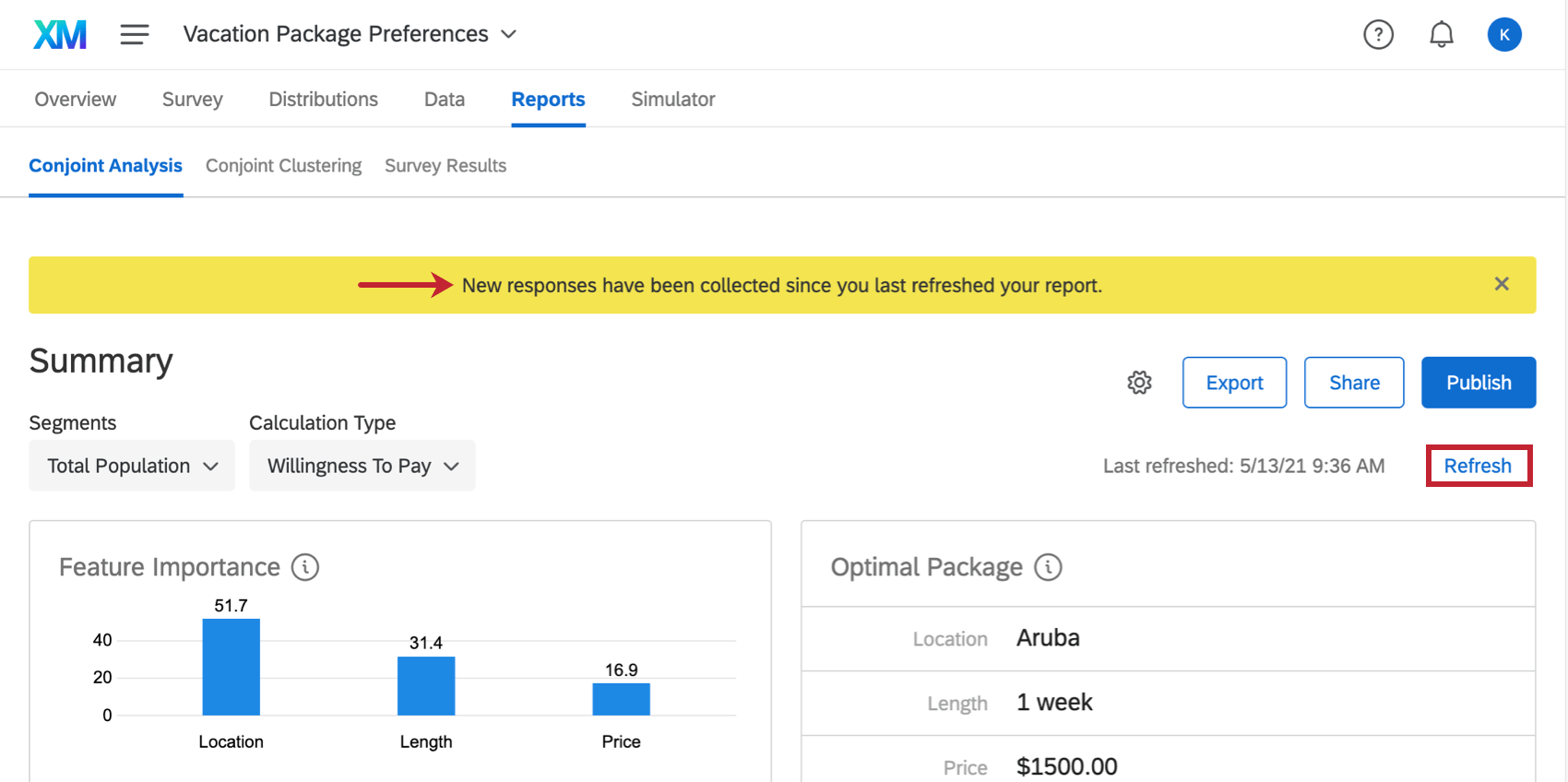
Refreshing the Report
When you collect new data and visit the conjoint analysis report, a yellow banner will alert you that New responses have been collected since you last refreshed your report. This means the data you see may be from a previous batch of responses. This banner can be temporarily closed, but if you leave the page and come back without any data refreshes having taken place, it’ll pop up again.

If you would like to manually refresh and force the report to update, click Refresh in blue on the upper-right.
Qtip: The report automatically refreshes every hour. To the left of the refresh button, it will tell you when the data was last refreshed.
Export
Using the Export button, you can export conjoint data into a CSV format. Learn more about the process, what calculations are exported, and what the different column headers mean on the Exporting Raw Conjoint Data support page.
Qtip: Exported data will not contain non-conjoint survey data. See the Survey Platform Exporting Data support page to see how to export just your non-conjoint data.
Total Population & Segmentation
The Total Population dropdown you may see in the upper-right is related to a feature called Segmentation. If you collect survey data on demographics, segmentation is a great way to analyze how different groups of people have different package preferences, allowing you to optimize products for specific populations of customers.
To learn more about this feature, see the Segmentation support page.
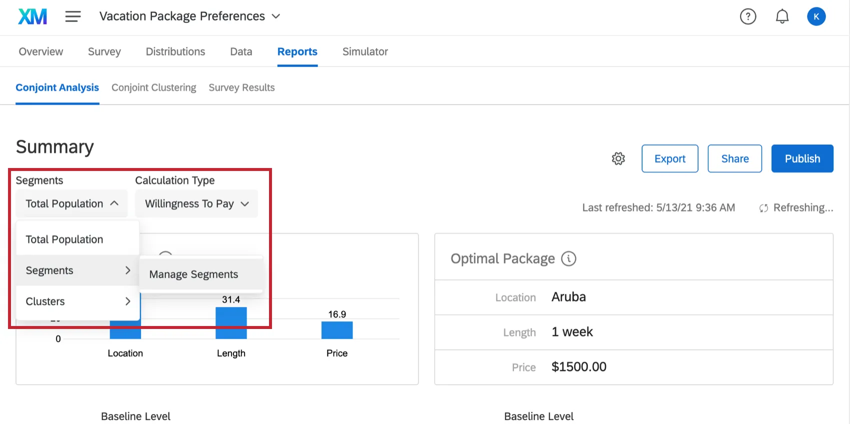
Image Key
If your levels have images attached, there will be an image key explaining the level corresponding to each image. In addition, if you hover over your graph, you will see images in place of feature text.

Changing Conjoint Report Display Names
You can change the display names of the features and levels of your conjoint project so that your data is easier to visualize. This will not affect the feature and level names as they appear in your conjoint survey.
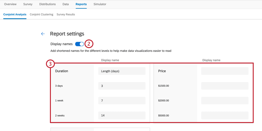
Qtip: You can leave a field blank if you don’t want to change its display text.
That's great! Thank you for your feedback!
Thank you for your feedback!