
Building Widgets (CX)
What's on this page
About Building Widgets
Widgets dynamically present data in graphs, charts, and tables.
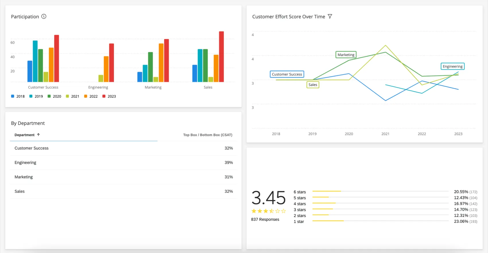
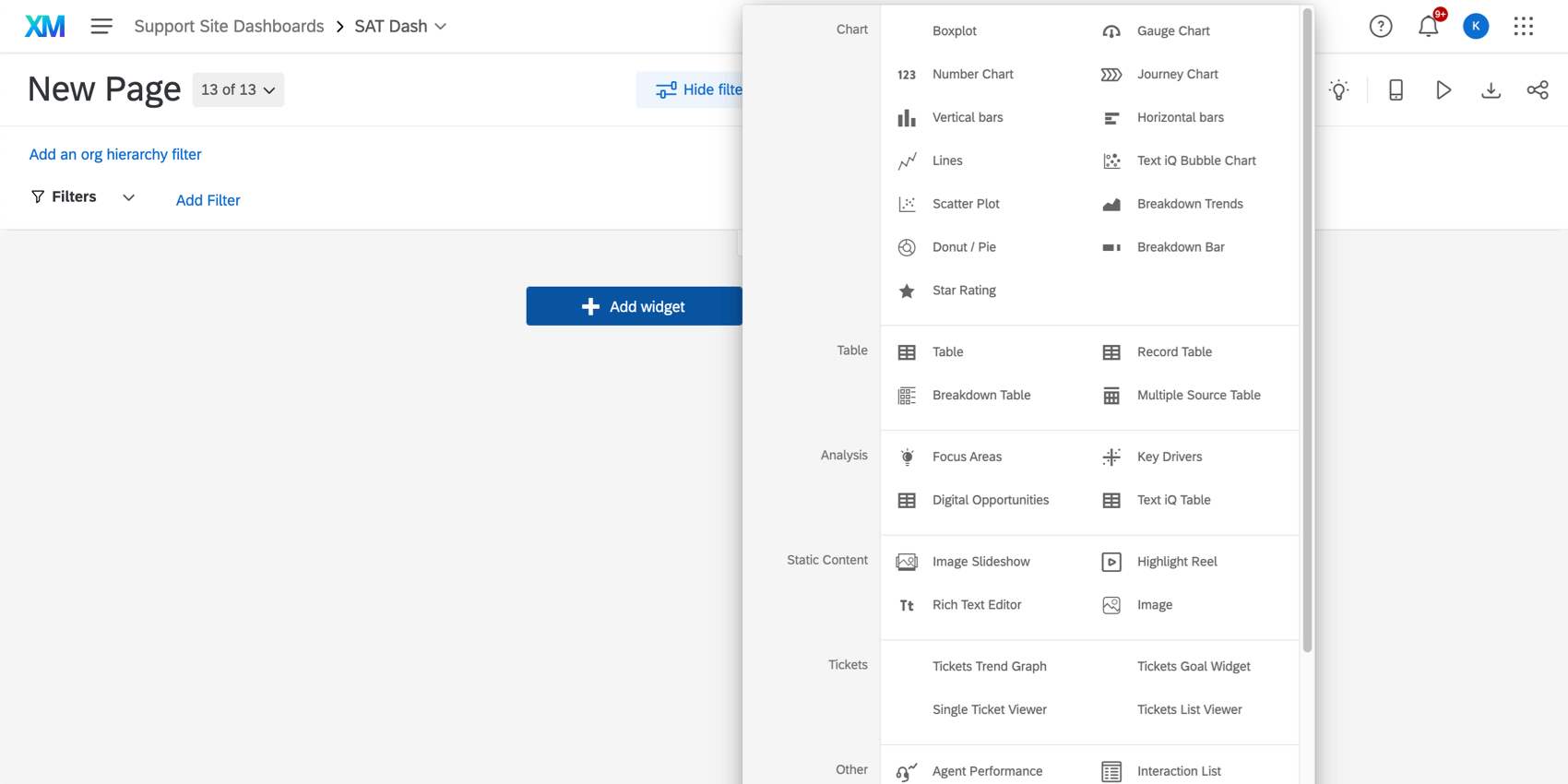
There are over 20 widget types, broken out into several categories in the widget selection menu:
- Chart: Insert plots and graphs.
- Table: Show tables and grids.
- Analysis: Identify relationships with key driver correlations.
- Static Content: Add images and fixed text.
- Other: Display open-ended text, region selections, and distribution data.

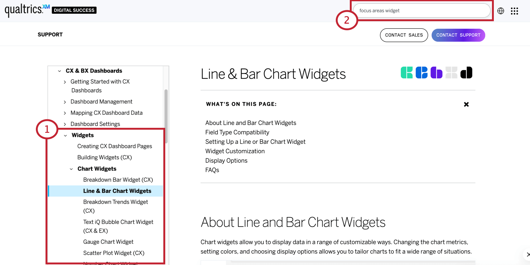
Learn More About Each Widget
To learn the details for each widget:
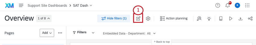
Adding Widgets
To add widgets to any dashboard page:
Qtip: In addition to adding widgets at the bottom of your dashboard, you can hover over the spot in your dashboard where you want to add a widget, click Add, and select Widget.
Attention: For optimal performance, we recommend a maximum of 28 widgets per page.
Editing Widgets
While every widget type is unique, a few basic editing features can be demonstrated with a simple chart.
To edit a widget:
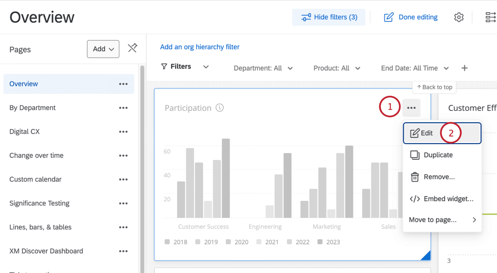
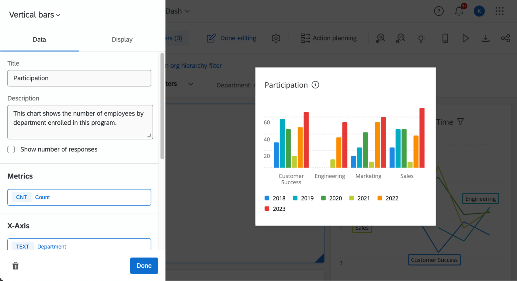
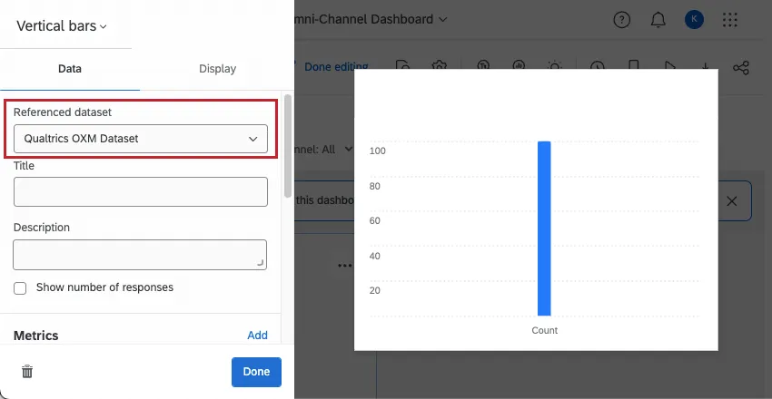
Referenced Dataset
The referenced dataset refers to the entire dashboard dataset that the widget uses. One dataset can contain lots of sources, so this dataset isn’t just the survey you’re reporting on in this dashboard, but every source and field you’ve added.
When you first create a dashboard and map your data, you’ll probably just have one dataset to choose from. To learn more about why you might use multiple datasets and how to get started, see Using Multiple Datasets in a Dashboard (CX).
Titles & Descriptions
To add titles and descriptions:
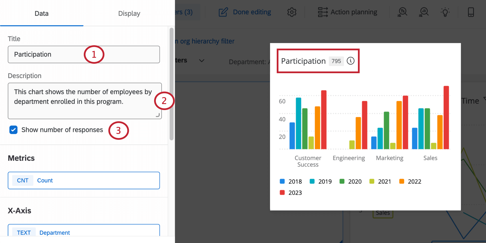
Once these options are set, dashboard viewers will be able to click on the widget title to see details about the widget.
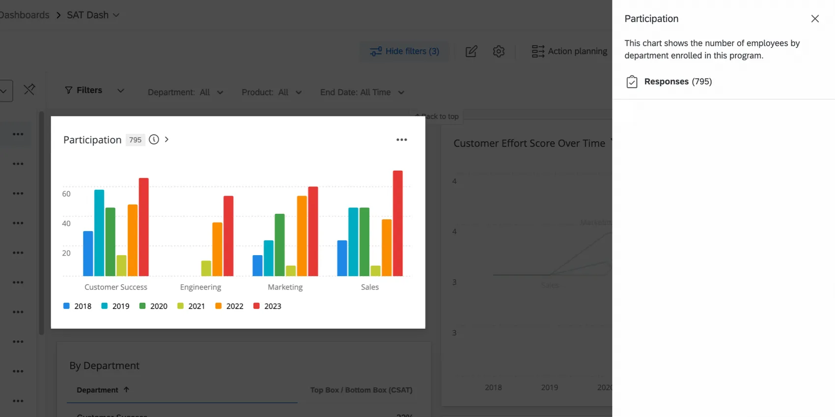
The sidebar shows the widget title, widget description, number of responses, and widget filters.
Qtip: If any of these fields were not configured in the widget options, they will not be displayed.
Widget Style
Widget styles can also be set in the dashboard theme. These settings affect whether the widget has a white background or displays its title.
To change an individual widget’s style:
- On: The widget will have a border around it. The widget will also have a white background, which can be useful to keep the widget readable if you’ve set a custom dashboard background color.
- Off: The widget will not have a border around it, and its background color will match whatever is set for the dashboard.
- Use dashboard default: The widget border will match what is set in the dashboard theme options.

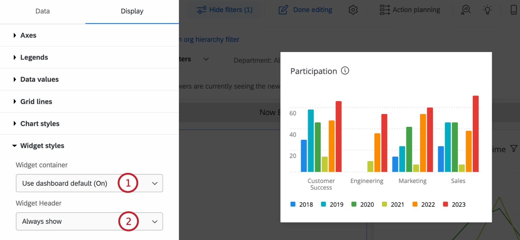
- Always show: Always display the widget’s title.
- Show on hover: Display the title when a dashboard viewer hovers their mouse over the widget.
- Never show: Do not display the widget’s title.
Qtip: Display options vary by widget. See specific widget support pages for more details on each display option.
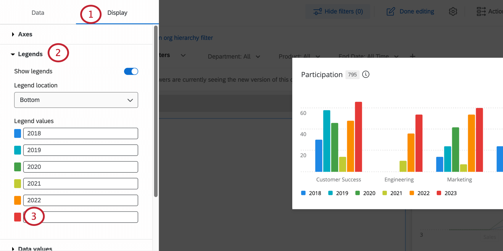
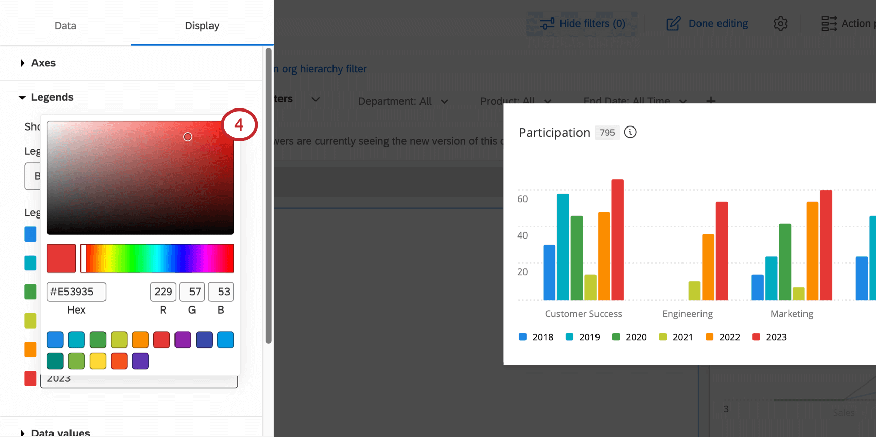
Labels & Colors
Colors can be changed for various settings in the widget’s Display tab.
Filtering Widgets
You can add filters directly to specific widgets. For detailed steps, see Adding Widget Filters.
Dashboard viewers are able to view a widget’s filters by clicking on the widget title or filter icon.

The sidebar shows viewers all filters that have been added to the widget. They can also click on individual filters and apply different values to the widget.
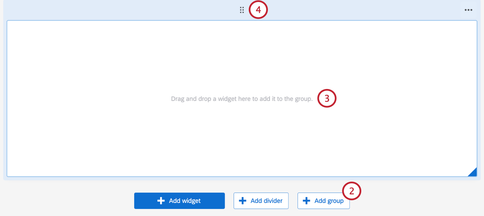
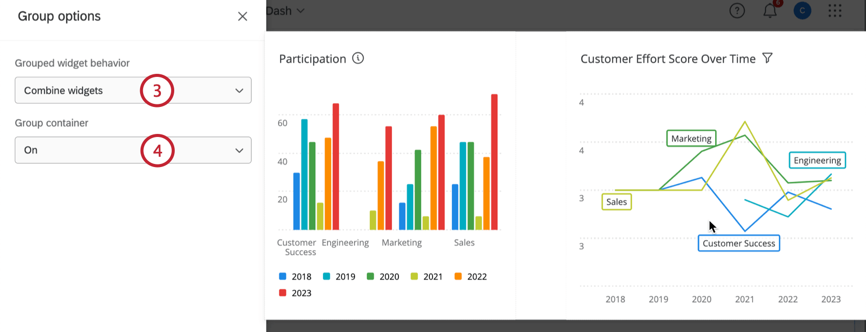
Grouping Widgets
Grouping widgets combines multiple widgets into a single unit. This allows you to apply widget display options to all widgets in the group.
Creating Widget Groups
To create a widget group:
Qtip: You can adjust the size and position of your widgets within the group.
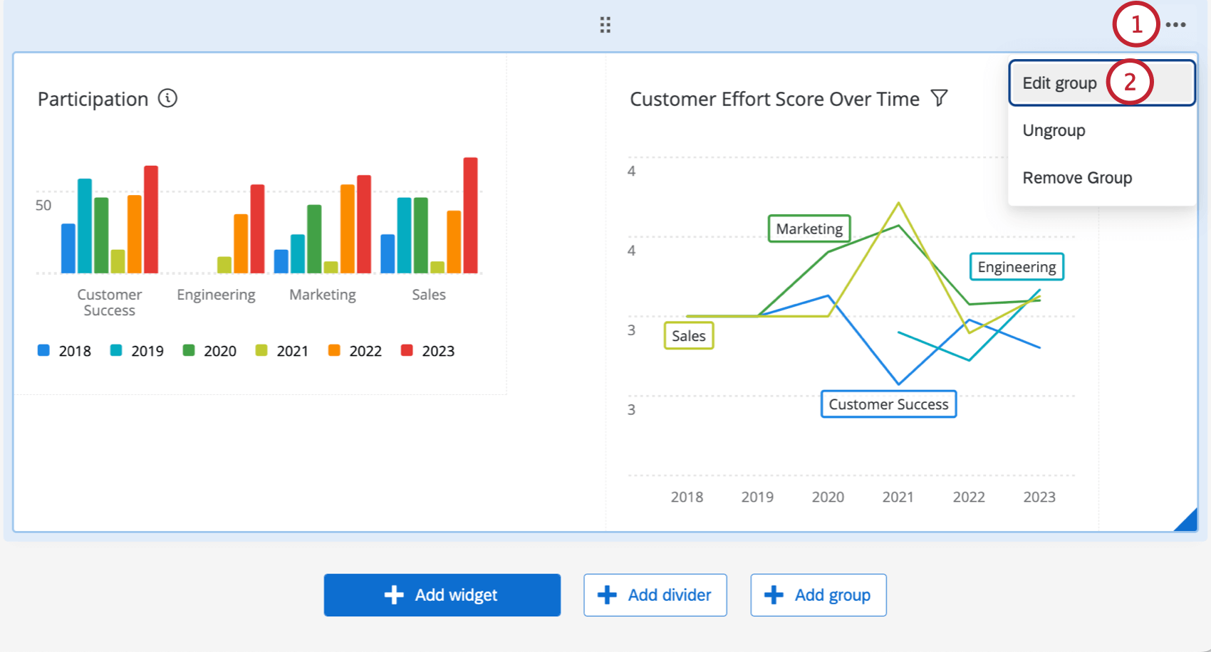
Editing Widget Groups
Once a widget group has been created, you have several options to modify the group. To edit a widget group:
- Combine widgets: Widgets will be displayed within the same container.
- Keep widgets separate: Widgets will be separated in their own containers. Containers are the white space behind your widgets. This means if you choose a dashboard background color, that color fills in the background on your widget, not just the spaces between widgets.

- On: The widget group will be within a container.
- Off: The widget group will not be within a container.
- Use dashboard default: The container settings in your dashboard theme will apply.
To ungroup the widgets in the group, hover over the 3 horizontal dots and select Ungroup. The widgets will remain in the same position on the dashboard page, but will no longer be grouped.
To delete a widget group, hover over the 3 horizontal dots and select Remove group. This will also remove all widgets from the group.
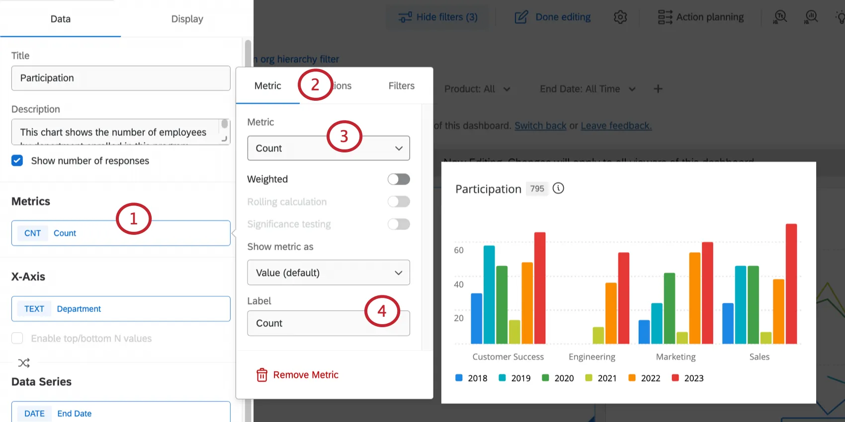
Widget Metrics
Many dashboard widgets require you to pick a metric.
The available metrics are:
Count: Display response counts from the selected fields (i.e., number of respondents who answered the question).

Qtip: Line, horizontal bar, and vertical bar charts let you customize how counts are displayed in even more ways than other widgets allow. See Count Metric Options.
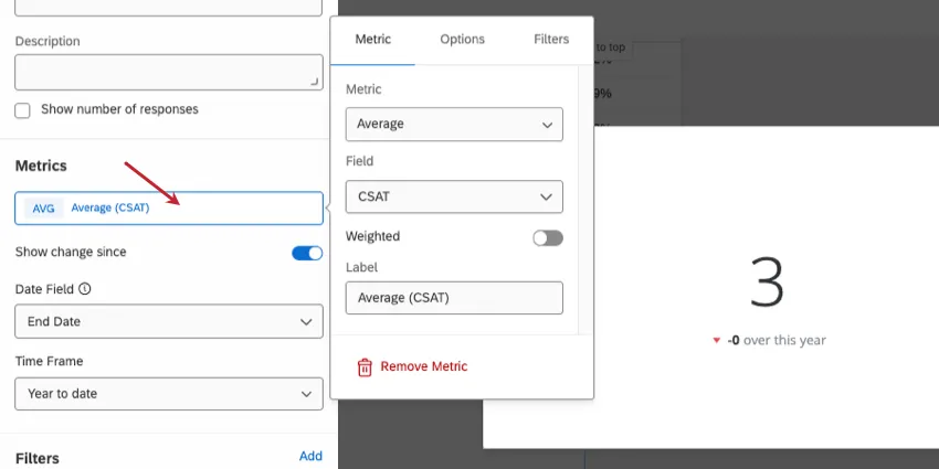
- Average: Exhibit the average value for a selected field.
- Minimum: Show the minimum value of a selected field.
- Maximum: Present the maximum value for a selected field.
- Sum: Pull in the sum of all values for a selected field.
- Net Promoter Score: Identify the detractors, passives, and promoters from NPS questions.
- Correlation: Select 2 fields to determine their correlation. The result will be given as a correlation coefficient (Pearson’s r), which is represented as a number from -1 to +1. The strongest possible negative correlation is -1, and the strongest possible positive correlation is +1.
Standard Deviation: Show the standard deviation of the responses in the field.
Qtip: The standard deviation metric is compatible with number chart, gauge chart, pie chart, lines, bars, and table widgets.
- Top Box / Bottom Box: Display the percentage of responses that fall into a specified range of values. Top box is the percentage of respondents who fit into the highest ends of the scale. Bottom box is the percentage of respondents who fit into the lowest ends of the scale.
Subset Ratio Metric: The number of people who selected a specific brand divided by the number of respondents aware of the brand. It can be used as an alternative to custom metrics when you are looking to visualize a proportion. See Subset Ratio Metric for more information.
Qtip: This metric is available on the bar, line, and table widgets. For these widgets, we recommend using the subset ratio metric instead of custom metrics.
- Percentile: Percentiles contain a set of 100 values (or buckets) for a particular field. A value for a field, such as an average, is calculated from the response data and then the value is looked up in the percentile list to see what percentile bucket (one of the 100 in the list) it falls in. When you select a percentile metric, you are showing what value is considered the 50, 75, 80, etc. percentile. You can show the following percentiles:
- 50% (Also known as the median)
- 75% (Also known as the third or upper quartile)
- 80%
- 90%
- 95%
99%

Example: NPS is an 11 point scale of values 0 to 10. Here are the percentiles for NPS.
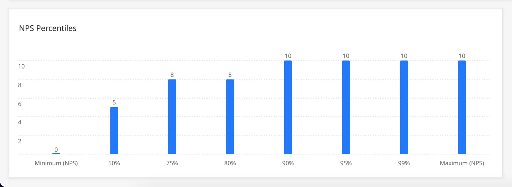
The median (50% percentile) is 5 because 50% of the values on the scale are equal to or smaller than 5 (1, 2, 3, 4), and 50% of the values on the scale are greater than 5 (6, 7, 8, 9, 10).
The 75% percentile is 8 because 75% of the answers are less than or equal to 8, and 25% are greater than 8. With a small enough scale, values will repeat themselves, so 8 also falls under the 80% percentile.Qtip: This metric is only available on the bar, line, and table widgets.
- Custom Metrics: Include any custom metrics you have created. For more information, visit the page on Custom Metrics.
- Saved benchmarks: Any benchmarks you’ve created. However, this only adds the benchmark to the widget, no other data; to showcase your own data alongside a benchmark to see how well your data measures up, we advise following the instructions in the Comparisons and Benchmarks section below instead.
- One-time Benchmarks: Configure a one-time benchmark for the widget. You can select the benchmark dataset, version, and field to display in the widget, and add benchmark-specific filters.
Qtip: Newly added metrics are initially set to Count.
Editing Metrics
Qtip: To add a new metric, click Add under the Metrics heading. A default Count metric will be added to your widget. Click on the new Count metric to make the changes as described below.
You may have additional options based on how you set up your widget or your dashboard. See Using Multiple Datasets in a Dashboard (CX), Response Weighting in CX Dashboards, Rolling Calculations in Widget Metrics, and Significance Testing in Dashboard Widgets.
Options Tab
The Options tab lets you change the displayed decimal places and the numeric style of a metric.
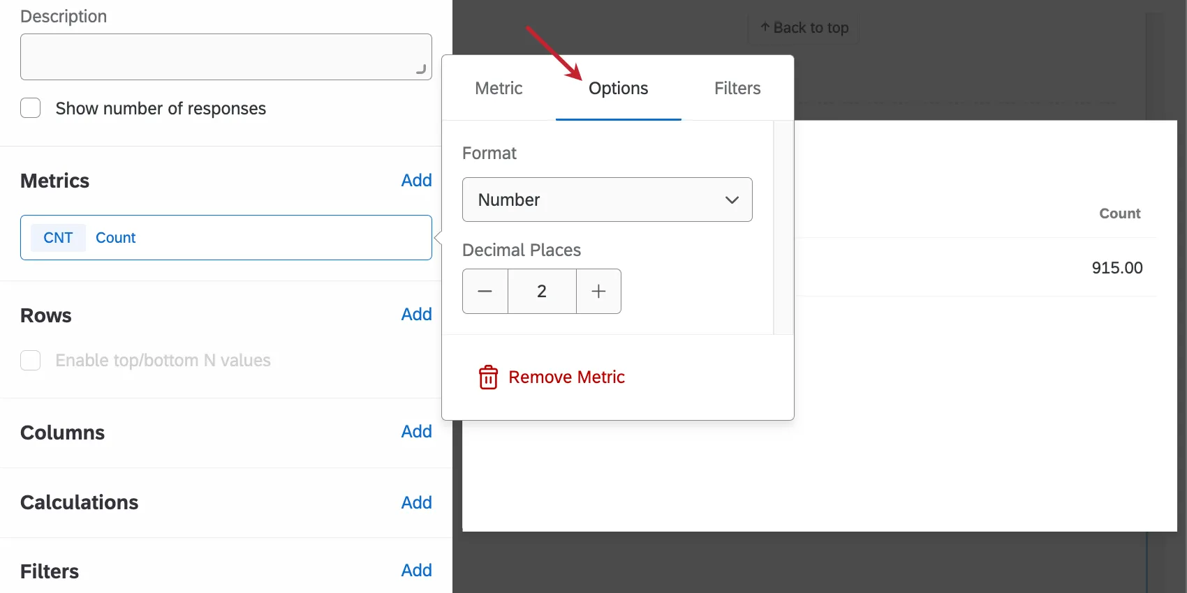
There are three metric formats:
- Number: Display the metric as a direct numeric value.
- Percent: Convert the metric value to a percentage (e.g., 0.10 becomes 10%).
- Currency: Show the metric as a currency value prefixed by a selected currency symbol (e.g., 50 becomes $50).
Filters Tab
The final tab in the metric settings window is Filters. Under this tab, you can add filters to your metric.
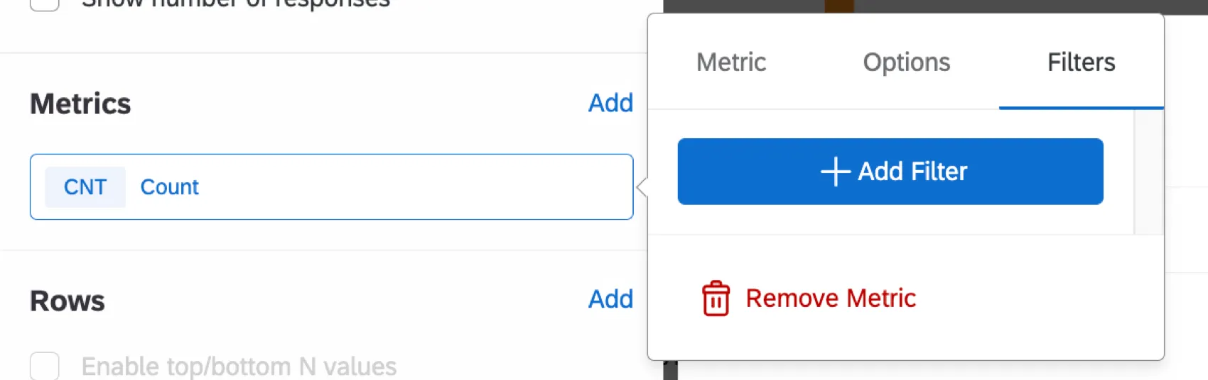
Filters on the metric will restrict the data that is represented by the metric on the widget. For example, if a filter to include only values 1-3 of a 5 point satisfaction scale is applied to a metric with type “count,” only responses that fall into this range will be included in the counts on the widget.
Adding a filter directly to a metric instead of the widget itself can be useful if there are multiple metrics that should have different filters added to a single widget. You can also use filters if you’ve configured a one-time benchmark.
To remove a filter from a metric or change the field being filtered, click the field name at the top.
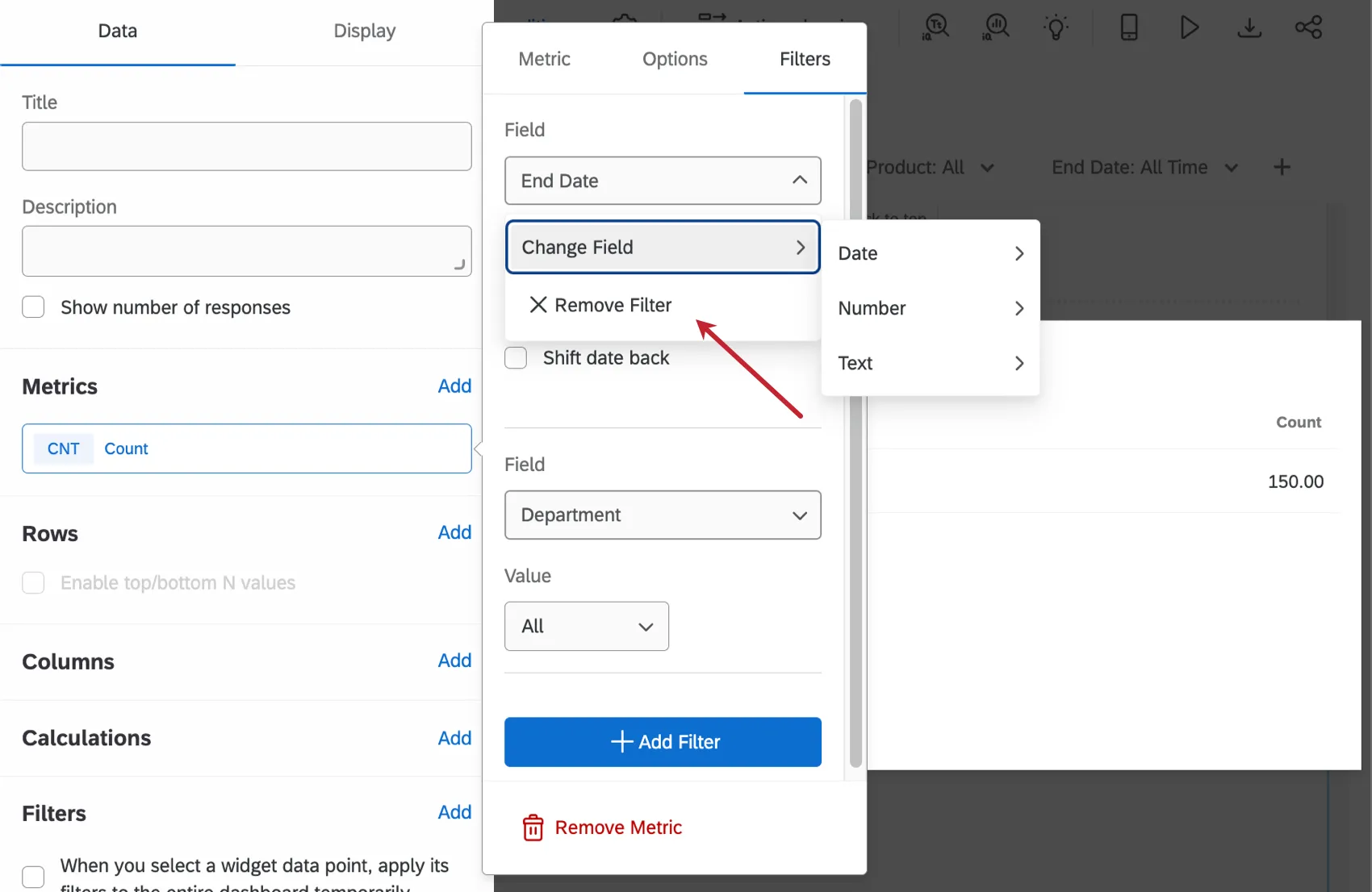
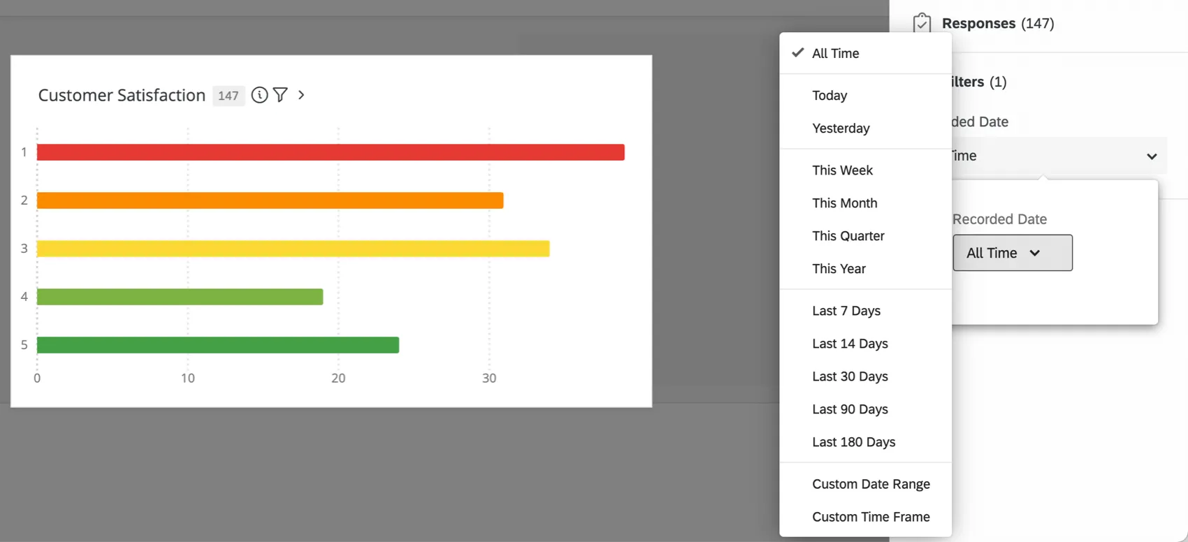
Qtip: For more on configuring date filters, see the Filtering CX Dashboards support page.
Displaying Top/Bottom N Values
Have you ever wanted to visualize only the top or bottom values of a metric in a widget? For example, let’s say you have a widget that displays your text topics but you have many topics in your dataset. It can be hard to identify topic outliers when every topic is displayed; however, you can limit the data shown in the widget by displaying up to 15 of the top or bottom values of a selected metric (for example, response count).
You can display the top / bottom values in the following widgets:
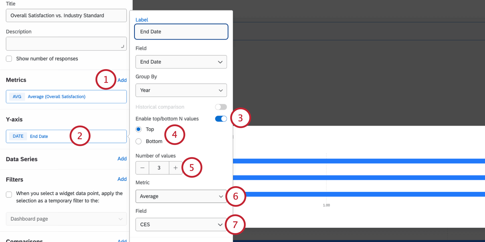
Qtip: The maximum number is 15.
Example: For example, let’s say I have a line chart widget showing NPS scores for my various customer accounts over time and I’d like to see my accounts with the lowest CSAT scores. I can select “Average” for my “CSAT” field and display only the bottom values, allowing me to see the customer accounts with the lowest CSAT while still tracking their NPS over time.
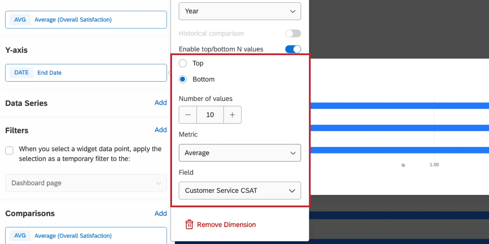
Qtip: This setting allows you to visualize only the top or bottom N values by any metric in the dataset. You can enable top/bottom N values of any metric, even when multiple metrics and dimensions are applied, and regardless of the metric that is currently being displayed in the widget.
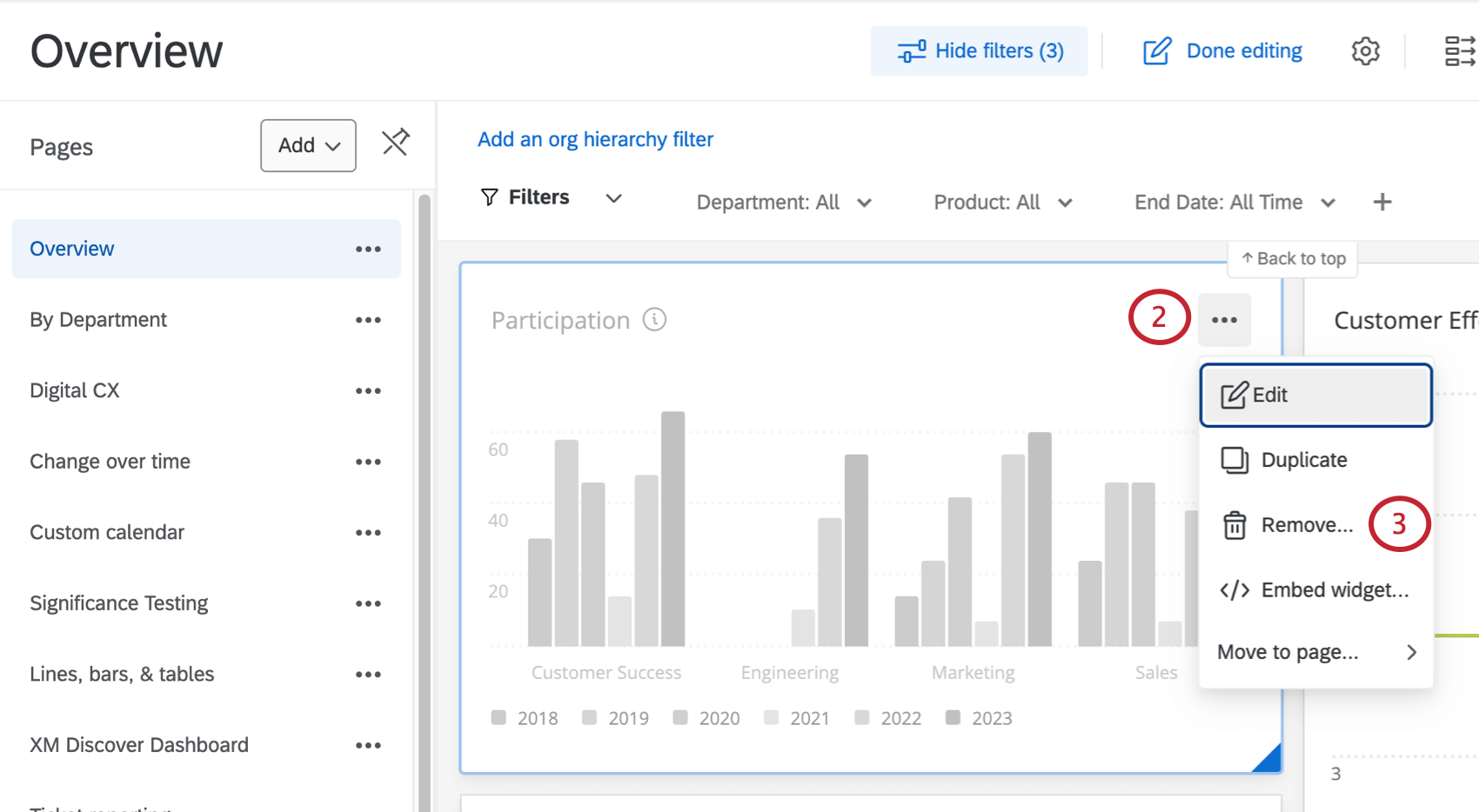
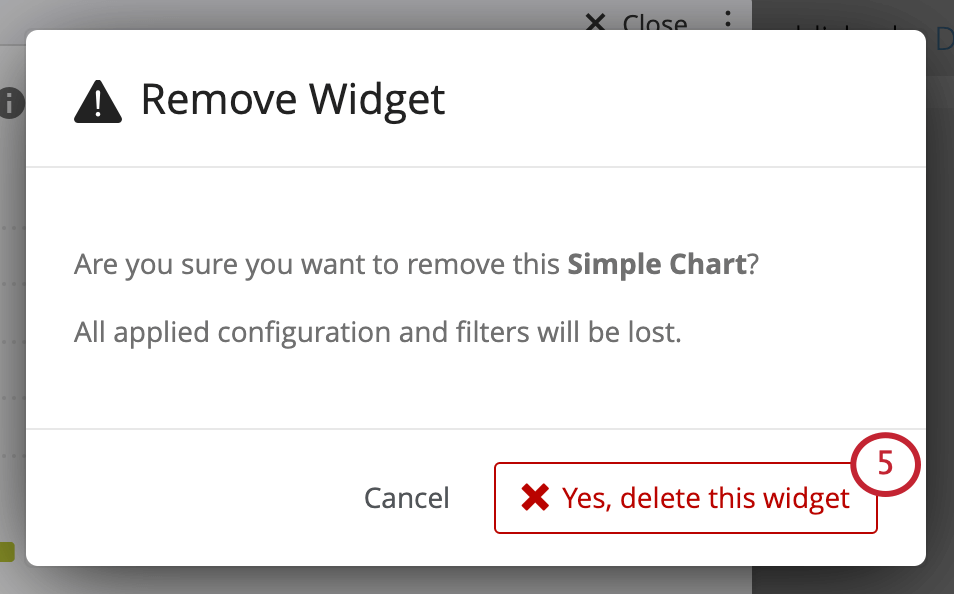
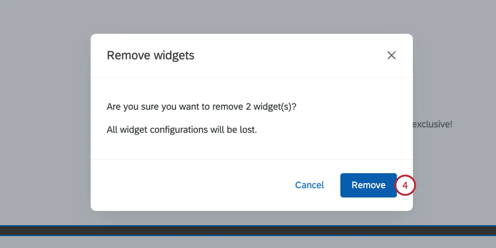
Removing Widgets
Warning: After you remove a widget, you cannot recover it.
Removing a Single Widget
Removing Widgets in Bulk
Make sure you’re in editing mode.
Click on the widgets you’d like to remove. Any selected widgets will be highlighted with a check mark.
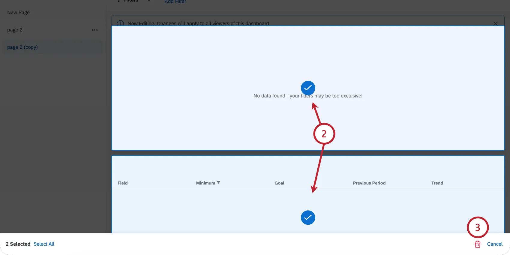
Qtip: You can see how many widgets you have selected using the banner at the bottom of the page. You can select every widget on your current page by clicking “Select All."
Click the trash can.
Click Remove.
Resizing & Positioning Widgets
To resize your widgets and arrange them on the page:
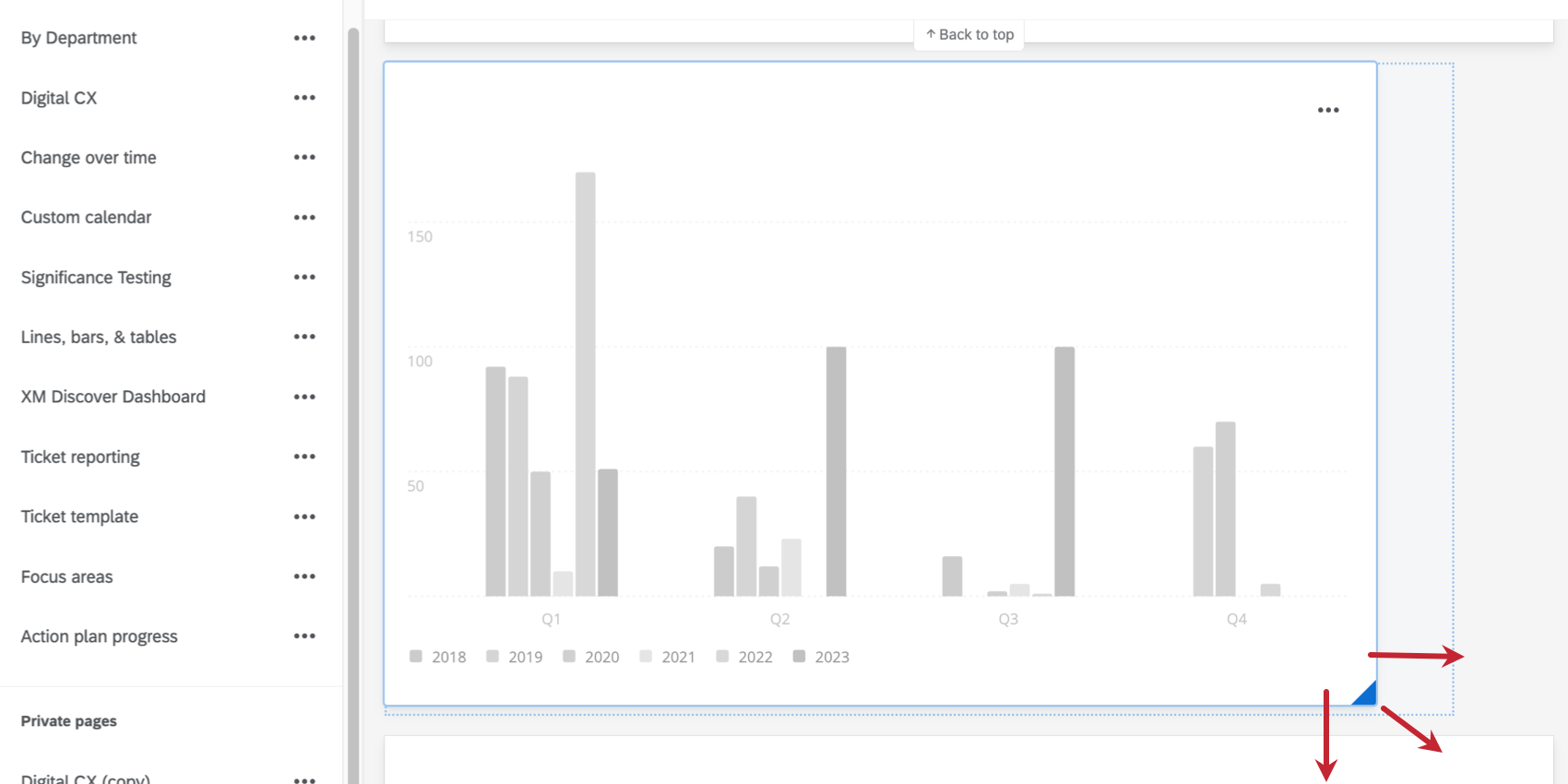
Qtip: Moving a widget automatically shifts all the other widgets into new positions on a page.
Duplicating Widgets
To make an exact copy of a widget:
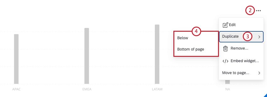
- Below: Create a copy directly below the original widget.
- Bottom of page: Create a copy at the bottom of the dashboard page.
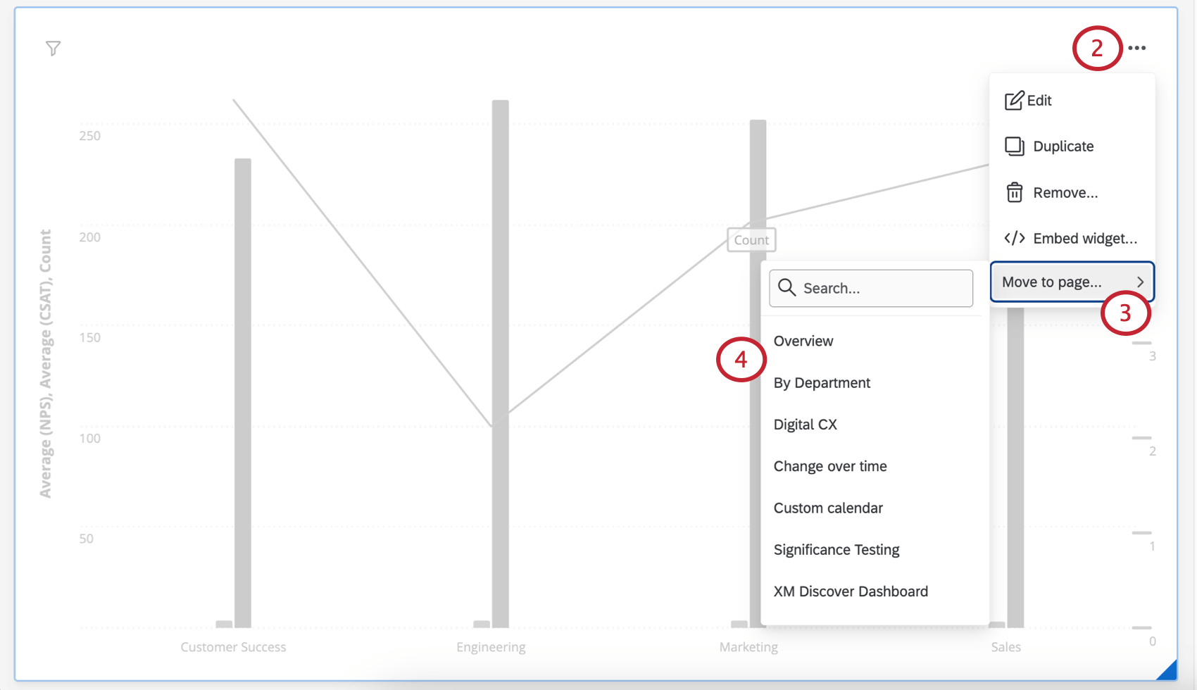
Moving Widgets to Other Pages
Qtip: You can only move widgets on private pages to other private pages. Likewise, you can only move widgets on public pages to other public pages. If you want to switch the privacy of a widget, you’ll have to make a public or private copy of the entire page instead.
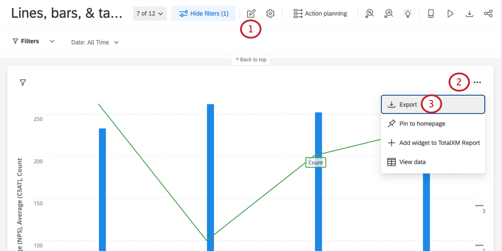
Exporting Widgets
Qtip: Whether dashboard viewers can export widgets or not is due to certain dashboard permissions. Learn more about exporting CX dashboard data.
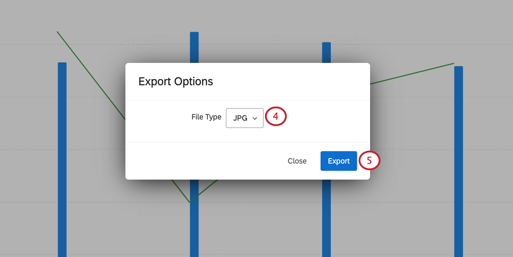
Widgets can be downloaded into several formats:
- JPG/JPEG: The Joint Photographic Experts Group’s compressed digital image format. Select JPG if you need an image for PowerPoints, social media uploads, or printed documents.
- PDF: The Portable Document Format from Adobe. Select PDF to capture a widget as a document independent of CX Dashboards or other software application. View in a PDF viewer. PDFs are printable.
- CSV: A Comma-Separated Values format. Pick CSV if you need to extract a widget’s data and pull it into a spreadsheet or database.
- XLSX: An Excel file format. Select XLSX if you need to extract a widget’s data and pull it into an Excel spreadsheet.
TSV: A Tab-Separated Values file format. Choose TSV to generate a simple text file presenting your data in a tabular structure. Commonly used to exchange information between databases.
Qtip: There is a 10,000 row limit when exporting widgets to CSV, TSV, or XLSX. Any rows past 10,000 will not be included in the export. Additionally, empty rows will be included in the export even if they are hidden in the widget.
- ZIP (Uploaded files): This option is only available for record table widget. See more on exporting uploaded files from record tables.
Any type of widget can be exported individually. To export a widget:
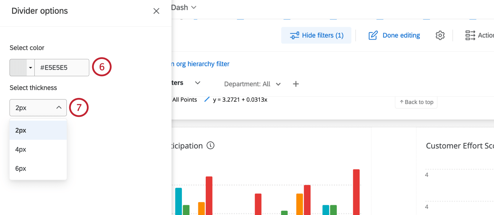
Widget Dividers
Widget dividers allow you to divide your dashboard pages to create clear sections.
To add a divider:
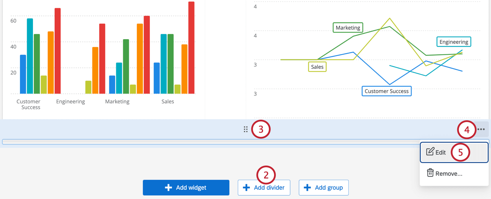
Qtip: To remove a group, hover over the 3 horizontal dots and click Remove.
View Widget Data
Some widgets allow you to view the data that’s displayed in them in a table format. To see this format, hover over the dots in the upper-right, then select View data.
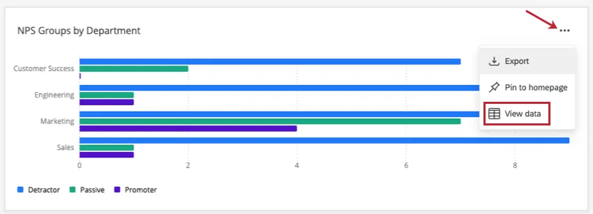
Qtip: Your dashboard must be in viewing mode, not editing mode, to see this option.
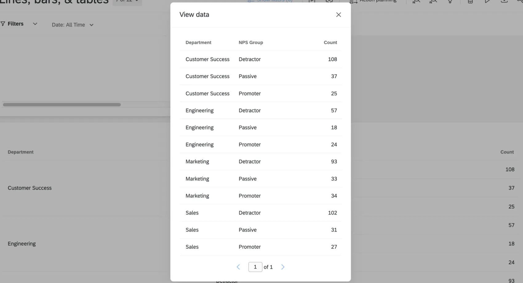
Example: The table widget shows the count of people who belong to each group, broken out by department. Because there are 3 groups (passive, promoter, and detractor) and 4 departments (customer success, engineering, marketing, and sales), the “View data” window shows us the count for every possible combination of group and department (12 rows of data total).
“View data” is available to any user on the dashboard, regardless of whether they have viewing or editing permissions. This is another way of viewing the same data from the columns and fields displayed in the widget, and will not show any additional information to dashboard users.
Widgets that allow you to view data
Not all widgets have the “View data” option. See the following for a list of compatible widgets:
- Table widget
- Journey chart widget
- Number chart widget
- Line and bar chart widgets
- Gauge chart widgets
- Key drivers widget
Qtip: Viewing data on a key drivers widget will show the driver, performance, importance, sample size, and quadrant. To understand these concepts, see the Interpretation section of the Key Drivers Widget page.
Deprecated Widgets
While you’re adding a new widget, you may notice a section of the menu named Deprecated Widgets. In this section, we list widgets that you can still temporarily create, but have been replaced with better, upgraded widgets or features.

Widgets listed as “deprecated” in this menu can still be used. However, they will eventually be removed from the platform. The timeline of each widget’s removal will vary. Widgets will not be removed until users have been told in advance. All deprecated widgets will automatically be migrated to the new version when they are removed from the platform, and will be fully functional throughout the migration process.
Qtip: Qualtrics may, in its sole discretion and without liability, change the timing of any product feature rollout, change the functionality for any in preview or in development product feature, or choose not to release a product feature or functionality for any reason or for no reason.
Please note that even if a type of widget is deprecated, existing widgets of that type will not stop working or be removed from your dashboard without communication. However, we recommend switching to new widget types to ensure maximum dashboard performance.
Attention: Widgets on the deprecated list are no longer being updated with improvements. If a deprecated widget does not behave as expected, please switch to the recommended replacement listed below.
Recommended widget replacements
Qtip: Would you like to keep up-to-date with the latest product updates, including new widgets and deprecated features? Subscribe to our weekly product release notes in the Experience Community.
- Distributions table: The XM Respondent Funnel can be used as an alternative to the distributions table widget. Once the respondent funnel is mapped, you can use a wide range of widgets to report on distributions.
- Pivot table: This widget has been replaced by the table.
- Simple chart: This widget has been replaced by the line, vertical bars, & horizontal bars widgets.
Simple table: This widget has been replaced by the table widget.
Qtip: If you need data translations, continue to use the simple table widget. However if you need label translations, use the new table widget.
- Trend chart: This widget has been replaced by the line, vertical bars, & horizontal bars widgets.
- Legacy rich text editor: This widget has been replaced by the rich text editor.
- Legacy word cloud: This widget has been replaced by the word cloud widget.
- Pie chart: This widget has been replaced by the donut / pie widget.
- Record grid: This widget has been replaced by the record table.
- Star rating: This widget has been replaced by the new star rating widget.
- Map view widget: This widget has been replaced by the new map widget.
FAQs
What dashboard widgets can I use with my distribution data in CX Dashboards?
What dashboard widgets can I use with my distribution data in CX Dashboards?
Why can’t I add the Ticketing-specific widgets anymore in CX Dashboards (e.g., Single Ticket Viewer, Tickets List Viewer, Tickets Trend Graph, and Tickets Goal Widget)?
Why can’t I add the Ticketing-specific widgets anymore in CX Dashboards (e.g., Single Ticket Viewer, Tickets List Viewer, Tickets Trend Graph, and Tickets Goal Widget)?
Why can't I see data in the widgets on my Ticket Reporting CX Dashboards page?
Why can't I see data in the widgets on my Ticket Reporting CX Dashboards page?
Does distribution information for personal links appear in the Distributions Table widget in CX Dashboards?
Does distribution information for personal links appear in the Distributions Table widget in CX Dashboards?
How is response rate calculated in the Distributions Table widget in CX Dashboards?
How is response rate calculated in the Distributions Table widget in CX Dashboards?
The count in my Number Chart widget does not match the count for the same value that I see in other widgets in CX Dashboards. Why is this?
The count in my Number Chart widget does not match the count for the same value that I see in other widgets in CX Dashboards. Why is this?
What method is used to determine the regression equation for the Scatter Plot widget in CX Dashboards?
What method is used to determine the regression equation for the Scatter Plot widget in CX Dashboards?
Now that I have my key drivers, how should I act on the results for my Key Drivers widget in CX Dashboards?
Now that I have my key drivers, how should I act on the results for my Key Drivers widget in CX Dashboards?
Can I bring more than one open-ended text question into a single Word Cloud widget in CX Dashboards?
Can I bring more than one open-ended text question into a single Word Cloud widget in CX Dashboards?
To add multiple open-ended text fields into your Word Cloud widget, enable the Use default field selector option and then select your fields in the Text Source dropdown. Your Word Cloud widget will display banner showing the field that's being viewed. Click this banner to adjust the displayed field.
I didn’t collect state or country data, but I have the location data recorded automatically as latitude and longitude. Can I use these coordinates in the CX Dashboards map widget instead?
I didn’t collect state or country data, but I have the location data recorded automatically as latitude and longitude. Can I use these coordinates in the CX Dashboards map widget instead?
Can I insert HTML or other coding languages in the Rich Text Editor widget in CX Dashboards?
Can I insert HTML or other coding languages in the Rich Text Editor widget in CX Dashboards?
My image is not hosted online, but I have it saved on my computer. Can I add the image to my Rich Text Editor, Image Slideshow, and Image widgets from a file location on my computer?
My image is not hosted online, but I have it saved on my computer. Can I add the image to my Rich Text Editor, Image Slideshow, and Image widgets from a file location on my computer?
Can I build a Simple Table widget in CX Dashboards to display all of the data from a matrix question similar to the table that is created by default in Reports?
Can I build a Simple Table widget in CX Dashboards to display all of the data from a matrix question similar to the table that is created by default in Reports?
Can I compare historical trends from a data field on my Trend Chart widget in CX Dashboards?
Can I compare historical trends from a data field on my Trend Chart widget in CX Dashboards?
How do I set my Gauge Chart widget to display an NPS Score in a CX Dashboard from an NPS question in my survey?
How do I set my Gauge Chart widget to display an NPS Score in a CX Dashboard from an NPS question in my survey?
How is the Breakdown Bar widget different from a stacked Simple Chart widget?
How is the Breakdown Bar widget different from a stacked Simple Chart widget?
Can Dashboards projects only be used for customer experience research?
Can Dashboards projects only be used for customer experience research?
Why are my metrics adding up to 99 or 101 instead of 100?
Why are my metrics adding up to 99 or 101 instead of 100?
33.60 + 33.60 + 32.80 = 100
Whereas if you choose to display no decimals with the same dataset:
34 + 34 + 33 = 101
Widgets can’t show infinite decimals, which means that regardless of decimal settings, some data will eventually have to be rounded up. This means that small deviations, like adding up to 99 or 101 instead of 100, work as intended.
That's great! Thank you for your feedback!
Thank you for your feedback!