
Scatter Plot Widget (CX)
What's on this page
About Scatter Plot Widgets
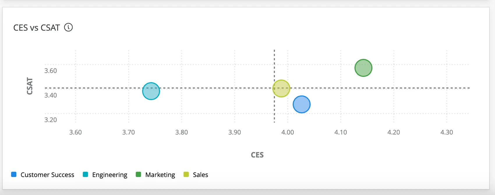
The scatterplot widget displays data from groups across multiple numeric fields. With this widget, you can observe the relationship between two metrics for a given group to identify patterns in the dataset.
Types of Dashboards
This widget can be used in a few different types of dashboard. This includes:
Field Type Compatibility
The scatter plot widget is compatible with the following field types:
- Numeric Value
- Number Set
Only fields with the above types will be available when selecting fields for the X-axis and Y-axis on the scatter plot.
Basic Set Up
For general settings that apply to most widgets, see Building Widgets. Setup unique to the scatterplot widget is detailed below. These items are found in the Data section of the widget configuration.
Metrics
Choose two different numeric values or number set fields to serve as the X-axis and Y-axis metrics. The scatterplot will show the relationship between these two variables.
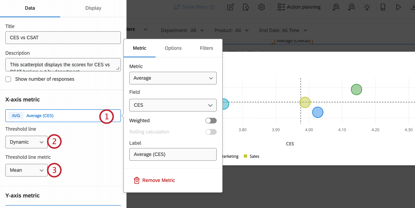
- Off: Does not display a threshold line.
- Static: Displays a threshold line on the axis value that you select.
- Dynamic: Displays a threshold line based on either the Mean or Median value of the axis metric.
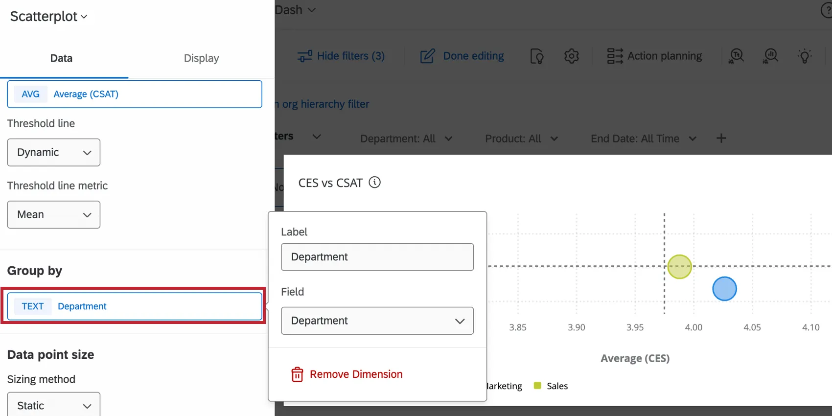
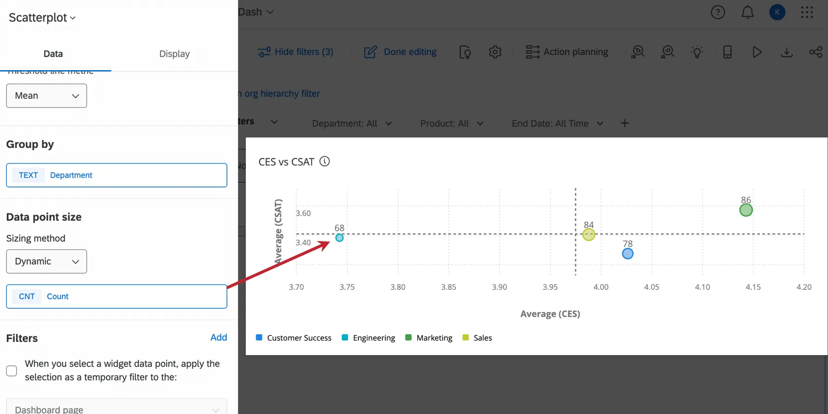
Group By
Select the field by which you would like to break out the axes data. Each data point on the scatter plot will represent the axes values for that group.
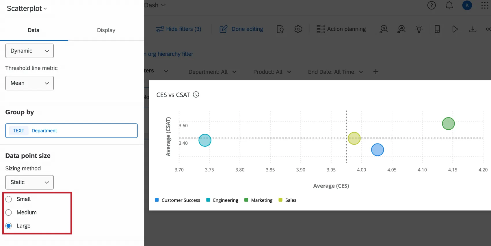
Data Point Size
To display each group as the same size on the scatter plot, select the Static sizing method in the data point size settings. You can choose whether all data points should be small, medium, or large.
The Dynamic sizing method is used to visualize an additional field of data on the scatter plot. After selecting this option, click the field to configure the metric. The size of the data points will be determined by their values in this metric. See Widget Metrics for more information on customizing that metric.
Widget Customization
For general settings that apply to most widgets, see Building Widgets. Customization unique to the scatterplot widget is detailed below. These items are found in the Display section of the widget configuration.
Axes
The axes settings customize the layout of the data in your scatterplot.
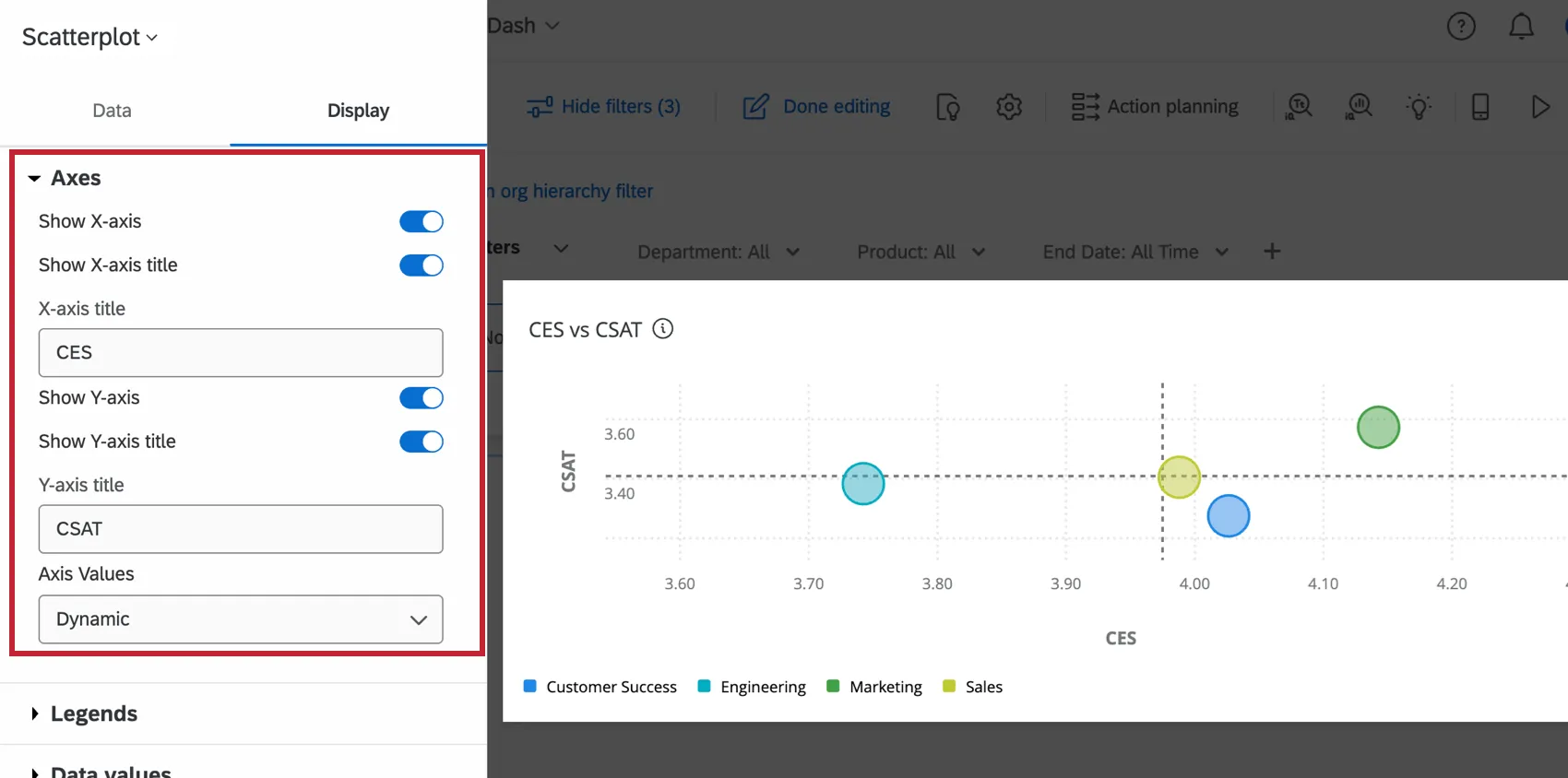
- Show X-axis: Display or hide the X-axis (horizontal), with labels.
- Show X-axis title: Add a title to the x-axis. You can edit the title in the X-axis title
- Show Y-axis: Display or hide the Y-axis (vertical), with labels.
- Show Y-axis title: Add a title to the y-axis. You can edit the title in the Y-axis title
- Axis Values: Control the range of values along each of the axes. To edit this range, select Static from the dropdown menu and insert the minimum and maximum values into their respective fields.
Legends
The legends settings customize the names and colors of the data displayed on the scatterplot.
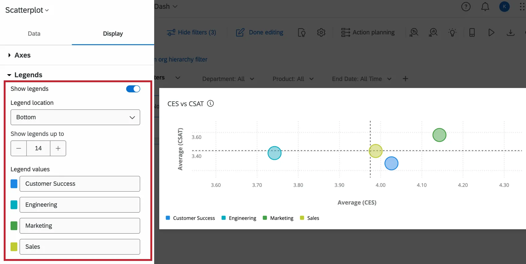
- Show legends: When turned on, displays the names of the group selected in the basic set up. These names are listed under Legend values.
- Legend location: Select where to display the legend values, either at the bottom of the graph or to the right.
- Show legends up to: Create a maximum limit for the number of legends that can be shown. If there are more legend values than this limit, the legend values will not be displayed.
- Legend values: This section lists the names of each data group, which can be edited by clicking on them. To change the color of the circle on the scatterplot, click the color to the left of that group name.
Data Values
The data values settings can display useful information on your scatterplot widget.
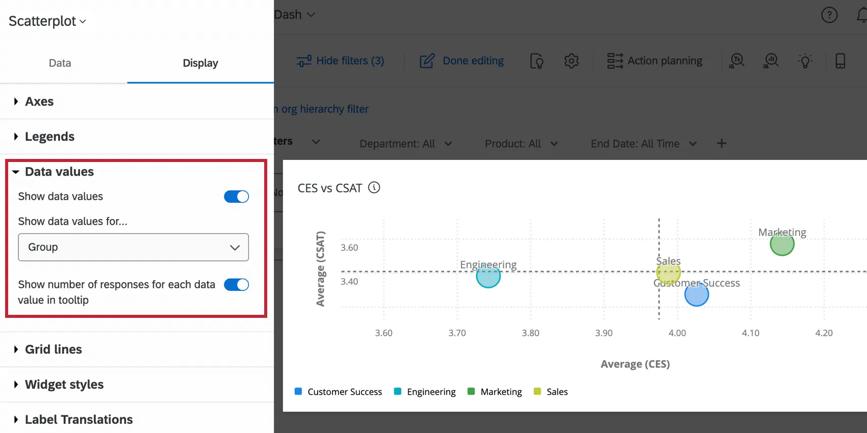
- Show data values: Display the selected values for each data point on the scatterplot. Select which values you’d like to view from the dropdown menu.
- X-Axis and Y-Axis: The x-axis and y-axis values for the data point.
- X-Axis: The x-axis value for the data point.
- Y-Axis: The y-axis value for the data point.
- Data point size metric: If you selected a dynamic sizing method for data point size in the basic set up, that value will be displayed.
- Group: The name of each data group.
- Show number of responses for each data value in tooltip: When enabled, the menu that displays while hovering over a data point will include the number of responses for that group.
Grid Lines
The Show vertical grid lines and Show horizontal grid lines settings control whether the grid lines are displayed on the scatter plot.
When the Enable threshold labels setting is turned on, labels will display in the four corners of the scatter plot. Each corner is identified as a “Quadrant” by default, but this can be edited by clicking on their field in the setting.
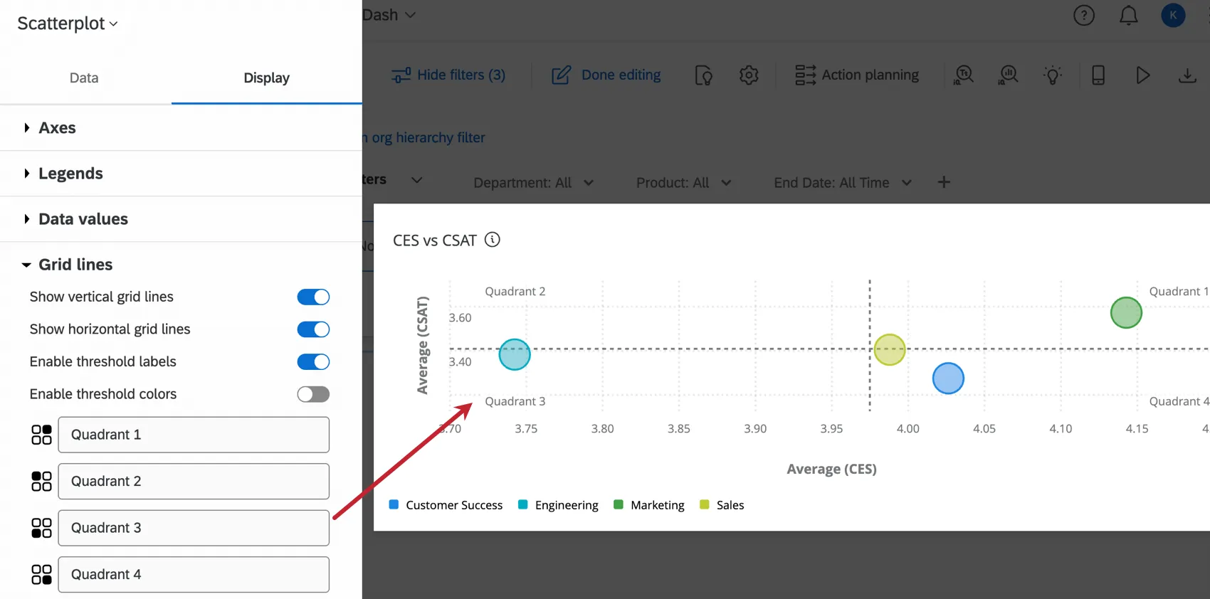
The Enable threshold colors setting adds a color to the areas on either side of the threshold lines configured in the basic set up. This can be helpful to identify the significance of each zone in your scatter plot.
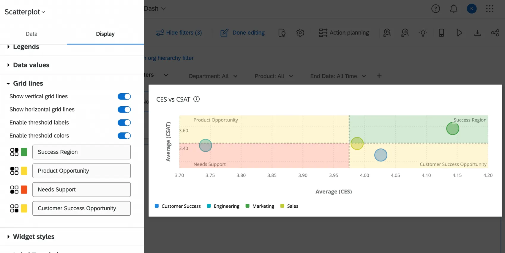
Qtip: If there are no colors on the scatter plot, make sure that neither of the threshold lines are set to off in the basic set up. If there is only one threshold line enabled, then only 2 threshold colors will display on the scatterplot.
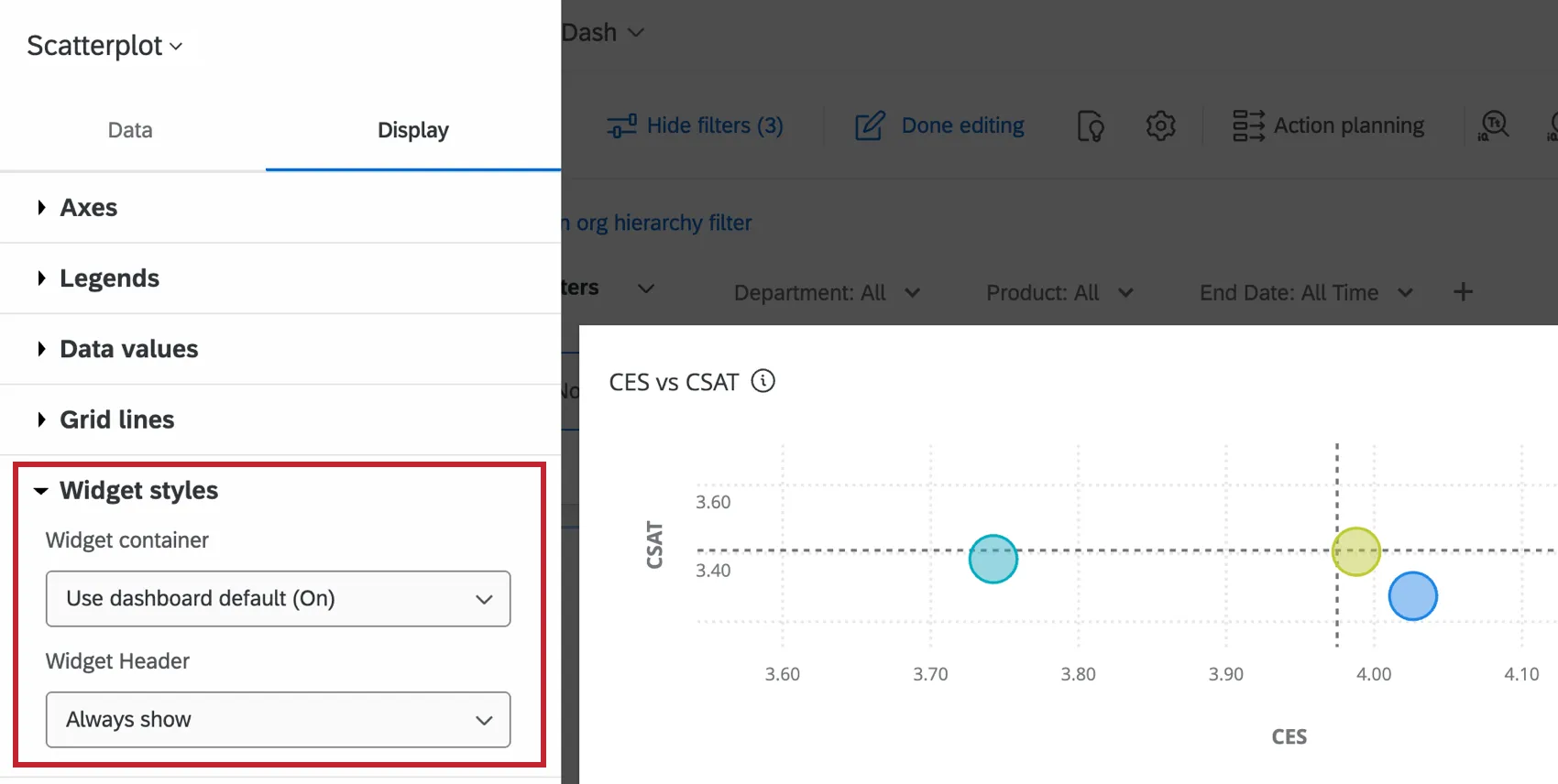
Widget Styles
The Widget styles affect whether the widget has a white background or displays its title. These settings can also be edited in the dashboard theme. For more information on configuring widget style, see Editing Widgets.
Legacy Scatter Plot Widget
Attention: This legacy version of this widget is being deprecated and is no longer supported. Brands created after April 9, 2026 cannot create legacy scatter plot widgets. For the same functionality with a more flexible setup, use the Scatterplot widget.
Basic Set Up
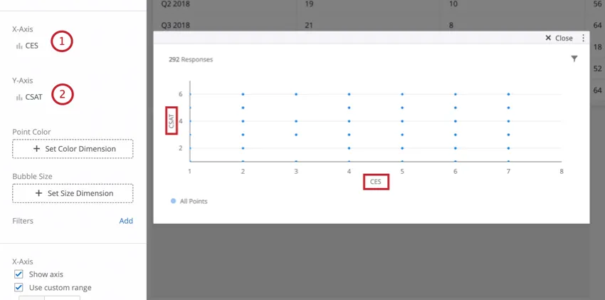
From there, you can further customize your scatter plot by choosing a measure that corresponds to bubble size and / or bubble color.
Widget Customization
For basic widget instructions and customization, visit the Building Widgets support page. Continue reading for widget-specific customization.
Point Color
Clicking Set Color Dimension under Point Color allows you to select a data field whose values will be displayed as different colors across the plot. Once a field is selected for this dimension, colors can be set for each value under the Legend Values section. Colors for points will be determined by the counts for each value. The higher the count for a particular value on a point, the closer it will be to that value’s color.
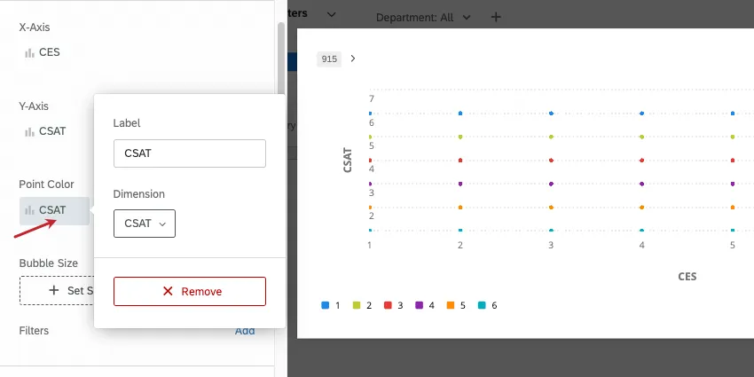
Qtip: Unlike the X and Y-axes, both Text and Number fields can be used for the color dimension.
Bubble Size
Clicking Set Size Dimensions under Bubble Size allows you to select a data field whose values will determine the size of the data points across the plot. In addition to a data field, count can also be used for the bubble size. Once a selection is made for this dimension, the point sizes will adjust to reflect the counts for each value (for a data field) or the overall count (if the metric count is selected).
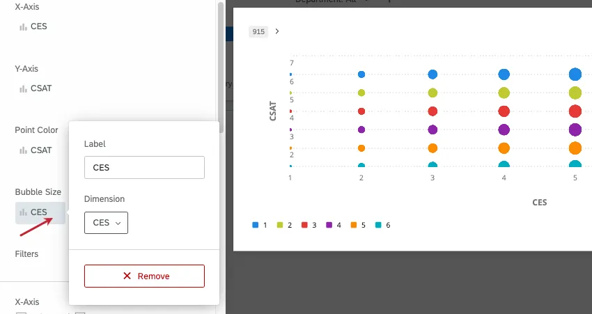
Qtip: If you set bubble size to “count,” you will no longer be able to set bubble color according to another field, and will have to use just one color for all bubbles. The reason for this is that by switching to “count,” each data point will represent multiple data points collected, as opposed to one specific aggregated data point.
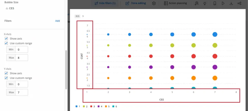
Additional X and Y Axis Settings
To hide the x or y axis, deselect Show axis under the corresponding axis. You can also select Use custom range to set a manual minimum and maximum range on the axis, rather than relying on what the widget automatically set based on data collected thus far.
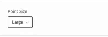
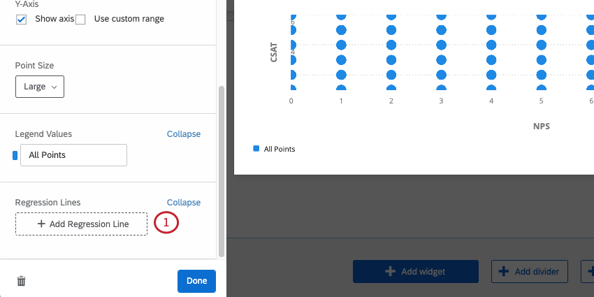
Point Size
There are three different point sizes that can be selected under Point Size: Small, Medium, and Large. Depending on how many points are displayed on your Scatter Plot, a smaller or larger size may be more appropriate.
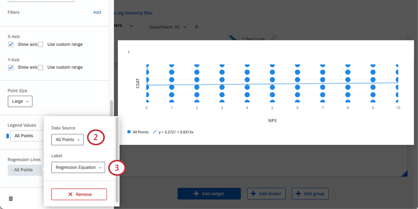
Regression Lines
You can add a line of best fit to your scatter plot.
FAQs
What method is used to determine the regression equation for the Scatter Plot widget in CX Dashboards?
What method is used to determine the regression equation for the Scatter Plot widget in CX Dashboards?
I have multiple datasets on my dashboard. Can I use this feature with all of my widgets?
I have multiple datasets on my dashboard. Can I use this feature with all of my widgets?
- Changing which dataset your widget shows: Not all widgets can have their referenced dataset switched. Some can only use the default dataset. For a compatible list, see this section.
- Showing multiple datasets in the same widget: Not all widgets can show multiple datasets’ results at the same time. For a compatible list, see this section.
That's great! Thank you for your feedback!
Thank you for your feedback!