
Simple Chart Widget
What's on this page
Qtip: This page describes functionality available to Engagement, Lifecycle, Ad Hoc Employee Research, and 360 projects. For more details on each, see Types of Employee Experience Projects.
About Simple Chart Widgets
Warning: This widget is being deprecated and is no longer supported. For the same functionality with a more flexible setup, use the line, vertical bars, & horizontal bars widgets.
The simple chart widget allows you to display data in a range of basic charts. Changing the chart type, setting colors, and choosing display options allows you to tailor charts to fit a wide range of situations.
Field Type Compatibility
The simple chart widget is compatible with the following field types:
- Number Set
- Date
- Text Set
- Multi-Answer Text Set
- Drill Down
- Measure Group
Only fields with the above types will be available when selecting your X Axis Dimension or Data Series for a simple chart.
Setting up a Simple Chart Widget
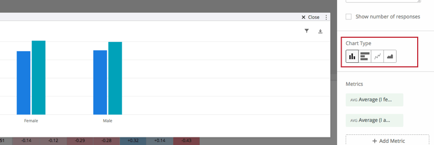
Chart Type
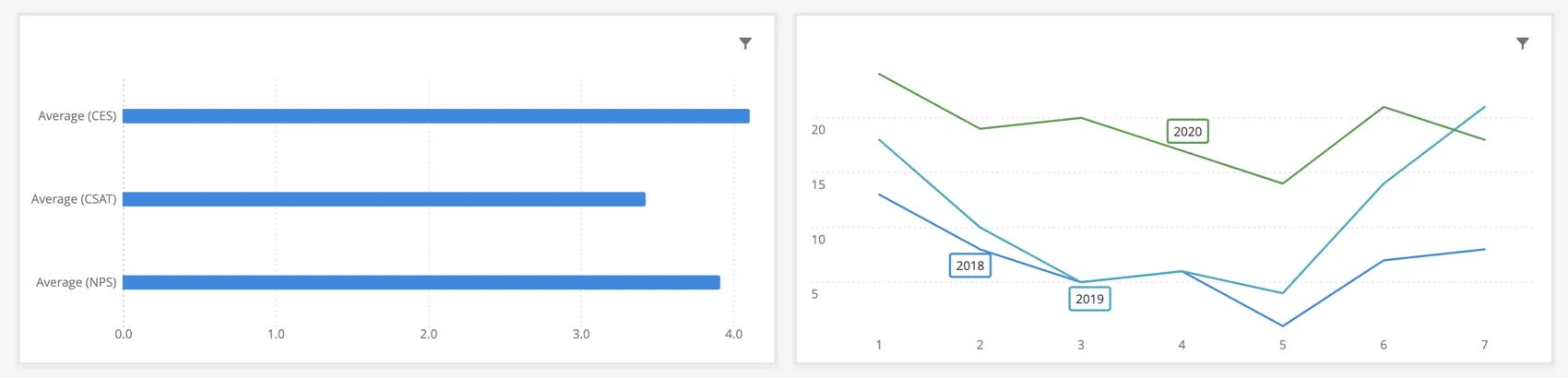
Choosing a chart type allows you to decide the format in which you would like your data to be displayed. The simple chart widget has four chart types:

- The Bar chart type creates a simple vertical bar chart.
- The Horizontal Bar chart type creates a bar chart that is oriented horizontally.
- The Line chart type displays the data points connected by a continuous line. Check Spline under Display Options to smooth this line.
- The Area chart type fills the area beneath the data with a solid color. This chart type is particularly useful if you are breaking out your data using a data series.
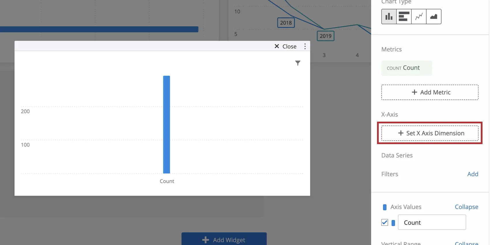
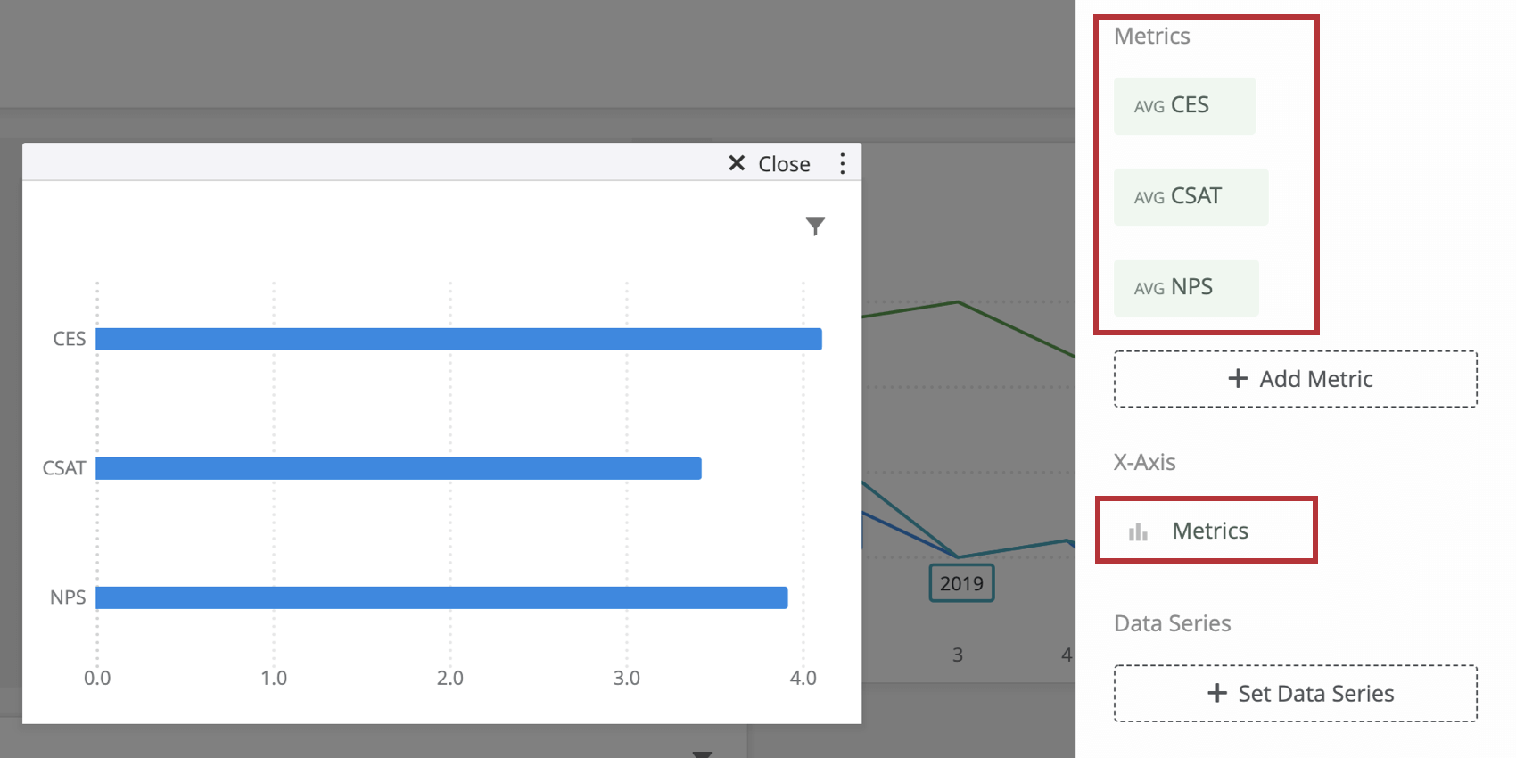
Metrics, X-Axis Dimensions, and Data Series
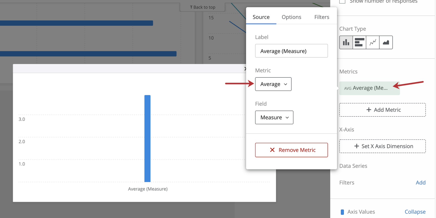
Qtip: When selecting a metric, every metric except count will need a field specified. Only a field with the type Number Set or Multi-Answer Text Set will be available. For more on metric options and filters, see Widget Metrics.
Qtip: You will only be able to specify your X Axis dimension if your widget has only one metric on it. If you use more than one metric in your chart, the X Axis dimension will automatically display Metrics and use your selected metrics as a breakout instead.

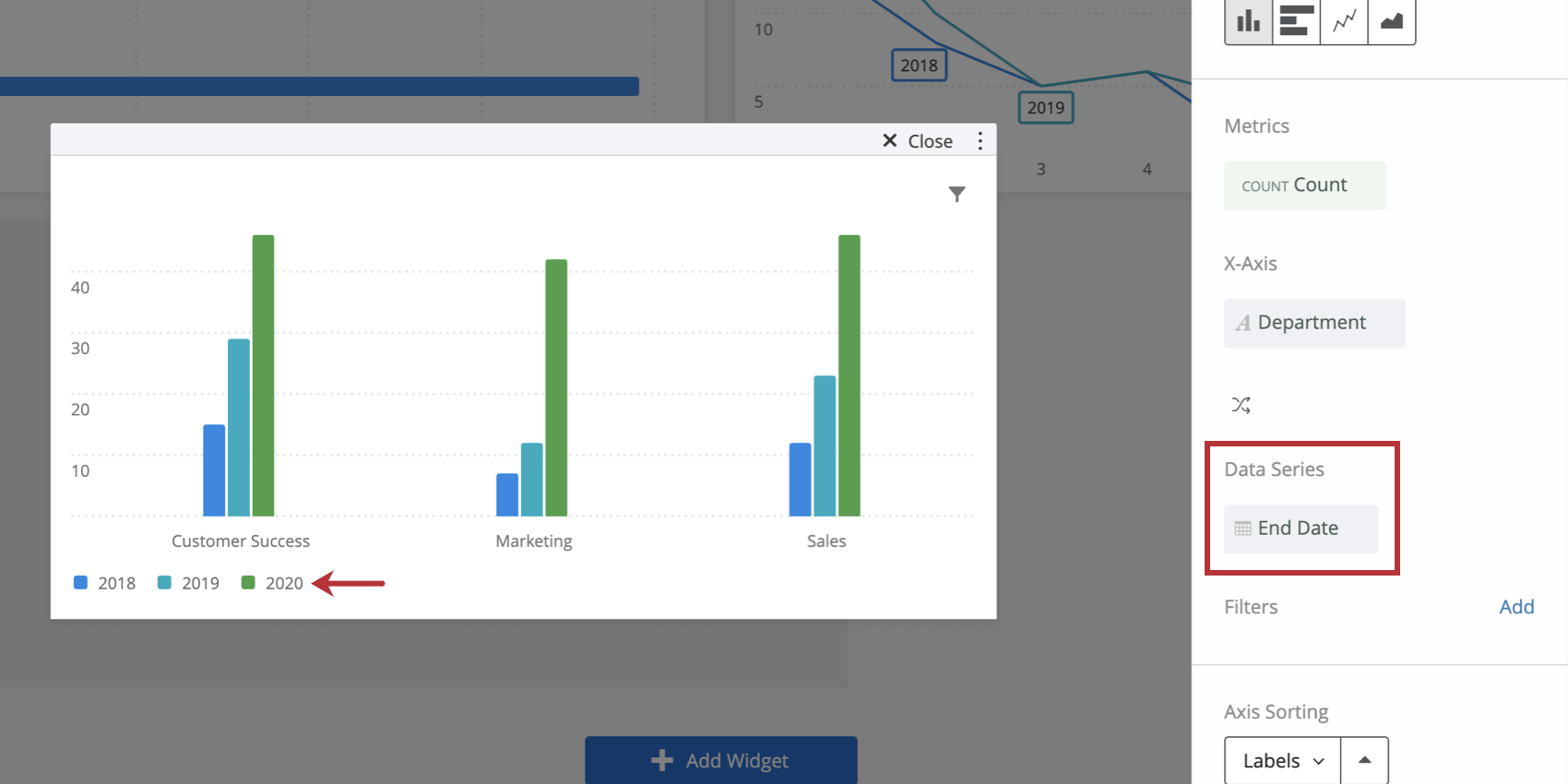
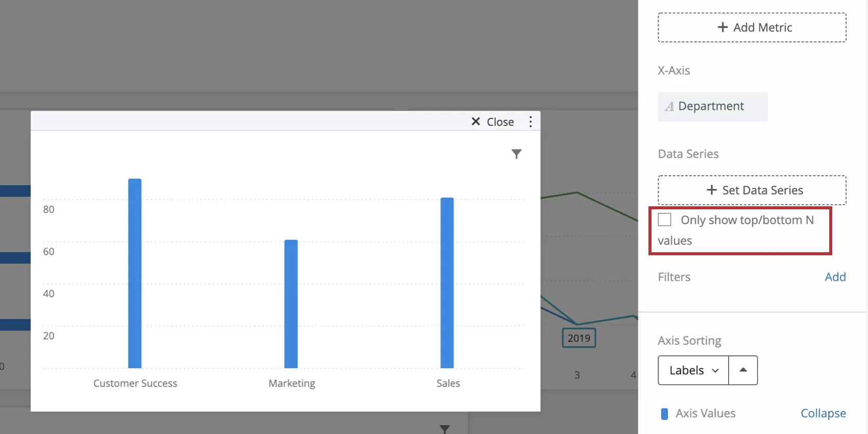
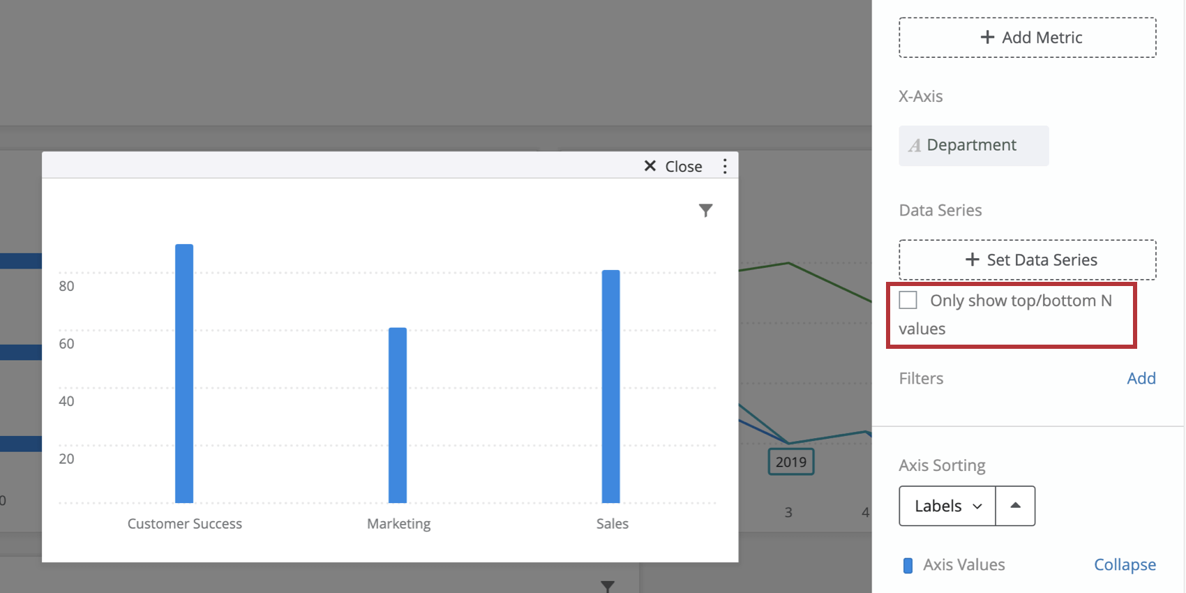
Qtip: If you choose to add a data series, you will only be able to add fields with the type Text Set, Multi-Answer Text Set, Number Set, or Date. If you do not add a data series and only have a single metric and x-axis dimension added, you will have the option to Only show top/bottom N values. Check this box to specify whether you would like to show only Top or Bottom values and to specify how many of these values you would like shown.
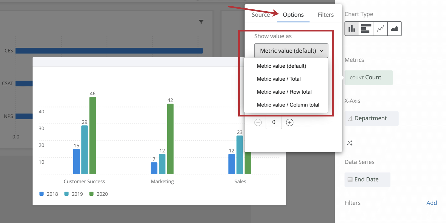
Count Metric Options
When you select count as your metric type and have both an x-axis and data series defined, additional options will be available for displaying your metric. To navigate to these options, click your metric and select Options.
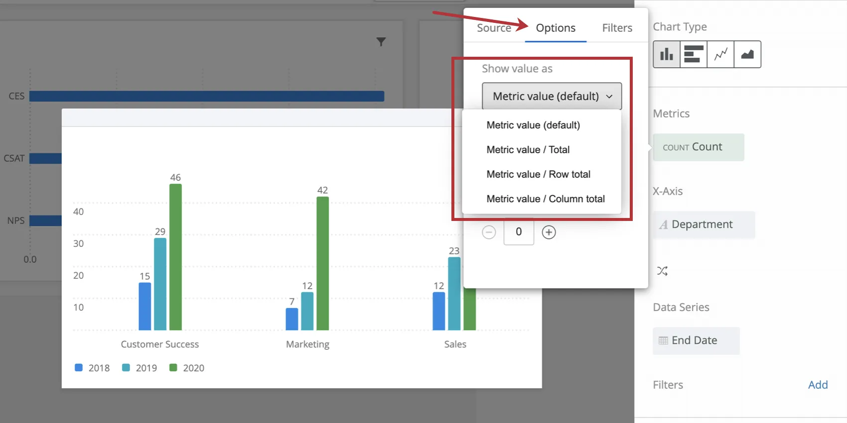
The different options are as follows:
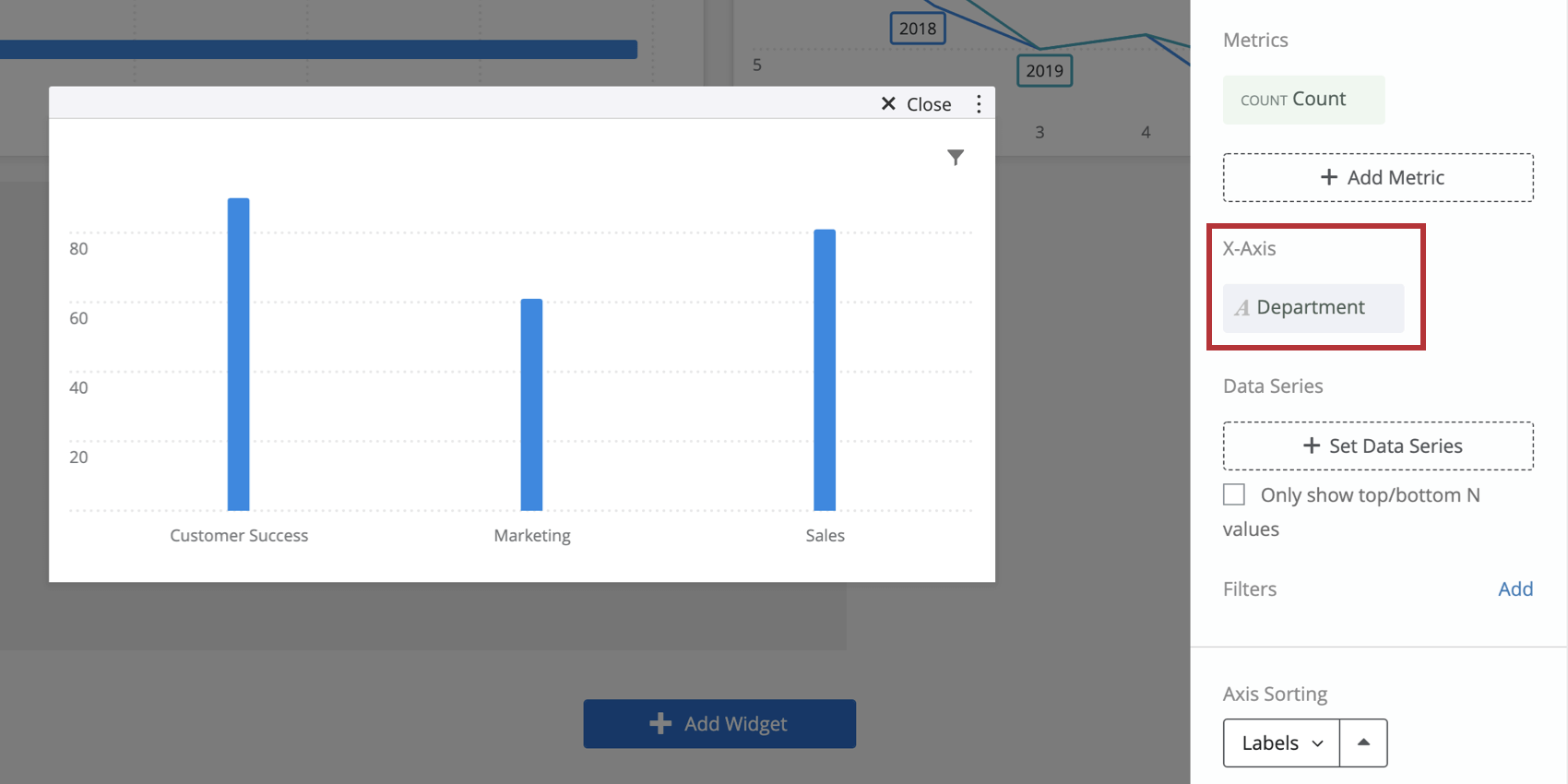
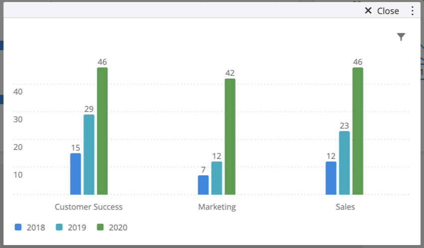
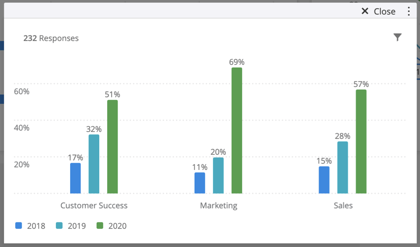
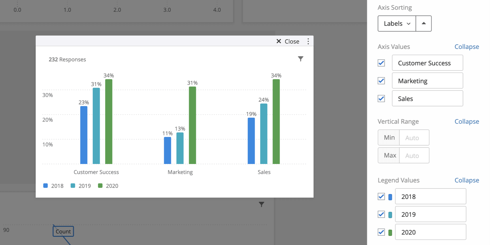
- Metric value (default): The chart will show the numeric count of each data point. The chart will display a number. Example: In this screenshot, each bar is displaying the number of responses that fit each data point. For example, there were 15 responses in Customer Success collected in 2018.

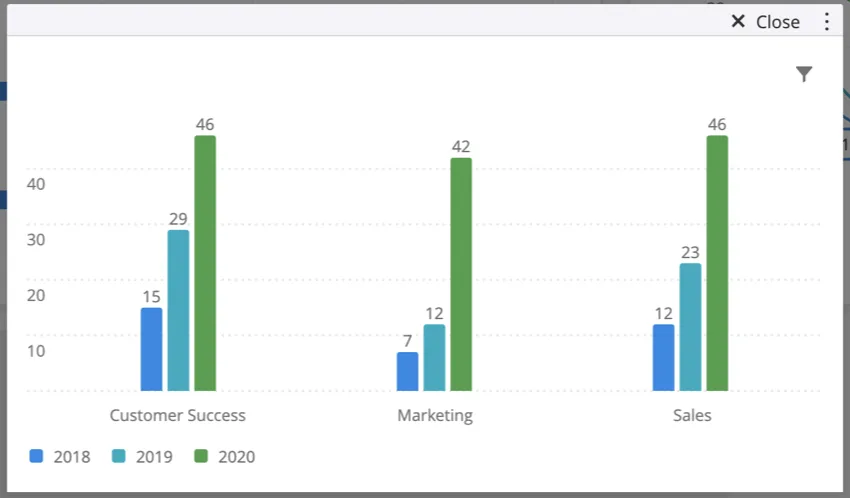
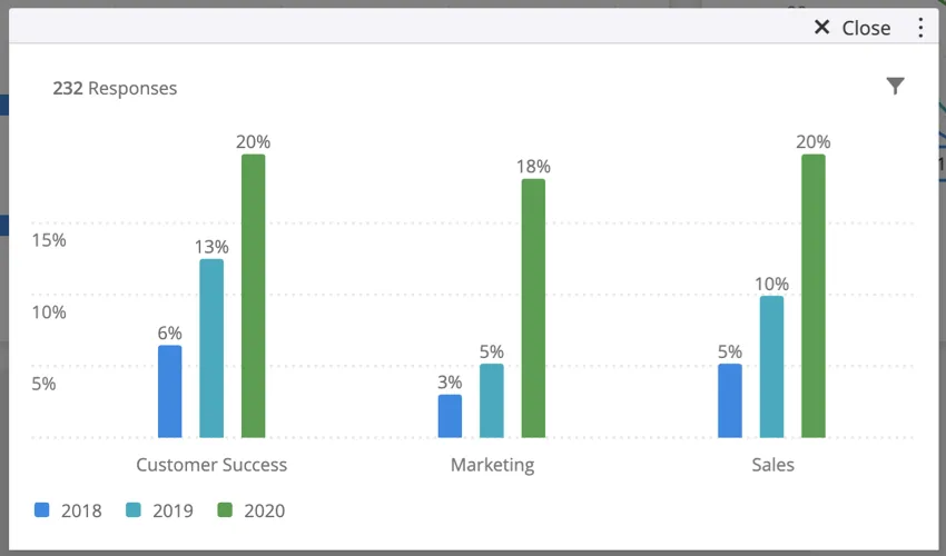
- Metric value/ Total: The chart will show the result of the calculation (numeric count/total number of responses). The chart will display a percentage. Example: In this screenshot, each bar displays the number of responses for each data point divided by the total number of responses. For example, the bar for Customer Success responses collected in 2018 displays 6% since 15 / (232 responses) = 0.06 or 6%.
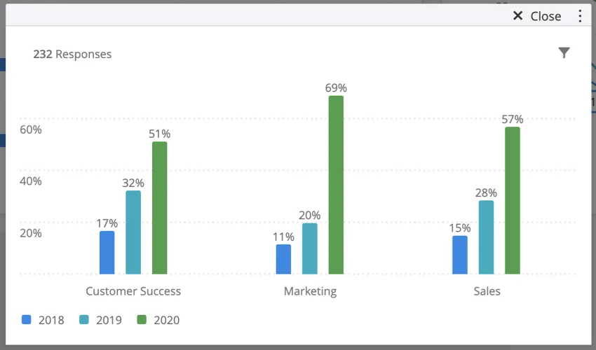
- Metric value/ Row total: The chart will show the result of the calculation (numeric count/total number of responses in the x-axis dimension). The chart will display a percentage. Example: In this screenshot, each bar displays the number of responses for a data point divided by the number of responses in the same x-dimension. For example, the bar for Customer Success responses collected in 2018 displays 17%. This is because the bar is showing the result of this calculation: (15/(15+29+46)) = 0.17 or 17%. To get these numbers, we add up each of the metric values from the default chart for Customer Success only. So, we see that 15 responded in 2018, 29 responded in 2019, and 46 responded in 2020. These responses make up the denominator of our equation. The numerator is the metric we’re interested in, which is the number of Customer Success that responded in 2018.
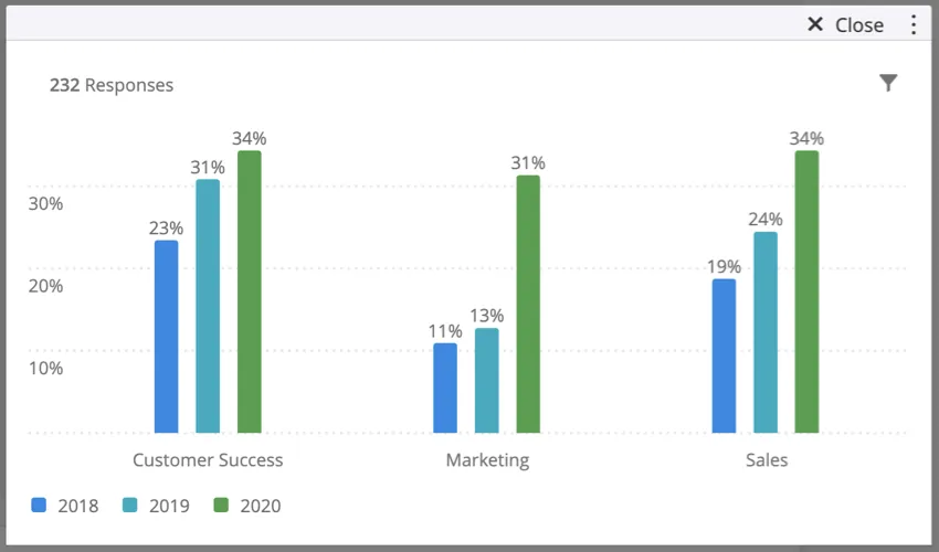
- Metric value/ Column total: The chart will show the result of the calculation (numeric count/total number of responses in the data series). The chart will display a percentage. Example: In this screenshot, each bar displays the number of responses for a data point divided by the number of responses in the same data series. For example, the bar for Customer Success that responded in 2018 displays 23%. This is because the bar is showing the result of this calculation: (15/(15+7+12+30) = 0.23 or 23%. To get these numbers, we add up each of the metric values from the default chart for responses that responded in 2018 only. So, we see that 15 were from Customer Success, 7 were from Marketing, 12 were from Sales, and 30 responses not shown were collected without department data. These responses make up the denominator of our equation. The numerator is the metric we’re interested in, which is the number of people in Customer Success who responded in 2018.


Widget Customization
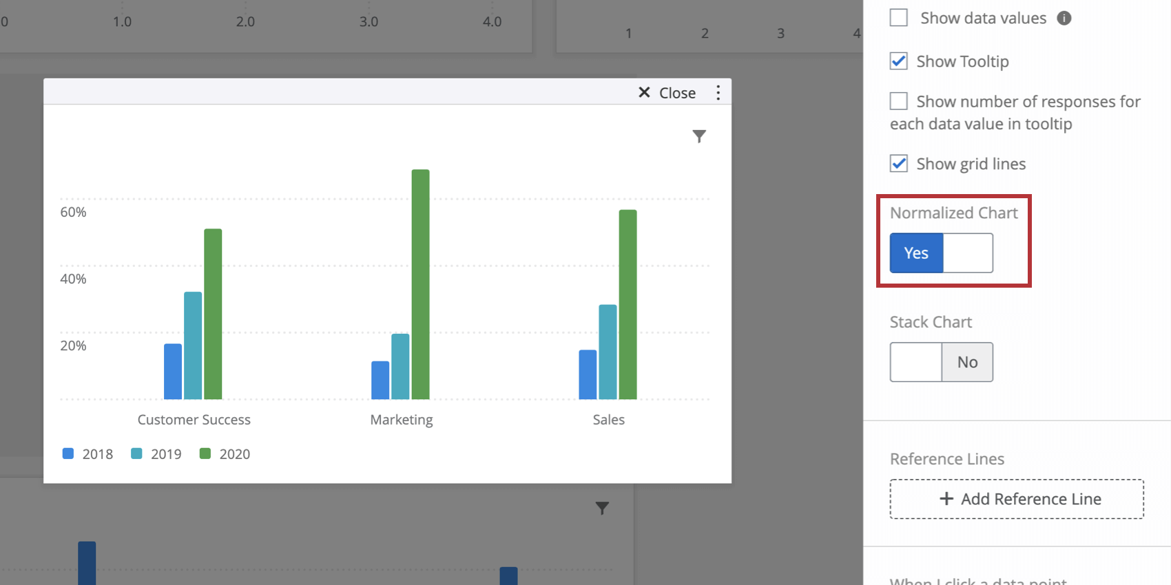
Normalize Chart
Switching Normalized Chart to Yes will display each data point in the chart as a percentage out of 100%. This is useful if your data is broken out with a data series and you would like to view the fraction of respondents that selected certain values as relative percentages instead of explicit counts.
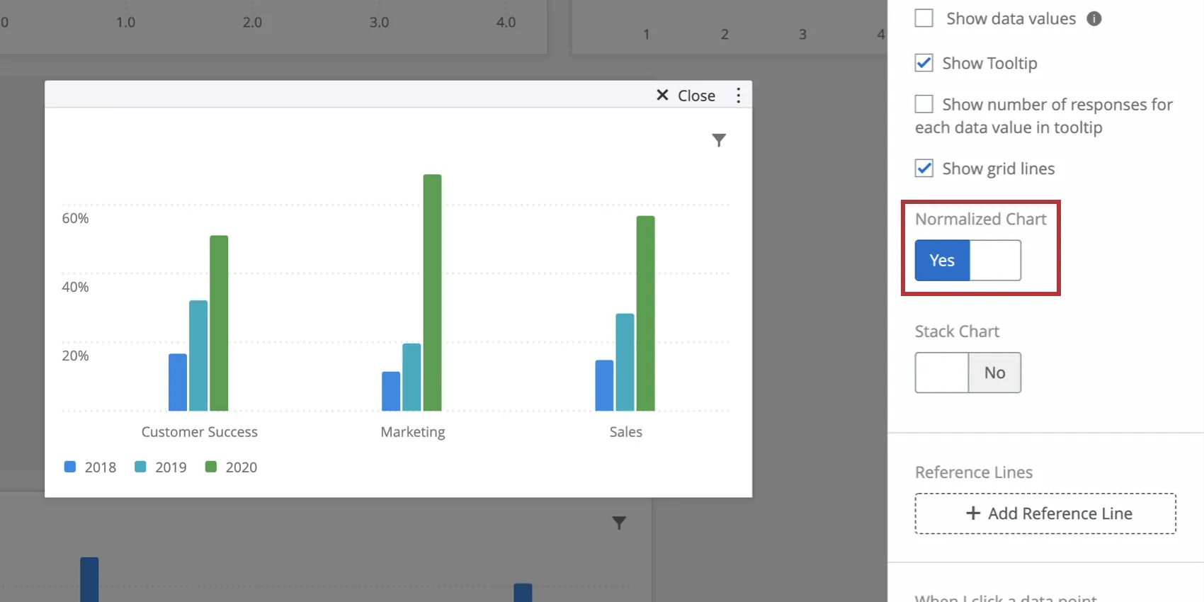
Qtip: “Normalize chart” calculates values the same way the “Metric Value / Row Total” feature does under additional Count Metric Options.
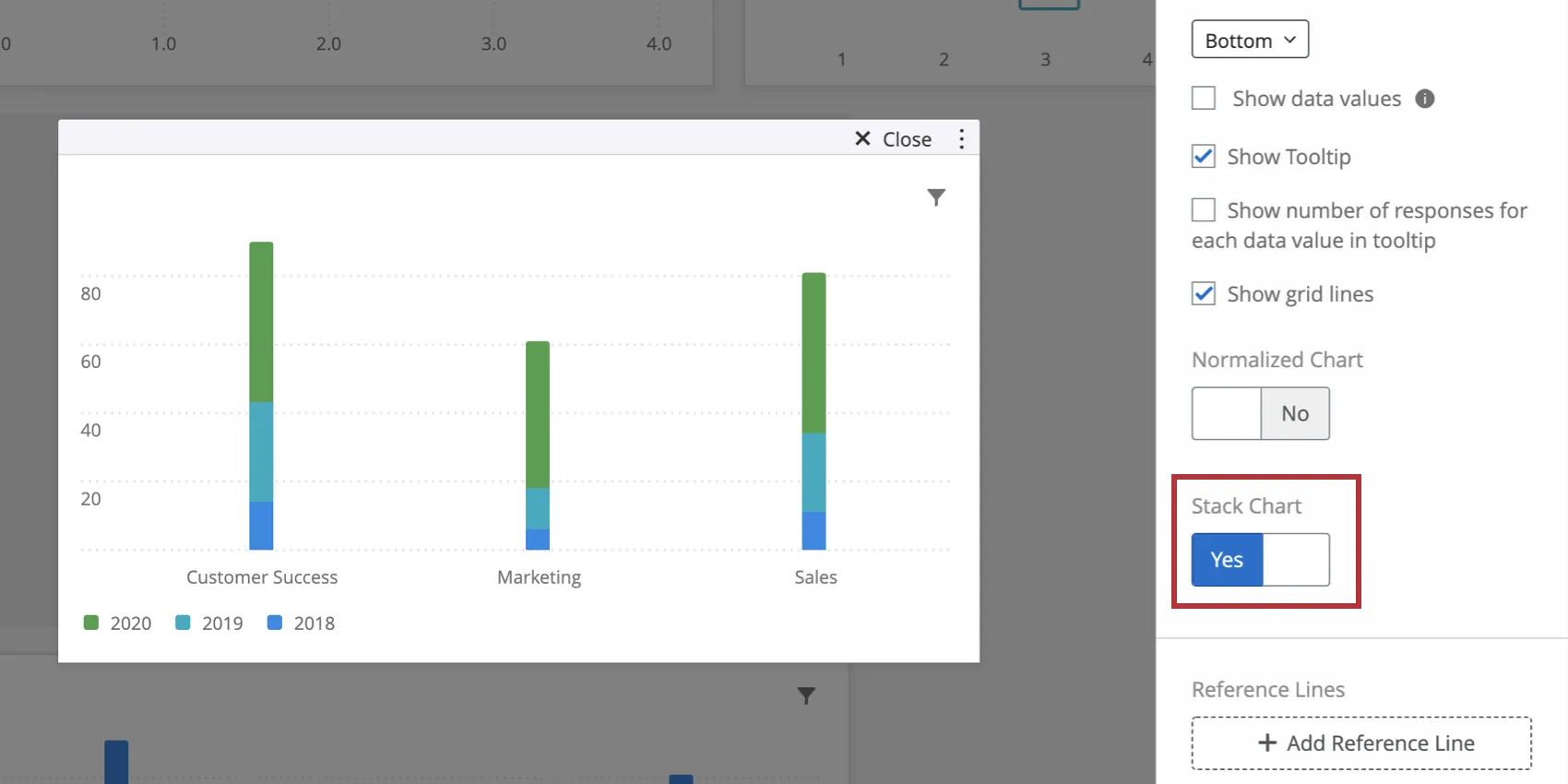
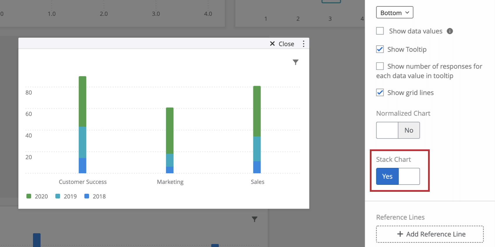
Stack Chart
Switching Stack Chart to Yes will condense the bars in your chart into a single stacked bar. If you have your widget broken out with a data series, there will be a stacked bar for each value of the data series field. This is particularly useful if you are normalizing the widget. In this case, the length of the bar will be 100% and it will be divided into sections to match the percentages of each data point.
Axis Settings
Depending on the setup you have chosen for your simple chart, you axis settings options may appear differently from what they are shown as here. However, functionality remains the same and you will be able to apply these settings to whatever setup you have chosen.

You can change how your x-axis is ordered by using the Axis Sorting options. Custom and Labels will always be options; additional options will appear depending on your widget setup. If you choose Custom, you will be able to drag and drop the axis values below the Axis Sorting section into whatever order you would like. To rename your axis values, simply click on the axis value’s name under Axis Values and type whatever name you would like.
Qtip: To reverse the order of any of your selections, select the arrow to the right of the Axis Sorting dropdown menu.
Qtip: By default, simple charts that use date fields will have “Enable automatic axis labels” turned on. Disabling this setting allows you to create your own axis labels.
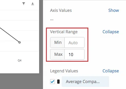
You will be able to specify your vertical range by typing in your min and max under the Vertical Range section. This defines the maximum and minimum values on the y-axis of your widget. If you do not define values, these ranges will be set automatically to be inclusive of your data values.
To change the color of a legend value, select the color to the left of the value under Legend Values. You can also drag and drop the legend values into whatever order you would like.
Display Options
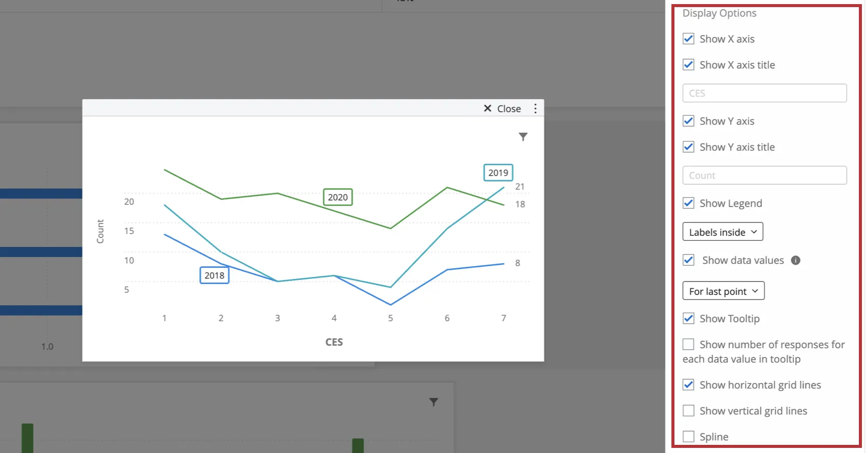
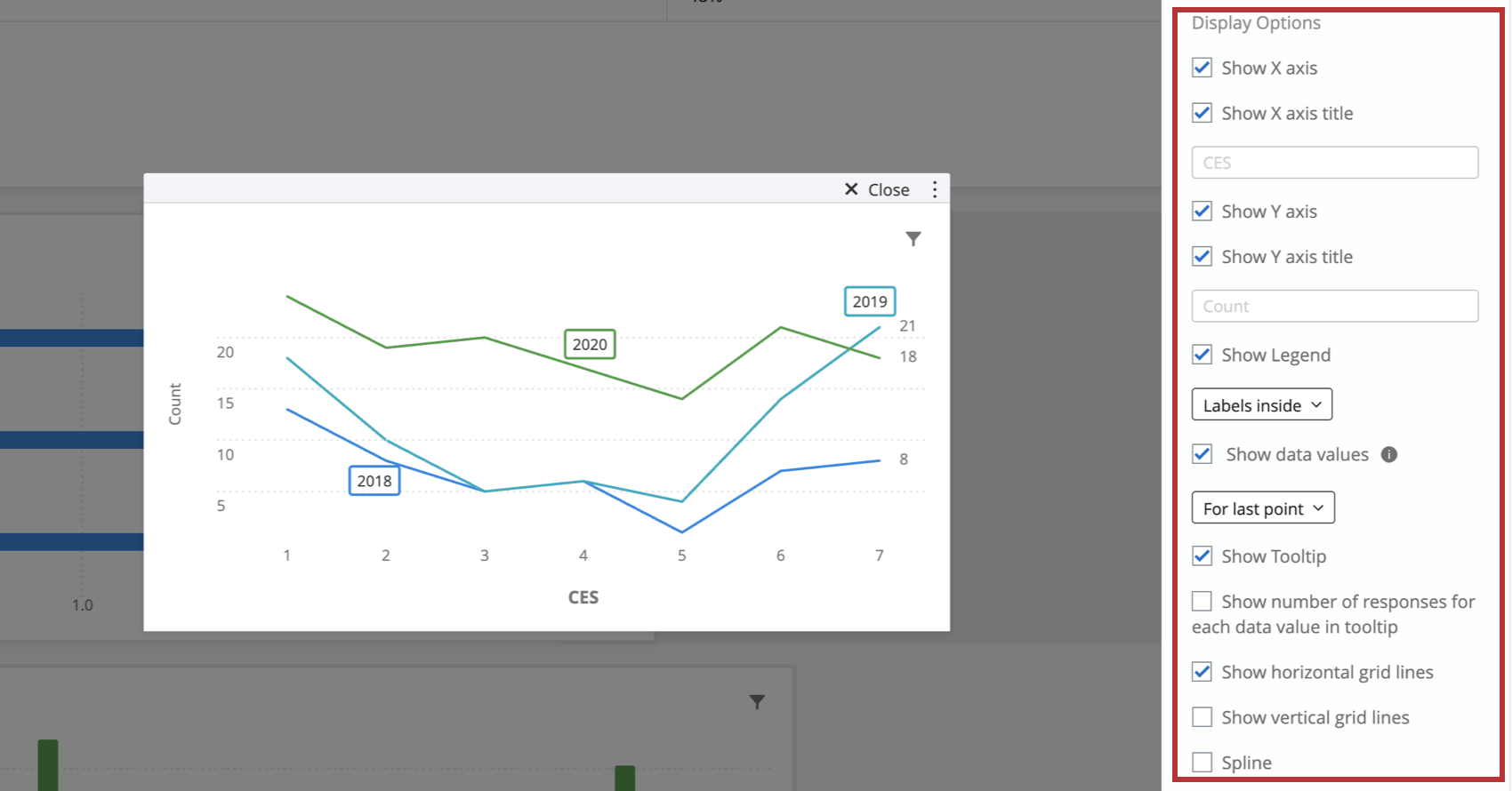
- Show X Axis: Displays your X Axis values.
- Show X Axis Title: Add a title to your X Axis. Qtip: If you add a title and want to return to the default, erase what you wrote; it will automatically go back to the field name.

- Show Y Axis: Displays your Y Axis values.
- Show Y Axis Title: Add a title to your Y Axis.
- Show Legend: Determine whether to show a legend on your chart, and where. Line charts have the option for in-line labelling.
- Show data values: Will display the data values on the chart itself. If you’ve got a line chart, you can show data on every point of the graph, for only minimum and maximum points, or only for the last data points.
- Show Tooltip: Displays the field value and its data value when you hover over it on the chart.
- Show number of responses for each data value in tooltip: Displays in the tooltip the total number of responses accounted for in each data value. Qtip: This setting can only show the total responses for up to 10 data values at once. After 10 data values, the tooltip will only show the number of responses for the value you are hovering over.
- Show grid lines: Displays grid lines on your chart. If you are using a line chart, you will have separate options to disable horizontal and vertical grid lines.
- Spline: Option for line charts that rounds out where points meet.
Qtip: When a line chart has multiple lines, you can click its label to bring it into focus. Click it again or click anywhere on the chart to un-focus it. (Be careful to click the label, not a data point – that could add a filter to the page.)

Significance Testing
Dashboards can help you understand whether the differences you see over time or between groups are statistically significant, and therefore worthy of driving important business decisions. With significance testing in simple line charts and simple tables, you can discover what data changes matter most.
See Significance Testing in Simple Charts & Simple Tables (CX) for more information. Although this is a CX Dashboards page, the functionality described is the same as in EX dashboards.
Rolling Calculations
Rolling calculations are a means of applying a metric over a set of data points composed of multiple periods. The rolling calculations options are Rolling Averages and Rolling Metrics.
See Rolling Calculations in Widget Metrics for more information. Although this is a CX Dashboards page, the functionality described is the same as in EX dashboards.
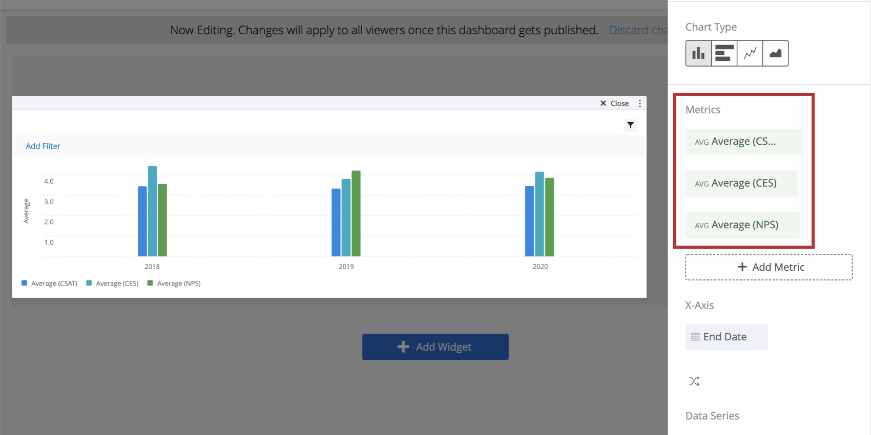
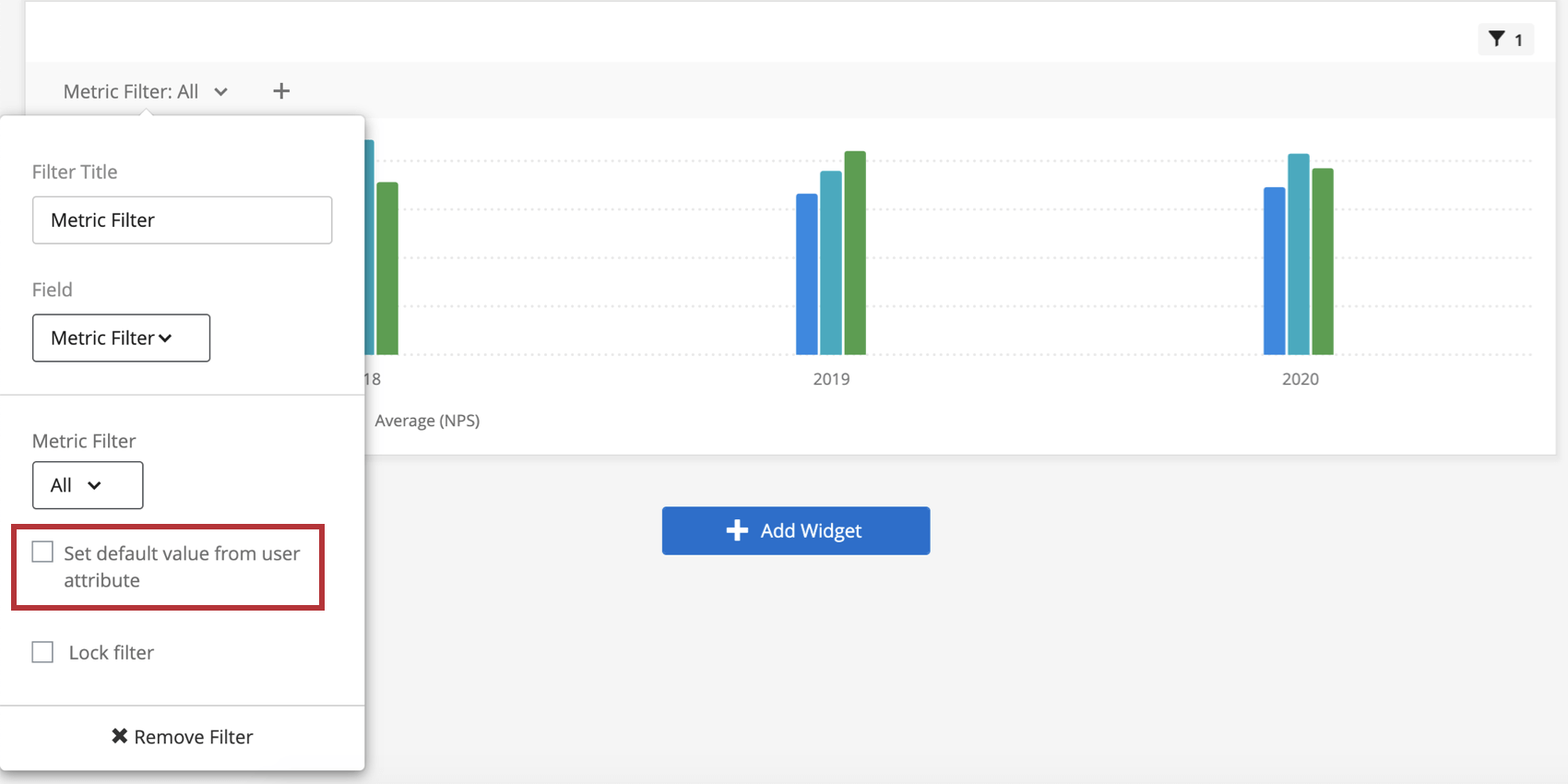
Metric Filters
Let’s say you’ve loaded many different metrics into your table – NPS, average, minimum, maximum, and so on – and you want to be able to filter this data for easier viewing. Furthermore, maybe you want some dashboard users have permission to see a certain metric, but others not to.
Metric filters are a special simple chart filter that allow you to decide who sees what metrics.
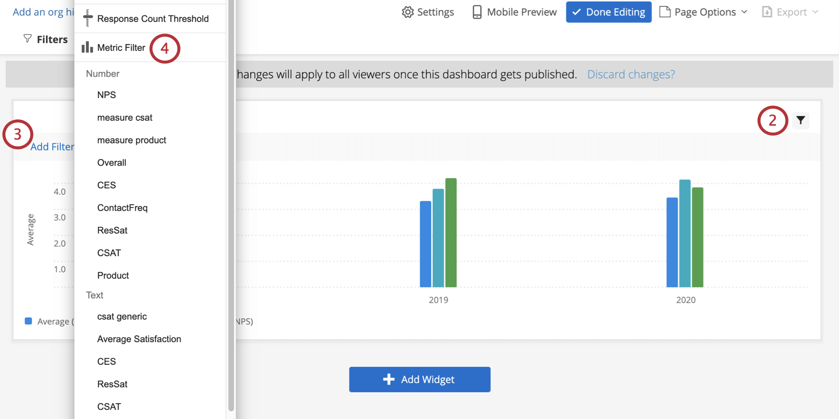
Adding a Metric Filter
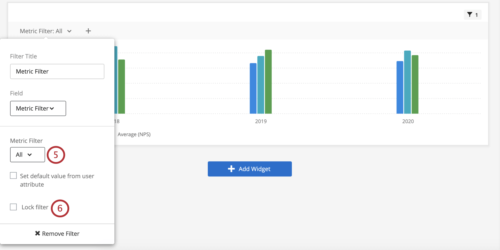
Mapping User Attributes to Metric Filters
You can make the default metrics users see vary based on user attribute. Users will still be able to select different filters, but what they see by default will vary.
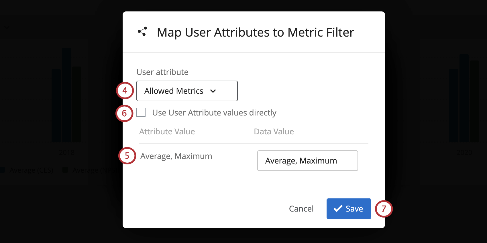
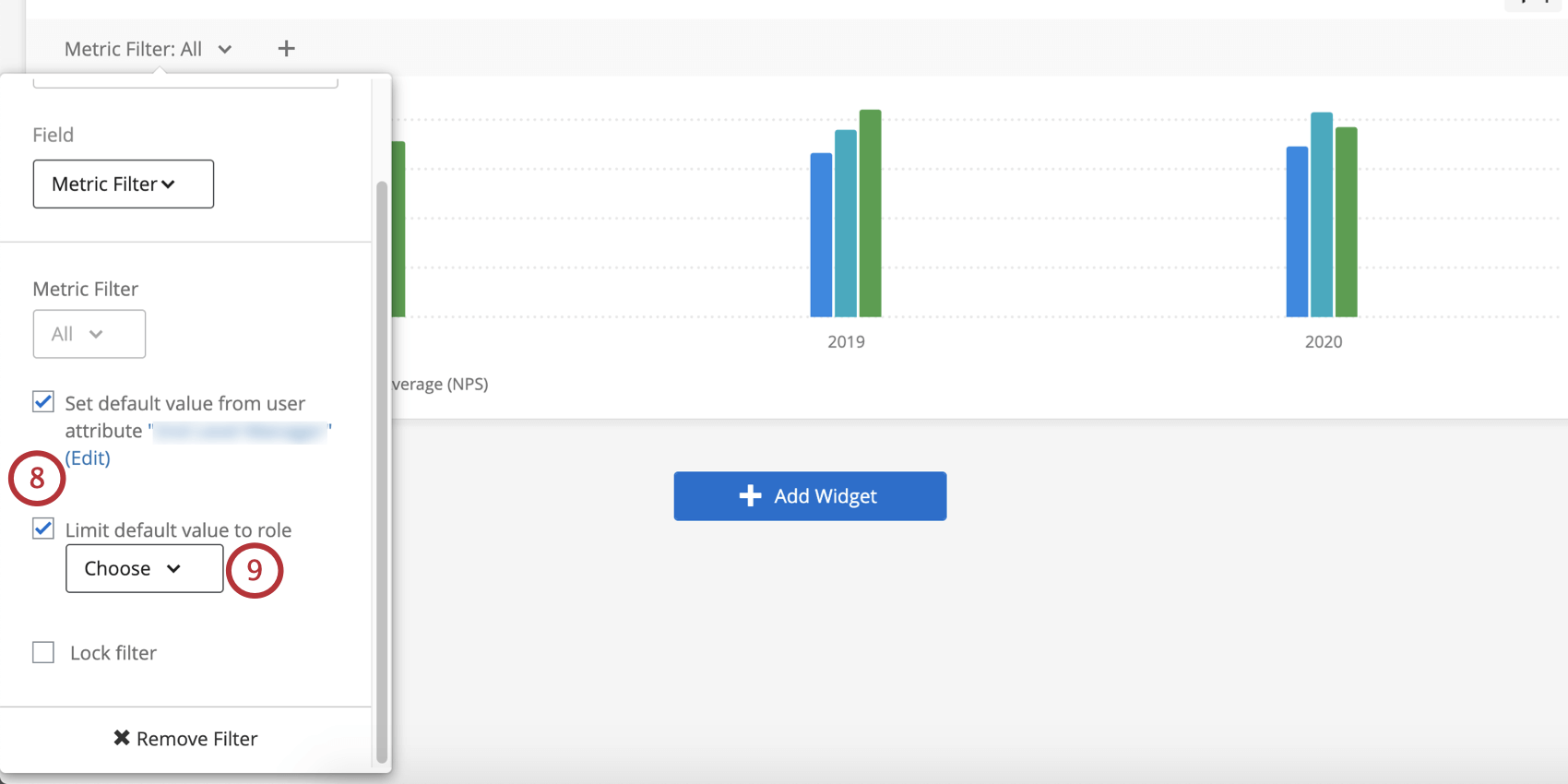
Qtip: When you choose to “Limit default value to role,” you are determining a single role whose default metrics will be limited by the members’ user attribute. This means that members of the role will see what you set as their user attributes by default, whereas everyone outside the role will just see all the metrics by default.
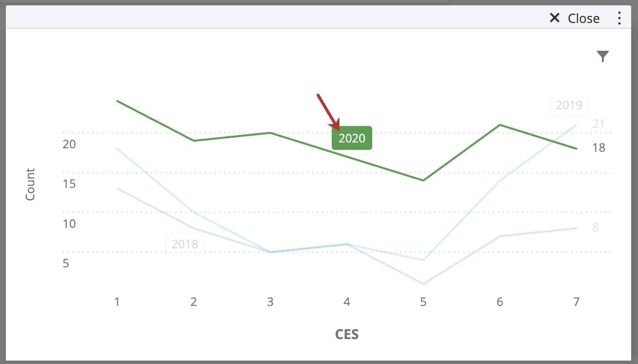
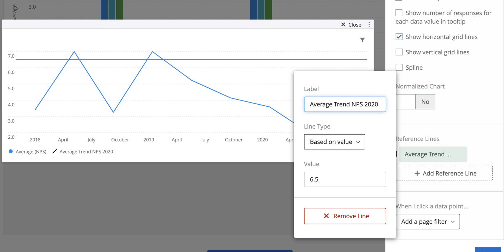
Adding Reference Lines to Widgets
You can also use aggregate data to set goal lines on simple chart widgets displaying your company’s data. This provides a nice visual key of where your company’s data stands against industry leaders.
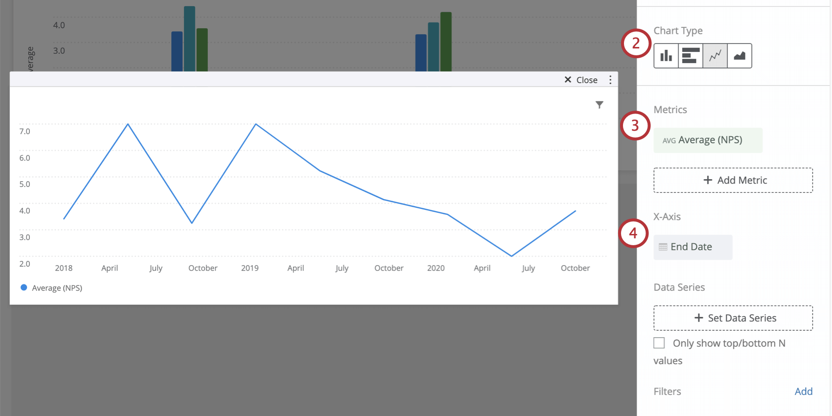
Qtip: Generally, goal lines work best with the line chart type.
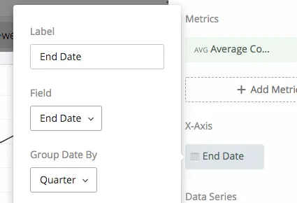
Qtip: In this example, we use an average metric of our company’s NPS data, and set the x-axis to a date field. We then organize this date by quarters to show how the data has changed from fiscal quarter to fiscal quarter.
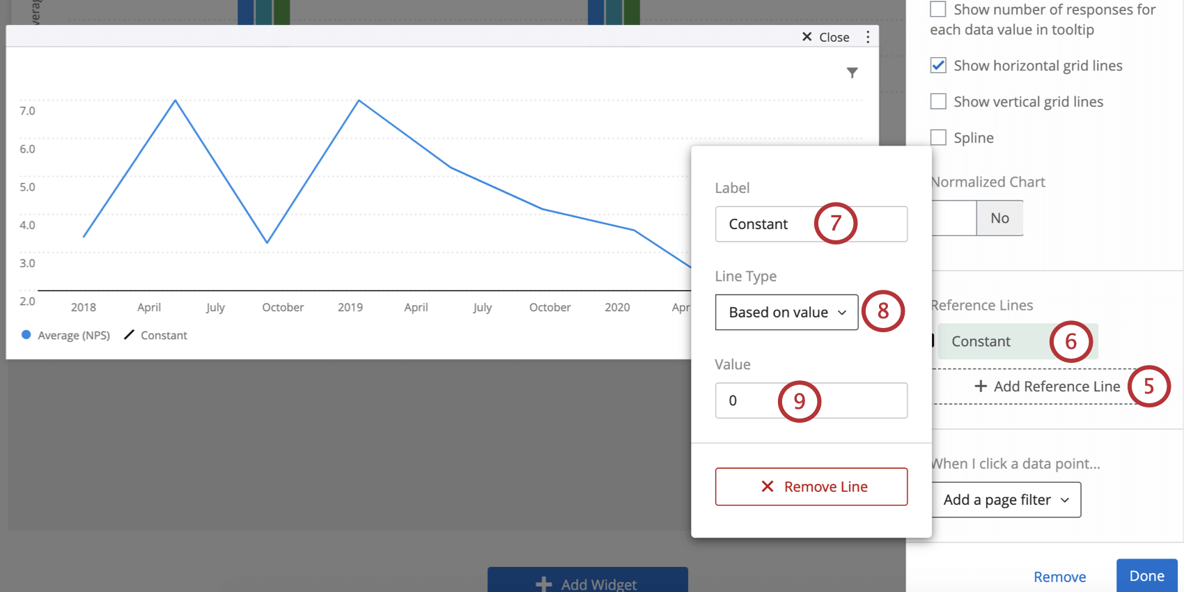
- Based on value: Type a static value to serve as the goal line.
- Based on metric: Select a metric, creating a dynamic goal line that adjusts as you collect data.
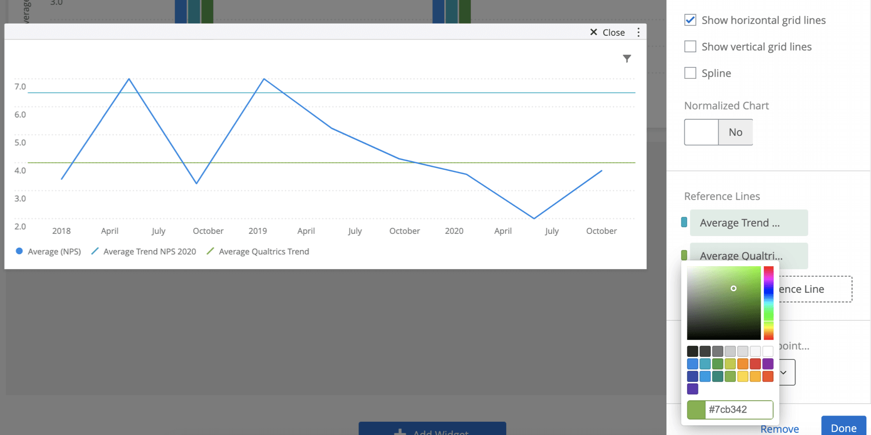
Goal line colors will be included in the legend.
Qtip: If goal lines are not appearing as you want them to on the widget, try adjusting the max or min of the simple chart.
Qtip: To remove a reference line, click on the line’s name and select Remove Line.
Date Filters
Date filters have a few unique functions on simple charts, including the ability to compare historically and a feature called metric filters.
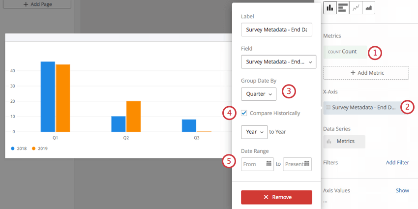
Compare Historically
If you have multiple sources mapped, the historical comparison option is a great way to show how employee feedback has changed over time.
Qtip: This setting is helpful if you have data from several years worth of projects mapped in your project, but you really only want to display a comparison of two years’ data. For example, I may have 2016, 2017, 2018, and 2019 mapped, but I really only want this chart to display data from Jan 1, 2018, to December 31, 2019.
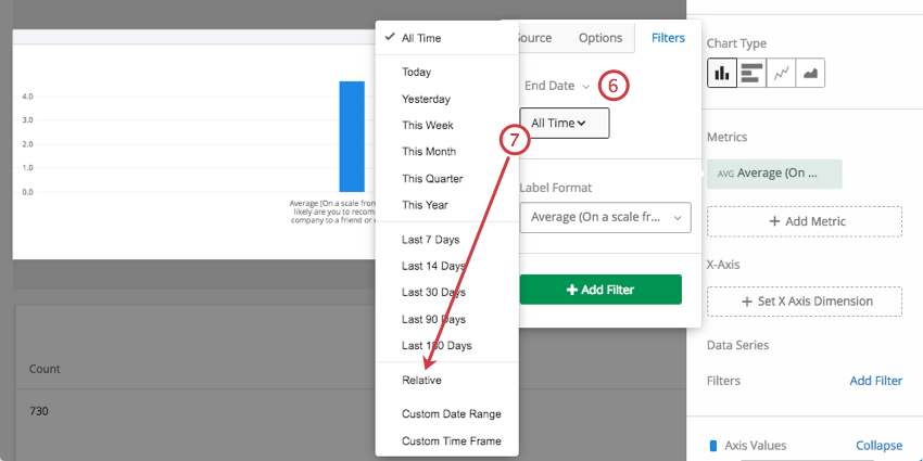
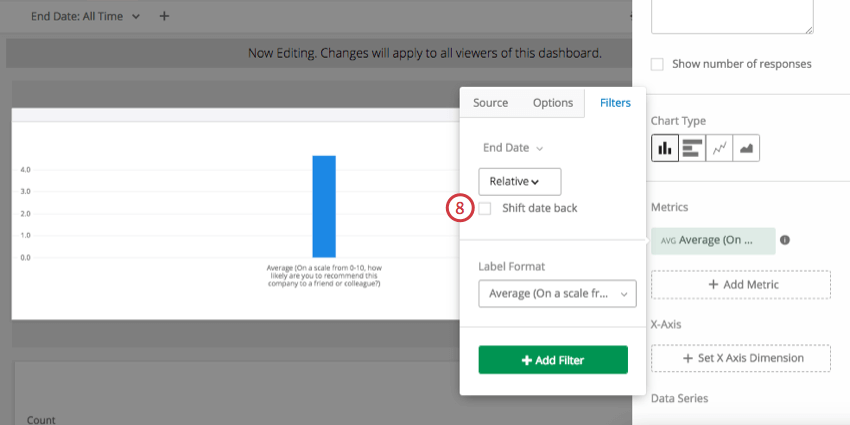
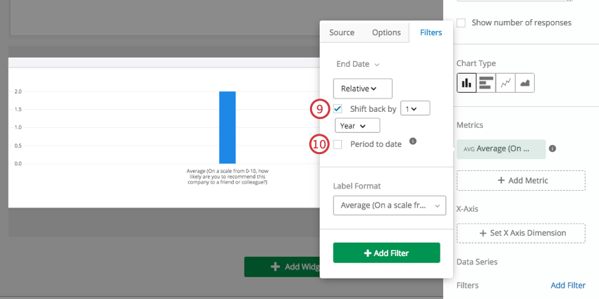
Relative Filters
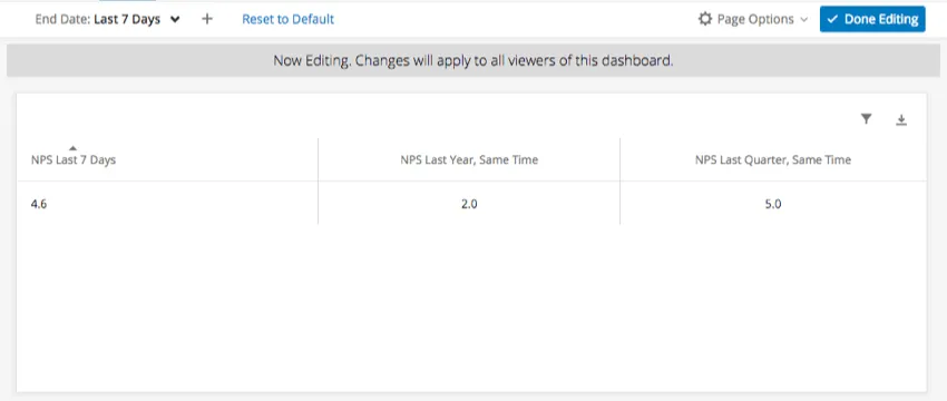
Relative filters are a type of shift back filter that can only be on the widget level to Simple Charts and Simple Tables. The purpose of relative filters is to filter a widget relative to a page-level date filter. For example, if your entire page is filtered to show data for the last 7 days, you can use a relative filter on your widget to show data for the same week last year.
Example: This dashboard page is filtered to show data for the last 7 days.This Simple Table has three Metrics added to it, each an average NPS. The first Metric is not filtered, showing the NPS for the last 7 days. The second Metric is shifted back 1 year from the page filter, showing data for the same week a year ago. The third Metric is shifted back 1 quarter from the page filter, showing data for the same week a quarter ago.
FAQs
What are aggregated metrics?
What are aggregated metrics?
That's great! Thank you for your feedback!
Thank you for your feedback!