
Breakdown Table Widget (CX)
What's on this page
About Breakdown Table Widgets
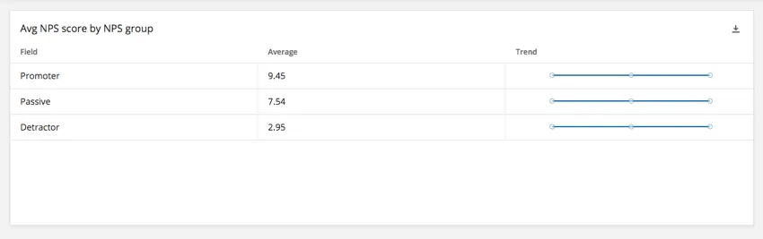
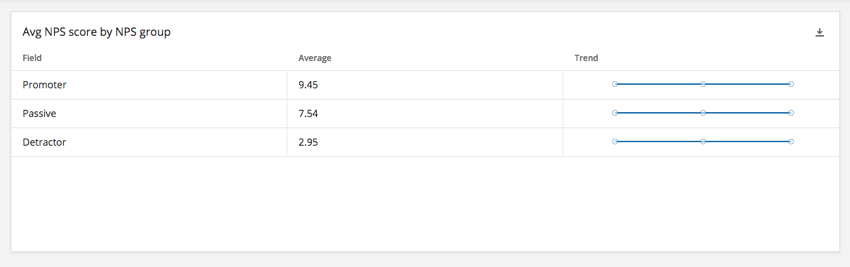
The breakdown table widget displays data from a single field broken out by the values of another field. For example, you may wish to display average satisfaction for separate NPS groups. Like the multiple source table, multiple columns can be added to the breakdown table to display additional information.
Types of Dashboards
This widget can be used in a few different types of dashboard. This includes:
Field Type Compatibility
For the breakdown table widget, the field to be broken out (source) and the field used to break out the source (rows) support different field types.
The following field types are compatible with the Source field:
- Numeric Value
- Number Set
The following field types are compatible with the Rows field:
- Numeric Value
- Number Set
- Text Set
- Text Value
Only fields with the above types will be available when selecting data fields for the source and the rows on the breakdown table.
Widget Customization
For general settings that apply to most widgets, see Building Widgets. Customization unique to the breakdown table widget will be detailed below.
Source and Rows
Before your breakdown table widget will display data, you have to set the source (the field to be broken out) and the rows (the break out). See compatible field types.
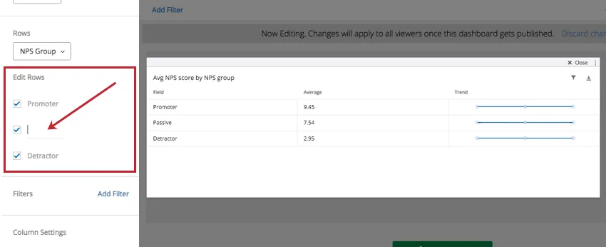
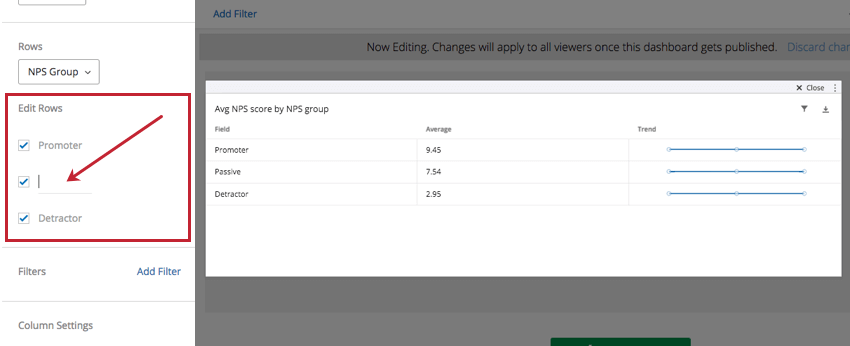
Edit Rows
By default, all possible values from the Rows field will be added to the table. Click the checkbox next to a particular value to remove it from the table. To rename a row, click the name of a field value and enter a new value for the name.
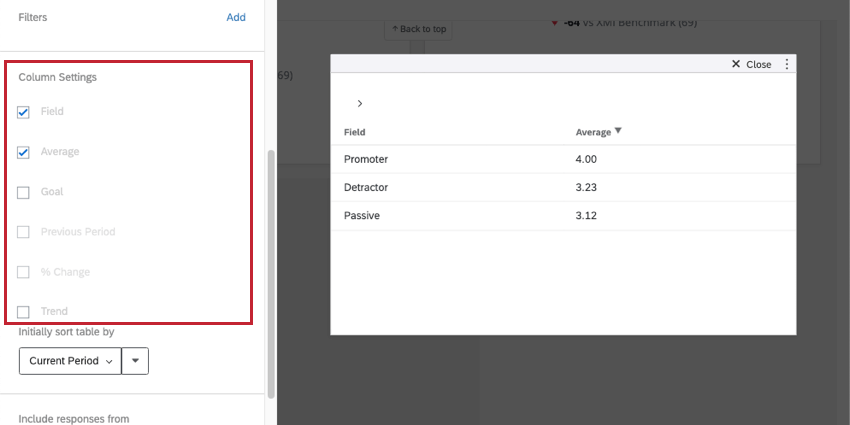
Column Settings
Under Column Settings you have the ability to select which columns you would like to appear in your table. By default, the columns for Field, Metric, and Trend will be shown.
- Field: Display the Field column. This is the name for each option in the field you set as the source. In this example, it’s Promoter, Passive, or Detractor groups of an NPS question.
- Metric: The metric you’ve selected. Although in the example below it is Average, you may have chosen count, NPS, minimum, maximum, top / bottom box, or sum instead.
- Trend: Display a miniature line graph of the change in data over time. Attention: The Trend column is not compatible with response count threshold filters.

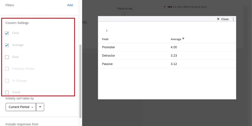
In addition to these, columns for Goal, Previous Period, and % Change can be added. These options are described in depth below.
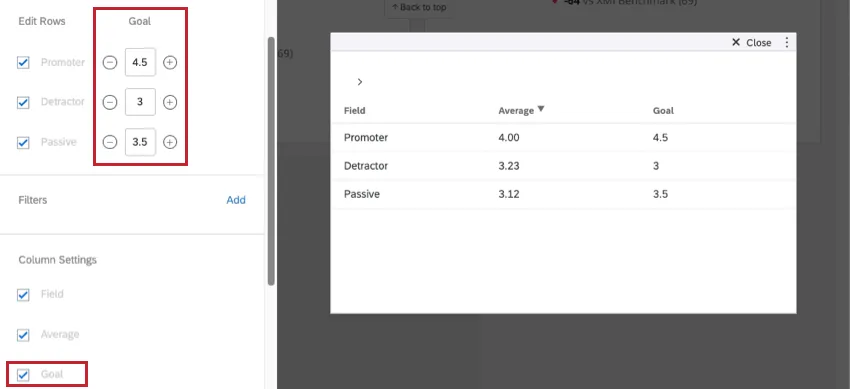
Goal
Goals can be useful for displaying whether your team or research data reached goals you set before collection.
Scroll back up to the Edit Rows section to set a goal for each row’s chosen metric. The goal for each row can be different.
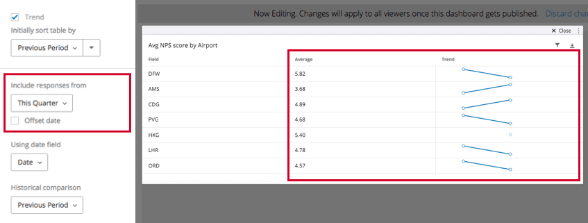
Displaying Historical Data
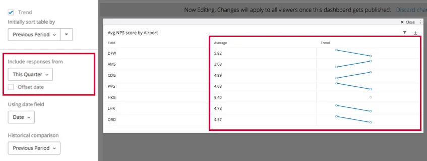
The Include responses from setting lets you choose the time period the data in the widget should cover in the selected metric’s column (in the example above, Average) and in the Trend column.
Once you have selected a time period that is not “All Time,” you will have additional options for displaying historical data.
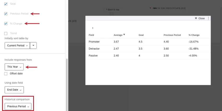
- Previous Period: Show scores for a previous period of time.
- % Change: Show the percent each row of data has changed over time.
- Historical comparison: Pairs with the Previous Period and % Change columns. You have two options:
- Previous Period: Showcase this week’s data as the main data source. Example: Let’s say you’re including responses form the last 7 days. Selecting “Previous Period” will show data from 7 days before that in the Previous Period and/or % Change columns.

- Same Period Last Year: Let’s say you’re including responses from the last 7 days. “Same Period Last Year” will show data from the exact same timeframe as last year in the
- Previous Period and/or % Change columns. That means if it’s the week of February 28, you’ll see data from the week of February 28 of last year.
- Previous Period: Showcase this week’s data as the main data source.
- Offset date: Adjust the data being displayed in the dashboard to the same period in the amount of time specified. For example, let’s say I want a page of my dashboard to always tell me how my company performed the exact same time two quarters ago. Thus offsetting date filters allows us to make helpful comparisons to our current performance. See Date Filters for more information.
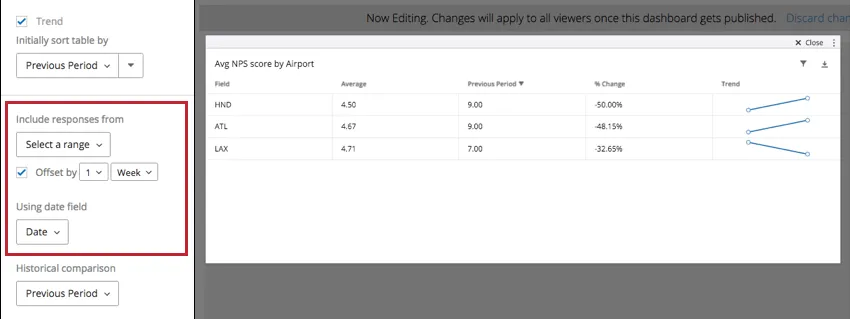
- Using date field: Select the date field to base this data off. This is any field you’ve mapped as a Date field type.
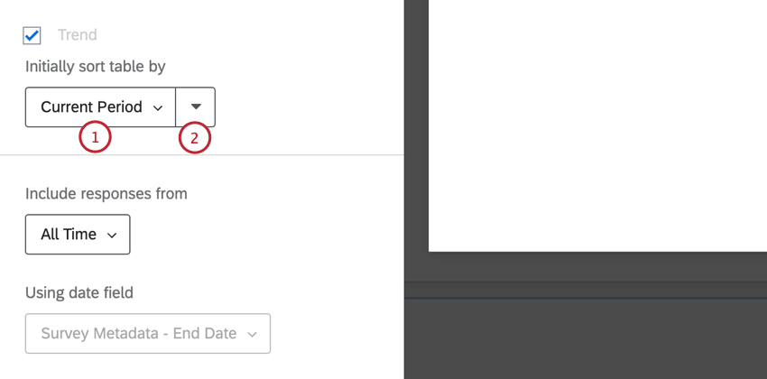
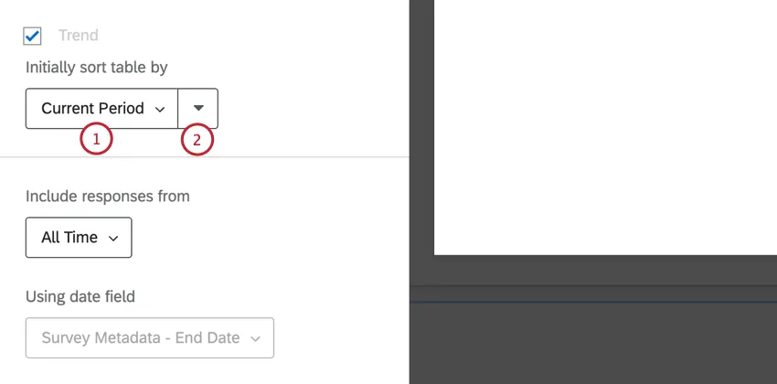
Initially Sort Table By
The Initially sort table by setting is used to determine the default sorting for the widget.
A dashboard viewer can sort the widget by a different field by clicking that field’s header in the table. This only changes the view for that dashboard viewer and will reset when they navigate away from the dashboard.
FAQs
I have multiple datasets on my dashboard. Can I use this feature with all of my widgets?
I have multiple datasets on my dashboard. Can I use this feature with all of my widgets?
- Changing which dataset your widget shows: Not all widgets can have their referenced dataset switched. Some can only use the default dataset. For a compatible list, see this section.
- Showing multiple datasets in the same widget: Not all widgets can show multiple datasets’ results at the same time. For a compatible list, see this section.
That's great! Thank you for your feedback!
Thank you for your feedback!