
Correspondence Analysis Widget (BX)
What's on this page
About the Correspondence Analysis Widget
Correspondence Analysis (also known as perceptual mapping) is a great tool to identify relationships between brands and different attributes they have, and to see the relative perceptions of these brands and how they compare with competitors.
Qtip: The competitors you are compared with are other brands you listed during the survey setup phase.
Data Requirements
Only Multiple Choice questions in a Multiple Answer format can be loaded into a Correspondence Analysis widget, and they should have the same options.
Example: In the default question, “Based on your experience or what you have heard, which apparel brand would you say offers a good value for the money? Select all that apply,” a good value for the money is the attribute (or trait) you are investigating, and the answers to the question are various brands.
By default, you will have at least three of these attribute questions built into your Brand Tracker survey, which is the minimum number you need to load data in the correspondence analysis widget. These fields should be mapped as Multi-Answer Text Sets.
Qtip: Don’t worry – if you’re using the pre-made Brand Tracker dashboard, we have already mapped this content for you.
These questions need about 50 to 100 responses before they will display data in the widget.
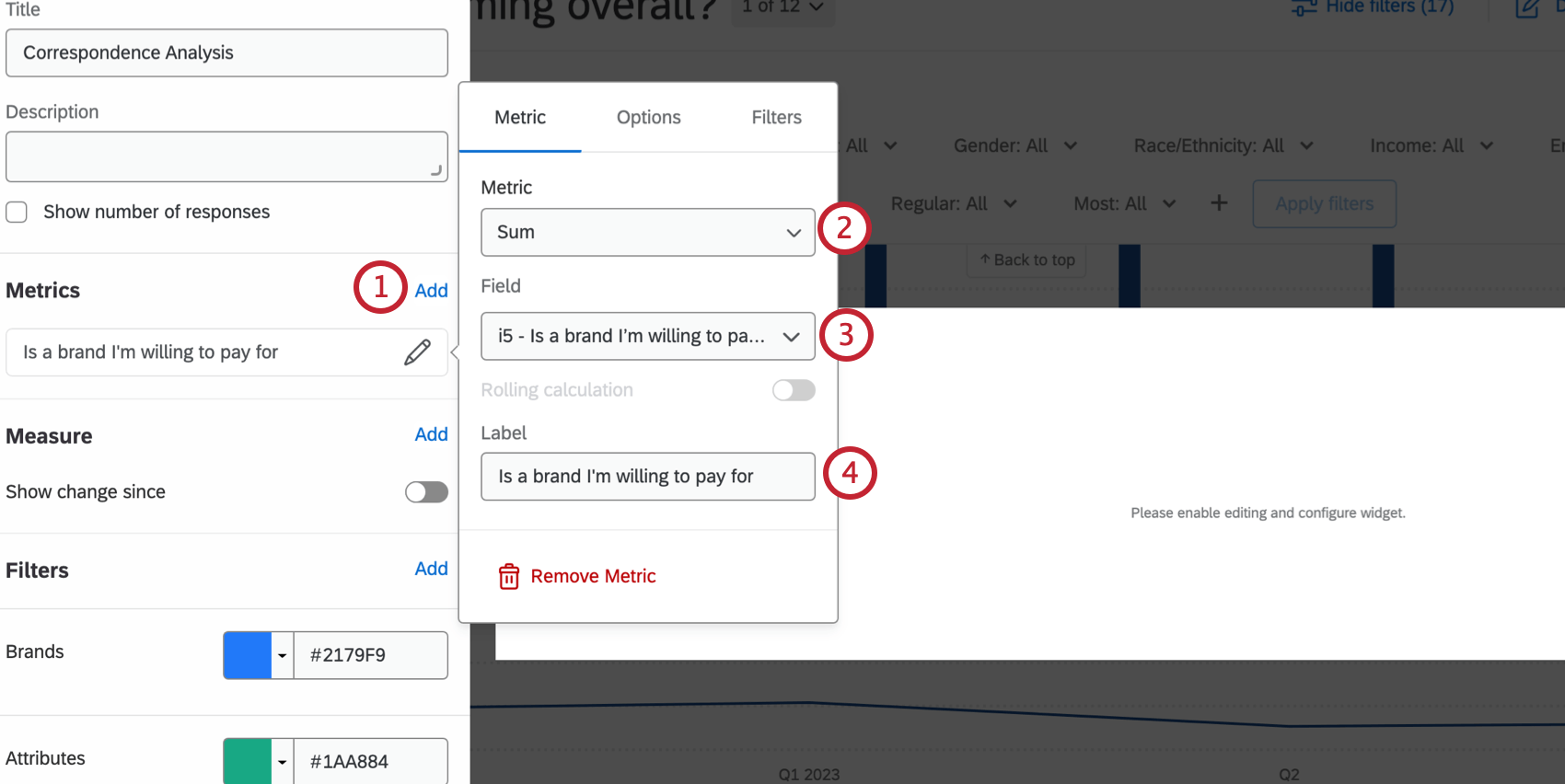
Adding Fields to the Widget
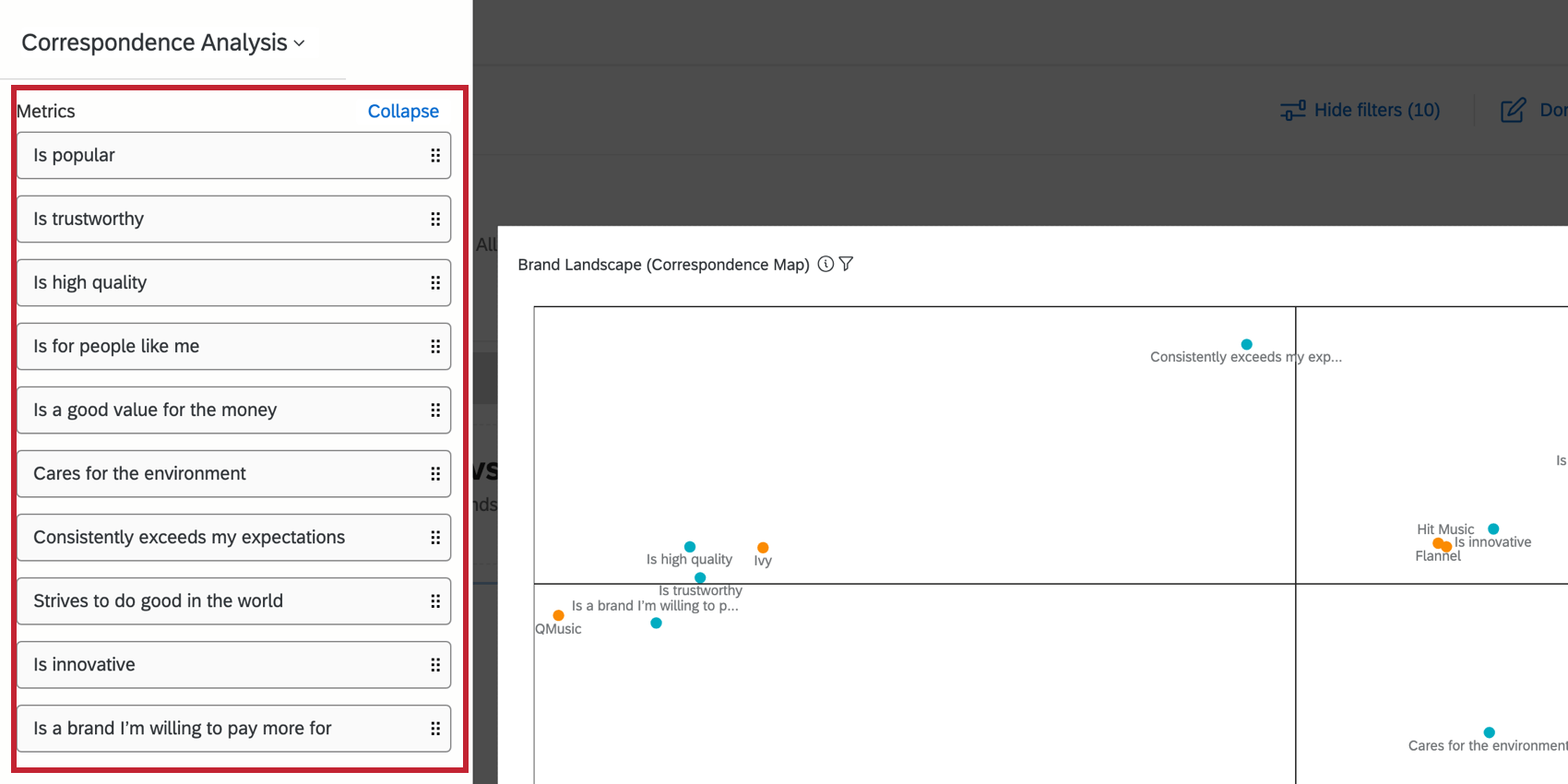
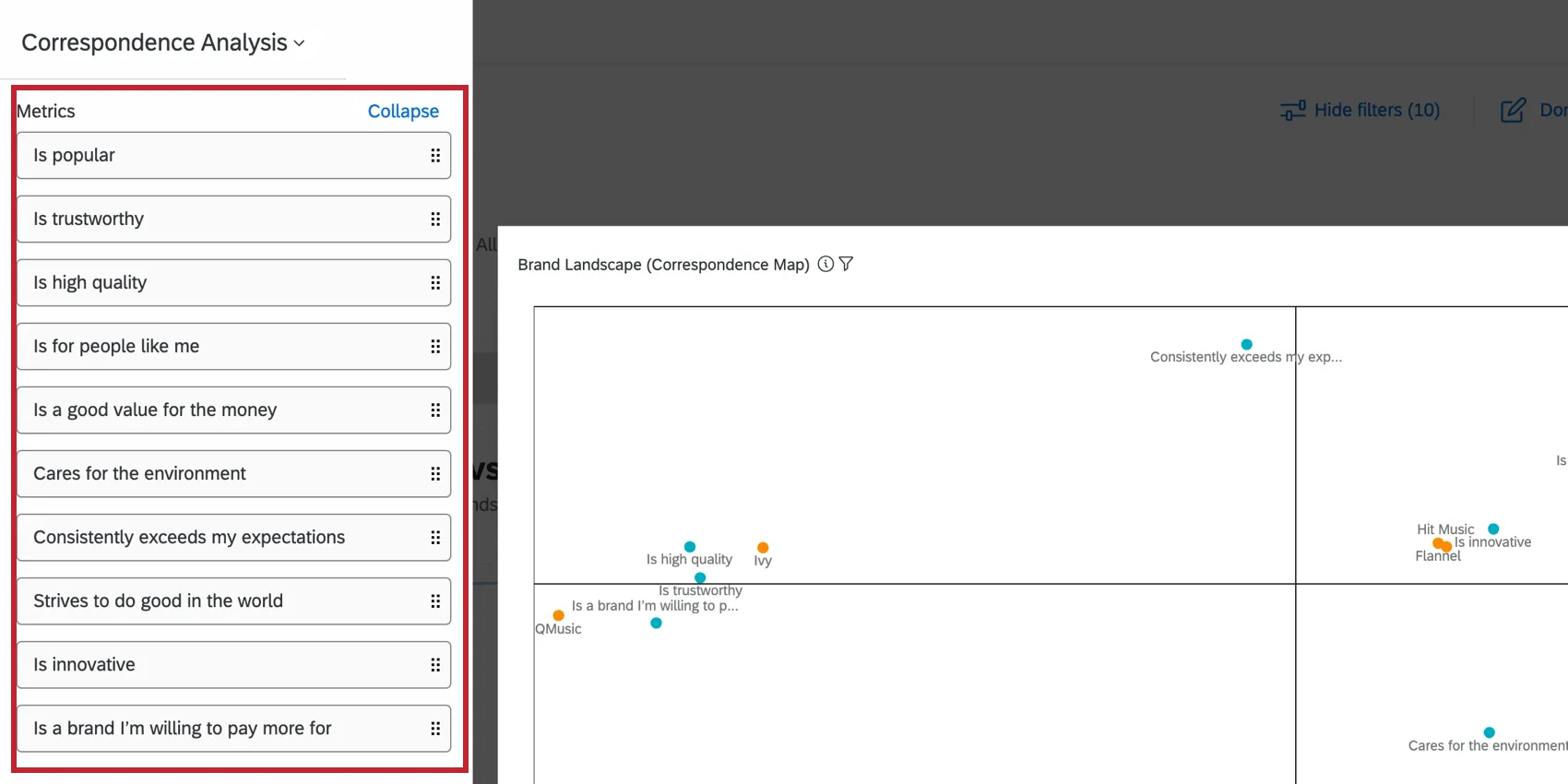
Hiding and Renaming Brands and Traits
Use the Metrics and Brands sections to rename brands and fields.
Qtip: Remember, you can also rename fields and their values in the dashboard data.
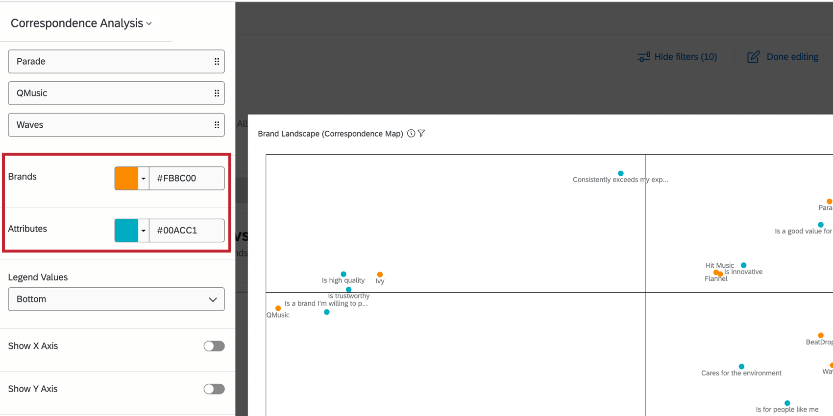
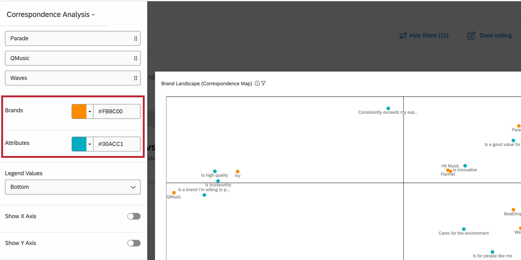
Switching Brand and Attribute Colors
You can pick which color you’d like to assign to the brands and attributes in your widget by clicking the color next to that item.
Additional Options
- Columns: Hide brands from the widget. You can also hide and display brands using the Axis Values option described earlier.
- Legend Values: Change how your legend is labeled.
- Legend Position: Change the position of the legend on the widget.
- Show X Axis: Show the line and the labels along the X Axis.
- Show Y Axis: Show the line and the labels along the Y Axis.
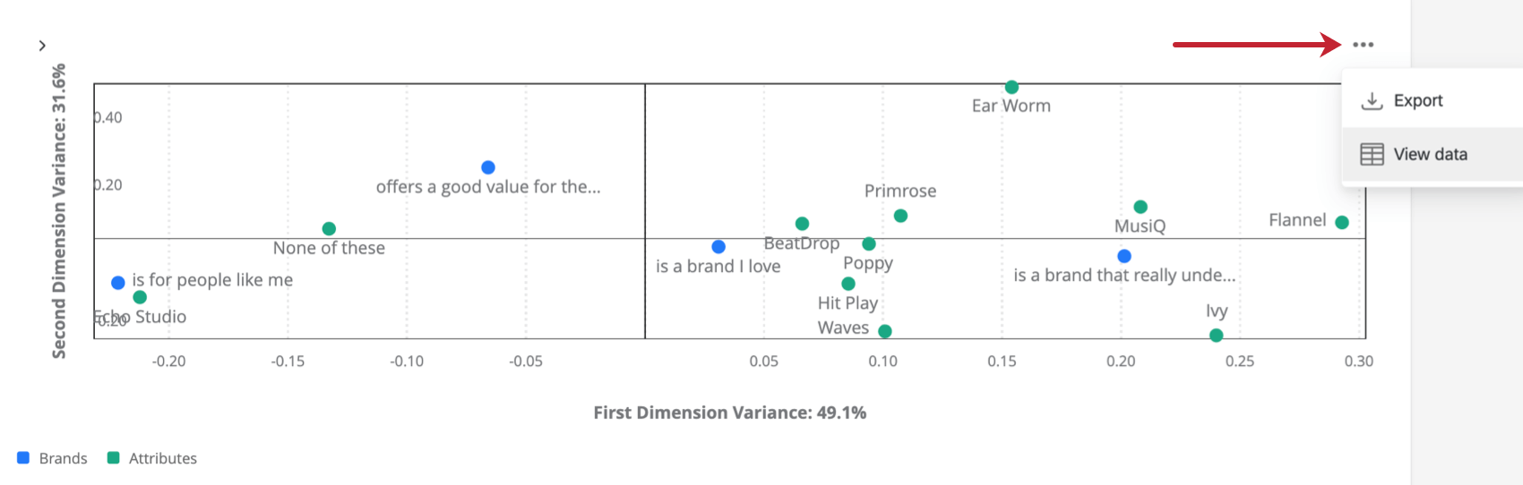
When you have finished editing the widget, click the three horizontal dots in the top-right corner of your widget to view more options.
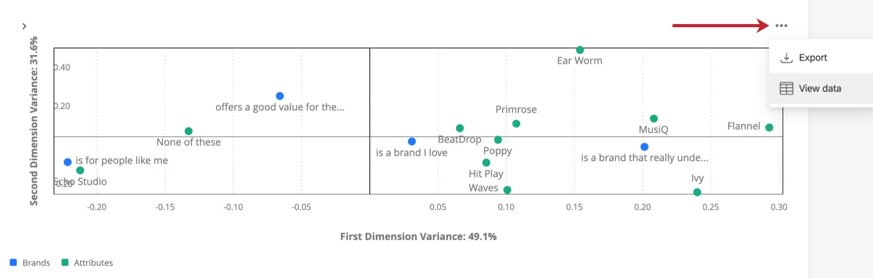
- Export: Export your widget as a JPG, PDF, CSV, or TSV.
- View data: View a table containing all the data coordinates within your widget.
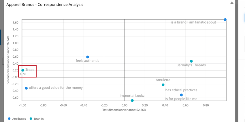
Interpretation
This widget takes the form of a scatter plot, with brands and attributes plotted as dots along the graph. You can analyze relationships between different brands based their proximity to one another – the closer, the more similarly they are perceived by respondents. We can also analyze relationships between brands and attributes by hovering over dots to see a ranking of most to least associated data points.
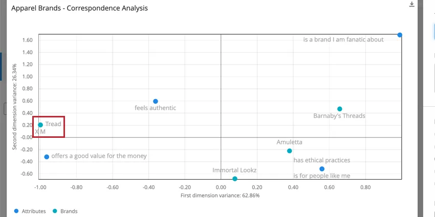
In the screenshot above, we can see that imaginary clothing brands Tread and XM are perceived as very similar to each other, so much so that the dots almost eclipse each other.
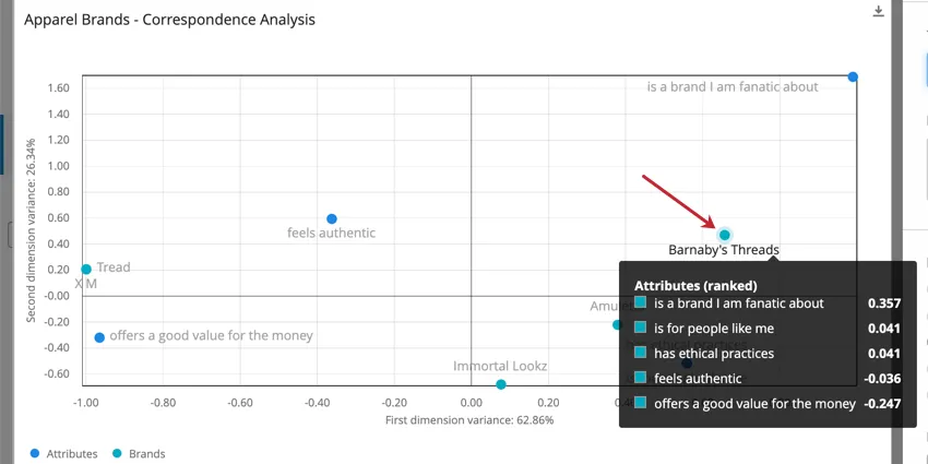
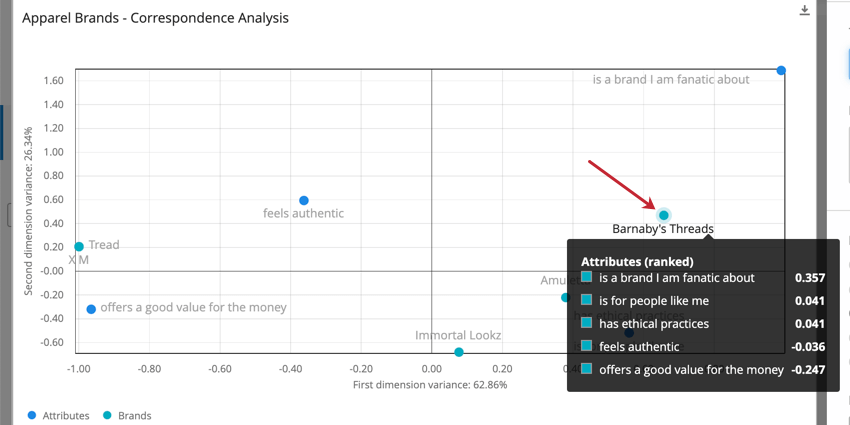
When we hover over the brand Barnaby’s Threads, we see that of the attributes we investigated, the strongest relationship is with “is a brand I am fanatic about.” The closer to 1, the stronger this relationship is.
When values are negative, this indicates a negative association between that brand and that attribute. In the case of the screenshot above, Barnaby’s Threads is definitely not perceived as authentic or as a good value for the money.
For a deeper explanation of correspondence analysis, see the linked page.
FAQs
How do custom metric filters interact with page filters in BX dashboards?
How do custom metric filters interact with page filters in BX dashboards?
That's great! Thank you for your feedback!
Thank you for your feedback!