
Brand Usage Reporting (BX)
What's on this page
Common Usage Questions
“Usage” reporting focuses on a consumer’s interactions with a brand. The type of interaction will vary industry to industry, but common usage questions include:
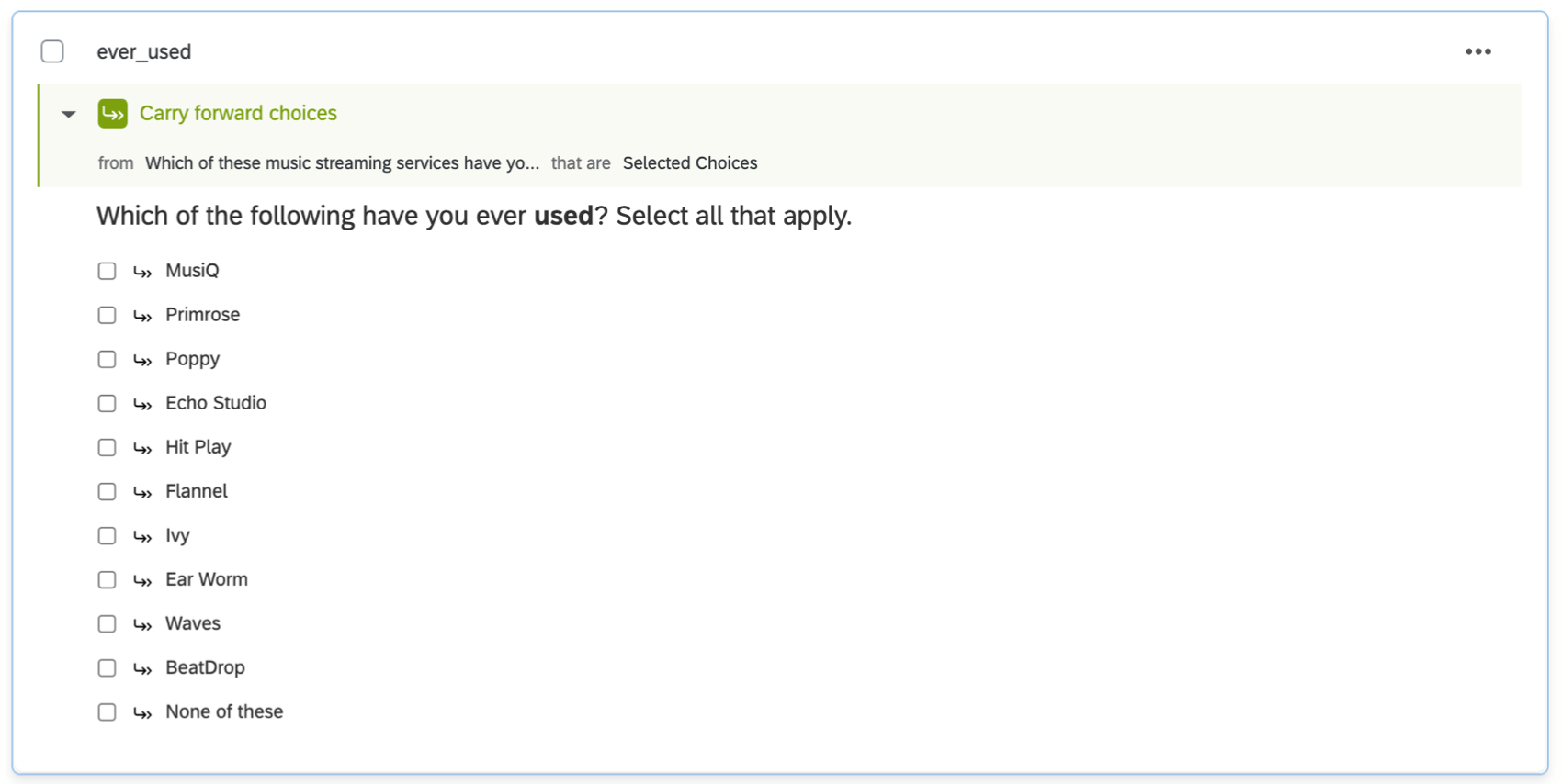
- Ever used: Which of these brands have you ever used?
- Regular use: Which of these brands do you regularly use?
- Other use: Which of these services have you used in the past 3 months?
- Subscription: Do you have a contract or subscribe to any of the following services?
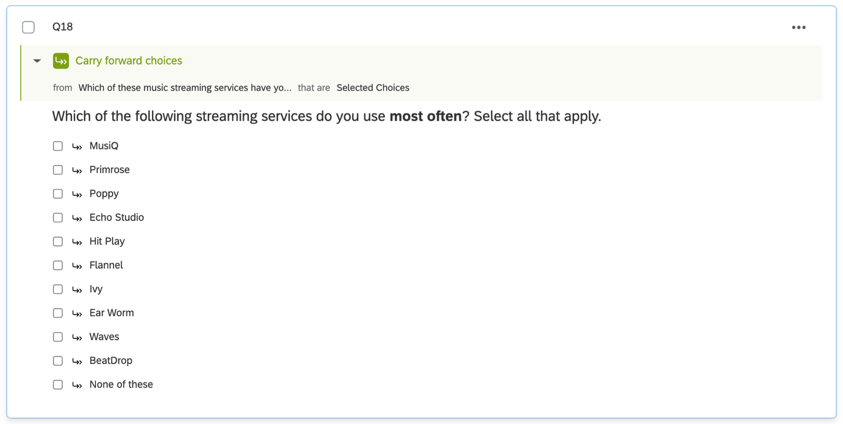
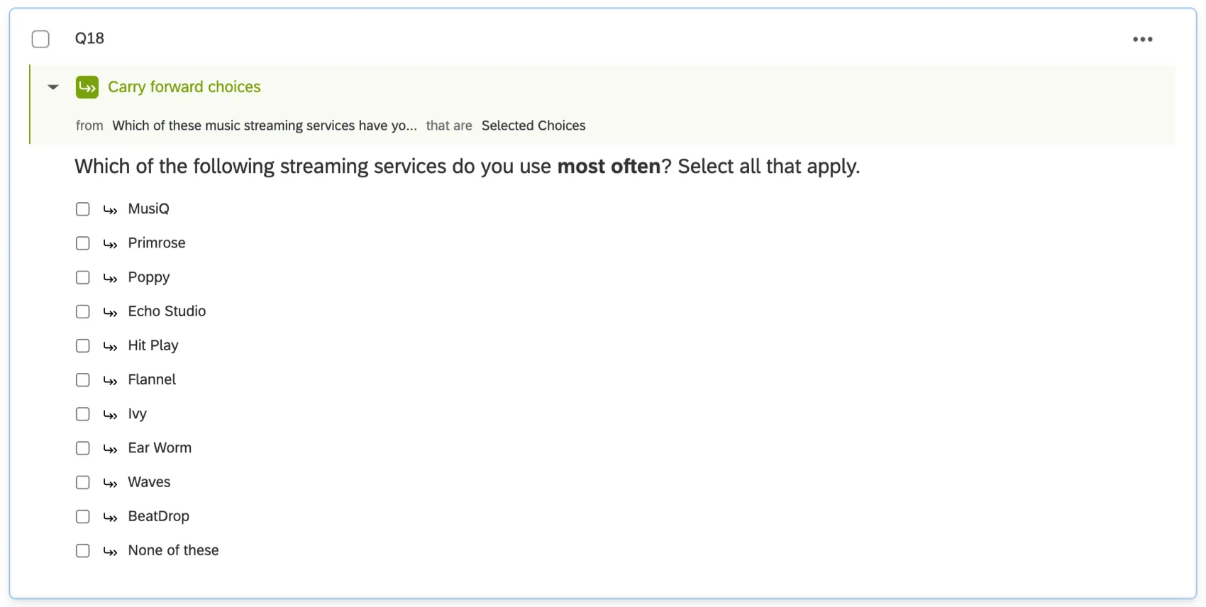
- Most often: Which of these brands do you use most often?
Qtip: There is often overlap between usage questions and the conversion funnel questions. If there is a lot of overlap, or if there are simply not enough usage questions in the survey to warrant their own page of the dashboard, usage reporting is sometimes omitted.
Survey Setup
By and large, usage questions are generally asked as multiple choice questions in multiple answer format. Your question asks respondents to pick which brands they have ever used, use regularly, and so on. The brands are listed as the answer options.
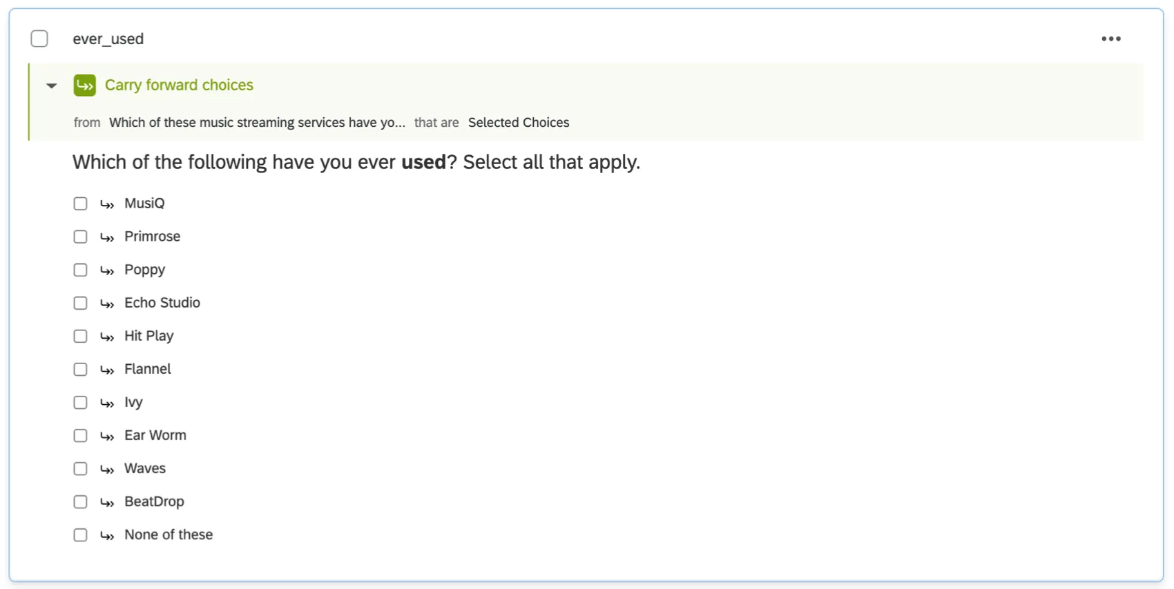
Qtip: It helps to use carry forward with these questions. For example, brands will only show in the “have you ever used this brand?” question if the brand is selected when the respondent is asked, “Including any of the brands you may have already mentioned, which brands have you heard of?” This is to help ensure the respondents answer logically – for example, how can a respondent have used a brand in the past week if they earlier said they had never used it?
Brands Used Most Often
Sometimes, you may want to include some type of “most often” question where respondents pick from among their ever used or regularly used brands and select the brand they use the most often. This is generally a multiple choice question in single answer format.
Qtip: Similar formats can be used with a matrix table or rank order, although we recommend sticking to multiple choice. Pick Group and Rank questions are incompatible with CX Dashboards.
Dashboard Data Preparation
Dashboard Data
Let’s move out of the survey and into the dashboard. Specifically, let’s configure our source in the Dashboard Data section in the dashboard settings.
All usage questions that were asked in a Multiple Choice – Multiple Answer format should be mapped as Multi-Answer Text Sets.
If you included a “most often” question as a single answer multiple choice, map this as a Text Set.
Custom Metrics
Custom Metrics are configured the same for usage questions as they are for funnel questions. See Custom Metrics on the Funnel Reporting support page for more detailed steps. Only the instructions on Funnel Levels are relevant – ignore the instructions on conversion ratios.
Widgets Commonly Used in Usage Reporting
Simple charts can be used to visualize brand usage in a few different ways.
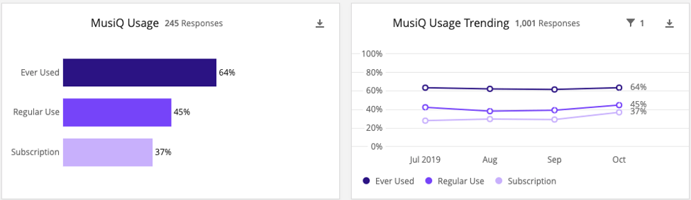
Individual Brand Usage
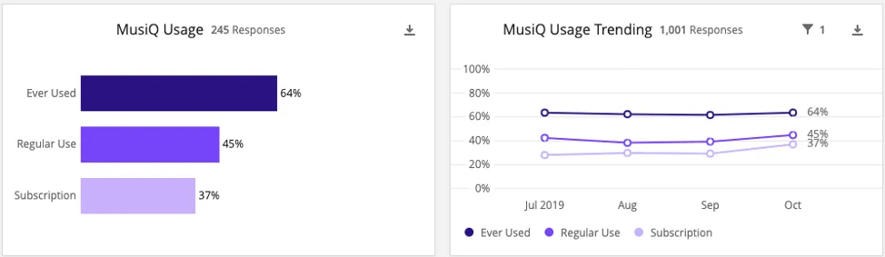
These charts show the levels of usage for a single brand. We see the number of respondents who qualify for each level divided by the total number of responses. For example, in the above image, 64% of all October respondents answered that they had ever used the brand.
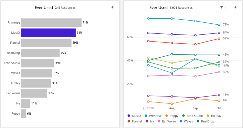
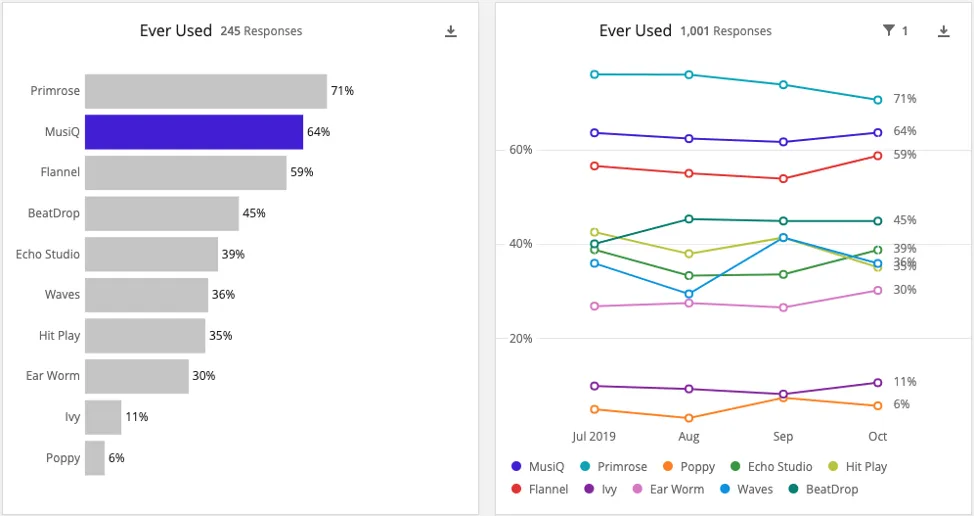
While the individual brand usage charts are very helpful for analyzing a specific brand, it can be difficult to quickly compare across multiple brands. To do that, we instead will create competitive charts so we can easily see how the client’s brand is performing relative to their competitors on any given usage level. The competitive charts usually consist of one bar chart showing percentages for all brands for that level, and one trending chart showing the same data over time.
Widget Setup
The set up if these charts is similar to the set up of the Funnel Leveling Trending and Competitive Charts for funnel levels, though of course with different naming, and our usage fields and metrics instead. The conversion-related charts for funnel levels are not relevant to usage.
FAQs
How do custom metric filters interact with page filters in BX dashboards?
How do custom metric filters interact with page filters in BX dashboards?
How do BX Dashboards query aggregated data for unique survey responses?
How do BX Dashboards query aggregated data for unique survey responses?
That's great! Thank you for your feedback!
Thank you for your feedback!