
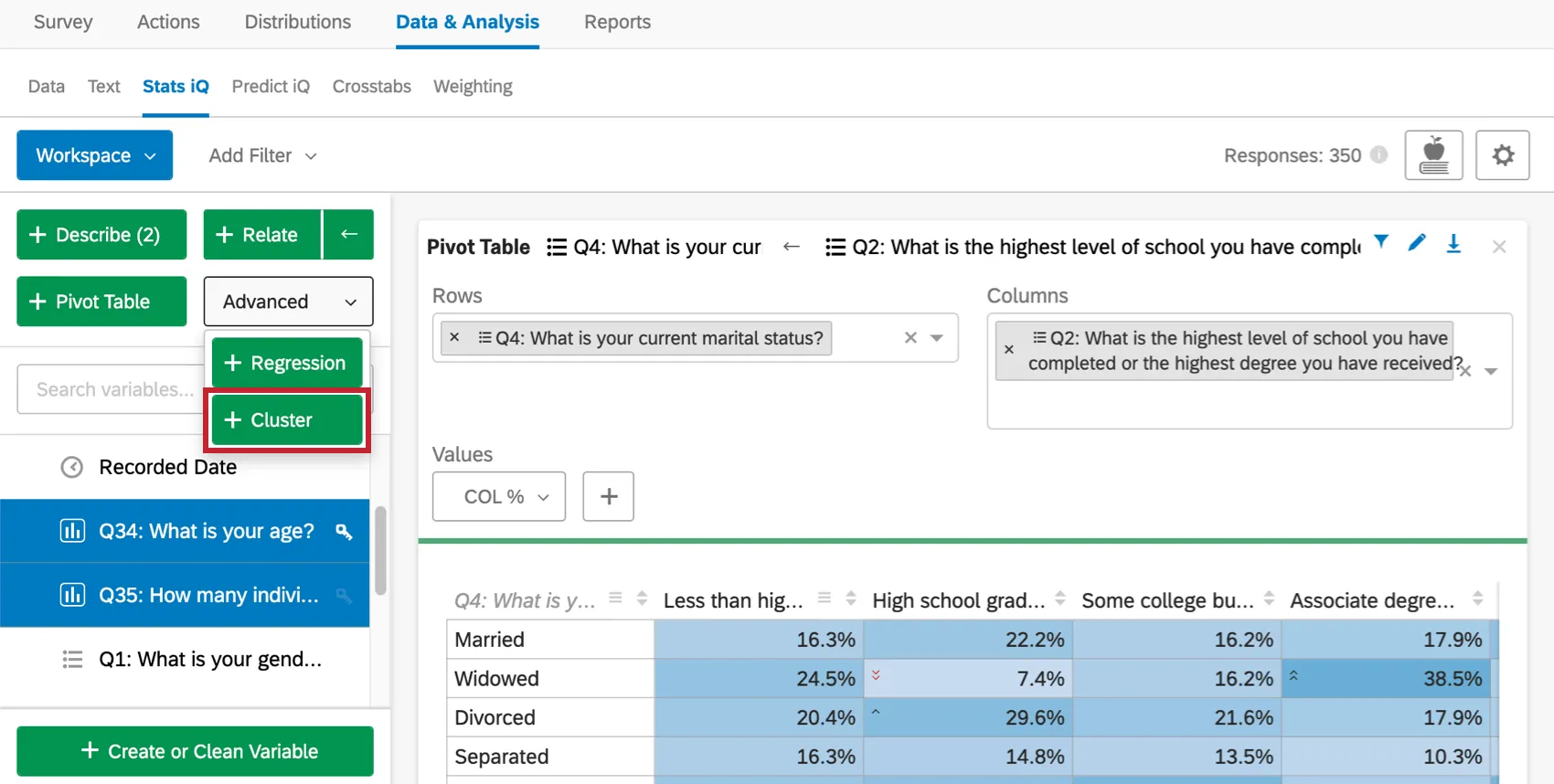
Cluster Analysis
What's on this page
About Cluster Analysis
When we analyze our data, we are often concerned with different demographic groups, and will segment respondents by income, region, age, and more. But sometimes these labels can be reductive – after all, knowing you have a lot of male respondents doesn’t tell you what kind of ad campaign they’d like to see. Is your audience primarily millenials? Soccer dads? Both? How do you put personal characteristics into terms that can be broken down for marketing purposes?
Cluster analysis is a means of detecting the groups that naturally occur in your survey’s dataset. This is done by analyzing which demographic, behavioral, and/or belief-based qualities are the most highly correlated.
Qtip: You may have up to 750 cards in your workspace. If you reach this limit, an error will appear when you try to create a new card, warning you that your oldest cards will be deleted.
Preparing a Survey for Cluster Analysis
In order to perform a cluster analysis, you need to be collecting the correct data in your survey.
- Ask the Right Questions:
- Demographics: Ask about basic descriptive information, such as age, income bracket, race, or gender.
- Behavior: Ask how customers interact with your brand and your products, or about behaviors that may relate to their purchasing behavior. For example, you can ask how often the customer goes shopping.
- Operational Data: This is information such as time spent on your website, or an employee’s tenure in your company. Qtip: Are you interested in tracking time spent on a page? Then you might be interested in using our Website Feedback feature. Contact your Account Executive if you are interested in learning more.

- Attitudes and Beliefs: Survey your respondents on their core values, their attitudes, and beliefs. This can include religious or political beliefs, but you can also ask about beliefs directly relevant to how your company works. For example, you can ask them to rate how important it is for support interactions to be face-to-face.
- Question Formats: Format questions about behaviors and beliefs as scales. The range on a scale can help us understand what scale points are correlated and therefore roughly in the same cluster; Yes/No and single-select questions are not as useful for cluster analysis. Example: If you ask “What kind of shopper are you?” and give the options “Prefer shopping at malls”, “Prefer shopping online”, and “Prefer shopping at boutiques”, the clustering algorithm will want to divide respondents into three groups, one for each answer. If you instead asked those as a series of questions (e.g., “Do you like shopping at malls?”) with responses 1 through 7, the clustering algorithm will do a better job at really discerning what separates different shoppers from each other.
 Qtip: Multiple Choice questions are the best for gathering scalar data.
 - Variable Types: When you are ready to analyze in Stats iQ, be sure to format your variables as categories or numbers. Dates are incompatible with cluster analysis.
Qtip: When creating your variables, consider ones that you already know to be highly correlated. This will help you remain in the 10 variable limit on cluster analysis.
Attention: Cluster analysis has a maximum sample size of 20,000 responses.
Performing Cluster Analysis
Qtip: You can only perform a cluster analysis on 10 variables at a time. If you’d like to include more, try to find variables that are highly correlated with each other and create an average of them using the Create or Clean Variable button.

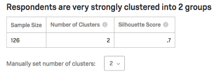
Cluster Analysis Results
Strength and Statics Table
The table will list sample size (how many respondents contributed data to this analysis), the number of clusters, and the silhouette score. The silhouette score is interpreted into phrases like “very strongly” in the sentence at the top.
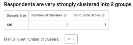
Qtip: For more on the silhouette score displayed in this table, see the Interpreting Cluster Analysis section.
Cluster analysis attempts to choose the appropriate number of clusters automatically by assessing the tightness of the clustering at various numbers, but penalizing higher numbers of clusters for being harder to work with. Choosing the right number is more art than science, and you should experiment with different numbers to see what works best.
In some cases, the algorithm won’t be able to produce a certain number of clusters and it will fall back to a smaller number.
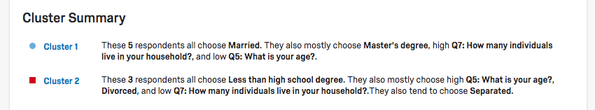
Cluster Summary
Your clusters will be listed in the Cluster Summary section. They will be described based on the questions members of the cluster answered most similarly.
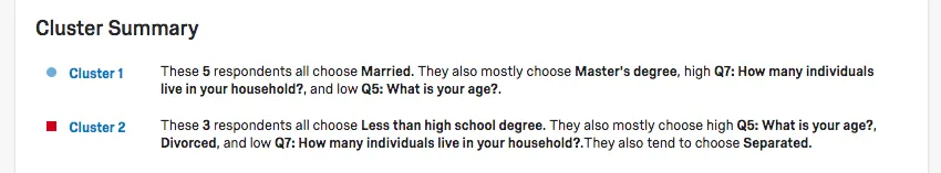
Example: Cluster 1 in this screenshot contains people who are:
- Married
- Have Master’s degrees
- Have few people (immediate family members, children) living in their home
- Young
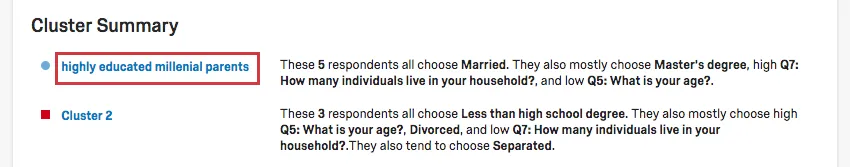
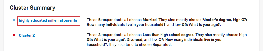
Click a cluster’s name to rename it.
Qtip: Renaming your clusters is important for making your results make more sense in a real-world or marketing context.
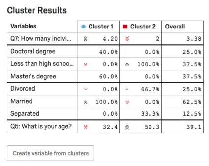
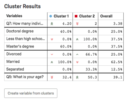
Cluster Results Table
In the Cluster Results table, the main variables of the cluster will be highlighted. For categorical variables, the most common option and the percentage of respondents in the cluster who provided this answer will be given. For number variables, you will see an average response.
Example: In this screenshot, level of education is categorical, so we see a breakout on percentages of respondents with Doctoral degrees vs. Less than a high school’s education vs. Master’s degrees.
Age is numeric here, so we see the average age for each cluster (32.4 for Cluster 1, 50.3 for Cluster 2).
To learn more about creating variables from clusters, see the Create Variable from Clusters section.
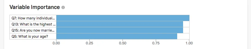
Variable Importance
The Variable Importance table shows the strength of the relationship between each variable and the clusters. A stronger relationship indicates that the variable was more important in the creation of the clusters.
To calculate this, we run regressions for each variable. For example, we’d run age against the cluster outcome, hours worked against the cluster outcome, and so on.
The r-squared values resulting from those regressions are then scaled up such that the highest r-squared is set to 1.
Example: Let’s say Q7 had an r-squared of 0.5, the highest in the group. We need to double that to set it to 1. That means that if Q13 had an r-squared of 0.4, it would show up as 0.8 in the chart below.
Creating New Variables from Results
Once you’ve determined clusters amongst your respondents, you can make these categories into new variables you can analyze in Stats iQ!
First, make sure to rename your clusters by clicking into their names.

Qtip: The renaming step isn’t required, but it will make your data cleaner and more understandable to you and your colleagues.
Once your clusters have names that make sense to you, click Create variable from clusters under the Cluster Results table. This will automatically add a categorical variable to your list of variables on the left.
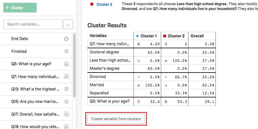
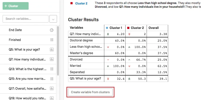
Qtip: This variable is only available in Stats iQ. It will not appear anywhere else in your Qualtrics data.
Technical Notes
Cluster analysis in Stats iQ uses Latent Class Analysis (LCA) to partition user provided data into its underlying clusters. Unlike other clustering algorithms, the Stats iQ LCA algorithm allows mixed data types to be clustered (numeric, categorical and binary).
Mixed-Type Latent Class Analysis
Latent Class Analysis (LCA) is a probability based clustering model. Each cluster is defined by a collection of probability density functions that, based on the value of a data point’s variables, returns the likelihood that a particular data point belongs in that cluster.
Example: Your family can be split into a few generations, such as the current children, the parents, and the grandparents. An LCA model would represent these 3 clusters, where each cluster is defined by a single probability function based on age:
Cluster Probability function Mean Probability function Standard Deviation Current 25 7 Parents 48 5 Grandparents 75 3 To assign someone who is 30 to a cluster, use these probability density functions to calculate that there is a 44% likelihood they are in Current, <1% likelihood they are in Parents and <1% likelihood they are in Grandparents. This individual would be assigned to its most likely cluster, Current.
An LCA model can be applied to multiple variables by multiplying the likelihood that a datapoint belongs to a cluster based on each variable. The model can be applied to different variable types by using different probability density functions:
| Type | Transformation | Probability Density Function |
|---|---|---|
| Categorical | Dummy encoded (N-1) | Bernoulli |
| Binary | Bernoulli | |
| Numeric | Normal |
Determining Number of Classes
To determine the optimal number of classes, Stats iQ uses a BIC score.
Evaluating Model Fit
To evaluate the objective ‘goodness’ of a model, Stats iQ uses a probability based silhouette score. A silhouette score is a measure of how well each datapoint lies within its cluster. A silhouette score measures the similarity of a particular point to all the other points in its cluster and compares that to how similar it is to all the points in its nearest neighbor cluster. To measure similarity between two data points, Stats iQ calculates the gower distance (a distance metric that works for binary, categorical and numeric data) between the points.
FAQs
How do I get my new responses to show up in Stats iQ?
How do I get my new responses to show up in Stats iQ?
What do I do if my data isn't loading properly?
What do I do if my data isn't loading properly?
That's great! Thank you for your feedback!
Thank you for your feedback!