-

Qualtrics Platform -

Customer Journey Optimizer -

XM Discover -

Qualtrics Social Connect
Displaying Benchmarks in Widgets (CX)
About Displaying Benchmarks in Widgets
Benchmarks are a metric standard that enable you to understand how your organization’s overall experience compares against industry peers, and to establish overall customer experience, NPS, or digital experience goals based on company and industry comparisons. Before you add them to your widgets, benchmarks can either be uploaded to the benchmark editor, or they can be configured directly within a widget.
How Benchmarks Appear on Widgets
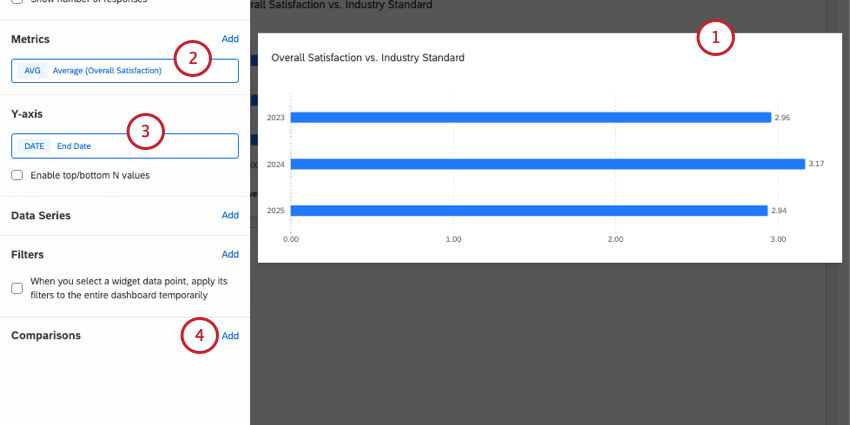
Benchmarks can be displayed on your widget as a comparison line with a custom color. This option is available in a lot of widgets, such as line and bar charts. You can create a custom static goal lines or even use any of the benchmarks you made in the editor as a goal line.
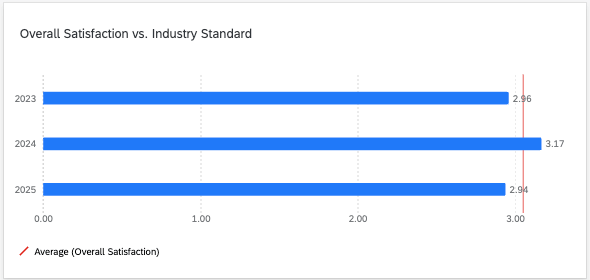
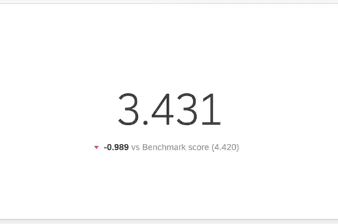
In number charts and gauge charts, benchmark comparisons appear as text below the primary metric, showing the difference between your performance and the benchmark.
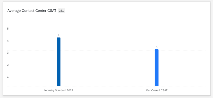
When a quick premade Qualtrics benchmark is added to a widget as a metric, you do not see a goal line or comparison text. Instead, you see another category in the widget. For example, you might see your benchmark and your average metric next to each other as bars on a bar chart.
Displaying Benchmarks as Comparison Lines
Once you’ve created any benchmark in the editor – whether they are industry benchmarks or custom benchmarks – it’s time to add them to your widgets.
- Create one of the supported widgets.
- Add a metric that isn’t count.
Qtip: We often recommend selecting a metric that matches with your benchmark so you can see the most accurate comparison. Since metrics available can vary by benchmark dataset, remember you can explore available data.Example: You saved a benchmark with customer care CSAT standards that includes average performance. For your metric, you choose the average of your customer team’s satisfaction rating.Example: You saved a benchmark with customer care CSAT standards that includes maximum and minimum performance. You add both to your widget, along with your own organization’s average CSAT to show how you fall within the bands.
- You can add breakouts, like data series, x or y axes, as needed.
Example: You break out your data over time, like the “recorded date.”
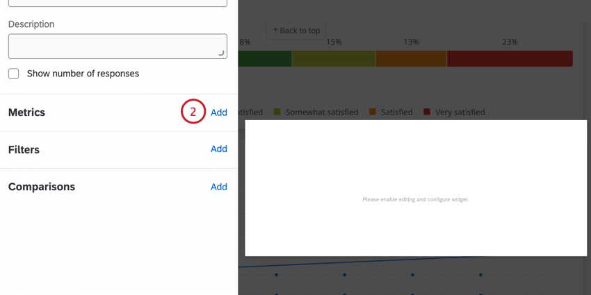
- Next to Comparisons, click Add.
- Under Comparison Type, select Metric.
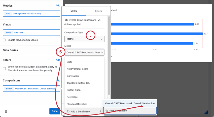
- Under Metric, hover over Add a benchmark and select the benchmark you want to use.
Qtip: Both pre-made industry benchmarks and custom benchmarks that you created will appear in this list!
- Under Benchmark Metric, select the metric you want for your benchmark. For this example, “Average” would give you the average Overall CSAT.
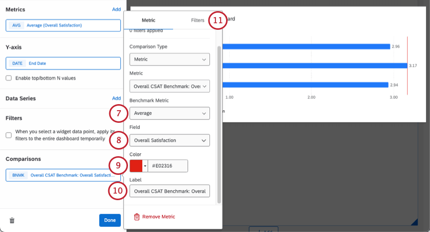
- Under Field, select the dashboard field you mapped to this benchmark.
Qtip: Under this field, you might see Use percentile options. For more details, see Setting Up Percentile Benchmarks.
- Choose a color for the benchmark line.
- Label the benchmark line. This name will appear in the widget’s legend.
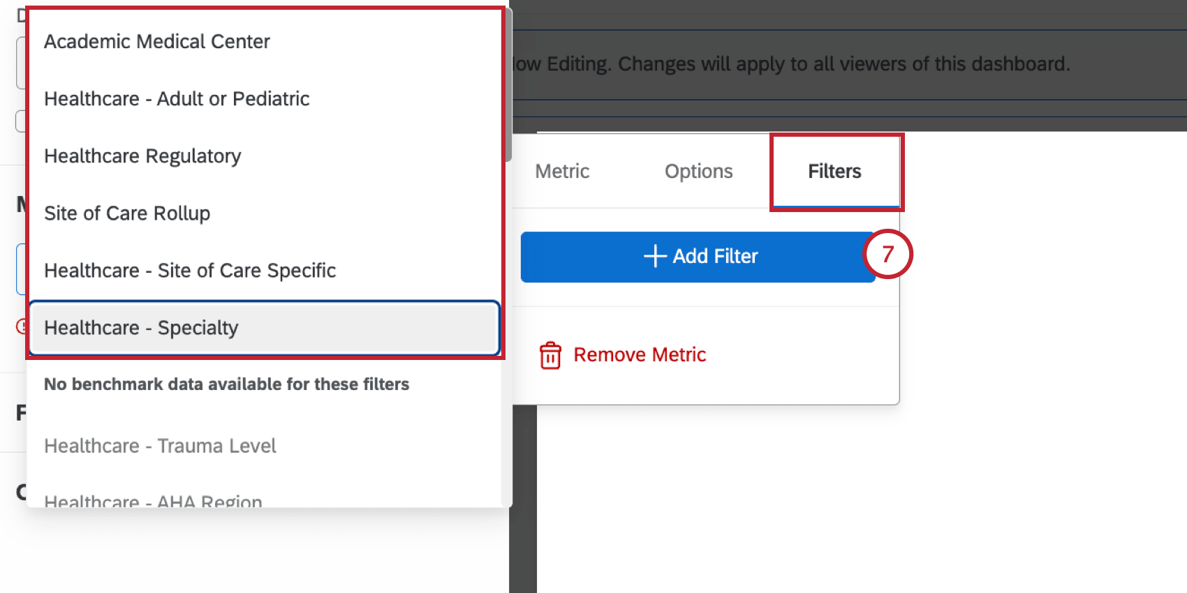
- Go to the Filters tab.
- Under Saved Filters, you’ll see the filter groups you created earlier.
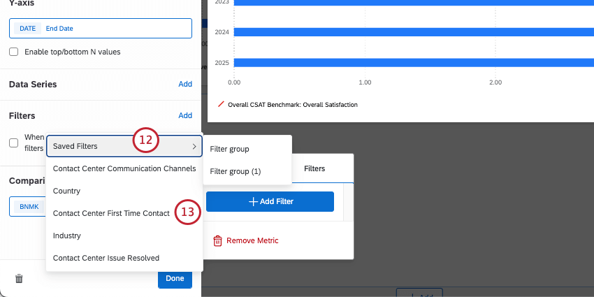
- You can also create new filters as needed.
Qtip: If your benchmarks don’t look right on your widget, check the following:
- Carefully match the widget metric (step 2) with the benchmark metric (step 7).
- Make your recode values are mapped correctly in the dashboard data.
- Make sure your mapped field and the benchmark you chose are mapped on the same scale. For example, if your CSAT is on a 7 point scale, but the benchmark is on a 6 point scale, they are not comparable.
Quick Premade Qualtrics Benchmarks
In addition to being able to create premade benchmarks using Qualtrics data in the benchmark editor, you can also create them directly on widgets like you would other metrics. You can think of this option as “quick premade benchmarks,” because you can easily choose from preset benchmark metrics and filters from right inside a widget.
Quick premade benchmarks have the same industry datasets and filters available as when you create them in the benchmark editor. Quick premade benchmarks are displayed on widgets as additional metrics, not goal lines. For example, on a vertical bar widget, the one-time benchmark would be another vertical bar.
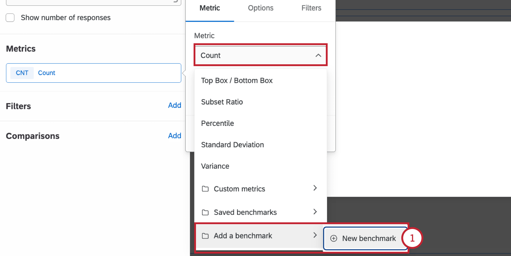
- Add a widget to your dashboard.
- Within the metric section select Add.
- Click on the Metric dropdown and hover over Add a benchmark.
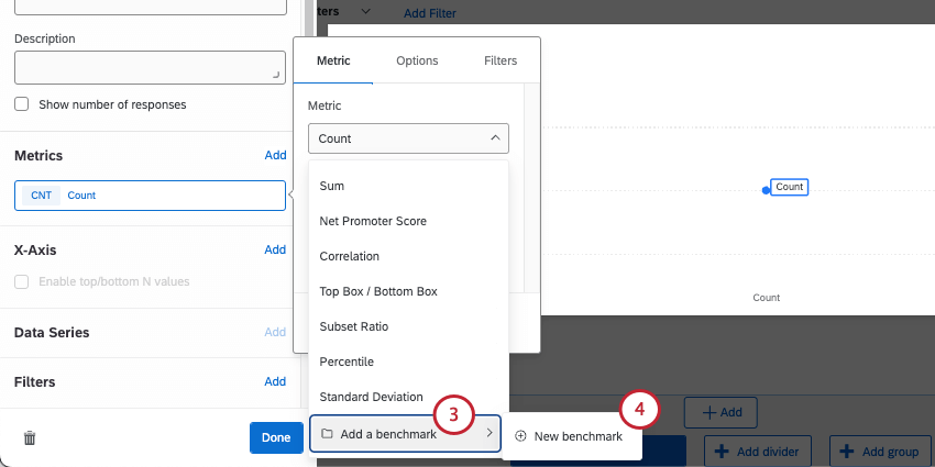
- Click New benchmark.
- Select a benchmark dataset. See a list of premade CX benchmarks.
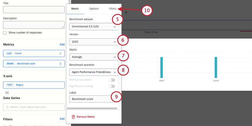
- Select a benchmark version (year data was collected).
- Select a metric. Options will be restricted based on the dataset you chose.
- Select the benchmark question whose data you want to display. Options may vary based on the dataset you chose.
Qtip: Under this field, you might see Use percentile options. For more details, see Setting Up Percentile Benchmarks.
- If desired, edit the benchmark label. This is how the benchmark’s name appears in the widget’s legend.
- Some benchmarks may require filters or have filters available.
You can now finish building your widget, such as adding more metrics for comparison and breakouts (e.g., x-axis, y-axis, or data series).
Filtering Quick Benchmarks
- Set up a quick benchmark in your widget.
- Click on your benchmark metric.
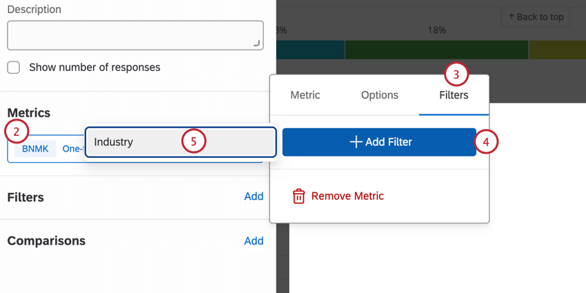
- Select the Filters tab.
- Select Add Filter.
- Choose your desired filter.
One-Time Custom Benchmarks
In addition to being able to create benchmarks in the benchmark editor, you can also create them directly on widgets. These are called “one-time benchmarks.” With this option, you can use a static number to add a goal line to a widget.
The benefit of one-time benchmarks is that they are quick to use. We generally recommend these if you only need to add one or two benchmarks. However, if you need to upload multiple benchmarks at a time or configure custom, reusable filters, it’s usually better to create with the benchmark editor and then display those benchmarks as comparisons.
- Create one of the supported widgets.
- Add a metric that isn’t count.
- You can add breakouts, like data series, x or y axes, as needed.
Example: You break out your data over time, like the “recorded date.”
- Next to Comparisons, click Add.
- Under Comparison Type, select Constant Value.
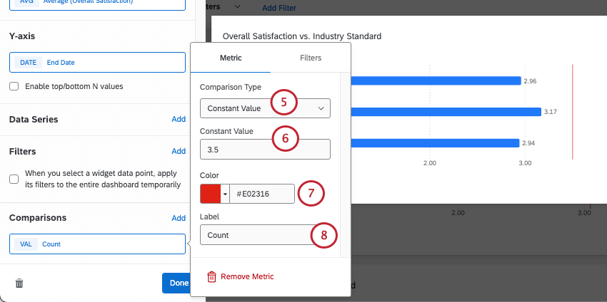
- Under Constant Value, enter your benchmark. Decimals are supported.
- Choose a color for the benchmark line.
- Label the benchmark line. This name will appear in the widget’s legend.
Setting Up Qualtrics Percentile Benchmarks
Percentiles contain a set of 100 values (or buckets) for a particular scoring scale. A value, such as an average, is calculated from the entire benchmark dataset, and then the value is looked up in the percentile list to see what percentile bucket (one of the 100 in the list) it falls in. Thus, percentiles are a great way to show industry rankings.
There are a few extra steps required if you’re setting up a percentile benchmark. These additional steps are the same regardless of whether you’re adding your premade Qualtrics benchmark as a comparison line or your main metric, or reusing a benchmark editor benchmark.
- Metric: For the first metric field, select your existing benchmark, or create a quick benchmark.
- Benchmark Metric: Percentile may be available for multiple metrics offered by the benchmark dataset. We generally recommend using Average.
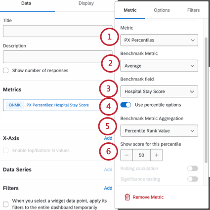
- Benchmark field: Select the field from your own dataset that you’ve mapped (or want to map) to the Qualtrics benchmark.
- Use percentile options: Enable this setting to use percentiles.
- Benchmark metric aggregation: You have two options that change how the benchmark metric is presented in the widget. Both of these options will show you the positive or negative difference between your score and the benchmark, but whether you see the percentile or the percentile’s exact score varies.
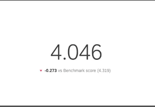
- Percentile rank value: Take a percentile rank and turn it into a number (as in raw score). For example, if you select the 50th percentile, you’d see an exact score from the 50th percentile, like 3.42.
Example: Here’s what this setting looks like in a number chart:
- Convert to percentile rank: Display the percentile rank itself. For example, if you choose the 75th percentile, the widget will mark the score in the correct spot, but label it as the 75th percentile instead of giving an exact score.
- Percentile rank value: Take a percentile rank and turn it into a number (as in raw score). For example, if you select the 50th percentile, you’d see an exact score from the 50th percentile, like 3.42.
- Show score for this percentile: Enter a number from 1-99 to select your percentile.
- Percentile benchmarks require a filter to work properly. Go to the Filters section of your benchmark and click Add Filter. Then, choose the field from the benchmark dataset you’d like to filter by. The exact fields available to you will depend on your selected benchmark and benchmark field.