
Breakdown Bar Widget
What's on this page
About Breakdown Bar Widget
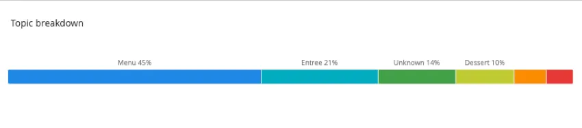
The breakdown bar widget displays data in a single bar where each data point is a proportional section of the bar. This widget is useful if you have data where you would like to have a compact way to look at how responses are distributed over a set of values.
Types of Dashboards
This widget can be used in a few different types of dashboard. This includes:
Field Type Compatibility
The breakdown bar widget is compatible with the following field types:
- Number Set
- Date
- Text Set
- Multi-Answer Text Set
- Drill Down
- Measure Group
Only fields with the above types will be available when setting your Dimension for a breakdown bar.
Widget Customization
For general settings that apply to most widgets, see Building Widgets. Customization unique to the breakdown bar widget will be detailed below.
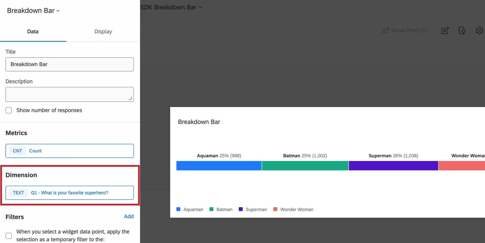
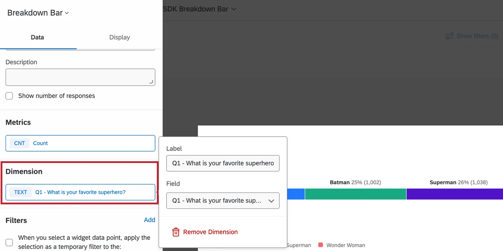
Dimension
The Dimension is the field you would like your metric broken out by. Click the Field dropdown to select a compatible field.
Display Options
The Dimension display options allow you to customize the color and labels of the dimensions you selected above.
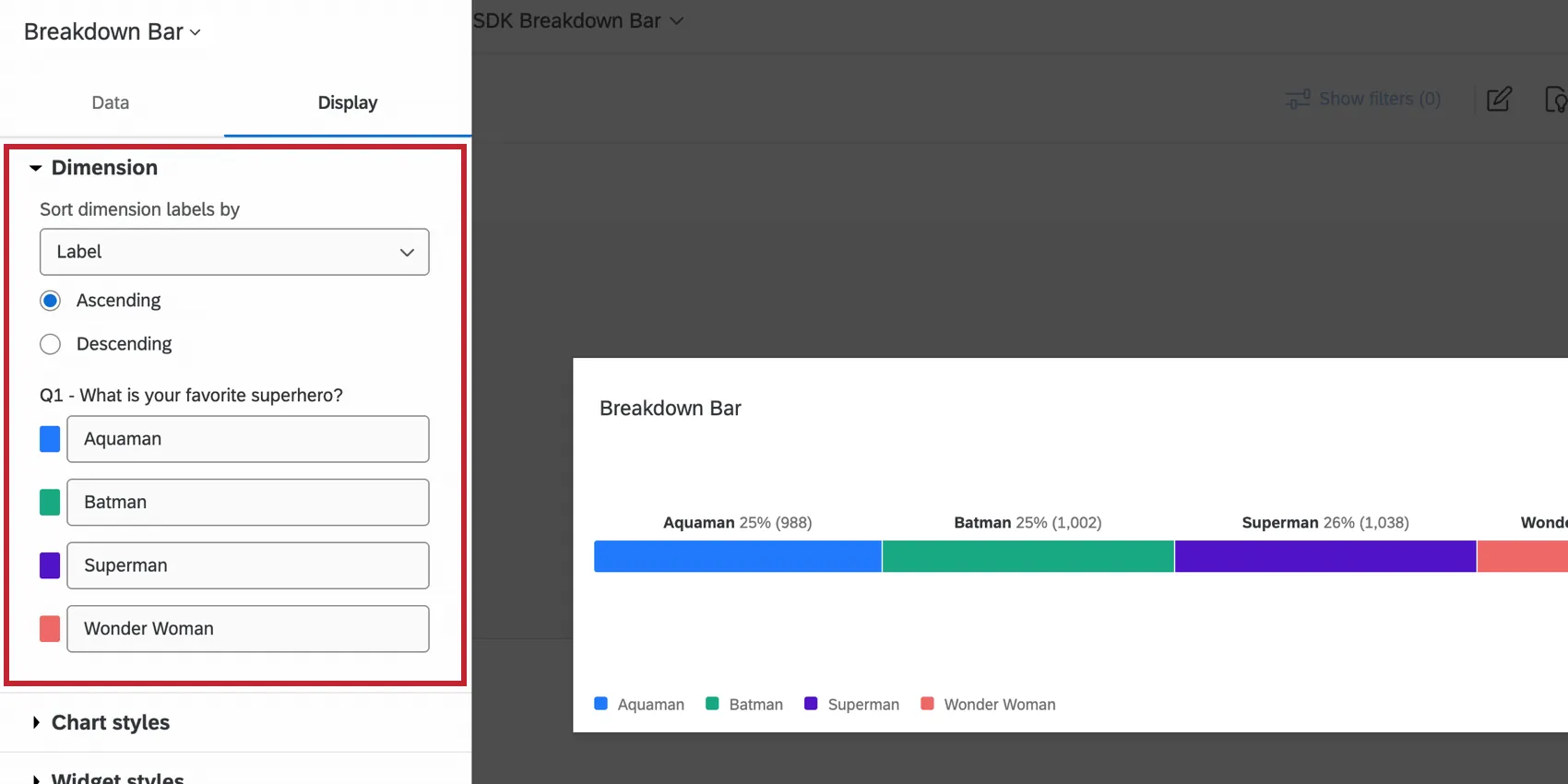
- Sort dimension labels by: Change the order of your data by selecting a sort option from the dropdown menu. If you choose Custom, you will be able to drag and drop the values into whatever order you would like.
- Data names: To rename your chart values, click on the name and type what you would like to see.
- Data colors: Change the colors of your data by clicking the colored box to the left of each label.
The Chart styles options allow you to customize the information displayed on the widget.
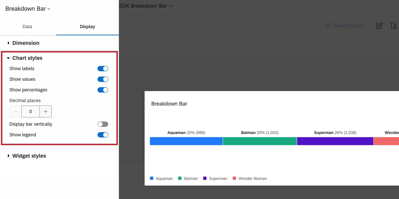
- Show labels: Displays the label of each dimension alongside the value.
- Show values: Displays the value of the metric for each dimension.
- Show percentages: Displays the percentage of the metric for each dimension.
- Decimal places: Displays the percentage of the metric to the decimal place provided.
- Display bar vertically: Displays the breakdown bar vertically instead of horizontally.
- Show legend: Displays the dimension labels along the bottom of the chart.
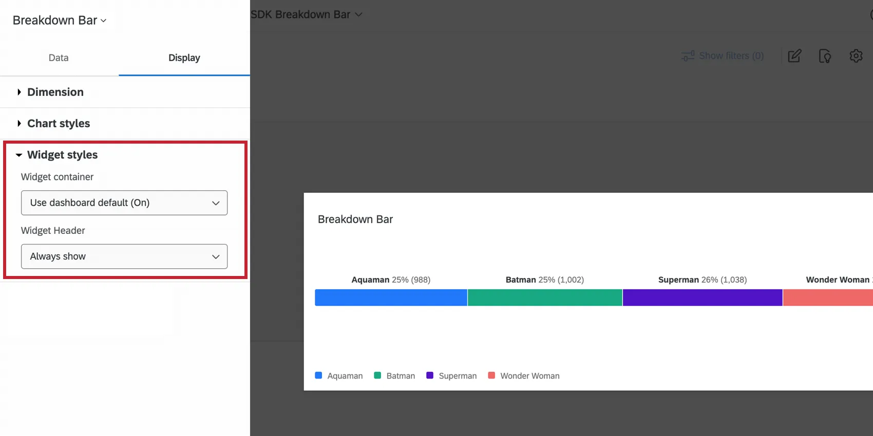
The Widget styles affect whether the widget has a white background or displays its title. These settings can also be edited in the dashboard theme. For more information on configuring widget style, see Editing Widgets.
Legacy Breakdown Bar Widget
Attention: This legacy version of this widget is being deprecated and is no longer supported. Brands created after April 9, 2026 cannot create legacy breakdown bar widgets. For the same functionality with a more flexible setup, use the Breakdown Bar widget.
For general settings that apply to most widgets, see Building Widgets. Customization unique to the breakdown bar widget will be detailed below.
Data Options
Once you’ve added a dimension to your widget, you’ll be able to hide, rename, and reorder the labels on your widget. If you decide to hide certain labels, you’ll have to decide whether you want to include this data when percentages are calculated on the widget. If not, deselect Include hidden labels in percents. If you keep this item selected and hide a label, the breakdown bar’s length will not adjust for the missing bar.
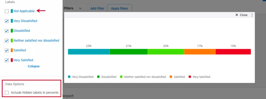
Example: You make a breakdown bar widget displaying satisfaction results (very satisfied, very dissatisfied, etc.). You want to know the percentage of respondents who answered each way. Your question included a “Not Applicable” option you’d like to hide and exclude from the widget’s results. Deselect the “Not Applicable” label and deselect the Include hidden labels in percents option.
Orientation
There are 2 options for the orientation of the breakdown bar widget: horizontal and vertical. Selecting a particular orientation can help you position the widget in relation to the other widgets on your dashboard.
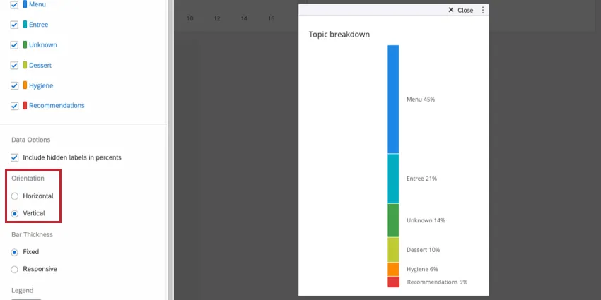
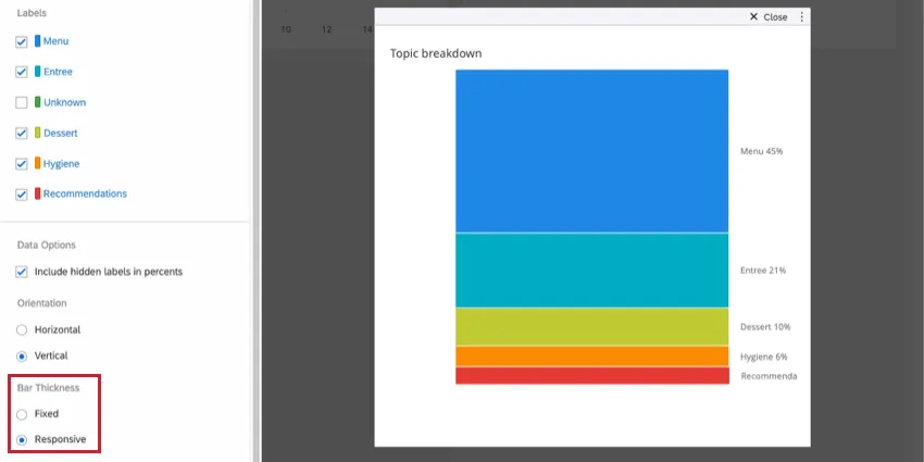
Bar Thickness
You can determine how thick your bar graph is. Fixed results in a lean, thin bar. Responsive results in a bar that gets thicker as you drag and resize the widget. Responsive horizontal bars get thicker as they are made taller, and responsive vertical bars get thicker as they are dragged wider.
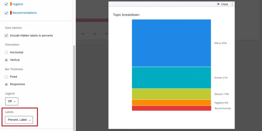
Labels
You can determine what amount of information is displayed in the labels on the colorful areas of the breakdown bar widget:
- Percent: Displays the percentage of responses that fall into a particular segment of the bar.
- Label: Displays the label assigned to each value in the Labels section.
- Count: Displays the number of responses that fall into a particular segment of the bar.
FAQs
How is the Breakdown Bar widget different from a stacked Simple Chart widget?
How is the Breakdown Bar widget different from a stacked Simple Chart widget?
I have multiple datasets on my dashboard. Can I use this feature with all of my widgets?
I have multiple datasets on my dashboard. Can I use this feature with all of my widgets?
- Changing which dataset your widget shows: Not all widgets can have their referenced dataset switched. Some can only use the default dataset. For a compatible list, see this section.
- Showing multiple datasets in the same widget: Not all widgets can show multiple datasets’ results at the same time. For a compatible list, see this section.
That's great! Thank you for your feedback!
Thank you for your feedback!