
Brand Drivers Analysis Widget (BX)
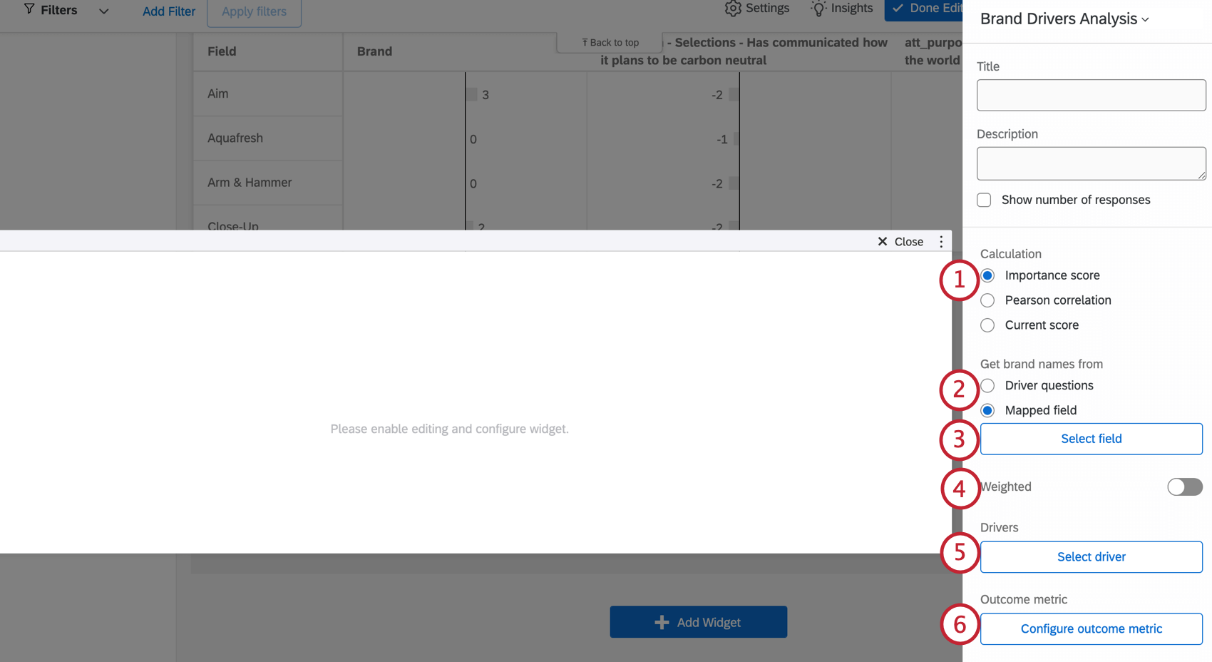
What's on this page
About the Brand Drivers Analysis Widget
Brand drivers analysis can help answer questions such as, “Which of these factors have a bigger impact on the overall brand rating – ‘ease of use’, ‘value for money’ or ‘relevant content’?” The brand drivers analysis widget measures how independent driving variables (drivers) affect key outcome metrics for a brand.
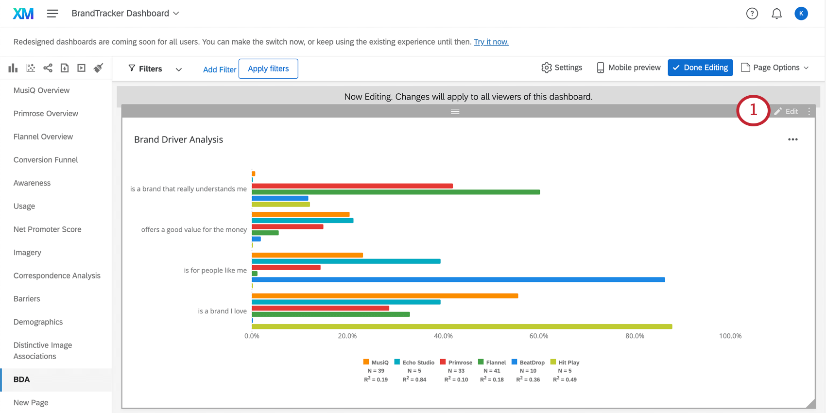
This widget shows the importance of each driver based on the data collected so far. When customizing this widget, you get to decide whether you want to show this analysis for one brand at a time, all brands comparatively, or whether you want to conduct category analysis. Category analysis aggregates the results of all the brands’ results into one, giving you a “global” performance view.
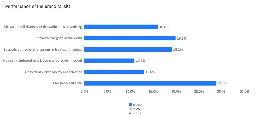
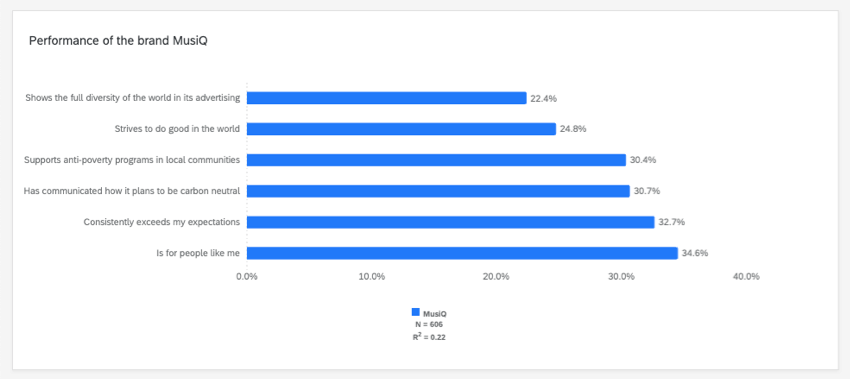
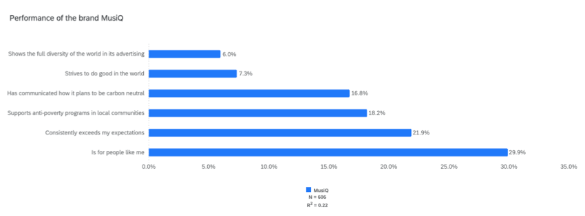
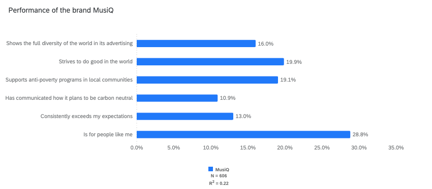
Example: Performance of a single brand.

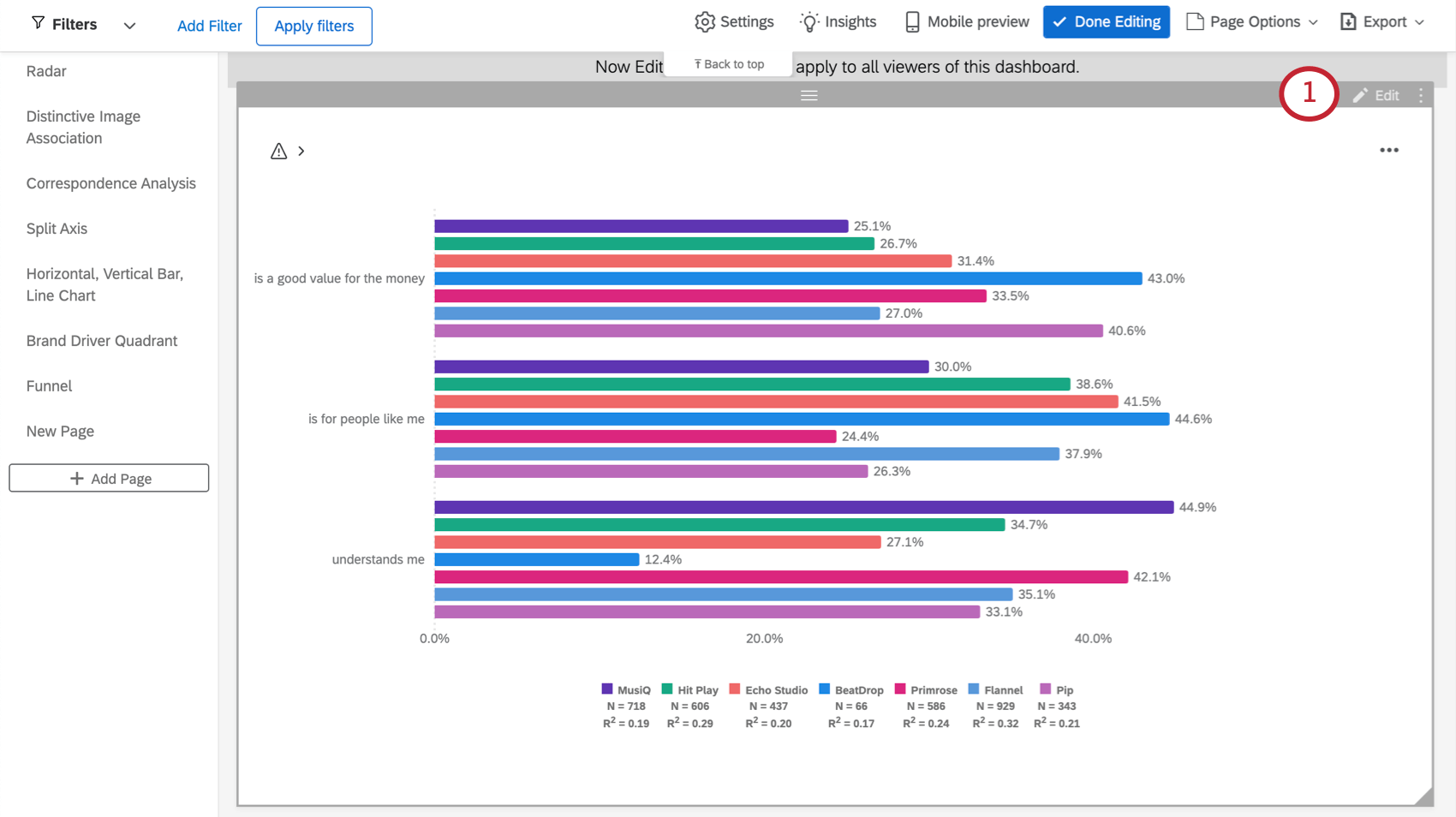
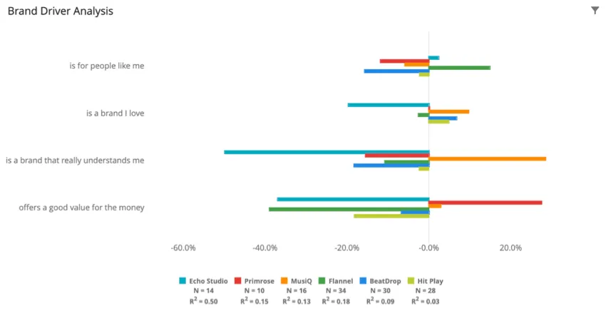
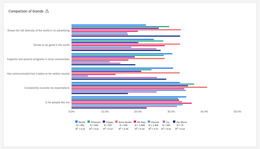
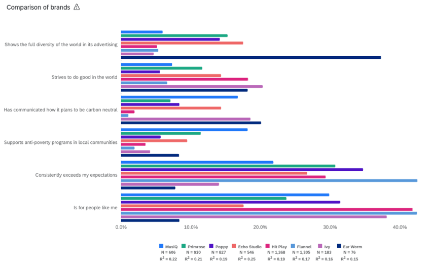
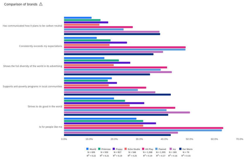
Example: Performance of all brands, comparatively.

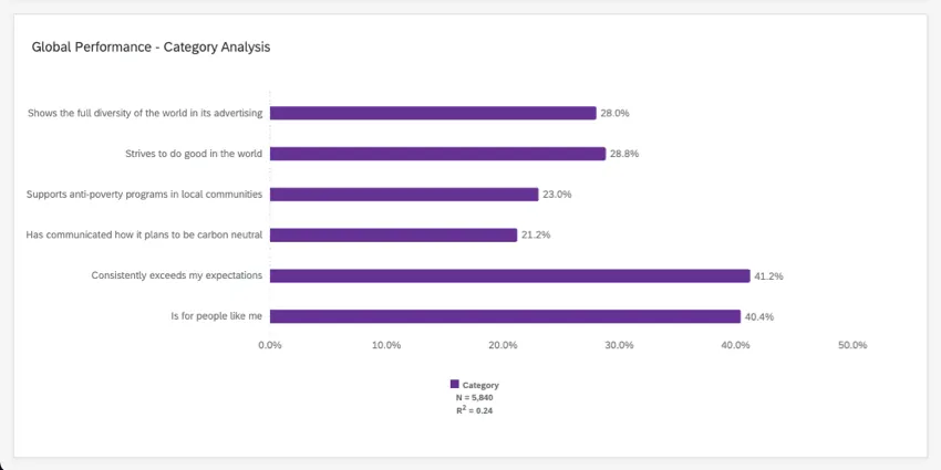
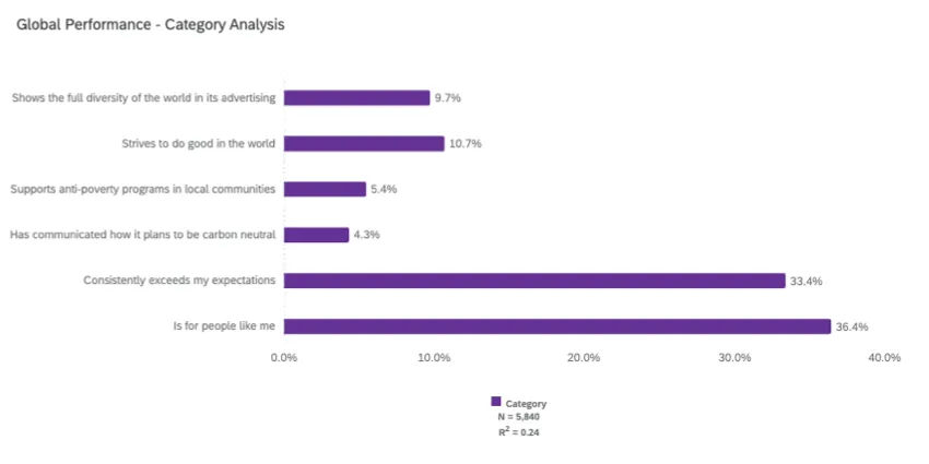
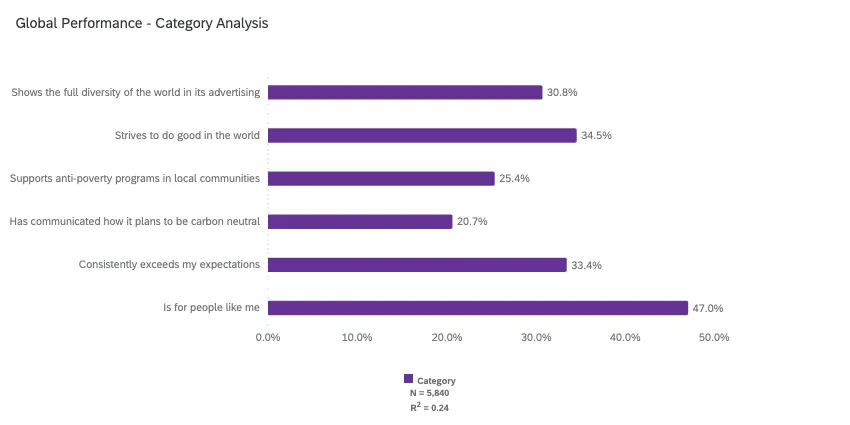
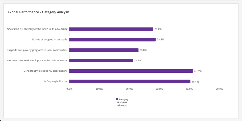
Example: Global performance of all brands, using category analysis.
You can also choose between several different ways of calculating importance. See Understanding Calculations for more on how to understand the results shown in this widget.
Data Requirements for Drivers
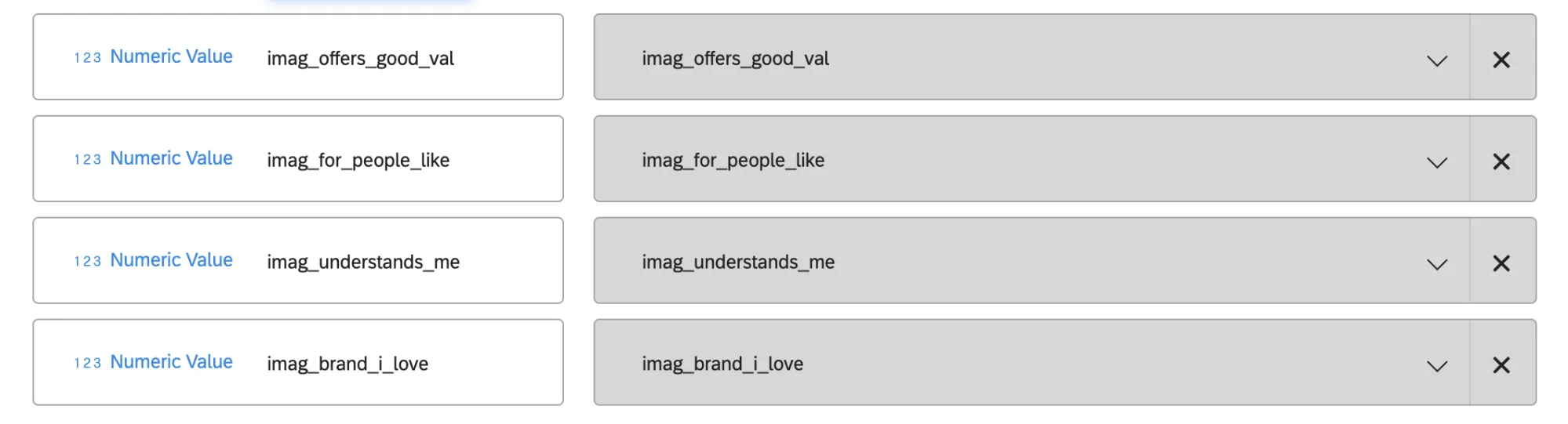
The drivers in this widget are your independent variables. These can be either brand imagery questions or product questions written in a scale format. Product questions can be about reputation, performance, reliability, and more.
Drivers generally come in two different data formats, depending on how your brand tracker survey was set up.
Driver Questions
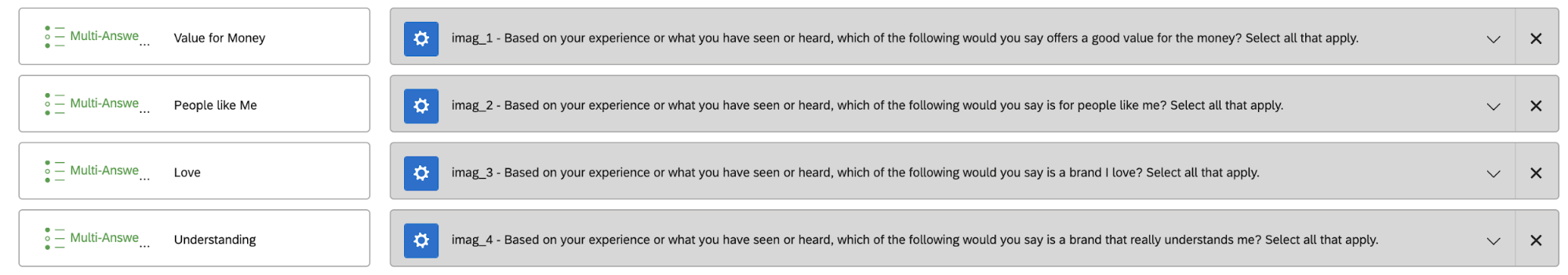
In one format, the brands are the answers to the driver questions.
Example: When asking respondents which of these brands offers a good value for the money, they can select from a list of brands.
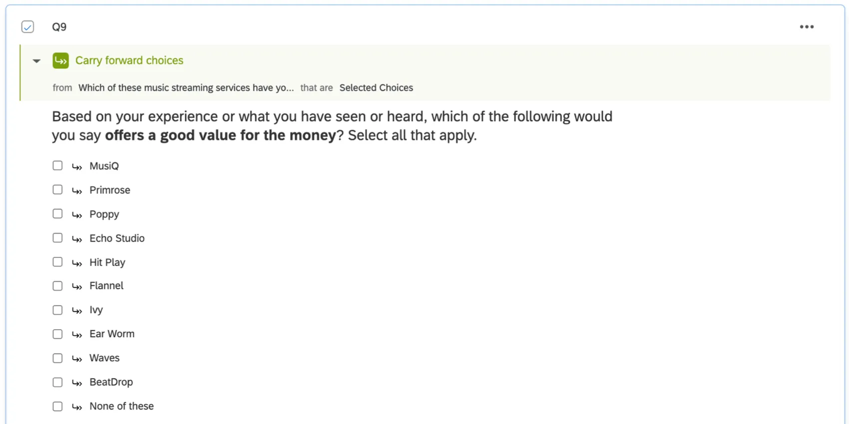
When mapped to your dashboard, these fields should be the Multi-Answer Text Set field type.
Mapped Field
In the second format, the survey’s been set up so that each individual survey response corresponds to the evaluation of only one brand. This means there will be a separate field that identifies which brand is being evaluated.
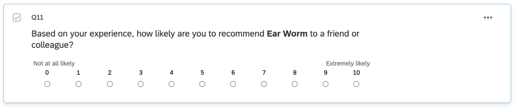
Example: One question, formatted as a scale, asking whether the brand gives a good value for the money or not.
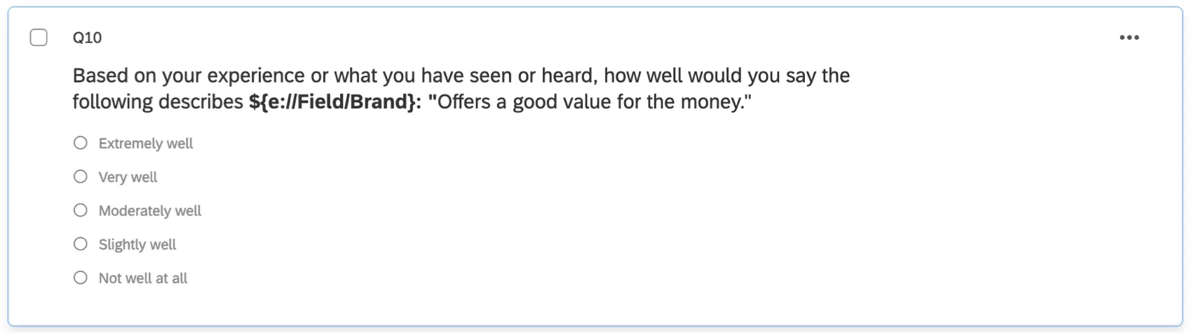
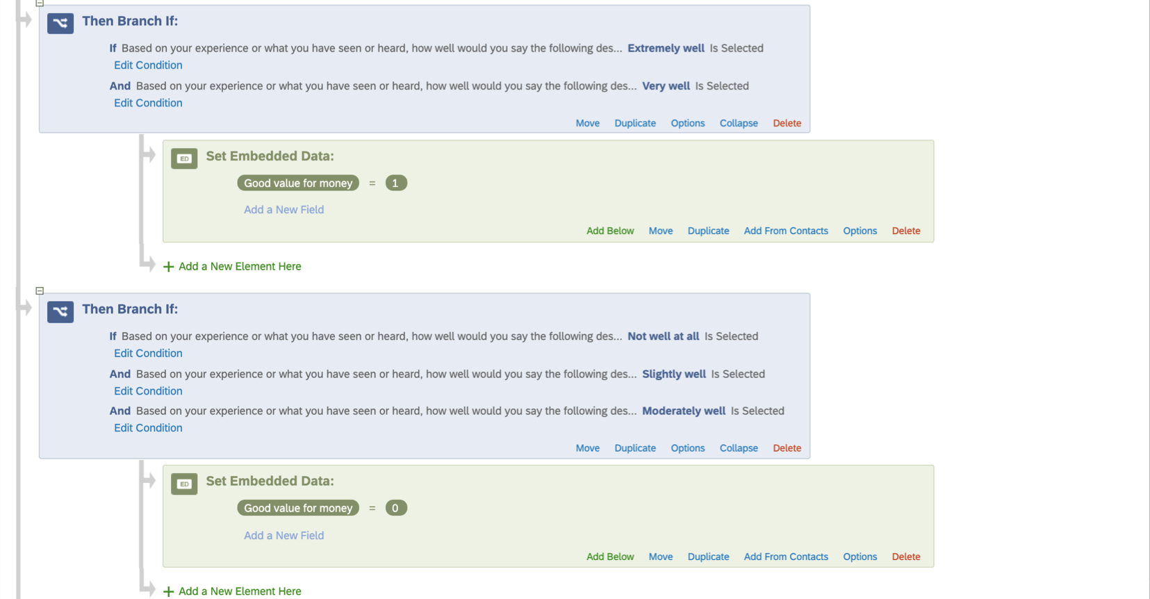
If you’re using this format, there should only be one of each imagery question for all brands. Notice how in the example above, the brand name is piped in to allow the same question to be used for different brands.
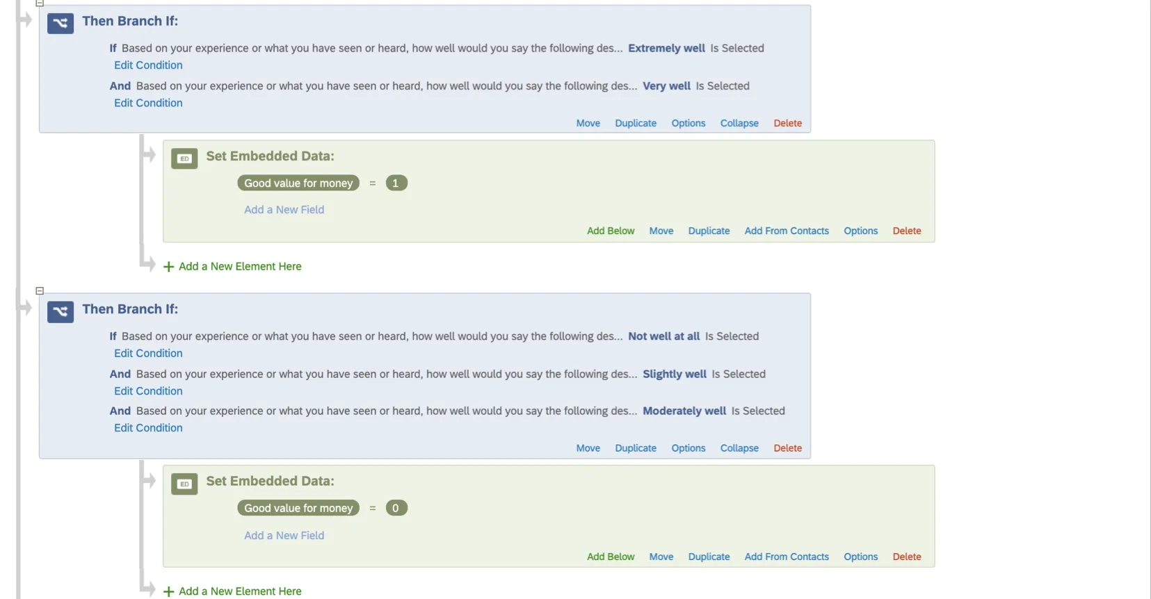
You will also need to have some sort of binary embedded data field prepared before data collection to indicate that a brand either does meet the expectations of the outcome metric (1) or does not (0). This would mean using branch logic to specify which scale points correspond to which values. For more detailed steps, see the Customizing your Survey with Scales subsection.
Qtip: Some fields configured for conversion funnel reporting, such as consideration, may already be formatted this way in your survey.
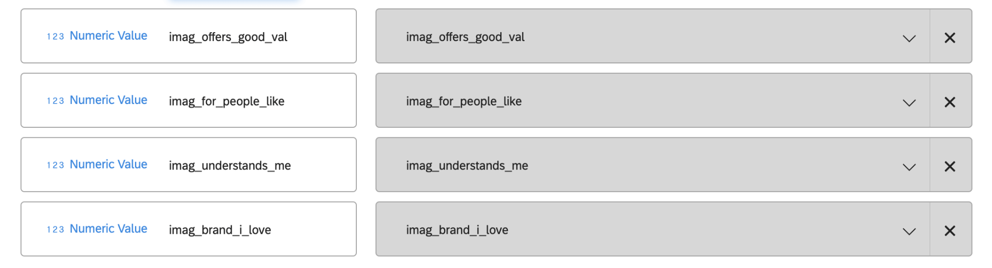
When mapped to your dashboard, the binary embedded data fields should be mapped as the Numeric Value or Number Set field type.
Data Requirements for Outcome Metrics
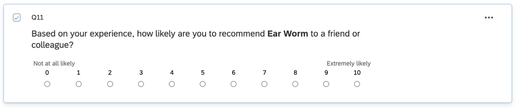
The outcome metric is the dependent variable in your analysis. Outcome metrics should represent some important measure for your brand. This can often include NPS questions, likelihood to recommend, or consideration questions.
The goal is to determine how the drivers affect this metric to give insight into possibilities for improvement.
Qtip: If you want to look at the impact of drivers on multiple outcome metrics, make a separate widget for each outcome metric.
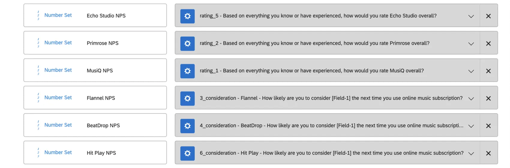
If using Driver questions, outcome metrics need to be mapped to the dashboard as the Number Set field type, because there’s a discrete list of numeric values that can be selected in the question. You should have a separate field for each brand.
Qtip: Your dataset may already have NPS fields mapped together under a field group – however, field groups are not compatible with this widget. You will need to make sure these fields are individually mapped.
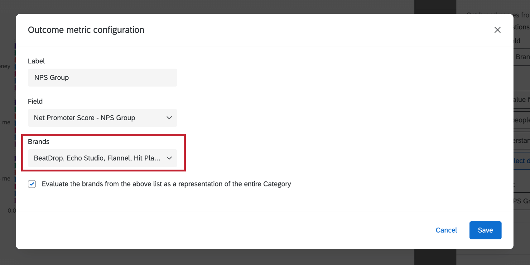
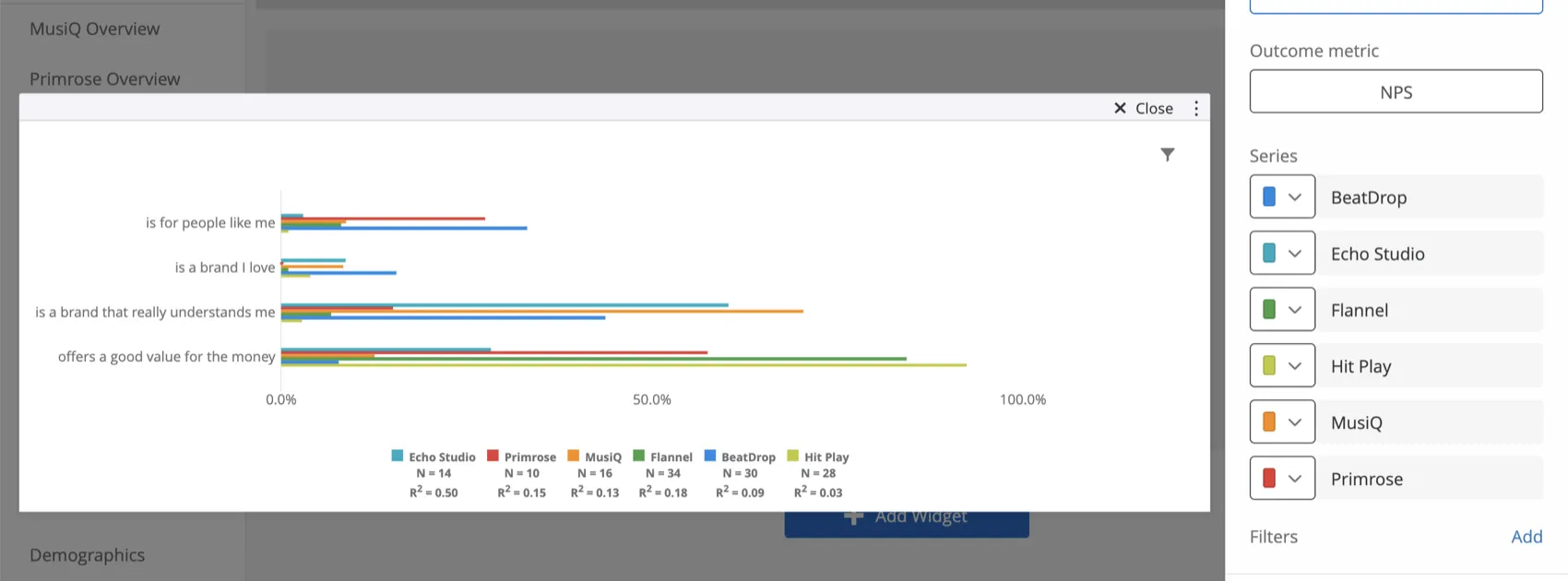
If using Mapped fields, the outcome metric needs to be mapped to the dashboard as the Number Set or Numeric field type. You will have only one outcome metric field for all brands. You also need to map the field where you identify what brand’s being evaluated. This can be any field type, although we recommend Text Set.


Widget Setup
Configuring the Outcome Metric for Driver Questions
Read these steps if you indicated that you would “Get brand names from” “Driver questions.”
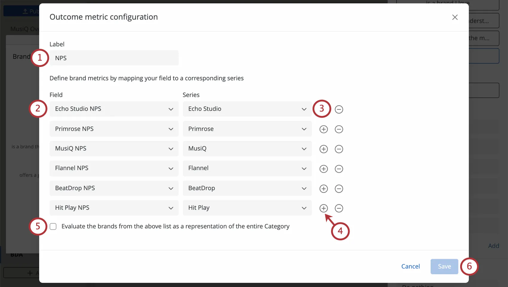
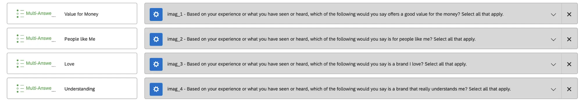
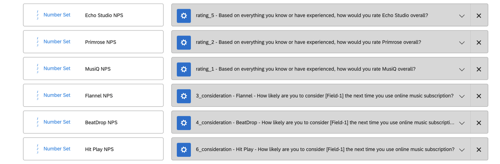
Qtip: Look carefully at the screenshot. Notice how for each field added (e.g., “MusiQ NPS”) the corresponding series (“MusiQ”) has the same brand name listed.
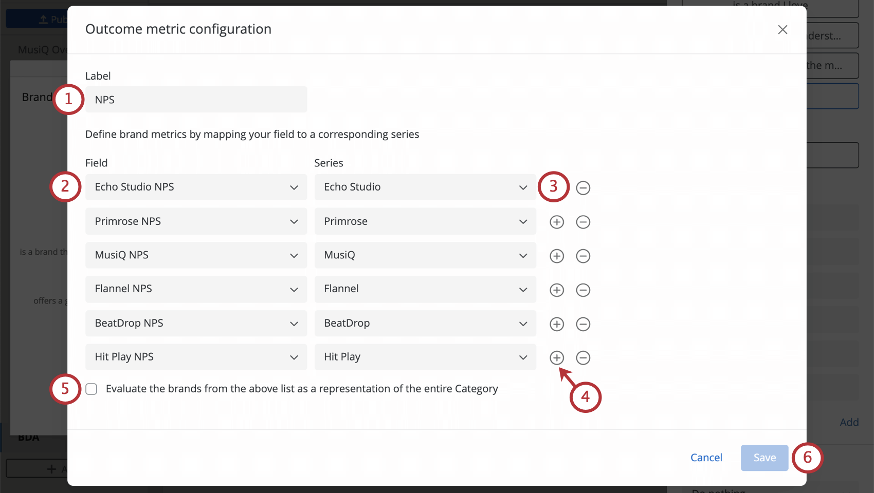
Example: Here is a widget with category analysis enabled. Instead of seeing individual brands’ importance scores, you see the scores for all of the brands aggregated into a single category together. For example, because we are studying music streaming apps, we could title this widget “Brand Analysis for Music Streaming Services.”

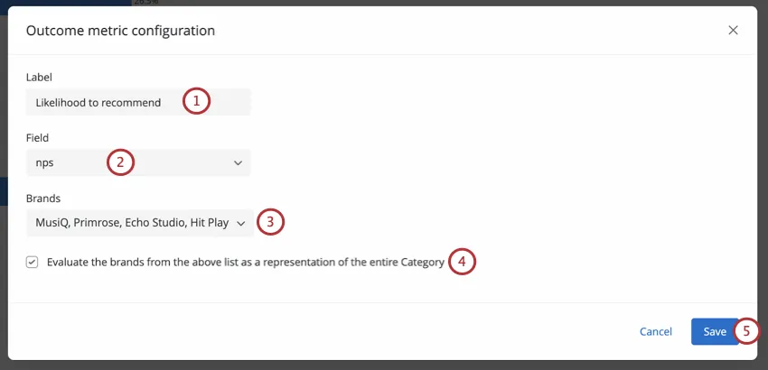
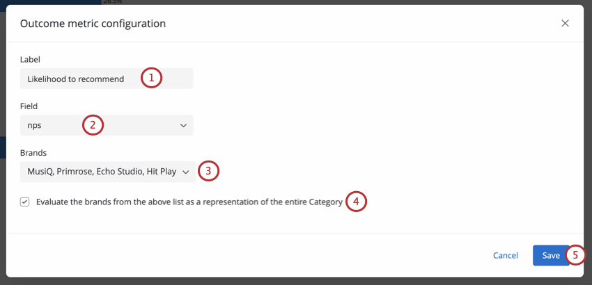
Configuring the Outcome Metric for a Mapped Field
Read these steps if you indicated that you would “Get brand names from” a “Mapped field.”
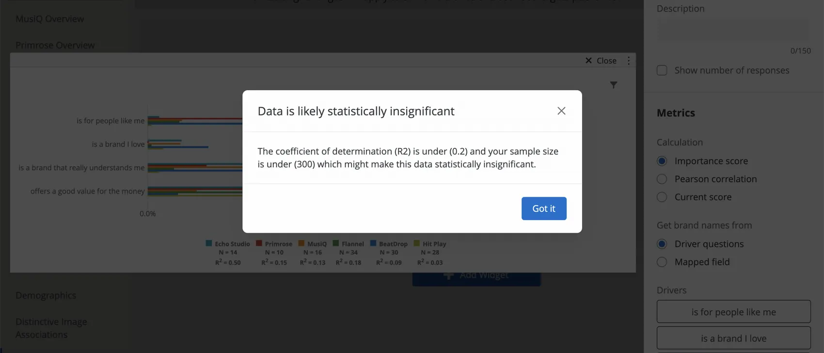
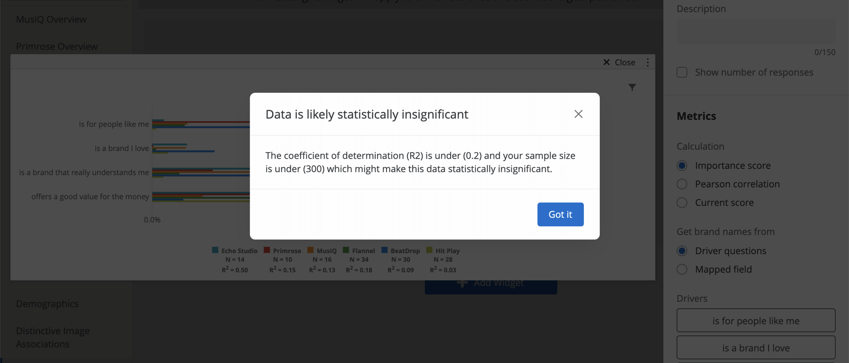
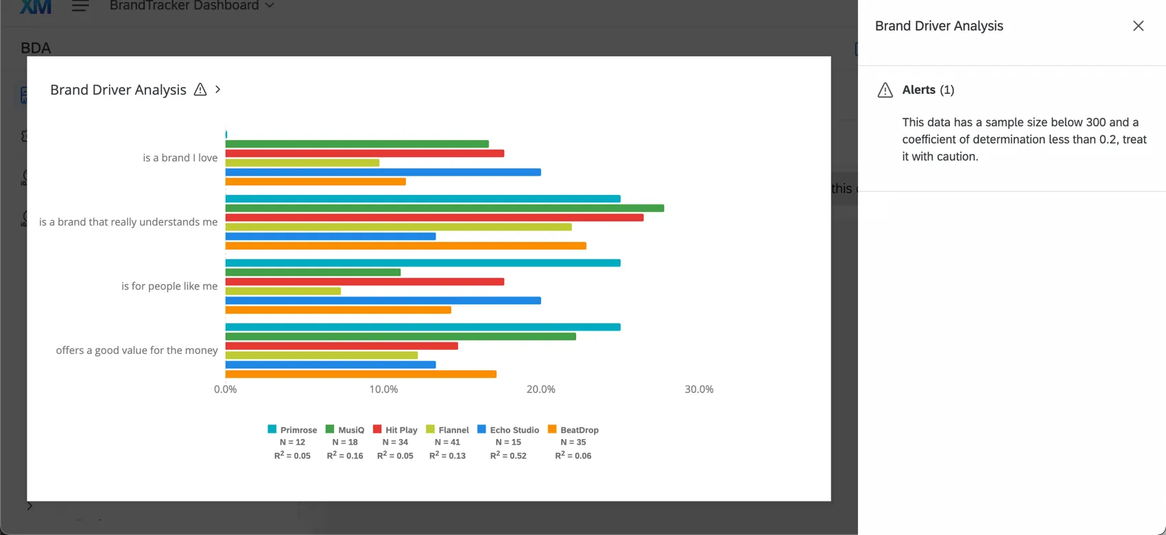
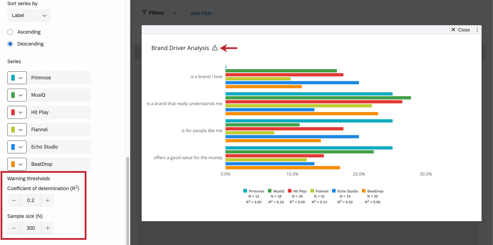
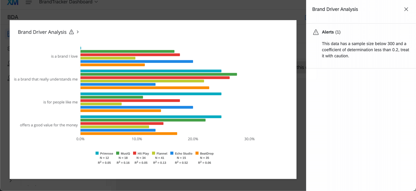
Qtip: Your widget will tell you that your results may be insignificant if your coefficient of determination (R2) is under 0.2 and the sample size is under 300 responses. Keep this in mind before making decisions based off the widget’s results. This warning applies regardless of the way you configured your widget (calculation chosen, drivers format, etc.).
Sorting Drivers and Brands
You can change the order that drivers or brands appear in your widget. This allows you to highlight which drivers are the strongest / weakest at a glance and establish dashboard consistency.
When choosing how to sort the drivers in your widget, you have two options: by importance score, or a custom order of drivers that you choose.
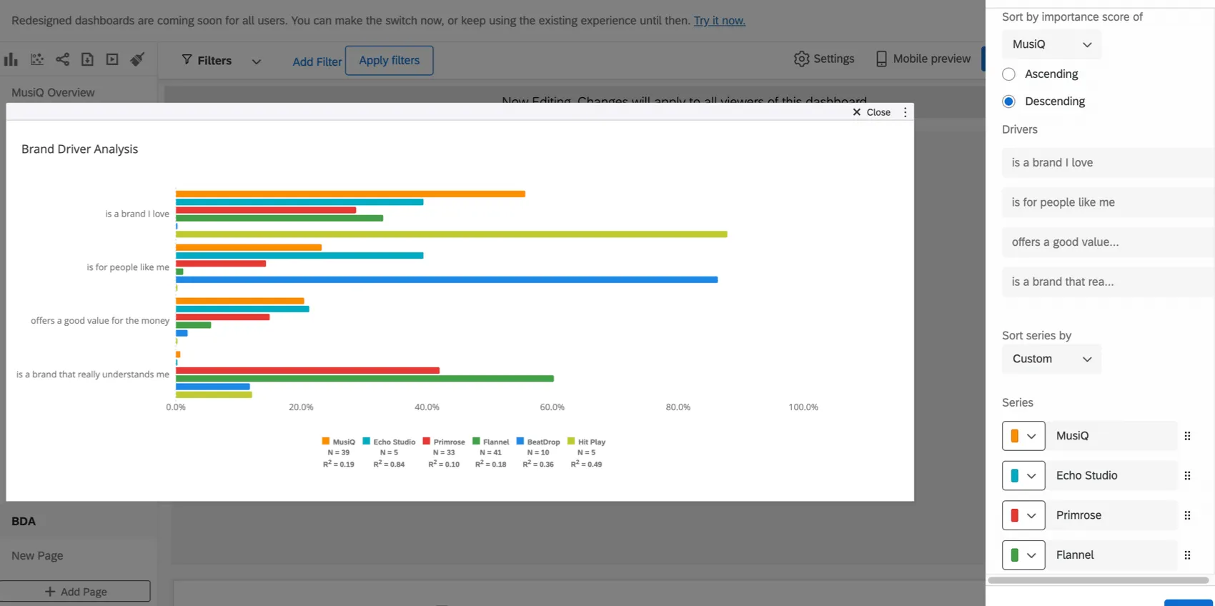
Sorting drivers by importance score
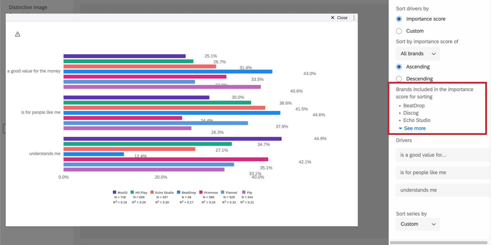
You can sort drivers by the importance score of all brands, selected brands, or individual brands. Widgets with category analysis can be sorted by the category’s importance score.
Qtip: Learn more about how importance scores are calculated under Calculation and Relative Importance. For more details on category analysis, see Widget Setup.
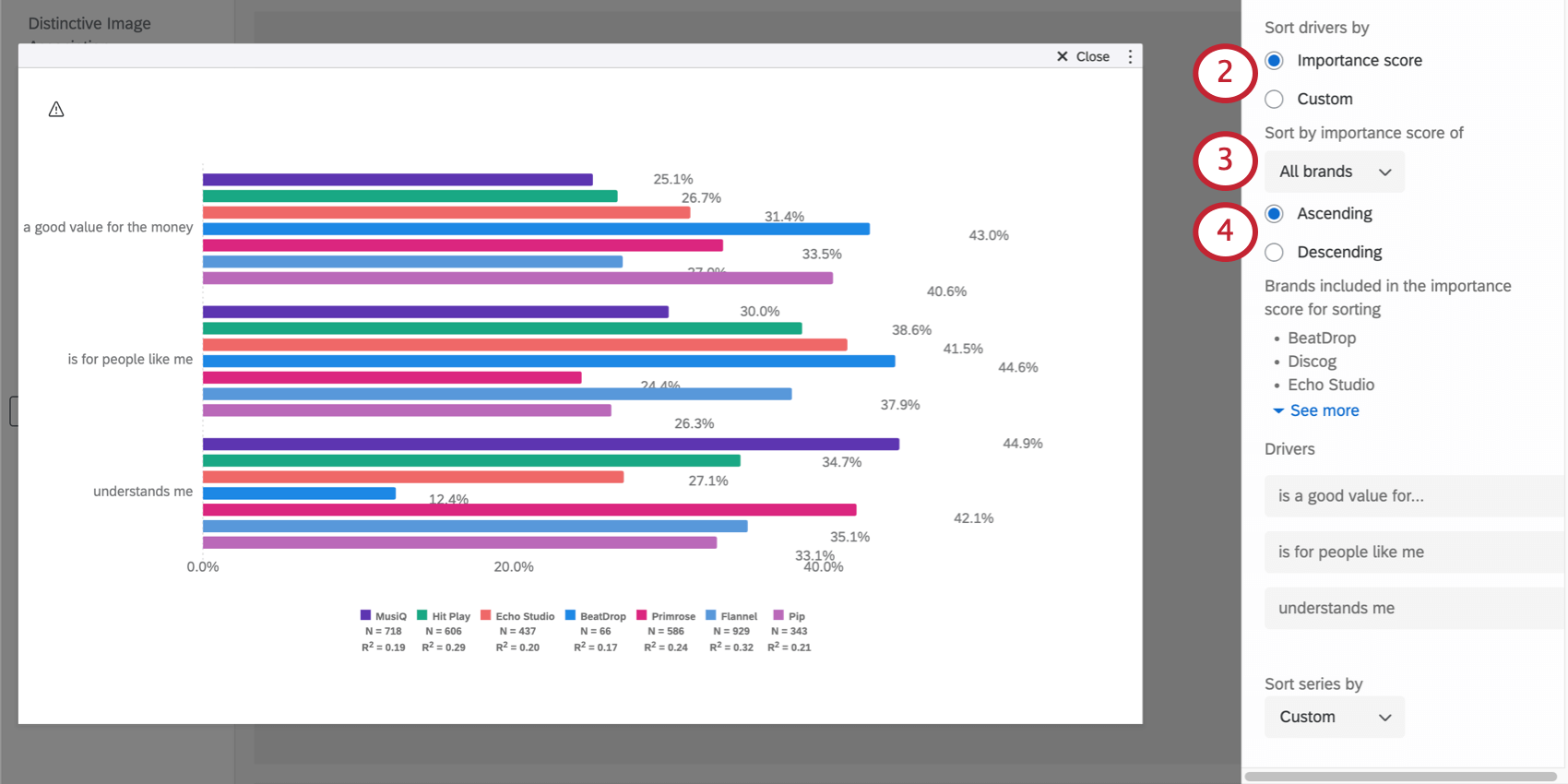
- All brands: While setting up an outcome metric, you can exclude certain brands. If you choose “all brands,” then all brands’ importance scores will be aggregated for each driver and used to sort the drivers, even if certain brands were excluded from the widget’s setup.
- Selected brands: The brands you chose in the outcome metrics configuration modal to include in the widget’s analysis will have their importance scores aggregated for each driver. Then the drivers will be sorted by these aggregated importance scores. Qtip: Outcome metrics can be based on driver questions or a mapped field. Basing an importance score on “Selected brands” is only available if your outcome metric is based on a mapped field. See below the field where these brands are selected:


- Individual brands: Select a specific brand whose importance score you’d like to sort by. Example: Our brand is named MusiQ. All the others are competitors we want to compare against. We decide to sort the widget by MusiQ’s importance score.

Qtip: If you’re unsure which brands are included in importance score sorting, the widget will list them.

Sorting drivers by custom order
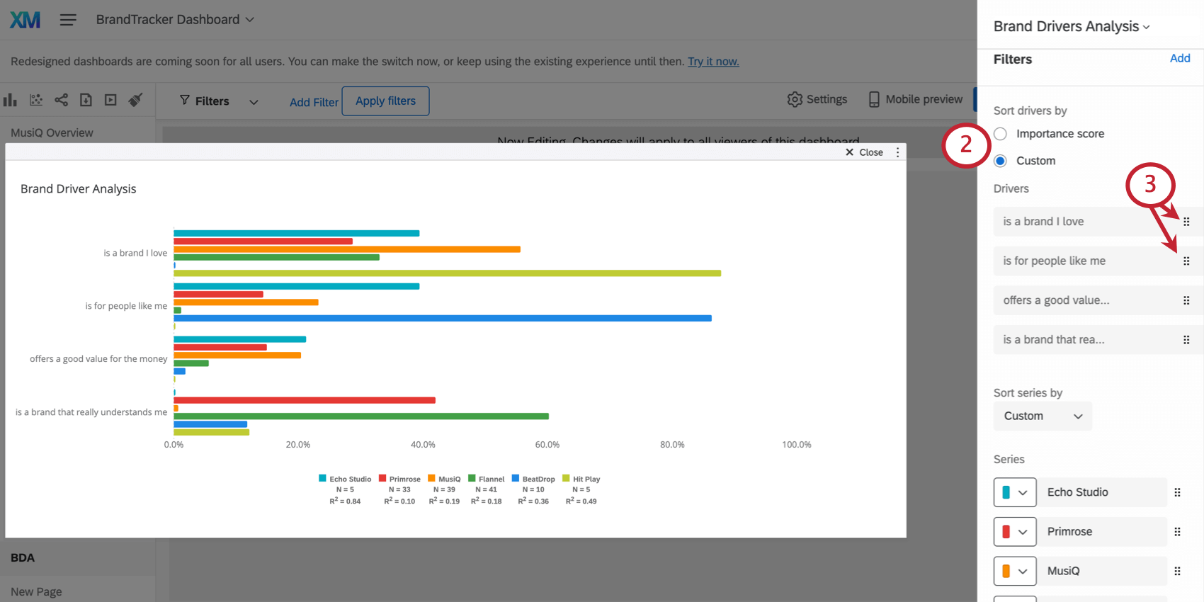
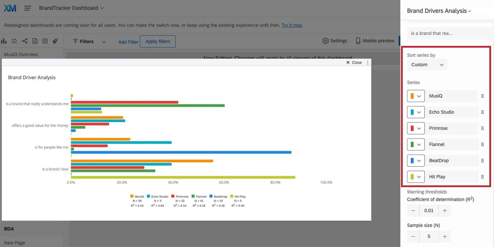
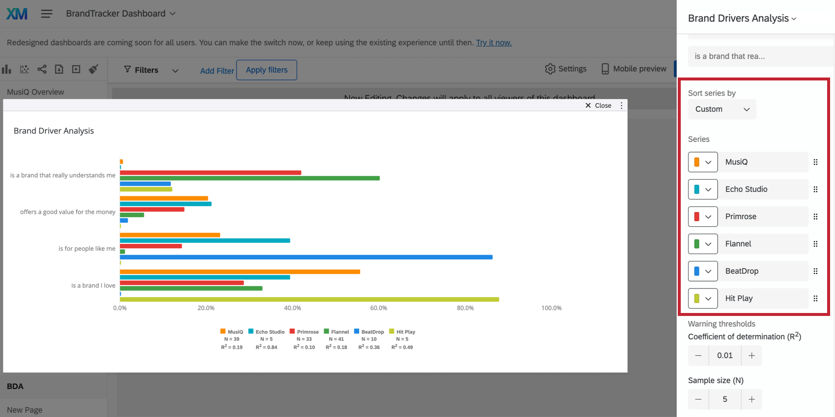
Sorting brands
Brands, also called series in the widget, can only be sorted in custom order. Click the dots to drag and drop brands into whatever order you want.
Qtip: If you choose to sort your widget’s drivers by brand performance, we also recommend adjusting your series sorting, described above. For example, if you want to sort by how your brand MusiQ performed on drivers, you may want to make MusiQ the first brand listed next to each of your drivers.
Widget Customization
Changing Brand Colors and Names
You can adjust the color and name associated with each brand under the Series list.
Warning thresholds
If results are statistically insignificant, you’ll want to take that into account before making decisions based on what you see in the widget. Therefore, it’s possible to add a warning that will appear on your widget when responses aren’t within a particular statistical range.
The coefficient of determination (R2) is set to 0.2 by default. The sample size (N) is set to 300. You can adjust these as needed.
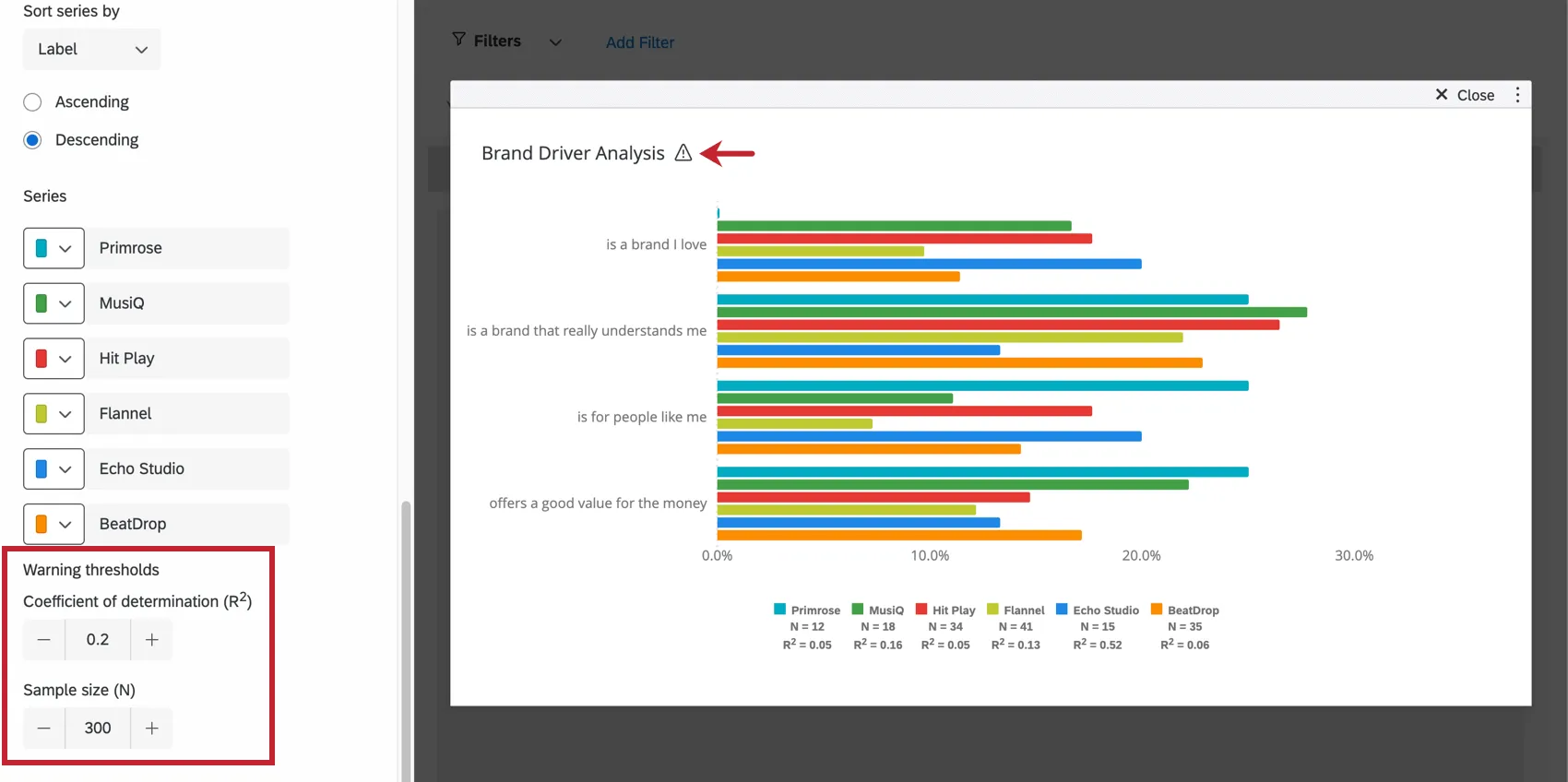
When you click the warning icon on the widget in the dashboard, it will elaborate on the warning.
Understanding Calculations
Driver analysis is conducted using Relative Weights Analysis to establish the relationship between the dependent and independent variables. Relative Weights Analysis not only handles high multicollinearity among predictors, but also calculates importance ranking and overall impact for each attribute.
Learn more about the different types of calculations you can perform on this widget below.
Qtip: The examples in each section are using the same dataset so you can see a comparison of the different calculations.
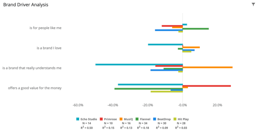
Importance Score
Importance score represents the relative weight of a particular driver on the key outcome metric. This shows how important each driver is to the key metric in question in relation to one another. The value will be between 0 and 1. The closer to 1 (the higher the percentage), the more that driver affected the key metric in your study.
See more about Relative Importance.
Example: This widgets shows one brand’s importance score for different drivers.

Example: This widgets shows the importance scores for different drivers for many different brands.
Example: This widgets shows the importance score for different drivers once all the brands in question are aggregated with category analysis.
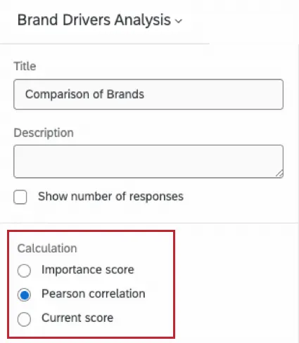
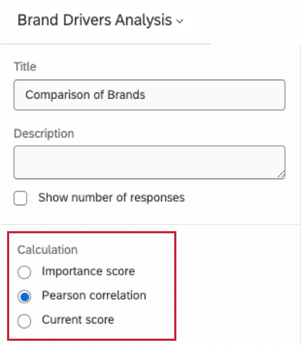
Pearson Correlation
The correlation score is the Pearson correlation coefficient between each driver and the key outcome metric. This is a value between -1 and +1, where -1 means there is a negative linear correlation and +1 means there is a positive linear correlation.
Example: This widgets shows importance of one brand’s drivers according to the Pearson correlation.

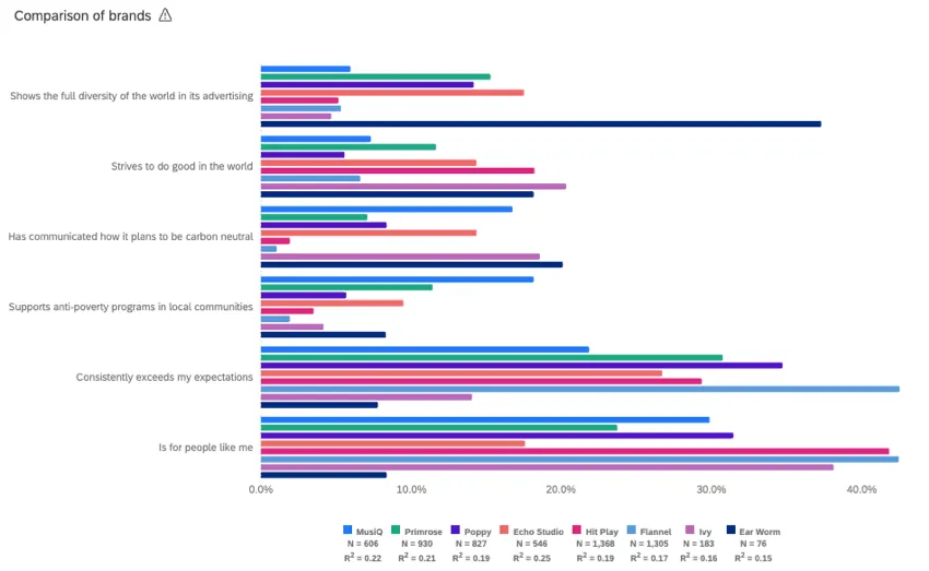
Example: This widgets shows importance of many brands’ drivers according to the Pearson correlation.

Example: This widgets shows importance of many aggregated brands’ drivers according to the Pearson correlation. These brands were aggregated with category analysis.

Current Score
The current score represents the current value of the driver over the key outcome metric’s dataset. This is computed by performing an average calculation of the driver field over the responses that answered the key metric question. Since driver fields are binary (0 or 1), this value will be between 0 and 1.
Example: This widgets shows one brand’s current score for different drivers.
Example: This widgets shows the current scores for different drivers for many different brands.

Example: This widgets shows the current score for different drivers once all the brands in question are aggregated with category analysis.
Data Freshness
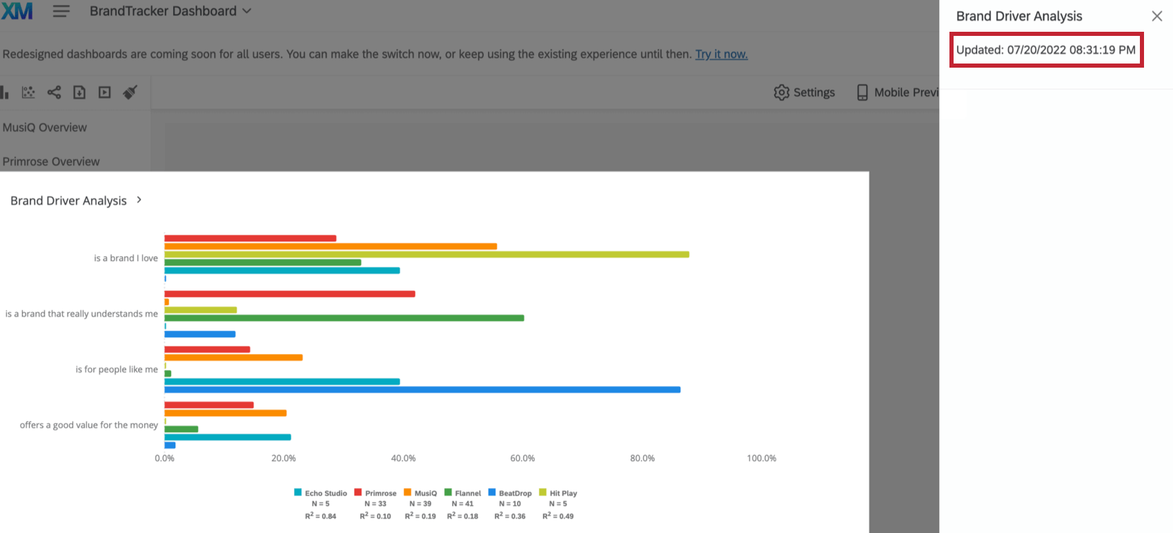
Click the widget title to view when the widget data was last updated.

Additional Options
Click on the three horizontal dots in the top-right corner of your widget to view additional options.
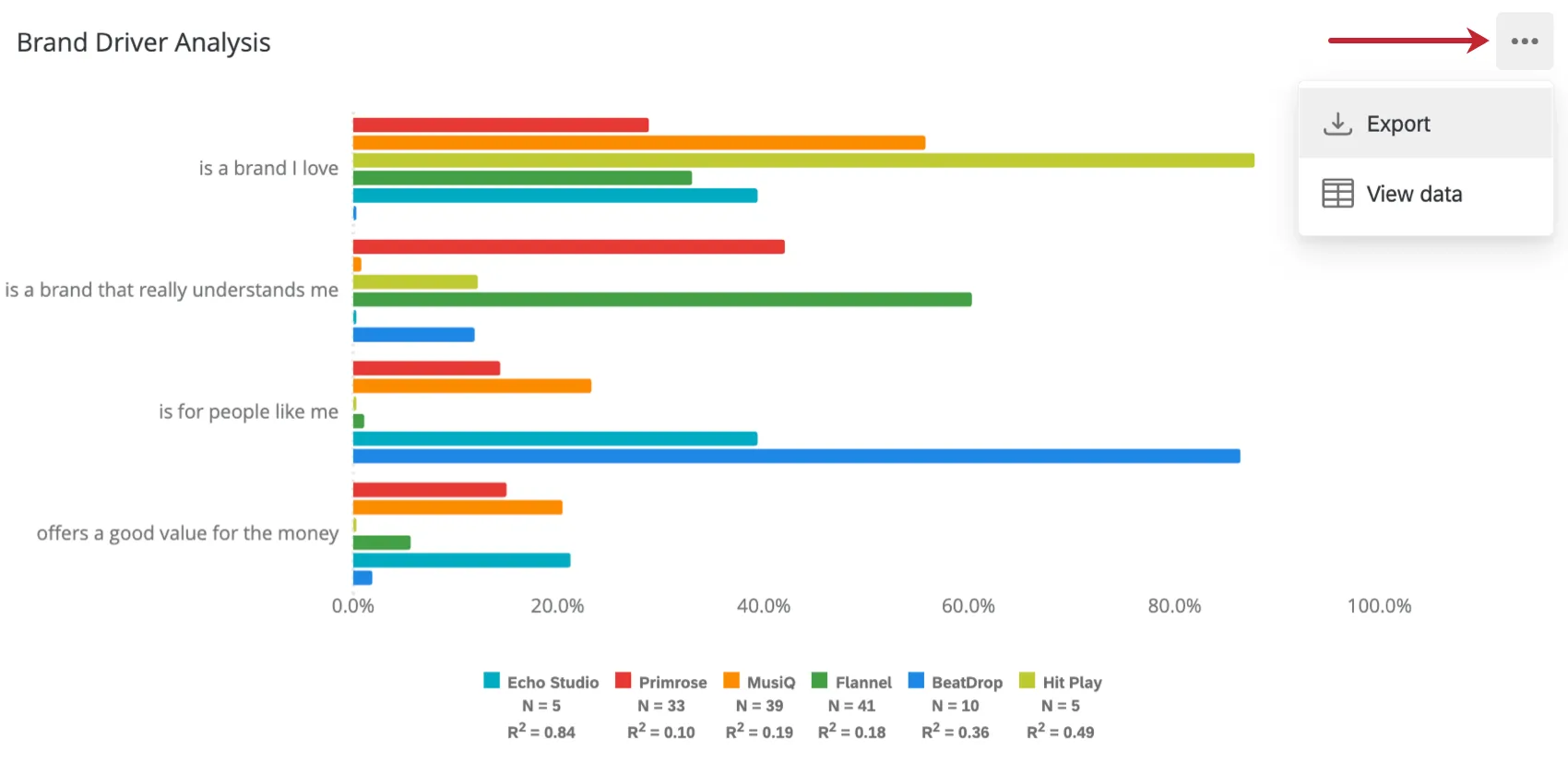
- Export: Export your widget as a JPG, PDF, CSV, or TSV.
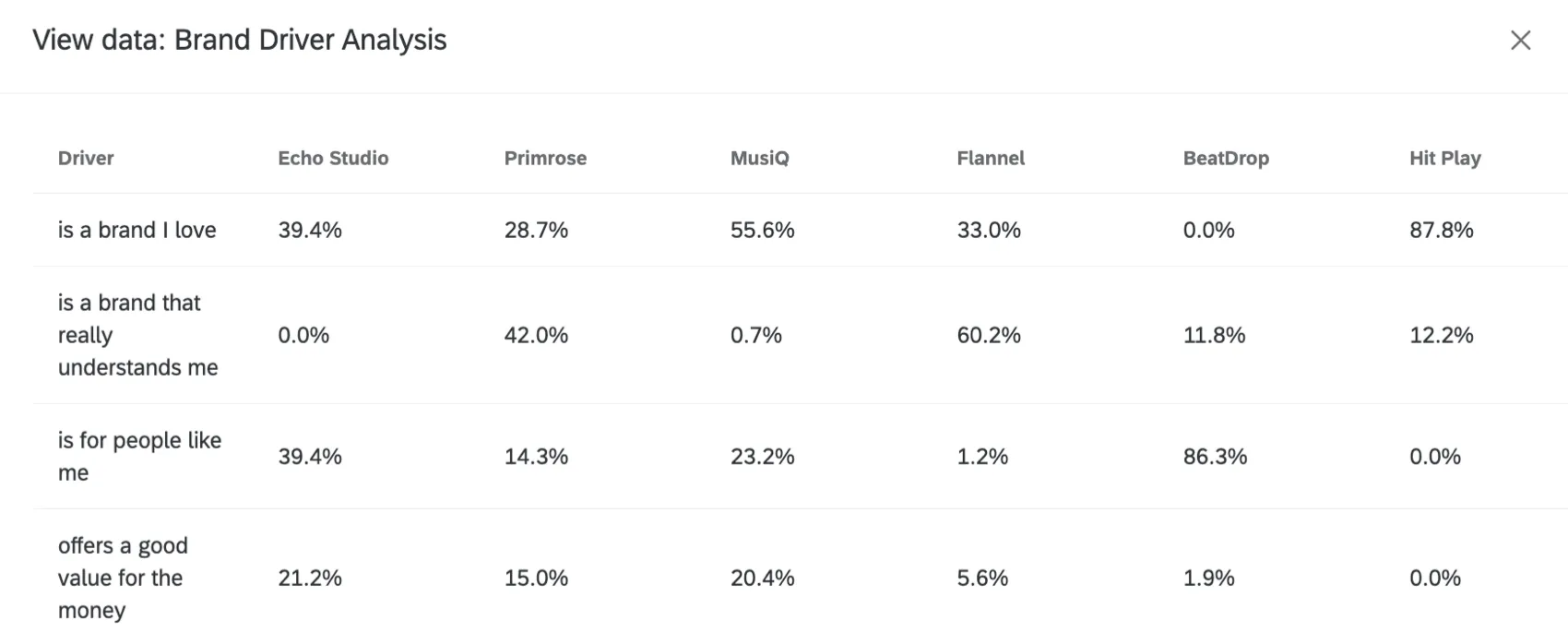
- View data: View a table containing the data for all drivers in the widget.

FAQs
How do custom metric filters interact with page filters in BX dashboards?
How do custom metric filters interact with page filters in BX dashboards?
That's great! Thank you for your feedback!
Thank you for your feedback!