-

Qualtrics Platform -

Customer Journey Optimizer -

XM Discover -

Qualtrics Social Connect
Conversion Funnel Reporting (BX)
Common Funnel Reporting
Conversion funnels, also called brand funnels, display the proportion of people that have different levels of interaction with a brand. These funnel levels are based on questions in the survey that the respondent answered about each brand. Common funnel questions include:
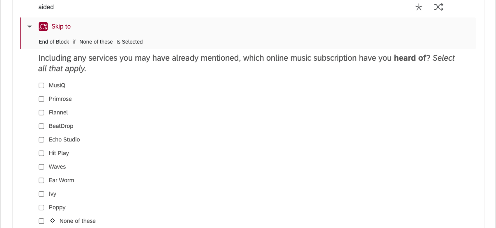
- Aided/Prompted Awareness: Which of these brands have you heard of?
- Consideration: How likely are you to consider this brand the next time you buy?
- Regular Usage: Which of these brands do you regularly use?
- Subscription: Do you have a contract with or subscribe to any of the following of these brands?
- Future/Purchase Intent: How likely are you to purchase [brand] next time you buy?
- Preference: Which of the following brands are you most likely to purchase?
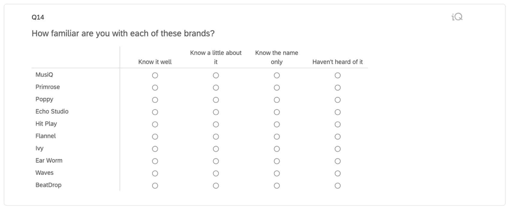
Funnels should only have about 3-5 levels, and they should be ordered logically, from the broadest group to the narrowest. For example, Awareness => Consideration => Regular Usage => Subscription. Each level logically proceeds to the next, with Awareness as the group with the most people, and Subscription as the smallest.
Auto-Generated Content by Brand Tracker Type
The setup assistant in the Brand Tracker project creates the following for the default funnel levels:
- Questions
- Embedded data fields
- Data mappings
- Custom metrics
- Widgets
These are the specific funnel levels included by default, by type of Brand Tracker project:
- Online Subscription Services: Awareness => Consideration => Regular Use => Subscription
- Consumer Packaged Goods Brand Tracker: Awareness => Consideration => Regular Use
Recommended Widgets for Funnel Reporting
In this section we’ll go over the recommended widgets for funnel reporting, and how these widgets add value to a dashboard. We’ll go over the step-by-step details of how to set them up later in the page, after we perfect the survey and dashboard data requirements.
For Funnel Levels
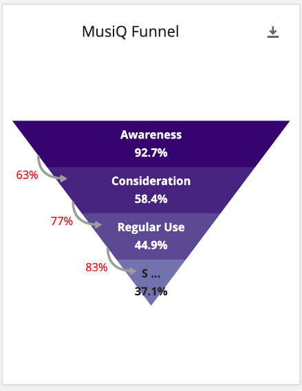
The funnel widget shows the levels of the funnel for a single brand. We see the number of respondents who select the brand for each level divided by the total number of responses. For example, 92.7% of all respondents answered that they were aware of the brand in the above image. This metric can help you understand how your brand is doing in their overall marketplace.
In addition, the chart shows the “conversion ratio”, or the percent of people who pass from one level to the next.
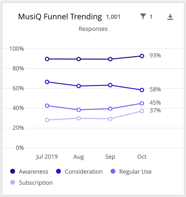
For Trending Charts
Simple charts (formatted as line charts) can be used to show the trends of actual funnel percentages and conversion rates. From this, you can monitor how your funnel levels and conversion ratios are doing over time.
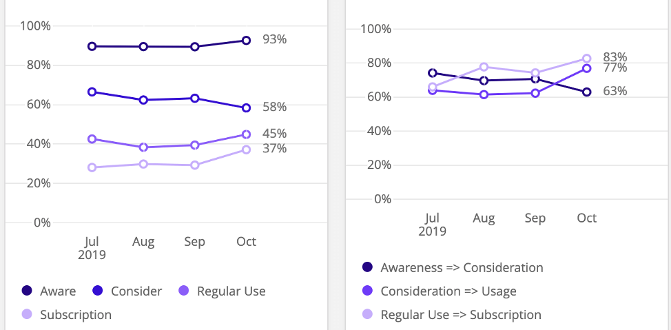
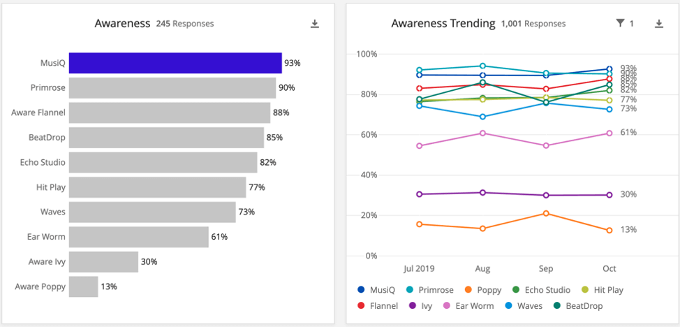
For Competitive Charts
Finally, you can use two more simple charts to create competitive charts. These allow you to easily see how your brand is performing relative to your competitors on any given level. The competitive charts usually consist of one bar chart showing percentages for all brands for that funnel level, and one line chart showing the same data over time.
Survey Setups
In this section, we’ll go over the types of questions you can use in your Brand Tracker survey in order to later map the data back into the widgets we discussed. There are three different setups, which can be modified based on your needs:
- Basic Setup: Using a single multiple choice question where you can provide multiple answers.
- Scale Setup: Creating a scaled multiple choice, single select question for each brand.
- Splitting Funnel Questions: Creating multiple versions of the same question.
Basic Setup
The funnel widget was designed to be compatible with multiple choice questions. Both multiple-answer and single-answer formats are compatible.
For example, questions may ask respondents to pick which brands respondents are aware of, or have used recently, or would consider purchasing. Your brands are the answers, and they’re all listed together in a single question. The multiple-answer format lets respondents pick every brand that qualifies.
For other questions, we ask respondents to select a favorite or preference. Each brand is an answer option, but respondents can only select one.
Customizing Your Survey with Scales
Another common format is doing one of the following:
- Making a separate multiple choice questions in a single answer format per brand, with scaled answer options.
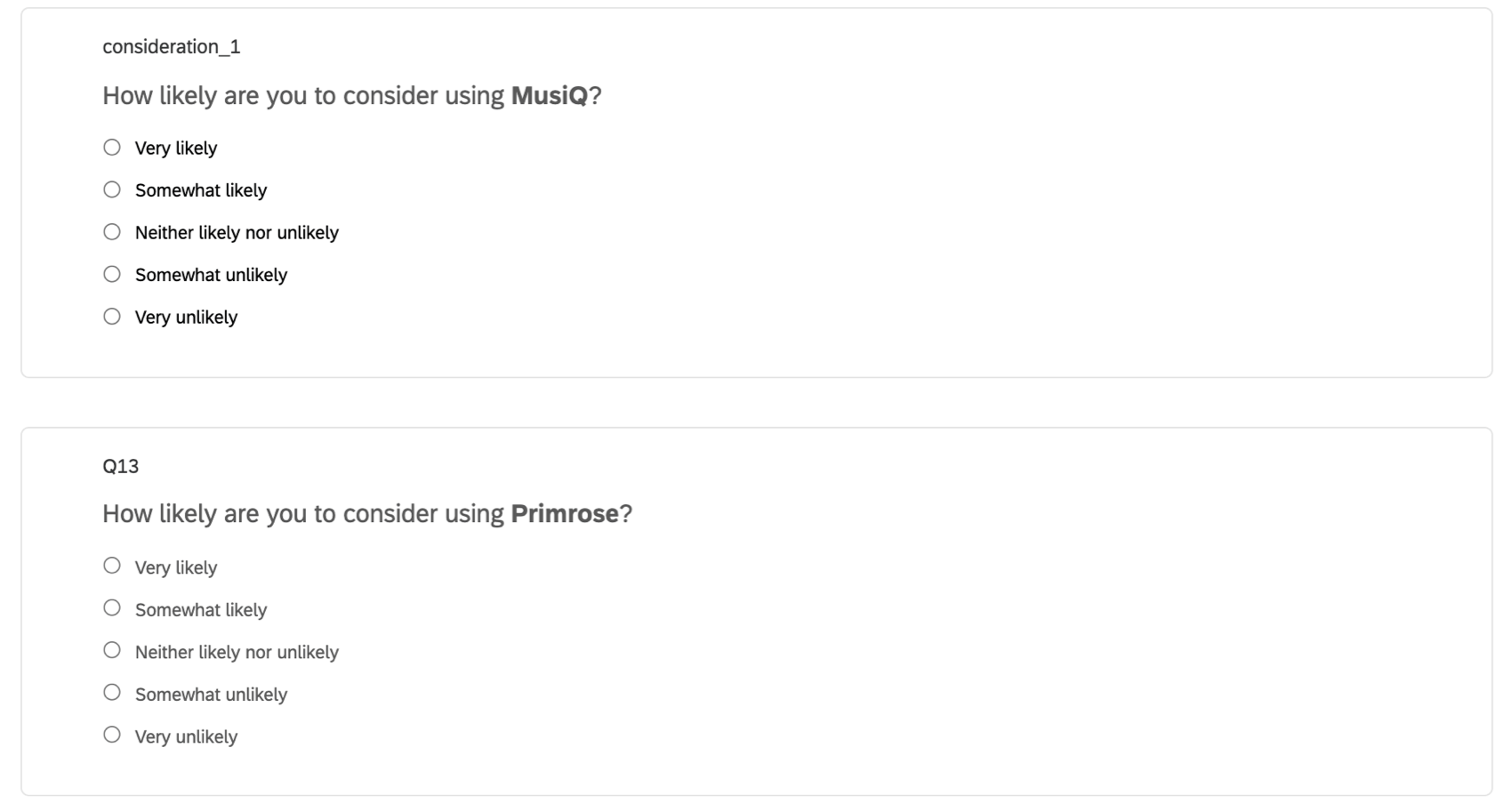
- Making one matrix table in a Likert format, where you ask a separate question per brand and give respondents scaled answer options.
This allows greater granularity during analysis (rather than the binary will consider/will not consider in a multiple answer question. The scale option gives more nuance).
However, these type of questions cannot be directly added to a funnel widget. For example, if we tried to add one of these questions to the funnel, we would be forced to pick just one answer option. If we wanted to be able to use both “Very likely” AND “Somewhat likely”, we wouldn’t be able to. We could only pick one of them. In most cases with a scale, we would want to be able to include top 2 box, top 3 box, etc., since that is more meaningful than any one value from the scale.
To make these kinds of questions work with our widgets:
- Go to the Survey flow.
- Add a branch, and drag it to the top of the flow.
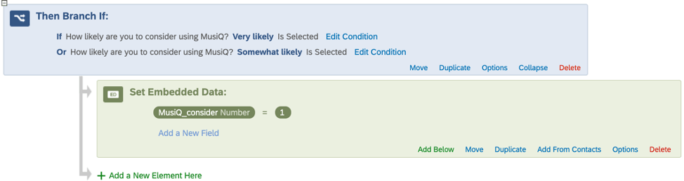
- Add the condition that “Very Likely” or “Somewhat Likely” must be selected.
- Under the branch, create an embedded data field and name it after the brand (e.g., Brandname_consider) and set the value equal to 1.
- Repeat these steps for each scaled brand.
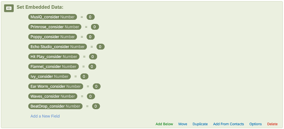
- Above all the branches, add a new embedded data element.
- Add each brand’s “consider” field, and set the value equal to 0. That way we have articulated values for both those who qualify for the funnel level (“1”) and those who don’t (“0”). This can be useful later when setting up filters, cleaning the data, and so on.
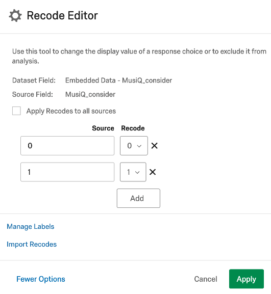
In the Funnel widget, we would then choose “MusiQ_consider” for the field and “1” as the value.
We would have separate branches with embedded data set up for each brand so that we could create separate Funnel widgets for all of them.
Customizing Your Survey by Splitting Funnel Questions
Ideally, the data for a single funnel level is collected in a single survey question. However, you may need the data split between two questions.
Example: In the images below, we wanted our consideration question phrased differently if the respondent was a current subscriber of the brand or not. We would like both of these questions to contribute to the same “Consideration” funnel level in the dashboard, though.
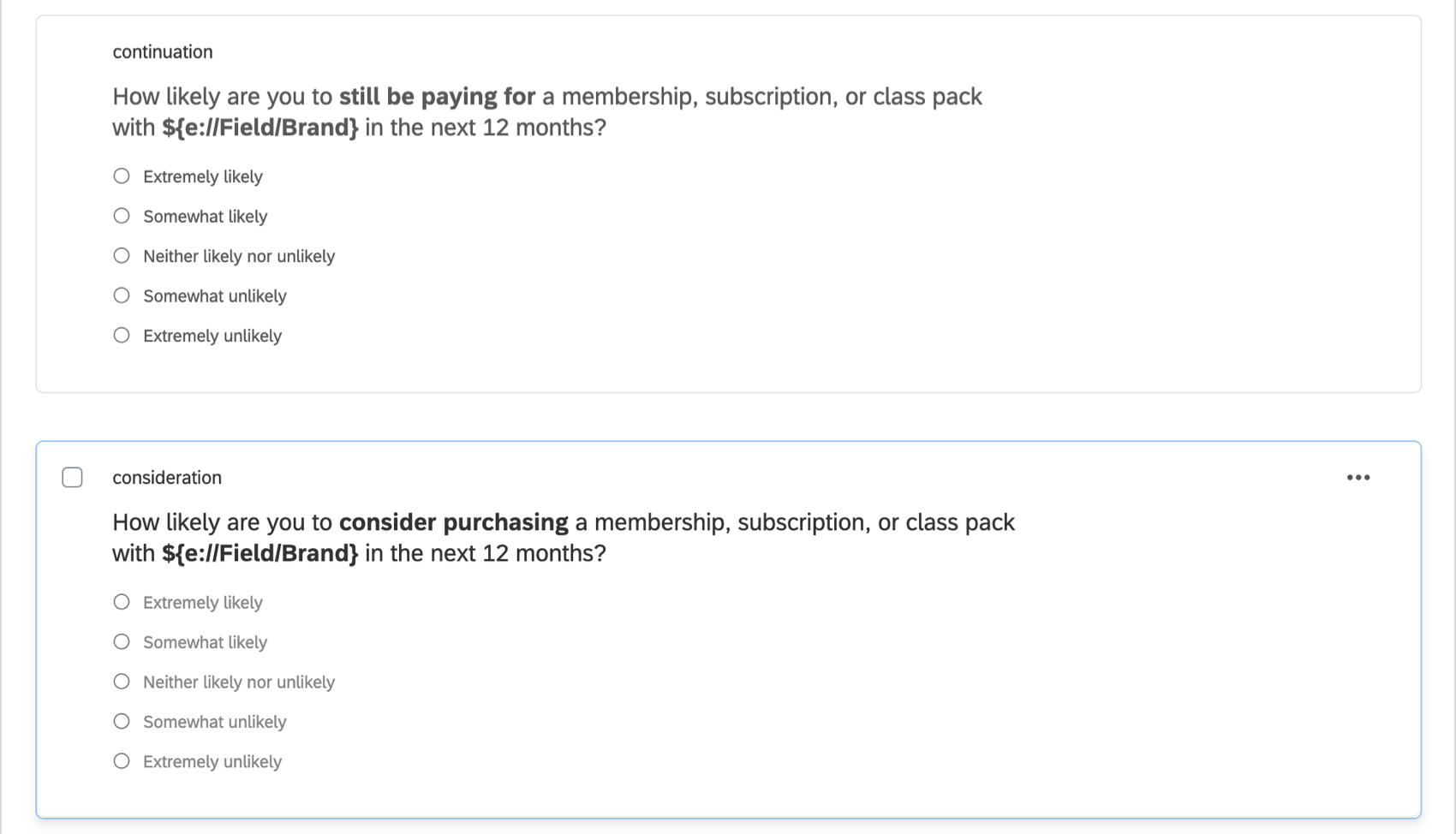
For instances where our funnel level is split across multiple questions, we need to create an embedded data field for each brand and set a value if the respondent selects any qualifying answer option. In this way, we effectively combine data from the relevant questions together in one place.
To make these kinds of questions work with our widgets:
- Go to the Survey flow.
- Add a branch, and drag it to the top of the flow.
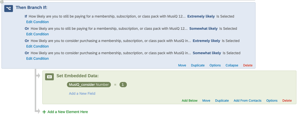
- Add the condition that “Very Likely” or “Somewhat Likely” must be selected in either version of the question. Make sure both these questions are referring to the same brand!
- Under the branch, create an embedded data field and name it after the brand (e.g., Brandname_consider) and set the value equal to 1.
- Repeat these steps for each scaled brand.
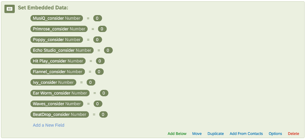
- Above all the branches, add a new embedded data element.
- Add each brand’s “consider” field, and set the value equal to 0. That way we have articulated values for both those who qualify for the funnel level (“1”) and those who don’t (“0”). This can be useful later when setting up filters, cleaning the data, and so on.
In the Funnel widget, we would then choose “MusiQ_consider” for the field and “1” as the value.
We would have separate branches with Embedded Data set up for each brand so that we could create separate Funnel widgets for all of them.
Dashboard Data Preparation
Once our survey is set up, we can turn to the dashboard side. Within the Dashboard Data section of the dashboard settings, we need to make several checks and adjustments to ensure the data is appropriately formatted.
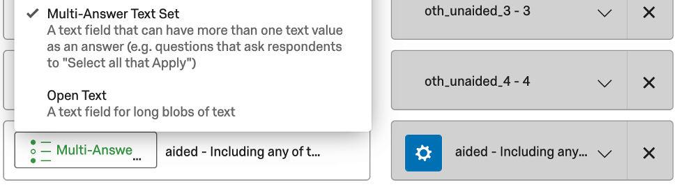
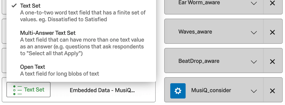
For Multiple Choice – Multiple Answer questions, we need to ensure they are mapped as Multi-Answer Text Sets.
For the 0/1 Embedded Data fields we described earlier, we need to ensure they are mapped in as Text Sets.
For these Embedded Data fields, we also need to click the blue gear (the Recode Editor), select More Options, and select Manage Labels. In this menu, we need to add labels for our Embedded Data values (often just “0” and “1”, although you can customize as necessary).
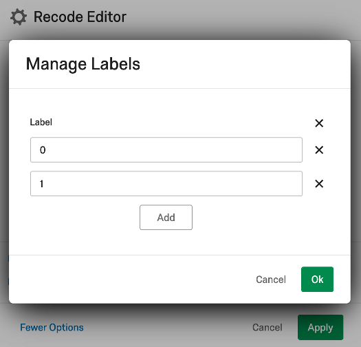
Once we’ve added the labels, we need to assign Source values to the labels (often the same name/value as the labels we’ve just created).
We need to repeat this process for each funnel Embedded Data field for each brand.
Once we’ve completed all the mapping adjustments and saved, the data is ready to be used in the Funnel widgets.
However, to prep the data for use in the trending and competitive charts, we now need to create custom metrics.
Custom Metrics for Trending and Competitive Charts
In the Custom Metrics section of the dashboard, we’ll need a custom metric for each funnel level and conversion ratio for each brand. This is so we can build our trending line charts and competitive charts.
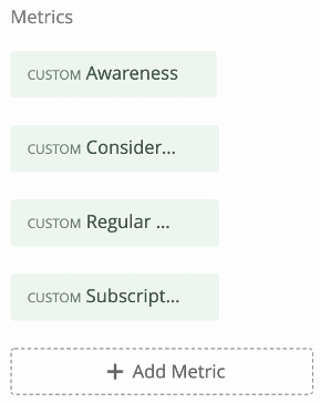
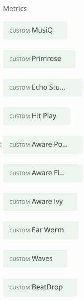
Let’s say we have four funnel levels: Awareness => Consideration => Regular Usage => Subscription. We’ll need to create seven custom metrics per brand:
Funnel Level custom metrics we need:
- Awareness
- Consideration
- Regular Usage
- Subscription
Conversion ratio custom metrics we need:
- Awareness => Consideration
- Consideration => Regular Usage
- Regular Usage => Subscription
If we have 10 brands, then that means that for this example, we need 70 custom metrics.
Auto-Generated Content
By default, each Brand Tracker project will generate custom metrics for you, meaning no further customization is required unless you have customized the funnel levels included in your survey.
- General Brand Tracker:
- Awareness
- Consideration
- Future Intent
- Preference
- Awareness => Consideration
- Consideration => Future Intent
- Future Intent => Preference
- Online Subscription Services:
- Awareness
- Consideration
- Regular Use
- Subscription
- Awareness => Consideration
- Consideration => Regular Use
- Regular Use => Subscription
- Consumer Packaged Goods Brand Tracker:
- Awareness
- Consideration
- Regular Use
- Awareness => Consideration
- Consideration => Regular Use
The following instructions are to help you build additional custom metrics if you are running a brand tracking survey where you have added other funnel questions.
Funnel Level Metrics
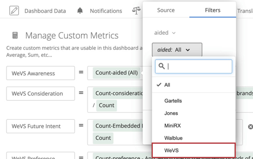
We want to create a custom metric that takes the number of people who qualify for that level for that brand and divides by the total number of respondents. This is accomplished by adding the following to a custom metric:
- Add a Count metric.
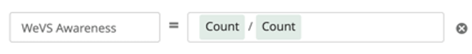
- Divide it by another Count metric.
- Click on the numerator (top) Count.
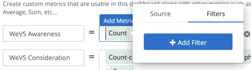
- Go to the filter tab.
- Choose the funnel level (e.g., Awareness, which may be labeled “aided” or “aided awareness”).
- Select the brand from the list of options.
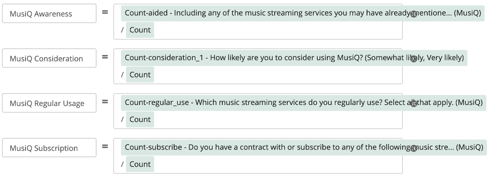
Here’s an example of what some of these finished custom metrics might look like:
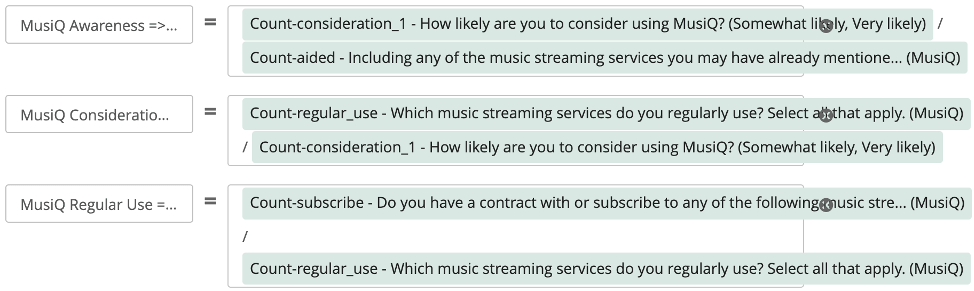
Conversion Ratio Metrics
We need to take the number of people who qualify for a given level for a given brand, and divide by the level immediately before it.
Example: For the Awareness => Consideration conversion ratio, we would take the number of people who select Consideration for the brand MusiQ, and divide by the number of people who select Awareness for the brand MusiQ.
Widget Set Up
This section goes over the detailed steps of how to set up each widget. Remember that if you used the Brand Tracker assisted setup, all of these widgets have been created for you. This set up is only necessary if you customized your survey’s funnel levels.
Brand Funnel Widget
See the Funnel Widget (BX) support page.
Funnel Level Trending
For each brand:
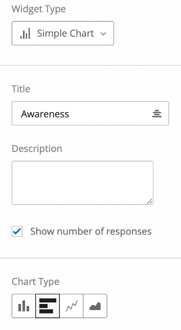
- Create a Simple Chart widget.
- Click Add Metric.
- Click Count.
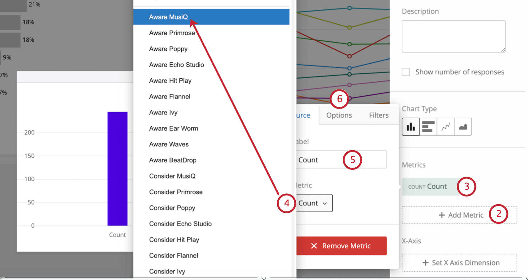
- Change the Metric from Count to our custom metric.
Example: We want to focus on the brand MusiQ. The first level we’re adding is awareness. We add the MusiQ Awareness custom metric.
- Add a straightforward Label, like Awareness.
- Next we’ll go into the Options.
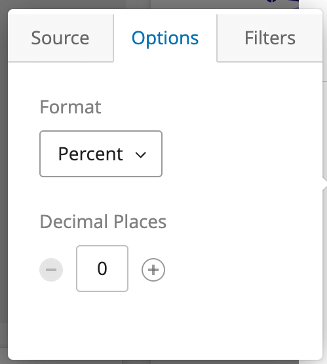
- Set the Format to Percent.
- Set the Decimal Places.
Qtip: This is usually set to 1, but can be 0, if desired. Decimal places should be consistent throughout the dashboard.
- Repeat steps 1-7 for all of our funnel levels. Remember you can drag and drop these metrics as needed to logically reorder them!
 Qtip: See common funnel reporting for the logical list of funnel levels.
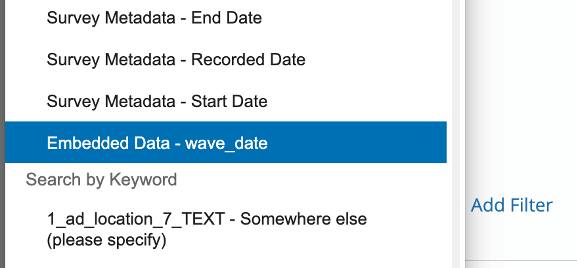
 - Click Set X Axis Dimension and choose a date field. This is often End Date, but could be a custom wave date field as well.
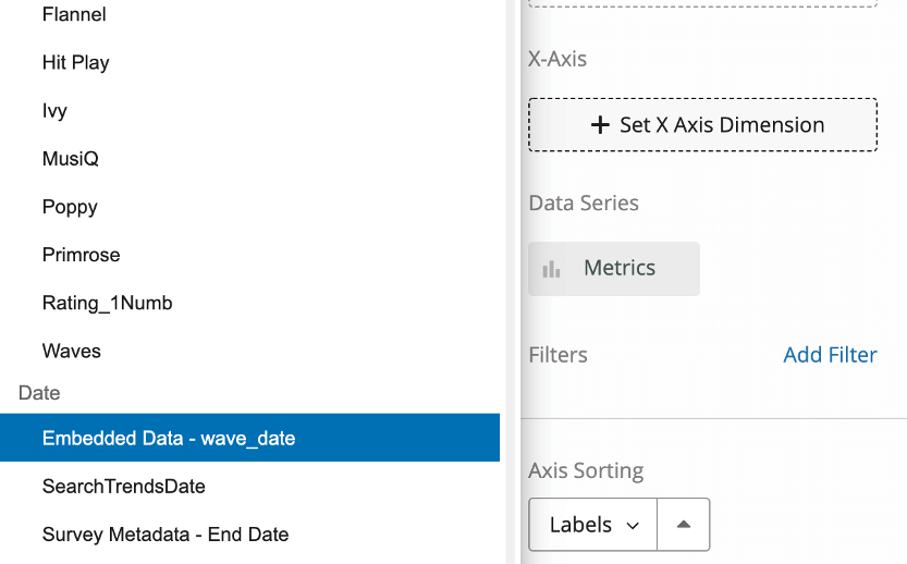
- Group dates by the timeframe you prefer.
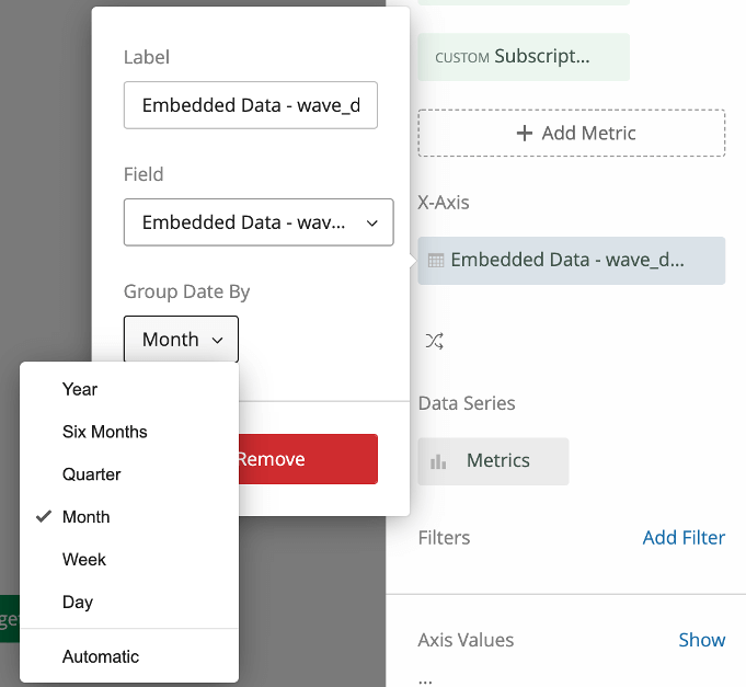 Qtip: Custom wave date fields are common to ensure respondents are assigned to the appropriate wave group, rather than being assigned to a month based on raw completion date.
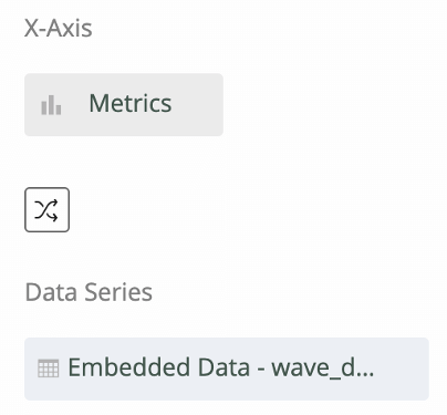
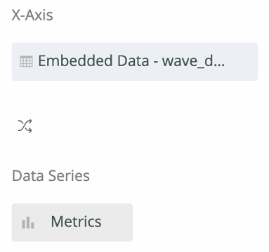
 - Click the axis swap button. This will rotate our custom metrics and the date field so that we see our metrics trended over time. We should see our date field as the X-Axis and our Metrics as the Data Series.
- Add a filter to the widget.
- Set this filter to the same date field and leave it set to All Time (the default).
 Qtip: Note that without this filter, if you add a time filter to the top of this page (e.g., “This Month”), the trend chart will update to show just that point in time, which makes the line format difficult to interpret.Qtip: It’s also possible to set this filter to a rolling time frame (e.g., last 90 days, last 180 days).
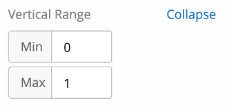
 - Set the Vertical Range to Min: 0 and Max: 1. This keeps our scale consistent from chart to chart, always showing 0% to 100%.
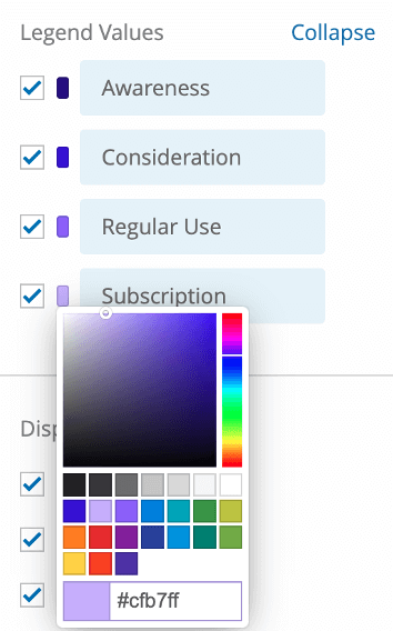
- Set the Legend Values colors to similar ones in your Funnel widget.
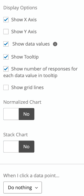
- For our Display Options, we recommend the following settings:
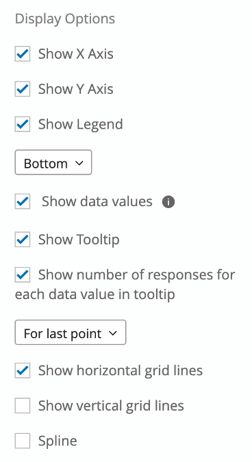
- Show X Axis
- Show Y Axis
- Show Legend (Bottom)
- Show data values
- Show tooltip
- Show number of responses for each data value in tooltip (for last point)
- Show horizontal grid lines
- Do not show vertical grid lines
- Do not spline
- Name the chart “[brand] Funnel Trending”, like “MusiQ Funnel Trending.”
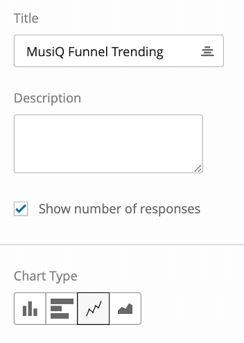
- If desired, you can enable Show number of responses so that you can see the base size.
- Set the Chart Type to Line so that you can see trend lines.
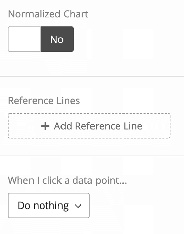
- Change When I click a data point to Do nothing. This is to prevent a filter from being added to the page when you click the widget.
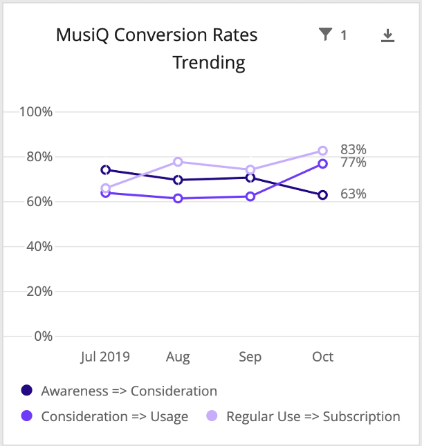
Conversion Rates Trending
Our Conversion Rates Trending chart will be set up much the same way as the previous, funnel level trending widget. We’ll add our conversion rate custom metrics (e.g., MusiQ Awareness => Consideration) instead of the funnel level metrics, but other than that, almost all the set up and settings will be the same.
Qtip: The only difference is that we won’t enable Show number of responses since in reality, the base size for each conversion ratio is the level before it, and so varies from ratio to ratio. Show number of responses will only show the biggest base, which can be confusing, so we disable it here.
Competitive Charts
For our competitive charts, we’ll create two charts for each level of our funnel: a point-in-time bar chart and a trending chart.
Let’s start with the point-in-time bar chart.
- Create a Simple Chart.
- Set the Chart Type to Horizontal Bar.
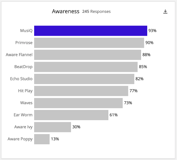
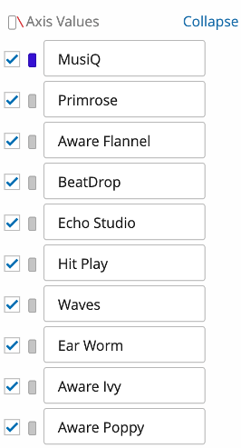
- Add custom metrics for each brand for the level. If we’re creating our Awareness competitive chart, we’ll add each brand’s awareness custom metric.
- Click each custom metric and go into the Options.

- Set the Format to Percent.
- Set the Decimal Places. This is usually set to 1 decimal place, but can be none if desired as well. It should be consistent throughout the dashboard as much as possible.
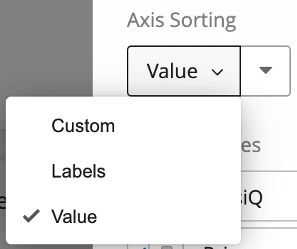
- Set Axis Sorting to Value so that the brands will be ranked from highest percent to lowest percent.
- For colors, set your competitors to a gray or some other neutral color. Then set your brand to the main company color, so it stands out.
- Name the chart after the funnel level, like “Awareness.”
- Enable Show number of responses so that you can see the base size.
- Set the Vertical Range to Min: 0 and Max: 1.
- Enable all Display Options except Show Y Axis and Show Grid Lines.
- Change When I click a data point to Do nothing. This is to prevent a filter from being added to the page when the widget is clicked.
For our trending version of this chart, we duplicate the widget we just made and make a few adjustments.
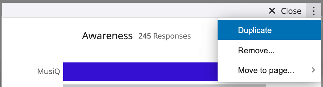
Here are our changes:
- Add “Trending” to the chart title.
- Change the Chart Type to
- Add our date field as the Data Series and group dates as desired.
- Swap axes so that we see our date field as the X-Axis and our Metrics as the Data Series (so we see our custom metrics trending over time).
- Click the date field, add a filter, and set it to All Time (or the chosen rolling period). This is to keep the structure of the line chart – if someone filters the page by date, it can change the line chart to a single point, which doesn’t make as much sense.
- Enable Show Y Axis and Show Horizontal Grid Lines in the Display Options
Our final chart should look something like this:
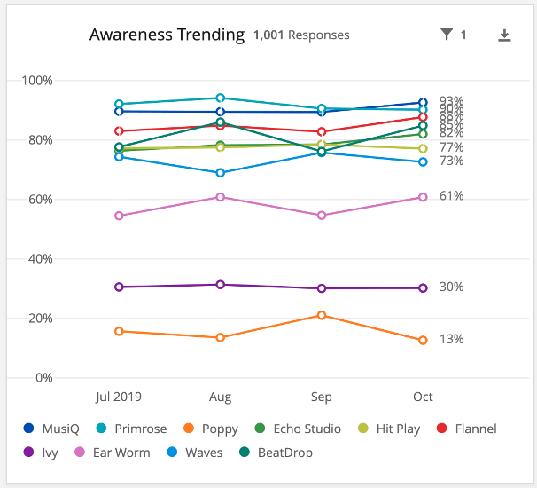
We then repeat this process for the other funnel levels.