
Gauge Chart Widget
What's on this page
About Gauge Chart Widgets
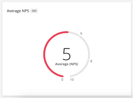
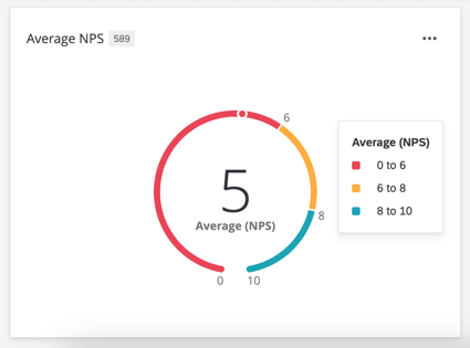
The gauge chart widget allows you to display the value of a particular metric on a set scale. The value is represented by a color bar progressing around an open circle, where the left end is the minimum value for this metric and the right end is the maximum value for the metric. In addition to the gauge bar, the widget will display the numeric value of the metric directly.

When you hover over a gauge chart, you can see the full range of values and their corresponding colors.

Qtip: The hover state is used when the widget is exported.
This widget can be used in a variety of dashboards, such as Employee Experience (engagement, lifecycle, and ad hoc employee research), Customer Experience, and brand trackers.
Types of Dashboards
This widget can be used in a few different types of dashboard. These include:
- CX Dashboards
- Results Dashboards
- Employee Engagement
- Lifecycle
- 360
- Pulse
- Ad Hoc Employee Research
- Employee Journey Analytics
- Brand Experience
Field Type Compatibility
The gauge chart widget is primarily based off of the metric added to it, and not directly off of a data field. The field type will only matter if you are using a metric other than count. When using metrics that require a data field (such as average), you will only be able to select Number Set or Numeric Value data fields.
In CX and BX Dashboards, you will also be able to select Measure Groups.
Basic Setup
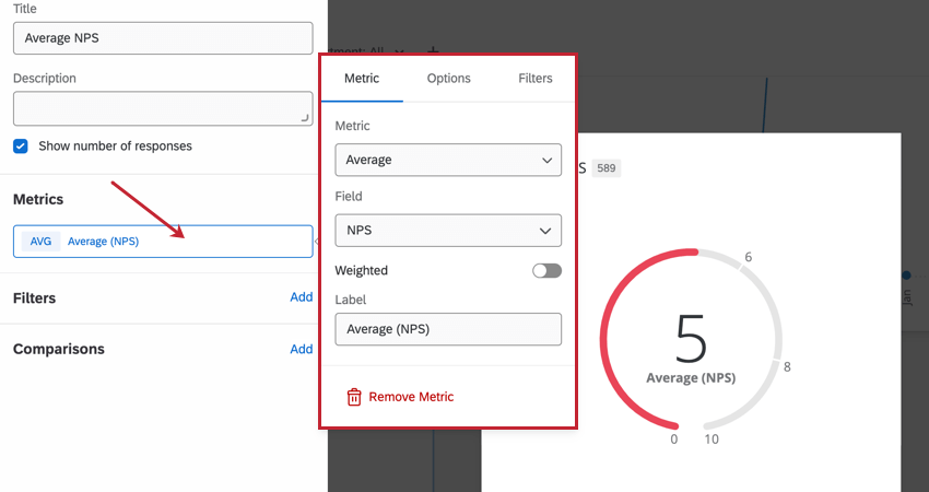
Metrics
You will need to specify a metric when adding a gauge chart widget. When selecting Metric, you will need to give your metric a Label (i.e., a name) and choose the metric itself. If you choose a metric other than count, you will need to specify the field that the metric will be calculated off of. You can also select Options to specify whether or not you would like your metric in a number, percent, or currency format as well as the number of decimal places displayed. Go to the Filters section to filter your displayed metric.
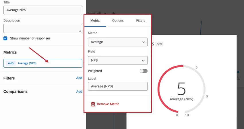
Your available metrics include:
- Count: Display response counts from the selected fields (i.e., number of respondents choosing a value in a five-point scale)
- Average: Exhibit the average value for a selected field.
- Minimum: Show the minimum value of a selected field.
- Maximum: Present the maximum value for a selected field.
- Sum: Pull in the sum of all values for a selected field.
- Net Promoter Score: Identify the detractors, passives, and promoters from NPS questions. Qtip: Gauge carts are frequently used to display NPS scores.

- Correlation: Input Pearson’s r value for the correlation between two fields.
- Top Box / Bottom Box: Display the percentage of responses that fall into a specified range of values.
- Custom Metrics (CX/BX Dashboards Only): Include any custom metrics you have created. For more information, visit the page on Custom Metrics.
- Benchmarks: Any benchmarks you’ve created. However, this only adds the benchmark to the widget, no other data; to showcase your own data alongside a benchmark to see how well your data measures up, we advise following the instructions in the Displaying Benchmark Comparisons section instead.
- One-time Benchmarks: Configure a one-time benchmark for the widget. You can select the benchmark dataset, version, and field to display in the widget, and add benchmark-specific filters.
Qtip: If you have multiple sources mapped in an Employee Experience dashboard, all source data will be displayed in the widget together. You will need to use a widget-level filter to ensure only one data source is displayed at a time. You can even lock this filter, if you don’t want dashboard users to adjust it.
For basic widget instructions and customization, see our support pages on more general widget editing (CX|EX). Continue reading for widget-specific customization.
Qtip: You cannot adjust title alignment on a gauge chart widget.
Filters
You can filter your widget in the Filters section. See Adding Widget Filters for more information.
Comparisons
You can compare your data against a different dataset. See Displaying Benchmark Comparisons for more information.
Display Options
You can customize how your widget looks in the Display section while editing your widget.
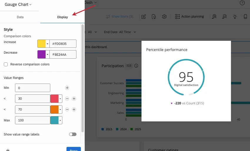
Style
If you’ve added a comparison, you can change the comparison colors shown under the chart. By default, if your displayed metric is less than the selected comparison, then the comparison arrow will be red. The arrow will be blue if the displayed metric is greater than the selected comparison.
You can customize the colors assigned to increase and decrease comparisons. You can enter a hex code, RGB, or select a custom color from a color wheel by clicking the arrow next to Increase or Decrease.
Select Reverse comparison colors if you’d like the colors to be reversed.
Value Ranges
Qtip: When setting your value ranges, if you would like to indicate decimals for cutoff points, please be sure to use a dot (.) instead of comma (,) when typing your entry.
Enter values in the Min and Max boxes found in Value Ranges section to determine the values associated with the beginning and end of your gauge. In addition to the minimum and maximum values, you can set up to six intermediate values. For each value, set the color that you would like the gauge chart to be when the metric is less than or equal to that value.
If you’d like the value range to appear on the ring even when users aren’t hovering over the widget, select Show value range labels. Deselect this setting to only show these values on hover.
Widget Styles
- Widget container: Controls the border around the widget. Your options include:
- Use dashboard default: The widget border will match what is set in the dashboard theme options.
- On: The widget will have a border around it.
- Off: The widget will not have a border around it.
- Widget Header: Controls the widget’s title appearance. Your options include:
- Always show: Always display the widget’s title.
- Show on hover: Display the widget when a dashboard hovers their mouse over the widget.
- Never show: Do not display the widget’s title.
Migrating Legacy Gauge Chart Widgets
Attention: All legacy gauge chart widgets will eventually be automatically migrated to the new version described on this support page. You can follow the instructions below to migrate your widget early and provide feedback about the migration experience.
Legacy gauge chart widgets cannot take advantage of all customization features outlined on this page. You can update a legacy widget to the new version by clicking the Change now link at the top of the customization panel.
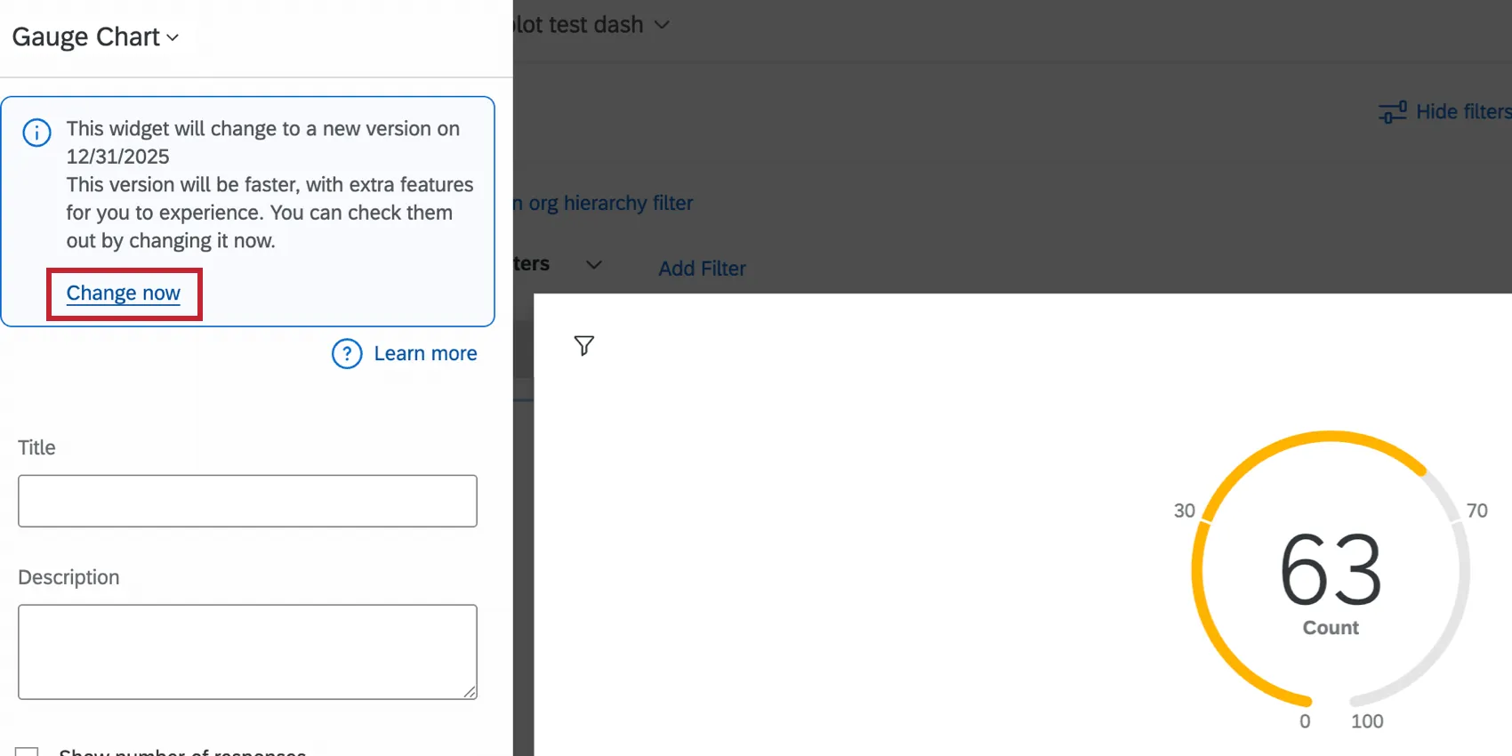
The widget will refresh to the new version while keeping your existing settings. You can then customize your widget further; see Basic Setup and Display Options for more information.
Providing Feedback & Reverting Changes
We’d love to hear any and all feedback you have about the widget migration experience. Follow the below steps to submit feedback to us. You can also temporarily revert your widget back to the legacy experience if you wish.
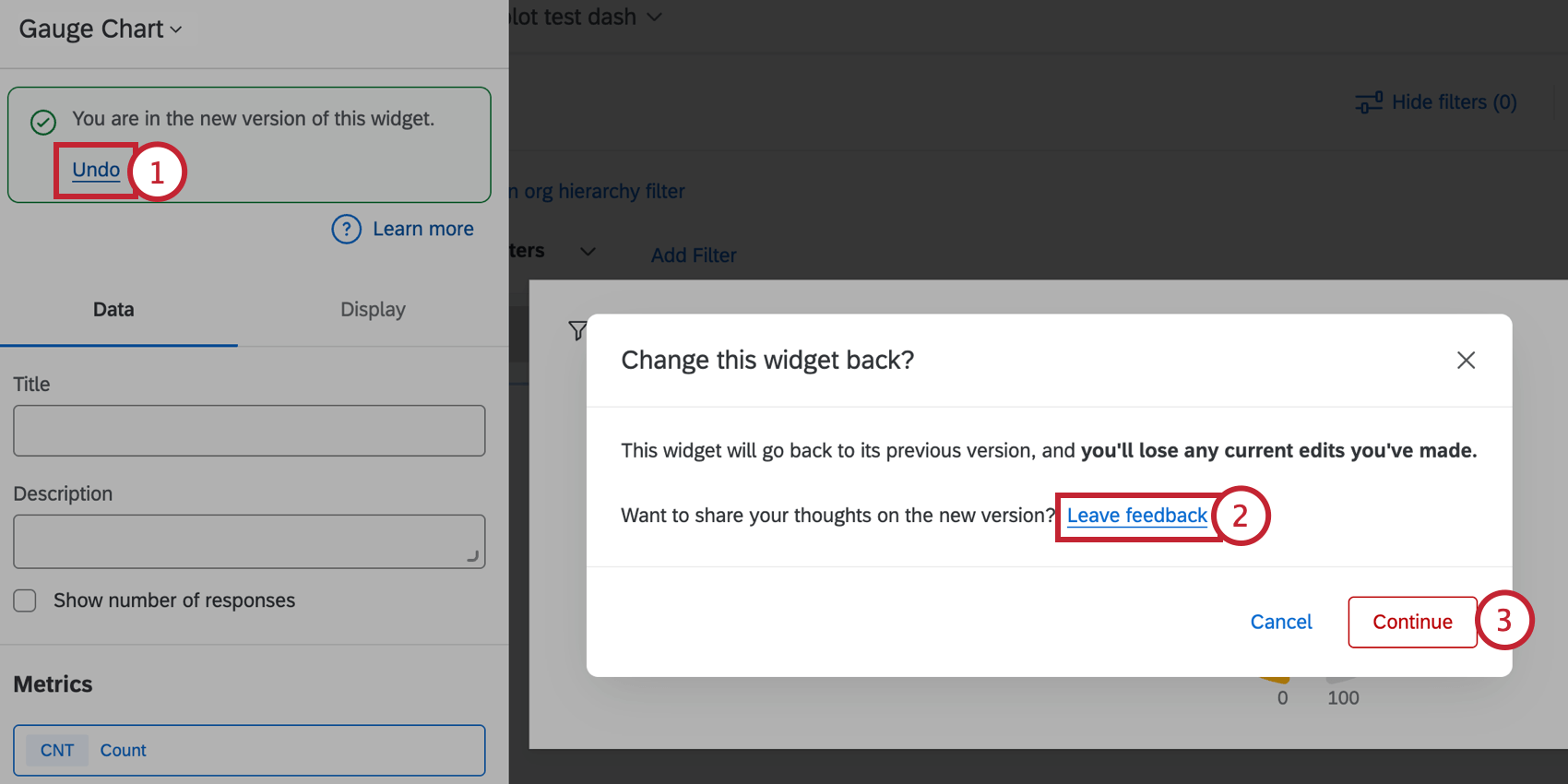
Attention: If you revert back to the legacy widget, any edits you’ve made will be lost. All widgets will eventually be permanently migrated to the new widget experience automatically.
FAQs
How do I add a comparison to my widget?
How do I add a comparison to my widget?
That's great! Thank you for your feedback!
Thank you for your feedback!