-

Qualtrics Platform -

Customer Journey Optimizer -

XM Discover -

Qualtrics Social Connect
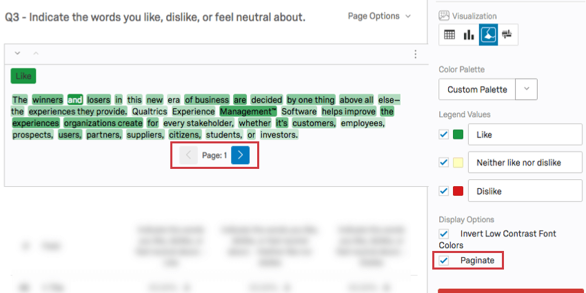
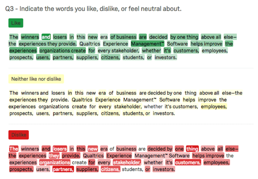
Text Highlights (Results)

About Text Highlights
The Text Highlights visualization is a graphical representation of the data collected from the Highlight question type. It colors each word in the interactive text portion of your question with a different shade of color depending on the number of times that word was selected. Words selected more often show up darker than others.
Customization Options
For general settings, see the Visualizations Overview support page. Read on for settings specific to the Text Highlights.
Legend Values
You have a variety of options concerning the answer names (or “legend values”), including the following:
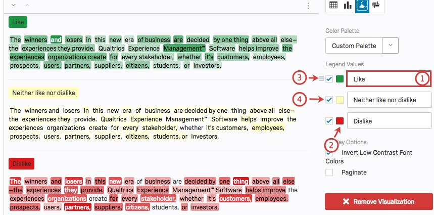
- Change the legend value text by clicking directly into the textbox for the name and entering the new name.
- Adjust the color of the option by clicking directly on the color box to the left of the value and selecting a new color.
- Change the order the values appear in the visualization by clicking to the left of a value and dragging it to its desired position.
- Hide values from the visualization by deselecting the checkbox to the left of the value.
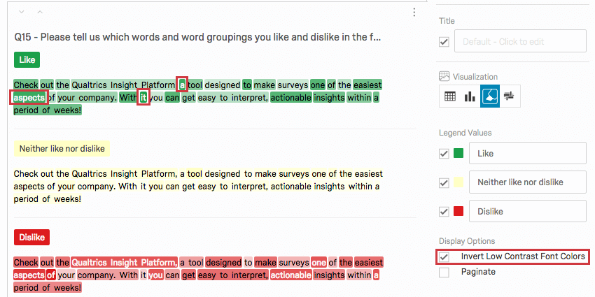
Display Options
You have two settings under the Display Options list in the editing pane. Some of these options will be enabled by default, but you can enable any combination of these to achieve your desired visualization:
- Invert Low Contrast Font Colors: When selected, this setting changes the color of the text from black to white for words that are selected often in order to make the text easier to see.
- Paginate: Break up your visualization into one page per category rather than display categories together as one long page.