-

Qualtrics Platform -

Customer Journey Optimizer -

XM Discover -

Qualtrics Social Connect
Patient Experience with Nursing Widget (CX)
About Patient Experience with Nursing Widgets
The Patient Experience with Nursing widget calculates patient experience performance according to the Magnet Recognition Program® submission requirements and displays it in a table. Survey scores are grouped into 9 categories. Each score is compared against the benchmark for the category to see if it has outperformed it. These comparisons are broken out into 8 columns, 1 for each of the most recent 8 consecutive quarters of patient experience data.
3 table views are available for the widget: Location Summary, Unit Summary, and Unit Detail.
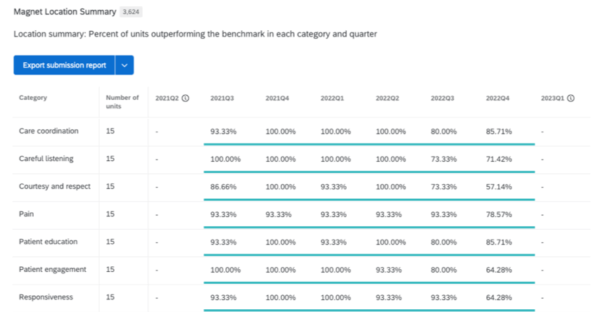
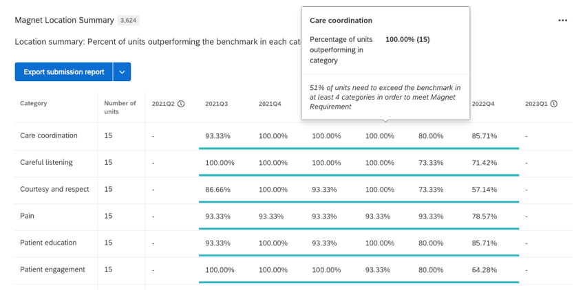
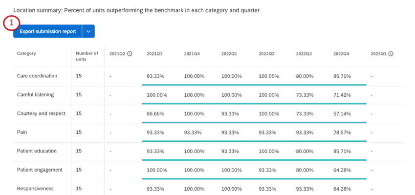
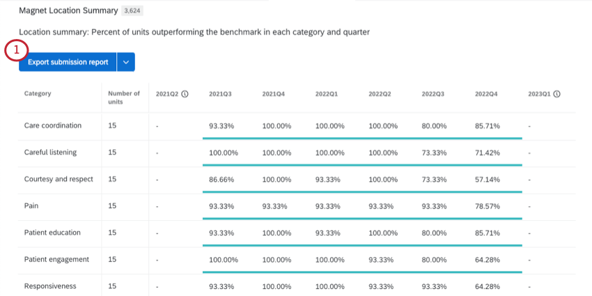
Patient Experience with Nursing Location Summary View
The Location summary table view displays the total number of participating units with at least 1 response per category for a single location and care setting. The percentage of units with at least 1 question outperforming the national benchmark is calculated for each category and each quarter.
If the percentage of units outperforming the benchmark is over 51%, the cell value is displayed in green, if it is under 51% it is displayed in red. 51% of units need to outperform the benchmark in at least 4 categories to meet Magnet Recognition Program® submission requirements.
Hover over a specific score to display additional information.
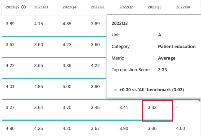
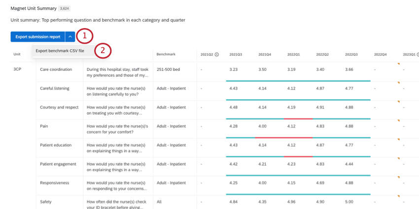
Patient Experience with Nursing Unit Summary View
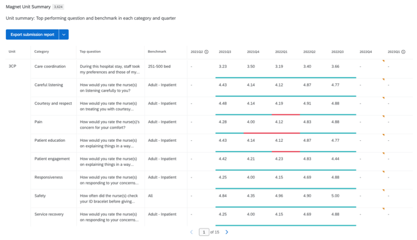
The Unit summary table view displays the top performing question in each category for a single location, care setting, and unit. Question performance against the most favorable benchmark for that question is displayed for each quarter. The question is compared against each of the available benchmarks and displayed green if it is outperforming the score of any benchmark, or red if it is scoring below the benchmarks.
The top performing question is determined by seeing which question exceeds the national benchmark in the most quarters during the 8 quarter submission period. If there are multiple questions that exceed the national benchmark over the same number of quarters, the question that outperformed the national benchmark by the highest performance score margin will be selected.
Hover over a specific score to display additional information.
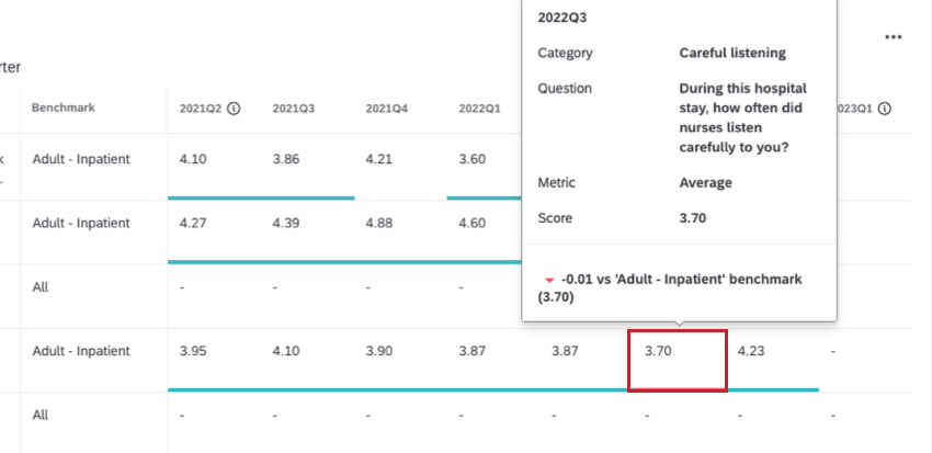
Patient Experience with Nursing Unit Detail View
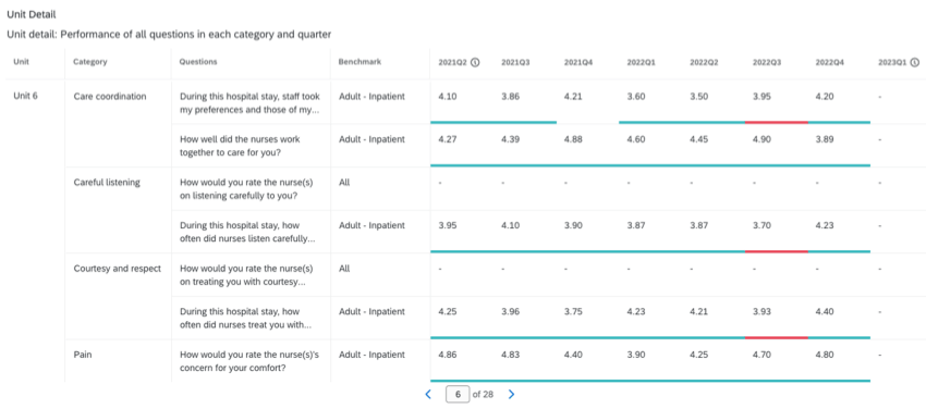
The Unit detail table view displays a list of all questions in each category for a single location, care setting, and unit. Question performance against the benchmark is displayed for each quarter. Green indicates the score is outperforming the benchmark, and red indicates it is scoring below the benchmark.
Hover over a specific score to display additional information.
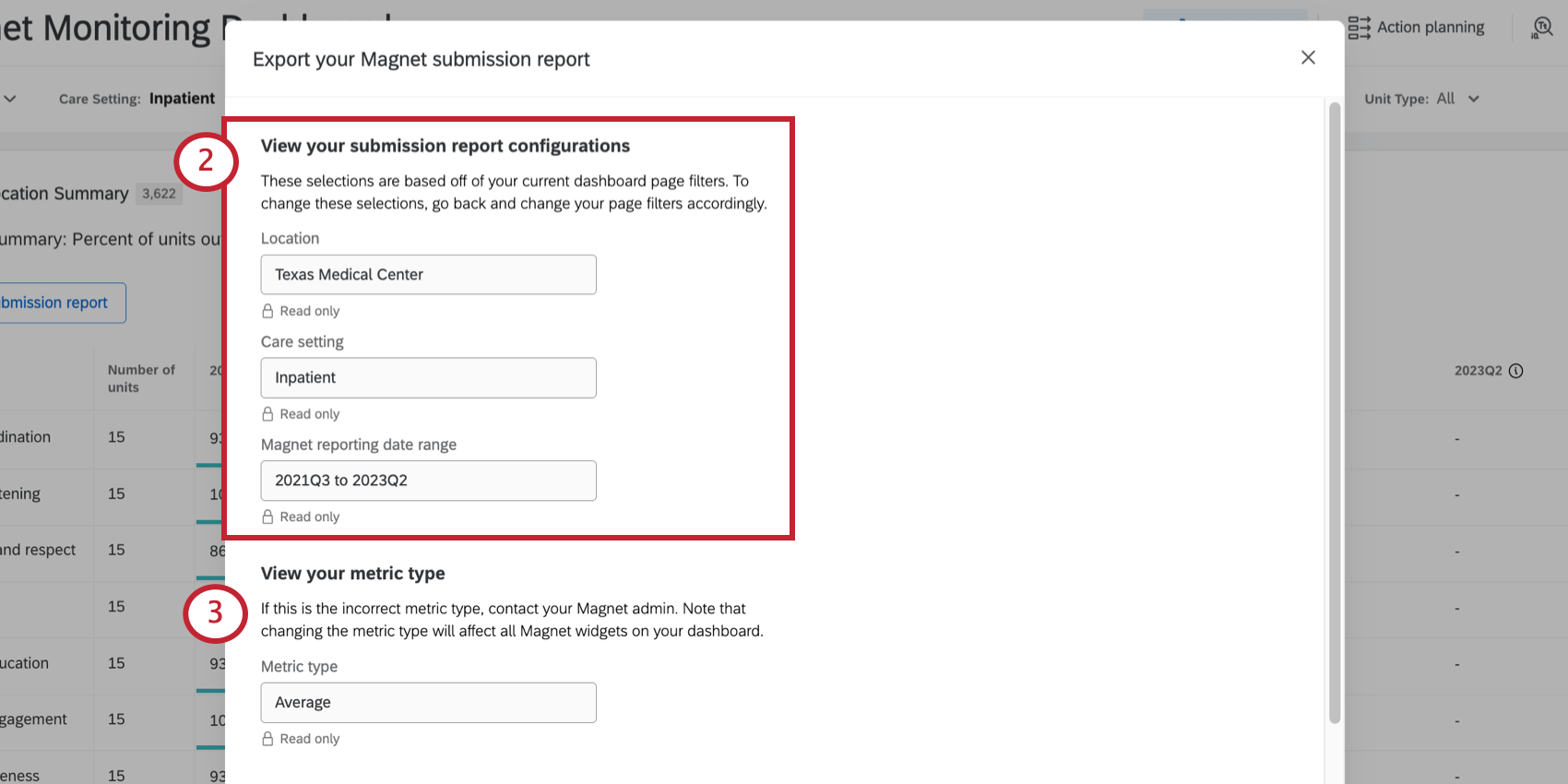
Export Submission Report
You can export a PDF of your Patient Experience with Nursing widget’s data, formatted and labeled according to the Magnet® Program Application Manual.
The submission report can be exported from all 3 widget views, including location summary, unit summary, and unit detail.
- Click Export submission report.
- Confirm that the correct location, care setting, and date range are displayed. If not, try adjusting the filters on your dashboard.
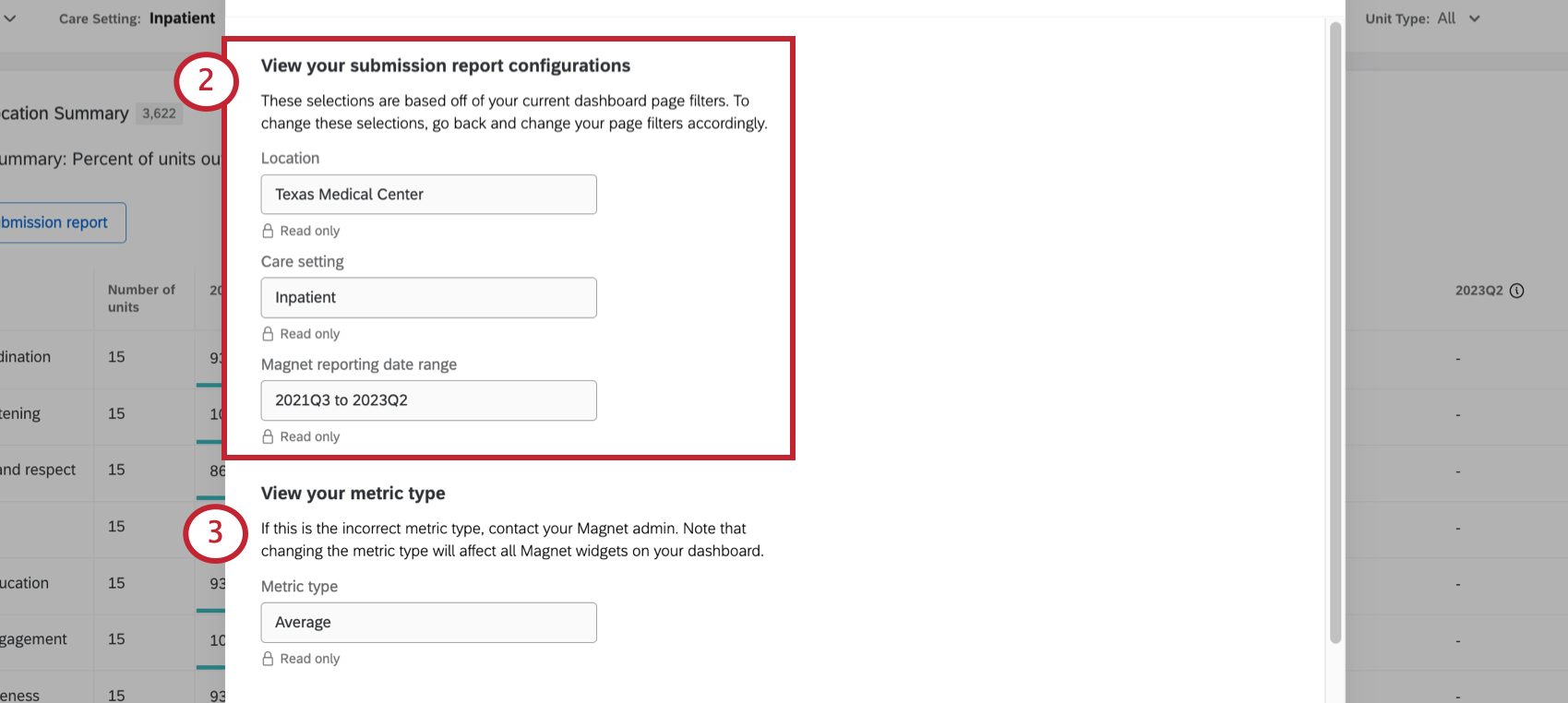
- Confirm that the correct metric is being used.
Qtip: If you’d like to switch to a different metric, we recommend reaching out to your Technical Success Manager. Please keep in mind that changing the metric will change all of the values in the widget.
- Select the Magnet manual version that data will be submitted for. This will label the data in the report according to Magnet Recognition Program® submission requirements.
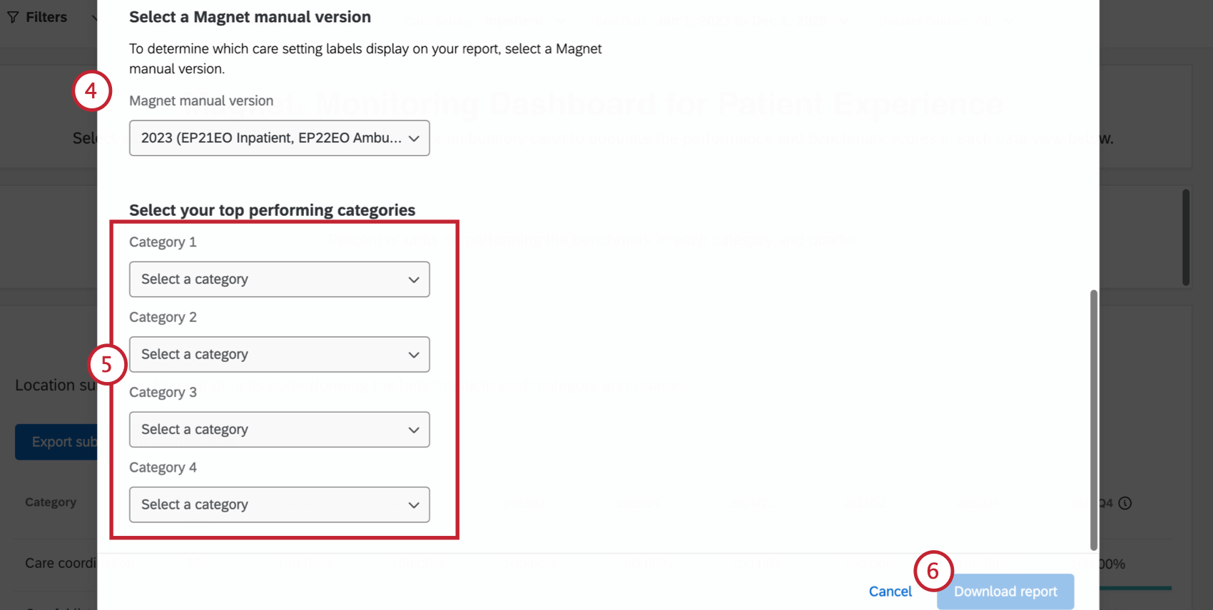
- Select your top 4 performing categories.
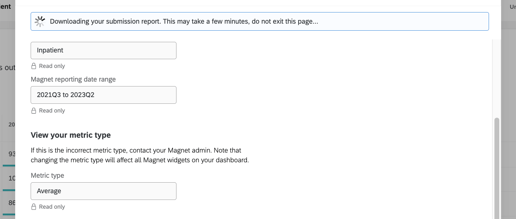
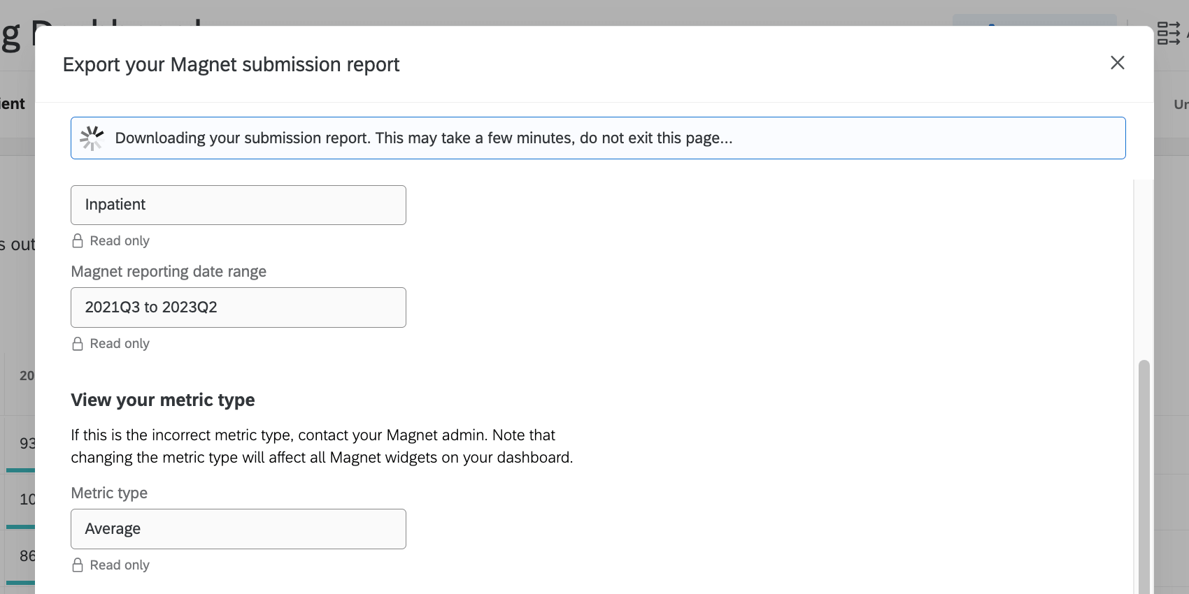
- Click Download report.
- Do not exit the window while the report is downloading.
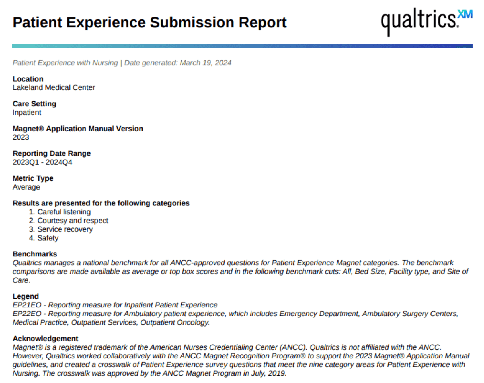
Example Export
Here is an example of a title page in the export. You will see all the information you confirmed during export, such as location, date range, care setting, metrics, and the results you chose.
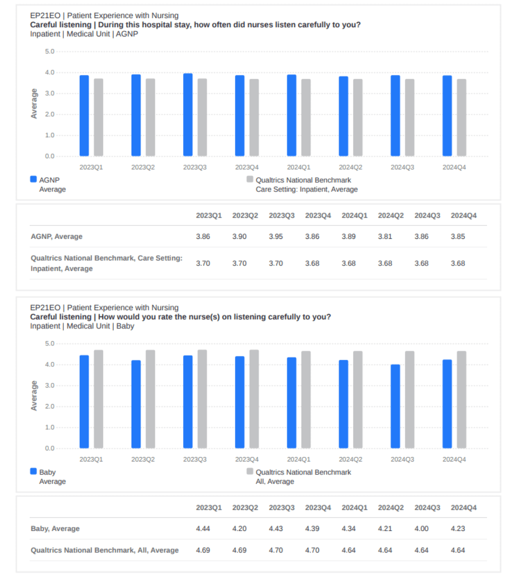
The report includes a graph and table for each unit, organized by the 4 categories selected. Each graph and the table reflect the unit’s performance against a national benchmark in the categories selected over the course of 8 quarters in the reporting period.
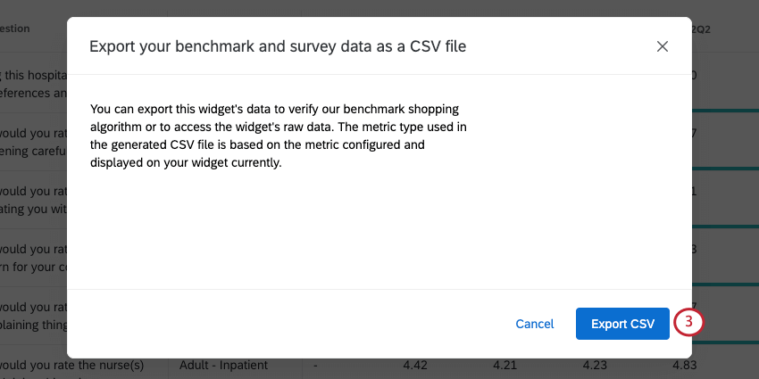
Export Benchmark CSV File
You can export a CSV file that shows how well each of your areas performed on a series of benchmarks, with the best performing benchmark called out for each survey item.
The metric type used in the CSV file (average vs. top box) is based on the widget’s configuration.
- Click the drop-down arrow next to the export button.
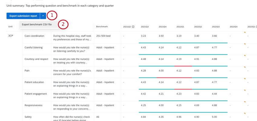
- Select Export benchmark CSV file.
- Click Export.
Example Export
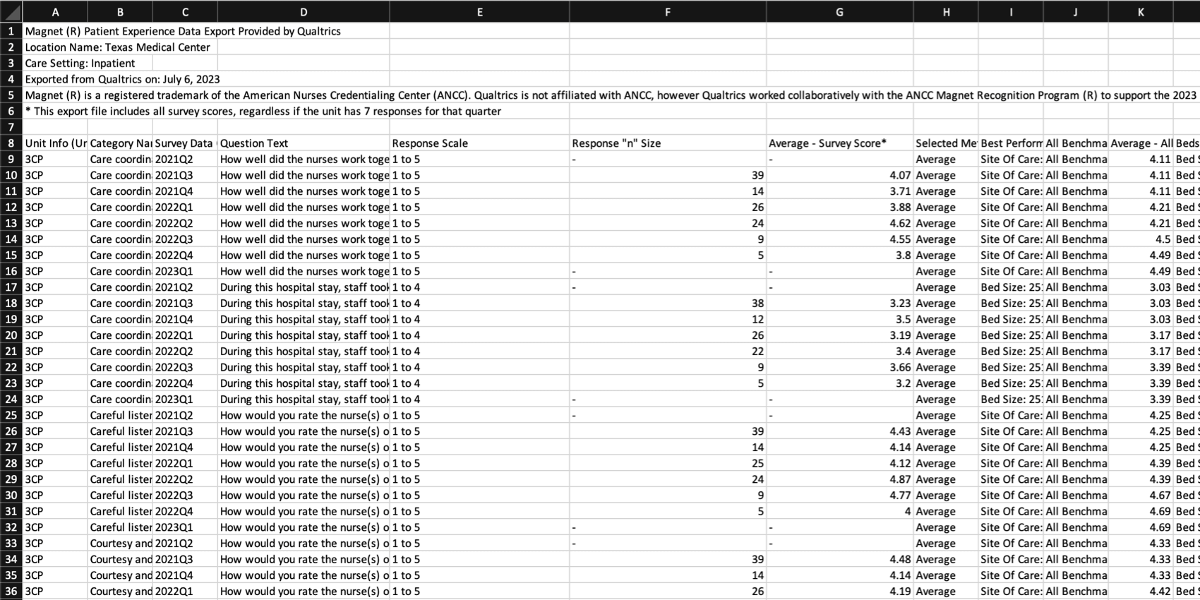
Every row represents a question for a unit. For every unit’s every question, you’ll see:
- Scoring category
- Question text
- Response scale (e.g., 1 to 5)
- Response “n” size
- Average survey score
- Metric (average or top box)
- Best performing benchmark
- Average performance on all benchmarks
- Average performance on individual benchmarks
Dashboard Requirements
To successfully display Patient Experience with Nursing reporting data, make sure your dashboard adheres to the following requirements:
- Response minimums: Questions must have at least 7 responses to be displayed in the Patient Experience with Nursing dashboard. The performance score for any question with less than seven responses per quarter will not be displayed in the dashboard.
- Filter limits: When filtering your dashboard, make sure you only have 1 location and/or care setting selected as part of your dashboard filter. Patient Experience with Nursing widgets will not load if more than 1 location or care setting is selected.
Date Filters
It’s important to understand how the Patient Experience with Nursing widget interacts with date filters in order to ensure the data you include in submission packets is its most accurate.
The Patient Experience with Nursing widget always shows 8 columns of data, despite the dashboard filters.
Likewise, be careful when you adjust your filters to exact days, as this can affect the data included in quarterly calculations.
Methodology
The Magnet Recognition Program® designates organizations worldwide where nursing leaders successfully align their nursing strategic goals to improve the organization’s patient outcomes. The Magnet Recognition Program® provides a roadmap to nursing excellence, which benefits the whole of an organization.
A Magnet® designated hospital is stated to be one where nursing delivers excellent patient outcomes, nurses have a high level of job satisfaction, and there is a low staff nurse turnover rate and appropriate grievance resolution.
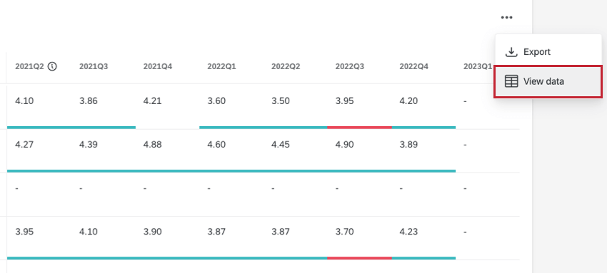
Additional Options
Click the 3 horizontal dots in the top-right corner of the widget and select View data to view a table containing all data within the widget.