
Trend Chart Widget (CX)
What's on this page
About Trend Chart Widgets
Warning: This widget is being deprecated and is no longer supported. For the same functionality with a more flexible setup, use a line chart widget instead.
The trend chart widget displays data from one or more fields across a set time period. These data trends can be displayed in various ways, allowing for a wide range of customization.
Field Type Compatibility
The trend chart widget is compatible with the following field types:
- Numeric Value
- Number Set
Only fields with the above types will be available when selecting the lines for the trend chart widget.
Widget Customization
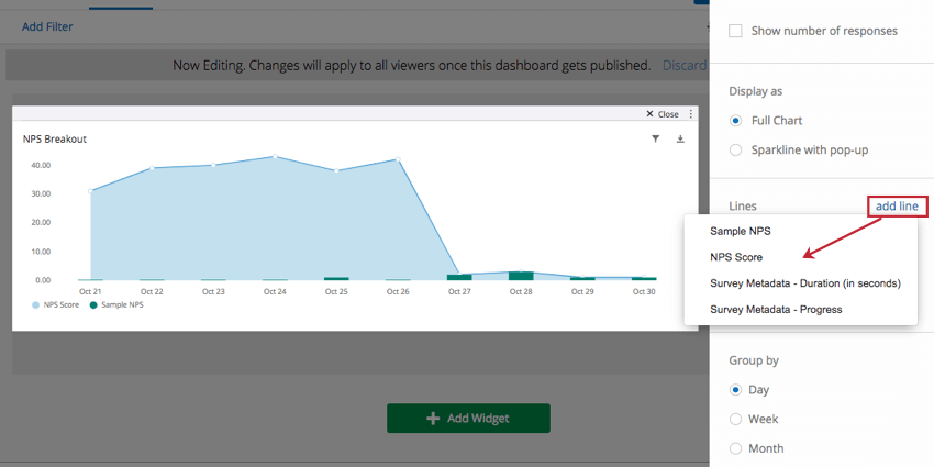
Basic Setup
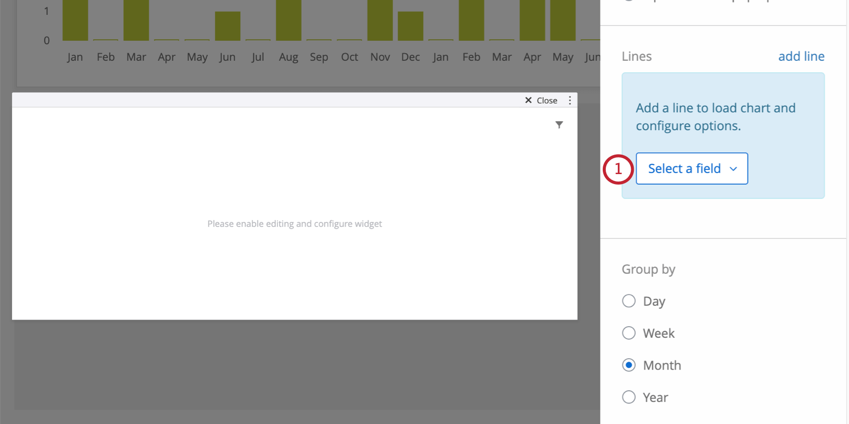
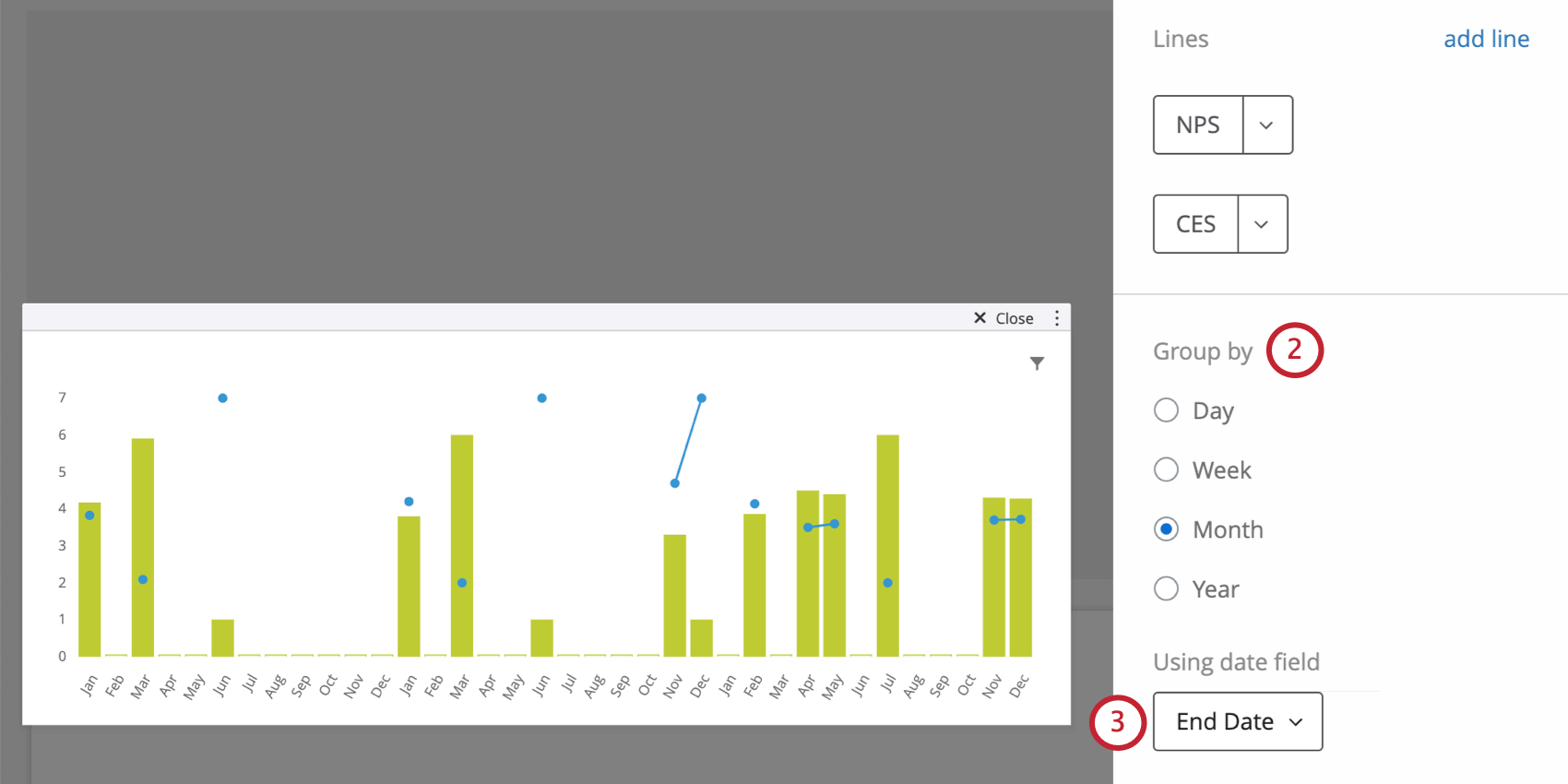
Adjusting Metrics
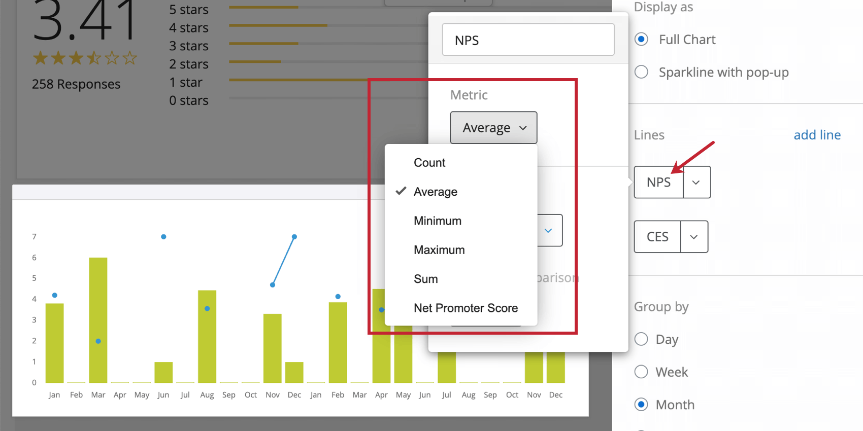
By default, when you add lines to the trend chart widget, they will default to count. This is just a count of how many responses were collected for that particular field (or how many rows / records there were in your imported data file). If you click on the field, you can choose from another metric, such as:
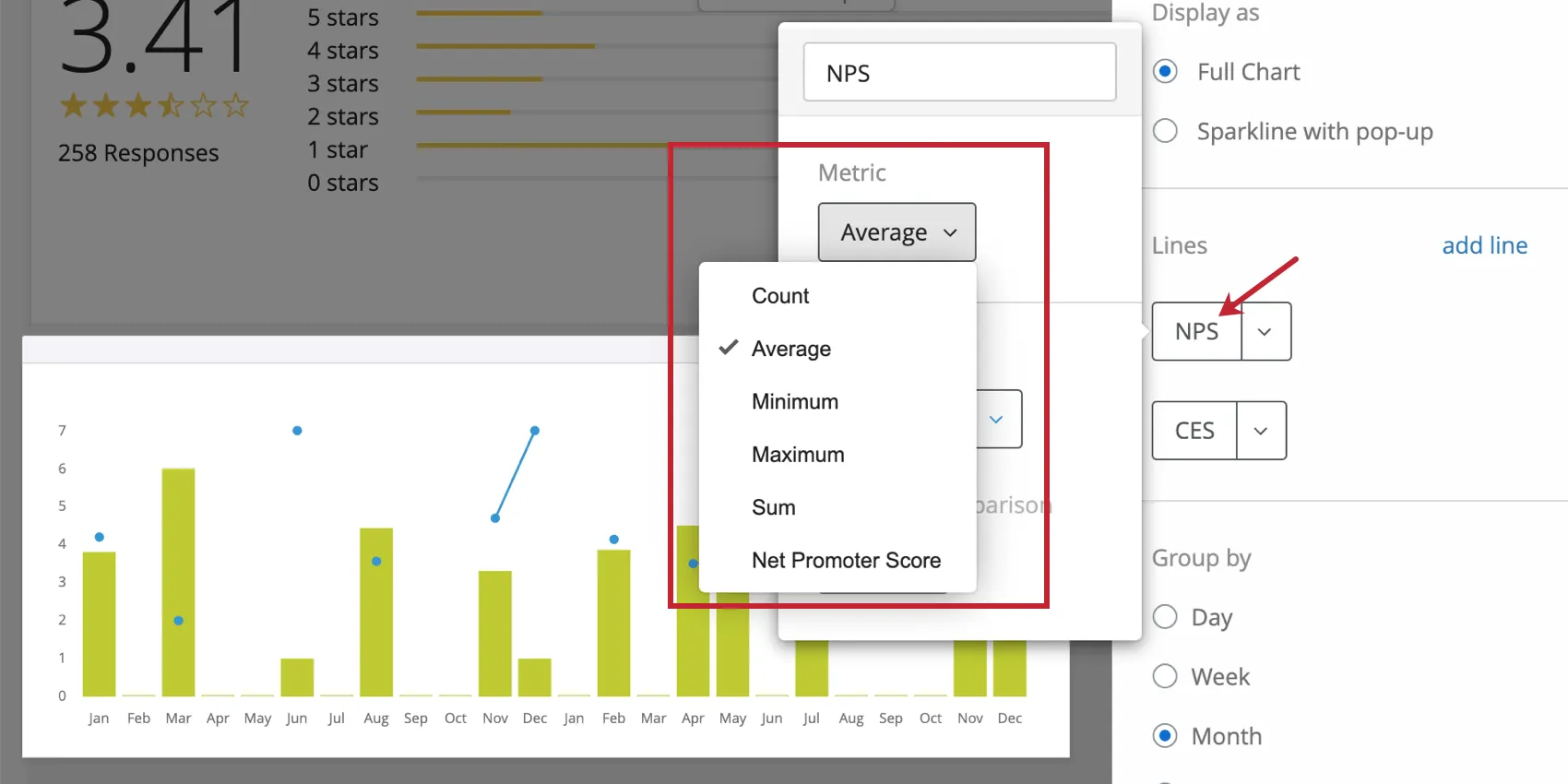
- Count: Display response counts from the selected fields.
- Average: Exhibit the average value for a selected field.
- Minimum: Show the minimum value of a selected field.
- Maximum: Present the maximum value for a selected field.
- Sum: Pull in the sum of all values for a selected field.
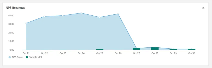
- Net Promoter Score: Identify the detractors, passives, and promoters from NPS questions.
Qtip: If you want to use correlations, benchmarks, custom metrics, or top / bottom box, we recommend using a simple chart widget instead.
Warning: The Historical Comparison feature on trend chart widgets has been deprecated.
Formatting How Data is Displayed
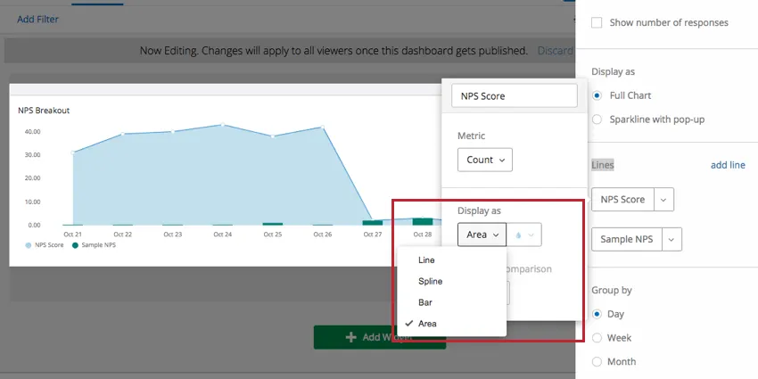
Click on a line you’ve added. Under Display As, you can choose between four different ways of displaying the field in your trend chart widget:
- Line: Display values for this field as points on a line graph.
- Spline: Display values for this field as points on a line graph, but with rounded corners.
- Bar: Display values as bars on a graph.
- Area: Connect values as a line graph, then shade the area underneath.
Choosing different display options for each line on your chart can make them easily distinguishable. Don’t forget to also adjust the color for each metric you add.
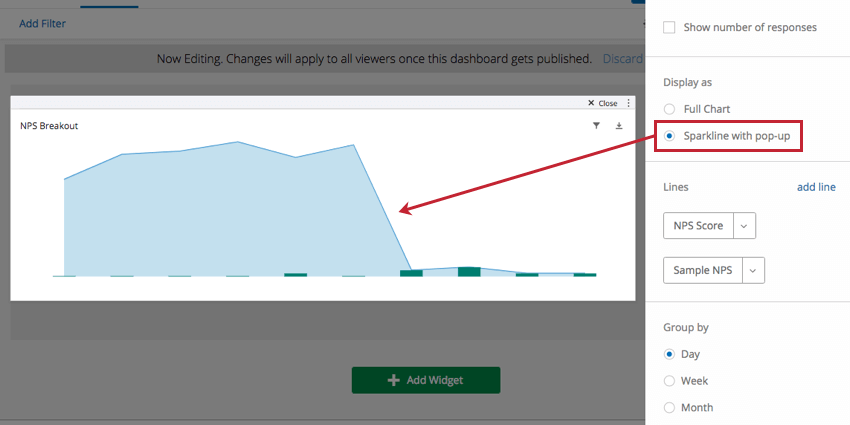
You also have the option to change how the chart itself is displayed. There are two options for displaying a trend chart:
- Full Chart displays the entire chart, including axes and labels.
- Sparkline with pop-up displays a simplified version of the chart with axes and labels removed. When the chart is clicked, a full version of the chart displays in a pop-up.

Vertical Range
Setting min and max values in the Vertical Range section allows you to manually specify the minimum and maximum values of the chart’s y-axis.
Axis Options
- Show horizontal axis: Deselect to hide the x-axis.
- Show vertical axis: Deselect to hide the y-axis.
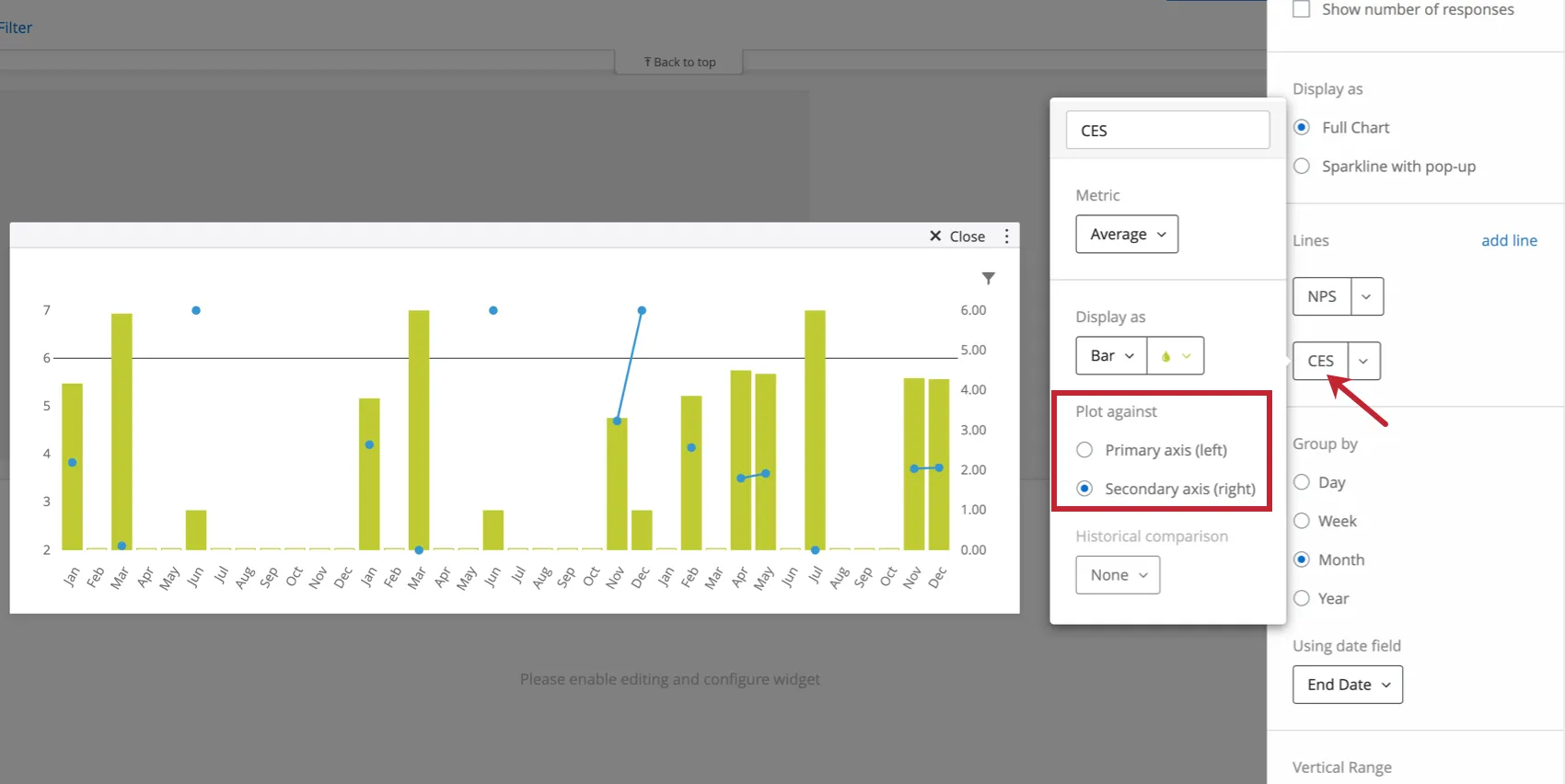
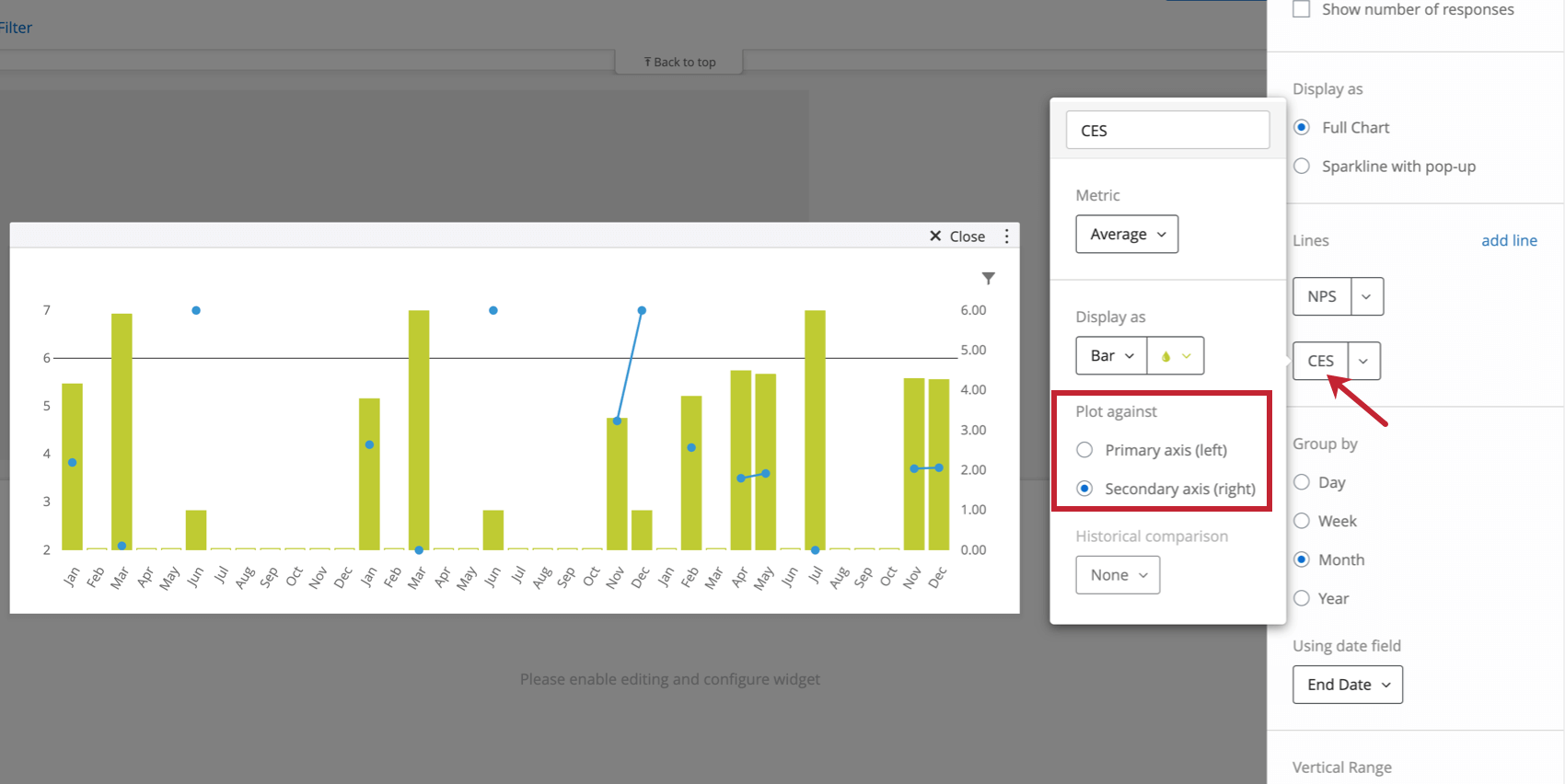
- Enable secondary axis: This is most useful when you have multiple lines added to the widget. Once you’ve enabled this feature, a second y-axis will be added to the widget, where you can separately chart one of your additional lines. See in the screenshot below how you can click a metric and determine whether it should be plotted against the secondary axis.
Chart elements to show
- Points (on lines): Add points to lines and splines. Deselect to show lines without points.
- Background grid: Add a grid to the chart.
- Legend: Add a legend to the bottom of the graph that explains what color corresponds to what line. Most useful for graphs with multiple lines.
- Tooltip: Allows dashboard users to hover over points to learn more about the data values.
- Horizontal reference line: Add a reference line to the widget. This static value will be set against the primary y-axis, if you have two on your widget.
Qtip: If you want to add multiple reference lines, customize their color, and even base these lines off dynamic custom metrics, you should consider using the simple chart widget instead.
FAQs
Can I compare historical trends from a data field on my Trend Chart widget in CX Dashboards?
Can I compare historical trends from a data field on my Trend Chart widget in CX Dashboards?
That's great! Thank you for your feedback!
Thank you for your feedback!