-

Qualtrics Platform -

Customer Journey Optimizer -

XM Discover -

Qualtrics Social Connect
Opportunity Analysis Chart Widget (BX)
About the Opportunity Analysis Chart Widget
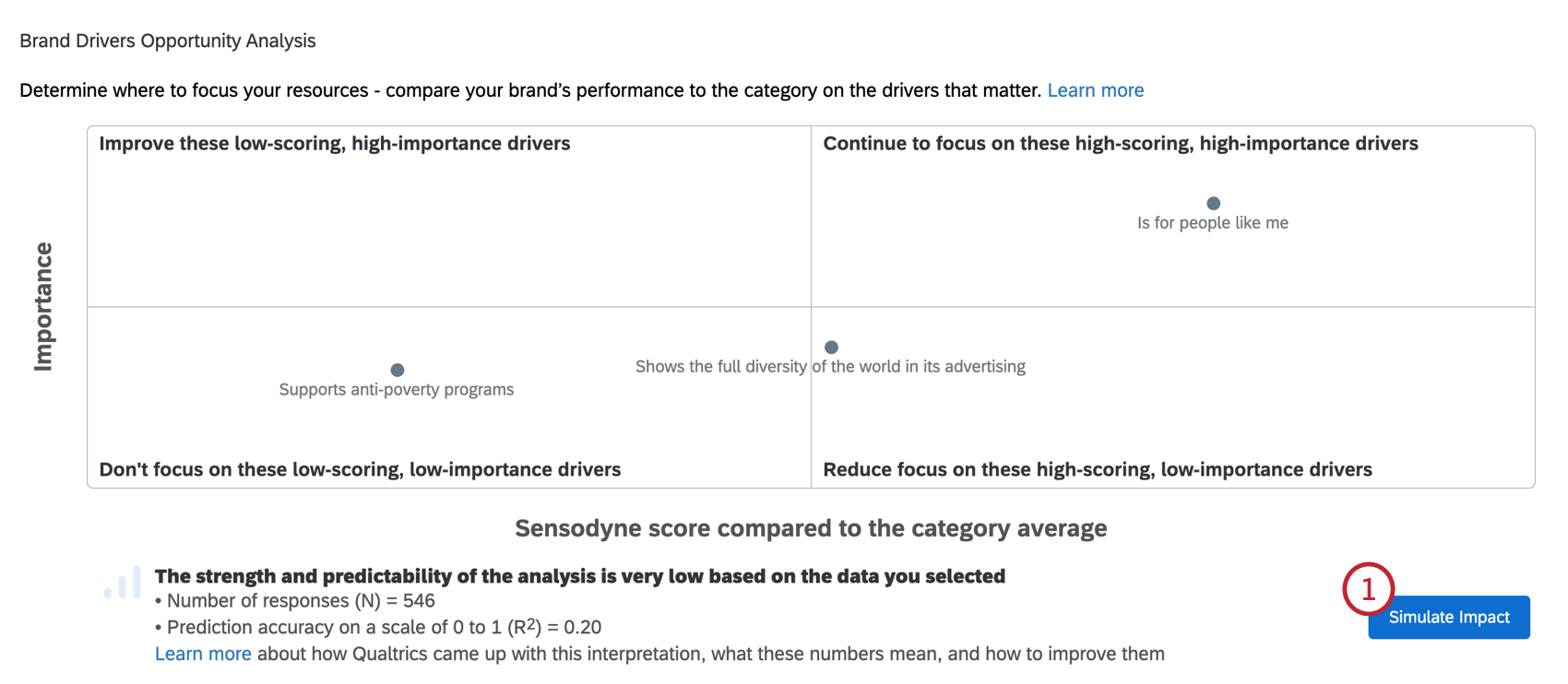
The brand drivers opportunity analysis chart allows you to test how independent driving variables affect a key metric and analyze your brand’s performance in comparison to the industry.
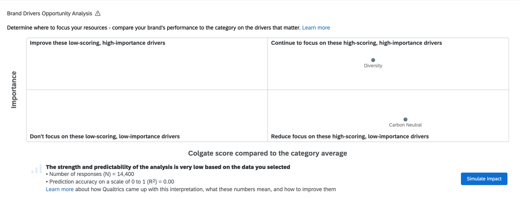
The y-axis of the chart represents the importance score, which indicates how important each of your drivers is within the industry.
The x-axis represents the score gap, which is the difference between your target brand (usually your own brand) and the industry average. A score gap can be positive (meaning your target brand scored higher) or negative (meaning your target brand scored lower).
Data Requirements for Drivers and Outcome Metrics
There are two important kinds of fields to think about when building this widget: drivers and outcome metrics.
Data requirements for the quadrant chart are extremely similar to the data requirements for the other brand drivers analysis widget. We recommend reading the following sections for guidance on formatting your survey and mapping your dashboard data to meet these needs:
Data Freshness
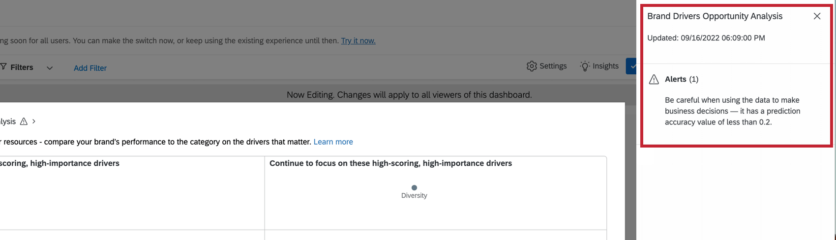
Click the widget title to view when the widget data was last updated.
Widget Setup
- Determine whether to get brand names from Driver questions or a Mapped field. See Data Requirements for Drivers for more information on the requirements for each.
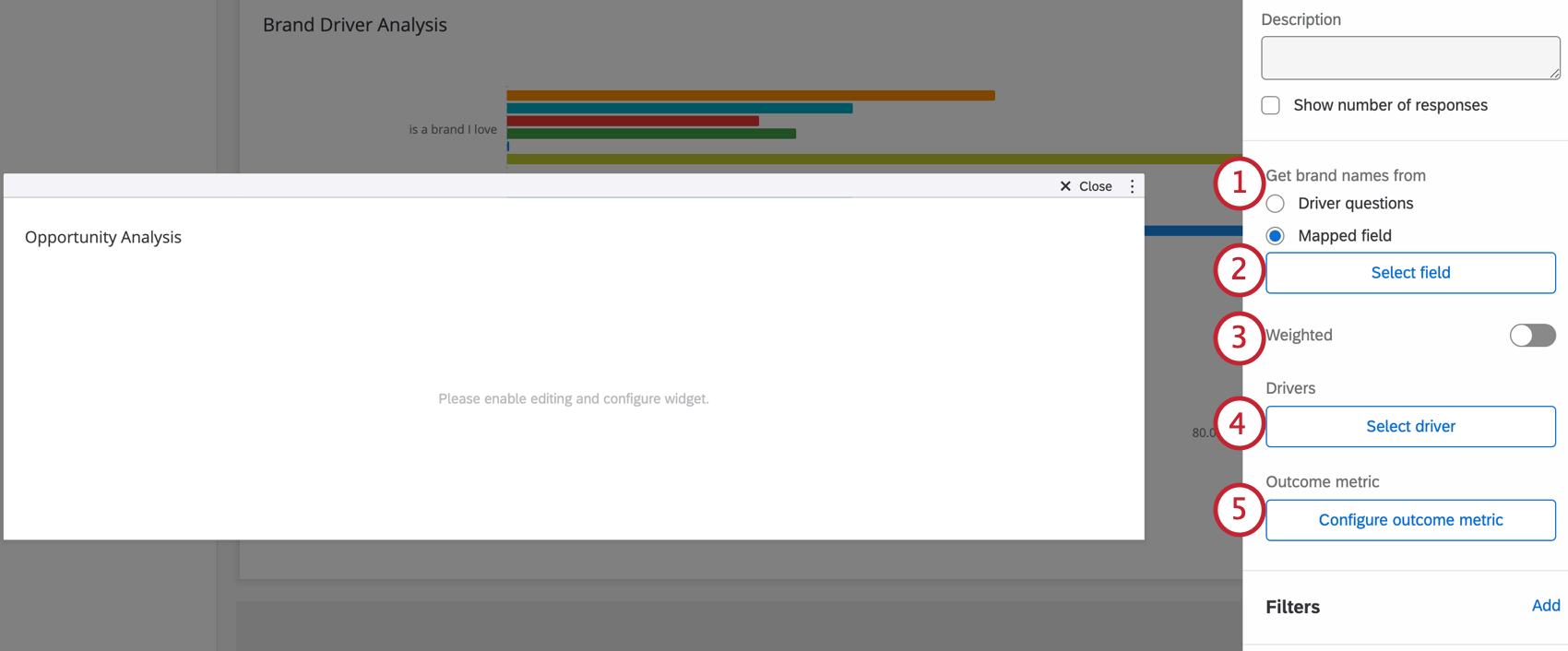
- If you selected Mapped field, click Select field to specify the brand where you store the brand evaluated in each response (usually just “brand,” but naming might vary).
- If a weighting scheme is configured in the dashboard, you can enable Weighted analysis to use the weights in this analysis. This step is not required.
- Click Select driver to add each driver.
- Click Configure outcome metric.
Configuring the Outcome Metric for Driver Questions
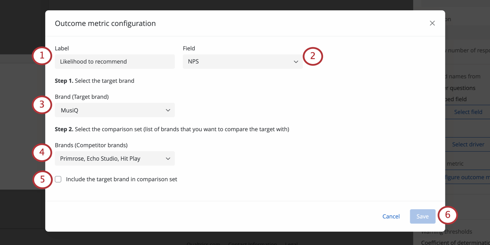
Read these steps if you indicated that you would “Get band names from” “Driver questions.”
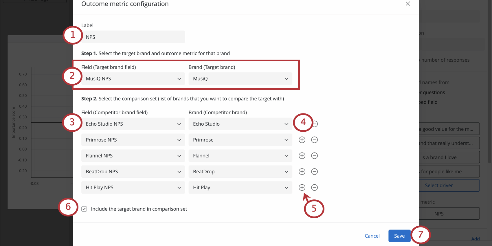
- Label the outcome metric.
- First, define the target brand and its outcome metric. The target brand is the one you want to compare to all the others. On the left, select the field you created for the outcome metric, and on the right, specify which brand that field measures.
- Next, you’ll be defining the brands you want to compare your target brand with. The “field” column on the left is where you choose the field you created for the outcome metric.
- The “Brand” column is where you specify the brand that field measures.
- Click the plus sign ( + ) to map another field. You should have a separate field for each brand, as pictured.
- Select Include the target brand in the comparison list. This determines whether or not the target brand will be aggregated into the comparison set when performing the calculation.
Qtip: Best practice is to always include the target brand in the comparison list.
- Click Save.
Configuring the Outcome Metric for a Mapped Field
Read these steps if you indicated that you would “Get band names from” a “Mapped field.”
- Label the outcome metric.
- Choose the field you created for the outcome metrics.
- Define the target brand. This is the brand you want to compare to all the others.
- Select the brands you want to analyze in the widget.
- Select Include the target brand in the comparison list. This determines whether or not the target brand will be aggregated into the comparison set when performing the calculation.
Qtip: Best practice is to always include the target brand in the comparison list.
- Click Save.
Widget Customization
For general information on how to add and edit widgets, visit the Building Widgets page. Continue reading for information about how to customize this specific widget.
Driver labels
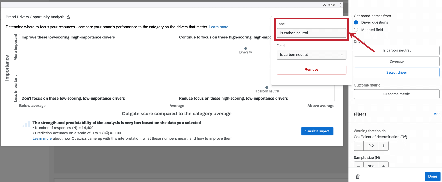
If desired, you can click on each driver to change how it is named.
Warning Thresholds
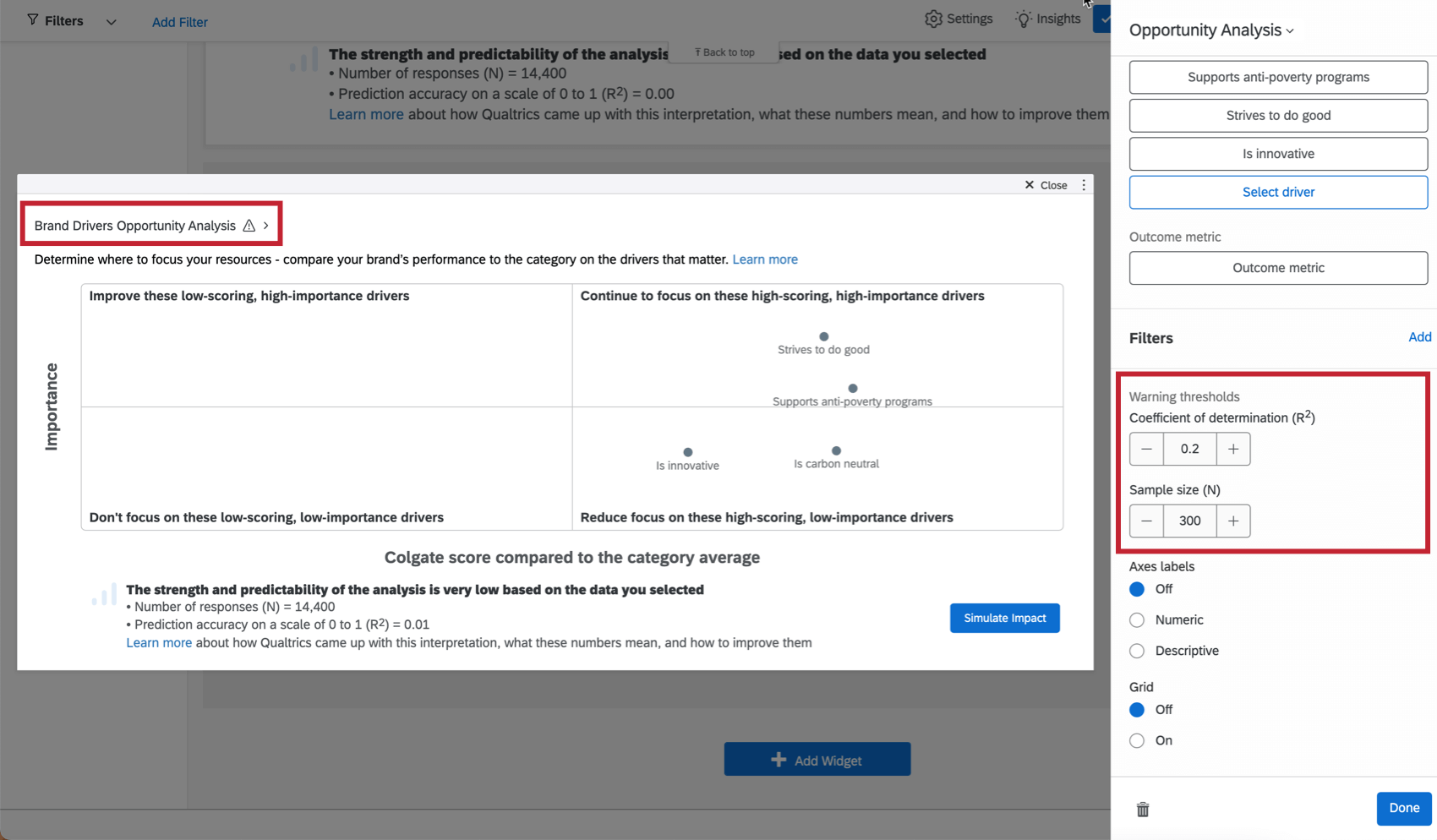
If results are statistically insignificant, you’ll want to take that into account before making decisions based on what you see in the widget. Therefore, it’s possible to add a warning that will appear on your widget when responses aren’t within a particular statistical range. When you hover over this icon, it will elaborate on the warning, as shown above.
The coefficient of determination (R squared) is set to 0.2 by default. The sample size (N) is set to 300. You can adjust these as needed.
Axes Labels
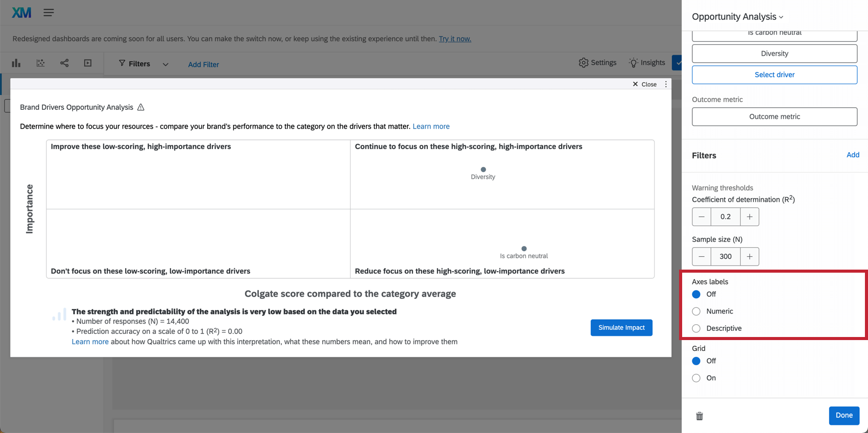
Indicate whether you would like to include numeric or descriptive labels on each axis.
Grid
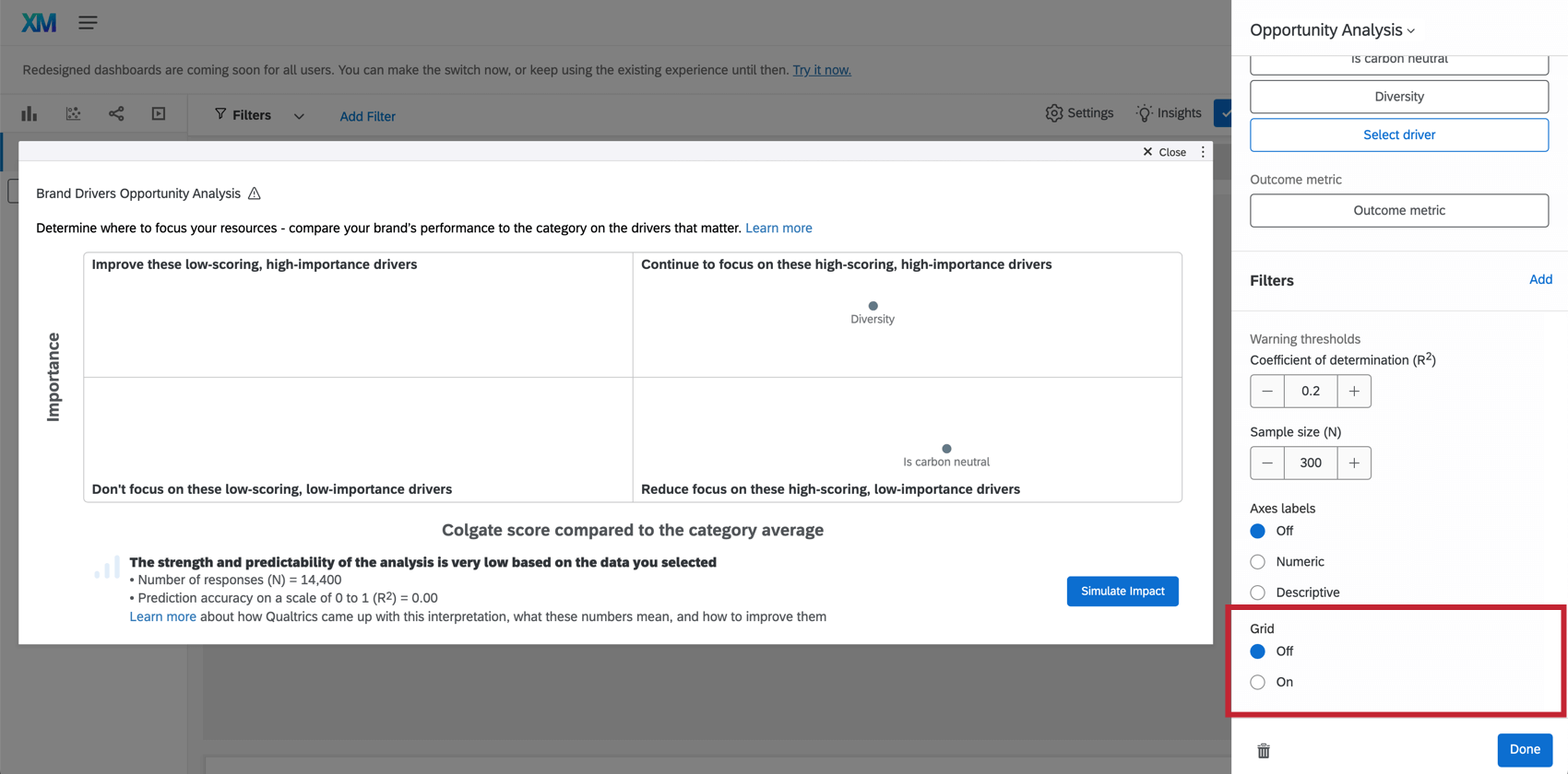
Indicate whether you would like grid lines included on the opportunity analysis chart.
Supplementary Analysis Information
At the bottom of your widget, you’ll see a quick summary of your selected drivers’ impact on your selected outcome metric.
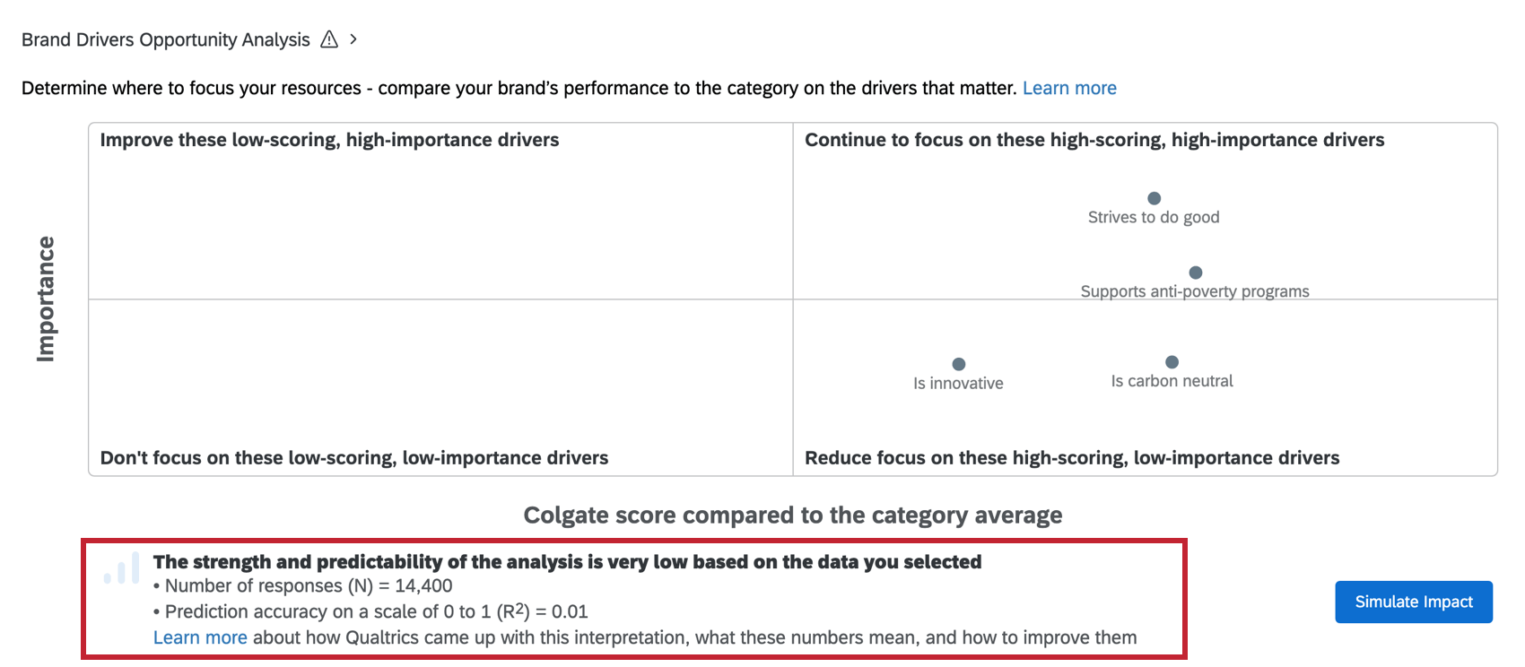
The number of responses (N) is the number of responses in the analysis. The larger the N value, the more confident you can be in the results. We recommend a minimum of 30 responses. If N is low, your filters may be too restrictive. Adjust your filters and rerun the analysis.
Prediction accuracy on a scale of 0 to 1 (R Squared) is the numeric metric for quantifying the analysis model’s prediction accuracy, which falls between 0 and 1. A 0 means the model has no predictive value, and a 1 means that the model perfectly predicts everything.
Impact Simulator
Determine a brand positioning strategy that maximizes impact on your brand health KPIs with the impact simulator!
The opportunity analysis chart tells you how your brand performs in certain perceptions compared to the rest of their category. As a next step, the impact simulator helps you determine which brand perceptions you should focus on to maximize impact to your brand health KPIs.
Put simply: the impact simulator allows you to simulate the performance of different brand perceptions so you can see the impact on your KPI of choice.
Simulating results with the impact simulator
Both dashboard editors and users with read-only access to the dashboard can use the simulator.
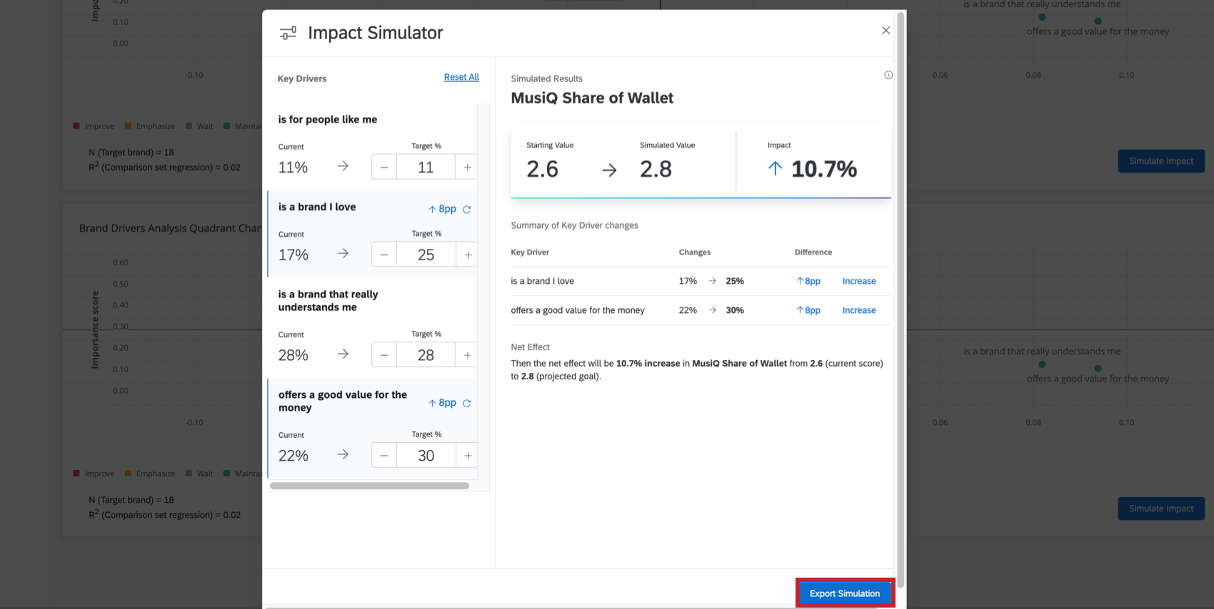
- To open the impact simulator, click Simulate Impact on the widget.
- Along the left, you’ll see key drivers. There is a current value, then the target, which you can edit.
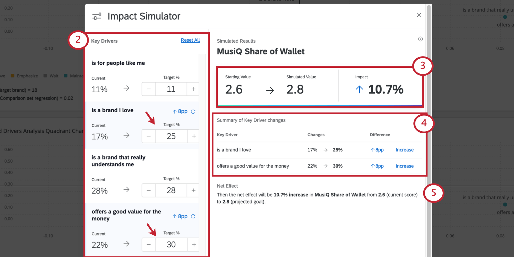
- As you increase or decrease a given driver target, your outcome metric will be adjusted to match the estimated impact.
Example: Here, the starting value of our outcome metric was 2.6. Then, once we adjust our drivers’ targets, we get a simulated value of 2.8. That’s an estimated impact of 10.7% on our outcome metric.
- The simulator also provides a helpful summary of key driver changes made during the simulation, and the subsequent impact (increase or decrease) this is estimated to have on the outcome metric.
- The Net Effect explains how the outcome metric changed in simple language.
Example: Then the net effect will be 10.7% increase in MusiQ Share of Wallet from 2.6 (current score) to 2.8 (projected goal).
The target on the right is the estimated impact on your outcome metric. You cannot edit this value directly; it changes as you adjust driver targets.
Calculation
Much like the quadrant chart’s results, the simulator uses Johnson’s Relative Weights. This method is widely used to evaluate how a dependent variable relates to a set of independent variables. It is able to provide clear results even if the independent variables have very high collinearity.
Exporting the Simulation
You can export a copy of the simulator’s results as a PDF. To do so, click Export Simulation.
Any user the dashboard has been shared with will be able to export simulator results.
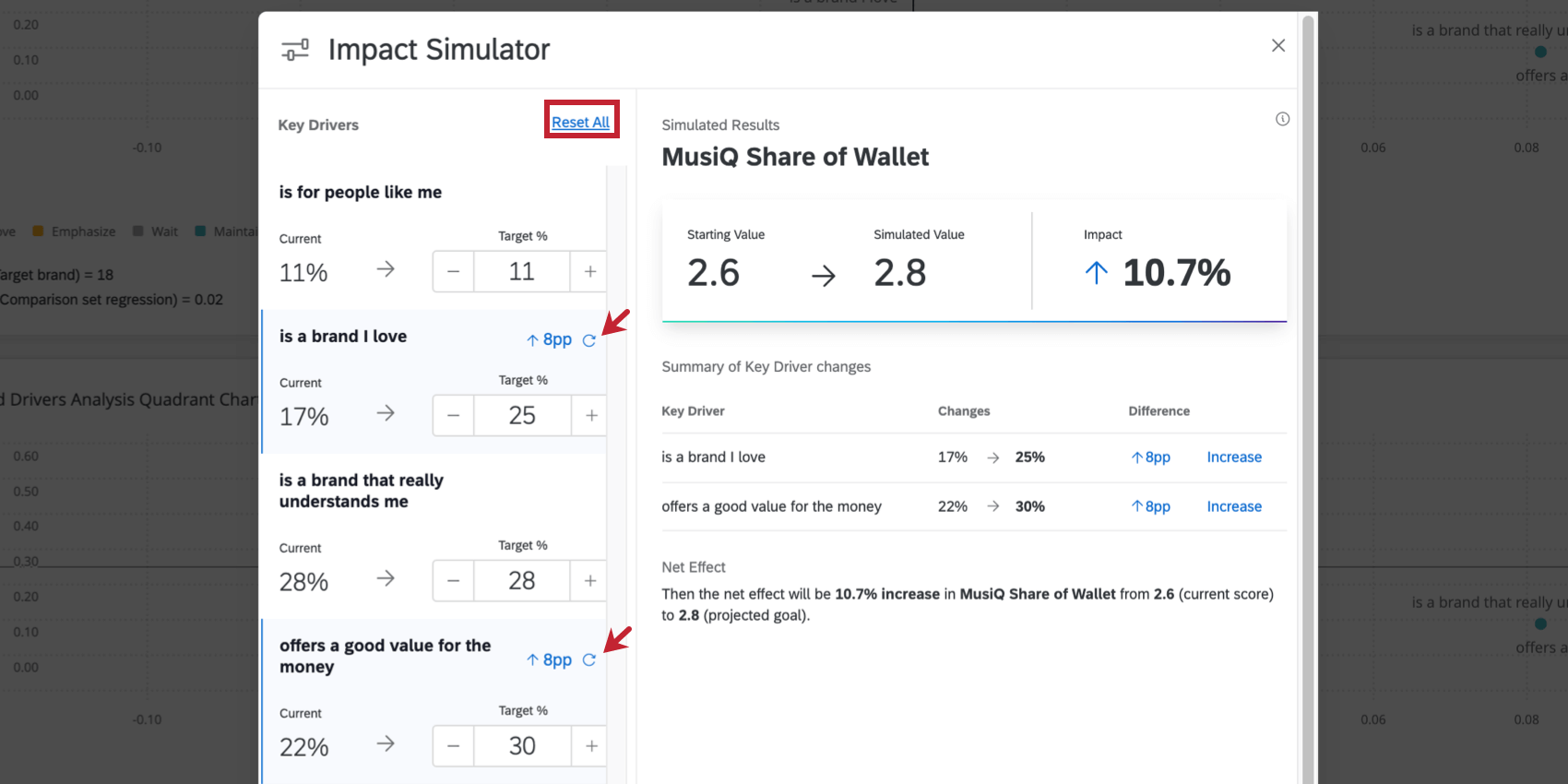
Resetting the Simulation
You can easily reset the simulation without having to manually adjust each driver. Click Reset All to reset all drivers, or click the refresh icon next to an individual driver to refresh just the one.
Key Terms
The following is a list of brand analysis research terms used on this page.
- Brand health: The way a company or brand delivers on its promises to customers. A brand is said to be healthy if customers believe it to be delivering on those promises.
- Brand perception: What people think of your brand.
- Brand position: How your brand is positioned in the market ultimately determines how consumers view you and your ability to meet their needs. It determines who you compete within your category, and if positioned right, it determines how much people or businesses will pay for your products or services.
- Category: The other brands you want to compare your brand(s) to. This could be competitor brands or even other brands one company owns. In other words, this is the marketplace that the brand cares about.
- KPIs: Technically a wider industry term, KPI is short for key performance indicators. These are the metrics your organization uses to measure success. There are many different KPIs out there, and no two organizations’ will look exactly the same. (Often, they even differ between departments or projects within the same company!)
The following is a list of terms unique to this chart’s setup.
- Outcome metric: The outcome metric is the dependent variable in your analysis. Outcome metrics should represent some important measure (KPI) for your brand. This can often include NPS questions, likelihood to recommend, or consideration questions.
- Driver: The drivers in this widget are your independent variables. These can be either brand imagery questions or product questions written in a scale format. Product questions can be about reputation, performance, reliability, and more.
Additional Options
Click on the three horizontal dots in the top-right corner of your widget to view additional options.
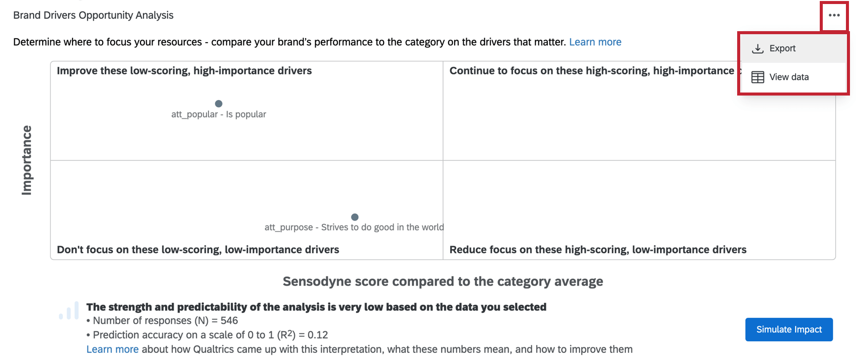
- Export: Export your widget as a JPG, PDF, CSV, or TSV.
- View data: View a table containing the data for all drivers in the widget.